1. Drawer-Front Roses + Warm Glint
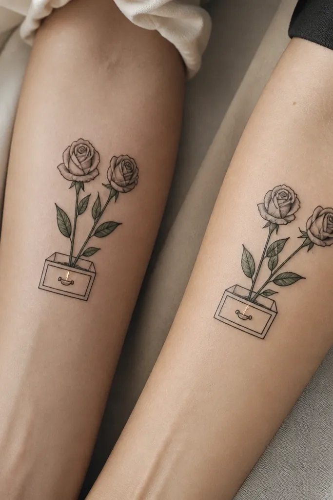
This one works because the drawer shape gives the eye a frame, so the roses don't float. The light-like glint is placed where your skin stays smooth in most poses, so it reads as intentional sparkle rather than random white dots. I like the rose stems because they create a vertical rhythm that matches across two bodies even if the forearms are different widths. The gray shading around the glint makes it look warmer without needing heavy color.
Do it around 3.5 to 4 inches long on each forearm. Keep the drawer lines thicker than the leaf vein lines. If you want a "light" effect, ask for white ink only on the glint and one small secondary highlight, not on every leaf edge. Placement: slightly above the wrist on the inner forearm looks clean.
Pro tipAsk your artist to mock up the glint at the exact size it will be after healing by using a temporary stencil and then stepping back 6 feet to check readability.
AvoidDon't put the glint on a joint crease; it will smear when your skin flexes.
2. Book-Spine Vines + Single Spark
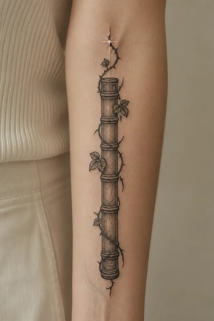
This design reads well because it treats the storage idea like a spine - a straight, stable boundary. Vines give you the ACOTAR plant energy without forcing big petals, and the single spark keeps the "lights" concept clear. I've found that one bright accent ages better than multiple tiny sparkles. The stipple shading supports the spark by adding a gentle dark background.
Size it to 2.5 to 3.25 inches so the spine edges don't blur. Use leaf clusters that are no thinner than a pencil eraser width at the smallest point. If you're matching with a bestie who wants bigger, extend the vines downward on one person while keeping the spine and spark position consistent.
Pro tipUse the same plant silhouette on both people (same leaf count per cluster), then vary only length. It still looks like a set.
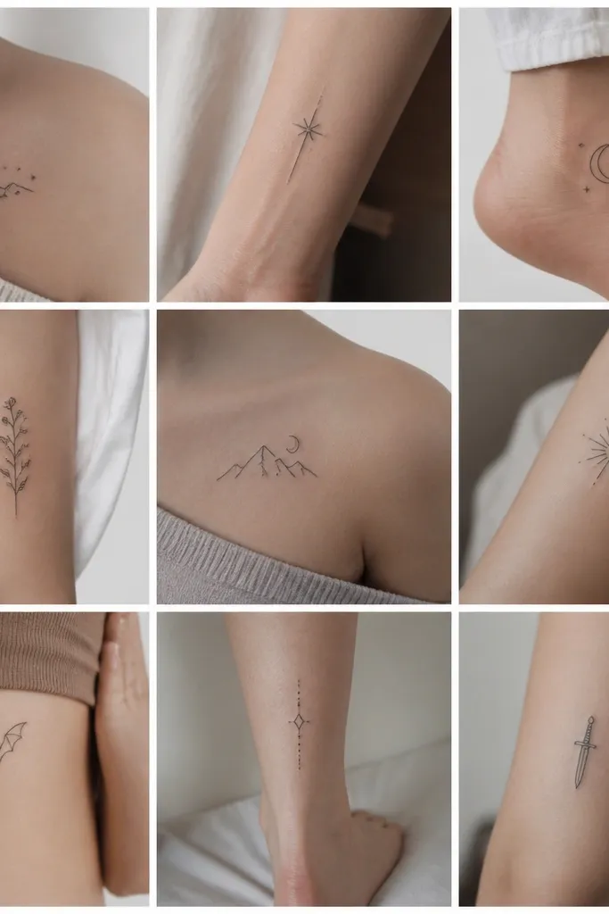
AvoidSkip ultra-fine "star dust" dots; they disappear fast.
3. Hanging Herb Jar + Leafy Halo
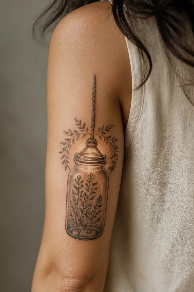
The jar shape is an easy storage symbol, and the hanging rope makes it feel like it has motion. A leafy halo gives you the "lights" vibe without relying on literal bulbs, and it frames the jar opening so the eye goes there first. This is the one I recommend when you want a softer, more magical look instead of heavy blackwork. The halo also helps hide minor healing texture differences between you and your bestie.
Place it on the outer upper arm or back upper arm for best stretch. Aim for 4.5 to 6 inches tall so the jar doesn't shrink into a blob. Keep the halo leaves consistent thickness, and put the glow at the jar rim only. If you add color, do muted sage-green leaves with gray-black linework.
Pro tipHave your artist stencil a halo radius that's slightly wider than the jar, so the glow stays visible after swelling and peeling.
AvoidDon't pack too many tiny leaves into the halo; it turns into gray fuzz.
4. Cage Lantern Thorns + Tiny Light Dots
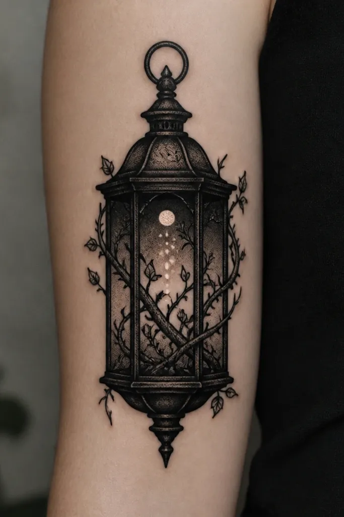
This looks like ACOTAR mood on purpose. The lantern cage is the storage concept, and the thorn vines give you that dangerous plant energy. Tiny light dots work here because the cage shading creates a dark background that makes the highlights pop. I like this design for people who want a darker palette and don't mind a more intense healing window due to the heavy black.
Go bigger than you think: 5 to 7 inches so the cage bars don't disappear. Keep the dot highlights spaced - at least the width of one dot apart - so they don't merge. If you do white ink, use only 3 to 5 dots total, with one "main" dot slightly larger.
Pro tipWear a loose sleeve for the first week. Heavy blackwork with lots of shading gets irritated by friction fast.
AvoidDon't make the cage bars too thin; they heal into mush.
5. Terrarium Box + Top-Lid Glow
Terrarium boxes look "contained," which is exactly what storage should do. The top-lid glow gives you the light effect without turning the whole piece into scattered sparkles. This one stays readable because the rectangle edges anchor the design. If you want matching tattoos that don't depend on color, terrarium layouts are your friend.
Place it on an outer forearm or calf for a flat surface. Size: 4 to 5 inches long. Keep the terrarium outline linework thicker than the leaf stems. For the glow, ask for a gradient that starts dark under the lid and fades outward, with only two highlight streaks.
Pro tipChoose a leaf style with clear separations - like alternating oval leaves - so the negative space shows through during healing.
AvoidDon't shade the entire terrarium with gray wash; it kills contrast.
6. Rose Thorn Bracelet + Storage Tab
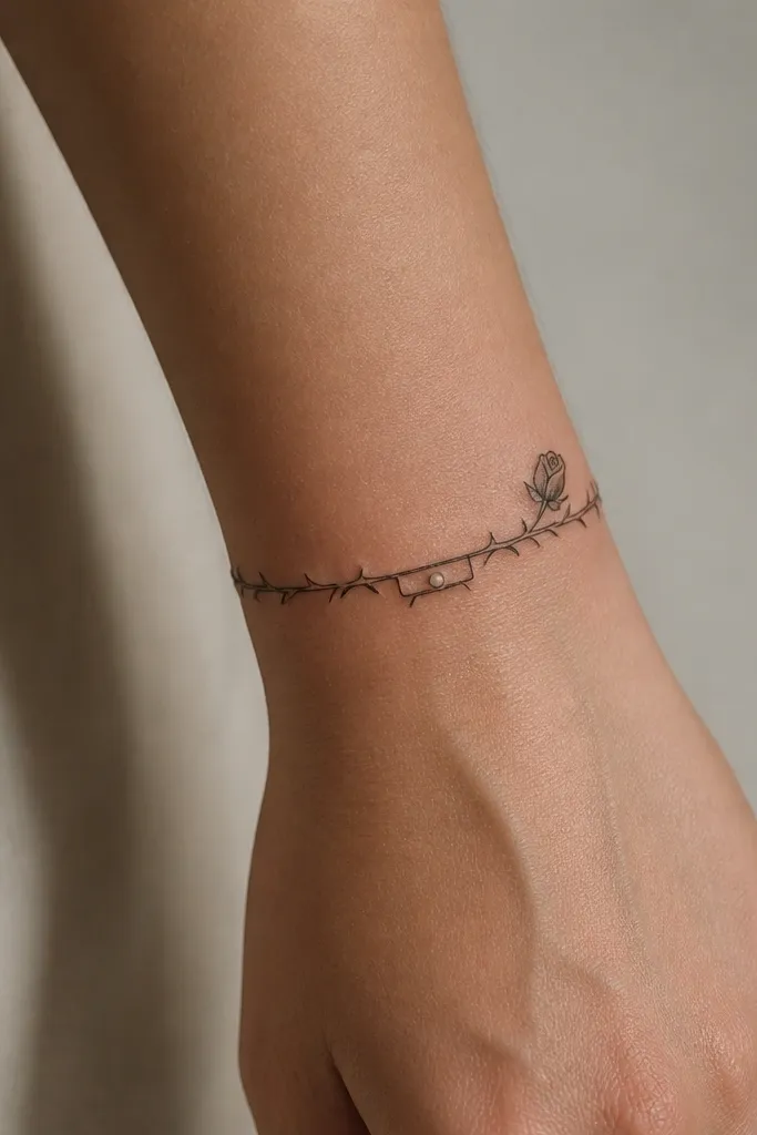
This is a smart matching option because the bracelet shape gives you consistency even if you place it slightly differently on each person. The storage tab is tiny, but it's the anchor for the theme, and it keeps the "lights" idea from getting lost. I've seen bracelet tattoos age better when the design is mostly outlines with controlled shading. The rose bud gives ACOTAR romantic energy without needing a full rose cluster.
Size the band width around 0.6 to 0.9 inches. Put the thorn linework on the outer side where your wrist bone doesn't compress the lines as much. The storage tab should be no smaller than 1/4 inch wide so it doesn't heal into a dot. One white highlight on the tab is enough.
Pro tipIf your bestie has smaller wrists, shrink the band width first. Keep the tab and rose bud proportions the same.
AvoidSkip micro-texturing on the band edges; it turns patchy after peeling.
7. Crescent Planter + Two-Point Lighting
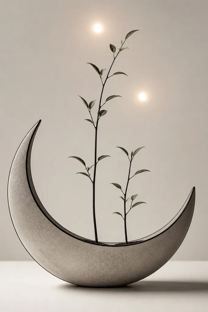
A crescent planter is a great storage symbol because it's curved and frames the plants naturally. Two-point lighting adds that "lights" idea in a controlled way, like stage lighting rather than random sparkles. The negative space inside the crescent keeps the tattoo from looking busy, which matters when you're matching on different body sizes. This one is also easy to adjust: add or remove one leaf cluster without changing the overall read.
Place it on the inner forearm or upper arm where the crescent won't be stretched too hard. Size: about 3.5 to 4.5 inches. Keep the two highlight points bigger than pinpricks; aim for small teardrops or circles about 2 to 3mm. Use gray shading under each stem so the highlights look warm.
Pro tipMake sure the crescent outline is bold enough to survive healing. Thinner crescent lines fade quicker than straight lines.
AvoidDon't put the crescent across a tight bend like the inner elbow; it distorts the curve.
8. Candle-Glass Leaves + Drawer Key Charm
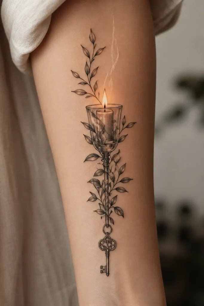
This design blends storage and lights in a way that reads clearly even at small sizes. The candle-glass top gives you the glow, while the drawer key charm ties it to storage without needing a full drawer panel. Leaves around the glass add that ACOTAR plant subject, and the charm gives you a focal detail that looks good in close-up. I like it because it feels personal but still matches as a set.
Keep it around 3 to 4 inches if you want it to stay crisp. Put the charm at the bottom so it doesn't get stretched by hand movement. For the glow, keep it limited to the wick and rim - two or three white strokes max. If you want color, use very muted olive-green leaves, not bright neon.
Pro tipAsk for the key charm outline to be thicker than the leaf stems. Keys are small and need line weight to stay legible.
AvoidDon't add too many tiny leaf tips around the glass; it competes with the glow.
9. Book of Shadows Style Plant Pages + Light Margins
This one reads like ACOTAR without copying any single character. The "storage" is the book pages, and the "lights" are margin highlights, which look clean in photos because they sit along edges. Plant pages give you natural symmetry, and the margin glow creates a soft frame that makes the whole piece feel intentional. It also ages well because the highlights are along a stable outline.
Place it on forearm lengthwise, 4 to 6 inches. Keep page edges bold and let the plants stay slightly smaller so the book shape stays dominant. Use white ink only for the margin lines, not inside the leaves. Match your bestie by keeping the same book rectangle height and the same number of leaf clusters per page.
Pro tipDo a stencil check with your arm relaxed and slightly bent. Book shapes look different when the skin stretches.
AvoidDon't fill the book pages with dense shading; you'll lose the plant silhouettes.
10. Lantern Jar + Ivy Knots + Threaded Glow
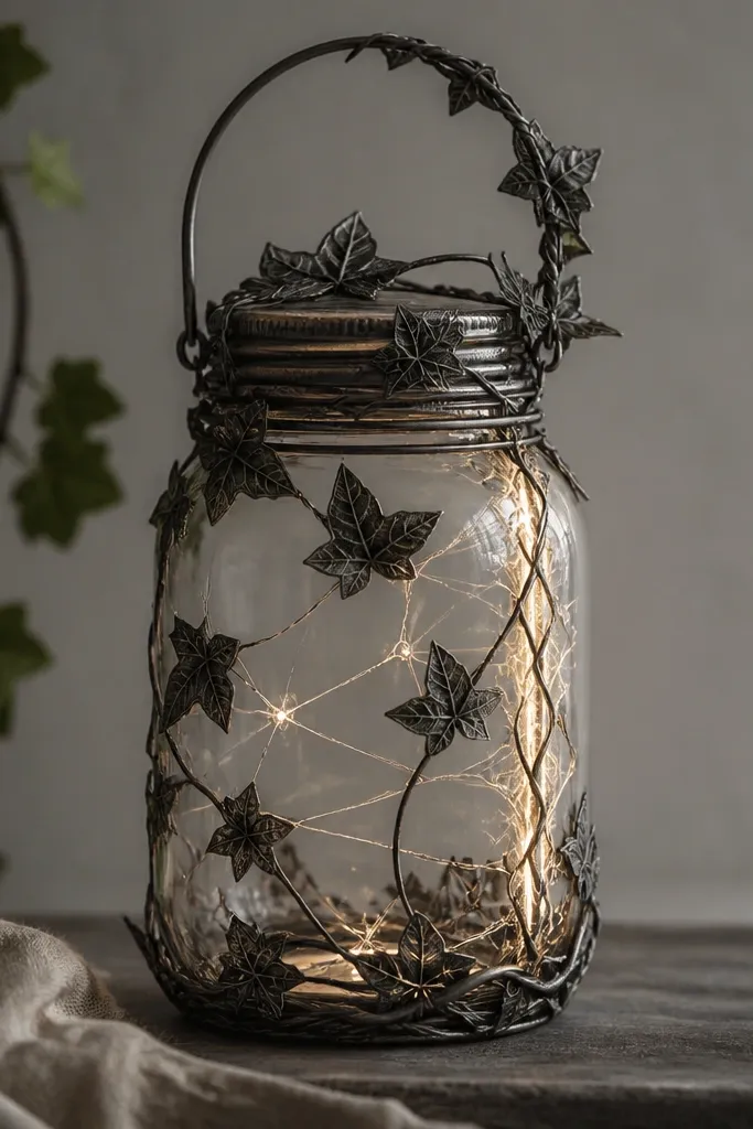
I like this for bestie matching because it gives you a clear system: jar, ivy knots, thread glow. The thread-like glow keeps the light concept from becoming random sparkles, and the ivy knots add texture without needing tiny leaf veins. The jar shape keeps it controlled so the piece doesn't turn into a generic vine tattoo. It also looks great in motion because the ivy knots create visible "anchors."
Size it 4 to 5.5 inches for a forearm or upper arm. Keep ivy knots thick enough to read - think bold loops, not thin strings. The glow should run along one threaded side only, so the design doesn't look like it has multiple light sources. Gray shading behind the threaded line makes the glow look warm.
Pro tipUse a reference photo of your own jar or lantern. Matching the highlight placement to real glass helps the tattoo look more believable.
AvoidSkip adding glow to the whole jar surface; it flattens the depth.
11. Cedar Box + Pine Tips + Soft Rim Light
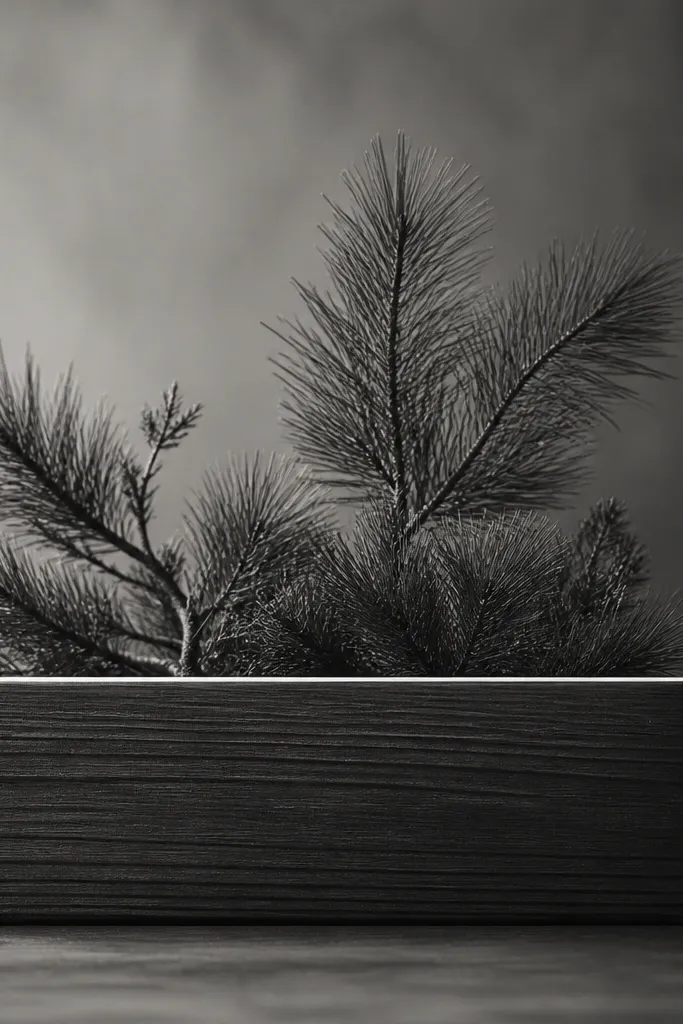
This design feels grounded and still magical. The cedar box is storage in a very literal way, and the pine tips keep the plant subject sharp even when the tattoo is small. The rim light is subtle, which means it won't look harsh or ghostly after healing. I've used this layout for couples who want ACOTAR mood but don't want roses everywhere.
Place on outer forearm or upper arm where the top edge of the box won't stretch too much. Size: 3.5 to 4.25 inches. Keep wood grain lines minimal - 6 to 10 short lines total. Rim light should be a single continuous highlight line, not scattered dots.
Pro tipAsk for the rim light to be drawn like a highlight on curved glass/wood, not a straight sticker line. Curved highlights look more realistic.
AvoidDon't add heavy color to the wood grain if you're doing white ink highlights; it can turn muddy.
12. Vine-Laced Lockbox + Keyhole Glow
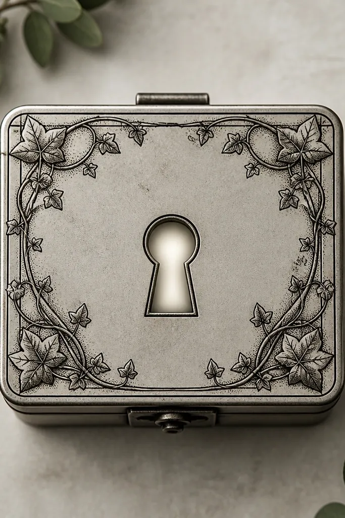
A lockbox is a storage symbol with built-in focus, so it's easier to keep matching between two people. The keyhole glow gives you a "light behind the object" effect that stays readable because it's centered. Vine lacing adds plant subject without covering the glow too much. This is one I'd pick if you want the tattoo to look like a spell object, not just decor.
Make it about 4 to 6 inches, depending on your placement. Keep vines at the edges, leaving the keyhole area clear. The glow should be a gradient inside the keyhole, with one small highlight stroke at the top. Match by keeping keyhole size the same on both bodies.
Pro tipIf your skin tone shows through during healing, ask for slightly stronger stippling around the keyhole so contrast stays.
AvoidDon't over-ink the glow with bright white; too much white ink looks chalky.