1. Black Rose Over Script Name
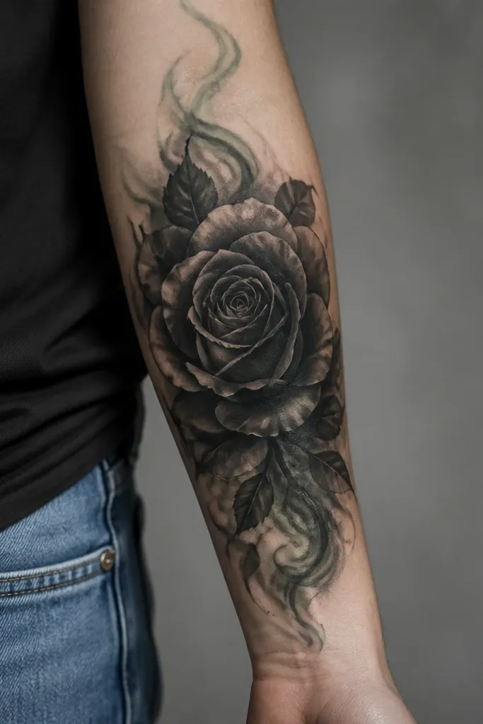
This works because roses create layered petal shapes that physically overlap the letter strokes. The thick center mass blocks out the original script, and the petal shading breaks up the uniform darkness so it doesn't look like a single flat patch. I like black-and-gray with only hints of muted color because names often reappear through thin color layers. The rose also gives you natural curves to hide script swirls.
Place the rose so the darkest center covers the middle of the name first. If your name is 2 inches long, aim for a rose about 2.75 to 3.25 inches across. Add 4 to 7 petals around the center with varied thickness - thick where the name sat, thinner at the edges for a smooth transition.
Pro tipAsk for a stencil that includes petal overlap lines that extend past the letter ends. That overlap is where the cover up actually wins.
AvoidDon't choose a tiny rose. Small blooms leave gaps where letters peek through.
2. Peony Fan With Dark Center
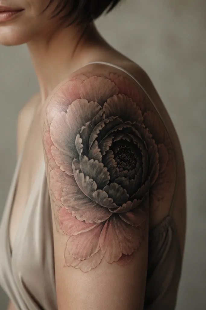
A peony fan hides text well because it spreads across the letter width while the center mass covers the densest parts. The petal layering creates multiple visual "stops," so your eye doesn't track to where the old name was. The blush and dusty red sit on top of black shading, which gives you color without making the underlying letters show. The fan layout also flatters women because it follows arm curvature.
Position the fan so it covers the full height of the name plus extra at the top and bottom. For a medium name, I aim for a peony that runs roughly from mid-bicep toward the outer arm for a clean silhouette. Use black and gray for the first pass and reserve pink only for outer petals and small highlights.
Pro tipAdd a few thin petal gaps filled with soft gray rather than leaving skin empty. That keeps the cover up looking intentional after healing.
AvoidSkip super bright neon pink. It can make the old ink look darker by contrast.
3. Vine Wrap With Hidden Letter Mass
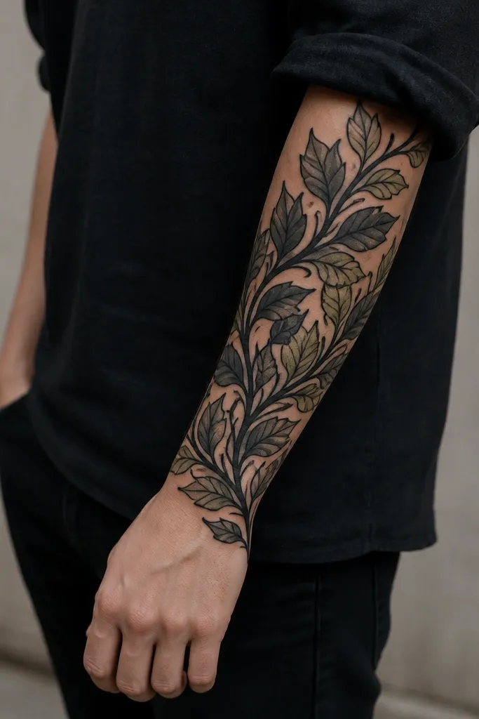
Vines cover names well when the leaves overlap in the same direction as the old letters. The dark vine line gives you a continuous anchor across the name, while leaf shadows disguise the seams. I like this for people who want something feminine but not floral-heavy. Olive-green accents look natural because they're muted and don't fight the black foundation.
Start the vine so it runs through the center of the name, then let the leaves cross over the letter strokes. Aim for leaf shapes about 1.25 to 1.75 times the height of the tallest letter in your old name. Keep outlines slightly thicker than you'd do for a new tattoo; cover ups need stronger line control.
Pro tipChoose leaf tips that point into the letter area. Directional overlap hides script loops.
AvoidAvoid thin line vines with lots of empty space. Names show through empty gaps.
4. Butterfly With Black Body and Soft Wings
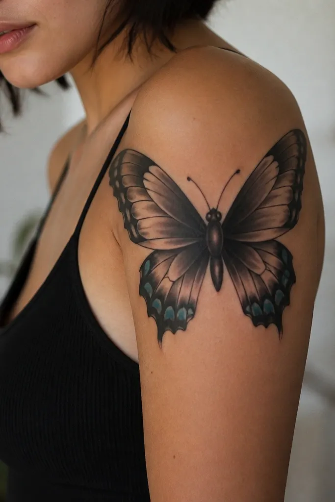
Butterflies work because the body can be placed directly over the densest part of the name, then the wings provide enough surface to cover remaining strokes. The scalloped wing edges break up the old lettering into something that reads as pattern, not text. Muted teal accents add interest without turning the tattoo into a high-contrast poster. This style also ages nicely because it isn't dependent on super fine linework.
Place the butterfly so the body covers the center of the name block, even if the name was slightly off-center. For a beginner-friendly cover up, keep wing span around 3 to 4 inches on forearm or upper arm so the artist has room to work over the letters. Use gray gradients around the wings to smooth transitions from black mass.
Pro tipAsk for a "shadow map" in the sketch - where the darkest wing sections go relative to the old letters.
AvoidDon't do a super delicate butterfly with lots of thin white highlights. Thin work is where old letters ghost through.
5. Sleeve-Style Sunburst Over Name
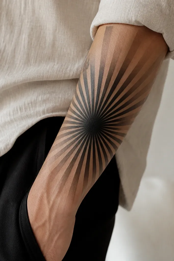
Sunbursts cover names because the rays are bold, directional marks that interrupt letter shapes. The center is a dark anchor that blocks the original text, and the alternating rays give structure so the cover up looks graphic, not messy. Warm tan and beige at the edges create a softer finish for women, especially if you don't want a fully black tattoo. This is one of the quickest-looking cover ups once healed.
Align the center of the sunburst over the middle of your old name. If your name is horizontal, place rays so they radiate up and out, covering letter ends that might otherwise stick out. Keep the rays thick at the center and thinner at the edges for a natural fade.
Pro tipRequest a ray count that matches the space - usually 18 to 28 rays on a forearm section. Too few rays look like stripes, not a cover up.
AvoidSkip fine line sun rays. They don't hold enough pigment to hide lettering.
6. Cover Up Script Into Geometric Crest
This approach is for people who want something clean and modern. A shield or crest shape lets the artist place dark blocks over the letters while geometric hatching fills the gaps. The negative-space triangles give your eye places to rest, which makes the tattoo look designed instead of covered. The muted gold-like highlights can be done as light beige or warm gray so it doesn't fade into patchiness.
Choose a crest that fully encloses the old name area with at least a half-inch margin on each side. Use thick outlines first and then add gray hatching in the directions that cover letter strokes. Keep the crest proportions balanced - too sharp and it can look like a sticker; too rounded and it can smear.
Pro tipIf you still want a hint of the old name, place it in the stencil as a guide, then design shapes that specifically overlap each letter stroke.
AvoidDon't rely on line-only geometry. Letters kill line-only cover ups.
7. Lotus Bloom With Black Petal Core
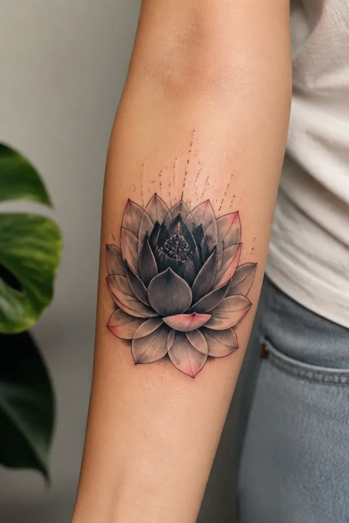
Lotus petals overlap naturally, which is exactly what you need for script cover ups. The black core blocks the name, and the petal gradients keep the tattoo from looking flat and heavy. Pink highlights at the outer petals read feminine while staying under control because the main coverage is still black and gray. The pollen dots add texture without adding thin lines that often fail on cover ups.
Place the lotus so the core sits over the densest letter area. For a name around 2 inches, aim for a lotus around 2.5 to 3 inches wide. Keep linework medium thickness and let the gradients do the blending - no overly delicate dotwork.
Pro tipAsk for a "petal shadow" plan: each petal should have one darker side that hides the direction of the old letters.
AvoidAvoid super thin lotus linework with lots of empty skin. Empty skin shows the old ink.
8. Mandala With Thick Rings
Mandala rings swallow names because they cover the whole area with repeated structure. The thick rings act like a blanket over the letters, and the radial symmetry makes the tattoo look intentional even if the old name was uneven. Muted red accents work because they sit on top of dark mass rather than replacing it. This is a strong option when you want cover up to feel "complete" and not like a single flower.
Size matters: if your name is 1.5 to 2.5 inches, build a mandala 3 to 4 inches across so thick rings can overlap. The center should be darker than anything around it - aim for a solid black spot in the middle. Use gray gradients between rings so the tattoo doesn't look like a printed stencil.
Pro tipHave your artist map the rings to the letter baseline. The ring breaks should land over the middle of letters, not between them.
AvoidDon't do a mandala with only thin dotwork. Names need solid coverage.
9. Black Ink Moth Over Name
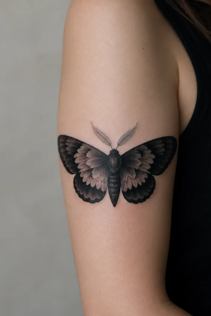
Moths are great for covering names because the wing shapes are naturally layered and can be made larger than your letters. The body can be positioned over the center of the name and the wings can extend beyond letter ends to cover leftover strokes. Smoke shading helps blend edges so the cover up looks smooth after healing. Keeping it mostly black and gray is a smart choice if your old name is dark.
Place the moth so the wing tops cover the highest points of the letters. For a beginner-friendly cover up, stick to a moth span of 3 to 5 inches depending on your placement. Let the artist use soft gradient transitions rather than hard stipple-only shading.
Pro tipAsk for the moth wings to overlap by at least a finger-width in the sketch. Overlap is what hides letter corners.
AvoidAvoid a tiny moth with lots of thin antennae. Those thin parts don't help coverage.
10. Hydrangea Cluster With Dark Background
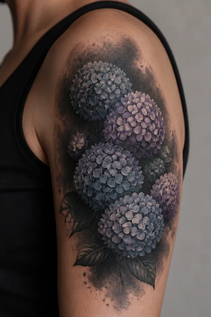
Hydrangea clusters work because the many small petal units create texture that breaks up the look of letters. The dense background wash is the anchor that hides the name, and the rounded flower heads read feminine without requiring delicate fine lines. Muted blue-gray and dusty violet look good on top of black because they don't create harsh contrast that makes old ink stand out. This is one of my favorite "soft but effective" cover ups for women.
Make sure the background wash covers the entire name plus extra around it. Use rounded cluster heads that overlap the name area instead of sitting beside it. Keep the petal dots slightly larger than you'd do on a brand-new tattoo so they hold pigment after healing.
Pro tipIf your name is small but dark, ask for a heavier background wash than you think you need. It's what keeps the lettering from ghosting.
AvoidDon't skip the background wash. Dot-only hydrangeas rarely cover names by themselves.
11. Owl With Black Chest Over Name
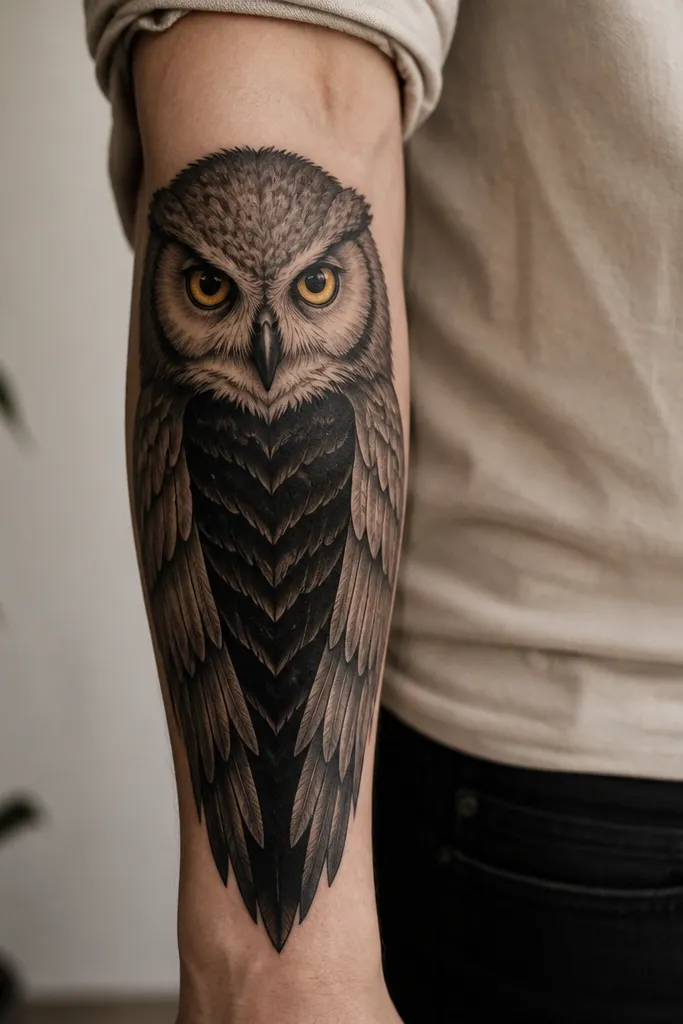
An owl is a practical cover up because the chest area can be designed as a dark block over the name. Feathers give you natural segmentation, so the tattoo doesn't look like a single blob. Muted gold-yellow eyes add warmth and femininity while the rest stays mostly black and gray for reliable coverage. If you like a slightly bold look, this one always reads clearly after healing.
Center the owl so the black chest sits exactly over the old lettering. For a name about 2 inches, aim for an owl height around 3 to 4 inches so the wings have room to cover letter tails. Keep the outline thickness medium to thick so the cover up holds up over time.
Pro tipAsk the artist to keep the darkest shading under the new chest feathers, not only at the edges. That placement hides the old strokes more reliably.
AvoidAvoid super thin feather linework. It looks pretty on fresh ink and then turns patchy when you need coverage.