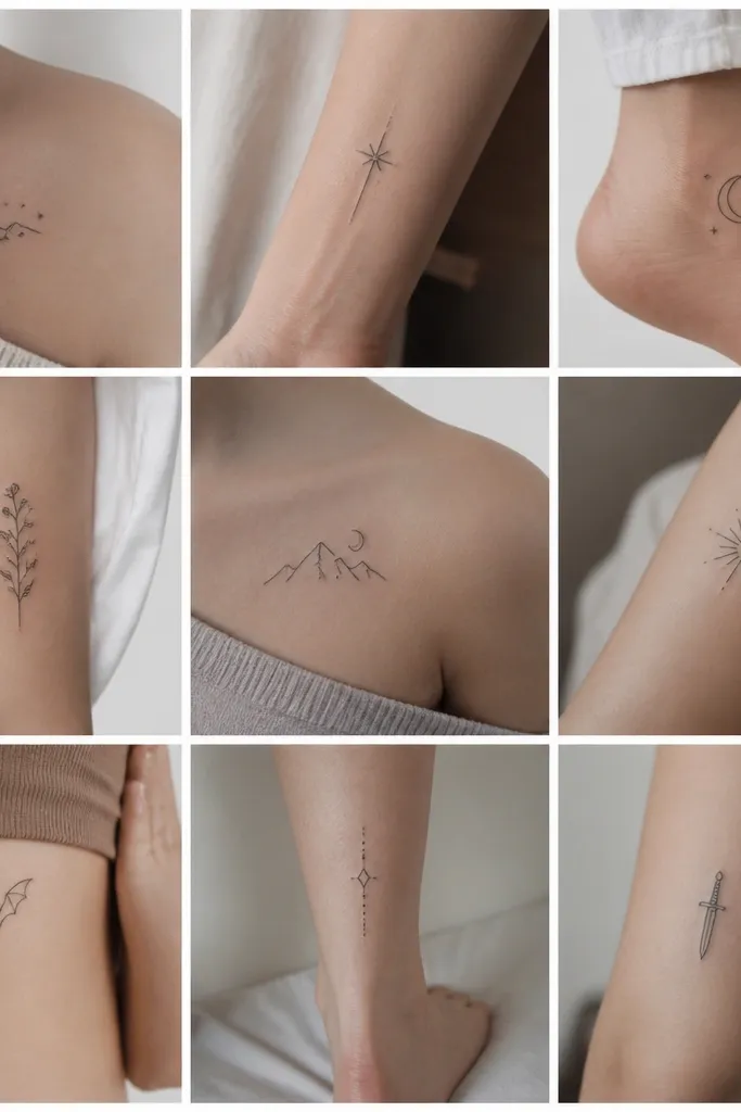
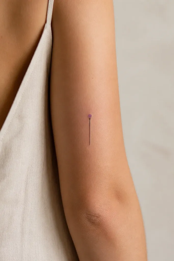
1. Starfall Dot Cluster (Feyre Vibe)
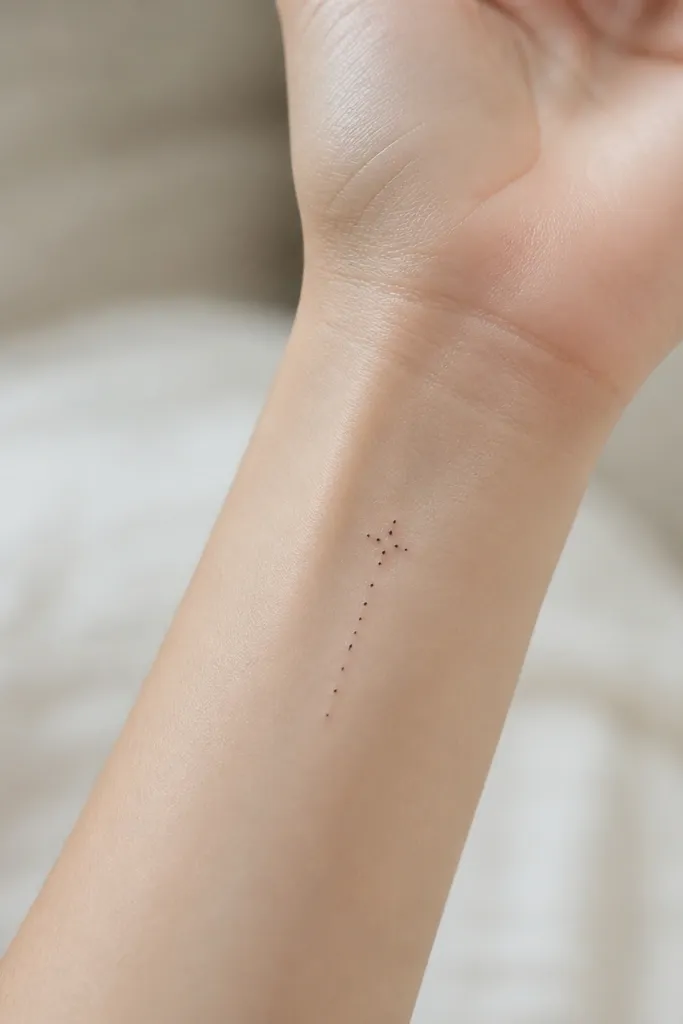
This design reads like "magic falling" without drawing any characters. Five dots keeps it graphic and budget-friendly because it avoids intricate shapes. The negative space around the dots makes it look intentional, not unfinished. I like it in pure black because it stays crisp and heals flat.
Place it on the inner wrist or behind the ear where you can keep it clean during healing. Size it around 8-12 mm across; any bigger and the dots start to drift as the skin moves. Ask for dot placement with consistent spacing, not random scribbles.
Pro tipTell your artist you want dots that are slightly uneven in size - one dot at 1.2 mm, others around 0.9 mm - so it feels organic.
AvoidAvoid packing more than five to seven dots into the same circle - it blurs into a smudge fast.
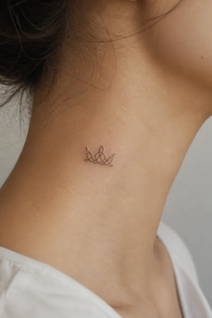
2. One-Line Court Crown
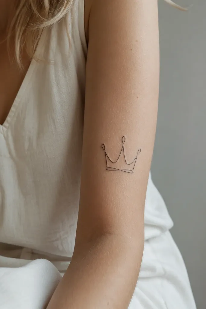
A crown outline gives you court energy without coloring, shading, or tiny gem details. One continuous line looks clean and modern, and it hides well if you ever want to cover it later. Because there's no fill, it stays light and minimalist even in black ink. The silhouette is the whole point.
Keep the crown height around 20-25 mm for forearm placement. Center it so the points don't angle into muscle lines. Use a line weight around 1.5 mm for the outline so it doesn't disappear after healing.
Pro tipAdd a single short notch at the top point - like a tiny break - to make it feel like a specific court crown rather than generic royalty.
AvoidSkip tiny circles where "gems" would be - those usually heal as gray dots.
3. Feather + Thread Loop
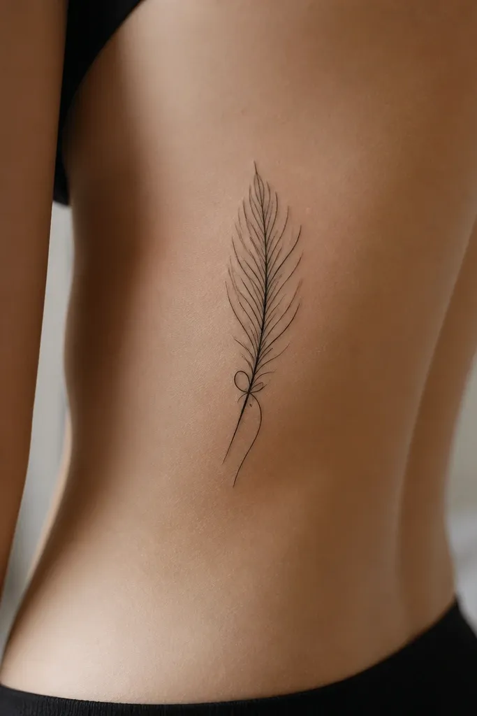
Feathers are ACOTAR-coded without needing wings or faces. The thread loop adds motion and symbolism without adding detail overload. This works because it uses repeating line curves that heal consistently. It also looks stylish because it sits naturally along rib contours.
Size the feather about 35-45 mm long. Keep the thread loop simple - one loop plus a short tail, no knot texture. Place it on the lower ribs or upper hip where the skin is less bony than the top of the rib.
Pro tipAsk for the feather barbs to be implied with 6-8 short lines, not dots - dots tend to fade together.
AvoidDon't add realistic feather shading - soft gradients blur and look patchy in black.
4. The Cauldron Ring
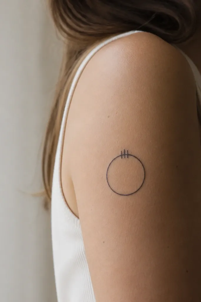
This is one of my favorite budget-friendly ACOTAR tattoos because it's instantly readable and doesn't require character art. The ring shape gives you that "ritual" feel while staying minimalist. It heals well because it's mostly straight-line geometry and a few short accents. The whole tattoo looks clean from across a room.
Make it roughly 18-22 mm wide for upper arm or bicep. Keep the ring line weight around 2 mm if you want it to last for years. Use the three marks as small spikes or short ticks - keep them under 3 mm.
Pro tipHave your artist add a tiny gap in the ring at the bottom so it looks hand-made instead of stamped.
AvoidAvoid adding flame lines around the ring - too many thin lines turn into noise.
5. Court Sigil: Three-Prong Mark
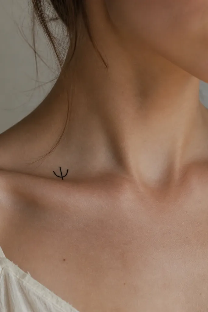
A three-prong mark looks like a court sigil without needing a full emblem. It's minimalist, graphic, and budget-friendly because it's mostly straight geometry. The collarbone placement makes it look intentional even when it's small. Black ink keeps it consistent and easy to maintain.
Size it around 12-16 mm tall so it doesn't warp with collarbone curvature. Place it slightly offset toward the sternum so it doesn't stretch across the bone. Ask for line thickness around 1.2-1.5 mm.
Pro tipRequest a slight taper on the outer prongs - it makes the symbol look more alive and less stamped.
AvoidSkip tiny decorative curls at the ends - they're the first thing to blur.
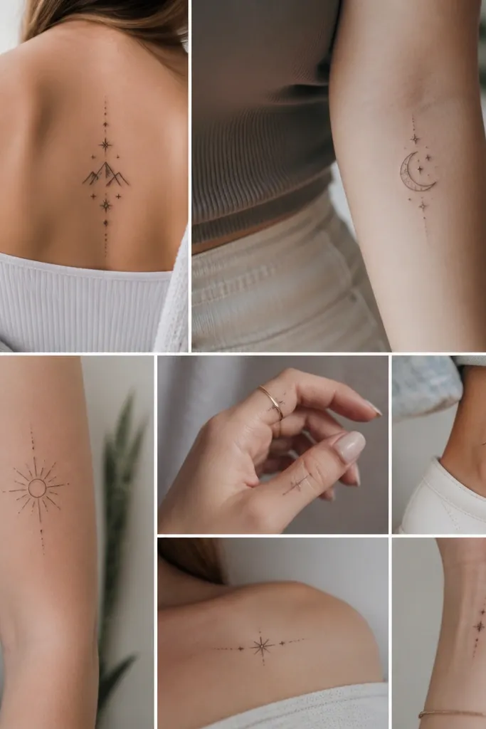
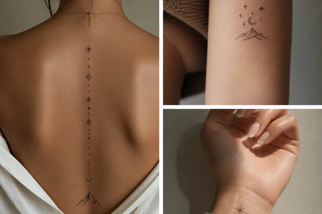
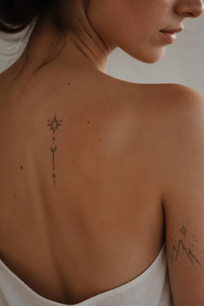
6. Three Stars in a Vertical Stack
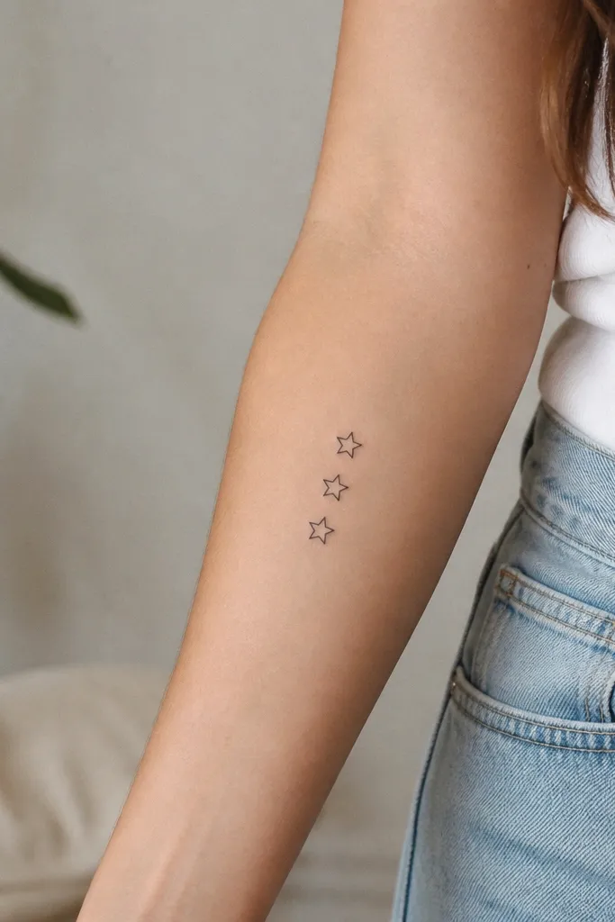
Stars are the easiest ACOTAR symbol to make minimalist and still look like a real tattoo. Three stars reads clearly and feels balanced even when small. Outlining only keeps it budget-friendly and avoids the "muddy" look that can happen with heavy fill. It also photographs well because the edges stay sharp.
Use 6-8 mm stars and stack them with about 4-5 mm space between each. Place on inner forearm or the side of the calf where the skin is smooth. Keep line weight around 1.5 mm for outlines.
Pro tipAsk for one star to be slightly rotated - just 10 degrees - so it feels less symmetrical.
AvoidAvoid filling stars solid if the artist plans to pack lots of tiny black - stick to outlines.
7. Rhysand Crescent with Micro Spark
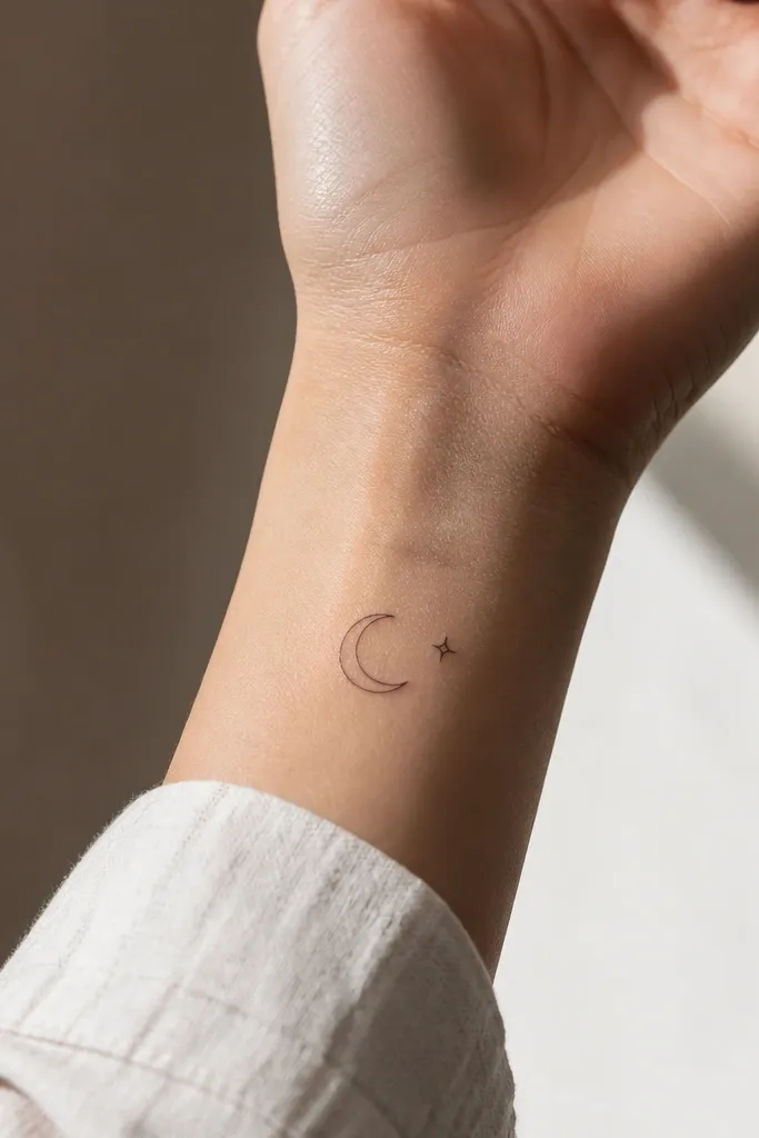
A crescent is a clean, recognizable symbol and it pairs well with the "night" aesthetic. The micro sparkle adds personality without making the tattoo busy. This works because it stays mostly negative space and uses a small number of shapes. It's also easy to size down for budget tattoo pricing.
Keep the crescent about 16-20 mm wide, and keep the sparkle under 5 mm. Place on the outer wrist for the best line visibility when your hand is relaxed. Use thin line weight around 1.2-1.5 mm.
Pro tipTell your artist you want crisp corners on the sparkle points - soft points heal fuzzier.
8. Violet Ink Accent Line
This design is for people who want color but still want it budget affordable. The black stem does the heavy lifting, and the single violet dot gives you the ACOTAR "violet" feeling. One accent color keeps cost down and reduces the chance the tattoo looks patchy later. It also looks classy instead of childish because there's only one color hit.
Size it around 25-35 mm long. Use one violet dot around 2-3 mm - not a filled flower. Keep the dot placed where it won't get rubbed daily. Ask for black line weight 1.8-2 mm so the structure lasts.
Pro tipBring a photo of violet ink you like and ask your artist to match tone - I've seen purple go gray when it's too cool.
9. Amarantha Loop Crown
Loop crowns look witchy and refined at the same time. This one nods to Amarantha without adding any literal imagery. The interlocking loops create visual interest even though the design is still minimalist. It works because each loop is thick enough to hold after healing.
Keep it small: 10-14 mm wide on the side neck. Use line weight around 2 mm for each loop stroke. Ask the artist to avoid tapering too much - thin loop ends fade first.
Pro tipIf your skin is sensitive, plan for a shorter session and good aftercare - neck tattoos get irritated fast.
10. Hybern Gate Rectangle
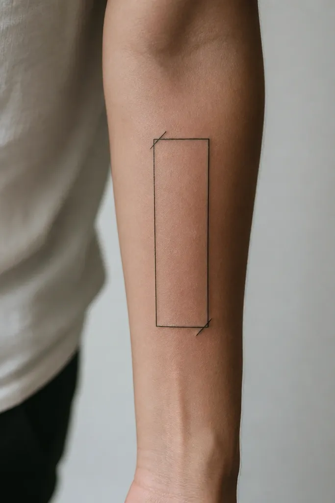
A gate shape is a clever way to hint at Hybern without drawing monsters. The rectangle reads like a portal or barrier, and the corner ticks add a "keyed" feel. This stays minimalist because it's mostly straight lines. Straight lines also hold up well if your artist uses the right line weight.
Size it around 28-35 mm wide. Place on the inner forearm or outer forearm where you can keep it from rubbing on sleeves. Use 1.8-2 mm line weight and keep the corner ticks under 5 mm.
Pro tipAsk for the rectangle to have slightly rounded corners - sharp corners can blur when skin stretches.
11. Court of Night Thread Cross
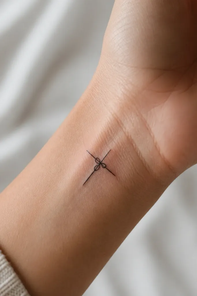
This tattoo reads like a symbol tied to night courts and magic, but it stays abstract. The curved thread line adds movement without turning it into a complicated design. Minimal crosses are easy for budgets because they need no shading. It also looks stylish because it sits naturally on wrist folds.
Keep it small: about 14-18 mm tall. Place on the top side of the wrist crease so it doesn't get stretched flat. Use line weight around 1.5 mm; avoid hairline strokes here because wrist skin changes a lot.
Pro tipIf your wrist gets dry, moisturize early after the first few days so lines don't crack during healing.
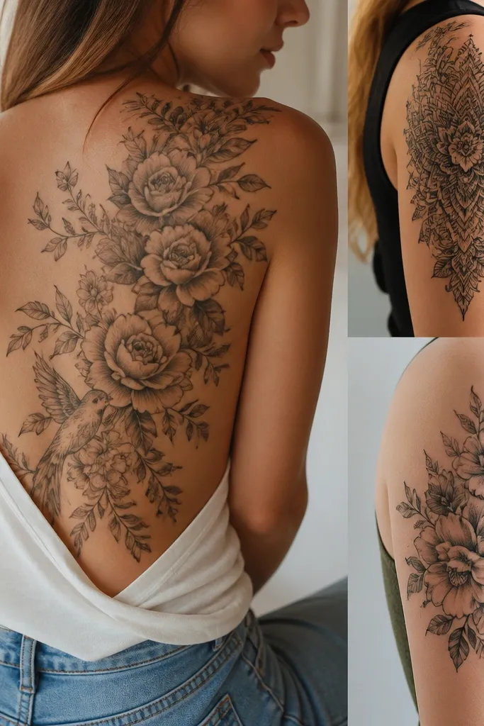
12. Feathered Heart Outline
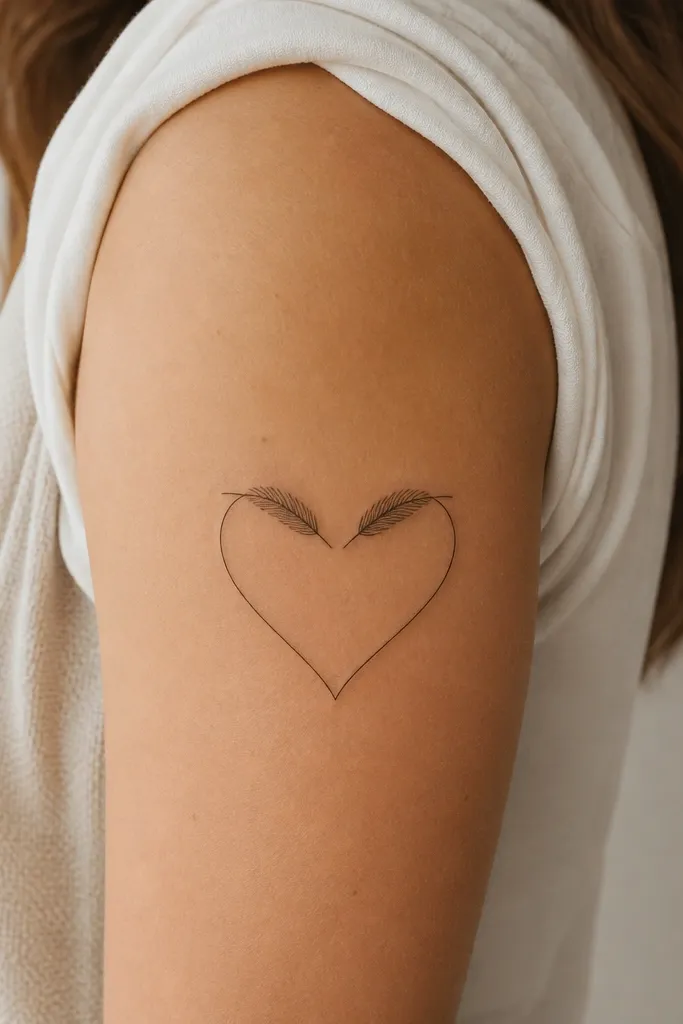
A heart outline is common, but adding feather barbs makes it ACOTAR-coded and more interesting. The outline-only style keeps it minimalist and budget-friendly. It also avoids the "solid heart" look that can feel generic. This design stays stylish because it's simple but not boring.
Size it around 35-45 mm. Place on upper arm or shoulder where it's less prone to stretching. Ask for barbs to be short and spaced, 4-6 total, not a full feather inside the heart.
Pro tipUse a line weight around 1.8 mm so the heart outline doesn't thin out during healing.