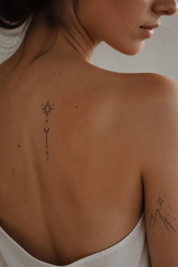
1. Star-Thread Crescent on the Forearm
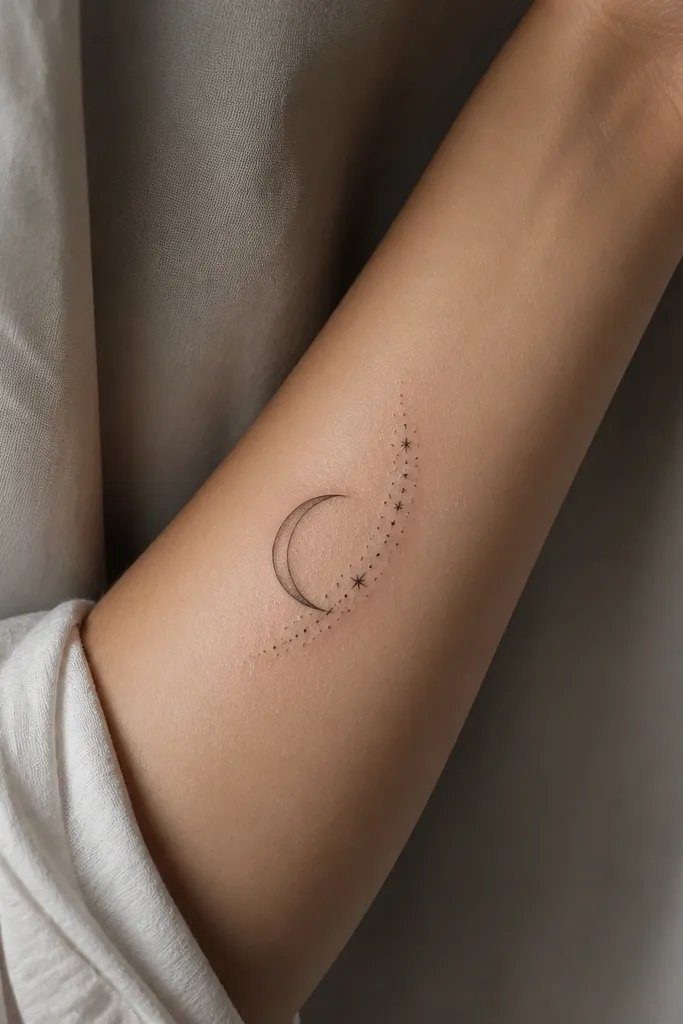
This design reads like magic thread because the crescent gives you a clean silhouette and the star dotwork adds "bookish" sparkle without tiny details everywhere. I like it because it stays legible as it heals: the outline holds, and the dots add texture instead of requiring micro-linework. The faint gray wash inside the crescent keeps it from looking flat, like it's catching moonlight.
Ask for a crescent height of about 5-7 cm and keep the dotwork arc to one edge so it doesn't sprawl. Use black outline with a soft gray wash inside, not full color. It looks best on the forearm flat side where it doesn't bend too much.
Pro tipRequest dotwork that increases in density near the tip of the crescent for a "glow" effect.
AvoidAvoid ultra-fine lines for the stars - if the dots are too tiny, they blur into gray fuzz.
2. Court of Dreams Crown Minimal Linework
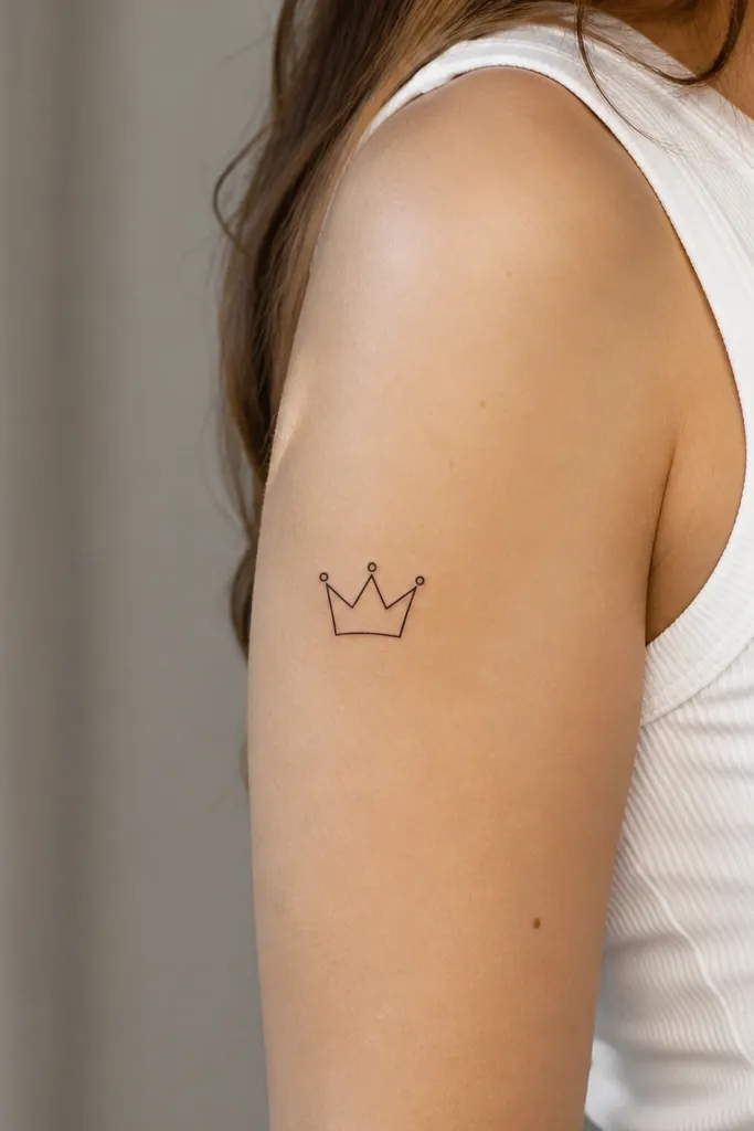
A minimal crown works because crowns are naturally graphic. You get ACOTAR symbolism without relying on delicate shading that disappears over time. The single dots at the tips give a dreamy sparkle without turning into a messy speckle field.
Place it on the upper outer arm about 10 cm above the elbow. Keep it small - around 4 cm wide - so the linework stays sharp. The artist should use a clean liner needle and stop before the lines get heavy.
Pro tipAdd one thin underline line beneath the crown so it looks like it's "resting" on the skin instead of floating.
AvoidSkip heavy black fill - a thick crown on a first tattoo can look like a blob after healing.
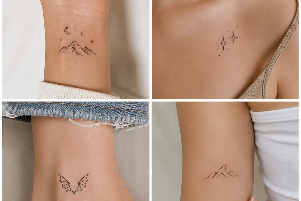
3. Rhysand-Style Bat Wings with Negative Space
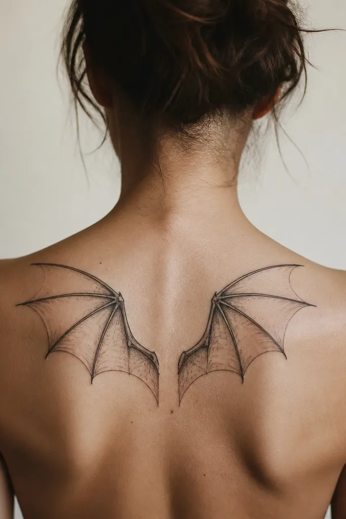
Negative space makes wings look airy instead of crowded. This is a beginner-friendly way to get that Rhysand mood because you're not drawing hundreds of feather lines. The taper and spacing create motion, and black ink alone is enough to look dramatic.
Ask for a wing span of 8-12 cm across the shoulder blade. Have the artist draw feather groups as 5-7 larger segments, not individual feathers. Keep the strongest black near the center and fade with gray wash toward the edges.
Pro tipTell your artist you want the wings to "follow your shoulder blade line," not sit flat like a sticker.
AvoidDon't put wings over a scar or bony ridge - the contrast breaks and can warp the shape.
4. Night Court Moon Sigil with Soft Gray Fade
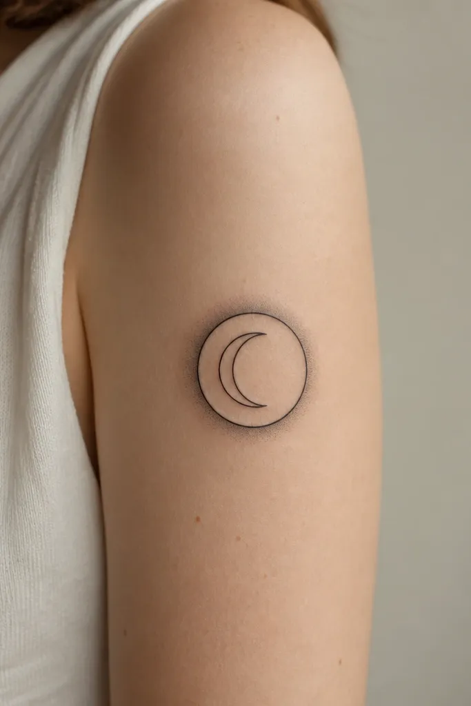
This works because the outer circle gives you a crisp border and the halo adds the dreamy "night" feeling. The crescent inside keeps it tied to ACOTAR without needing extra text. Gray fade gives depth without relying on color that can shift over time.
Size it around 5-6 cm diameter. Request a gray halo that fades out within 1-2 cm from the ring, so it doesn't turn into a smudgy ring. Placement on upper arm or outer shoulder looks best because the skin is flatter.
Pro tipAsk for stencil placement with the ring perfectly centered on the muscle - symmetry is what makes this one look expensive.
AvoidAvoid letting the halo get too large; big halos blur fast.
5. Three Drops of Starfall (Dotwork Teardrops)
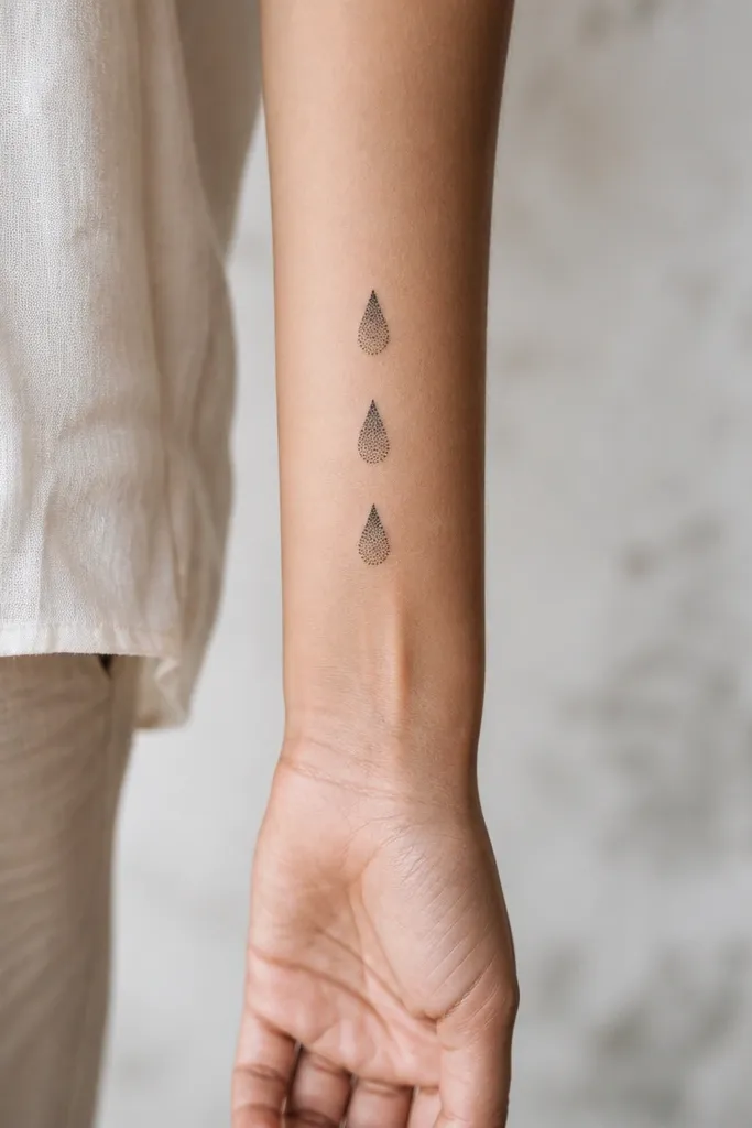
Starfall feels magical because teardrops suggest falling light. Dotwork is beginner-friendly when it's kept to small clusters - you get sparkle texture without hairline details. The fade from dark to light makes the drops look dimensional, like they're catching light mid-fall.
Keep each teardrop 1.2-1.8 cm tall and leave 4-6 mm spacing between them. Have the artist use dotwork density control: more dots at the top, fewer toward the bottom. This placement works well on the inner forearm where it lays flat.
Pro tipBring a reference that shows dot size variety; one-size dots can look flat.
AvoidDon't request a solid fill teardrop - it loses the dreamy star effect.
6. Fae Knot Bracelet Charm on the Wrist Area
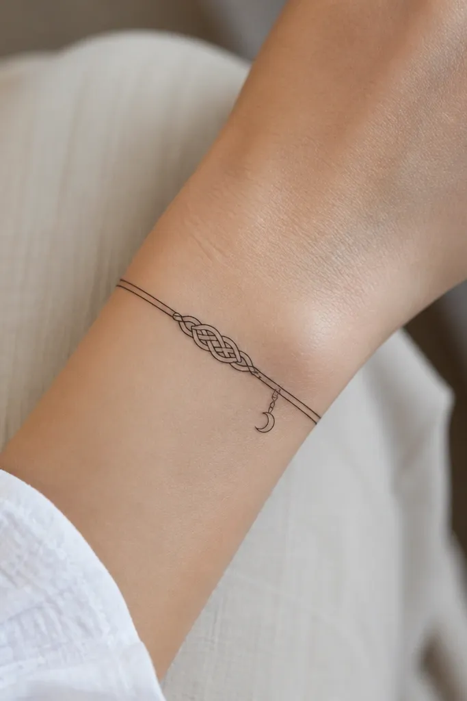
A knot charm reads like a spell binding. It's easy to keep it beginner-friendly by limiting the knot to big interwoven bands rather than fine rope texture. The tiny crescent adds ACOTAR mood while staying small enough to be readable.
Place it on the outer wrist where the skin is smoother than the inner side. Size the knot about 3-4 cm long. Ask for one thin crescent only - no extra stars around it, or it gets crowded.
Pro tipRequest clean line weights: thicker at the outer bands, thinner on the inner overlap.
AvoidAvoid placing it on the exact bend crease of your wrist - it stretches and softens fast.
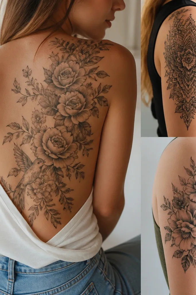
7. Court of Thorns Rosebud with One-Line Thorns
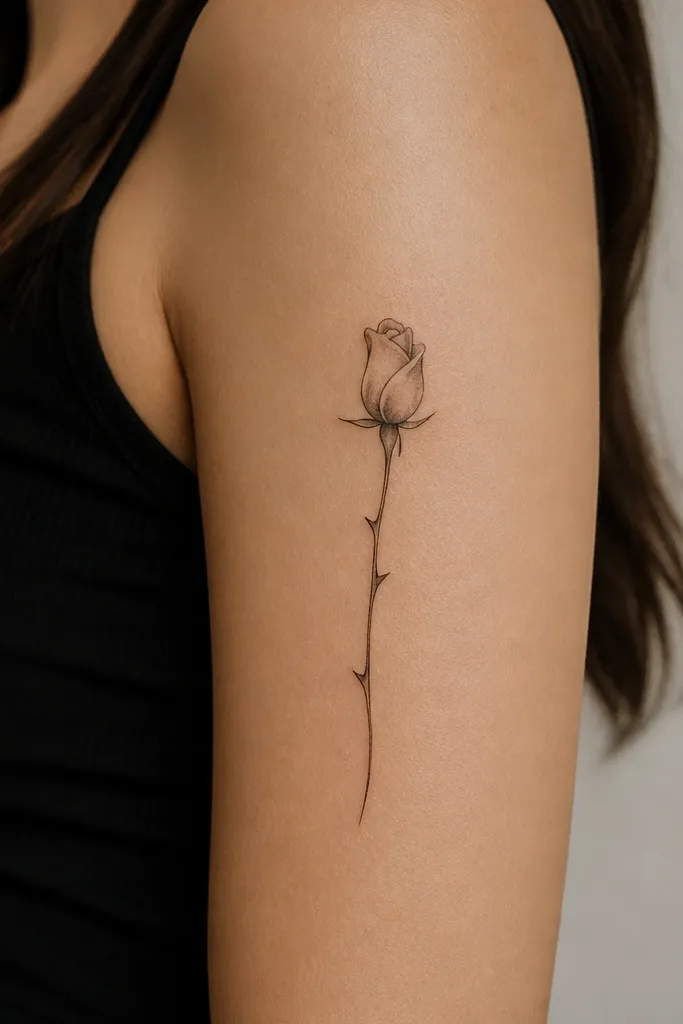
A rosebud symbolizes danger and beauty without needing a full bouquet. One-line thorns keep it from looking like a tangled mess, and gray shading at the base gives it depth without turning into a realism tattoo. It's readable after healing because the main shapes are simple.
Keep the rosebud about 4-5 cm tall. Ask for petals outlined with medium line weight and shaded only at the bottom third. Place it on the upper arm so the stem can follow the natural curve of the muscle.
Pro tipAsk for the leaves to be minimal - one leaf shape on each side looks better than five tiny ones.
AvoidSkip heavy black petal fill; it makes the rose look like a stamp.
8. Feathered Quill with Tiny Sparkles
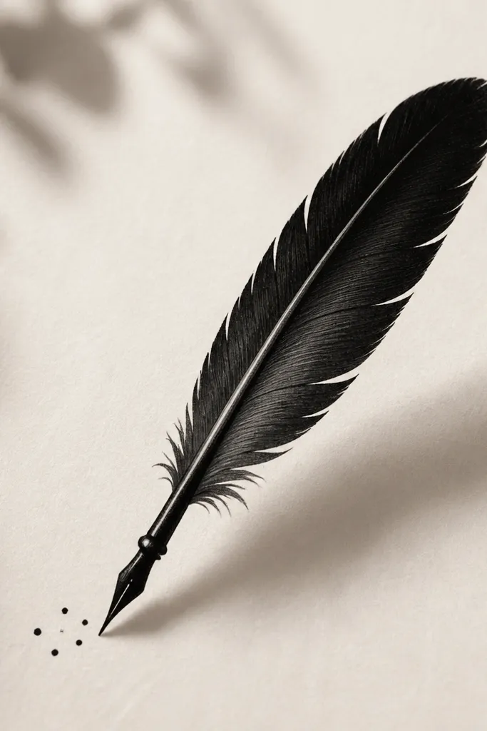
Quills scream book magic. The trick is keeping the feather simplified into a few bold segments and using only a handful of sparkles. That keeps it "dreamy" instead of "busy," and the gray on the shaft adds a soft, ink-like look.
Size it about 6-8 cm long. Place it on the outer forearm or upper arm where the angle stays flattering. Request gray wash only on the quill shaft and one side of the feather - no full shading.
Pro tipAsk your artist to draw the quill with a slight taper - it makes the whole piece look intentional.
AvoidDon't add lots of extra symbols around it; the quill needs breathing room.
9. Violet Veil Glyph Behind the Ear
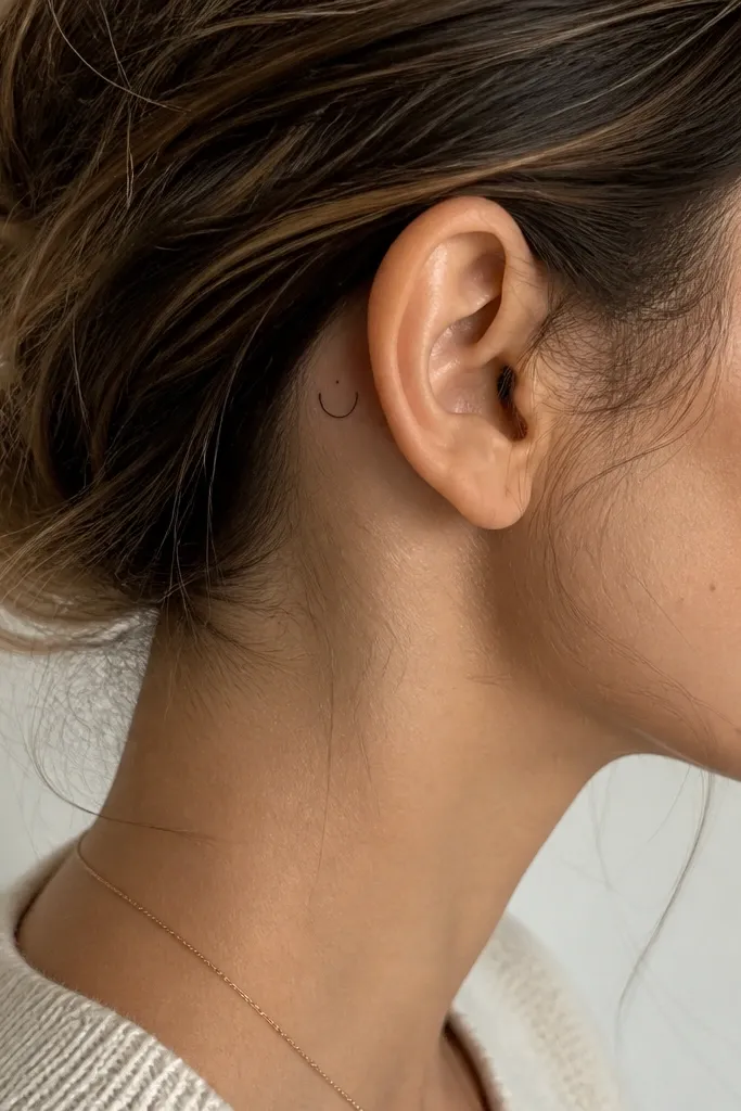
Behind-the-ear tattoos look cute and private, and a small glyph keeps it beginner-friendly. The "veil" shape gives ACOTAR energy without turning into a full portrait. A light gray halo makes the glyph feel softer and more magical than flat black.
This should be tiny - around 1.5-2.5 cm. Use black outline with a very light gray halo no more than 5 mm around it. Tell the artist you want it centered behind the ear so it doesn't drift when your head turns.
Pro tipWear your hair the way you normally do, then mark the stencil position with a mirror before the needle goes in.
AvoidAvoid big halos behind the ear; skin there heals differently and can blur.
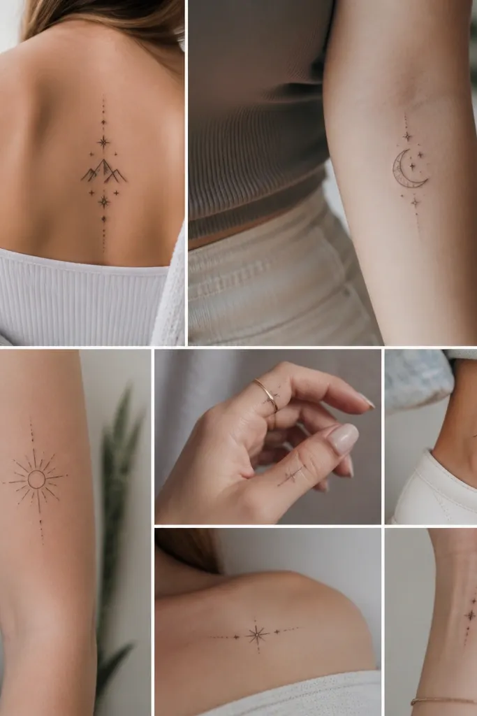
10. Starfall Orbit Line on the Side Rib
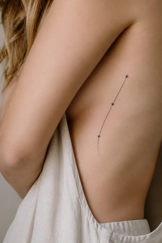
An orbit line is clean and symbolic - it looks like magic moving in circles. Keeping it a single line makes it readable even as your body shifts. The three dots act like punctuation so it feels intentional, not random.
Place it on the side rib area where you can keep the line mostly vertical. Size the arc to about 7-9 cm long. Request a thin line weight and small dot sizes that are consistent - no dramatic dot variation.
Pro tipAsk for the line to follow your rib curve, not be perfectly straight across the stencil.
AvoidDon't make the arc too wide; rib tattoos can stretch and widen during healing.
11. Fae Sigil Frame with One Center Star
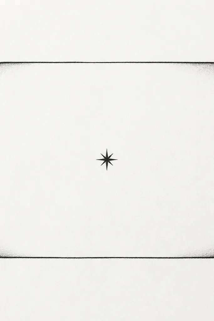
Frames look like spell seals. The center star gives the ACOTAR "magic" signal, and the rounded corners keep it from looking harsh. Gray shading along the frame edge adds a subtle dimensional border.
Keep it compact: 4-6 cm wide and 4-6 cm tall. Place it on the upper thigh outer side or upper arm where it doesn't twist much. Ask for the frame lines to be medium-weight so the corners hold after healing.
Pro tipRequest the star to be a simple 5-point star, not a detailed sparkle - simplicity heals better.
AvoidAvoid ornate corners; they disappear into soft gray.
12. Illyrian Wind Swirl with One Leaf
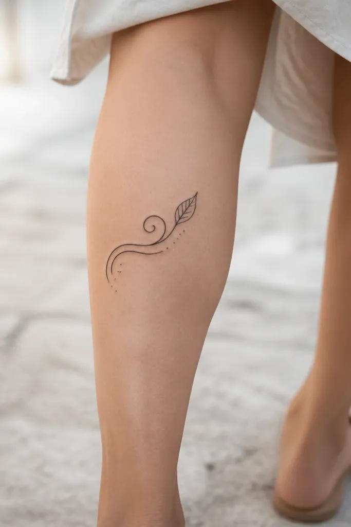
Swirls represent wind and movement, and a single leaf ties it to Illyrian nature without turning into a full botanical. Tiny dot accents make it feel magical, like pollen in air. The leaf gives you a focal point so it doesn't look like random line art.
Size it around 8-10 cm long. Place on the outer calf where your skin stretches less than the inner leg. Use black linework with gray dots only if your artist is great at dot consistency.
Pro tipAsk for the leaf outline to be slightly thicker than the swirl so it reads clearly.
AvoidSkip multiple leaves; too many shapes make it look cluttered.