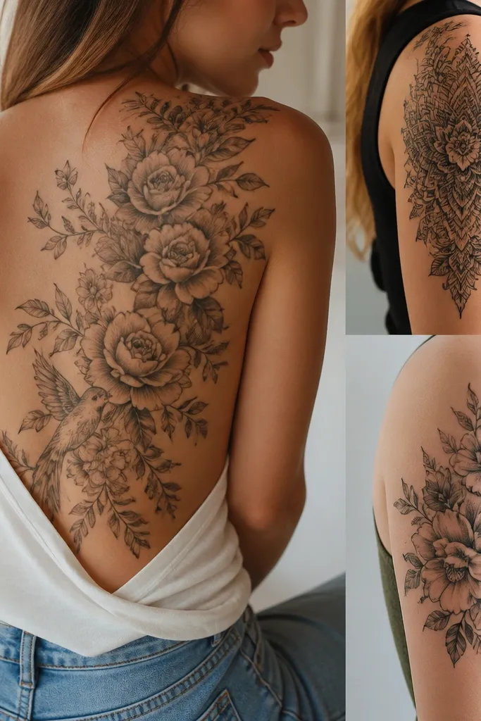
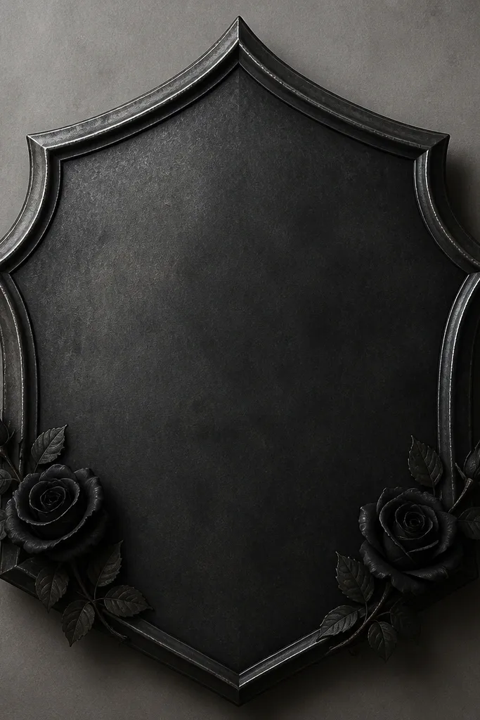
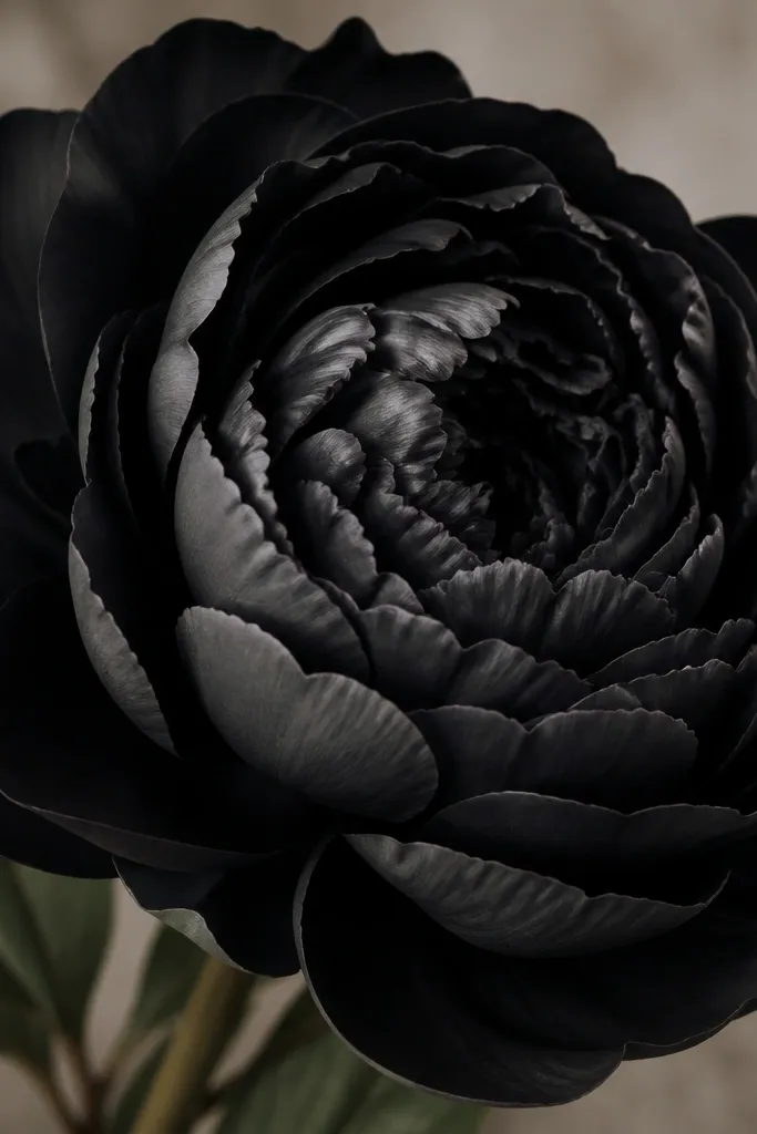
1. Black Rose With Veil Petals
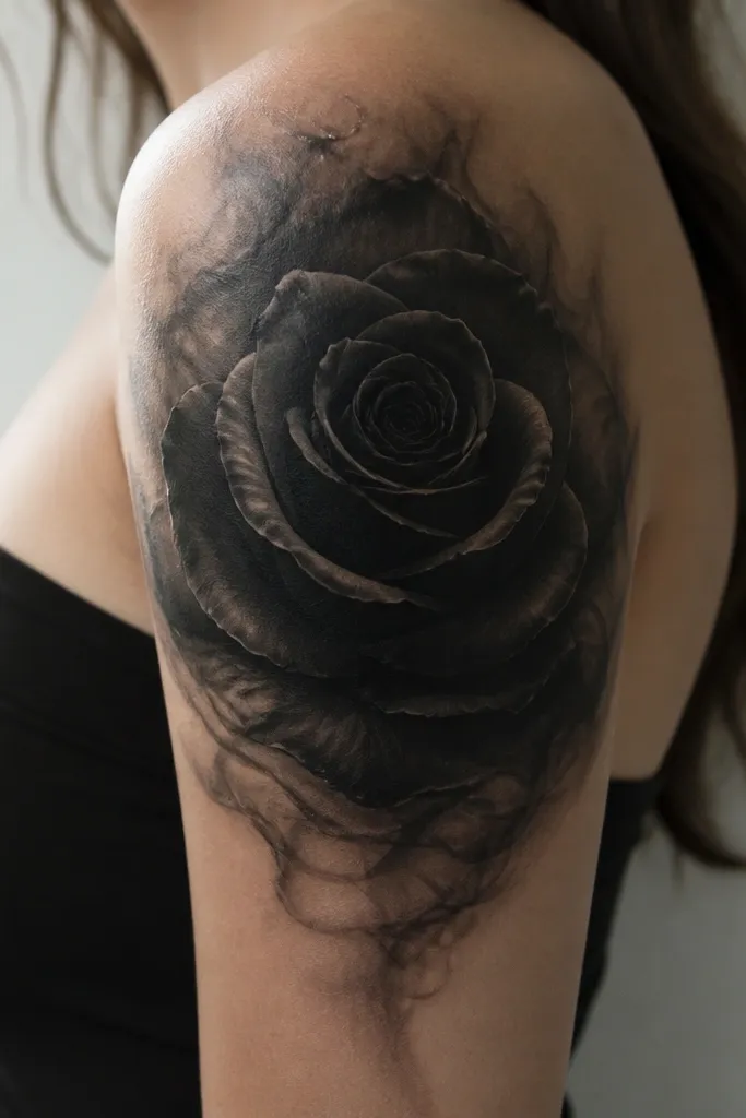
A rose is a reliable cover up subject because it gives you a natural "center mass" for blackout and a perimeter for softer shading. The smoky veil petals help hide under-ink linework by turning old edges into a blended texture. I like using near-black shading plus cool gray highlights so the final piece reads dimensional instead of flat charcoal.
Place the rose so the darkest point sits over the densest old ink - usually the middle of the original tattoo. Keep the outer petals wide enough that each petal overlaps the previous lines by at least a finger-width. Use a limited palette: black, cool gray, and tiny highlight flecks.
Pro tipAsk for a slightly off-center bloom. That lets the artist tuck in shadow where the old tattoo is darkest without making the whole thing look symmetrical.
AvoidAvoid a rose that's all thin outlines. Thin lines over old ink turn into a gray sketch you can see through.
2. Barbed Wire Heart With Solid Center
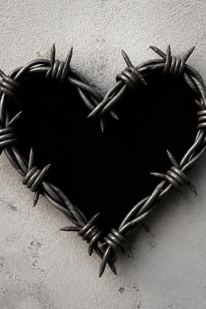
A heart gives you a clean shape, and the barbed wire adds texture that eats the old lines. The solid center is where the cover up happens - it blocks everything underneath fast. I've seen this work especially well when the old tattoo is a mix of script and thin line art because the wire texture turns those ghosts into "part of the design."
Go bigger than you think. For a budget large cover up, the heart should be at least 5 inches wide so the solid center has enough area to hide the under-ink. Keep the wire thickness consistent and let the barbs catch the light with small gray accents.
Pro tipHave the artist add 2-3 curved shading bands inside the heart. They create depth and keep the piece from looking like a flat sticker.
AvoidSkip super fine barbs. Too many tiny spikes look cheap and blur after healing.
3. Feather Fan Cover Up With Black Base
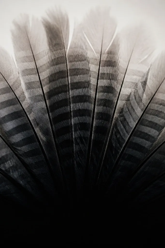
Feathers are great because they naturally create a rhythm of stripes that can hide messy old ink. The trick is starting with a black base where the under-tattoo is strongest, then building lighter feather bands on top. That contrast makes the old lines vanish, and the fan shape gives you lots of coverage without needing 50 tiny details.
Use a fan layout so the widest part covers the densest area. For budget work, aim for 7-10 feather tips, not 20. Let the feather stripes overlap by a small amount so there are no obvious gaps where old ink could show.
Pro tipPick one feather type for the whole piece (for example, smooth ribbon-like stripes). Mixing feather styles makes the cover up look busy and harder to read.
AvoidDon't leave the base too gray. If the black base isn't dense, the under-ink shows through the lighter bands.
4. Celtic Knot Frame Over Script
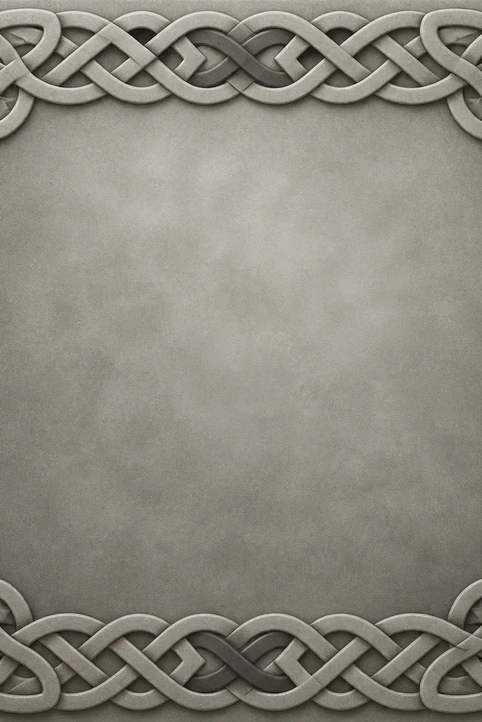
A knot frame is one of the best ways to cover script because it turns scattered letters into one controlled composition. The thick knot bands create a "wall" of ink that hides the old strokes, while the center shading lets the artist blend the remaining ghosts. I like rounded knot edges because they heal cleaner than sharp, angular lines.
Use a frame that extends beyond the old tattoo by about 1 inch on each side. That extra border matters - it gives the cover up room to swallow the worst parts. Keep line width bold and consistent, then add subtle gray depth in the center.
Pro tipAsk for a darker knot at the top and bottom. It anchors the frame and makes the center look intentional, not like a filler patch.
AvoidAvoid skinny knot lines. Thin Celtic work over old ink disappears into gray and looks unfinished.
5. Japanese Wave Panel With Dark Crest
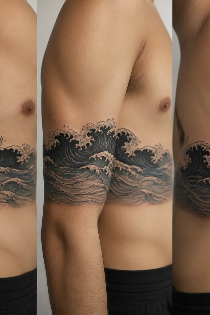
Waves cover old tattoos well because the motion lines break up the under-ink into segments. The dark crest band is the blackout layer, and the foam highlights create crisp separation. I've used this style to cover old floral linework where the original lines kept showing as a weak outline.
Choose a panel orientation that matches your skin movement - horizontal for ribs, slightly diagonal for outer thigh. Keep the crest band thick enough to cover the densest region. Use gray-blue shading if you want a softer look, but keep the crest dark and solid.
Pro tipHave your artist add foam only along the top wave edges. Foam all over makes it look like a sticker sheet and doesn't hide the under-ink well.
AvoidDon't use only fine wavy lines. Fine waves look pretty on fresh skin but they show old ink underneath.
6. Medieval Armor Plate With Roses
Armor plates are cover up workhorses because they let the artist build structure with outlines, bevel shading, and solid shadow blocks. The roses act like focal points so your eye lands on the flowers instead of scanning the cover up area. This combo is especially good when your old tattoo has mixed density - armor can handle it with different shadow depths.
Make the plate shape big and dominant - at least 6 inches wide for large coverage. Let the plate edges overlap the old ink by a solid margin. For roses, keep them smaller than the plate so they don't compete with the blackout.
Pro tipAsk for two highlight directions on the armor (one on the top edge, one on the inner bevel). It makes the metal look real and hides transitions.
AvoidSkip a "flat sticker" armor. If the bevel shading is weak, the whole thing turns into a dark block.
7. Big Om Symbol With Sunburst Shading
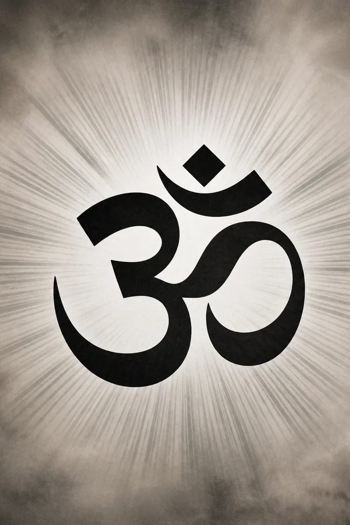
A big Om works because it gives you one iconic shape plus a background that can hide anything messy. The sunburst rays create value separation, so the old tattoo's lines get drowned in the ray pattern. I like keeping the symbol thick and dark, then using lighter gray rays to prevent the whole piece from turning uniformly gray.
Center the Om over the densest part of the old tattoo. Make the symbol lines thick - thin Om lines don't cover well. Keep the rays broad and spaced, then fade them outward with smoke shading so the boundaries look smooth.
Pro tipTell your artist you want the rays to start darker near the Om and lighten as they go out. That gradient sells the cover up and hides under-ink edges.
AvoidAvoid a tiny Om. Small symbols over old ink look like a cover up that didn't commit.
8. Dark Peony With Layered Shadows
Peonies cover well because overlapping petals let the artist bury old lines in layers. Thick outer petals create immediate blackout, and the layered shadows add depth so the tattoo reads "illustrated," not painted over. I've used peonies to cover older floral pieces where the original linework kept ghosting through.
Go for a peony that fills the whole area - don't leave big blank skin around it. Each petal layer should overlap the last enough to hide the previous tattoo strokes. Keep highlights minimal and placed where the petal edges curve.
Pro tipAsk for a darker petal edge line that's slightly thicker than the inner shading. It gives you crisp separation after healing.
AvoidDon't add lots of tiny petal dots in budget work. They look cute in a stencil and then blur into smudges.
9. Sunflower With Black Background Fade
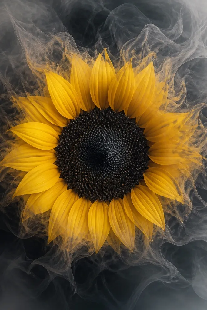
A sunflower works because the center can be used as a blackout zone, while the petals can be colored or shaded to create contrast. The black background fade hides old tattoos quickly because it wraps around the shape instead of only covering the center. I've found that a controlled fade is more believable than a patchy blackout.
If you want color, keep it limited: yellow petals plus a few warm orange accents, with black center and gray smoke. Make the center large enough that it overlaps the densest under-ink by at least half an inch. Place the flower so the darkest fade sits where the old tattoo is darkest.
Pro tipUse warm tones (sunny yellow, muted orange) and avoid super neon colors. Neon turns muddy under cover-up shading.
AvoidAvoid a bright yellow flood over a faded blackout. If the base isn't dark enough, old ink will gray everything out.
10. Small-Detail Rose Patches On Large Blackwork
This is the method I use when the old tattoo is dense and the client wants detail without wasting time. The big blackwork base hides what you need hidden fast, and the rose patches add just enough complexity to make it look intentional. It's budget-friendly because the artist isn't forced to render a full detailed illustration everywhere.
Plan 3-5 rose patches inside a larger blackwork silhouette. Keep patch sizes proportional - if one patch is tiny, it looks like a sticker over a blackout. Let the blackwork edges be clean and thick so the transitions don't look like coverage that's trying to apologize.
Pro tipAsk for one consistent highlight style across all roses (same stroke length and placement). Consistency makes the whole piece feel designed.
AvoidDon't mix tiny realism roses with giant block blackwork. That mismatch makes the cover up look slapped on.
11. Lotus Bloom With Dotwork Halo
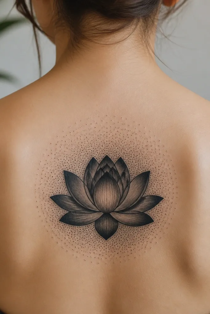
Lotus petals give you big curved coverage areas, and dotwork halos hide uneven under-ink by creating texture gradients. The dot density gives the artist control over how dark the background needs to be. I like this for clients who want something feminine but still sturdy enough to cover older tattoos.
Keep the lotus petals thick and overlapping. The halo should be a complete circle or near-circle so it reads like a frame, not random dots. Use black dotwork with gray transitions, and keep highlights on the petal edges only.
Pro tipTell your artist to map the dotwork density in bands (dark near the lotus, lighter outside). Banding makes it look designed instead of accidental speckling.
AvoidAvoid a halo that's too sparse. Thin dotwork doesn't hide old lines - it just draws attention to them.
12. Large Script Cover With Calligraphy Banner
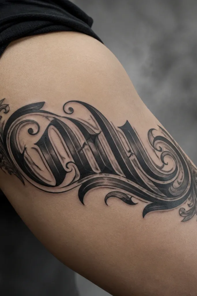
If your old tattoo is also text, you can cover it with newer calligraphy that's built thicker. A banner layout works because it creates a strong silhouette and gives the artist space to blackout the areas where the old letters show through. The gray smoke background blends edges so the new script looks like one piece, not a patch.
Use thick, connected calligraphy strokes. Keep the banner wide enough that the old tattoo sits fully behind the letters and flourishes. Ask for a smoked gray background around the banner so the edges fade naturally with skin movement.
Pro tipChoose a font style with thick downstrokes. Thin scripts look pretty on paper but they don't cover well after healing.
AvoidAvoid trying to perfectly match the old tattoo's size and shape. Coverage needs overlap, not a tight fit.