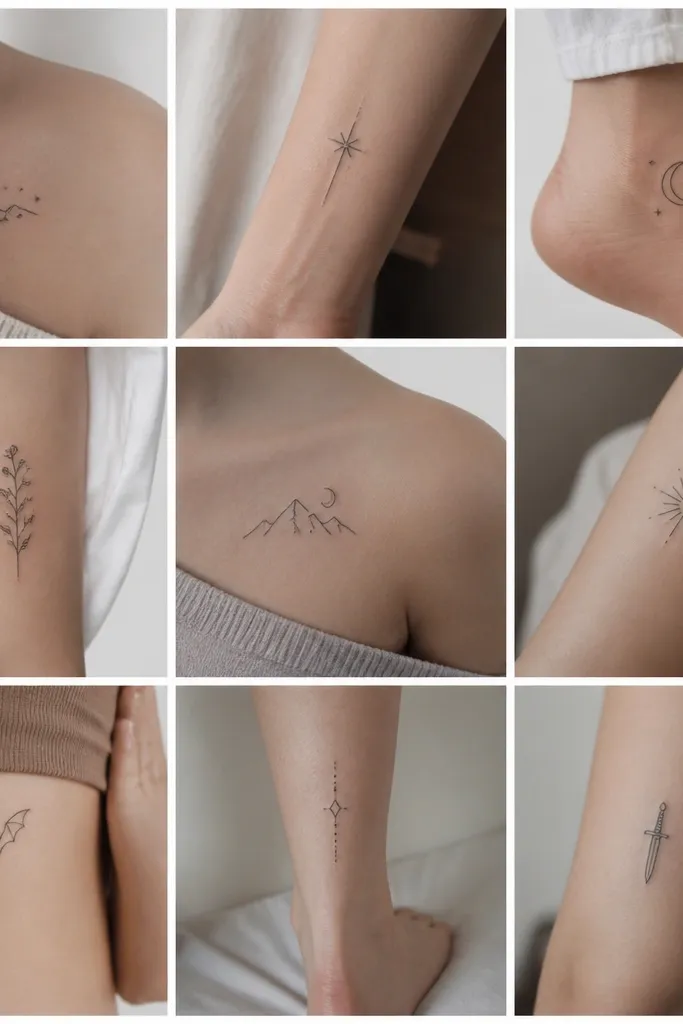
1. Feyre Thorn Halo on the Inner Wrist
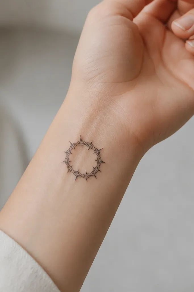
This design is a ring first, detail second. The thorn halo reads as a complete symbol from far away because the circle shape is unmistakable. The thin line work gives you courtly texture without filling the whole area, and the negative-space gaps keep it from healing into a dark donut. I like adding a light gray base shading on only one side so it catches light when you move your wrist.
Place it on the inner wrist just above the crease where the skin is flatter. Keep the overall size around 1.2 to 1.8 inches across so the thorns stay distinct. Ask your artist to use crisp black outlines and only minimal gray in the lower third of the ring.
Pro tipTurn your wrist slightly when you show the stencil. If the thorns still read as thorns at an angle, your size is right.
AvoidDon't add extra thorn clusters all around - that's how it turns into a gray scribble during healing.
2. A Court Mask Profile with Micro-Veil Shading
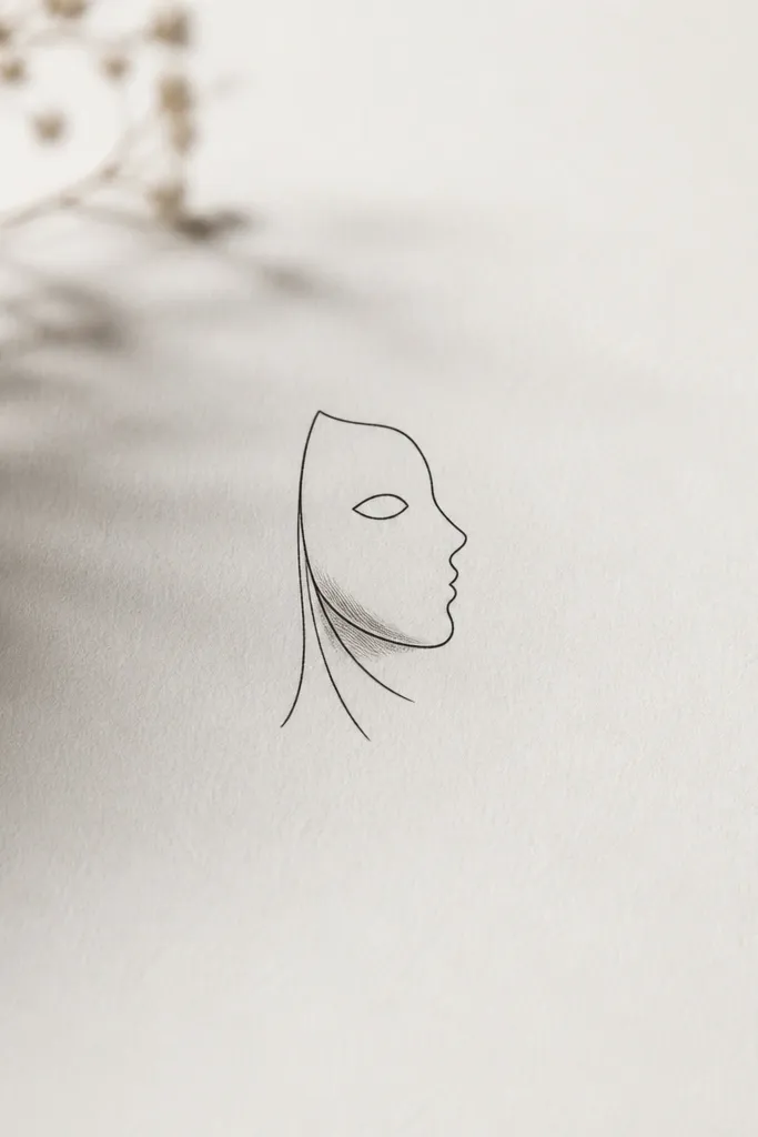
Mask profiles work small because the outline is simple and recognizable. The micro veil lines give you the ACOTAR court mood without needing a full scene. I've seen this style heal the best when the veil lines are short and separated - they look like fabric threads instead of noise. Keep shading minimal so the mask stays sharp rather than turning into a dark blob.
Use the side of the upper arm or outer forearm for the cleanest healing. Size it around 1.5 inches tall. Ask for a single thin gray shadow under the cheek and no heavy fill.
Pro tipHave your artist stencil the mask profile twice - once straight, once slightly rotated. Pick the angle where the eye opening stays crisp.
AvoidSkip thick black fill in the mask - it causes the eye opening to visually collapse.
3. The Illyrian Wings Split in Two Lines
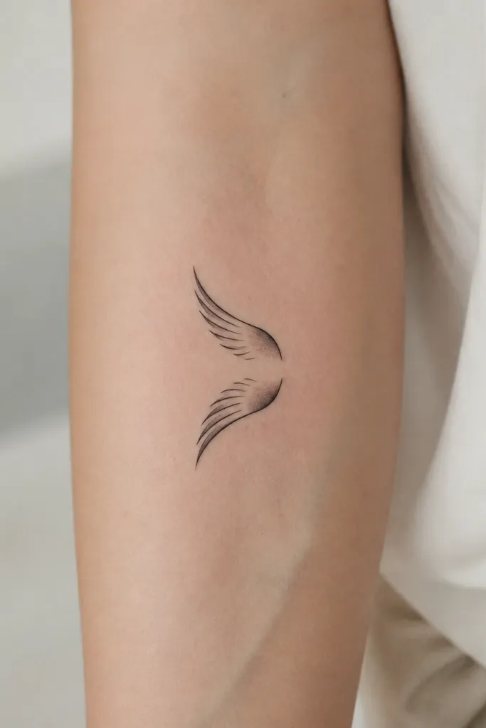
This is for people who want wing symbolism but don't want a full back-piece. Splitting the wings into two arcs keeps the reading strong in a compact space. The feather lines are drawn as separate strokes so they heal with texture rather than smearing together. A gentle gray gradient at the base makes the wings look dimensional even with no color.
Place it on the outer calf or the side of the upper arm where you can keep the wings from stretching. Target a total height of 2 inches. Ask for fewer feather strokes than you think - about 6 to 10 lines per wing arc.
Pro tipIf you wear long sleeves often, place it where the wing tips peek out - it looks intentional, not cramped.
AvoidDon't cram a full feather fan. Small wings should look like intent, not texture overload.
4. Court Sigil Keyhole Mark
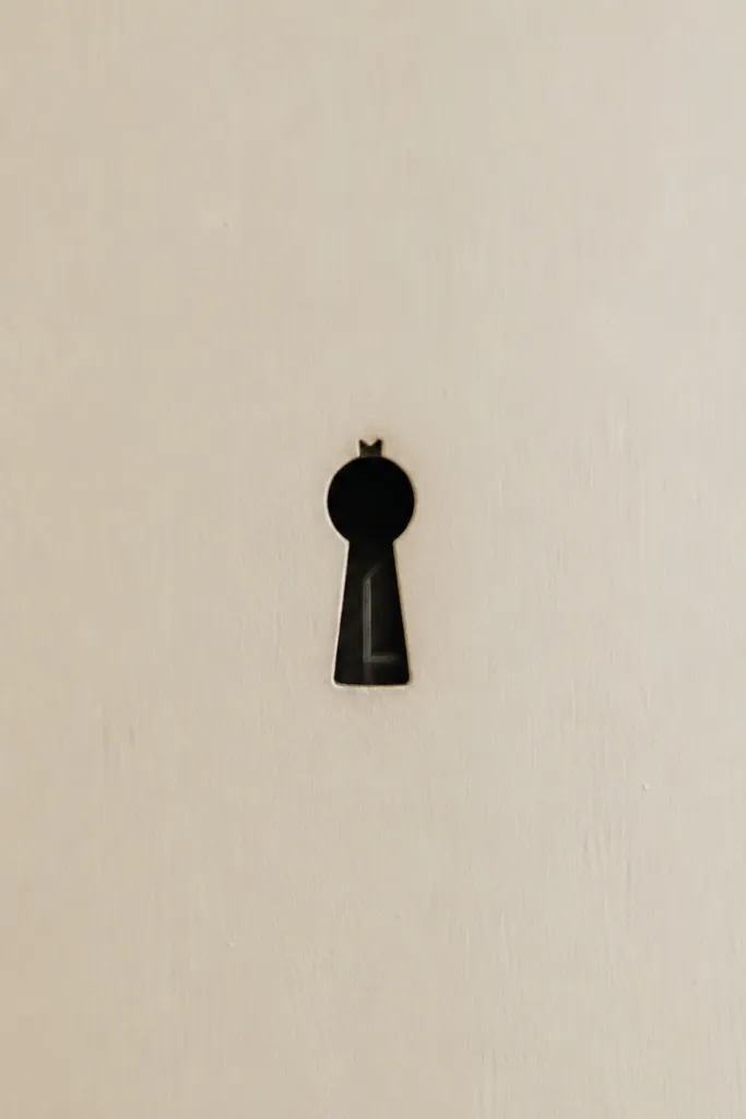
A keyhole shape gives you a natural focal point and a built-in frame. The court vibe comes from the crown-like top and the inner linework that suggests wards. This tattoo works small because the geometry is clean and healing-friendly. I like using a slightly tapered inner line so the keyhole looks lit from one side.
Best spots are behind the ear or the inner ankle area (not directly over the bone). Keep it under 1 inch wide so the crown notch stays crisp. Request black outline with a tiny gray shadow only under the keyhole rim.
Pro tipMake the inner line thinner than the outline by about 30 percent in the stencil.
AvoidAvoid heavy gray washes - keyholes need crisp edges to stay readable.
5. Feyre's Spring Court Thorns with Tiny Blossoms
Thorns plus blossoms gives you that Feyre energy without requiring a full flower bouquet. The vine reads as motion, and the blossoms act like punctuation. Tiny teardrop petals hold detail better than complex petals, and the light gray shading keeps them from looking flat. The contrast between sharp thorns and soft buds makes the design feel courtly even when it's small.
Place it on the forearm, running upward along the bone line. Size it about 2.2 to 2.8 inches tall. Ask your artist to keep blossoms under 0.25 inches each and shade only one side of each bud.
Pro tipChoose one blossom that is slightly larger. It gives the eye a clear starting point.
AvoidSkip full floral shading across the whole vine - it turns into a dark green-looking mass after healing.
6. The Three-Tier Court Starburst
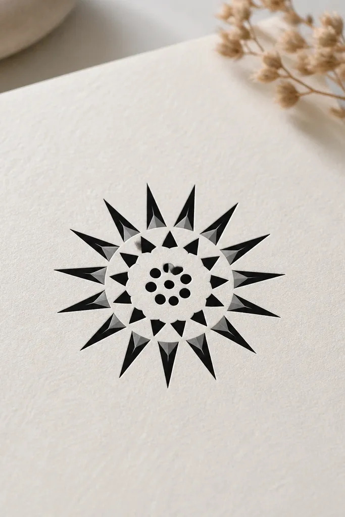
Starbursts are perfect for small spaces because the shape holds up even when lines soften slightly. The three-tier structure creates depth without needing color. Cutouts in the middle ring keep the design airy and avoid a filled black donut. I've had this exact structure heal well because the negative space does a lot of work.
Put it on the collarbone edge or the side of the neck where the skin is smooth. Size it around 1.2 inches wide. Ask for black points with a tiny gray fade on the bottom edge of the outer tier only.
Pro tipIf your artist suggests adding more points, tell them to keep the point count the same as the stencil - fewer points heal cleaner.
AvoidDon't add a thick outline around the entire starburst. It makes it look like a sticker.
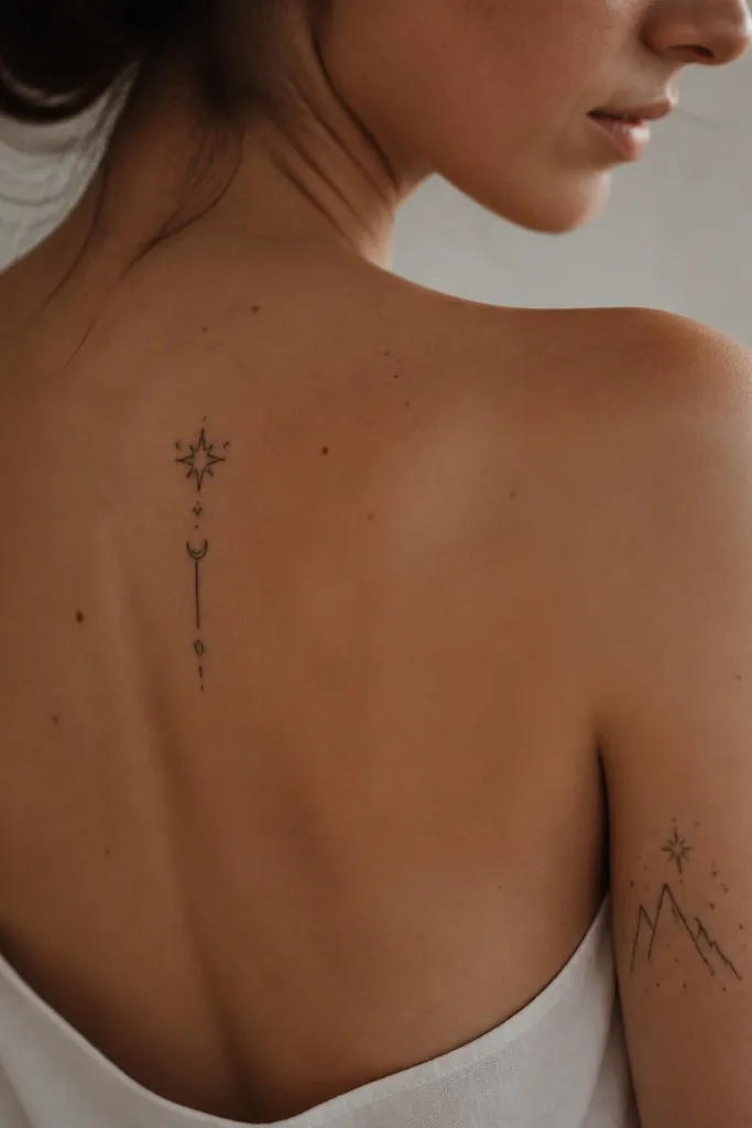
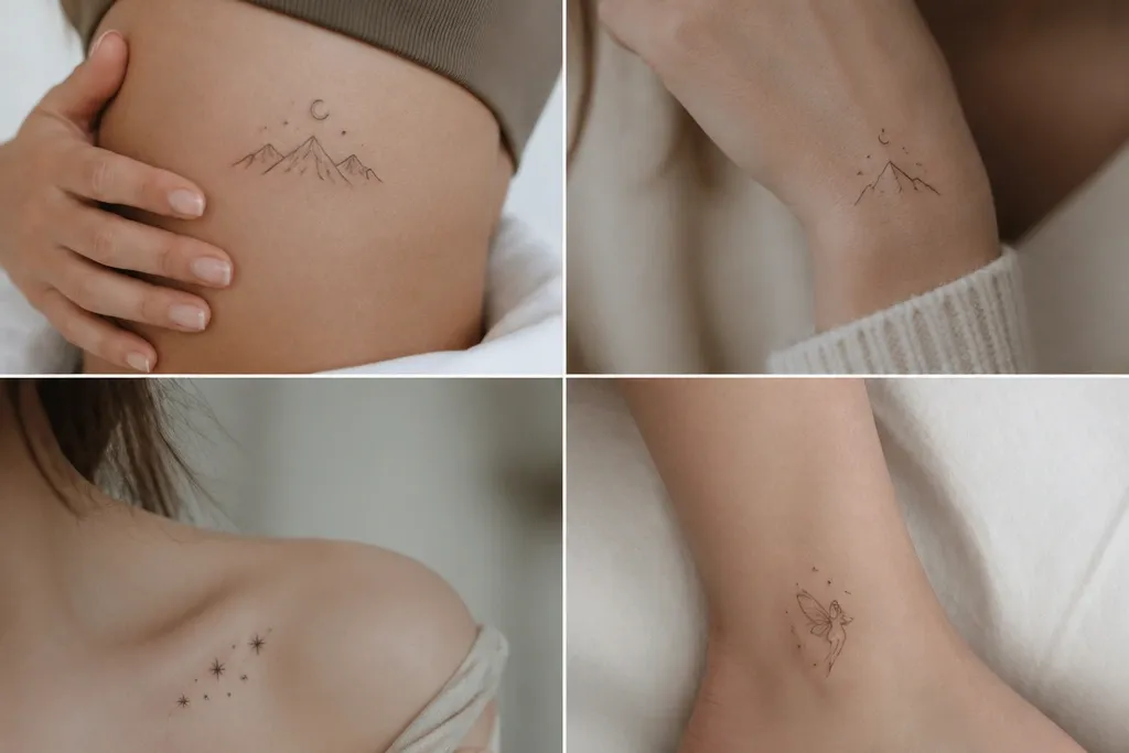
7. Rhysand Night Sky Dots with a Single Crescent
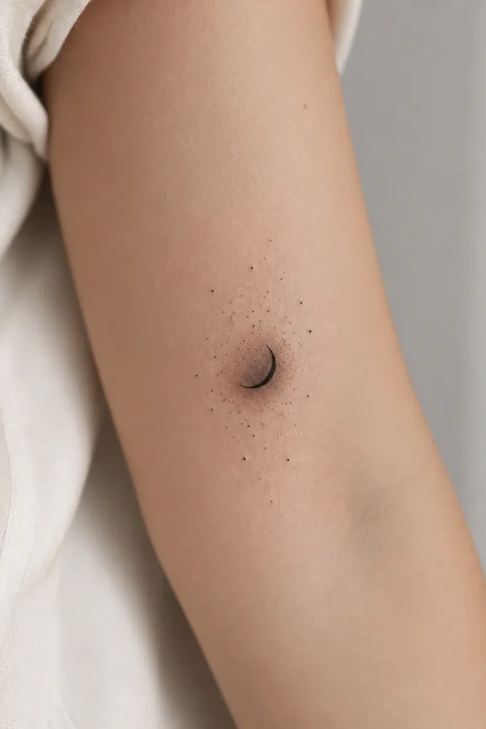
This is a compact night-sky piece that stays readable because the crescent is one clear silhouette. The dot stars add atmosphere without requiring lines that blur. I like giving the crescent a soft gray underlayer - it looks like moonlight on skin. Keep the star dots sparse enough that they don't turn into one gray speck.
Place it on the upper arm outer edge or the rib side where you can control stretching. Size it around 1.6 inches wide. Ask for one crescent only and 10 to 18 stars total, with 2 or 3 slightly bigger dots for contrast.
Pro tipRequest dot sizes that are intentionally varied. Flat uniform dots heal like noise.
AvoidAvoid dense starfields in tiny space. Too many dots smear into a single texture patch.
8. A Court Ribbon Knot with Fine Script Bars
Ribbon knots look elegant small because they have clear curves and a repeating structure. The horizontal bars give court typography vibes without locking you into a specific phrase that might look wrong later. I've used this trick for clients who want ACOTAR energy but don't want exact text. The knot lines should be clean and the bars should be thin so they read as decorative detail.
Place it on the inner forearm near the tendon line. Size it around 1.7 inches across. Ask for black linework only, with light gray shading inside the loops for depth.
Pro tipIf you want "script" feel, keep bars to 3 or 4. Too many bars turn into a barcode.
AvoidAvoid real micro-font inside a tiny tattoo. It rarely stays legible.
9. Valkyrie-Style Blade Charm on the Ankle
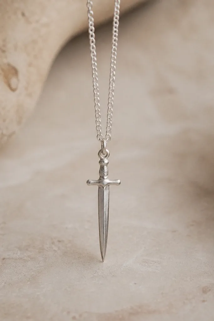
A single vertical blade shape reads clearly even when your skin moves - it's a straight silhouette. The crossguard adds the "court weapon" feel, and the hanging lines make it look like a charm. A light gray shadow along one edge gives the illusion of metal. This tattoo works compact because it doesn't rely on tiny curved details to survive healing.
Place it on the outer ankle area, just above the bony bump. Size it around 1.3 to 2 inches tall. Ask for linework with one consistent gray shadow band about 2 to 3 millimeters wide.
Pro tipWear a shoe that shows the ankle. If the tattoo is visible in that spot, it looks intentional, not hidden.
AvoidDon't place it directly over the highest point of the ankle bone. It blurs fast.
10. Court of Night Thorns Mini Crest
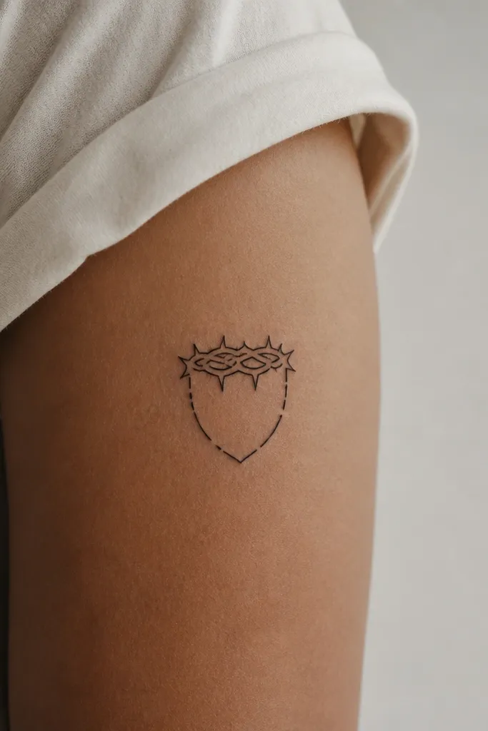
Crests fit small spaces because the outline is the main element and the interior detail can be sparse. The thorny crown signals ACOTAR without needing complex figures. I love using only outlines and thin interior spikes, because the crest stays crisp after healing. Keeping it unfilled also prevents the gray from pooling into one dark patch.
Place it on the upper arm where the skin is less bouncy when you walk. Size it around 1.8 inches tall. Ask for clean symmetry in the shield and a crown with 5 to 7 thorn tips, no more.
Pro tipHave your artist draw a mirrored version of the crest first. If symmetry is off on paper, it will be worse on skin.
AvoidAvoid heavy interior shading. A crest needs air between lines.
11. Feyre's Brushstroke Fae Mark with Dot Accents
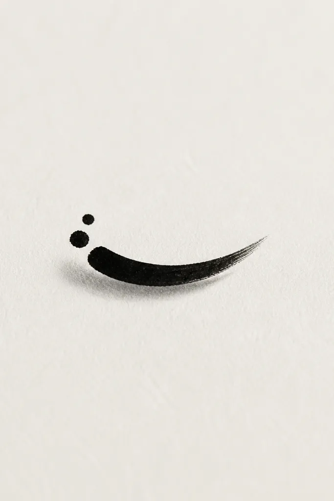
This is the "ACOTAR but make it tiny and stylish" option. The brushstroke shape is readable as a symbol, and the dot accents add a magical feel without clutter. The tapered end helps the tattoo look intentional rather than unfinished. Light gray under-shadow adds depth while keeping the main line sharp.
Place it on the side of the ribcage or lower outer arm where you can keep the line from stretching too much. Size it around 1 to 1.4 inches long. Ask for one main stroke and only two dot accents - keep it spare.
Pro tipTry it in two sizes on paper. The smaller one looks more "charm-like," the larger one reads as a symbol.
AvoidSkip thickening the stroke to make it bolder. It usually heals thicker and loses the elegant taper.
12. Wyrd-Thread Knot with Negative-Space Loops
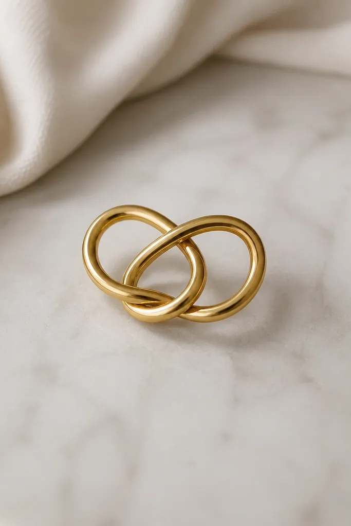
Knots look great small because they're built from simple crossings. Negative-space pockets keep the loops distinct, even as the tattoo softens over time. The gray shadow on only one side makes the knot feel dimensional. This one is very ACOTAR in vibe because it looks like fate tied into a symbol.
Place it on the inner bicep or the back of the upper arm near the tricep. Size it around 1.6 inches across. Ask your artist to keep loop thickness consistent and to avoid adding extra knots inside the main knot.
Pro tipAsk for the knot to be drawn so one loop overlaps the other by a clear amount - that overlap is what makes it read as a knot.
AvoidAvoid filling the knot with gray. A filled knot becomes a dark oval.