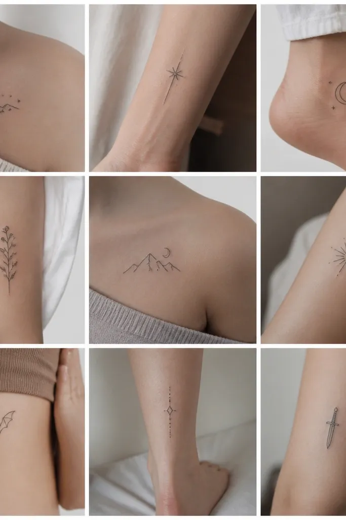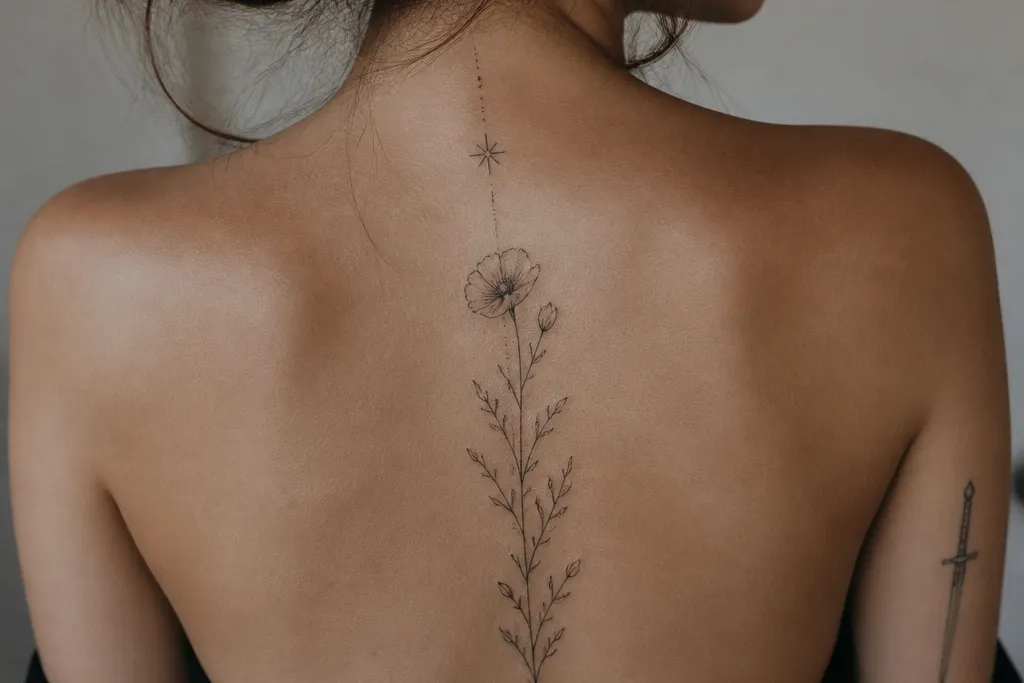
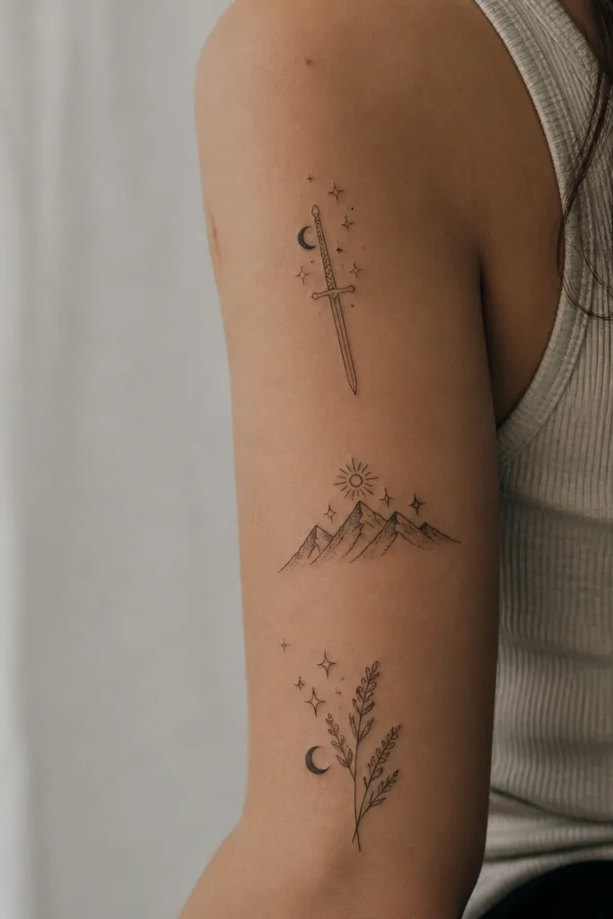
1. Single-Line Dagger With Negative Space Guard
This one reads fierce because the outline is confident and the guard uses negative space instead of solid fills. The open oval creates a "pause" in the design, which makes the dagger look controlled rather than aggressive. Fine-line black keeps it modern, and the lack of shading helps it stay crisp as it heals. It also pairs perfectly with other tiny symbols later because it doesn't fight for attention.
Size it around 3.5 to 5 cm long for best longevity on forearm or upper arm. Keep line weight consistent - think 0.25 to 0.35 mm if your artist offers that range. Place it vertically on the inner forearm or outer upper arm so it tracks with your arm's length.
Pro tipAsk for the guard to be slightly wider than the blade, about 1.2x the blade width, so the silhouette pops in photos.
AvoidDon't add micro-details on the blade - they turn into gray fuzz too fast.
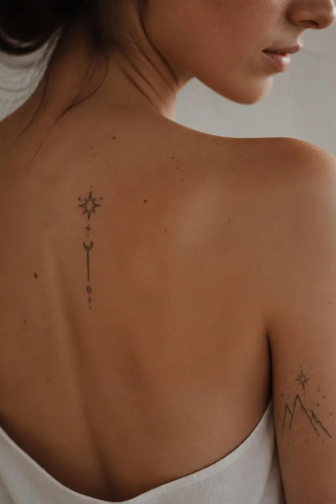
2. Nesta Crown Mark as a Thin Arc
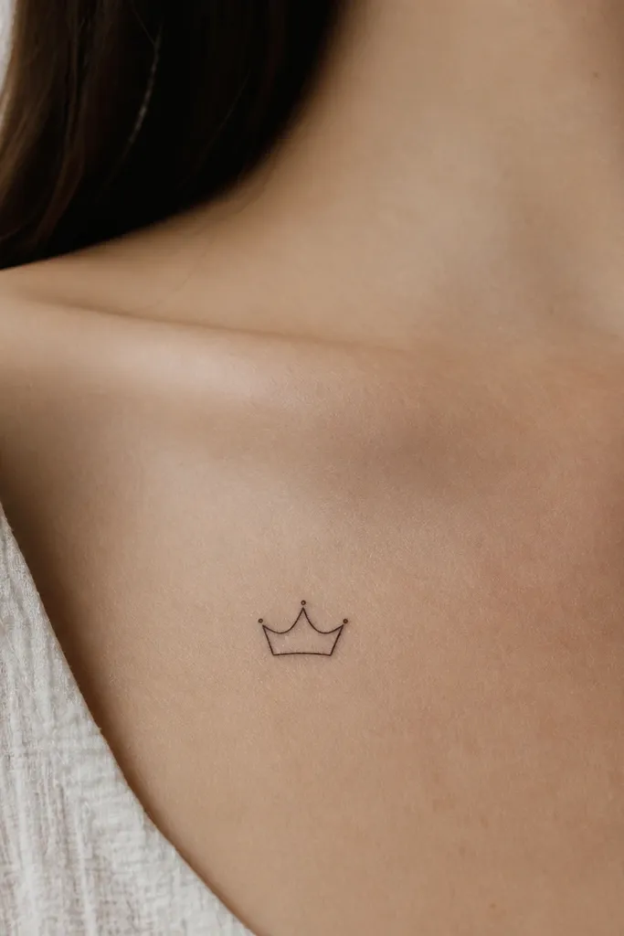
A crown shape works for Nesta because it feels like authority without turning into a jewel-heavy fantasy tattoo. The minimalist arc keeps it feminine and sleek, while the blank interior makes it look clean on the body. You're not trying to draw a full tiara - you're drawing the idea of one. That restraint is what makes it modern minimalist instead of cosplay.
Go for 2.5 to 3.5 cm wide at the widest point. Placement that flatters: collarbone side (not dead center) or the outer wrist area. Keep the points short and sharp so the crown reads even when the skin creases.
Pro tipIf you want one accent, add a single tiny wine-red dot at the top center point, no more.
AvoidAvoid thickening the lines to "make it pop" - thick lines flatten the crown's delicate shape.
3. Storm-Edge Linework Behind the Ear
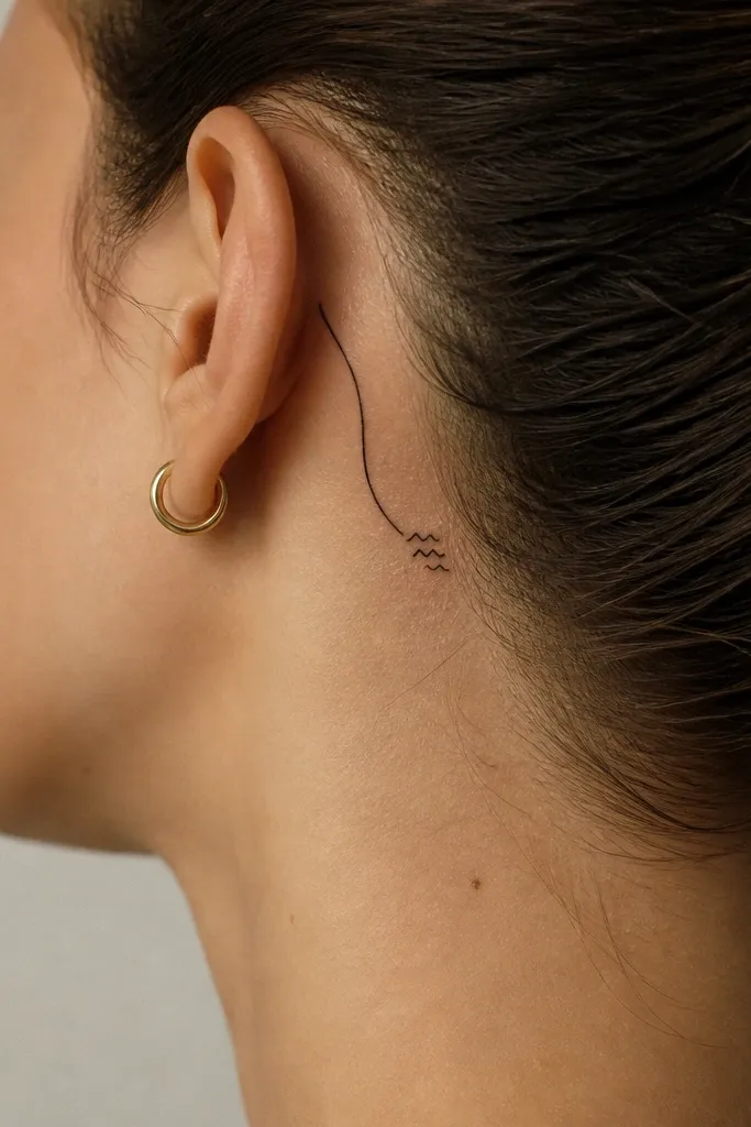
Storm marks feel Nesta because they suggest weather and control at once. This design works because it's basically a silhouette - one curve and a few spikes - so it stays readable as the years pass. Behind-the-ear placement makes it look intimate, like a secret you only show when your hair moves. The minimal shading keeps it from going smoky.
Keep it small: 2 to 3 cm total length. Trace the curve along the natural fold behind the ear so it doesn't look "stuck on." Use fine-line black only; gray can blur here because the area gets friction from hair and collars.
Pro tipTake a mirror photo with your hair tucked back before you book the appointment - match the curve to your actual anatomy.
AvoidDon't add extra cloud doodles - they crowd the shape and turn it into random scribble.
4. Twin Line Wing Edge on Outer Upper Arm
Wing edges look modern minimalist because they imply movement without drawing anatomy. The twin-line approach gives you structure - it looks intentional, not like a random flourish. The notches act like "feather hints" while staying clean. It also makes Nesta's power feel controlled rather than decorative.
Size it about 6 to 9 cm long so the curve holds its shape on the arm. Place it on the outer upper arm where the skin is flatter and you have room to let the curve breathe. Ask your artist to keep the notches spaced so the lines don't merge during healing.
Pro tipIf your artist is great with symmetry, ask for the two lines to be equidistant at the widest point - about 2-3 mm apart.
AvoidSkip feather textures. They age into a gray smudge.
5. Tiny Keyhole Pendant on Collarbone Side
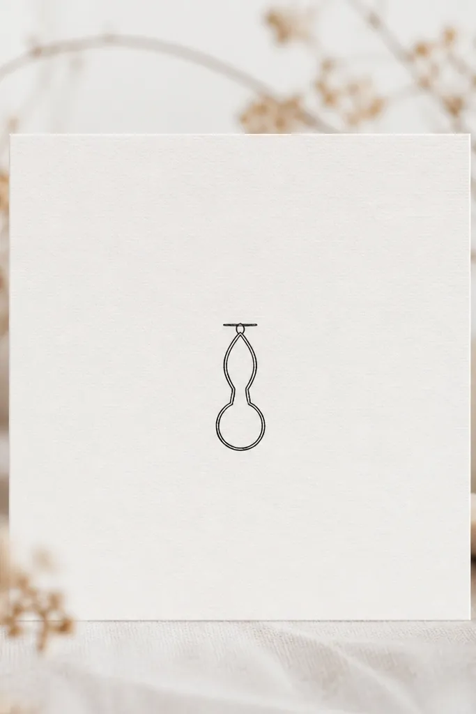
A keyhole reads like secrets and control, which is Nesta in one symbol. Minimalists love pendant shapes because they sit naturally on curved body areas. The clean teardrop opening creates a focal point without any fill. It also photographs well because it sits close to the skin and doesn't need heavy contrast.
Keep it 2.2 to 3.2 cm tall. Place it slightly off-center on the collarbone side to avoid looking like a logo. Use one straight connector line at the top - too much "chain" detail makes it look busy.
Pro tipAsk for crisp line ends with no tapering - keyholes blur when the tip thins out too much.
AvoidDon't add a key outline beside it - that turns into a generic "lock" tattoo fast.
6. Micro Dotwork Chain Around the Ankle
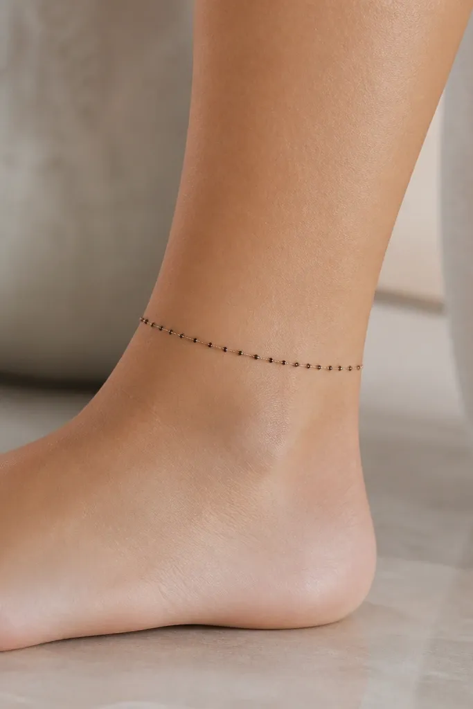
Dotwork chains look modern because they're textured but still minimal. The micro gaps keep it light, and the tiny links read clean even on small joints like the ankle. This works with Nesta energy because it feels like restraint - something bound but not weak. It's also the easiest way to add texture without shading large areas.
Wrap length: about 6-8 cm total, positioned on the outer ankle bone. Use a dot spacing that your artist can keep consistent; ask for dot sizes around 0.6-0.9 mm. Avoid full-circle wraps unless you want it to catch on shoes constantly.
Pro tipHave the artist place it so the highest point of the chain sits slightly forward - it looks better when you walk.
AvoidAvoid solid chain outlines. They thicken and look heavy on ankles.
7. Broken Crown With One Clean Line Crack
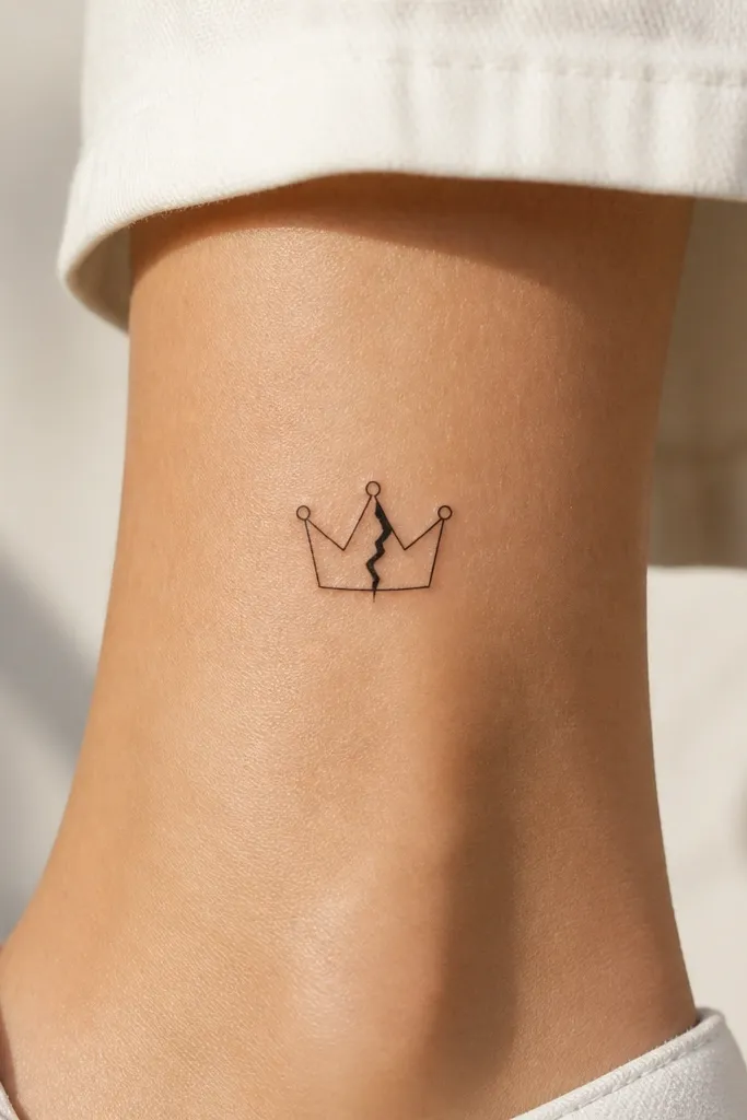
The broken crown idea fits Nesta because it reads as survival, not tragedy. The minimalist crack gives you story without drawing damage everywhere. Keeping the crack as one clean line makes it look graphic and modern, like a design mark. This also ages well because the crown outline remains distinct while the crack adds edge contrast.
Size it around 3 to 4 cm wide. Place it on the back of the upper arm or the outer forearm where it's visible when your arm bends. Keep the crack centered and straight - off-center cracks look accidental.
Pro tipChoose line weights like this: crown at 0.25-0.3 mm, crack at 0.35 mm for a deliberate hierarchy.
AvoidDon't add extra chips around the crown. It turns into a messy burst.
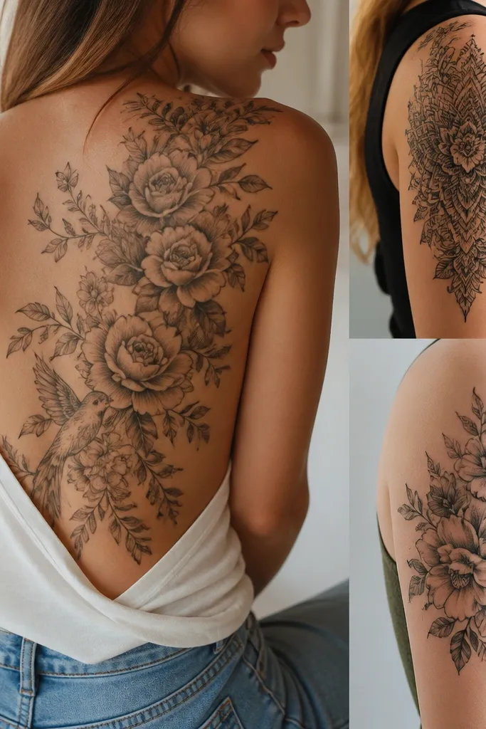
8. Featherless Wing Slice on Rib Edge
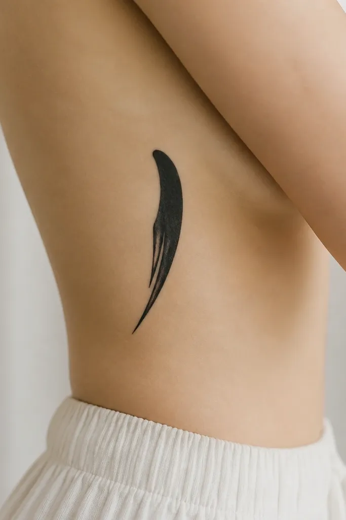
Rib placement makes minimalist wing slices feel personal and intense. The featherless shape works because it's clean and graphic, not illustrated. The taper gives you motion - like the wing is cutting through air. It looks feminine because the curve follows the rib line rather than sitting flat like a sticker.
Size it about 7-10 cm long with a narrow top and wider base. Place it on the side rib where your body naturally curves, roughly 2-3 finger widths below the armpit line. Ask for smooth line taper so it doesn't look thick at the top.
Pro tipWear a bra or strap that shows where the skin creases - mark the placement on your body before tattooing.
AvoidAvoid heavy shading on ribs. It blurs fast with movement and sweat.
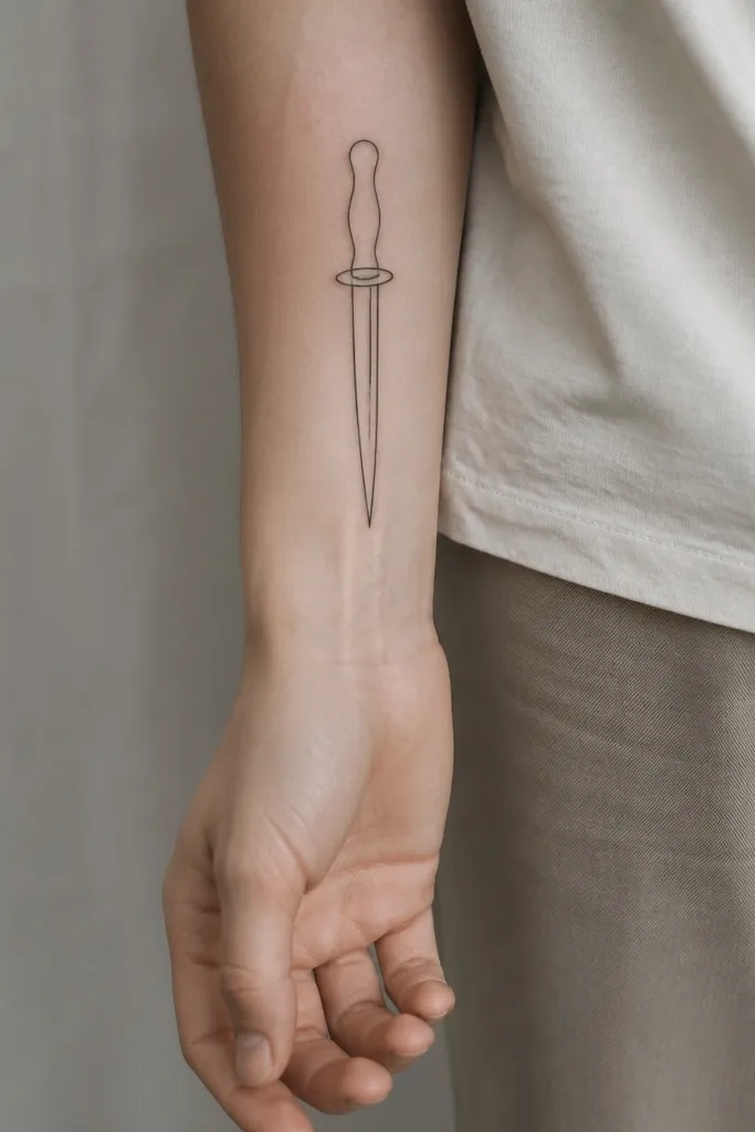
9. Blood-Wine Dot at the Dagger Tip
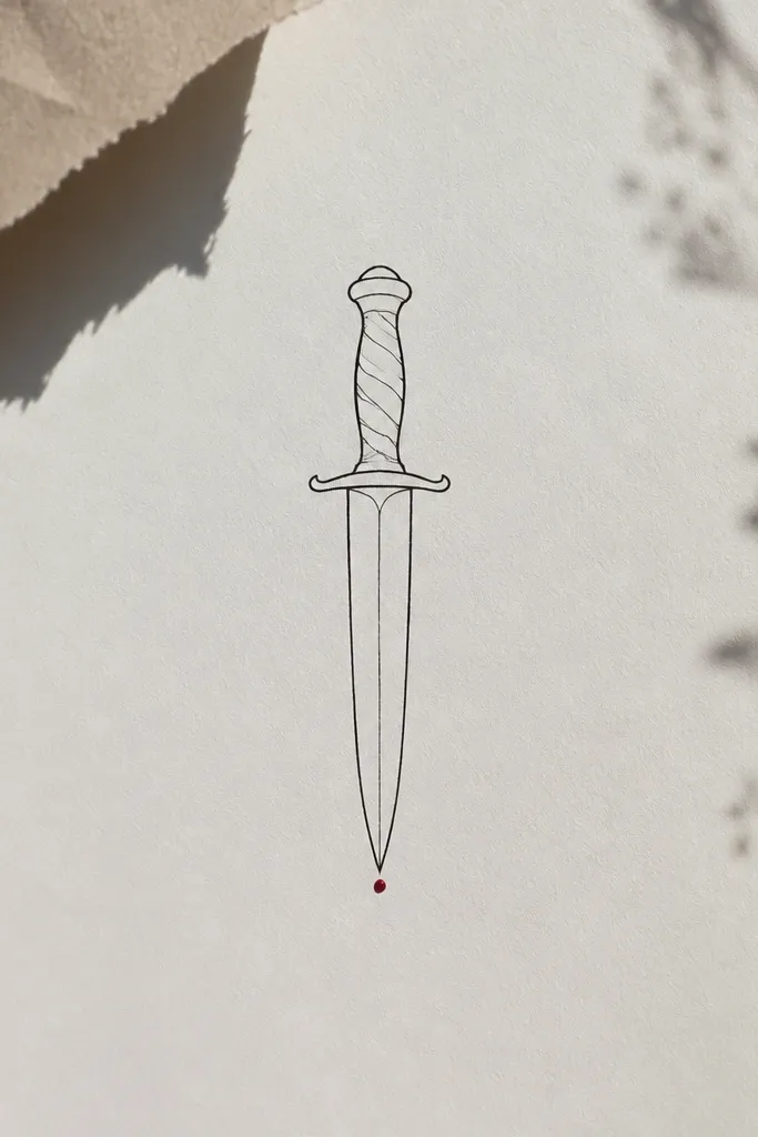
This is how you add color without turning the tattoo into a colored cartoon. One wine dot at the tip gives the design a focal sting. The black outline does the heavy lifting so the overall piece stays minimalist and readable. It also ages better than colored fills because there's almost no area to fade.
Keep total dagger length around 4-6 cm. Place it on the forearm or upper arm where you can see the dot clearly in daylight. Tell your artist you want one dot, not a smear or a tiny "splash."
Pro tipAsk for the dot to be slightly raised in contrast - crisp edges, no gradient.
AvoidDon't color the whole guard. It makes the tattoo look old-school and thick.
10. Nesta Sigil as Minimal Monogram Lines
Monogram-style sigils hit that ACOTAR vibe without copying a full character scene. It feels like Nesta because it's sharp, spare, and designed like a mark you'd stamp. The fewer strokes, the cleaner the healing - and the more "modern minimalist" it looks. I like these because they let you keep the tattoo personal without relying on a detailed image.
Plan for 2-3 cm square or slightly rectangular. Place it on inner wrist, upper arm inner, or behind the knee area where skin is smooth. Ask your artist to draw it on stencil first and adjust until it looks balanced when your hand is relaxed.
Pro tipBring a reference of the exact line thickness you want by comparing to a current tattoo you like on yourself.
AvoidSkip complex interlocking curves. They merge into one blob.
11. Storm Script Underline on Wrist
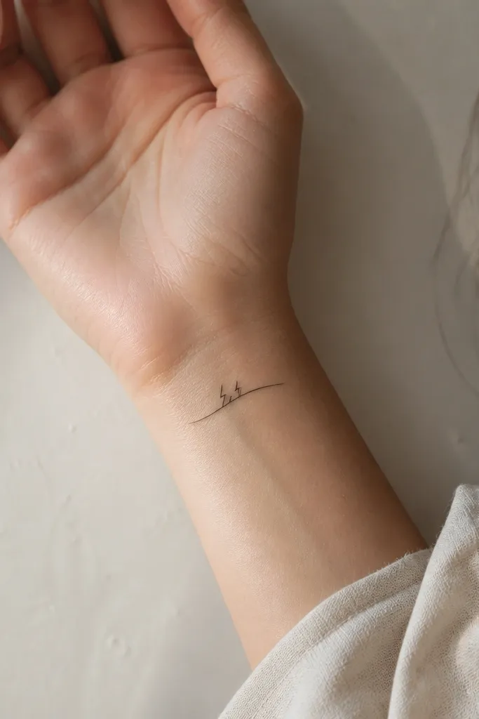
This reads like a storm signature, not text. The underline keeps it elegant while the jagged marks make it fierce. Wrist tattoos can get blurry, so this design stays safe by using mostly straight-ish lines and limited micro details. It also feels Nesta because it suggests temper and power without being loud.
Keep it 4-5 cm across, placed on the inner wrist where it gets less friction than the outer side. Use fine-line black and no gray. If your skin is prone to fading, keep the jagged marks bigger - small spikes disappear first.
Pro tipWear a watch or bracelet for a day and see how the line sits - place the tattoo where it won't be constantly rubbed.
AvoidDon't add letters or numbers. Small text blurs on the wrist.
12. Crown + Dagger Stacked in One Column
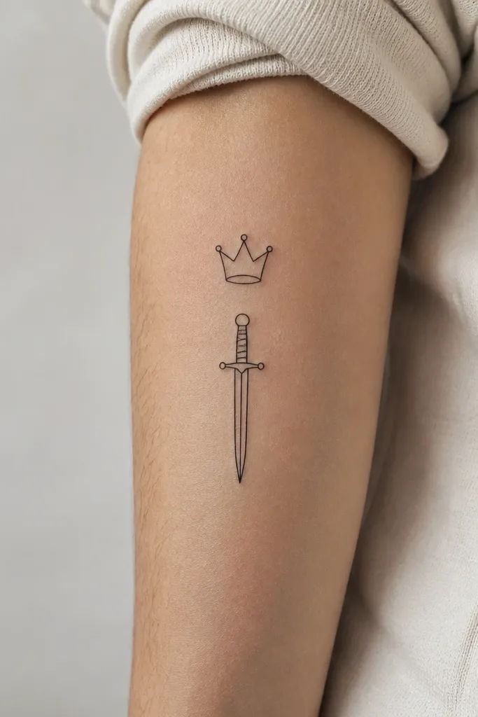
Stacking crown and dagger gives you Nesta's authority plus her edge in one clean silhouette. The one-column layout looks intentional and modern because the eye moves in a straight line. Minimalist works here because the crown is simple, and the dagger is simple - together they still read clearly. It also makes a great first ACOTAR tattoo if you don't want a big piece.
Target 5-7 cm total height on upper arm or inner forearm. Keep the crown width about half the dagger blade length so it doesn't overpower. Ask the artist to space them with a small gap of clean skin, about 3-5 mm.
Pro tipChoose a placement that matches your posture. If you slouch, a collarbone tattoo will look tilted in photos.
AvoidAvoid adding extra symbols between them. One gap is enough.