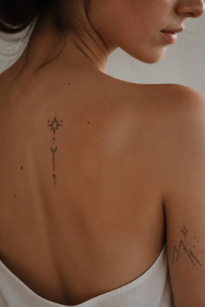
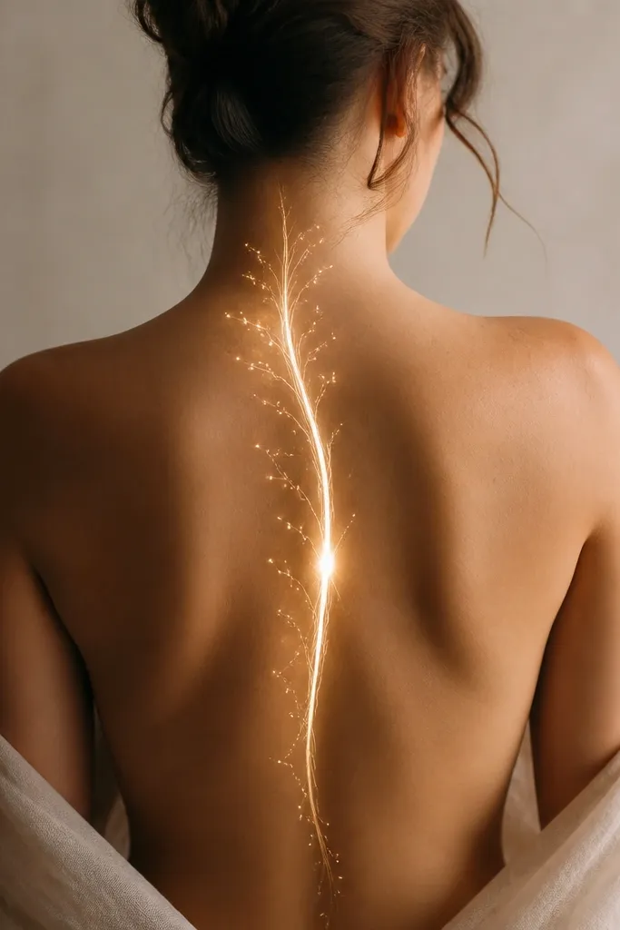
1. Starfall Trail With a Single Court Sigil
This works because the star trail creates motion while the single sigil gives your eye a clear landing spot. I like using black ink for the stars and a slightly lighter gray halo behind the sigil so it feels like it's glowing without turning into watercolor. The thin centerline keeps everything aligned with your natural spine curve.
Place the first star at bra-strap level, then space stars about 1 to 1.5 finger widths apart. Keep the sigil about the width of two fingers at most so it doesn't dominate the trail. Ask for a dot-shaded halo around the sigil using small, slow passes so the halo looks even, not mottled.
Pro tipBring a photo of your favorite bra shape and mark the center with a thin washable eyeliner line so the artist can match your actual back curve.
AvoidAvoid stacking multiple sigils of equal size - the spine turns into a cluttered column.
2. Thorns and Ribbon Wrap Around the Spine Centerline
The ribbon wrap adds flow because it's not perfectly straight - it hugs the spine's curve. Thorns give you ACOTAR texture, while the buds keep it feminine and soft. I've found that thorn tattoos look best when the thorns taper like real stems instead of being uniform spikes.
Anchor the thickest thorn cluster at mid-back, then let both directions thin out. Keep thorns separated by small negative-space gaps so the design breathes. For color, I'd add only one accent color: a muted deep plum in 5-10 tiny bud dots.
Pro tipIf you want the thorns to look dimensional, ask for slight line tapering plus a faint gray underlay on the side touching the "ribbon."
AvoidAvoid thick, same-width thorn lines - they flatten and look like clip-art.
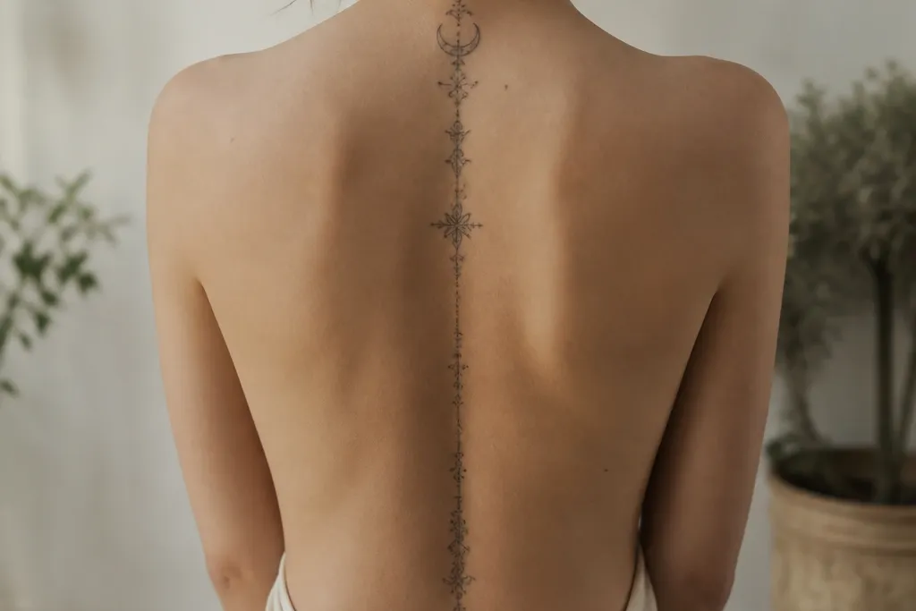
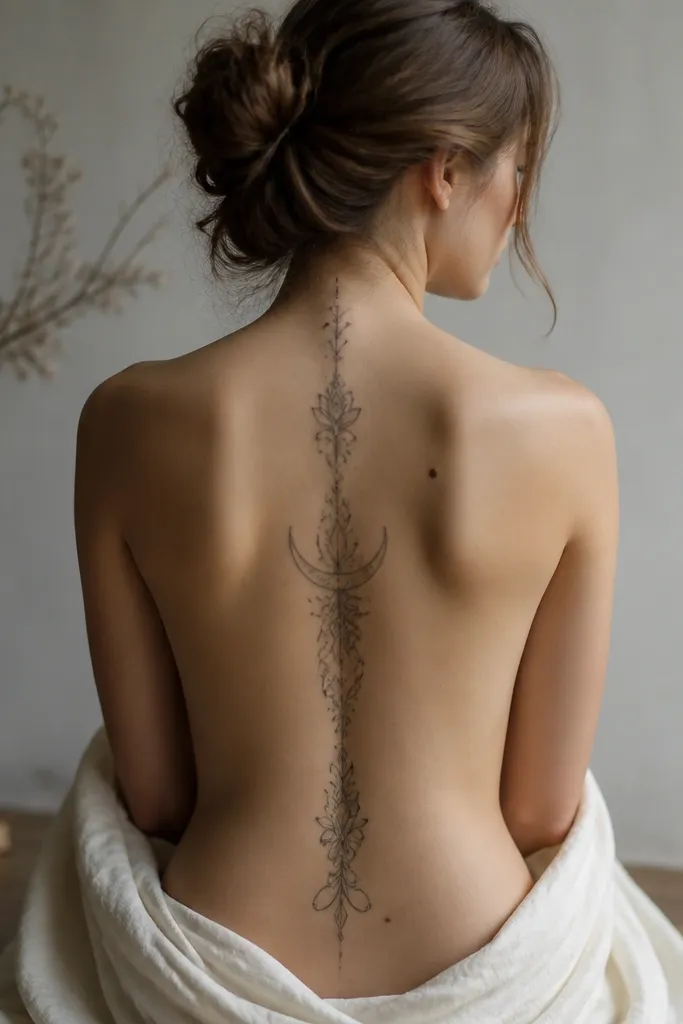
3. Crescent Moon Over a Minimal Court Border
This looks clean because the crescent gives a strong silhouette and the thin court border frames it without crowding. The fading star dots create a gentle gradient effect while staying mostly black and gray. I like this layout for women who want ACOTAR vibes but hate busy shading.
Place the moon just below the neck base, not on the neck itself. Make the border about the length of your palm and keep it narrow, like 6-8 mm wide lines. Use dot shading inside the border that decreases in density as it moves downward.
Pro tipAsk your artist to keep the border corners slightly rounded - sharp corners can look harsh on the spine.
AvoidAvoid a thick moon outline with a thin border - the contrast can look mismatched.
4. A Court Crown With a Feathered Spine Trail
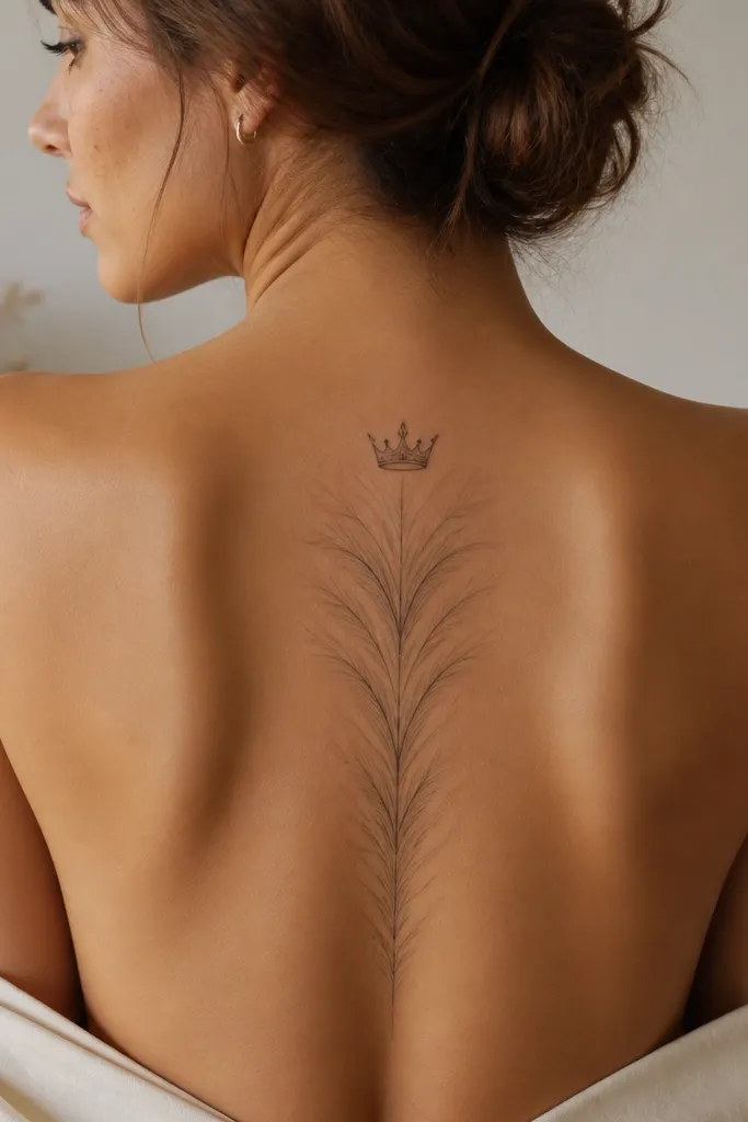
Crown + feather trail works because it turns a "top symbol" into a flowing downwards composition. The feather strokes mimic motion and keep the lower half from looking empty. I like the crown smaller than you think - the spine already gives you a big vertical canvas.
Keep the crown height around 2.5-3.5 inches, then let feather strokes taper to wisps at the lower back. Use gray shading behind only the central feather strokes so you don't get a muddy look. Stick to black and gray unless you add one tiny berry-red accent to a crown jewel.
Pro tipHave the artist do a quick stencil on your back and check it in a mirror from two angles before they start tattooing.
AvoidAvoid full-color jewels all over the crown - color over a spine line can look patchy.
5. Lucien-Style Wolf Lines Down the Spine
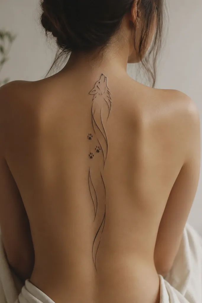
This is for people who want ACOTAR energy without a literal character scene. Thin, curved linework reads as movement, and the paw-print dots give you a story beat. I've noticed that abstract animal linework looks best when the lines have consistent thickness and clean negative space.
Start the "head" illusion around mid-upper spine, then guide the lines downward so the shape narrows near the waist. Place paw-print dots about one every 2-3 inches, aligned slightly off-center to keep it alive. Keep shading minimal - a few light gray hatches under the main line can add depth.
Pro tipIf your artist offers to thicken lines for "visibility," ask them to test on a small patch first so it doesn't ruin the delicacy.
AvoidAvoid wrapping the wolf lines around both sides equally - it can look like a symmetrical sticker.
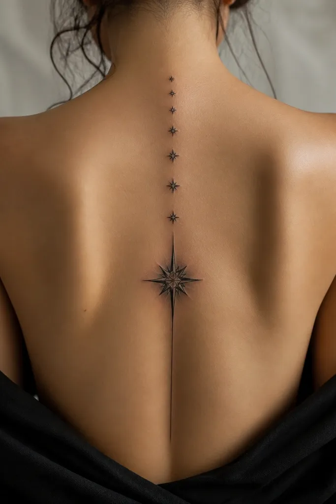
6. Night Court Stars With a Thin Veil Border
The veil border creates a frame that follows your spine curve, so the stars feel like they're falling inside a boundary. I like this for women who want a dreamy vibe but hate heavy shading. The fade keeps it from looking like a single dense patch.
Draw the veil border as two thin lines that gently diverge then converge, creating a soft hourglass feel. Keep the star cluster at the upper third, then reduce star size and density every 2 inches. Use gray dot shading under the veil line if you want subtle depth.
Pro tipAsk for a stencil that includes the border line weight - if the border is too dark, it fights the stars.
AvoidAvoid putting the densest stars at the very top - it makes the upper back look crowded.
7. Aelin-Style Thread of Light Through the Center
A light thread reads like motion because it has one job: guide your eye. The slight thickening at mid-back creates a natural focal point. I've found that this style looks best with mostly black linework plus a very controlled amount of pale gray behind the "thread."
Keep the thread width around 2-3 mm at the narrowest, then widen to about 4 mm at the focal point. Add 6-10 sparkles total, spaced evenly, with no big clusters. If you want an accent, use a single muted lavender dot behind 2-3 sparkles.
Pro tipYou can test the glow effect by having the artist do a few lines in gray only, then decide whether to deepen them after you see it on skin.
AvoidAvoid heavy black fill behind the thread - it turns into a stripe instead of a glow.
8. Barbed Wire Hearts on the Lower Spine
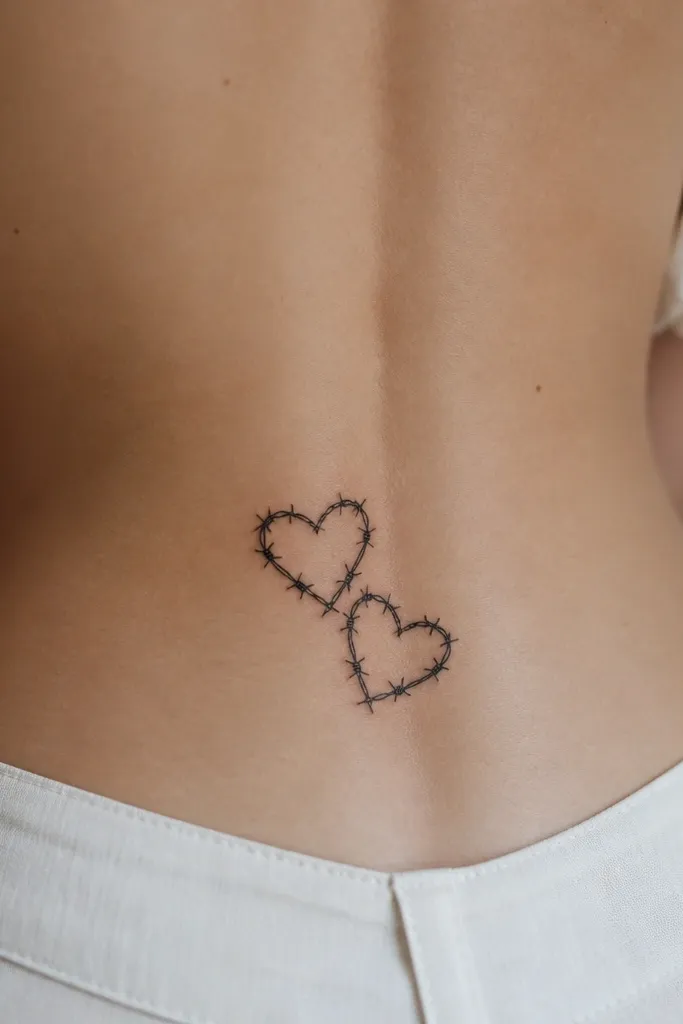
Lower-spine hearts work because the lower back naturally has a flattering curve when you stand. Barbed wire gives the ACOTAR edge without needing a full scene. The key is using negative space inside the hearts so it doesn't become a solid black blob.
Place the hearts in the lower third only - about 2-3 inches above the waistband line. Keep each heart height around 1.5-2.2 inches. Add a few tiny gray hatches under the top heart to create depth.
Pro tipWear the outfit you'll use most often (leggings or jeans) and confirm the tattoo clears seams without getting cropped visually.
AvoidAvoid placing hearts too high - they can press against shoulder blades and look awkward.
9. A Court Map Line With Tiny Coordinates
This reads modern and ACOTAR-adjacent without turning into text. The "route" line gives flow, and the coordinate markers keep it from feeling empty. I like it because you get structure with minimal shading - great for long-term legibility.
Keep markers small: no more than 3-4 mm each. Place the larger circle marker at mid-back, and taper the route line thickness slightly as it goes downward. Use black ink only, with optional gray dot shading under the mid marker.
Pro tipAsk your artist to draw the route on your back with a pen first so you can see the spacing in real life.
AvoidAvoid tiny text along the line - it fades fast on the spine.
10. Vines + Dots Gradient From Shoulder to Waist
A dot gradient makes the piece feel like it's moving, even when it's mostly black and gray. The vines add ACOTAR nature energy without needing literal characters. The gradient also hides aging - dotwork tends to soften well over time.
Start vines at bra-strap height and let them branch once on each side. Use dot density highest at the top third and lowest at the bottom third. Keep the vine lines thin and consistent, and avoid heavy gray fills.
Pro tipIf you want a cleaner fade, ask for a test patch with two dot densities so you can pick the look before full commitment.
AvoidAvoid full coverage dot shading - it turns into a gray fog.
11. Celtic Knot Wrap With a Single Star Center
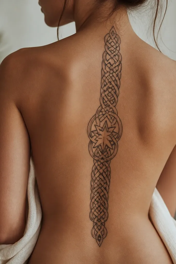
Knotwork gives you structure and flow because it naturally fills space in a controlled way. The single star prevents the design from feeling purely decorative. I've done knotwork on spines and learned quickly: you need tight negative space so the knot stays readable.
Make the knot band about 1 cm wide at the widest point, narrowing slightly toward the top and bottom. Place the star at mid-back, centered on the spine line. Use black ink with light gray shading only inside one side of the knot lines.
Pro tipAsk for crisp line intersections - if intersections blur, the knot turns into a squiggle.
AvoidAvoid overcrowding the knot - too many crossings make it look like scratch marks.
12. Fae Mask Profile Silhouette in One-Color Gray
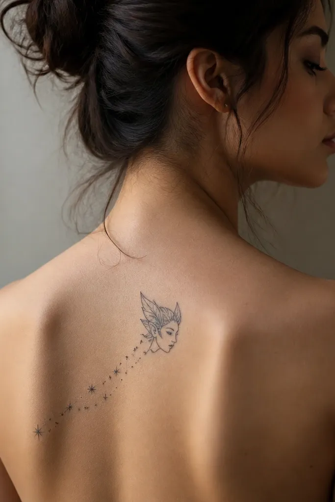
A silhouette works on the spine because it doesn't require lots of tiny facial details that blur as skin changes. The one-color gray gives an ACOTAR mood without the mess of full shading. Stars trailing from the mask make it feel like it's moving into the rest of your back.
Keep the mask height around 3.5-4.5 inches. Outline in black, then fill with smooth gray. Add 8-12 tiny star dots trailing downward-left, keeping the trail sparse so it doesn't compete with the silhouette.
Pro tipIf you want it to last, avoid super tiny highlights in the mask - they fade first.
AvoidAvoid realistic face shading with lots of micro-details - the spine doesn't forgive it.