1. Amarantha Crown + Court Stars (Two Matching Bands)
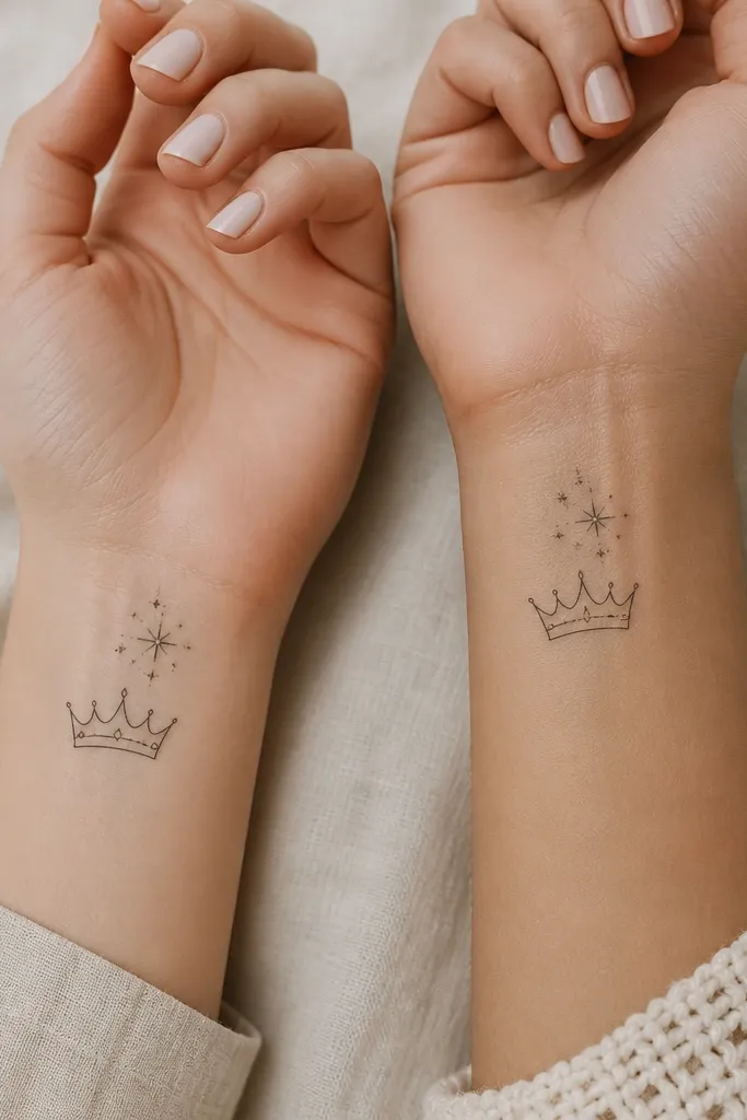
This works because the design reads like a set of matching cuff jewelry. The crown gives you a clear silhouette, and the stars add controlled sparkle without filling the whole space. I like using dotwork for the stars because it keeps the mid-tones airy; solid fill makes stars look heavy fast. Keep the crown's shading limited to soft stipple under the base line so it stays crisp as it heals.
Place the band around the inner wrist or slightly toward the thumb side, about 8-10 cm long. Use a crown width around 3-3.5 cm so it doesn't swallow the wrist. Artist should use a fine liner for the crown outline and a stipple shader for the base shadow. Color stays black and gray only - no blue or purple wash - so it photographs luxe.
Pro tipAsk for a "skin-break" plan: have the artist mark where the crown stops and where the star dots begin so there's breathing room between them.
AvoidDon't request full black star fills; they blur sooner than dot clusters.
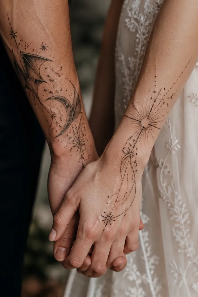
2. Illyrian Wings Split Down the Middle (Front/Back Pair)
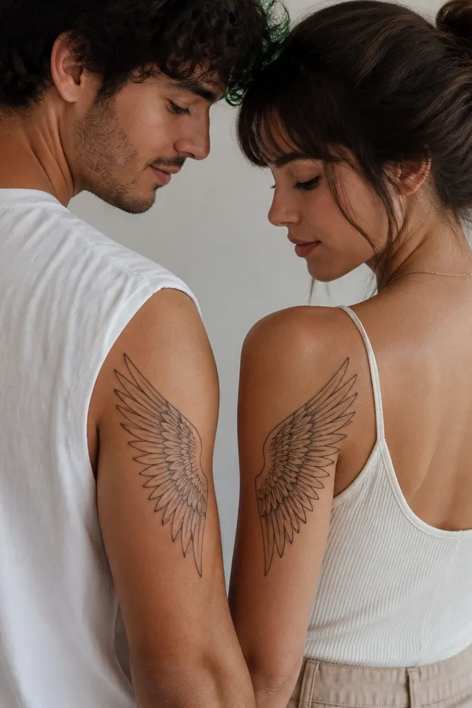
The expensive look comes from feather line discipline. Each feather line is thin and consistent, with only a few thicker "spine" lines to anchor the wing shape. Instead of shading the entire wing, the tattoo uses negative space to suggest membranes between feathers. When you split it across two people, the negative space reads as intentional design, not emptiness.
Put one wing on the outer upper arm (bicep area) and the matching wing on the upper inner arm or shoulder blade side, depending on your anatomy. Keep the wing height around 18-22 cm and the feather count tight (no more than 10-12 main feather groups). The artist should add stipple only along the outer edge where the wing would catch shadow. Keep it black ink with gray highlights only.
Pro tipDo a quick "side-by-side test" in a mirror: stand where you'd be at a couple photo and check that the wing tips overlap visually at the same height.
AvoidAvoid heavy black background behind wings; it makes the feather lines disappear after healing.
3. Court of Nightmares Rose + Thorns (Matching Micro-Filigree)
Micro-filigree reads luxe when it stays controlled. The rose petals are thin-lined with tiny dot shading, so you get a soft bloom effect without turning into a dark patch. The thorns are drawn with clean hook tips and a few negative-space breaks, which gives the whole piece a "crafted" look. It also works well because both partners get the same motif density.
Size it for the forearm: aim for a 10-14 cm stem length. Place the rose around mid-forearm and angle it slightly so the thorns point toward the elbow. Use dotwork only in the petal centers and along the thorn bases, not across the whole stem. Tell your artist to keep line weight consistent at about 0.8-1.0 mm for outlines.
Pro tipBring reference of a real dried rose photo, not a cartoon. The petal edges change the whole vibe from "childish" to "luxury."
AvoidSkip thick black fills in the petals; they look muddy on skin.
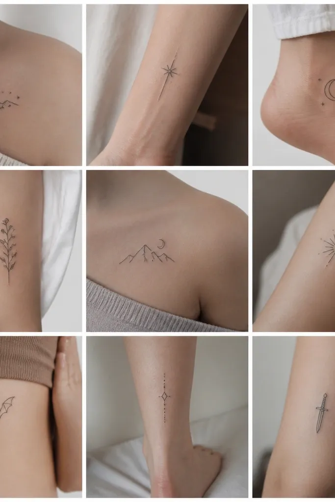
4. Starfall Halo Over Hands (Small, Expensive-Reading Couple Piece)
Hands are where "expensive" shows up fast because your movement catches contrast. A small halo with tiny star dots looks like fine jewelry when the outline stays sharp. The halo line gives structure, and the scattered stars create depth through dot size variation. Keep the stars sparse enough that skin still shows through; that's the luxe part.
Place it on the back of the hand near the knuckles, not across the palm. Size the halo circle around 3.5-4.5 cm diameter. Use a single thin line for the halo and stipple dots inside - no heavy shading. If you're matching, keep the star dot count the same on both hands but vary the star positions slightly for personality.
Pro tipAsk how the artist will handle line thickness for hand skin. You want crisp lines, but not overly thick ones that heal raised.
AvoidAvoid full-circle shaded halos; they fade into a gray ring.
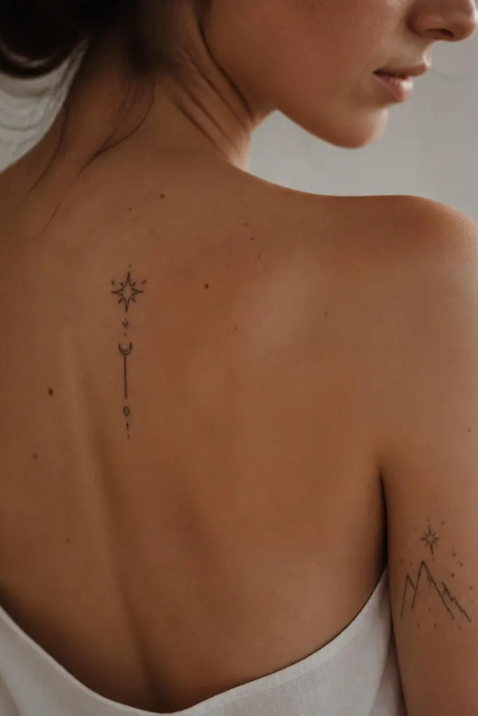
5. Court Sigil Pair: Thorned Circle + Crowned Moon
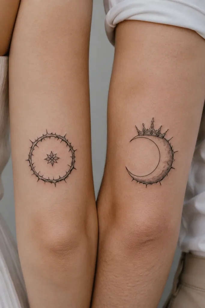
This is a luxe match because each person gets a complete symbol with the same "spike language." The thorned circle and crowned moon both have sharp points, so your eye reads them as a couple even when they're different. The expensive look comes from restraint: only minimal gray stipple, and no extra filler icons. Keep the center details small so they don't turn into a blob.
Put the thorned circle on the upper arm or outer bicep, about 7-9 cm wide. Put the crowned moon on the forearm near the wrist or on the upper inner arm, around 6-8 cm. The artist should outline the spikes with thin line and add stipple shadow only where the spikes meet the base shape. Stay black and gray.
Pro tipTell your artist to keep the spike count consistent between both designs. Even small differences can make the set look off.
AvoidDon't add extra hearts, ribbons, or extra lettering; it cheapens the symbol focus.
6. Matching Raven Ink: Silhouette + Feather Dotwork
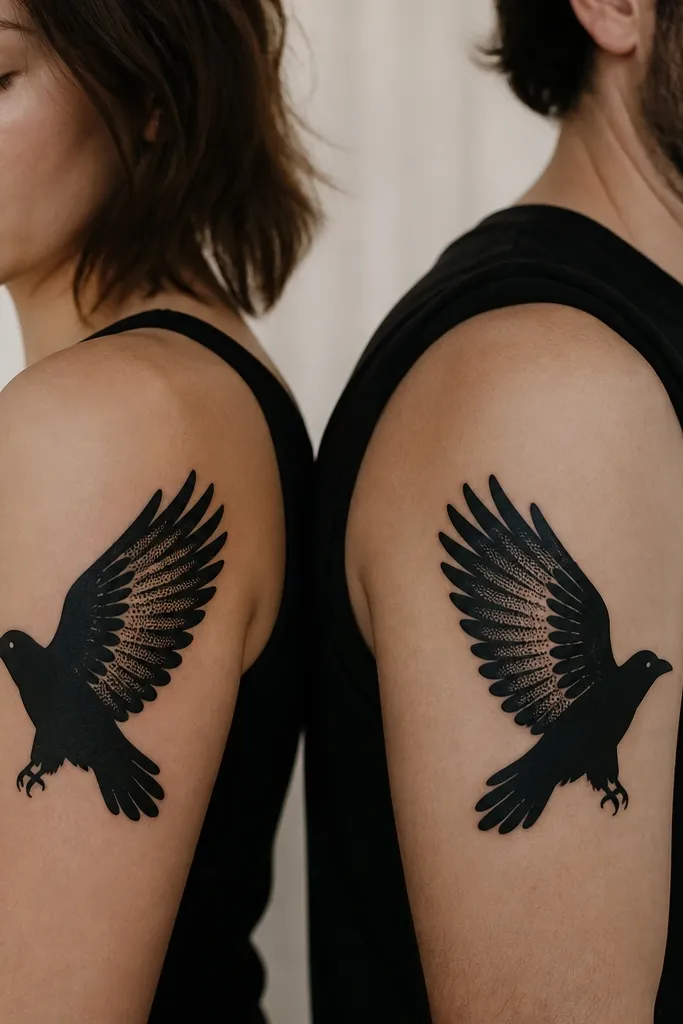
Raven tattoos look expensive when you anchor them with a clean silhouette and add just enough texture. The dotwork feather rows create a soft, controlled gradient without turning the whole bird gray. This gives you contrast and depth that still reads crisp after healing. If you keep the silhouette solid and the texture limited, the piece stays bold.
Place one raven on the outer upper arm and the other on the inner upper arm so they face each other when you stand close. Size about 12-15 cm long. Have the artist keep the wing dotwork to 3-4 feather rows only. Use black ink for the body and stipple for feather texture; no color.
Pro tipAsk for a "hard edge" outline where the silhouette meets skin - that crisp boundary is what reads high-end.
AvoidSkip full-wing shading; it blurs into a dark patch on the outer arm.
7. Two-Part Feyre Thread: Stitch Lines + Tiny Pendant Star
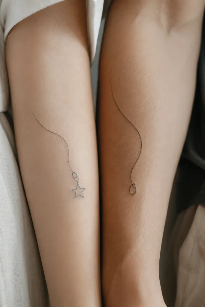
Thread-stitch tattoos look luxe because they rely on line precision and negative space. The "expensive" feel comes from consistent line weight and the illusion of tension in the stitch path. Tiny pendant stars add romance without clutter, and the loop point makes the tattoo feel like it belongs to a matching set. Keep it clean - no extra decorative flowers.
Place on forearms: one on the outer forearm, one on the inner forearm so the thread paths can visually mirror each other. Length 10-13 cm. Use a fine liner for stitch lines and a small stipple shadow under the pendant loop. Keep the pendant star about 8-10 mm wide so it stays sharp.
Pro tipBring a photo of actual embroidery thread and show the artist how the stitch spacing looks. That spacing is the difference between "cute" and "expensive."
AvoidAvoid thick marker-style lines for thread; it kills the stitch illusion.
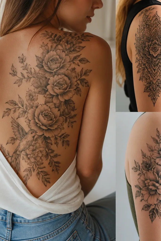
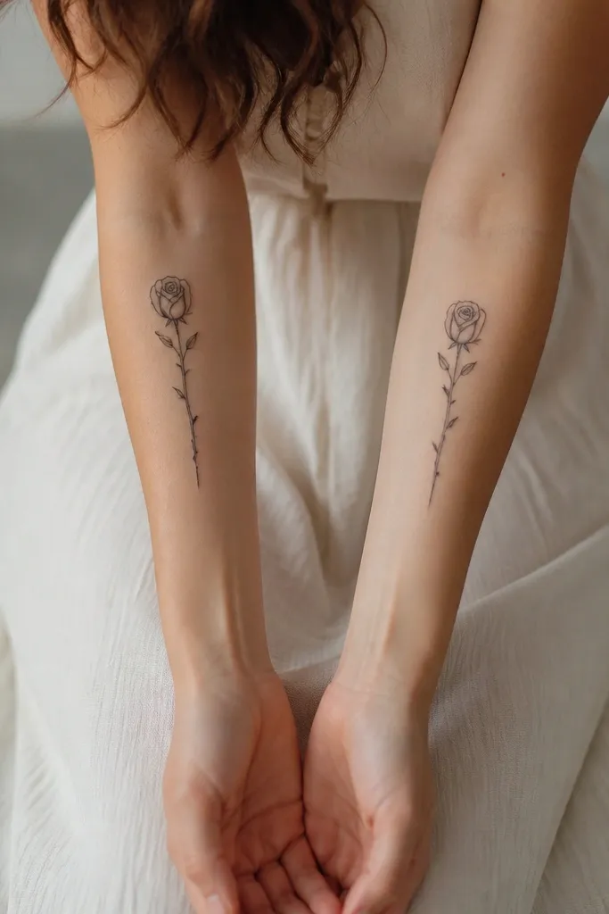
8. Amor Vincit Style Vines: Rose + Thorns as a Couple Frame
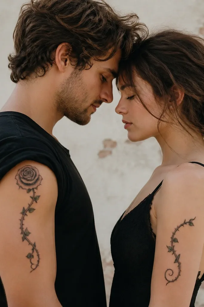
This works when the vine acts like a frame. The rose gives romance, the thorns add ACOTAR energy, and the band placement makes it read like a planned design, not scattered icons. I've seen this look expensive because the vines are drawn with varied line weight - thicker at the main stem, thinner on the tendrils. The shading is light stipple under the rose and at a few thorn bends.
Use a band width around 10-12 cm on the bicep. Place the rose about 3-4 cm from the top edge of the band. Make the two designs complementary by matching the vine curvature, not by repeating the entire rose. Keep the thorn tips sharp but small so they don't dominate the band.
Pro tipAsk your artist to draw it on your arm first with the exact band angle you want. Vine tattoos shift with arm rotation.
AvoidDon't cram too many thorns; five to seven strong thorn points look better than twelve messy ones.
9. Star-Cut Heart Pair: One Side Outline, One Side Dotwork Fill
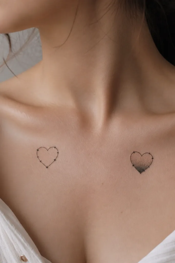
This is luxe because it creates a deliberate contrast between outline and texture across the couple. One partner's heart reads crisp and architectural; the other reads soft and glowing because of the dot gradient. The "star cuts" keep it ACOTAR-adjacent without needing extra symbols. It's also a clean way to match without forcing the exact same ink density.
Size it at 3.5-4.5 cm wide. Place one heart slightly higher on the collarbone and the other 1-2 cm lower so the pair looks balanced in photos. The dotted fill should fade from top to bottom using stipple, not gray wash. Keep the star cuts as thin negative-space gaps so they stay sharp.
Pro tipIf you're prone to keloids or thick scar tissue, keep the interior stipple lighter; heavy dot fills can look raised later.
AvoidAvoid watercolor-style splashes inside the heart; they age unpredictably on collarbone skin.
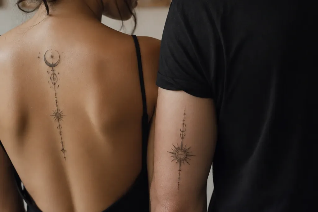
10. Night Court Key + River Thread (Matching Wrist Cuffs)
Keys and river lines look expensive when they're drawn like a single continuous object. The key has a clean silhouette; the river thread has motion created with line curvature and tiny dot highlights. Both share the same "cuff" placement and the same small star cluster, so your set reads coordinated. Luxe comes from keeping the cuff border thin and adding texture only at one spot.
Place the key cuff on the outer wrist so the bow faces up when you hold your hand. Put the river cuff on the inner wrist with the hook pointing toward the thumb. Keep cuffs 6-8 cm long. Use fine liner for the key and river line, stipple dots for only 6-10 highlight points total, and keep everything black and gray.
Pro tipAsk for the star cluster to be the same total dot count on both cuffs. It's a small detail that makes the match feel intentional.
AvoidDon't add extra chain links; they clutter the cuff and make it look like random filler.