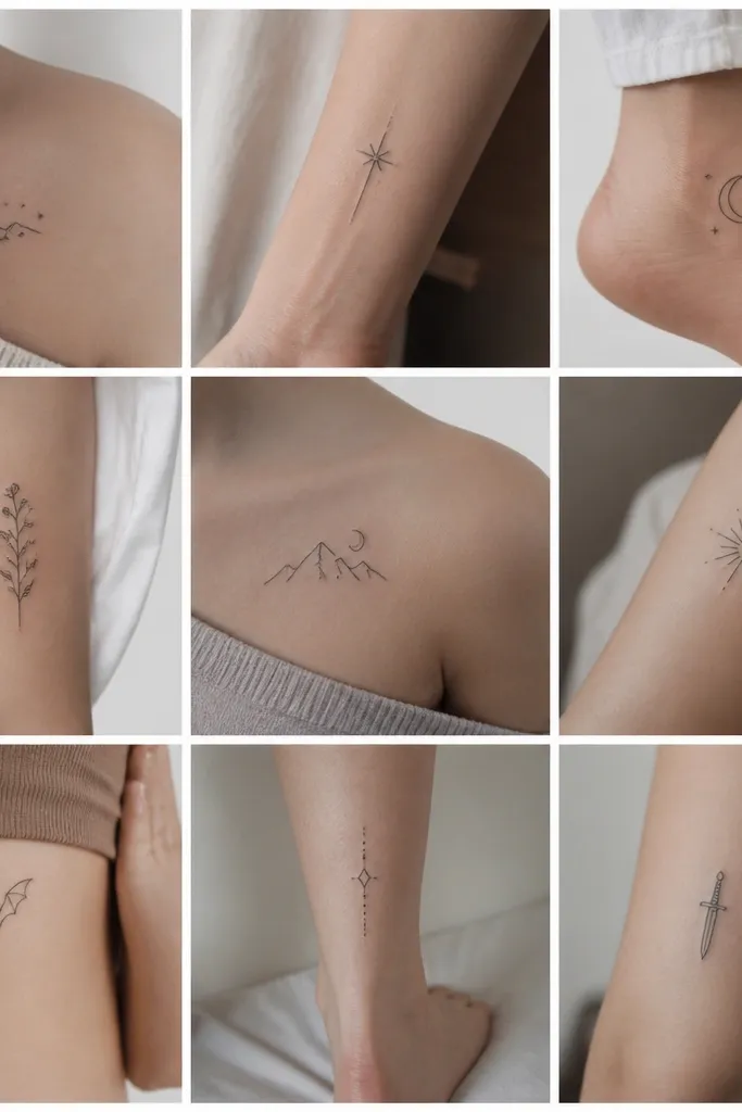
1. Illyrian Wingline on the Upper Arm
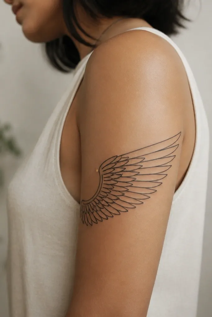
This works because wing feathers look best when each segment is its own shape. Black linework makes it read like ink even when the method is temporary. The small gold dot gives you that ACOTAR shimmer feel without needing heavy color fills.
Place it on the outer upper arm from about 2 inches above the elbow crease to the mid-bicep. Keep the width around 2.5 to 3 inches so feather lines don't collapse when your arm bends. If you're using a temporary tattoo transfer, press for the full 30 seconds and avoid lotions for the next 8 hours.
Pro tipDo a "bent-arm check" in the mirror. If the feather gaps disappear when you flex, scale it up by 1/4 inch.
AvoidDon't choose a super-thin version - feather lines under 1 mm look messy fast.
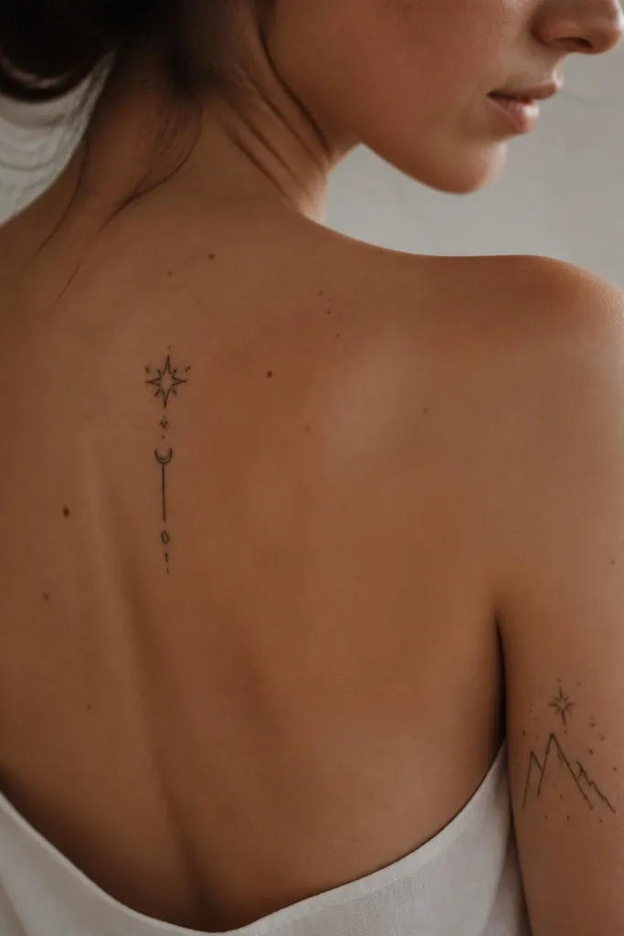
2. Starfall Rune Cluster (3 Symbols)
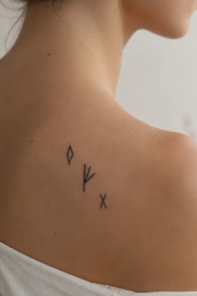
Runes look crisp because you can keep them modular. A cluster of 3 gives you visual weight without tiny micro-details. Black ink style with one slightly thicker rune mimics how real tattoo artists vary line weight.
Size it for the back of the upper arm or the outer shoulder: target 2 inches tall total. Use a transfer sheet or a temporary fine-line ink pen kit designed for skin. Let the ink set fully before you touch fabric.
Pro tipTrace the design on paper and tape it on your skin first. I've saved so many placements by checking symmetry under daylight.
AvoidAvoid multi-color rune packs - they look dull once they fade.
3. A Court-Choice Sigil on the Collarbone
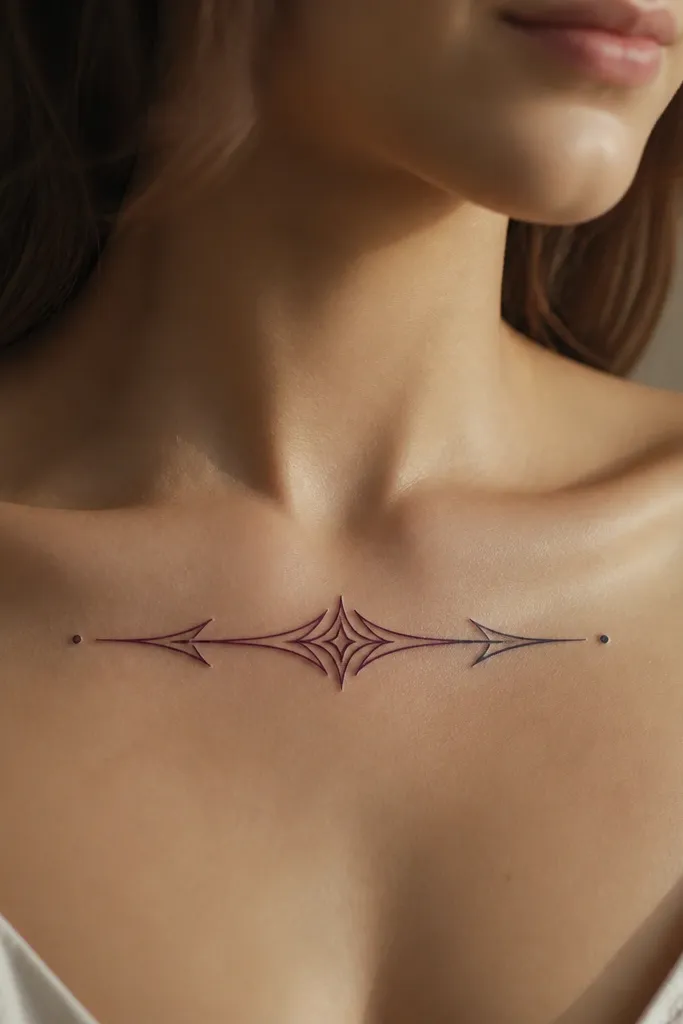
The collarbone is a perfect spot for one bold symbol because it gives the design room to sit flat. Deep plum reads like "magic" but stays believable as tattoo ink. A black outline keeps the edges clean even with temporary wear.
Keep it narrow and horizontal, about 3 inches long and 1/2 inch tall. Use a transfer tattoo with color layers or a skin-safe marker kit that allows layering. Wear a soft bra or scoop-neck top for the first day so friction doesn't lift the edges.
Pro tipMark the placement by finding the hollow at the base of your neck and centering the sigil there.
AvoidDon't put it too close to the bra band - rubbing makes the plum fade first.
4. Illyrian Bow String Teardrop Mark
This is the kind of small symbol that looks real because it's simple and high-contrast. The curve makes it flattering, and the teardrop gives it a focal point. Even temporary ink methods look convincing when the design has only one path for the eye.
Try it on the inside of the forearm, near the wrist but not on a bony bump. Target 1.5 to 2 inches long. If you're using a temporary ink pen, do two passes: first a light guide, then a darker final stroke after it dries 60 to 90 seconds.
Pro tipUse a hair dryer on low for 10 seconds to set the top layer after application.
AvoidSkip teardrops that are too tiny - they blur into a dot.
5. Winged Serpent Wrap on the Forearm
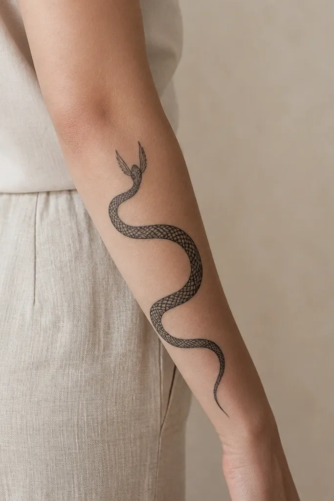
A wrap design looks good because your arm shape helps sell the motion. Minimal shading keeps it readable during fading. The head winglets add that Illyrian fantasy edge while staying within a single ink color.
Place it on the outer forearm from 3 inches above the wrist to mid-forearm. Aim for 3 to 4 inches tall total and keep the serpent body line thickness consistent. If you're doing a temporary transfer, secure the skin with a wipe of rubbing alcohol first and let it dry fully.
Pro tipFor the smoothest look, apply on dry skin after a shower and skip body oil entirely.
AvoidDon't choose designs with lots of grey gradients - temporary methods turn gradients into patchy blocks.
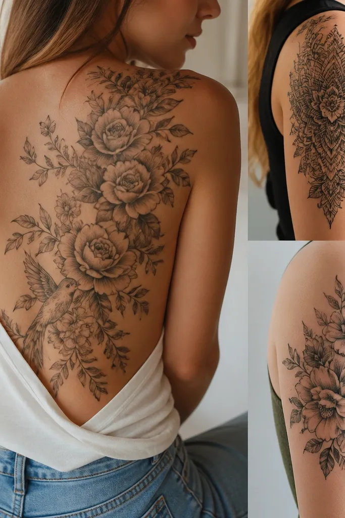
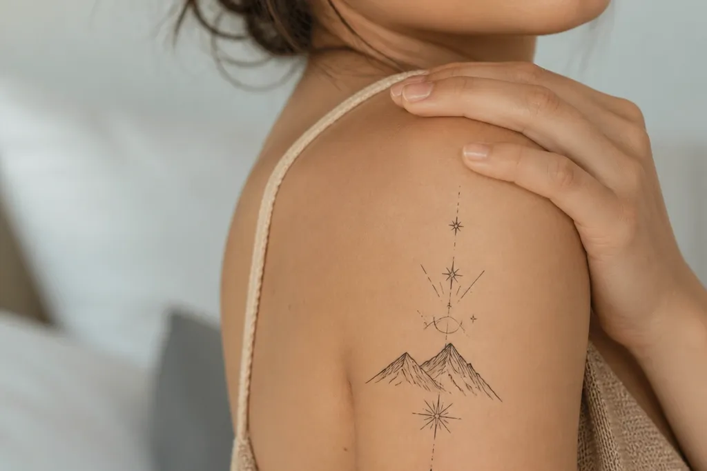
6. Fae Crown Halo on the Shoulder Blade
This works because shoulder blades are wide and forgiving. A halo crown reads even when the tattoo fades because the silhouette stays intact. Star dots inside give depth without needing heavy shading.
Position it just below the shoulder blade peak, about 4 inches across. Use a transfer tattoo with crisp edges, or a temporary stencil kit if you want control. Press from the center outward to avoid air bubbles under thin lines.
Pro tipWear a loose tank for the first night so the tattoo doesn't get pulled while you sleep.
AvoidAvoid placing it too low on the upper back where your waistband rubs.
7. Three-Loop Illyrian Knot on the Side Rib
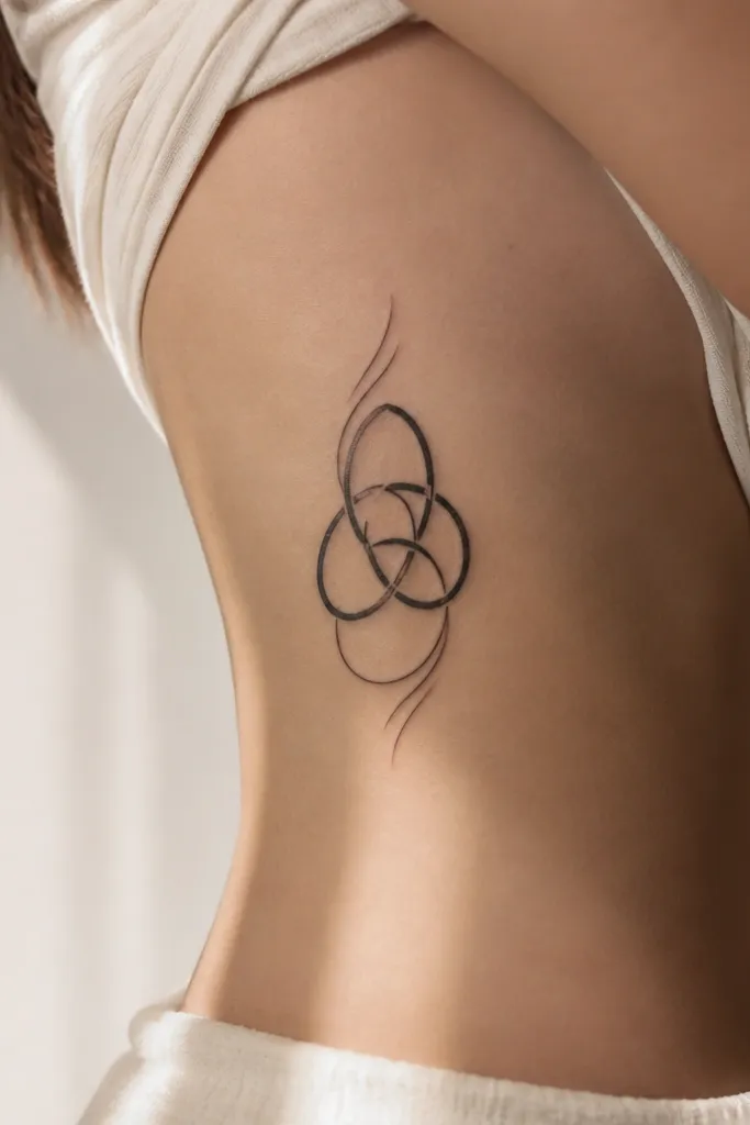
Knot symbols look "tattoo real" because they have structure. Three loops give you enough complexity without going microscopic. The vertical orientation flatters the torso and keeps the symbol from stretching into a smear.
Place it on the side rib where you can still reach it easily - usually 2 to 3 inches above the waist. Keep it about 2.5 inches tall. Use a thicker-line transfer or a stencil kit because side skin movement kills fine detail.
Pro tipPut a thin layer of clear, fragrance-free setting spray over the tattoo after it sets, then let it dry completely.
AvoidSkip super-thin linework here - ribs move and thin lines break apart.
8. Night Court Style Crescent with Dots
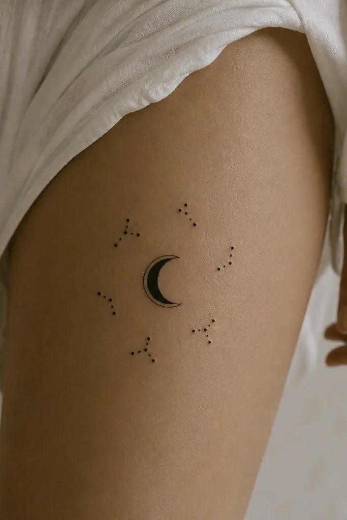
Crescents photograph well because they hold a clear shape. Dot clusters add that ACOTAR "night magic" look without requiring gradients. The black stays bold even when it starts to fade.
Place it on the outer upper thigh, about 4 inches long. Keep dots spaced enough that they don't merge - I aim for at least 3/16 inch between clusters. For temporary transfers, press longer than the instructions if your skin is dry; I do 40 seconds.
Pro tipUse bike shorts or leggings to test friction. If it rubs, the fade will show in a day.
AvoidAvoid placing it on skin that rubs constantly under clothing seams.
9. Illyrian Spearhead on the Inner Bicep
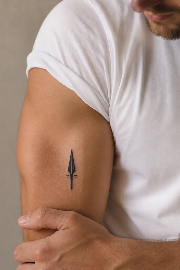
Spearhead shapes look sharp because they're geometric. Inner bicep placement stays relatively still, so line edges stay cleaner than on joints. The small side bars make it look intentional instead of like a random mark.
Size it to about 2 inches tall. Place it where your arm tenses so the point faces forward. Use a stencil and temporary ink pen for best control, or a transfer if the edges are crisp.
Pro tipIf you're between sizes, go bigger. A 2.25-inch version looks more like a real tattoo than a 1.5-inch one.
AvoidDon't bend the stencil while applying - angled lines look sloppy.
10. Vine + Star Accents on the Calf
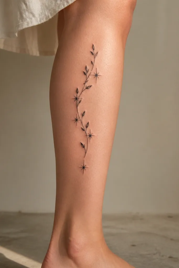
Vines hide fading better because the line continues in one direction. Star accents act like "anchors," keeping your eye on the design even when it lightens. This is a good choice if you want something Illyrian that still feels soft.
Place it on the outer calf, starting near the middle and running down diagonally about 5 inches. Keep line thickness medium so it doesn't turn into a single dark stripe. For temporary application, let each section dry before you move on if you're using marker ink.
Pro tipUse a matte top coat made for temporary tattoos so the stars don't glare under flash.
AvoidAvoid glossy layers - they look plastic in daylight.
11. Feather + Threadline on the Wrist
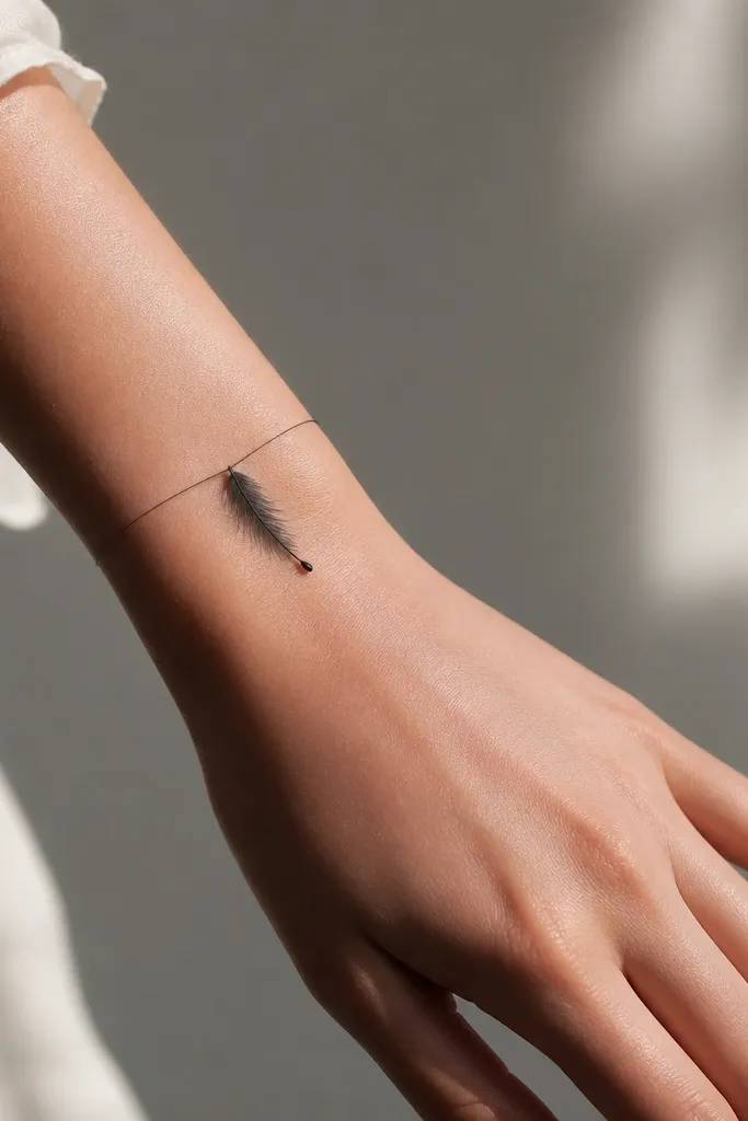
This looks like a real fine-line tattoo because the wrist is a natural "bracelet" canvas. The threadline gives you movement, and the dot tip makes the feather identifiable even when it fades. Keep it delicate but not micro - micro ink disappears first.
Aim for 1.75 to 2.25 inches across the wrist. Place on the outer wrist where you don't see as much rubbing. Use a transfer tattoo or stencil kit with a fine tip; press firmly and avoid water for 6 hours after.
Pro tipWear a thin watch band on top for the first day to reduce friction.
AvoidDon't put it on the palm-side where hand washing destroys the edges fast.
12. Court Colors Accent on a Simple Rune
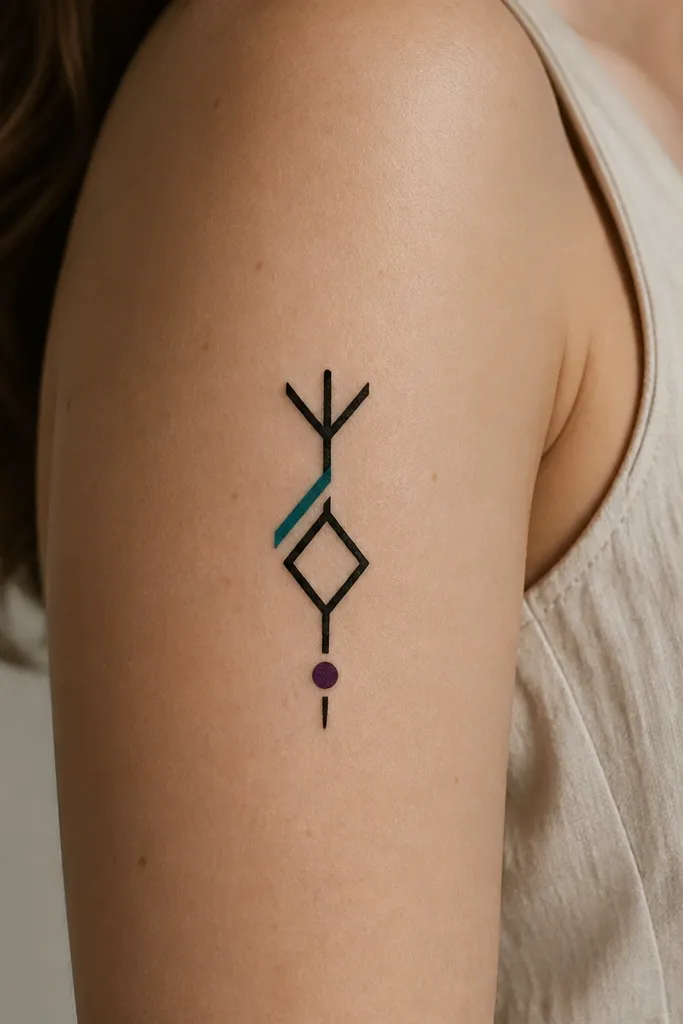
If you want ACOTAR energy but you're renting, this is the cleanest way: keep the symbol black and add one accent color. Teal reads like fae magic and plum ties it back to court vibes. One accent also keeps temporary ink from looking patchy.
Place on the upper arm near the outer bicep, about 2.5 inches tall. Use a transfer that has color layers, or apply black first then add teal with a skin-safe brush pen. Let the black set before the accent so colors don't bleed.
Pro tipMatch accent color to your clothing. Teal pops under olive, plum pops under cream.
AvoidAvoid multiple accents on tiny designs - it turns into a smudge.