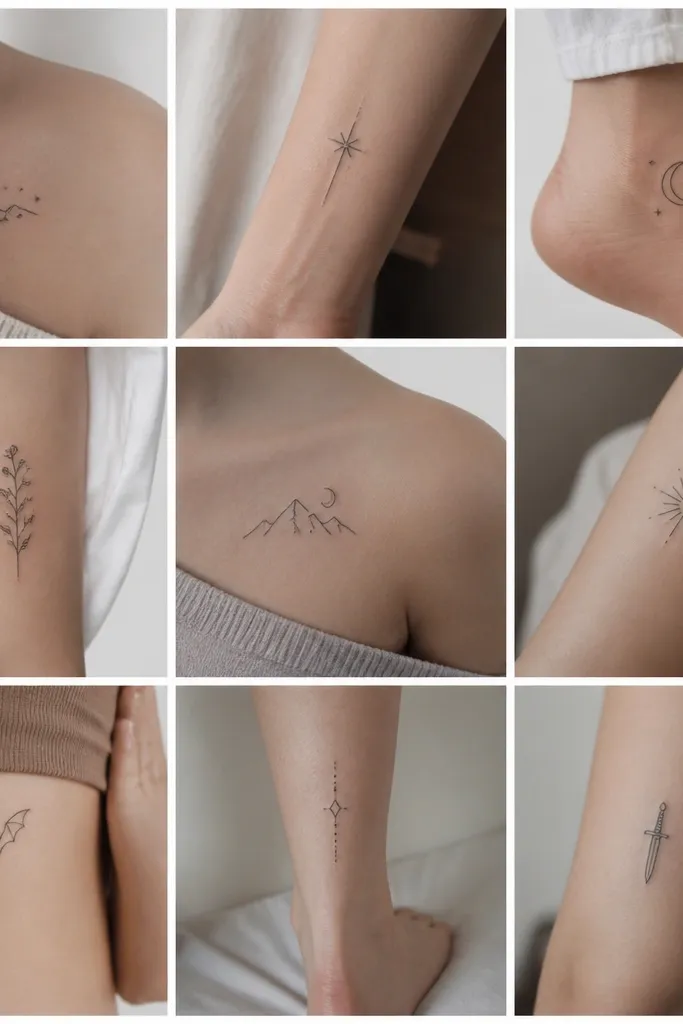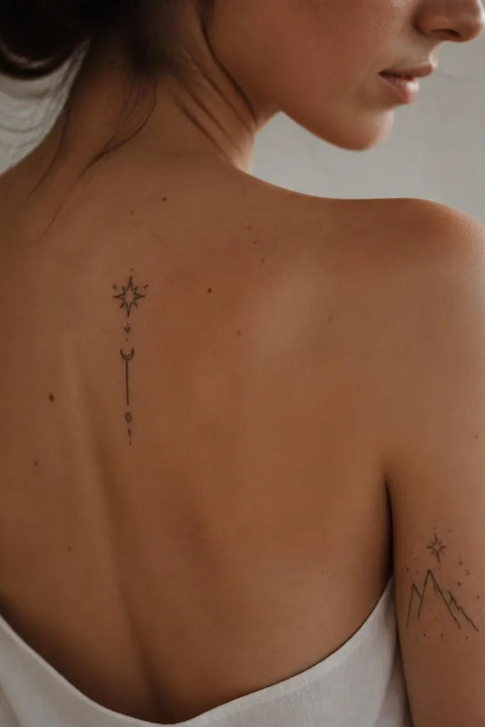
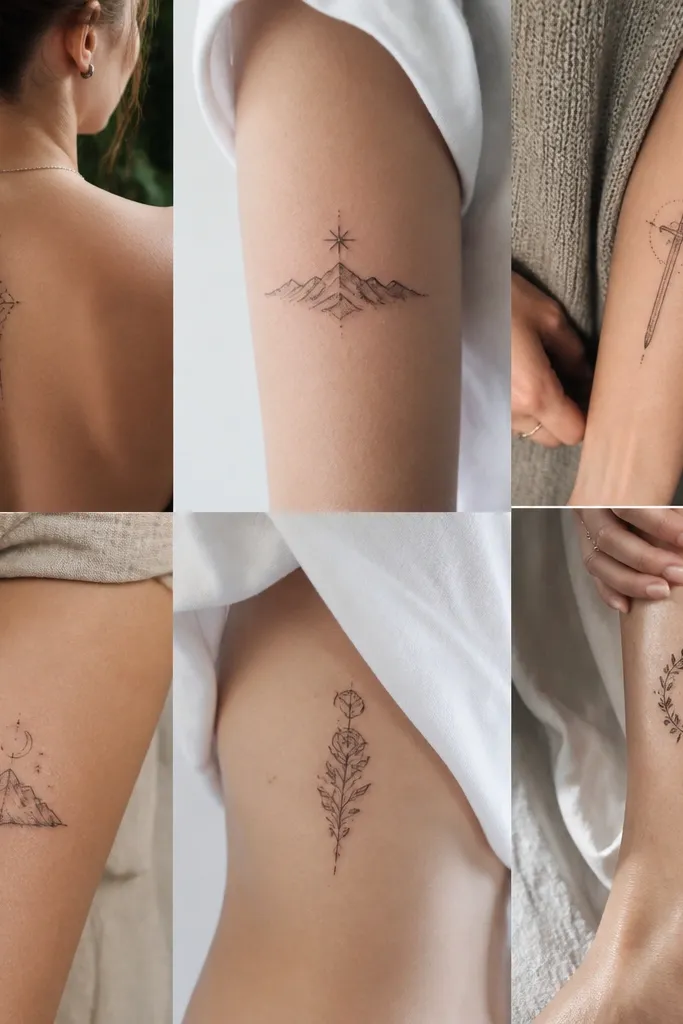
1. Starfall Court Sigil in One Clean Outline
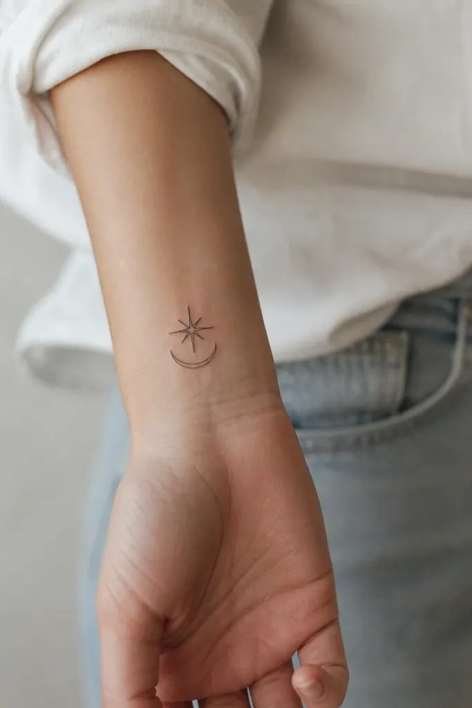
This works because the whole design is readable as a single shape: star points and a simple arc. Fine-line loves negative space, so the gaps between star points stay bright instead of turning into a solid blob. I keep the lines consistent and thin, so the tattoo heals with a sharp edge instead of gray fuzz.
Size it around 1.2 to 1.8 inches across on the wrist, and keep the star points spaced so they don't crowd. Ask for a single outer contour line and light interior linework only if it supports the shape. Placement on the outer wrist is steady and easy to touch up later if you ever want a micro refinement.
Pro tipBring two versions to your artist: one with extra spacing between star points and one tighter, then pick the one that still looks clean when you squint.
AvoidDon't add heavy stippling inside the star points or it will blur into a gray mass after healing.
2. Rhysand's Veil Motif with Negative-Space Wings
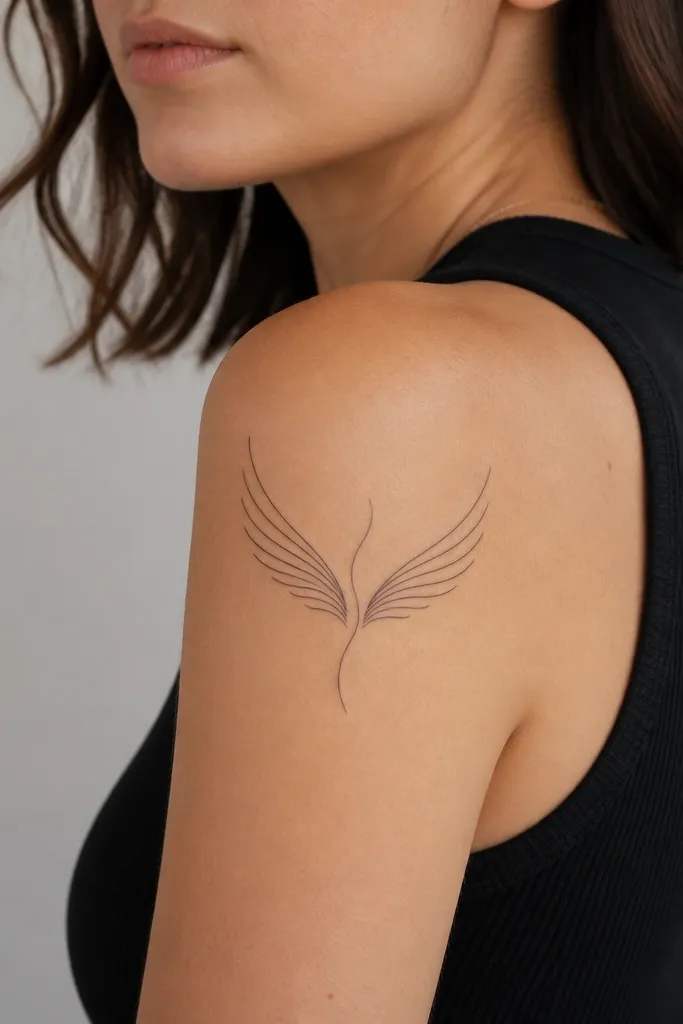
This gives you the ACOTAR mood without relying on tiny unreadable details. The "veil" line is your focal point; it pulls the eye across the wings and keeps the silhouette cohesive. Negative space between wing segments prevents the tattoo from looking like a single dark sticker as it ages.
Ask for a wing span around 3 to 4 inches so the lines have room to settle. Keep line weight consistent and avoid any big soft shading - use only thin linework and tiny, controlled accents at the tips. Upper arm placement handles fine-line well because skin moves less than ribs.
Pro tipHave your artist sketch the wing segments as separate pieces first, then connect them with only one central veil line.
AvoidAvoid full shaded wings with lots of dotwork - it usually turns muddy on the outer shoulder.
3. Court of Night Thorns as a Curved Micro Branch
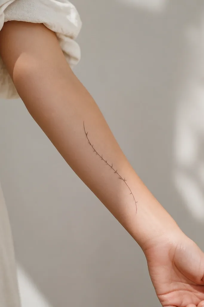
A micro branch reads like movement, and fine-line thorns look sharp when they're spaced. This design works because each thorn has its own "definition" - you can count them even after healing. I like it without shading because the contrast comes from spacing and line clarity, not gray gradients.
Keep it narrow: about 0.8 to 1.2 inches wide at the thickest part, and 3 to 5 inches long. Place it along the inner forearm where you can see it when your arm flexes. Ask for thorns that taper - thicker at the base, thinner at the tip - so the points stay crisp.
Pro tipAsk for a quick stencil mock on your arm while you flex - if thorns crowd when your skin stretches, the tattoo will blur sooner.
AvoidDon't stack thorns too close together; crowding makes them merge into one dark line.
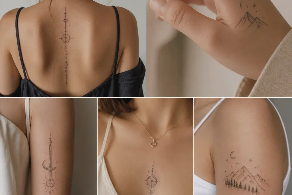
4. Fae Ring Keyhole with Thin Orbit Dots
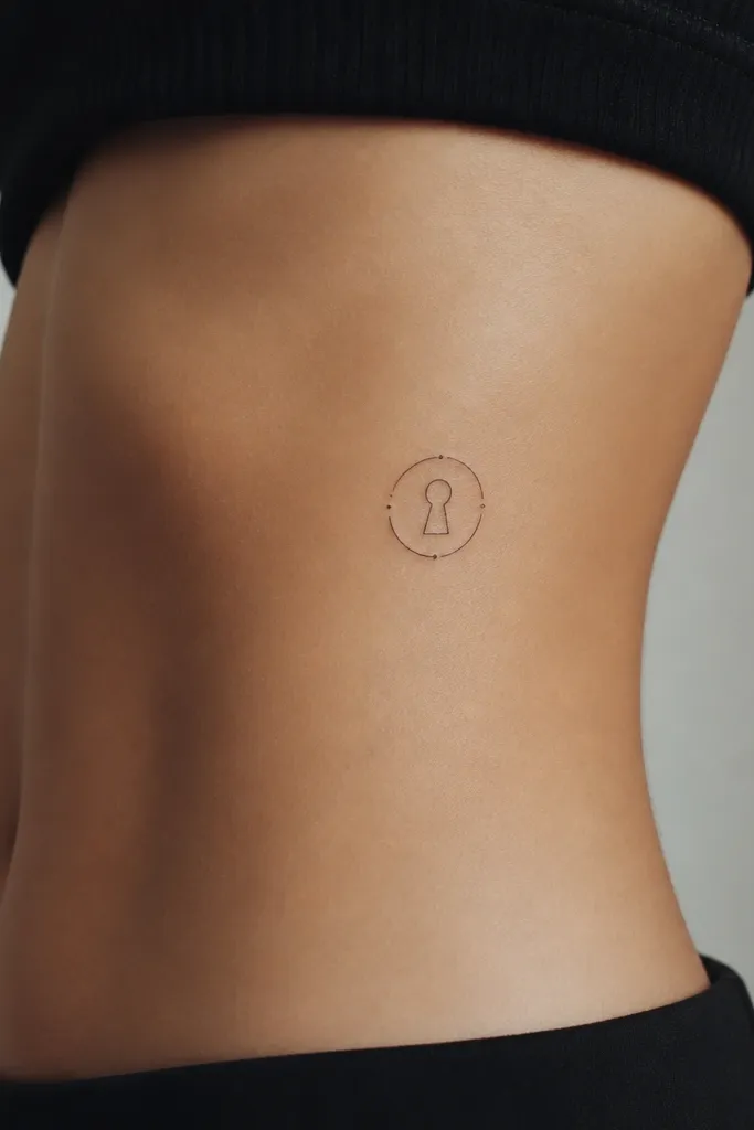
Keyhole shapes are naturally readable, and the ring tells people "fae sigil" without spelling anything out. The orbit dots add magic energy while staying minimal enough to age well. I keep the dots few and deliberate so they don't become a speckled blur.
For ribs, keep it small: about 1.5 to 2.2 inches across. Use a thin ring line and leave a clean gap at the top of the keyhole so the negative space stays bright. Place it where you can tuck a bra strap or underwear line above it - friction changes how fine-line holds up.
Pro tipIf you're worried about rib fading, ask your artist to slightly thicken only the ring line - keep the keyhole thin.
AvoidAvoid dense dotwork around the ring - it looks great on day one and turns into a gray halo.
5. ACOTAR Book Spine Lines with a Single Court Symbol
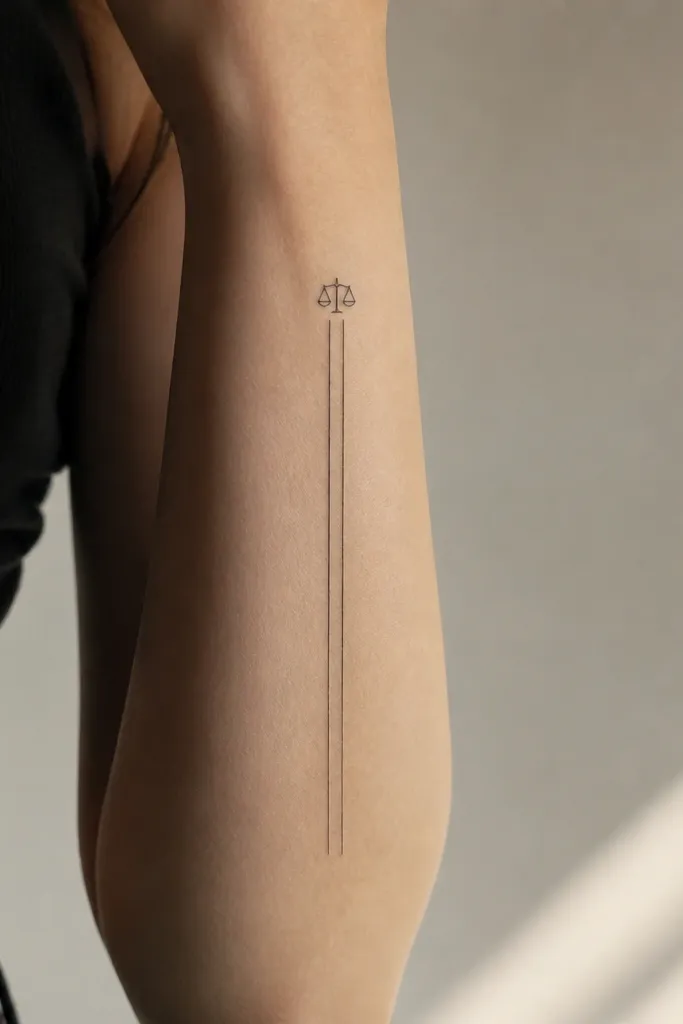
This layout works because it's built for vertical readability. The two spine lines frame the small symbol so it doesn't float or look random. Fine-line stays clean here because your design is mostly contour lines with one focal icon.
Keep the spine lines about 0.08 to 0.12 inches apart so the book shape reads, then add the symbol no larger than 0.5 inches wide. Forearm placement is forgiving for fine-line because you can keep it protected from sun. Ask for straight, steady linework - no wavering like a shaky sketch.
Pro tipBring a ruler to your appointment photo - ask your artist to match the spacing to your stencil rather than freehanding.
AvoidDon't add extra ornaments along the spine; too many elements make it look like a doodle.
6. Illyrian Wings with One Feather Line Strategy
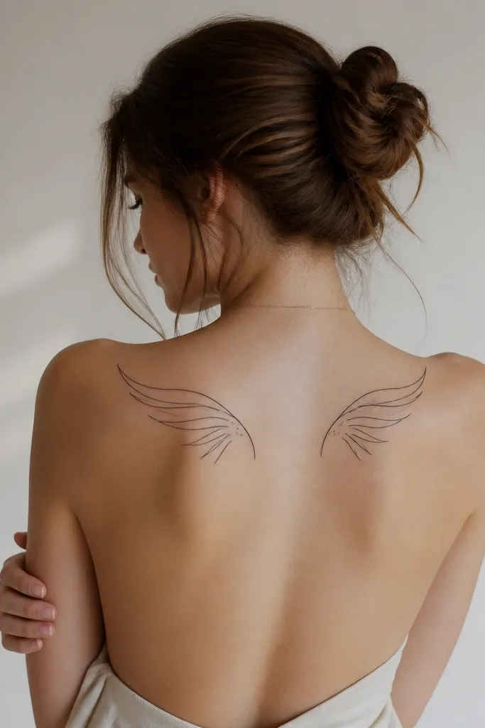
The trick is fewer feathers, better structure. I like a one-feather-line approach because each feather has a clear boundary, so the tattoo holds definition even when the skin texture shifts. Minimal dots keep it from turning into a gray cloud.
Upper back works best for wing tattoos because it's wide and less exposed to friction. Target 4 to 6 inches across, and keep feather count around 8 to 12 per side. Ask for a strong outer wing contour and then interior linework that follows feather direction, not random speckles.
Pro tipUse a mirror check: stand sideways and see if the wing silhouette reads as "wings" from a distance. If it doesn't, the design is too busy.
AvoidAvoid heavy shading behind the wings; it often blurs into background smudging.
7. Amren's Quiet Symbol as a Tiny Floating Mark
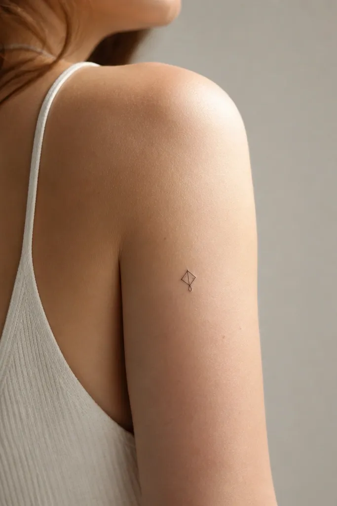
Quiet symbols age well because they rely on clean geometry, not lots of texture. The "floating" feel comes from spacing: the mark sits alone with no extra lines crowding it. Fine-line looks best when it's crisp and centered, especially for someone who wants a tattoo that doesn't scream from across the room.
Size it around 0.5 to 0.9 inches wide. Place it where you don't rub it constantly - upper arm outer area is better than inner elbow. Ask for a stencil that centers on a natural skin line so the glyph doesn't warp as you move.
Pro tipIf you want it to feel more "character," add one tiny dot accent, not a mini scene.
AvoidDon't add micro script around a tiny glyph; it will heal thin and unreadable.
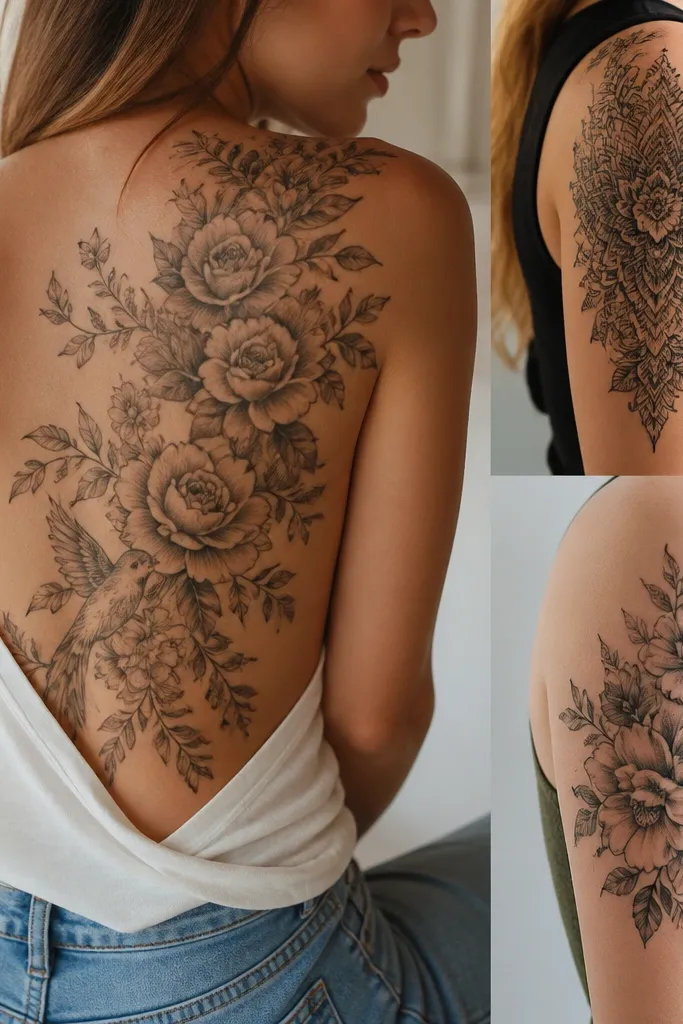
8. Tamlin's Court Rose as a Line-Only Stem Spiral
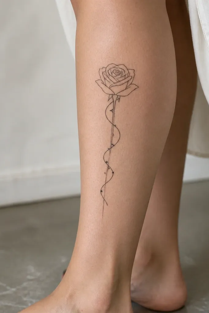
A rose that's mostly contour lines stays sharp because petals are outlined, not shaded. The spiral stem gives it motion and keeps the design from looking flat. Line-only shading also prevents the gray "smoke" effect that happens when fine-line shading gets too soft.
Calf placement is great for fine-line because it's less wrinkly than hands and less friction-heavy than ribs. Size around 3 to 4 inches tall, and keep petal count moderate (around 6 to 9 petals) so each one has space. Ask for a consistent line taper on thorns and stem so it looks delicate, not drawn with one thickness everywhere.
Pro tipBring a reference of the rose in black-and-white. If the reference relies on color gradients, your tattoo will need line equivalents.
AvoidAvoid filling petals with stipple - it turns into a textured gray patch.
9. Feyre's Thread of Gold as a Thin Crossline
This is a symbol-first tattoo that reads like "thread" because it has a knot and tension points. Fine-line loves one or two focal moments, and this knot gives you that. The accents make it feel magical without needing elaborate background shading.
Use forearm placement with about 2.5 to 3.5 inches length, and keep the knot about 0.4 to 0.6 inches wide. Ask for a slightly thicker line at the knot center for emphasis, then return to thinner line weight. This tattoo looks best with clean skin - avoid placing it where you get a lot of sun damage.
Pro tipAsk your artist to draw the knot as a tight loop, not a loose swirl. Tight loops heal cleaner.
AvoidDon't add extra twists along the whole line; it turns into scribble.
10. Night Court Crescent with Micro Spark Trails
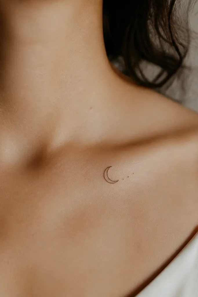
Crescents are the easiest ACOTAR-to-read-at-a-glance shapes. Micro spark trails add story energy while staying simple enough for fine-line longevity. I keep the sparks as short marks (like tiny dashes), not dots, because dashes hold shape better on healing.
Collarbone placement needs restraint: size around 1.8 to 2.6 inches and keep sparks count low (about 6 to 10). Ask for the crescent outline to be slightly thicker than the sparks so the moon stays the focal point. Place it so it doesn't sit right on the collarbone ridge where it rubs on bras.
Pro tipSchedule it after a period where you can avoid tight straps for a week - friction messes with healing fine-line.
AvoidAvoid a dot-heavy spark trail; it often turns into a soft gray smear.
11. ACOTAR Court Names in Tiny All-Caps with a Symbol Divider
Text looks best when it's disciplined. All-caps with consistent spacing stays readable, and a small symbol divider keeps it from looking like random typography. Fine-line text works when your artist uses steady spacing rather than squeezing letters to fit a pre-made stencil.
Keep the text height small but not tiny: about 0.18 to 0.25 inches tall per letter. Inner forearm is a good start because you can protect it from sun. Ask for baseline alignment and equal spacing - the divider symbol should be roughly the same width as two to three letters.
Pro tipPrint your chosen font style as a stencil mock and tape it to your arm for 10 minutes before committing. If it feels too small to read, it is too small.
AvoidAvoid cursive scripts for fine-line ACOTAR text; loops blur fast.