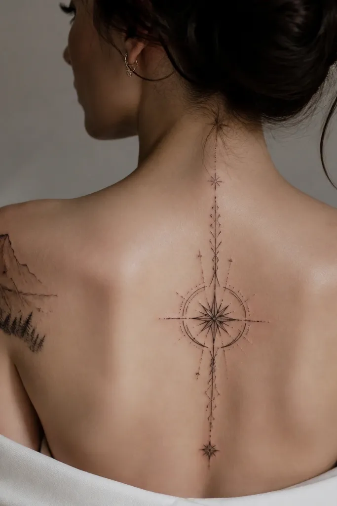
1. Court of Night Sigil in Blackwork Column
This works because it reads like a piece of jewelry: one clear symbol, tight symmetry, and strong negative space. I like pure black lines with a light gray shadow only at one side, so the sigil looks dimensional without turning into a gray blob. The expensive vibe comes from restraint and clean edges - nothing is overworked. If you want it to feel bookish, keep the lines slightly calligraphic, not geometric.
Place it on the outer upper arm or the side of the forearm where it can sit straight and vertical. Size it so the main symbol is about 3 to 4 inches tall, with at least a finger-width of empty space around it. Ask for tapered line ends so the edges look sharp after healing.
Pro tipTell your artist you want "blackwork with one-sided gray depth," then check the sketch from two feet away.
AvoidAvoid packing the symbol with lots of tiny dots - healed dotwork can blur and make it look smoky.
2. Starfall Page Edge Behind a Small Thorn Crown
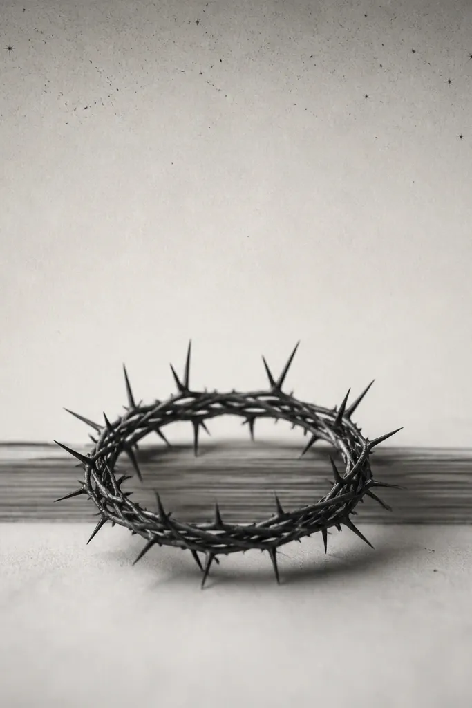
The page edge motif makes it feel literary without needing text. The thorn crown gives you the ACOTAR mood, but it stays elegant because it's small and refined. Star specks add sparkle, and the negative space around them keeps the piece from looking busy. The expensive look is the contrast between the sharp thorn lines and the soft, airy star dust.
Go for inner forearm or upper arm near the bicep where the vertical strip can follow your arm shape. Keep the crown about 1.5 inches wide. Use soft gray shading only on the page edge lines, not on the thorns.
Pro tipAsk for the page edge lines to be slightly curved to match your skin stretch direction.
AvoidSkip full shading behind the crown - if the background becomes a gray wash, the thorns lose clarity.
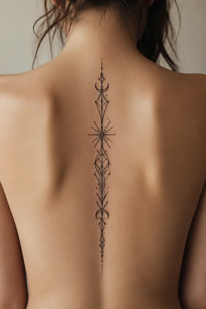
3. Siphon Thread Wrap with Minimal Greek-Key Border
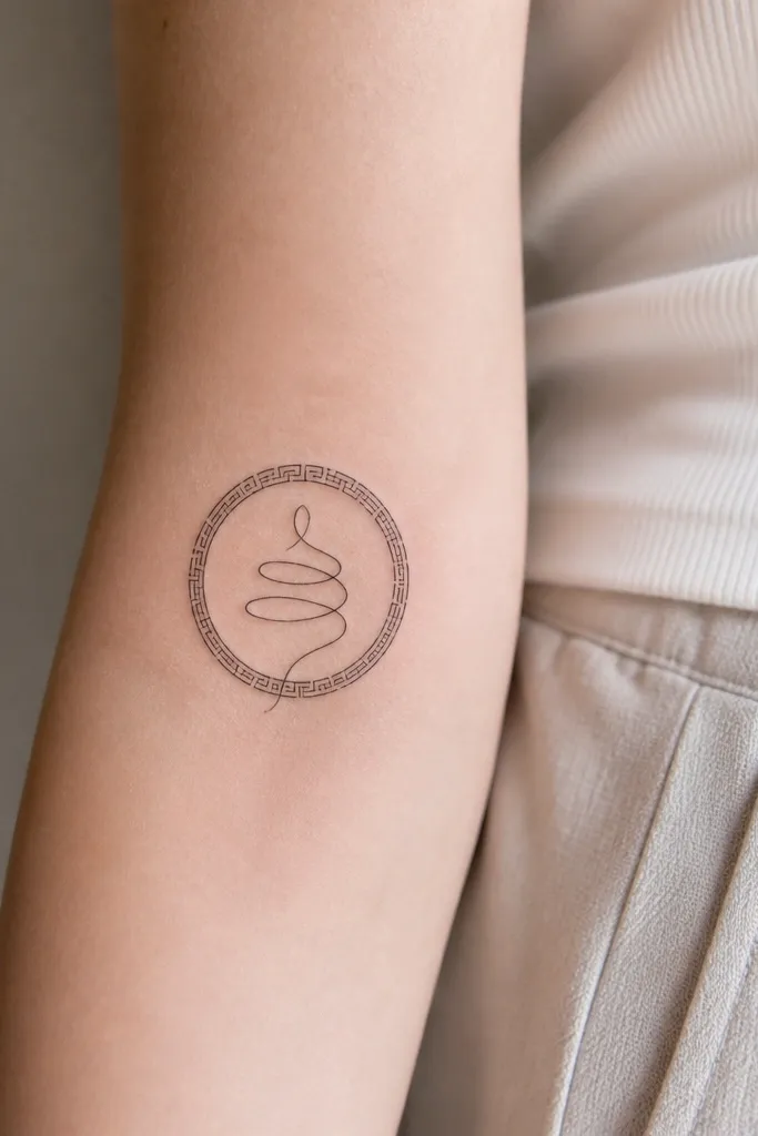
Threads and borders feel expensive because they're structured. The spiral line gives motion, while the tiny Greek-key border frames it like a bookplate. Keep it mostly black with a single thin gray gradient on the inner curve so it looks like light hits the "thread." This is a great option if you want ACOTAR symbolism without a literal character.
Place it on the wrist-side of the forearm or the outer wrist area, about 2.5 to 3 inches across. The border should be thin - think hairline, not thick outline. Your artist should use smooth line weight changes so the spiral feels dimensional.
Pro tipChoose hairline ink-only for the border and use gray only on the spiral's "shadow side."
AvoidDon't make the border too large - a big frame around a small symbol makes the center look cramped.
4. Hybern-Ish Crest in Muted Deep Burgundy Accent
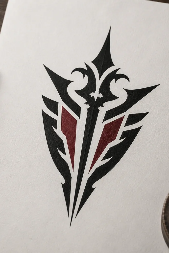
This is how you add color without losing the expensive look. Muted burgundy reads like old wine, which fits the Hybern vibe better than bright red. The crest stays readable because most lines are black, and the color is placed in tiny wedges or seals. That limited color placement creates contrast and makes the tattoo feel finished.
Put it on the upper arm outer panel or the side of the ribs where you can keep it flatter. Size it around 3 inches tall. Ask for burgundy only in small inner fills and keep black lines crisp around it.
Pro tipBring a reference for "muted burgundy" rather than cherry red - ask the artist to test the tone on your skin first.
AvoidAvoid full-color fills - they heal uneven and often turn dusty.
5. Rhysand's Night-Feather Outline with Soft Smoke Shadow
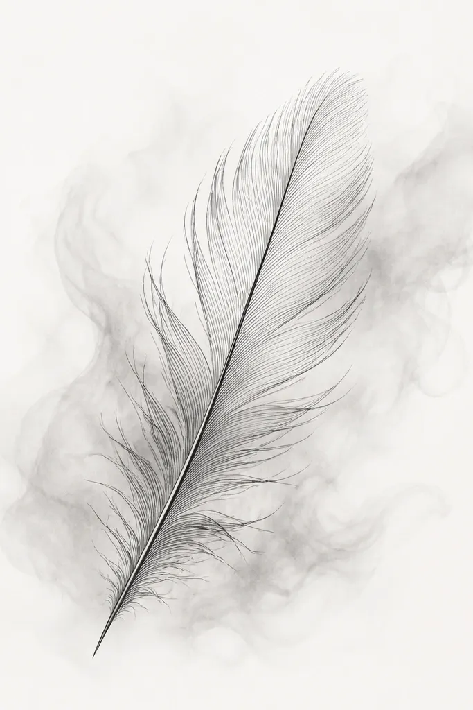
Feathers look expensive when the outline is clean and the shading is controlled. The smoke shadow creates depth without turning the tattoo into a gray cloud. Keep the feather itself mostly linework, then add gray where the "barbs" would catch light. It feels ACOTAR because it reads like a night motif, but it stays tasteful and not cartoonish.
Place it on the upper back near the shoulder blade or the outer upper arm. Size it about 4 to 5 inches long. Ask for the smoke shadow to fade quickly - no hard-edged background.
Pro tipTell your artist to keep the feather's negative space crisp so the barbs don't fill in during healing.
AvoidSkip heavy black fill - it makes feathers look like a silhouette stamp.
6. Illyrian Wings Fragment with Pearl-Gray Highlights
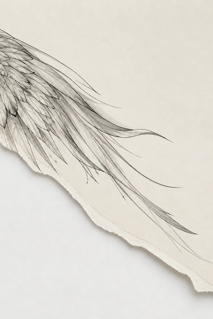
A fragment wing is more elegant than full wings because it avoids the "big back tattoo" heaviness and keeps the detail crisp. Pearl-gray highlights mimic the way light catches feathers. The torn-page feel makes it bookish and ACOTAR-adjacent without copying a character. This is the kind of tattoo that looks expensive in winter coats because it stays sharp against skin.
Place it on the upper thigh outer side or the side of the rib cage. Keep it smaller, around 3.5 to 4 inches. Use thin gray streaks, not blanket gray - your artist should leave many lines unshaded.
Pro tipAsk for dot highlights only on the top edge of the wing, like a highlight line broken into tiny points.
AvoidDon't cram micro-feather lines everywhere - too much detail in one area blurs.
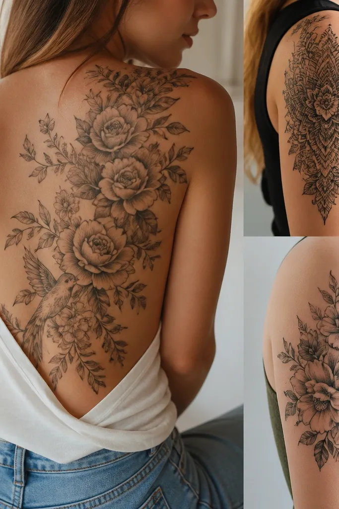
7. Court of Dreams Flower Seal with Green-Gold Micro Color
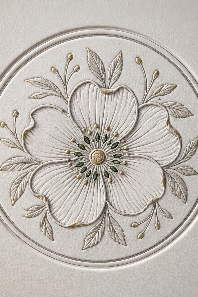
Flowers can look cheap when they're outlined thick and colored heavily. This version stays elegant because it uses micro color accents - tiny dots or thin wedges - over mostly blackwork. Forest green feels botanical and fits the dreamy court vibe, while muted gold makes it look like an old book illustration with a metallic ink note. The circular seal gives it a "stamp" feel that reads expensive.
Place it on the ankle outer side or the upper arm inner side. Keep the seal around 2.5 to 3 inches across. Ask for gold only as tiny highlights, never as a full fill.
Pro tipRequest smooth gray gradients in the petals so the black lines don't look stuck on top.
AvoidAvoid using bright neon green - it heals dull and makes the tattoo look off.
8. The Cauldron as an Ink-Only Ring with Negative Space Steam
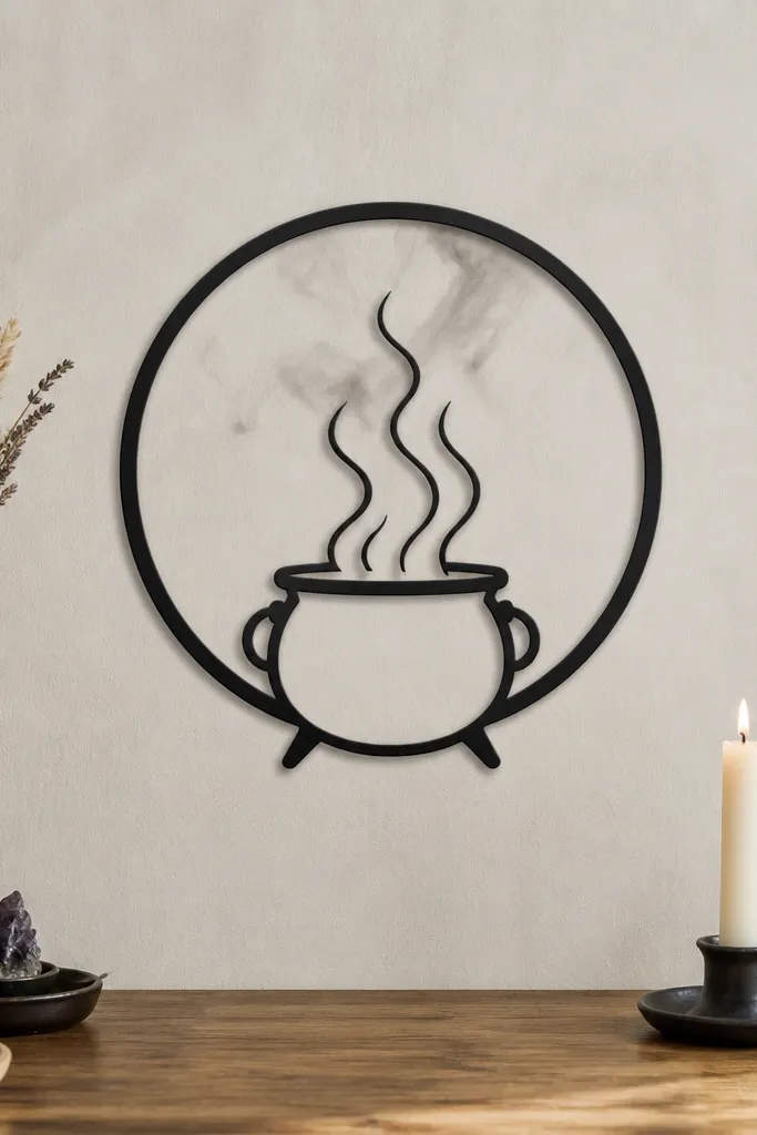
Ink-only ring designs look expensive because the composition is simple and clean. The cauldron reads through the outline, and the steam is created by leaving skin uninked - that's the trick. Add only a couple soft gray wisps so the steam looks like it's drifting, not printed. This looks stunning on people who want ACOTAR symbolism without dark backgrounds.
Place it on the upper chest center or the lower neck/upper collarbone area, vertically or slightly tilted. Size it around 2.5 to 3 inches wide. Ask your artist to avoid filling the inside - the steam lines need space to show up after healing.
Pro tipUse placement that has less skin stretch than forearm - it keeps the ring from warping.
AvoidDon't add a full smoky background - it kills the negative-space steam effect.
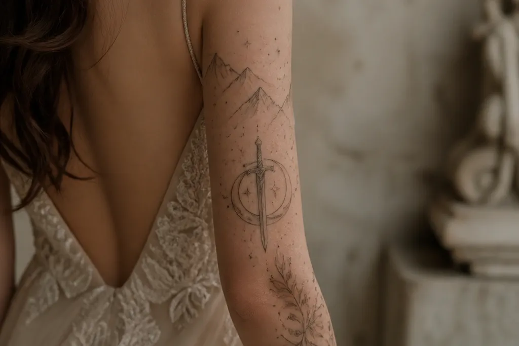
9. Book Spine Tattoo with a Single ACOTAR Court Symbol
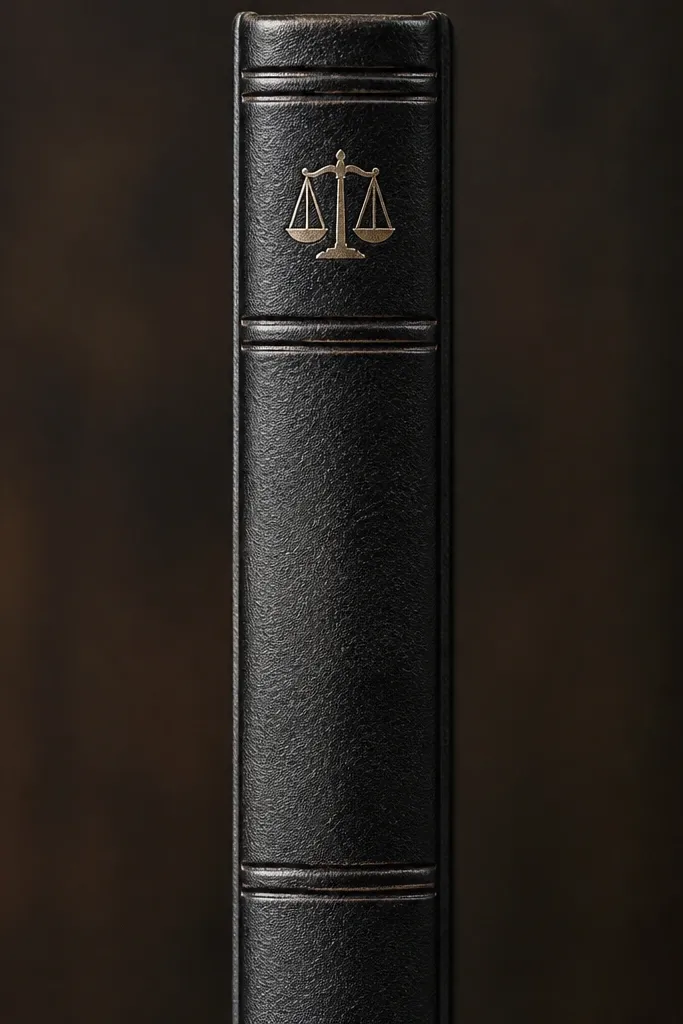
This is one of my favorite ways to do bookish tattoos without risking text readability over time. The spine lines create that "old hardcover" look, and the single court symbol gives you the ACOTAR tie-in. Because there's no tiny text, it heals cleaner. The expensive look comes from consistent line weight and a gentle gray shadow that makes the spine feel raised.
Put it on the inner upper arm or side of the ribs. Make it tall and narrow - about 5 inches tall, 1 inch wide. Ask for a light gray shadow on one side of the spine lines only.
Pro tipRequest the spine lines to be slightly off-center so it looks like a real book, not a perfect diagram.
AvoidAvoid tiny serif lettering - it blurs faster than symbols.
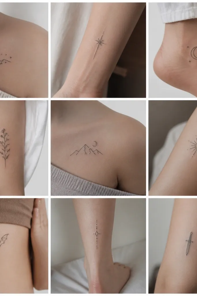
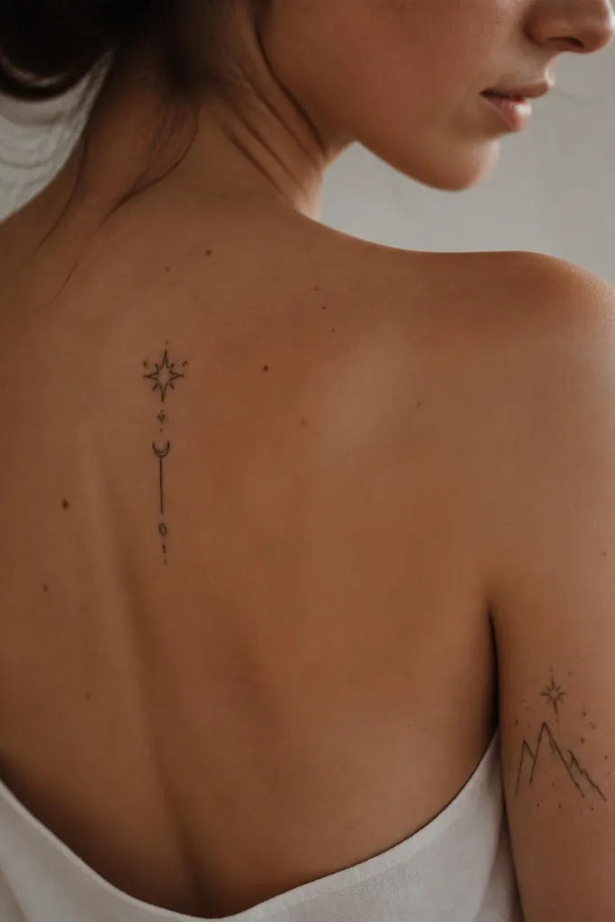
10. Star-Shot Constellation with One Jewel Dot
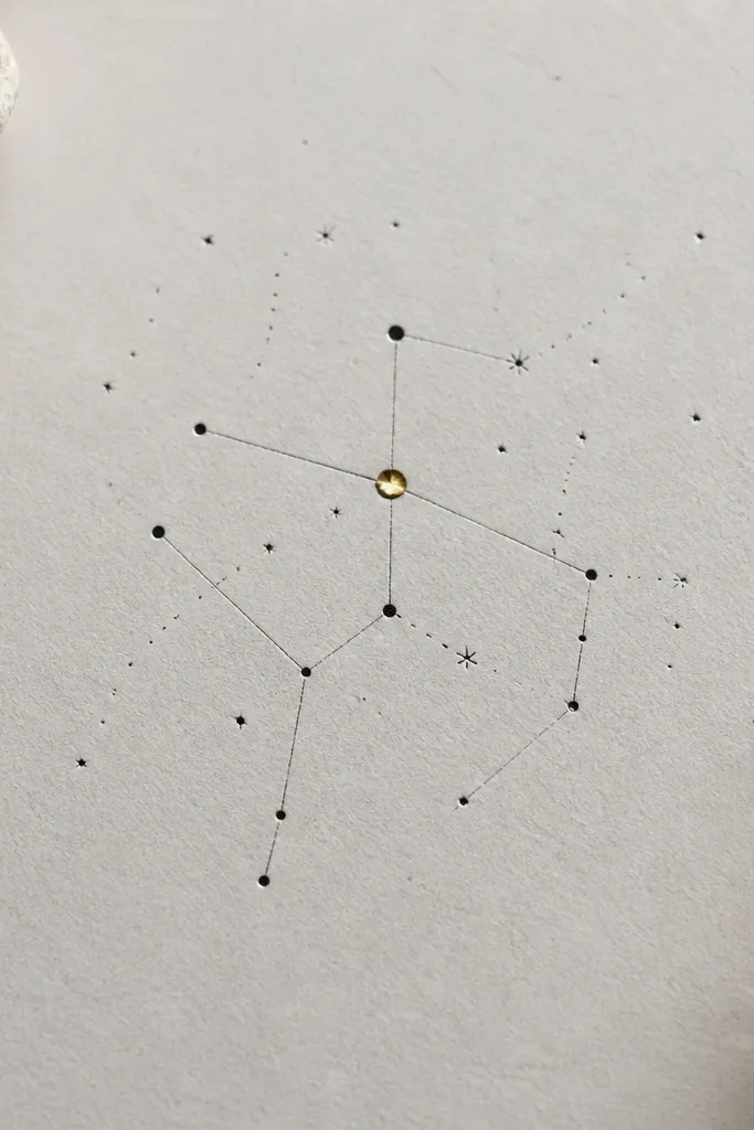
Constellations look expensive when they're sparse. This one keeps the lines thin and the dot sizes varied slightly so it feels natural. The single jewel dot gives you that "expensive ink" flash without turning into a rainbow cluster. It's ACOTAR-coded through the star imagery, and the minimal approach keeps it elegant.
Place it on the back of the upper arm or shoulder blade. Size it about 3 inches across. Ask for the jewel dot to be small - like a pinhead highlight - and keep the rest monochrome.
Pro tipUse a slightly curved line for the constellation so it matches the body's contour.
AvoidDon't make every dot the same size - that's what turns it into a cheap sticker look.
11. Thorned Heart Outline with Dark Ink Center Fade
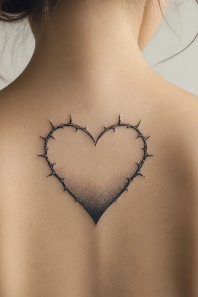
This heart is classy because it's mostly negative space. The thorns add drama, but the design avoids overfilling, so it stays clean after healing. The dark ink fade gives depth without a solid block of color. It looks expensive because the fade is smooth and the heart outline stays crisp.
Place it on the sternum or upper chest, centered, or on the upper arm inner side. Keep it about 3 inches tall. Ask for the fade to be one-direction only, so it doesn't look muddy.
Pro tipTell your artist you want the fade to stop before the top thorns so the outline stays sharp.
AvoidSkip full black hearts - they heal thick and flat.
12. Emerald Court Leaf with Gold Thread Border
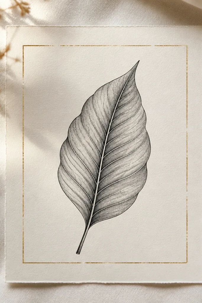
Gold thread borders look like expensive stationery or antique book binding. The leaf stays readable because it's centered and uses gray shading to show form. Emerald ink should be muted, not bright - think deep forest with a slight gray undertone. The gold thread is minimal, so it doesn't look like a cheap glitter tattoo.
Place it on the ankle bone area or outer forearm. Size it around 2.5 to 3 inches long. Ask for the gold thread line to be hair-thin and slightly uneven like real thread.
Pro tipUse a single emerald accent line in the leaf veins, not full leaf fill.
AvoidAvoid thick gold outlines - they can look raised and heal uneven.