1. Charcoal rose + smoke gradient panel
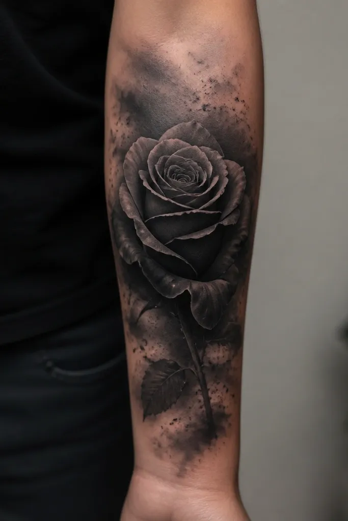
This works because a rose gives you a clear focal shape and the smoke gradient gives you a controlled way to swallow older lines. I like charcoal and cool gray for forearms because they sit closer to what most old black ink already looks like, so the cover reads cohesive during healing. The tiny ash flecks break up any leftover edges from the original tattoo and keep the design from looking like a flat sticker. The overall feel is moody, but still feminine because the rose silhouette stays soft.
Place the rose so its base sits about 1.5 inches above the wrist crease and the top lands around the mid-forearm. Keep the smoke gradient wider than the rose by 1/2 to 3/4 inch on each side so it can bury stray lines. If your old tattoo is mostly lettering, let the smoke gradient extend under where the letters were - that hides uneven spacing better than trying to cover with petals alone.
Pro tipAsk your artist for a "hard edge" on the rose outline and a "soft edge" in the background smoke. That contrast is what makes it look designed, not blended.
AvoidAvoid using only thin linework for the rose center - it heals lighter and can expose the old tattoo through the gaps.
2. Warm red peony with broken dot shading
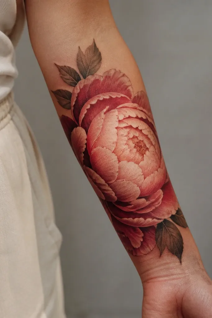
A peony gives you thick petal surfaces that can hide old shapes fast. The warm palette (brick red, dusty rose, and a touch of peach) works well when your original tattoo is black or heavy gray because the new pigment has a different color story, not just darker gray over gray. Broken dot shading is the trick I like for cover ups - it breaks up old line directions and makes the background feel intentionally textured. It also looks more alive than a smooth wash once healed.
Size the peony so it spans about 4 to 5 inches in length. Put the darkest petal blocks at mid-forearm where old ink is usually darkest, then fade toward the ends with lighter peach highlights. Include a few small negative-space highlights in the petal folds so the cover keeps a delicate look even when it's covering something bold.
Pro tipChoose a stencil that lets petals overlap the old tattoo edges by at least 1/4 inch. Overlap is how you hide stubborn corners after healing.
AvoidSkip neon red - it looks bright when fresh and can turn muddy as it settles, which makes old ink edges easier to see.
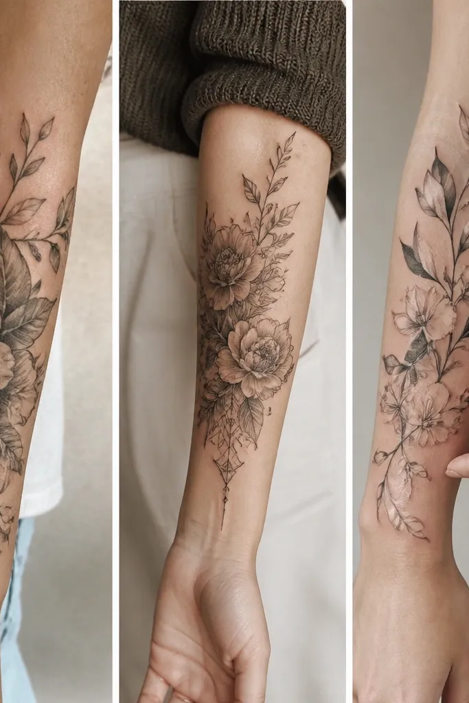
3. Botanical sleeve band with sage green leaves
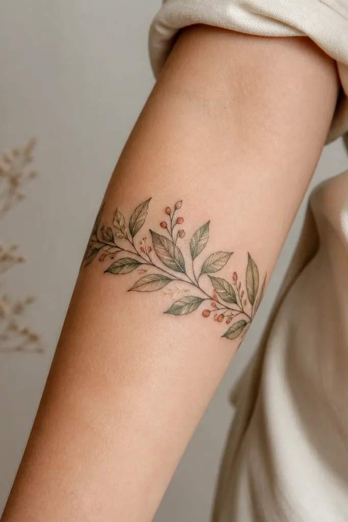
Bands are underrated for cover ups because they follow how the skin wraps and they hide uneven healing across a smaller area. Sage green and olive are great over black ink because they cover old contrast without turning the whole piece into a single dark blob. The leaf veins and small stems give your eye places to land, so you don't notice any leftover edges from the previous tattoo. It looks feminine because the band feels like a wreath, not a cover plate.
Aim for a band thickness of about 1.5 to 2 inches. Place it so the thickest leaf cluster sits at the outer forearm, then let thinner stems trail toward the inner side. For the best blend, use darker olive in the lower half and lighter sage on the upper half, matching how light hits the arm.
Pro tipWear a short-sleeve to your appointment and ask your artist to align the band with your arm's natural curve when your elbow is bent. That's how you prevent the band from looking crooked later.
AvoidDon't outline every leaf in heavy black. It can look like a sticker and make the cover seem like it's sitting on top instead of flowing with the skin.
4. Butterfly and floral lattice over old script
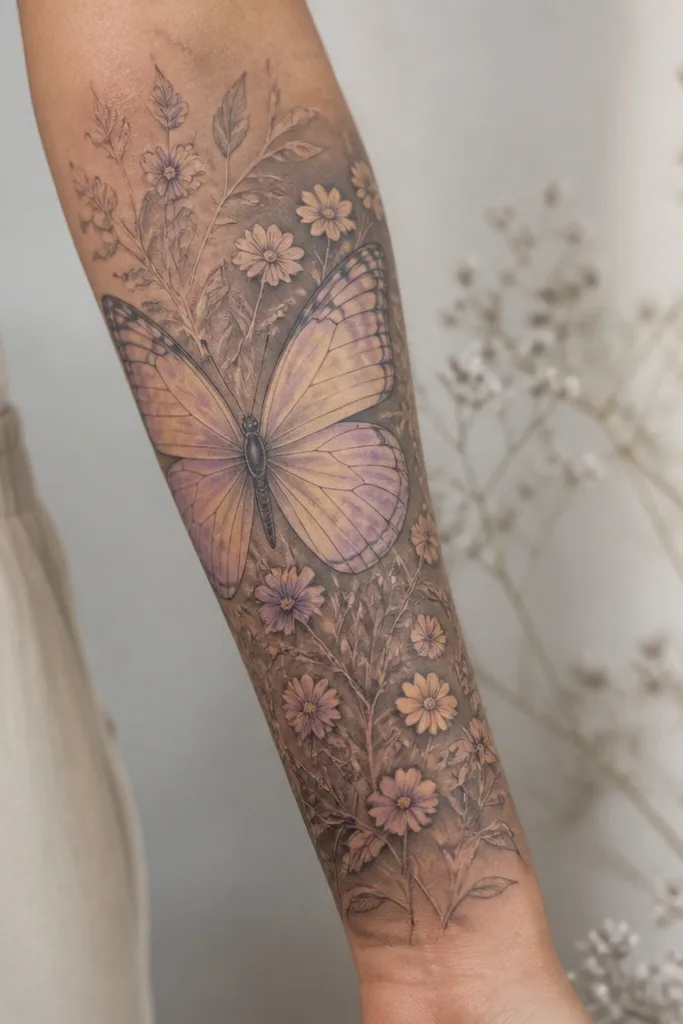
If your old tattoo is mostly script or thin lines, a butterfly with a floral lattice helps because it interrupts the reading direction. The wing gradients use light-to-mid tones to create depth, while the slightly darker shading behind the lattice absorbs lingering letter fragments. I like adding a few thicker "anchor" flowers at the ends of the lattice - it keeps the whole piece from looking fragile over dense old ink. The butterfly also gives you a natural focal point that makes the cover feel intentional.
Plan the butterfly so its body sits around mid-forearm and the wings extend about 2 inches across. Put the lattice where the old script was, but keep the densest shading behind the parts that used to be darkest. Add tiny flower buds in a warm cream and lilac so the color breaks up any leftover linework.
Pro tipAsk for a stencil that follows the direction of the old text, then design the lattice to wrap across it. When the cover fights the same direction, it hides better.
AvoidAvoid full watercolor bleed everywhere. Too much soft edge can leave letter ghosts visible after healing.
5. Geometric triangle cover with warm skin-tone fades
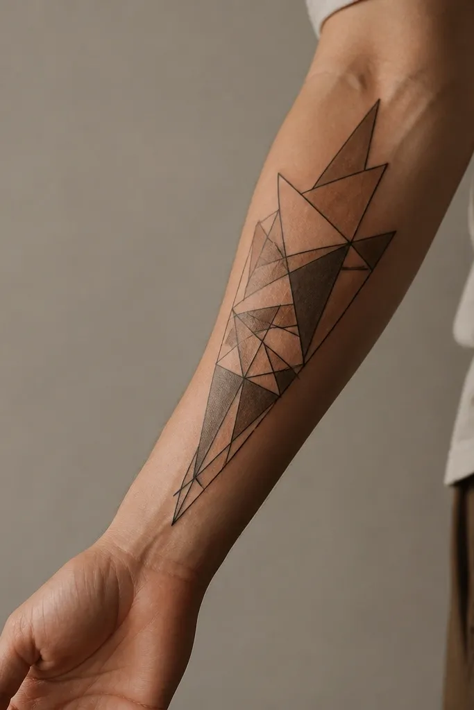
This is my go-to when the old tattoo is a solid block or a heavy outline and you want something that still looks clean. The geometric shapes let you place darker values exactly where the old ink is thickest, then use warm skin-tone fades to blend outward. It looks aesthetic because the negative space and crisp edges keep it graphic, not messy. Forearms show everything, so geometry helps you control the final look.
Use three to four triangle layers, with the darkest layer in the middle. Keep the warm beige fades smooth but not watery - you want a soft transition that doesn't turn patchy. Place the main triangle cluster slightly above the wrist crease so it doesn't get squished when you flex.
Pro tipIf your skin is very cool-toned, shift the beige toward light peach in the stencil. Warm fades hide better on cool skin than flat gray tones.
AvoidDon't rely on "covering" with beige only. Beige alone often looks spotty after healing, so you need real dark value placement too.
6. Portrait-style cat face with dotwork fur
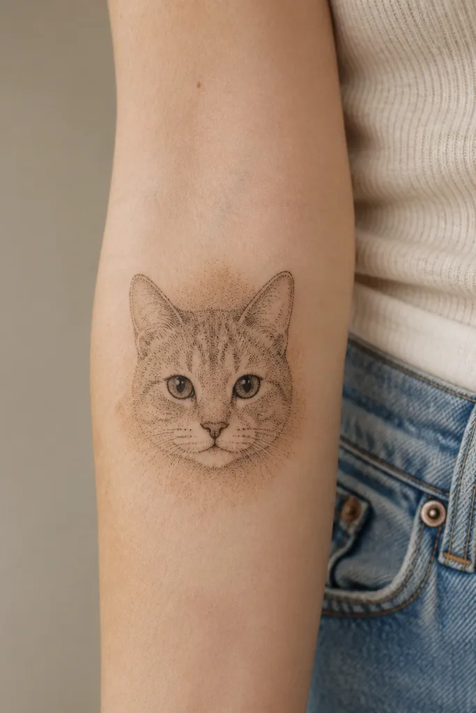
I've covered old tattoos with portrait elements more times than I can count, and dotwork fur is one of the best ways to do it on a forearm. The dots create texture that hides uneven underlayers, and the eyes give you a sharp focal point that makes the cover feel premium. A faint warm brown wash under the face helps the overall piece look cohesive even if the old tattoo peeks through lightly in the edges.
Keep the cat face about 3.5 to 4 inches tall so it fits the forearm without warping. Place it so the top of the head sits near the middle of the arm and the chin points toward the outer side. Use darker dot clusters around the eyes and cheeks, then lighten the dot density outward to blend.
Pro tipAsk for two dot sizes - one tight for the face shading and one slightly larger for background texture. That contrast keeps it readable after healing.
AvoidAvoid using only straight-line shading. It can reveal the old tattoo's direction when the skin tightens.
7. Sacred heart with ribbon banner and soft shading
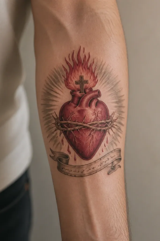
A sacred heart cover works because it has built-in contrast: deep red, bright highlight, and a gray halo to absorb old black lines. The ribbon gives you a place to hide lettering without keeping it readable, which is important when you're covering messy old text. I like using soft gray halo gradients instead of sharp backgrounds because they help blend the edges of the cover. It looks romantic but still bold enough for forearm coverage.
Size the heart so it spans about 3 to 4 inches tall. Keep the halo wider than the heart by at least 1 inch on each side. For the ribbon, use decorative strokes instead of actual words if your old tattoo was text-heavy - you don't want overlapping letter shapes fighting each other.
Pro tipIf you want it to look feminine, add a small cluster of tiny heart-shaped sparkles in warm cream near the highlight area, not across the whole tattoo.
AvoidSkip super-thin linework for the ribbon. It heals uneven and can make the cover look like it's fading around the edges.
8. Japanese-inspired koi with wave block cover
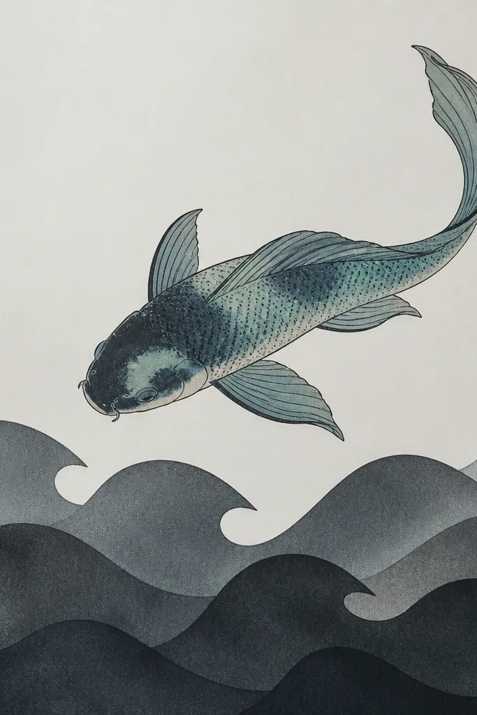
Koi covers are effective when you need to cover a bigger area without turning it into a single dark patch. The waves let you place dark charcoal blocks exactly where the old tattoo is densest, while the koi body in teal-blue adds a new color direction. Fine dot scales help fill gaps and make the transitions look smooth after healing. It's aesthetic because the movement lines are clear even if the underlayer is uneven.
Place the koi so the head sits toward the outer forearm and the tail tapers toward the inner side. Use wave blocks that overlap the entire old tattoo zone by about 1/2 inch. Keep the koi outline slightly thicker than the waves so your eye reads the fish first.
Pro tipChoose slate and charcoal wave tones, not pure black. Pure black can look too heavy and make the koi fade visually as it settles.
AvoidAvoid crowded backgrounds with too many wave layers. Too much noise makes cover ups look like they're fighting each other.
9. Crescent moon + star scatter with navy wash
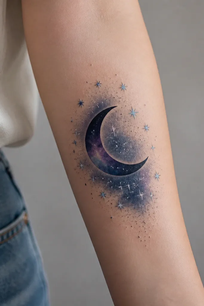
This style hides because the navy wash gives you a wide, consistent field to bury old lines. The crescent moon creates a strong silhouette, and the star scatter breaks up any leftover edges. I like navy and indigo over black because it looks intentional and it still reads dark enough to cover. The silver star highlights add a clean, modern finish that looks good even when the forearm is bare.
Center the crescent around mid-forearm and let it taper toward the wrist. Keep the star scatter slightly denser near the moon and sparser at the ends so the design doesn't look like a stamp. Use a fade that extends beyond the old tattoo by at least 3/4 inch to catch stray lines.
Pro tipAsk for the stardust specks to be tiny and sparse. When they're too large, they look like leftover stencil ink after healing.
AvoidDon't place stars only in one straight line. Forearms curve, and straight placement can expose the cover boundaries.
10. Floral vine with black-and-rose dot accents
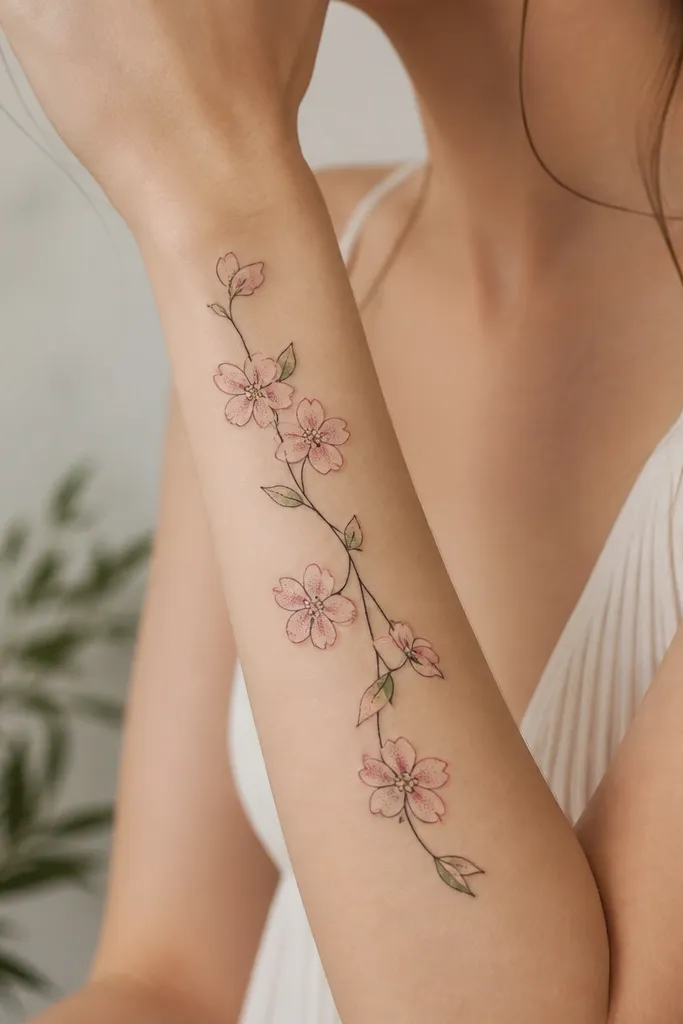
This works when you want coverage that still looks delicate, but you need a real plan to hide underlines. The rose-pink dot accents create midtone texture that distracts from old linework, while the black vine gives structure. I've used this approach to cover faded black outlines because the dot shading adds density where it matters and leaves the rest lighter for a natural look. The result reads like a designed vine, not a random cover patch.
Follow the forearm's length with a vine that starts near the wrist crease and rises toward mid-forearm. Keep the densest clusters over the darkest old tattoo sections. Use light green leaves only in small amounts so they don't look like a separate sticker layer.
Pro tipMake the vine slightly thicker at the center and thinner toward the ends. That taper makes the cover look like it grew there.
AvoidAvoid tiny flowers packed too close together. They blur after healing and can reveal the old tattoo pattern through the fuzz.
11. Ombre sleeve patch in plum + charcoal
This is the "I need it gone fast" option when the underlayer is messy and you don't want to think about hiding specific shapes. Ombre patches work because the gradient spreads coverage across an area, and the plum center gives you a feminine color that still reads dark enough to bury old ink. The brush-like streaks add movement so it doesn't look like a plain rectangle. I've found this style looks best on forearms when you keep it as a patch, not a full sleeve.
Keep the patch height around 4 inches and width around 2 to 3 inches. Place the plum center over the darkest underlayer area and fade into charcoal toward the edges. Have the artist add a few darker streaks in the center so the transition looks intentional, not like a fade job that stops abruptly.
Pro tipIf your skin scars easily, ask for a slightly tighter edge at the boundaries of the patch. It reduces the chance of a light halo after healing.
AvoidAvoid a perfect oval or rectangle with hard borders. Hard borders draw attention to where the cover starts.
12. Floral blackout edges with clear negative-space heart
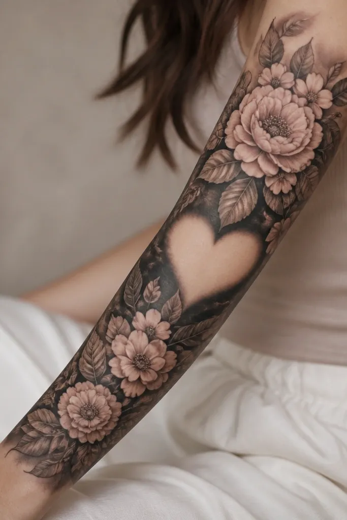
This one hides because it uses dark framing where you need opacity, then gives your eye a clean negative-space shape in the middle. That contrast makes the piece look graphic and intentional, even if the underlayer is uneven. Muted blush and gray keep it soft, while the charcoal edges cover the old tattoo's mess. The negative-space heart is a strong design element that makes the cover look planned instead of camouflaged.
Place the negative-space heart centered over the densest old tattoo area. Build the charcoal shading around it first, then add flowers so their petals overlap the charcoal edge by about 1/4 inch. Keep the negative-space heart size consistent from top to bottom so it doesn't distort when the forearm flexes.
Pro tipWear long sleeves to your appointment and ask your artist to check the negative-space shape while you flex your wrist. That tells you if it stays heart-shaped after movement.
AvoidDon't make the negative-space heart too small. Small gaps can blur as skin sheds, and then the cover loses the clean center.