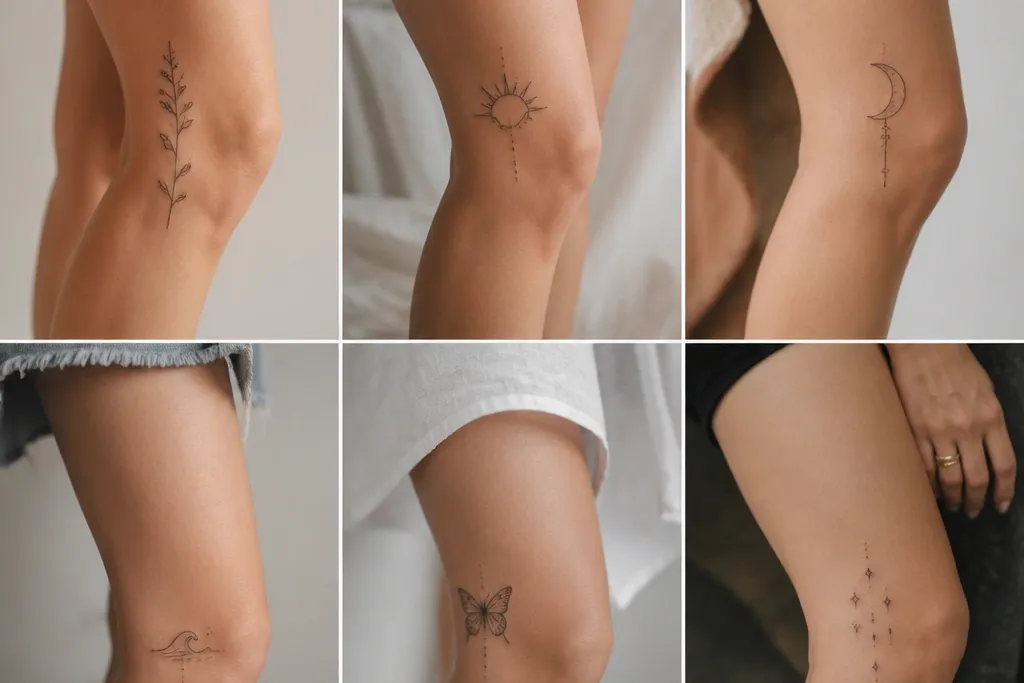
1. Outer-knee micro star cluster
This placement works because stars stay readable even when the knee flexes - there's no shading to blur into gray. Keep them micro and let the negative space do the design. I like pure black for the simplest look, with one slightly larger star as the anchor.
Place the biggest star around the 3 o'clock side, about 2 finger-widths above the knee crease. Arrange the rest in a shallow arc going up toward 2:30 o'clock. Line them up so their points rotate along the leg angle, not perfectly vertical.
Pro tipAsk for a stencil test while you bend - if any star crosses the crease line, move the whole cluster up by 1 cm.
AvoidAvoid larger stars or any gray wash here; it looks faded faster on the outer knee.
2. Single-line crescent with a tiny dot
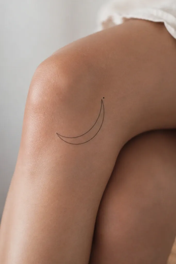
A crescent outline reads clean in minimal style and doesn't depend on heavy contrast. The tiny dot adds balance and gives your eye a stopping point when the knee moves. The diagonal tilt matches the way skin stretches along the outer leg.
Position the crescent so its open side faces toward the calf. Put the dot near the upper tip at about 2:45-3 o'clock. Keep line weight consistent - ask for needle work that stays uniform at about the width of a fine pen line.
Pro tipChoose one of two sizes: either 1.5 cm long for a discreet look or 2.5 cm long if you want it visible under shorts.
AvoidDon't thicken the crescent edges after the stencil - heavy lines can look like a blob after stretching.
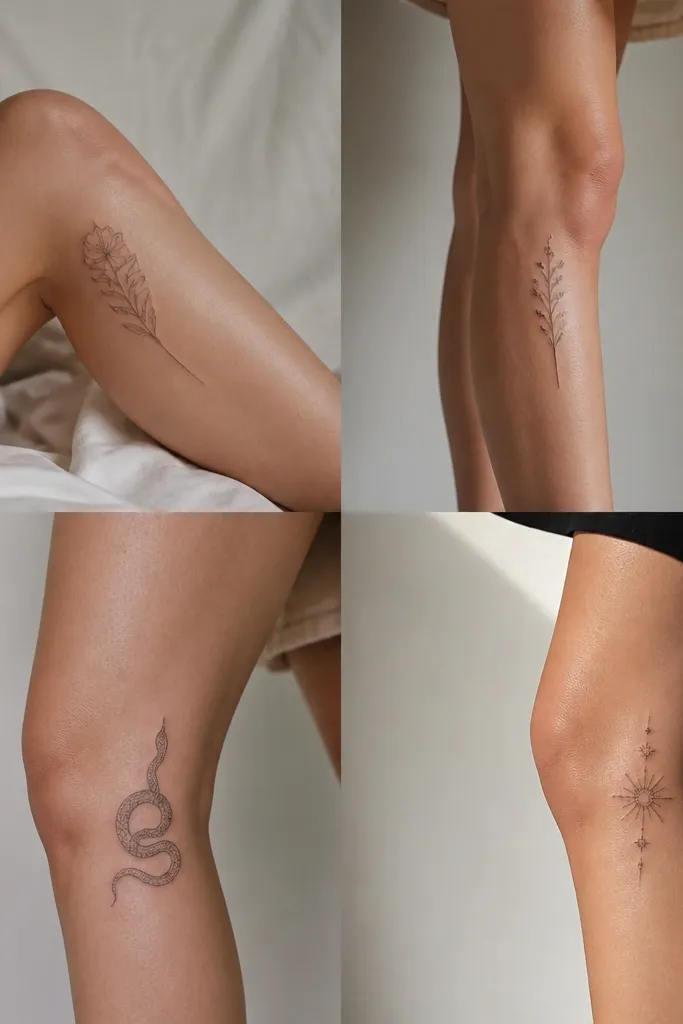
3. Minimal leaf stem pointing upward
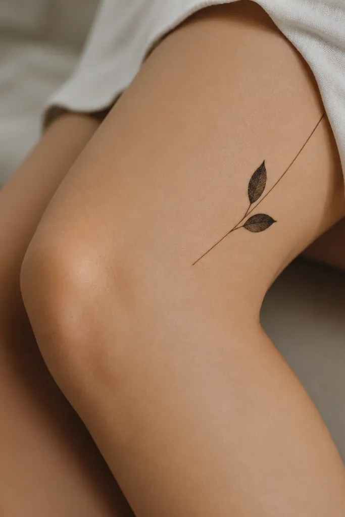
Leaf tattoos feel feminine but this one stays minimalist by using negative space and a single continuous stem. The upward stem direction helps the design keep its shape when you walk. Use flat black, no heavy fill, so it stays crisp.
Anchor the base of the stem at the outer knee side around 3:30 o'clock. Place the top leaf about 1.5-2 cm above the crease line. Make the leaves mirror each other in size so it looks intentional from both angles.
Pro tipAsk your artist to do a few test lines on the stencil area with transfer gel - you're checking that the line width looks delicate, not scratchy.
AvoidSkip tiny dot shading on the leaves - it clogs and turns muddy on knee skin.
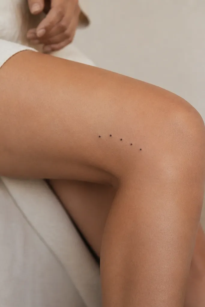
4. Three-dot vertical micro constellation
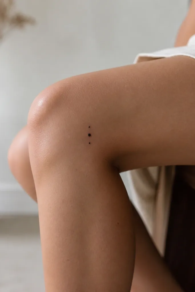
Dots survive movement better than thin lines because there's no long stroke to distort. A tiny larger center dot gives the piece a focal point. This is the lowest-commitment option that still looks like a deliberate design.
Place the bottom dot just above the crease on the outer side (around 3 o'clock), with the middle dot 0.8-1 cm higher. Keep all dots the same spacing so it doesn't look accidental. Use one-needle dot technique for clean circles.
Pro tipIf you wear leggings a lot, test where sock seams hit your knee - move the dots up so they don't rub daily.
AvoidAvoid dot clusters wider than 1.2 cm; they can blur together over time.
5. Thin geometric angle bracket
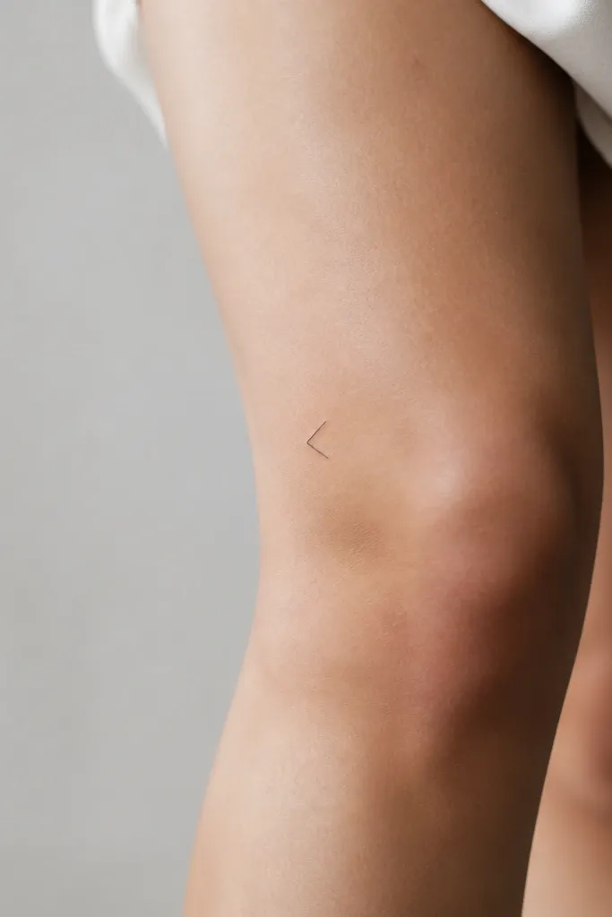
Geometric minimal tattoos look sharp when the lines are crisp and short. The angle bracket shape reads well even from the side when your knee bends. I like this design because it doesn't require shading to look finished.
Place the bracket so the "open" side points toward the calf. Position it around 2:30-3:15 o'clock on the outer knee, about 2 cm above the crease. Keep the width under 2 cm so it stays delicate.
Pro tipAsk for a stencil that includes the exact corner points; you want the artist to match your skin's contour with the angle.
AvoidDon't let corners get rounded - if the artist overworks the line, it turns into a soft squiggle.
6. Tiny lightning bolt with dot end
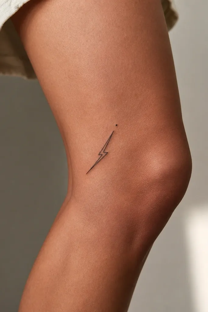
Lightning bolts look strong in minimal size because the silhouette stays recognizable even when the skin stretches. The dot end makes it feel balanced and intentional. Keep it black-only so it doesn't fade into gray.
Place the bolt so the base starts near the crease line but does not cross it, around 3 o'clock. Angle the bolt toward 2:15 o'clock. Keep the bolt length around 2-2.5 cm for readability.
Pro tipIf you're worried about pain, this design is fast - it usually takes less time than florals, and that matters for knee spots.
AvoidAvoid long bolts - they get weird when the knee folds.
7. Single-line ribbon curve
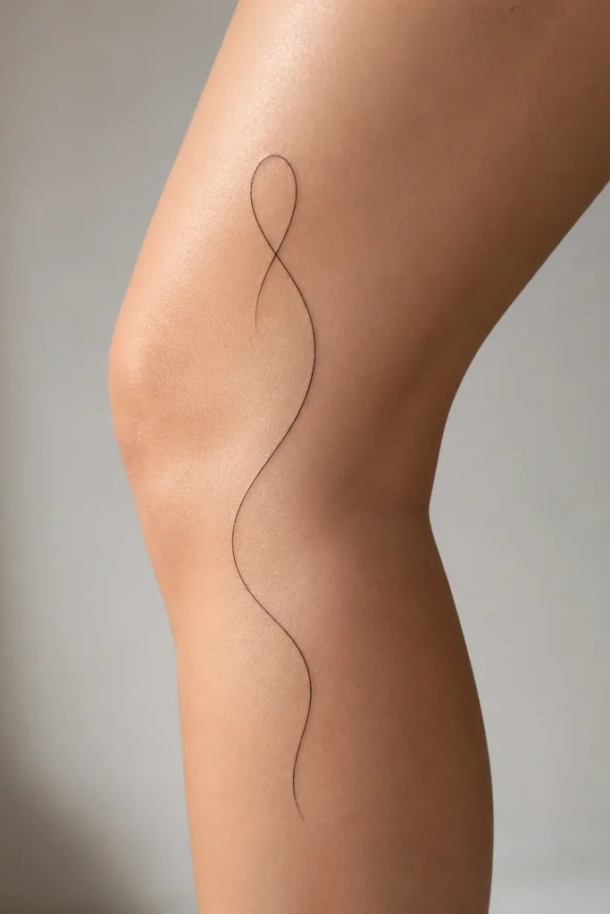
A single-line ribbon looks classy without adding bulk. Because it's one line, it keeps its character through movement. The small loop gives it shape without needing shading.
Place it on the outer knee between 2:45 and 3:45 o'clock, following the leg's natural curve. The loop should sit higher, about 2 cm above the crease. Keep the line weight consistent so it doesn't "thicken" as it curves.
Pro tipAsk for a slightly thicker first pass at the start point only, then keep the rest thin - it makes the flow look controlled.
AvoidSkip double lines close together; they blur into each other on knees.
8. Micro butterfly outline near outer crease
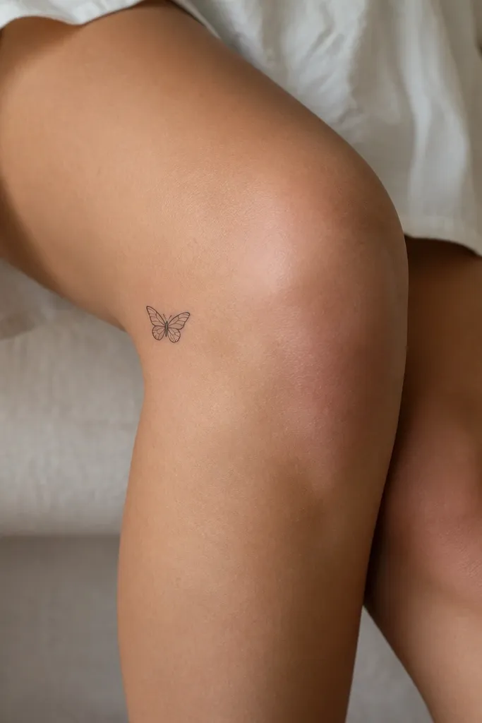
An outline butterfly gives you the look without the heavy fill that can blur. It's also easy to scale down so it stays crisp. Place it so the wings sit above the crease and the body stays aligned with the leg angle.
Position the body around 3:30 o'clock. Keep the wings small, total width under 2.2 cm. Make sure the bottom wing tips do not land on the crease line - move it up if they do.
Pro tipIf you shave that area, do it gently before healing starts - irritation makes outlines look cloudy.
AvoidAvoid fully filled butterflies; knee friction makes fills fade unevenly.
9. Minimal paw print, half-size
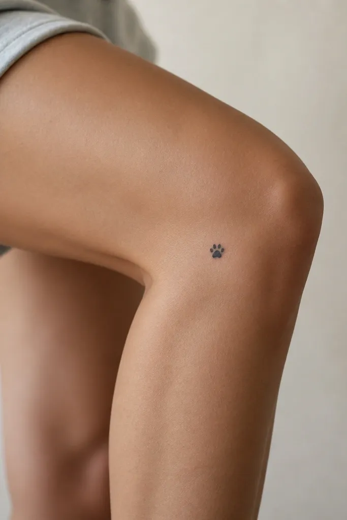
A paw print works because the pads are naturally separated shapes, so they read even when skin stretches. Half-size keeps it from turning into a single black blob. Use a clean stencil with evenly spaced toes.
Place it at about 3 o'clock, with the paw facing toward the thigh. Keep it about 1.6-2 cm wide. Make the toes slightly rounded, not sharp - knee skin makes sharp corners look harsher.
Pro tipChoose a paw print design with simple toe shapes, not lots of tiny texture lines.
AvoidDon't add whisker-like lines for detail; they vanish fast on this spot.
10. Outer-knee dot trail with one comma
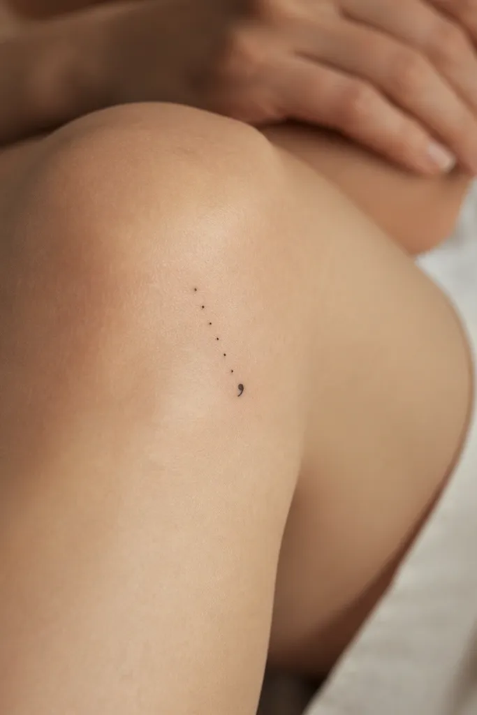
Dots give you that minimalist "floating" effect, and the comma end adds motion. This also hides early fading better because you're not relying on a long continuous line. The diagonal trail matches how your skin stretches when you walk.
Start the trail near 3:15 o'clock, then angle up toward 2:15 o'clock. Keep the dots spaced about 3-4 mm apart. Place the comma mark at the top end; it should be about 5-7 mm long.
Pro tipAfter healing, wear a tight sock for a week and check rubbing - if it scuffs, you'll know to move the placement on a future piece.
AvoidAvoid too many dots (more than 9); it looks like a smudge after a year.
11. Micro barbell with two tiny circles
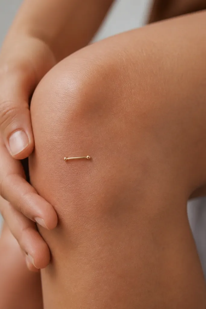
This is a great minimalist option if you want something sporty. The circles give the bar a finished look even if the skin stretches slightly. Use black-only ink and keep the bar length short so it doesn't warp visually.
Place the bar diagonally instead of straight across the knee, around 2:45-3:15 o'clock. Keep total length under 2.5 cm. The circles should be the same size, about 3-4 mm each.
Pro tipIf you want it to look symmetrical, ask the artist to measure with calipers on the stencil before tattooing.
AvoidDon't place it right on the crease; it will look bent when you sit.
12. Minimal arch line with tiny notch
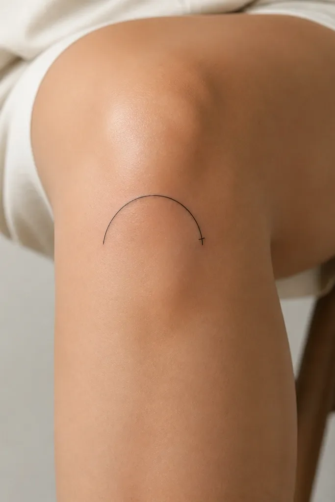
An arch line mimics the knee contour, so it looks natural from the side. The notch adds character and keeps it from feeling generic. Because it's single-line, it heals cleaner than filled shapes.
Position the arch so the ends sit just above the crease at about 2:40 and 3:40 o'clock. The notch should be slightly off-center, closer to the top end. Keep line weight consistent and avoid double passes.
Pro tipAsk for a slightly smaller arch than you think. Knee skin makes it look bigger once healed.
AvoidAvoid heavy black fill behind the arch; it makes the linework look thicker than intended.


