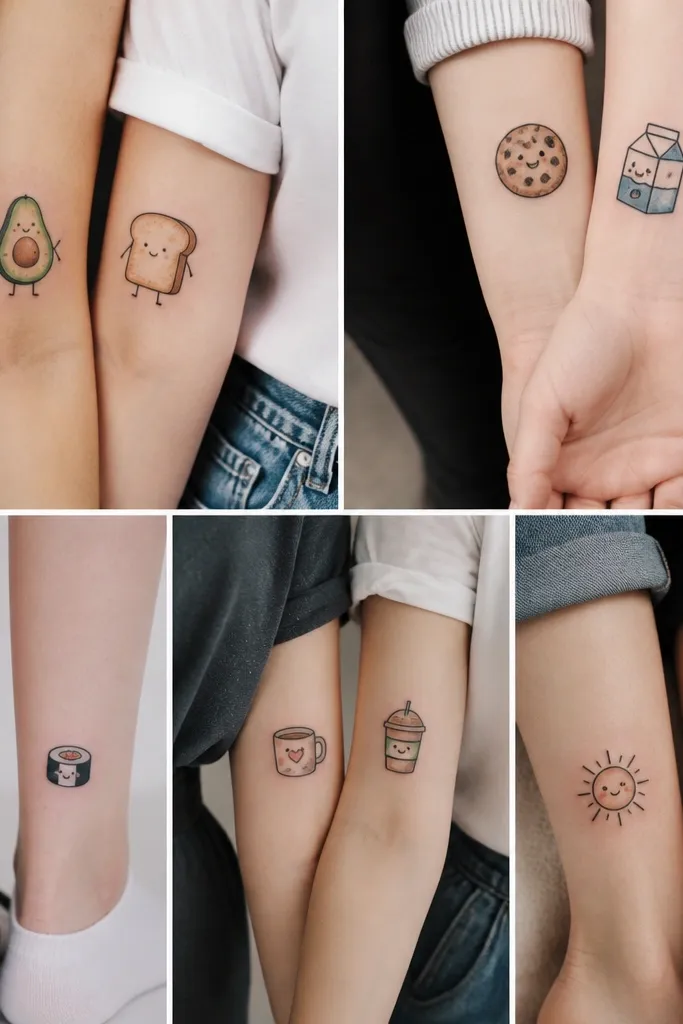

1. Tiny Knee Cuff Dot Line
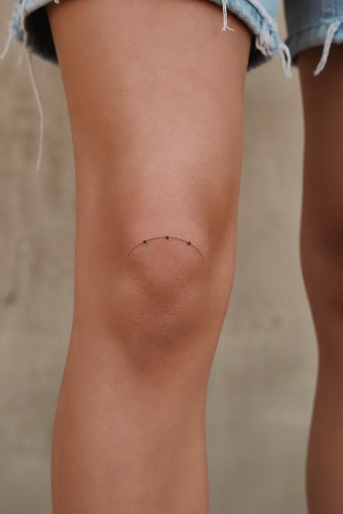
This works because it is built from simple geometry that stays legible as your skin stretches. The three dots give you a focal point, while the curved arc mimics the kneecap shape. It reads like jewelry from a distance but it is still cheap because it is quick to stencil and shade-free.
Place it on the outer front knee area, slightly above the crease. Keep the dot diameter around 1.5-2 mm and keep the whole piece under 4 cm wide so it does not drift when you bend. Black ink only is the cleanest route for budget pricing.
Pro tipAsk your artist to test the stencil with your leg bent, not just standing straight.
AvoidSkipping size control and letting the arc get too wide makes it look like a smudge after healing.
2. Micro Crescent Above the Kneecap
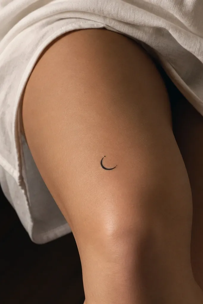
A crescent is forgiving because it has one clear outline. Centering it above the kneecap keeps the curve aligned with how your skin shifts. The tiny star dot adds personality without adding time.
Size it to about 2.5-3.5 cm across. Place it on the front inner edge of the knee where it looks balanced even when you walk. Use solid black for the crescent and one solid dot, no gray wash needed.
Pro tipIf you want it to look extra crisp, ask for a slightly thicker outer line and a thinner inner edge.
AvoidPutting the crescent directly on the crease makes it flatten visually and blur sooner.
3. Single Minimal Rosebud Near the Inner Knee
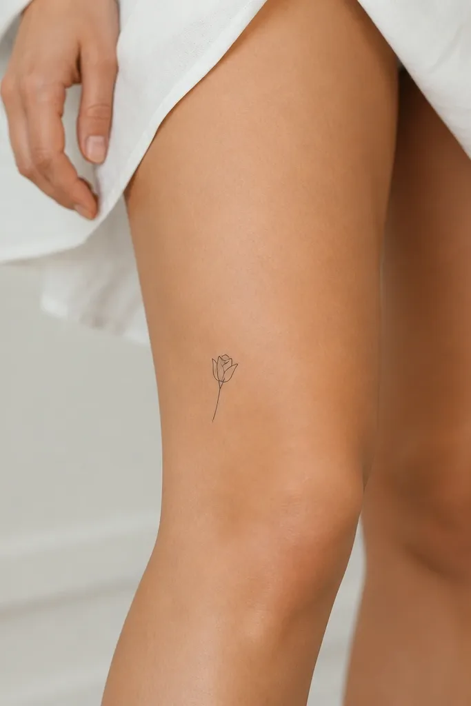
Linework rosebuds look delicate but still read clearly because the petals are bold outlines. Keeping it unshaded keeps cost down and prevents patchy gray in a high-movement spot. The inner knee location also makes it look intentional under skirts.
Keep the petals tight and avoid tiny leaf veins. Aim for 3-4 cm tall. Place it just above the inner knee joint, not on the very center of the kneecap. Black ink with clean negative space around each petal makes the design pop.
Pro tipBring a reference image of rosebuds with no shading and ask your artist to copy the same thickness of lines.
AvoidChoosing a rose with lots of micro-thorns and tiny dots usually heals into a gray blob.
4. Feather Tip Only
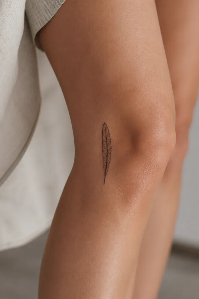
Feathers look good small because you only need the silhouette. A feather tip avoids the messy middle where lines often get crowded. The vertical orientation makes it look longer and more elegant as it moves with you.
Place it on the outer knee or slightly behind the knee line. Keep it 3-5 cm tall and keep the inner bars to 4-6 short lines. Stick to black ink so the feather stays crisp.
Pro tipAsk for the outer feather outline to be slightly heavier than the inner bars.
AvoidAdding full feather shading and gradients in the knee area usually heals uneven.
5. Three-Line Infinity Twist
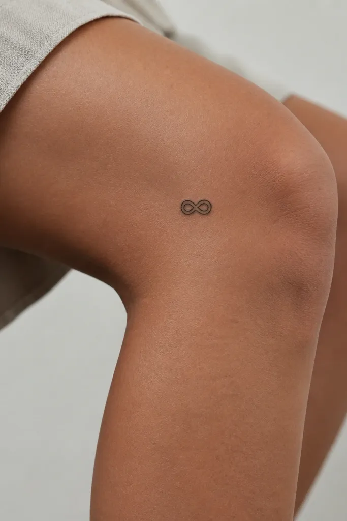
This design stays readable because it has thick structure even when skin stretches. Three parallel lines give it texture without needing any gray wash. It also looks good from the side when your leg bends.
Keep the infinity about 2.5-3.5 cm wide. Place it on the outer front knee where the symbol faces forward when you stand. Use consistent line thickness so the loops do not look like they were drawn by hand.
Pro tipIf you want it extra clean, ask your artist to stencil it using a digital stencil for symmetry.
AvoidIf the loops are too small, the three lines can merge and turn into a single dark blob.
6. Bow Tie Micro Outline
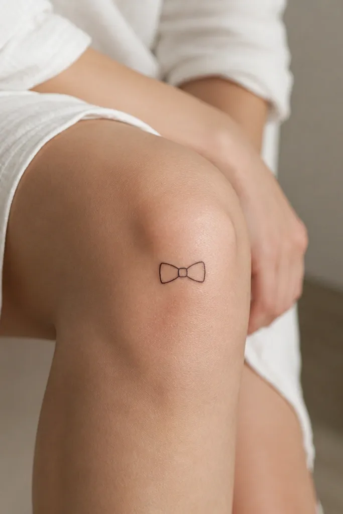
A bow tie works because it is basically two shapes. Outline-only designs heal well because there is less ink saturation. It reads playful but still minimalist if you keep the lines clean and the size tight.
Size it around 3 cm wide. Place it slightly above the kneecap so it does not get stretched onto the crease. Use black ink only, and keep the center knot small - about the width of one line.
Pro tipAsk for the bow tips to be rounded, not sharp, so healing looks smoother.
AvoidOver-thickening the outline can make it look like a sticker that never fully settles.
7. Tiny Saturn Ring (No Planet)
You get the space vibe without the extra detail of a planet. A ring is fast for an artist, and it heals predictably when it is just one shape. The tilt makes it look styled rather than stamped.
Make the ring about 2.5-4 cm wide. Place it on the outer top knee so the tilt faces your leg when you walk. Use solid black with one short break line - keep it under 5 mm.
Pro tipTell your artist you want a single continuous line with a clean taper at both ends.
AvoidAdding more rings or tiny stars under it often turns into clutter at knee distance.
8. One-Word Script Accent in Blocky Letterforms
Script can blur on the knee, so I like blocky letterforms with even spacing. One short word stays within a budget because it is quick and does not require shading. The spacing helps the letters stay distinct as the skin moves.
Keep the word to 4-6 characters max and size it about 2.5-3.5 cm wide. Place it on the inner knee so it shows when you wear shorts. Ask for consistent baseline alignment so it does not look crooked after healing.
Pro tipUse a stencil font that has thick strokes, not thin handwritten script.
AvoidChoosing ultra-thin script strokes usually turns into gray fuzz.
9. Minimal Butterfly Wing Outline
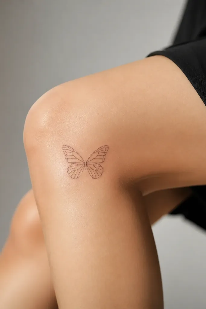
A wing outline gives you motion energy without the bulk of a full butterfly. No shading keeps it from looking muddy in a spot that moves a lot. Symmetry makes it look intentional even when it is small.
Place it on the outer side of the knee, not dead center. Keep it 3-4.5 cm wide. Use a clean line with 5-7 inner vein lines per wing max, and keep them short.
Pro tipAsk for the wings to be slightly separated so the negative space stays visible.
AvoidOverloading the wing with lots of tiny vein details makes it blur fast.
10. Geometric Triangle Stack
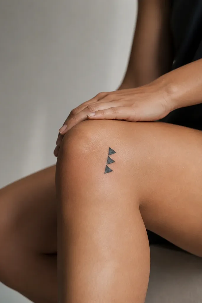
Geometric shapes heal well because the edges are clear. The offset stacking gives a modern look without needing gray shading. It also fits budget because it is mostly straight lines.
Keep each triangle about 8-12 mm tall and keep the whole cluster under 3.5 cm. Place it above the knee crease so it does not stretch into the fold. Use black ink only and keep the spacing between triangles visible.
Pro tipHave your artist draw the triangles with consistent line weight - uneven lines make it look cheap.
AvoidLetting triangles touch removes the negative space and makes the cluster turn into a single shape.
11. Tiny Keyhole With Dot
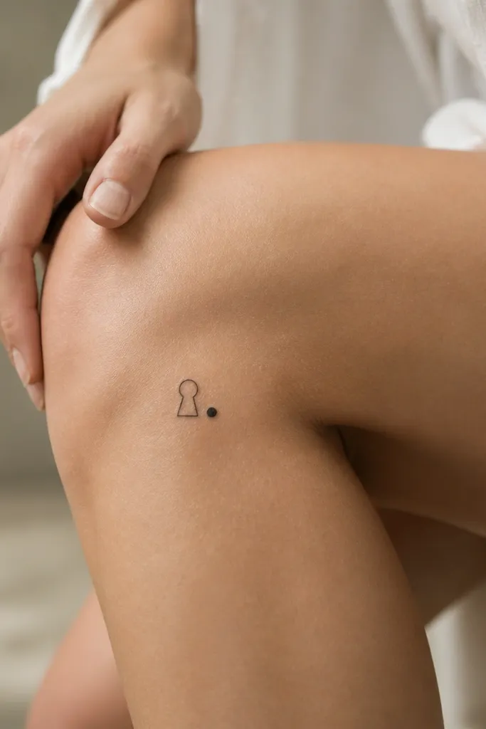
The keyhole shape reads instantly even at small size. The single dot adds balance and gives the tattoo a finished look. Outline-only keeps it clean and cheaper than anything with heavy shading.
Size it about 2.5-3.5 cm tall. Place it on the outer front knee so it shows under dresses. Keep the keyhole opening rounded and the dot about the size of the keyhole line thickness.
Pro tipAsk for the keyhole outline to be smooth and not angular.
AvoidUsing a tiny keyhole with overly thin lines often disappears as it heals.
12. Three Petal Minimal Flower
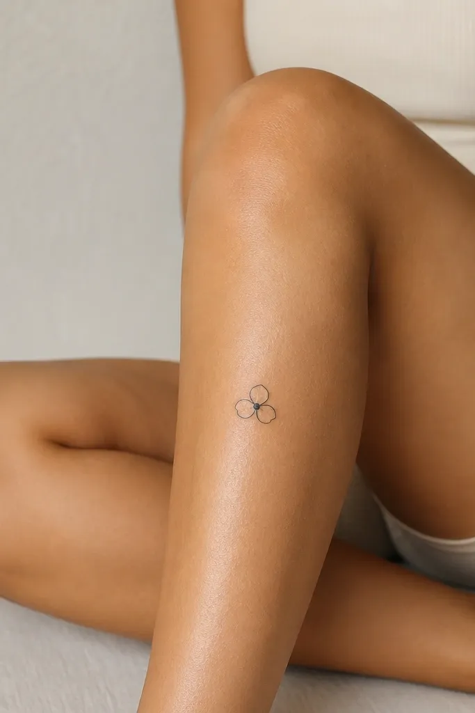
Three petals make a flower look feminine without the detail overload of full blossoms. The filled center dot anchors the design and keeps it readable. No shading means fewer passes and a lower price.
Place it just above the kneecap crease and keep it 2.5-4 cm wide. Use solid black for the center dot and thin-to-medium linework for the petals. Leave a little gap between petals so they do not merge.
Pro tipIf you want it to last, ask for a slightly heavier center dot so it does not fade first.
AvoidAdding extra petals or a ring around the flower usually makes it look busy.