
1. Two Tiny Constellations With Shared Star
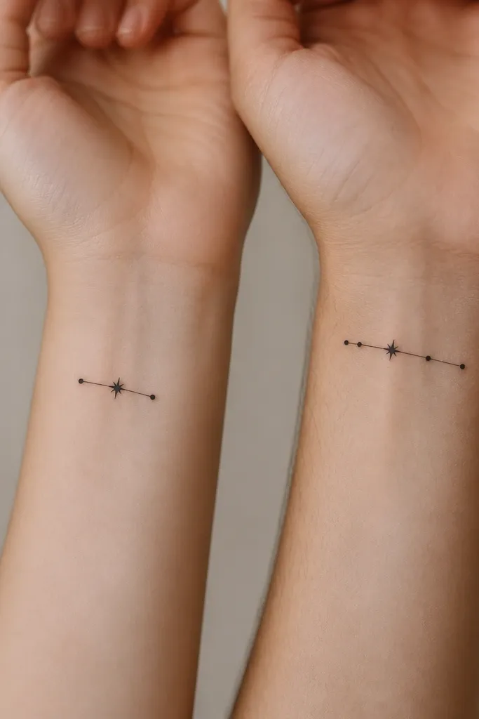
This set works because constellations read as "we're connected" even when they're not identical. The shared star is the visual handshake - same dot size, same position in the cluster - so the meaning clicks fast. I like using a clean single-line join between dots, not lots of sketchy lines, so the geometry stays crisp.
Keep both designs around 1.25 inches wide. Use 0.8mm-1.0mm line thickness for the connecting strokes and keep dot sizes consistent: one slightly larger dot for the shared star. Place one on the inner wrist and the other on the outer wrist for a matching-but-not-copy feel.
Pro tipAsk your artist to stencil with two different dot maps first, then lock the shared star placement before tattooing.
AvoidAvoid tiny five-pointed sparkles around the constellation - they blur and make it look messy.
2. Matching Half-Heart With Two Names Inside the Negative Space
Half-hearts are cute because they imply you complete each other, but minimalist half-hearts look less cheesy than full hearts. The negative space matters; it makes the tattoo feel airy and modern. If you want names, keep them to initials or two tiny letters so the design stays legible.
Size it to about 1 inch tall for collarbone or upper shoulder. Use solid black only for the heart outline, leave the inside mostly empty, and keep letters in a simple sans style. Place the halves where they'll "meet" in a mirror at a natural angle, like collarbones or upper chest.
Pro tipDo initials in the same font on both people and ask for the letters to be outlined lightly in the stencil so you can see spacing before the first needle.
AvoidSkip cursive name scripts - they turn into blobs on small tattoos.
3. Coffee Cup And Tiny Steam Curl
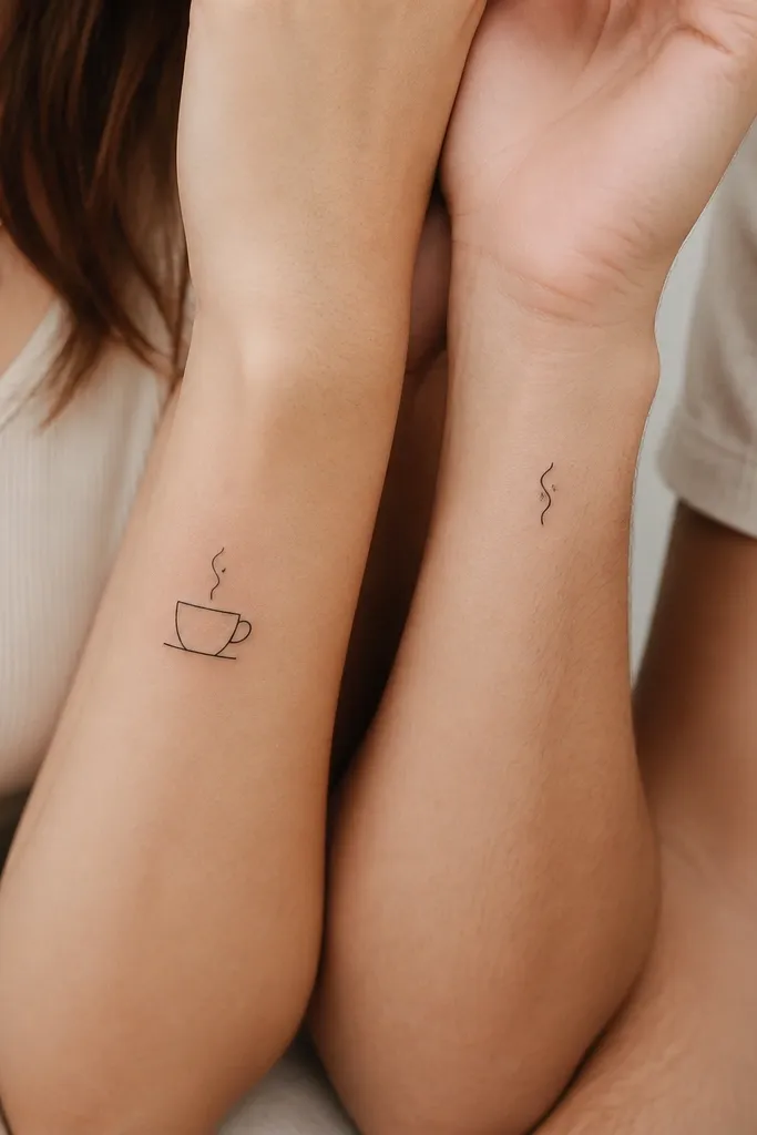
This one is for friends who bond over a ritual. The cup + steam idea reads instantly, even small, and it feels personal without needing a big scene. Steam curls also age well because they're single strokes, not lots of shading.
Keep the cup about 1.1 inches tall with only two line weights: one for the outline and one slightly thicker for the base. On the partner, place just the steam curl about 0.7 inches tall near the wrist crease. Use black ink only for a crisp look.
Pro tipChoose a steam curl shape that matches your friend's laugh - one tight curl for a quiet friend, a looser curl for a chaotic one.
AvoidAvoid adding whipped cream dots or extra details on the cup - small line art clumps together.
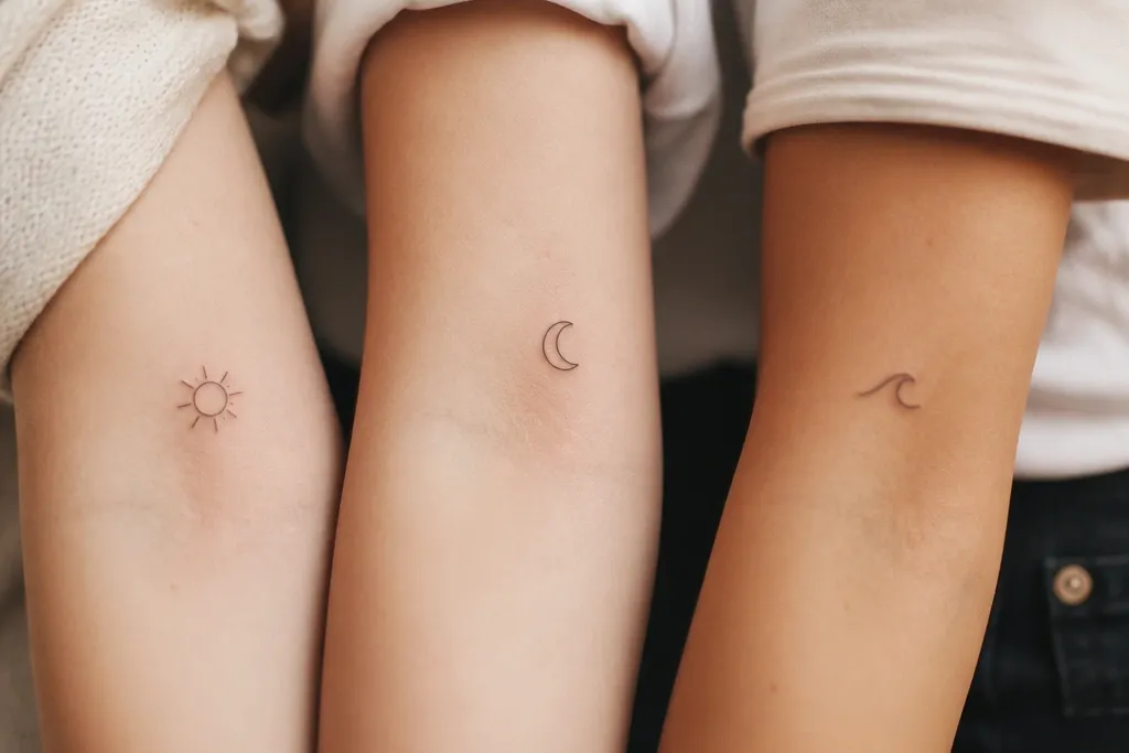
4. Sun And Moon With Matching Dot Borders
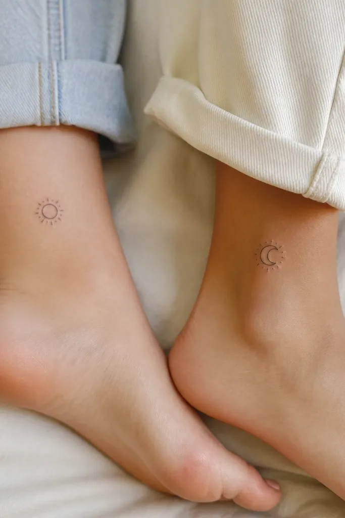
Sun and moon works because it's a friendship metaphor you can explain in seconds: different moods, same bond. The dot border ties them together visually, so it feels like a set even though the symbols differ. Dot rays are also perfect for minimal tattoos because they stay readable as points.
Size both to around 1.2 inches wide. Use dot rays in the same spacing around the circle or crescent. Place on symmetrical spots like left and right ankle for a matching feel when you wear sandals.
Pro tipAsk for the dots to be evenly spaced in the stencil, not hand-placed, so it doesn't look uneven after healing.
AvoidSkip thin triangle rays - they fade faster than dots.
5. Two Matching Paper Planes With Different Fold Lines
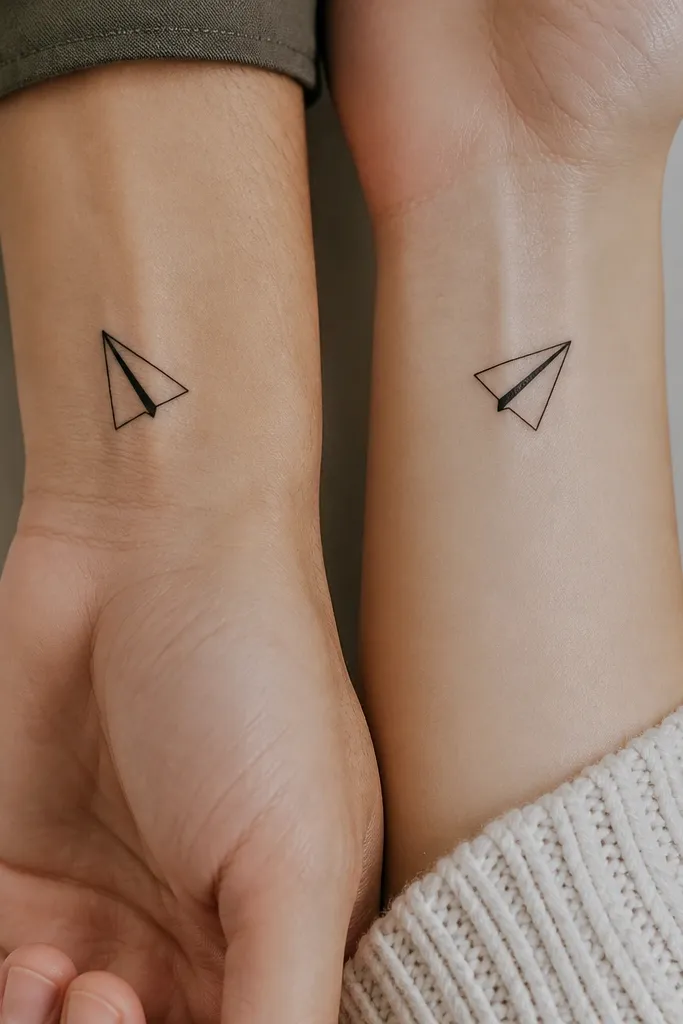
Paper planes are the kind of friendship symbol that feels playful, not romantic. The different fold lines let you personalize each person while keeping the main silhouette identical. It stays cute because it's basically a tiny drawing with clean geometry.
Keep planes under 1.4 inches wide. Outline the plane in solid black, then add exactly one internal fold line in thinner weight. Place one on the inner wrist and one on the back of the wrist so they peek out differently.
Pro tipChoose fold line direction based on your arm angle so the line doesn't look crooked when your hand is relaxed.
AvoidDon't add multiple internal lines - it turns into a dark smear on small skin.
6. Infinity Loop With One Tiny Break
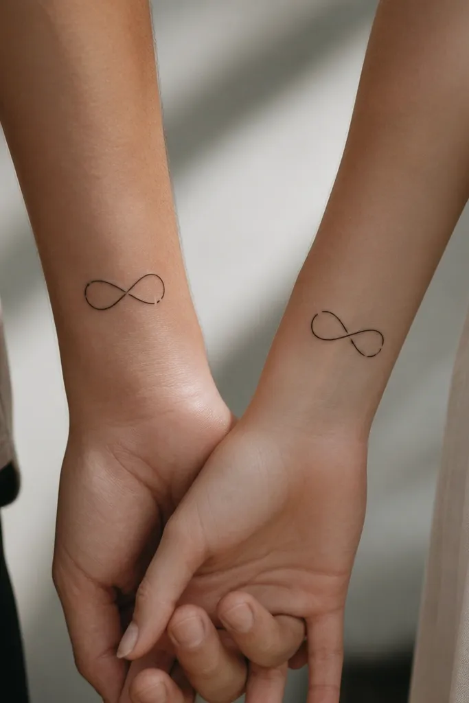
Infinity is common, but the tiny break makes it feel fresh and meaningful. It reads like "we're connected through time," while the break hints at distance, growth, or change. Minimal linework keeps it from looking like generic clip-art.
Make it about 1 inch tall. Use one continuous line with a deliberate micro-gap (about 1-2 mm) - don't make it too big. Place both on the same side of the wrist but different positions so the gaps visually balance.
Pro tipBring a photo of how you want it to sit when your wrist is bent, and ask the artist to test the stencil on your arm angle.
AvoidAvoid a thick, double-line infinity - it looks heavy and dated.
7. Two Matching Lightning Bolts With Different Length Tips
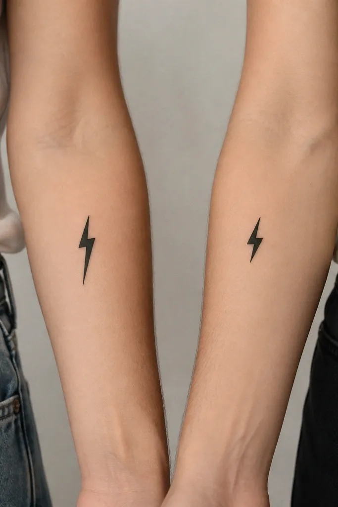
Lightning bolts are energetic friendship tattoos without turning into edgy rebellion. The tiny difference in tip length gives each person a personal "signature" while keeping the set consistent. It also heals well because it's mostly solid silhouette, not tiny line segments.
Size around 1.0-1.3 inches. Keep the bolt as a single solid shape with slightly rounded corners so it doesn't create sharp ink blowouts. Place one on the inside forearm near the wrist, the other on the back forearm.
Pro tipAsk for a slightly rounded bolt outline; it looks cleaner after healing than razor-sharp corners.
AvoidSkip dot shading inside the bolt - it turns muddy on small pieces.
8. Tiny Key And Tiny Lock Charm Set
This set feels sweet because it's about access - to each other's calm, help, or honesty. A key and lock can look too mechanical if it's detailed, so keep it to one clean outline each. The matching round knob ties both designs together fast.
Keep the key about 1.2 inches long and the lock about 1.0 inch wide. Use black outlines with no extra teeth beyond two. Place on opposite wrists so the set feels like a pair you carry.
Pro tipHave your artist align the shapes so the key tooth angle matches the lock's keyhole orientation.
AvoidAvoid adding tiny gears or extra latch details - they blur.
9. Two Matching Daisies With One Petal Missing
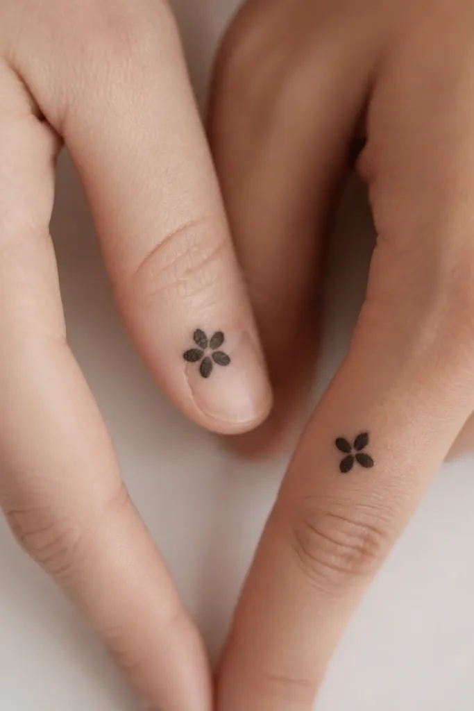
Daisies read as wholesome friendship, but the missing petal makes it feel personal instead of generic. It also gives you a built-in "set identity" where each tattoo feels like a companion piece. Minimal petals look good in black ink and heal cleanly.
Finger tattoos are small - keep it under 0.8 inches and place on the side of the finger, not the pad. Use five rounded petals for one person, four for the other, with the center dot the same size. Keep the stem out of it; skip the stem line to prevent smearing.
Pro tipIf you're nervous about finger healing, pick the ankle or outer wrist instead. Same design, better longevity.
AvoidAvoid micro-thin petal outlines - they fade into the skin tone.
10. Two Tiny Hearts In A Circle Outline
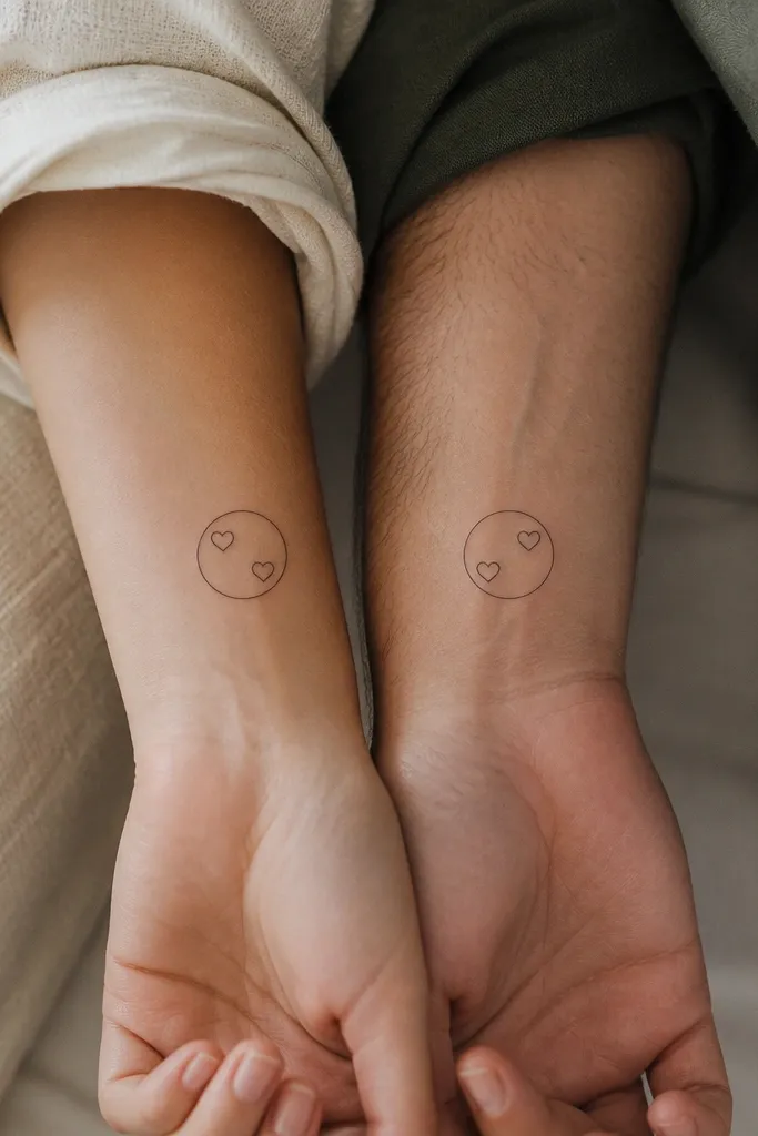
This is a "friendship club" tattoo without being loud. The circle makes it feel intentional and clean, while the two hearts show closeness. The mirror flip gives personality without breaking the set.
Use a light line weight for the outer circle (0.6mm-0.8mm) and slightly thicker dots for the hearts if needed. Keep hearts tiny, about 3-4 mm tall. Place one on the inner wrist and the other on the outer wrist for a matching vibe from different angles.
Pro tipAsk the artist to make the circle perfectly round in the stencil; uneven circles show up after healing.
AvoidSkip shading inside the hearts - it makes them look gray on small skin.
11. Matching Bookmark Icons With Different Quotes As Micro Letters
Bookmarks are one of the cutest friendship symbols because they connect to shared time and comfort. Keep it super minimal: just the bookmark shape and one micro letter. It looks thoughtful in everyday life and doesn't feel romantic.
Size around 1 inch tall. Use black linework only, no ink fill. Put the letter centered inside the bookmark cut, using a simple uppercase letter. Place on the inner forearm where you can see it when you roll up sleeves.
Pro tipPick letters that mean something to both of you, like the first letter of a nickname you only use with each other.
AvoidAvoid long quotes - micro text doesn't stay crisp.
12. Two Matching Waves With One Extra Dot
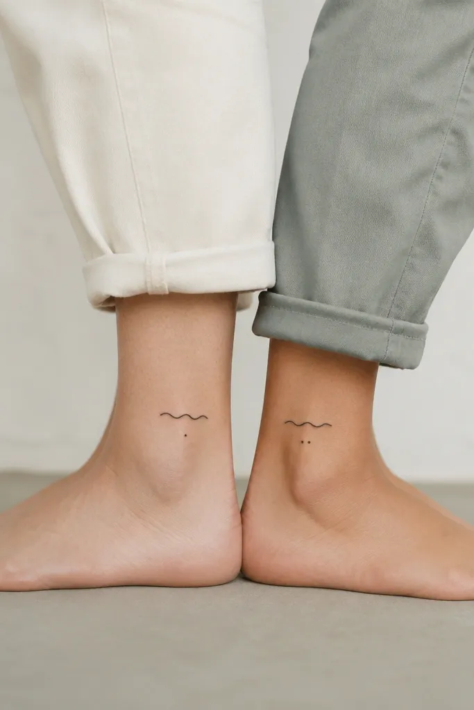
Waves work for friends who feel like "home" or "calm." The one extra dot gives a clear difference while keeping the main wave identical. It's also friendly for minimal artists because waves are simple curves that heal well.
Keep the wave line about 1 inch wide. Use black dot placement that's consistent in spacing; the extra dot should be the only change between the two tattoos. Place on each ankle for a matching look in summer.
Pro tipAsk for a slightly thicker wave line weight than you think you need; very thin waves disappear.
AvoidDon't add water droplets around it - they create clutter.