
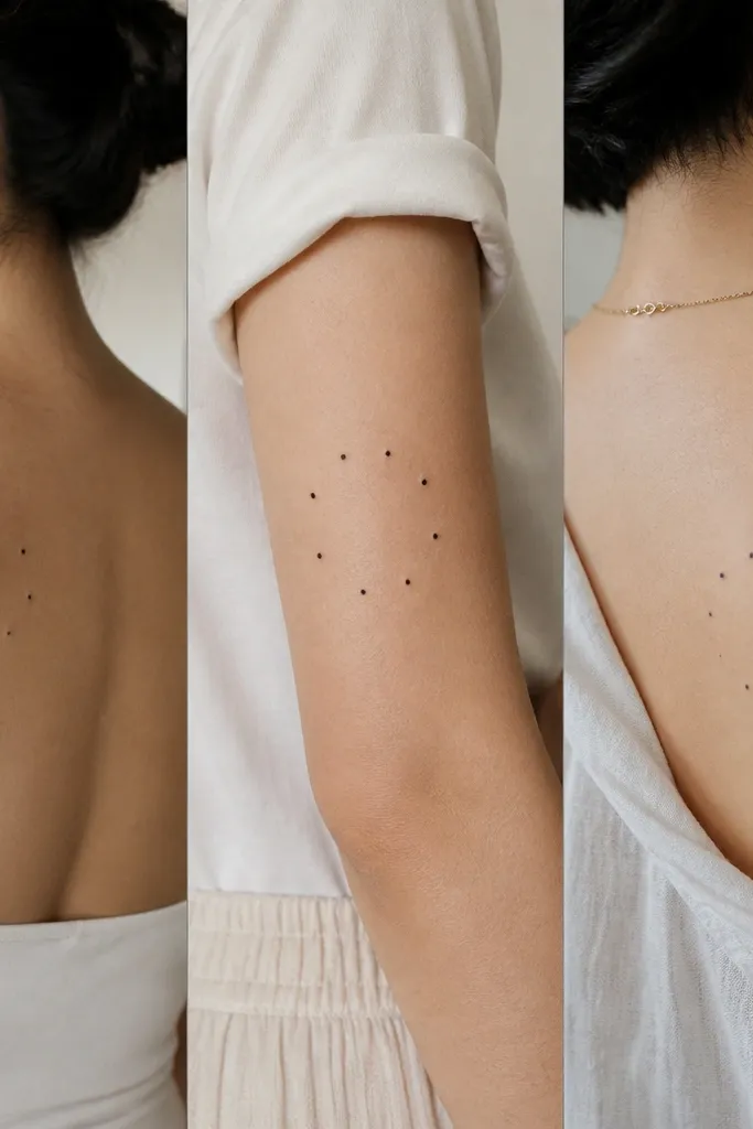
1. Three Constellations With One Shared Star
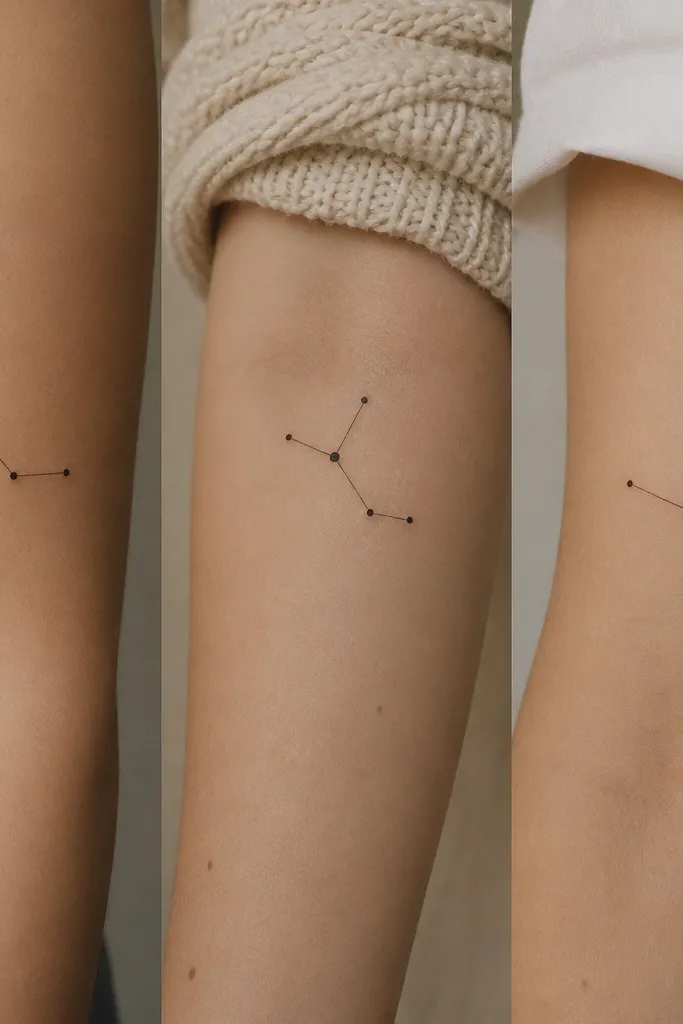
This works because it reads as a set from a distance: the same dot size and the same line thickness make the constellations feel related. The "shared star" is the tie-in that makes each person's version feel connected even if the rest of the pattern is different. I like pure black for the dots and lines so it stays crisp after healing.
Give each person a constellation with 6-10 stars, but keep the shared star at the same relative spot (for example, always the top-right dot). Place one on the outer forearm, one on upper arm (slightly above the elbow), and one on the collarbone edge so the spacing looks proportional. Keep the lines thin - like a 0.25-0.35 line weight look - and avoid shading.
Pro tipBring the artist a reference image of the exact dot spacing you want (print it and mark the shared star with a circle). Ask them to match dot diameter across all three stencils.
AvoidAvoid adding a bunch of extra tiny dots - healing turns them into specks and the constellation stops looking intentional.
2. Interlocking Triangles Like a Tiny Knot
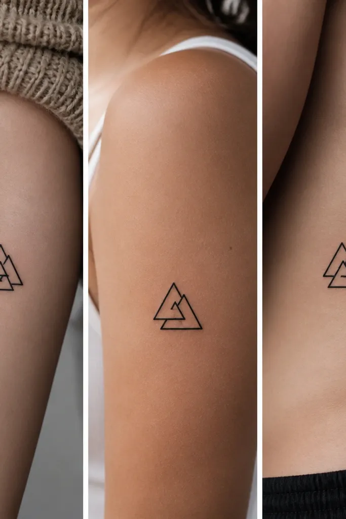
Geometric minimalist tattoos stay sharp because the shapes are clean and the design doesn't rely on gradients. The interlocking triangles look "designed" even when they're small, and the missing/rotated side makes each tattoo personal while still belonging to the same system. I've seen this set look cohesive on three different placements because the edges line up visually.
Each tattoo should fit a 15mm by 20mm rectangle. For variation, keep two triangles identical across all three, then rotate the third triangle by 60 degrees for each person. Placement: one on the inner wrist (back side), one on the side of the upper arm, and one on the top of the foot arch. Keep it black-only.
Pro tipAsk your artist to draw it with a single consistent stroke thickness so the triangle borders don't look like they were filled in by hand.
AvoidSkip triangle designs with lots of micro-details inside the triangles - they blur and look messy after two weeks.
3. Three Minimal Hearts With One Shared Outline
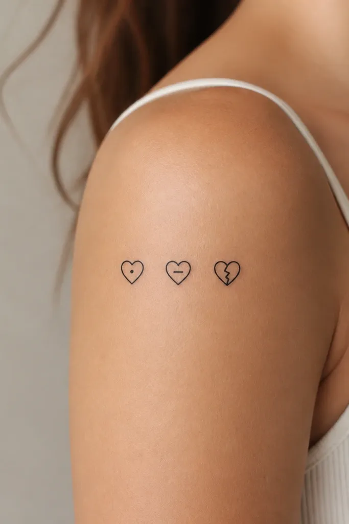
Hearts are the fastest to communicate friendship, but they can also look childish if they're thick, filled, or overly detailed. This version stays classy because it's outline-only with tiny internal marks that look like punctuation. The shared outer outline makes it feel like a set, while the different internal detail keeps it personal.
Keep the heart size around 12mm tall. Place one on the upper inner arm, one behind the ear (slightly lower), and one on the collarbone edge. Use black ink with no gray shading. The internal marks should be tiny - a 2-3mm dot or a short 4-6mm dash.
Pro tipTell your artist you want a "clean cutout" heart, not a cartoon heart. Ask them to show you a stencil preview so the point at the bottom is sharp.
AvoidAvoid filled hearts. After healing, they expand slightly and can flatten into a blob.
4. Shared Infinity, Split Across Three Spots
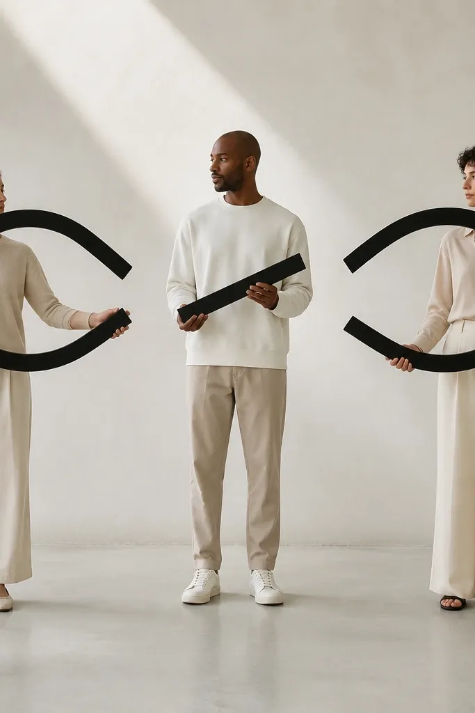
This is the kind of matching that feels clever without being loud. Each person's tattoo is small, but the shared idea shows up when you line photos up or stand close. I like it because infinity symbols stay readable with thin lines if you keep the size controlled and avoid extra curls.
Make each fragment about 10mm to 18mm long. Person A gets the left loop, person B gets the middle crossbar and a short segment of the right loop, person C gets the right loop. Place them on the forearm, upper arm, and inner bicep so the direction of the infinity looks consistent when arms are down.
Pro tipUse a stencil with arrows showing the intended rotation. Minimal tattoos look "wrong" if one person's infinity is flipped.
AvoidSkip thick infinity symbols with lots of overlap. They heal wider than you expect and lose the split-fragment effect.
5. Three Tiny Coordinates With One Same Dot
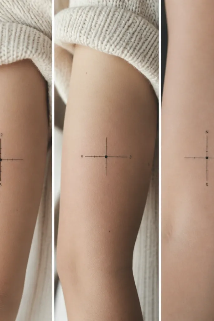
Coordinates can look messy when the text is tiny or the font is too decorative. This version keeps everything minimalist: a single dot marker plus short tick marks, and optional micro-numbers only if your artist can do crisp lettering. The shared marker dot creates the "we all belong to the same place" feeling.
Use a font that looks like a simple sans serif or monoline tech style. Keep the numbers under 6mm tall, and keep the whole tattoo under 22mm wide. Place one near the ankle inner side, one on the outer forearm, and one on the rib edge (not too low). Black ink only.
Pro tipIf you want numbers, bring a printed stencil at final size and check readability in good daylight before you commit.
AvoidAvoid fancy cursive coordinates. They blur fast and turn into an unreadable squiggle.
6. Three Matching Feather Tips With Different Base Lines
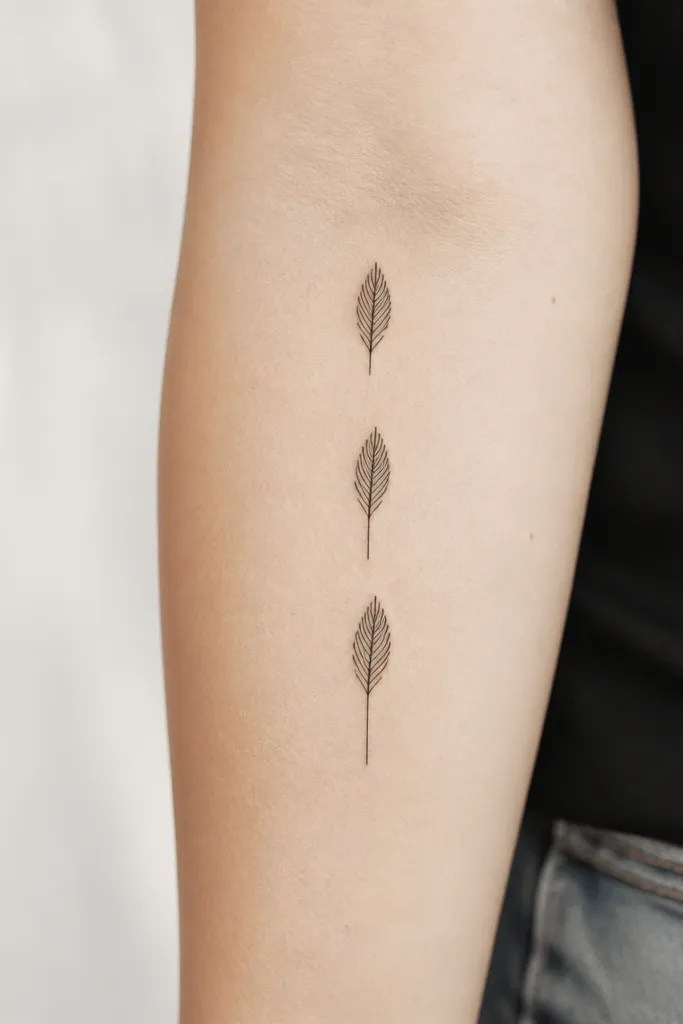
Feather tattoos can get overdone with lots of barbs. Keeping only the tip and using simple linework makes it look clean and grown-up. The matching tip gives you the shared identity, while the different base line length makes each person's piece feel like it belongs to their body.
Target 18mm-24mm height. Place one on the outer upper arm, one along the side of the calf, and one on the back of the shoulder near the shoulder cap. Ask for thin, controlled linework and no shading. The base line can be a single straight segment - 6mm on one person, 10mm on another, 14mm on the third.
Pro tipAsk your artist to draw the feather tip with the same curve on all stencils. That curve is what makes it read as a feather instead of a leaf.
AvoidSkip dot shading on feathers. It looks soft at first and then turns patchy as it heals.
7. Three Tiny Mountains Under One Sun Dot
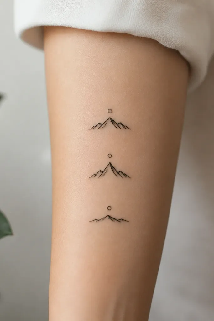
This looks stylish because it's flat black silhouettes with one consistent sun element. Minimal mountain peaks still read clearly even when small, and the different peak heights keep the set from feeling copied. The shared sun dot makes it unmistakably a group idea.
Keep each mountain between 14mm and 20mm wide. Put the sun dot about 6-8mm above the highest peak. Place one on the inner forearm, one on the outside of the upper arm, and one on the top of the foot arch. No gray shading - just solid black shapes with clean edges.
Pro tipHave your artist match the mountain slope angle across all three. If one mountain is steeper, the set looks random.
AvoidAvoid adding snow caps or extra lines. It turns minimalist into clutter quickly.
8. Three Matching Keyholes With One Shared Loop
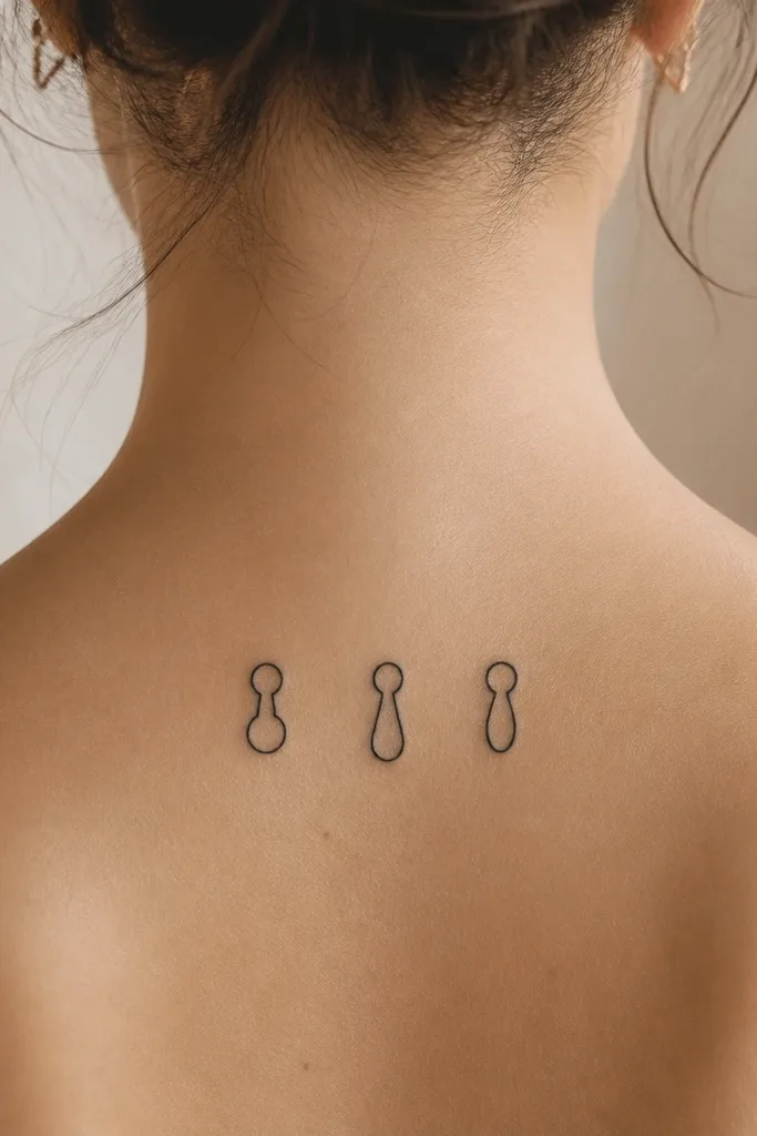
Keyholes feel like a private symbol, and they look good as minimalist linework because the shape is naturally simple. The shared top loop is the anchor that makes the set feel coordinated. Different bottoms let each person have their own version without losing unity.
Choose a keyhole size around 16mm tall. Place one on the side of the wrist, one behind the ear, and one on the collarbone edge. Keep the top loop identical - same diameter and same line thickness. The bottom shapes should be 6-8mm in width.
Pro tipAsk for an outline-only keyhole, no internal shading. Outlines age cleaner than filled shapes on small tattoos.
AvoidSkip thick black fills in the keyhole. They can bleed outward and turn the shape into a dark spot.
9. Three Arrow Marks Pointing Toward the Same Center
Arrows look sharp and modern because they're linear. The trick for three-person sets is making the arrows feel like they're pointing toward the same idea even if the central dot sits differently on each body. The minimalist arrowhead stays crisp if you keep the shaft short and the line weight consistent.
Make arrows about 14mm long with a 4-6mm arrowhead. Place one on the inner forearm, one on the outer ankle area, and one on the upper rib side. Use one shared dot style - same size and same spacing from the arrowhead. Black ink only.
Pro tipBefore you tattoo, rotate your stencil on a mirror and check that the arrowhead points the direction you want when your arm is relaxed.
AvoidAvoid long arrow shafts. They stretch with movement and blur.
10. Three Minimal Letters Using Same Mono Font
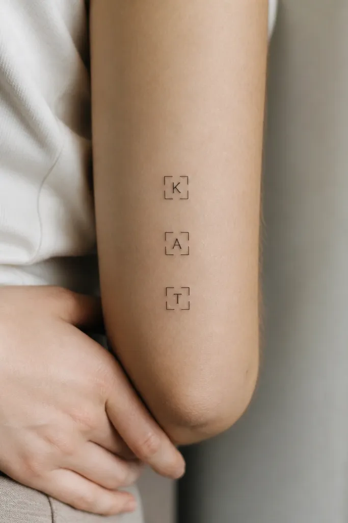
This is for friends who want meaning but don't want big symbols. A single letter tattoo looks clean when it uses the same monoline font and the same framing element. The tiny square bracket keeps it looking designed, not like a random character.
Pick letters that fit your group meaning - first initials, shared nickname letter, or a symbol letter like "A" for your group name. Keep the letter height around 10mm to 14mm. Frame it with a thin bracket box about 2-3mm from the letter edges. Place one on the top of the wrist, one on the inner bicep, one on the side of the calf.
Pro tipAsk your artist to ink a test stencil on skin and compare it to a printed font sample. Mono fonts vary a lot in real life.
AvoidAvoid bold block fonts. They fill in and look chunky once healed.
11. Three Shared Dots Forming One Circle When Combined
Dot tattoos are underrated for friendship sets because they're flexible and look intentional even when small. The ring-complete idea gives you a "together" meaning without needing detailed drawings. Keep dots consistent in diameter and spacing so each person's tattoo feels like part of one graphic system.
Use dot sizes of about 1.2mm to 1.8mm. Each person gets a partial ring: Person A has top-left and top dots, Person B has top-right and bottom dots, Person C has left and right dots to close the ring. Place one on the outer forearm, one on the shoulder blade edge, and one on the back of the upper arm. Black ink only.
Pro tipBring a simple grid sketch. Tell your artist the exact number of dots and the target ring diameter so spacing stays consistent.
AvoidSkip dot sizes that are too tiny. They fade into your skin tone and stop reading as dots.
12. Three Matching Waves With Different End Shapes
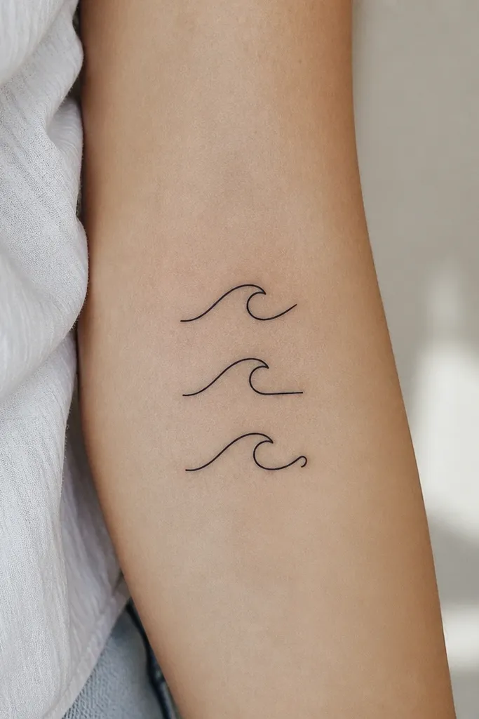
Waves look classy when they're minimal - just one clean line, no extra swirls. The shared wave curve gives you the group identity, and the different end cap makes each person's tattoo personal. It also ages well because it's one continuous line with controlled thickness.
Keep the wave about 18mm wide and 8mm tall. Place one on the inner wrist, one on the outer upper arm, and one just below the collarbone. Use a single needle line style so the wave has one consistent weight. Black ink only.
Pro tipAsk for a line that looks smooth in motion, not jittery. A steady hand and good stencil transfer matter more than you think.
AvoidAvoid multi-line waves with thick-to-thin gradients. They look uneven after healing.