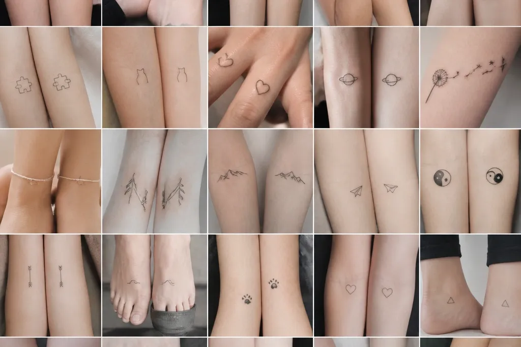
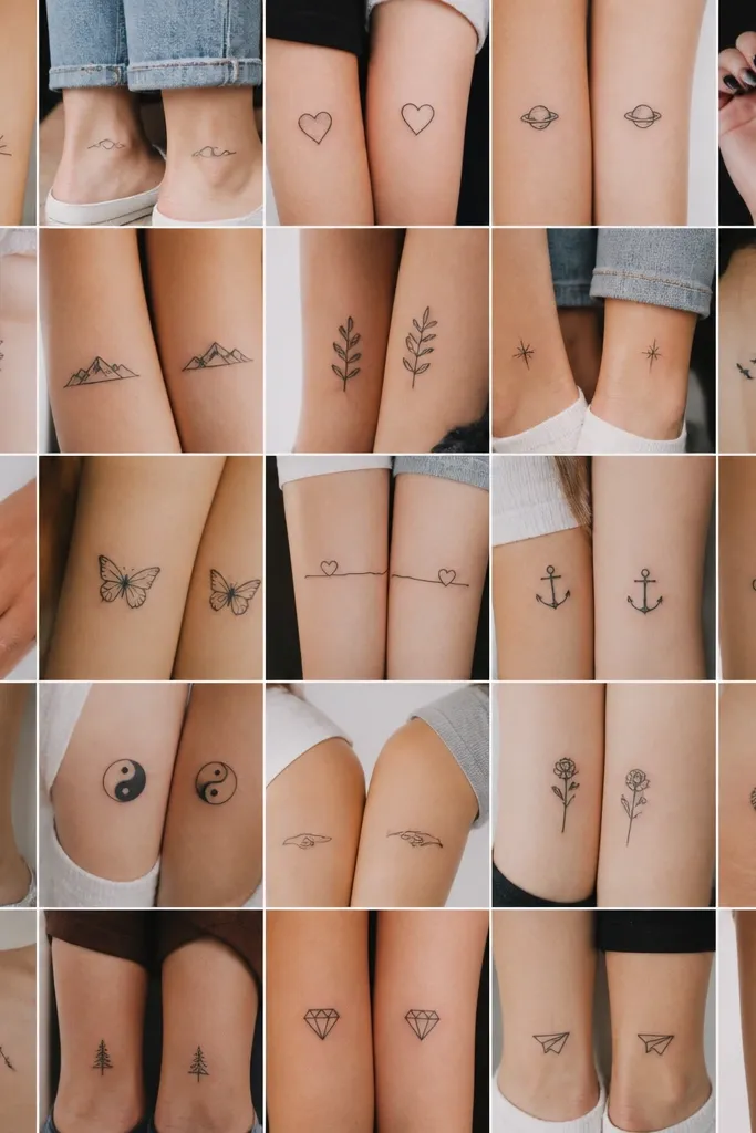
1. Interlocking Tiny Stars
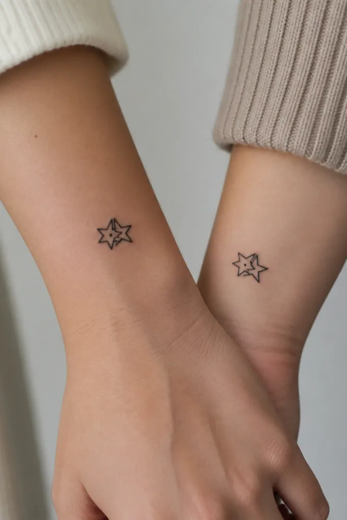
This design stays sharp because stars are geometric and don't require shading. Use all-black ink with no gray washes, and you get clean edges that heal predictably. The interlock gives the "together" feeling without needing a long horizontal piece. A single dot at the overlap makes each tattoo slightly different while still matching the overall silhouette.
Make each tattoo 1.5 to 2 inches wide. Place it on the outer upper arm near the bicep or on the side of the wrist where the skin is smoother. Keep line thickness around 2-3 mm for a minimalist look that doesn't fade into nothing.
Pro tipAsk for a stencil mockup that you can hold next to your other wrist so the interlock size feels right on both bodies.
AvoidAvoid thin hairline stars - they blur fast during healing and look like smudged dots.
2. Matching Seed Sprout With One Bead
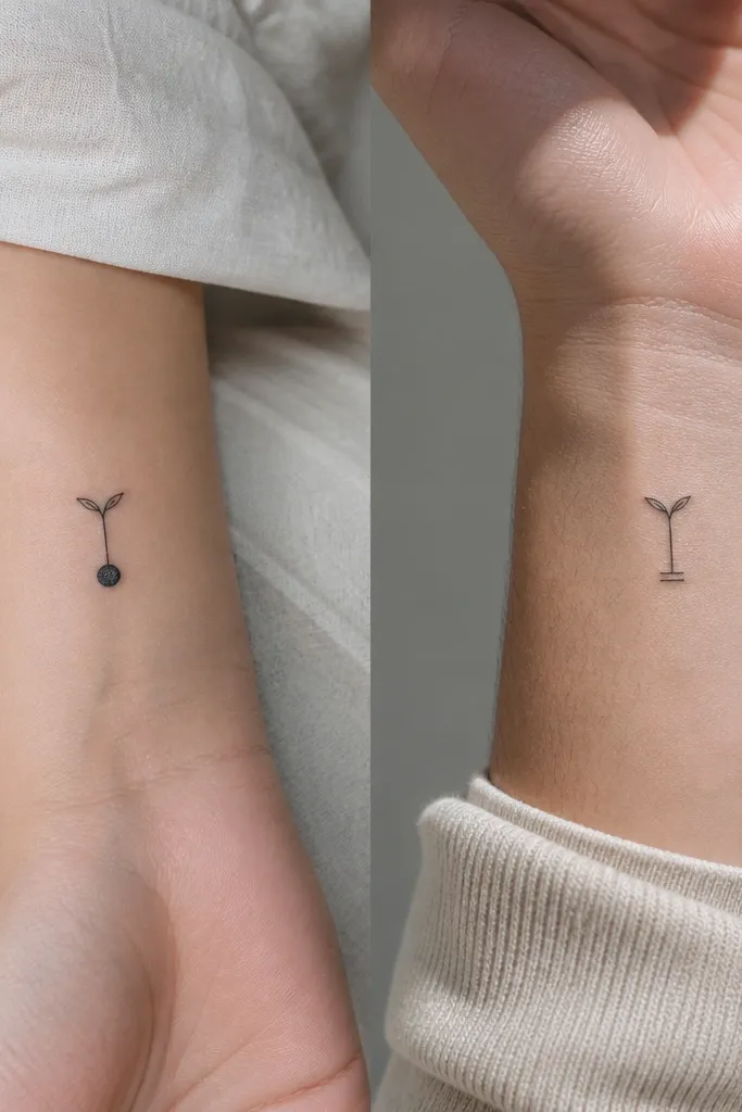
Seed and sprout drawings look delicate but they're actually beginner-friendly because they use simple curves and short leaves. The one bead difference makes it feel like a shared story rather than a copy-paste. Keep it monochrome so it heals clean and doesn't turn patchy. The sprout shape also looks good on curved placements like the wrist.
Size it 1.75 to 2.25 inches tall. Put it on the inner forearm or the outer wrist, and orient the stem upward toward your hand. Use one consistent leaf shape on both versions, then swap the bead count near the seed.
Pro tipUse a reference photo of a real seed pod to show your artist the shape you like, then keep the tattoo simplified to three main lines maximum.
AvoidDon't add extra tiny veins in the leaves - they disappear after the first month.
3. Two-Minute Handwritten Coordinates
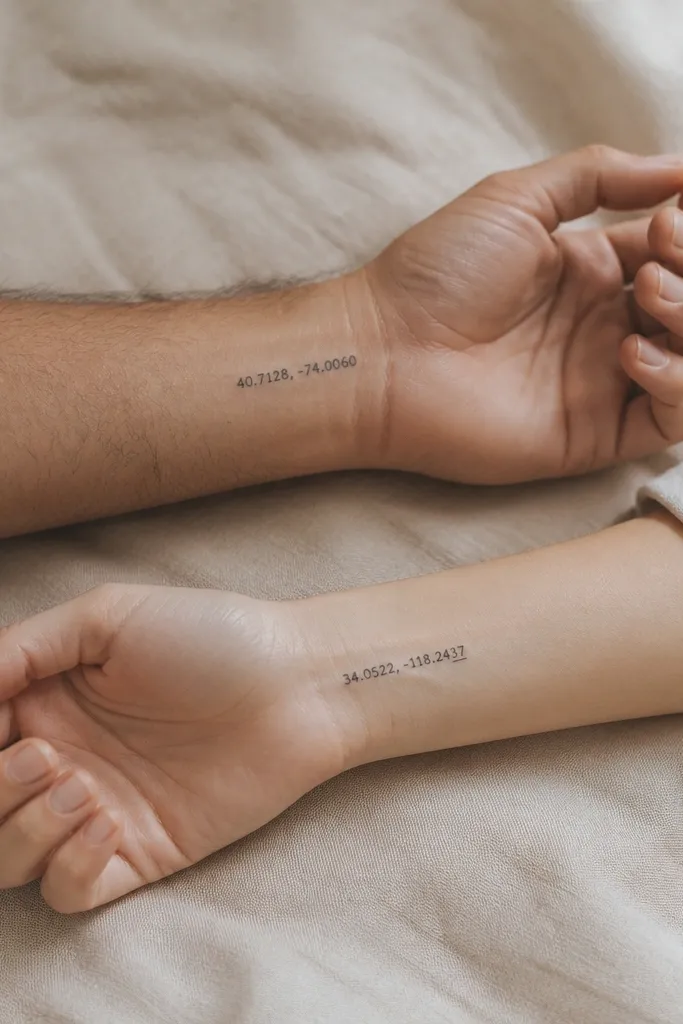
Coordinates work because they're personal and compact. The trick is choosing a font that looks handwritten but stays readable. On healed skin, thin script can fade, so you want slightly thicker strokes than you'd expect for "fine line." When both people have the same style but different underline or last digit mark, it feels like a duo without being identical.
Keep the whole line under 2 inches. Place on inner wrist where you'll see it on most days. Give your artist the exact text spelling and punctuation, and ask for a stencil sized to your wrist width.
Pro tipPrint the coordinates in the exact font you want and measure it in inches, then ask the artist to match that physical size.
AvoidSkip super-thin calligraphy - it heals gray and turns into a smear.
4. Half-Heart Split at the Center Line

Half-hearts look great because they're instantly recognizable and don't need shading. You're also controlling the composition: each side has a clear boundary that heals evenly. The center line gives a crisp "match" moment without needing a full two-person placement. Keep it black and simple for the best long-term readability.
Size each half-heart at 1.5 to 2 inches tall. Put it on the outer forearm or the side of the wrist so the halves line up when you bring arms together. Ask your artist to draw the heart with a consistent curve radius so both halves meet cleanly.
Pro tipDo a quick test with a paper heart cutout at the same size before you commit to placement.
AvoidDon't place it on a spot that twists when you move - the halves won't line up and the effect dies.
5. Tiny Infinity With a Single Star Tip
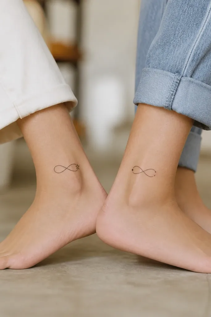
Infinity symbols hold up well in minimalist tattoos because they're bold curves with clear negative space. Adding a star tip or dot lets each tattoo feel like it's yours while still matching the shared infinity. This also gives you a clean focal point if one person's placement gets more light wear over time.
Keep it under 2 inches long. Ankle placement works, but keep it on the outer side where skin moves less than the inner ankle. Use 2-3 mm line thickness and no gray fills.
Pro tipAsk for the infinity to be slightly wider than tall so it doesn't look squished after healing.
AvoidAvoid adding loops inside the infinity - it turns into a knot of dark gray.
6. Friendship Hearts in Negative Space
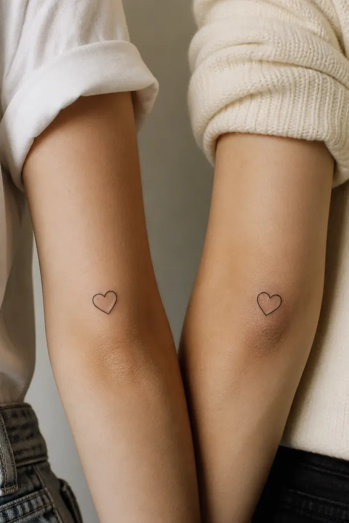
Negative space hearts look clean because the "ink" is mostly linework and the rest is healed skin. That means fewer fill areas that can blur. The slight shift of the inner heart makes the duo feel intentional. Keep everything black with sharp edges so the negative space stays crisp.
Size it 1.5 to 2.5 inches wide. Place on the outer upper arm or upper chest where you'll have less friction. Ask for a stencil that clearly shows the inner cutout - you want it centered but not identical.
Pro tipBring a simple doodle and insist on a stencil with the negative space visible - don't accept a version that's too thick.
AvoidDon't go too small with negative space - if it's under 1.25 inches, the cutout can fill in visually.
7. Matching Minimal Moon Phases
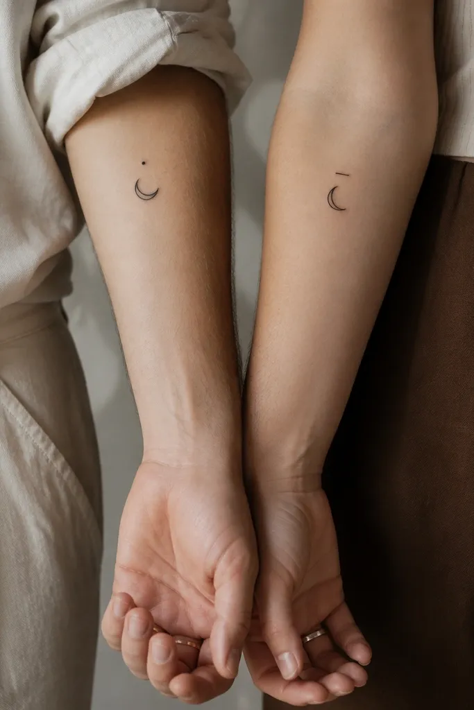
Moon phases read well because each phase is a clear silhouette. Minimalism works here because you don't need texture - just crisp outlines and a clean crescent curve. The dot or dash above the moon makes each piece personal without changing the core idea. This also looks great on wrists because the arcs follow the skin naturally.
Make the moon itself about 1 to 1.25 inches across. Place on the inner wrist or the outer forearm near the thumb side. Keep the crescent cutout clean and ask for consistent line weight across both versions.
Pro tipIf you want it to look extra sharp, ask your artist to avoid any gray shading and keep it solid black.
AvoidSkip realistic craters - they blur and turn gray on small placements.
8. Two Tiny Birds on a Single Branch Line
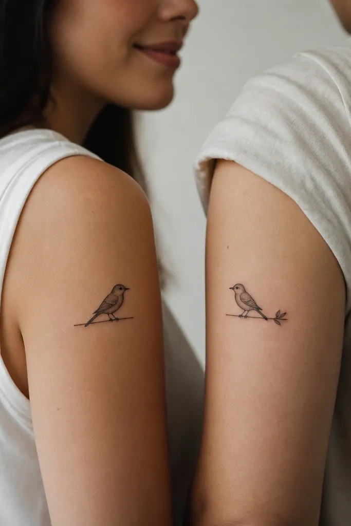
This is a minimalist "same story" tattoo that still feels separate. Bird silhouettes are simple shapes, so they heal well. The branch line gives you a visual anchor, and the facing direction makes it obvious they're meant to be together. Keep it black with no feather detail beyond the outline.
Size each bird around 1.75 inches tall including the branch. Place it on the side of the forearm or the outer upper arm. Keep the branch line short so it doesn't stretch weirdly across a joint.
Pro tipAsk for the bird outlines to be thick enough that they don't fade to a gray outline after healing.
AvoidAvoid adding tiny feather strokes - they look like specks and disappear.
9. Small Heartbeat Line Ending in Two Symbols
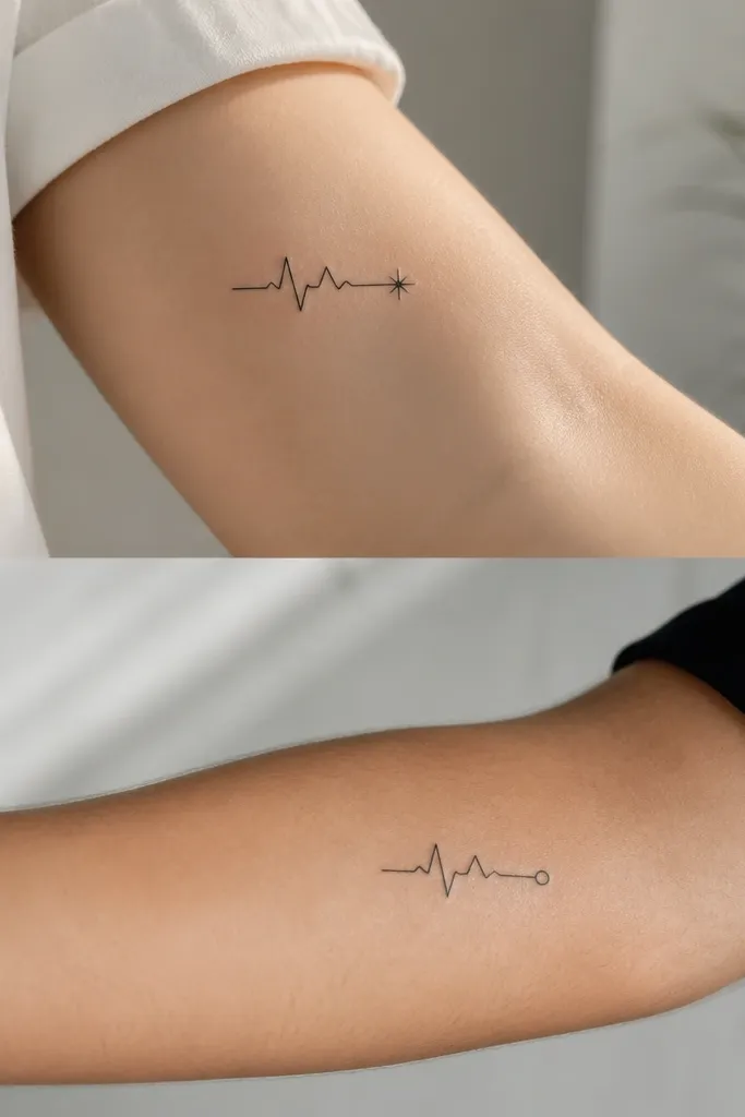
Heartbeat lines are great because they're linework with a clear direction. The end symbol is what makes it friendship-themed, and it's easy to make one person's ending a star and the other a dot. Keep it monochrome so it doesn't muddy during healing. This design also looks good on ribs because it's a slim vertical line.
Keep the total height 2 to 3 inches. Place on the upper ribcage side or the outer forearm. Ask for a stencil that matches your breathing line - avoid placing it too close to the armpit where it moves a lot.
Pro tipBring a short ECG strip photo and ask your artist to make the waveform feel "natural" but still simplified to 3-4 peaks.
AvoidDon't make a super long heartbeat line - it smears on movement and gets hard to read.
10. Matching Tiny Keys With Different Teeth
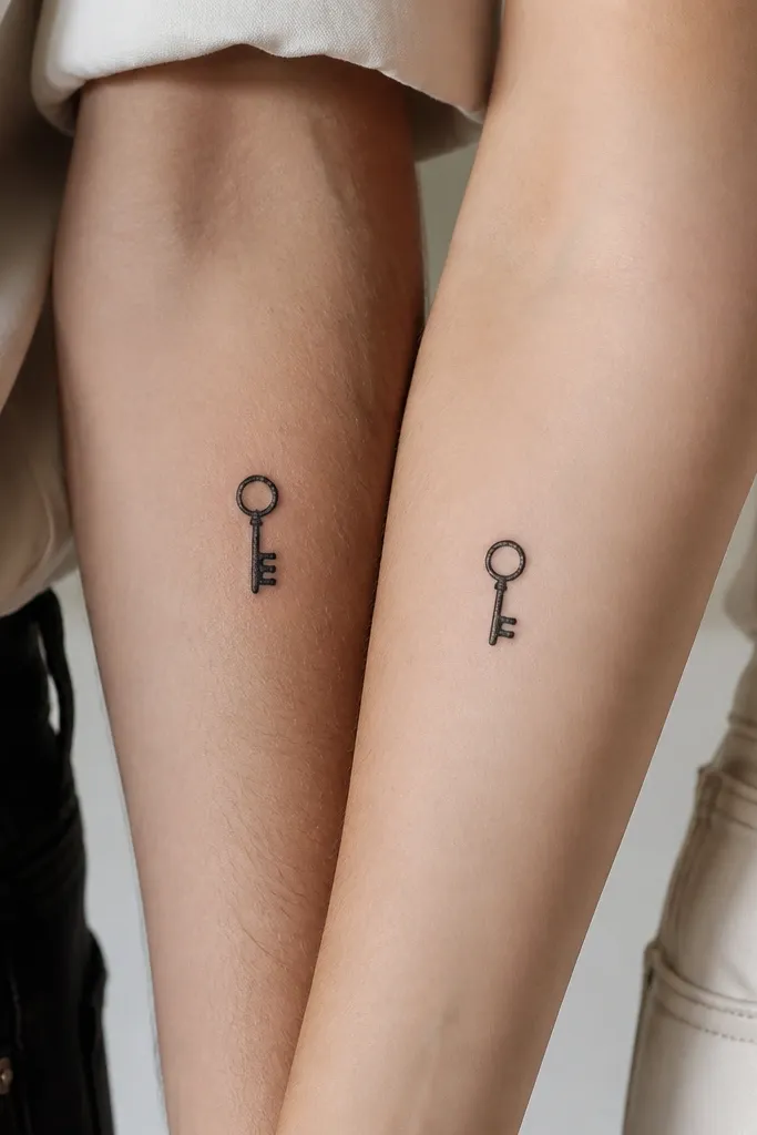
Keys look good in minimalist style because they're basically circles and straight lines. By changing only the tooth count, you keep the shared "key" concept while giving each tattoo its own identity. The round ring also helps the design hold up - circles tend to heal more evenly than thin curves. Keep it all-black for long-term readability.
Size each key 1.25 to 2 inches tall. Place on the wrist bone area or just above the ankle bone. Make sure the teeth lines are thick enough - you want at least 2 mm so they don't turn into a dark smudge.
Pro tipAsk your artist to test the key on your skin with a stencil at the exact size - keys can look too delicate once it's real.
AvoidAvoid adding tiny ornate engravings on the shaft - it turns into gray texture.
11. Split Comet Tail With Shared Head
Comets are a fun minimalist choice because the head is a simple shape and the tail can be adjusted without changing the whole composition. The shared head makes it clearly "the same thing," while the tail length difference feels personal. No shading needed - just solid black lines and dots. This one looks especially good on forearms where the tail direction can follow the arm.
Keep it 2 to 2.5 inches long. Place on the outer forearm with the tail pointing toward the elbow or toward the wrist - pick one direction and commit for both people. Use a consistent dot size for the trailing dots so it looks intentional.
Pro tipTell your artist you want the tail to taper - straight thick-to-thin strokes look cleaner than a uniform line.
AvoidDon't pack too many dots - three is enough or it turns into a texture blur.
12. Tiny Matching Flowers With One Petal Missing
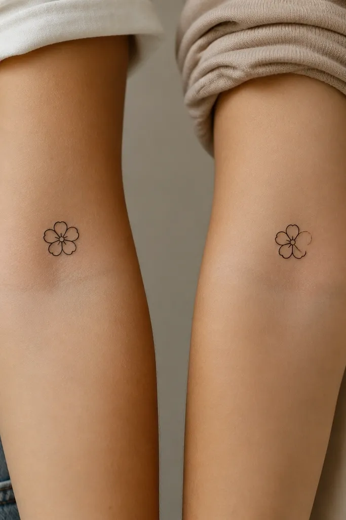
Minimal flowers look cute but they can get messy if the petals are too detailed. This approach stays clean by using simple petal outlines and controlling the number of petals. The missing petal is a smart way to make the pair feel connected without being identical. Keep the center as a single dot, not a filled circle.
Size each flower 1.2 to 1.8 inches wide. Place on the outer forearm or upper arm where you won't rub it constantly. Keep petals evenly spaced so the flower doesn't look lopsided after it heals.
Pro tipAsk for a stencil drawn slightly larger than you think, then size down after you see it on skin.
AvoidAvoid tiny filled centers - they can over-saturate and look like a blob.


