1. Single-Stem Mini Rose Above the Kneecap
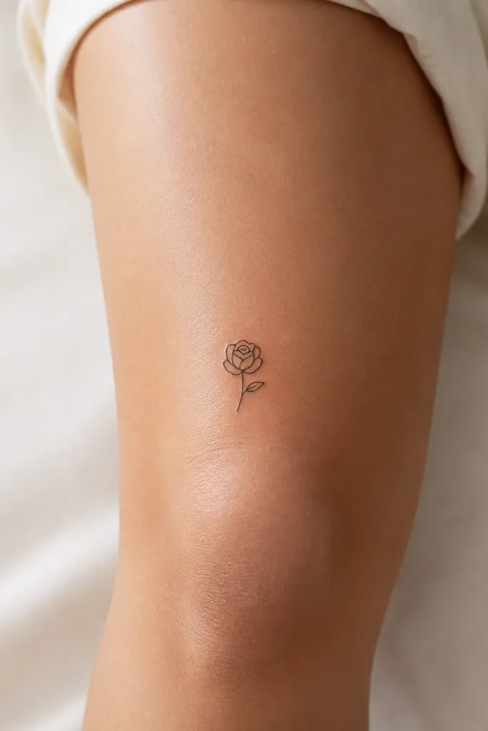
This layout reads dreamy because the petals don't touch edge-to-edge; the open skin between them keeps the flower airy. The rose is simple: five main petal shapes and one inner curve, so the tattoo doesn't rely on tiny details that fade. I like the stem tapering to almost nothing near the bottom - it looks delicate even when the knee shifts. A black-only version also ages predictably on a high-movement area.
Ask for the center petal height around 7-8 cm from top to bottom. Place the first petal row just above the kneecap so when you bend, the petals don't stretch sideways. Keep the leaf small - about the width of the petal base - so it doesn't crowd the flower. If you want color, add a micro blush dot in the center only.
Pro tipUse a stencil that marks your knee bend - sit down and bend your leg during placement so the petals stay aligned.
AvoidAvoid packing the rose with lots of micro shading inside each petal - that's where the blur starts.
2. Two-Petal Blossom with Soft Stipple Center
This is dreamy because it's basically negative space plus a tiny focal point. Two petals keep the shape readable even when the knee stretches. The stipple center adds warmth without turning into gray haze across the whole design. I've seen this exact style hold up better than fully shaded flowers on the knee because the ink is concentrated where your eye expects it.
Request a petal width of about 2.5-3 cm per petal, with the center stipple around 6-8 mm wide. Position the blossom so the open gap faces outward toward the front of your leg. Keep stipple density moderate, not solid - the center should look like a soft blur, not a black dot.
Pro tipAsk your artist to test the center with a quick line-and-stipple swatch on your arm first so you can judge how it will look after healing.
AvoidSkip heavy stipple that fills the whole petal interior - it turns into a smudge as the skin moves.
3. Dainty Daisy Chain on the Knee Curve
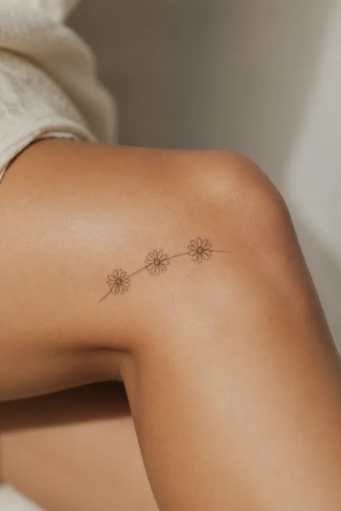
A short chain of three daisies looks dreamy because it creates motion - your eye follows the curve instead of staring at one rigid spot. The petals are simple and repeated, which means the design stays consistent as it ages. Thin stems keep it airy, and the small dot centers give a clean focal point. It's also practical: if one daisy softens, the other two still read as a flower set.
Keep the total height around 9-10 cm so it doesn't wrap too far onto the shin. Place the middle daisy closest to the kneecap, then taper the stems so the top and bottom daisies sit slightly above and below the bend line. Petals should be thin ovals, not long teardrops, so they don't stretch during movement.
Pro tipWear the kind of pants you live in during your fitting - if you usually wear skinny denim, place the bottom daisy high enough that it won't get rubbed daily.
AvoidDon't add extra leaves or extra flowers - too many elements on a knee makes it look busy fast.
4. Crescent Petal Flower with Micro Accent Dots
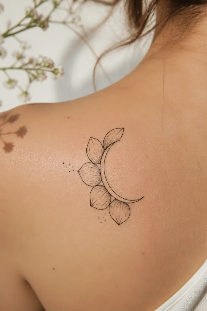
This one reads dreamy because the petals are half-forms, like the flower is half in shadow. The crescent layout matches the knee's shape, so it doesn't fight your anatomy. Micro accent dots add sparkle without turning into full shading. The key is restraint: dots only near the petal edges so they fade as "texture," not as a gray stain.
Ask for a design that's about 6-7 cm tall, with the crescent opening facing toward your outer thigh. Keep the dot clusters to two small groups - one on each side - rather than scattering them everywhere. If you want color, keep it to a single pale blush dot in the center.
Pro tipDuring healing, protect it when you sleep - knee tattoos get rubbed by sheets, and dots are the first thing to blur.
AvoidAvoid a full background of tiny dots across the knee area - it looks dirty after healing.
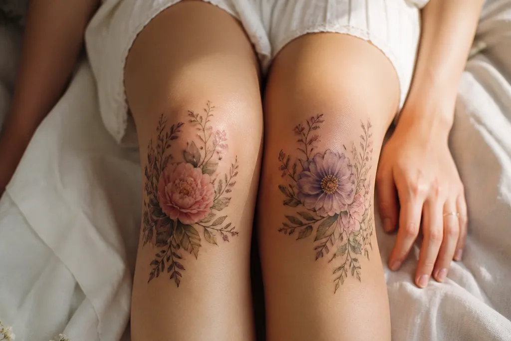
5. Blackwork Mini Peony with Negative-Space Petals
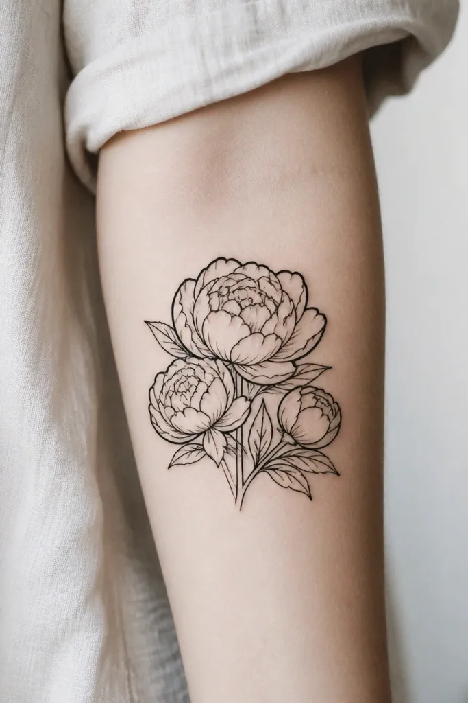
Peony can still be minimalist when the artist leaves gaps between layers. This works on knees because thick outer petal outlines hold up under friction, while negative space keeps it from turning into a heavy blob. The layering is controlled: you get depth without needing dense shading. I've had peony-style designs look better than delicate roses on knees because the shape is inherently readable.
Target a size of 7-9 cm tall and about the same width. Place the widest petal layer slightly above the kneecap so the lower layers don't get distorted when you bend. Ask for line weight variation: bold outer edges, thinner inner lines. Leave the center mostly open or just lightly stippled.
Pro tipRequest a stencil with three petal layers maximum - more layers often become a gray mass after a year.
AvoidSkip full solid black shading inside each petal - it heals dark and then turns into a flat gray patch.
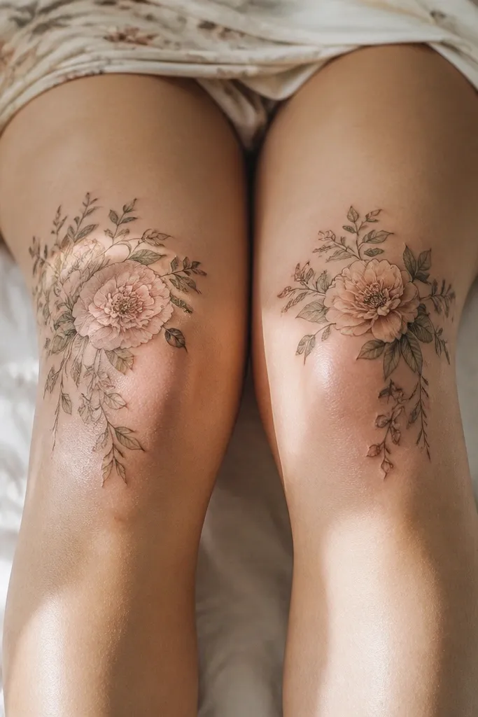
6. Watercolor Blush Center Flower with Black Outline
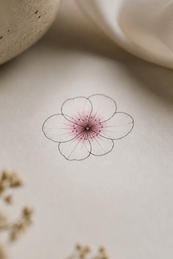
Dreamy doesn't have to mean full watercolor. This design keeps the petal structure crisp with black outlines, then adds a blush center that looks like soft light. Because the color area is small, it fades gracefully instead of turning patchy. The knee is rough on color; limiting it to the center is the difference between "pretty" and "muted blotch."
Ask for a black outline first, then watercolor confined to a circle about 1 cm wide. Keep the petals uncolored and only add a tiny gradient that fades outward. Place the flower slightly higher than the kneecap and angle the petals toward the front of your leg for a clean look.
Pro tipPick a blush pink that heals toward rose, not neon - neon-pink tends to go dull and chalky on knees.
AvoidAvoid painting watercolor across multiple petals - it spreads and blurs with movement.
7. Tiny Orchid with Two Leaves and One Airy Stem
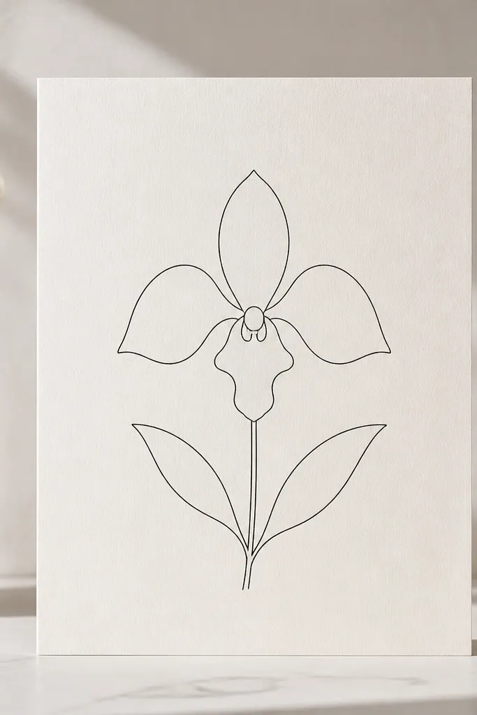
Orchids look dreamy because they have natural negative space - the central lip and side petals don't need dense shading. The thin stem keeps the design light, and the two leaves frame it without adding clutter. This style also ages well because the orchid's silhouette stays recognizable even if the fine lines soften a bit.
Aim for 6-8 cm tall. Place it so the orchid sits just above the kneecap and the stem angles toward the outer leg. Keep the leaves small, about the width of the petal base, with one leaf slightly higher for balance. If you want color, add a tiny pale purple dot only in the lip area.
Pro tipAsk for symmetry in the orchid's central lip, not in the leaves - slight leaf asymmetry looks more natural.
AvoidDon't thicken every line. If the whole orchid is the same weight, it loses that airy orchid look.
8. Forget-Me-Not Trio with Micro Vein Lines
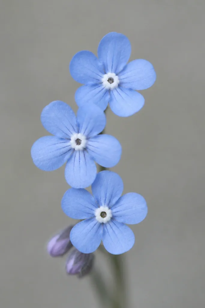
This works for dreamy because the forget-me-not shape naturally reads delicate, and the three-flower cluster fills the knee curve without becoming crowded. Micro vein lines add detail but only if they're sparse. The center dot anchors the flower so it still reads even after the fine lines soften.
Choose a height of about 8-9 cm with the middle flower nearest the kneecap. Keep vein lines to one or two per petal, not a web. If you want color, use the lightest blue only inside the petal tips or the center ring, not across the whole petal.
Pro tipAsk for the stencil to include a few petal gaps - those gaps keep the design from turning into a single blue-black smear.
AvoidSkip full blue fill on a knee. Color fill is where patchiness shows first.
9. Minimal Lotus with One Petal Split
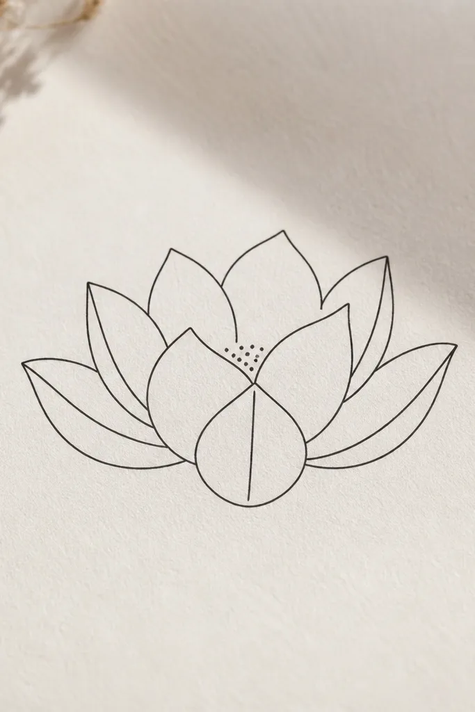
Lotus looks dreamy when it's not overworked. This design uses fewer petals and one intentional split line to create detail without clutter. The open center keeps it light on the knee and stops the tattoo from feeling heavy. A tiny dot cluster in the center gives texture like soft shadow.
Keep it around 7-8 cm tall. Place the lotus so the center sits slightly above the kneecap and the outer petals curve around it. Ask the artist to draw one split line per flower, not multiple - one split is enough to create the "hand-drawn" feel. Color should be optional and minimal.
Pro tipIf you wear skirts more than jeans, you can place it a touch lower. If you wear leggings daily, keep it higher to reduce rubbing.
AvoidAvoid adding extra leaf branches - lotus knees look best when the design stays compact.
10. Single Cherry Blossom with Floating Petal Specks
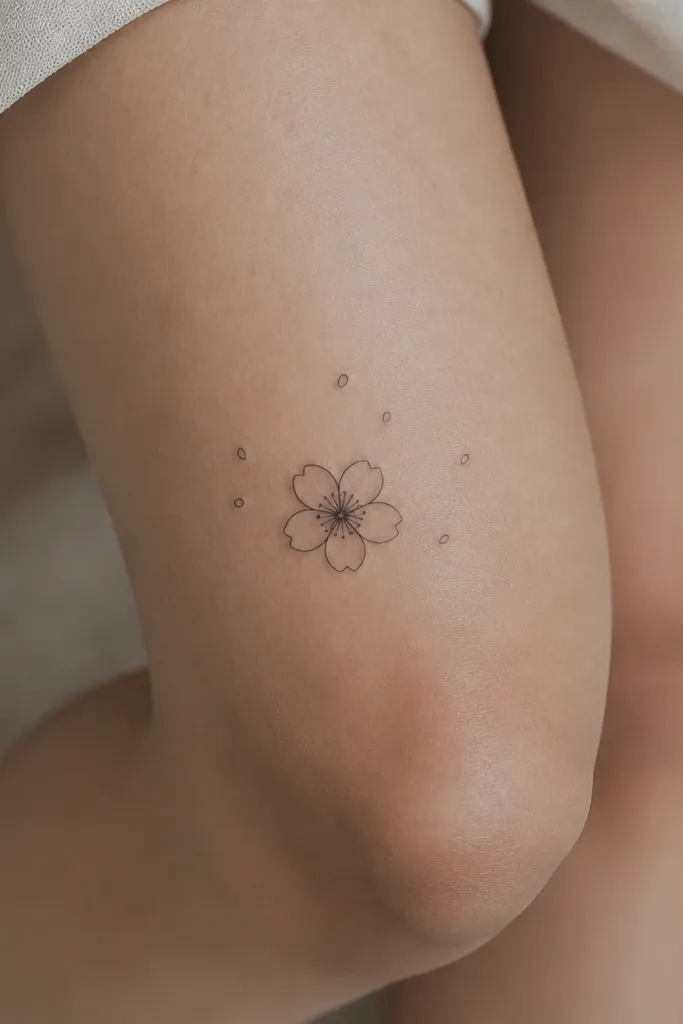
Cherry blossoms feel dreamy because the petals are soft curves, not sharp angles. The floating specks add that "moment" vibe without needing a full background. This also gives you a built-in fade plan: even if some specks soften, the main flower stays clear. It's a clean alternative to roses when you want something gentle but still unmistakably floral.
Target 6-7 cm tall. Place the blossom slightly above the kneecap and keep specks to a small cluster on one side so it looks intentional. Make the specks tiny - like 1-2 mm dots - and limit them to about 6-10. Keep the flower outline thin but confident.
Pro tipBring a stencil reference with a similar petal count so your artist doesn't add extra petals and shrink the design more than you want.
AvoidDon't add a full swirl trail around the knee - it makes the design look like it's trying too hard.
11. Minimal Vine Loop Ending in a Mini Rose
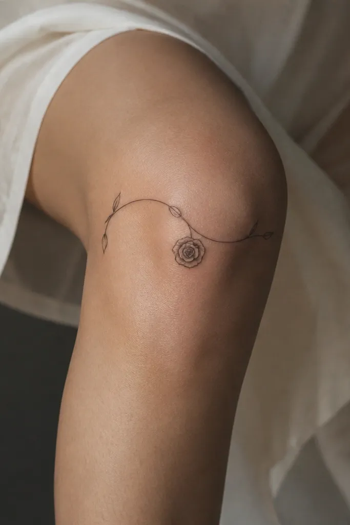
A vine loop gives you a guide line that naturally follows the knee curve. The mini rose at the end becomes the focal point, and the vine adds motion without adding bulk. I like this for dreamy because the negative space between vine lines and rose petals stays open and airy. It also hides early fading better: if the rose softens a bit, the vine shape still reads as intentional.
Plan for 8-10 cm total height, with the rose about 5-6 cm wide. Place the vine loop so it hugs the outer curve of the knee and doesn't cross the kneecap directly. Keep the vine line hairline, and limit buds to one or two. If you add color, do it only in the rose center.
Pro tipAsk for the vine line to taper at both ends. Thick-to-thick lines look heavy on knees.
AvoidAvoid adding multiple rose buds along the vine - it stops being minimalist fast.


