1. Planet + Orbit Pair
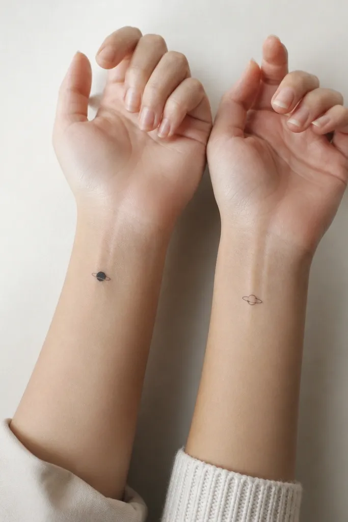
This set works because it uses one simple shape system: circle + ring + dot. The filled planet gives a clear focal point, and the thin ring reads as movement without getting busy. On both people, the negative space keeps the lines crisp and makes the tattoos look intentional even when they're small. Black ink keeps it consistent; no gray gradients needed.
Do the planet on the first person at about 8-10 mm wide. On the second person, keep the ring the same size but replace the planet with a single dot of matching diameter. Place on the inner wrist about 1-2 cm above the wrist crease so it stays visible when you flex your hand.
Pro tipAsk the artist to draw the ring line thickness to match the planet dot diameter. That one detail makes it look like a designed system, not two separate tattoos.
AvoidDon't add stars or extra dots - they crowd the space and turn into a muddy cluster over time.
2. Half Hearts Facing In
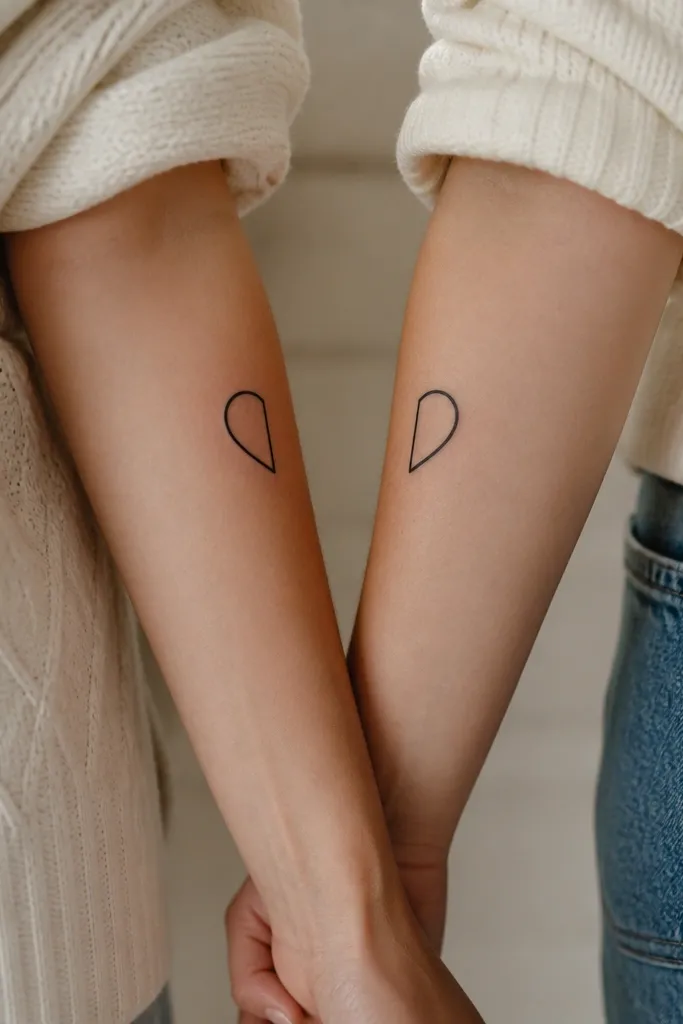
Half hearts are the only "matching" that feels interactive without needing color. When you hold your arms together, the hearts complete, and when you're apart, each tattoo still looks like a simple icon. The trick is keeping the heart shape geometric so it doesn't turn into a wobbly blob. Black line-only ages better than heavy fill for this style.
Size them around 12-14 mm tall. Place one on the outside of each forearm at the same height, roughly mid-forearm, so the halves line up when arms are side-by-side. Keep line weight even - around 1.5-2 mm for the outline, depending on artist style.
Pro tipMake a quick alignment test: tape two paper half-hearts to your forearms and stand in front of a mirror. You want the flat edges to meet smoothly.
AvoidSkip tiny hearts with lots of internal curves; micro-curves blur faster than you think.
3. Two Constellations, Same Star Map
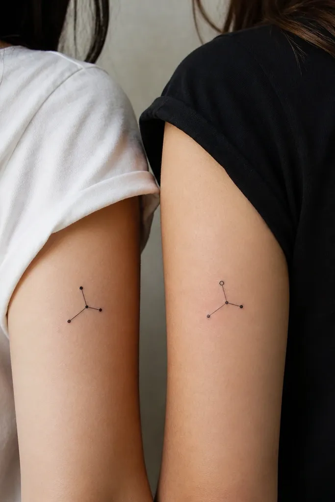
Constellations look great small because they're naturally built from dots and line segments. Keeping the connection lines short prevents the design from becoming a tiny spiderweb. The one-dot variation keeps it matching without being identical, which stops the set from looking like a copy-paste sticker. I like black-only with dot sizes that match exactly.
Use 4-6 stars max. Place on upper outer arm so you get a steady surface; aim for about 15-20 mm wide. Keep the dot sizes consistent - pick one dot diameter and use it for all dots except the ring dot variation on the second person.
Pro tipTell your artist the constellation should be readable from a distance. Ask them to stencil it, step back, and check visibility before ink goes in.
AvoidAvoid long looping connecting lines; they look fine on paper and turn messy on skin.
4. Infinity Ribbon with Tiny Knot
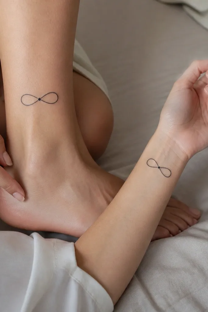
Infinity symbols are clean and forgiving when you keep them simple. The tiny knot dot at the crossing adds a focal point and gives the tattoo a "signature" without adding extra elements. This design looks good at small sizes because the loops are thick enough to hold shape. Black ink makes it crisp and easy to maintain.
Size about 10-12 mm across for wrists and 12-14 mm for ankles. Use a single line weight, no shading. Place wrist on the inner side, just below the wrist bone; ankle on the inner ankle bone area where you can still see it when you stand.
Pro tipAsk for the loops to be slightly wider than tall so it doesn't look squashed when your skin stretches.
AvoidDon't add flowers or swirls around it; those extras make the infinity line look crowded.
5. Matching Tiny Bookmarks
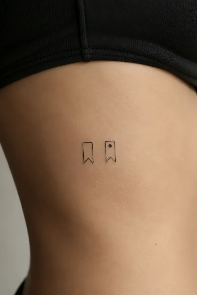
Bookmarks are such a good friendship tattoo because they imply "we're both in the same story" without needing text. The shape reads instantly even when it's small, and the notch line gives character. I like this idea for besties who are always trading books or playlists - it feels personal without being cheesy. Keeping it flat black with one micro variation keeps the match tight.
Keep it about 18-22 mm tall on the ribcage side. Place where fabric won't rub too hard - low rib, not the high underarm crease. Make the top notch and bottom point symmetrical on both people.
Pro tipTell your artist to keep the bookmark edges sharp. Soft rounded edges look cute on paper but blur into a generic teardrop on skin.
AvoidAvoid tiny text inside the bookmark; it will fade into background.
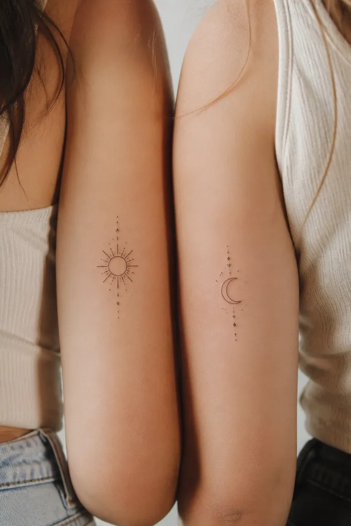
6. Sun and Moon Minimal Pair
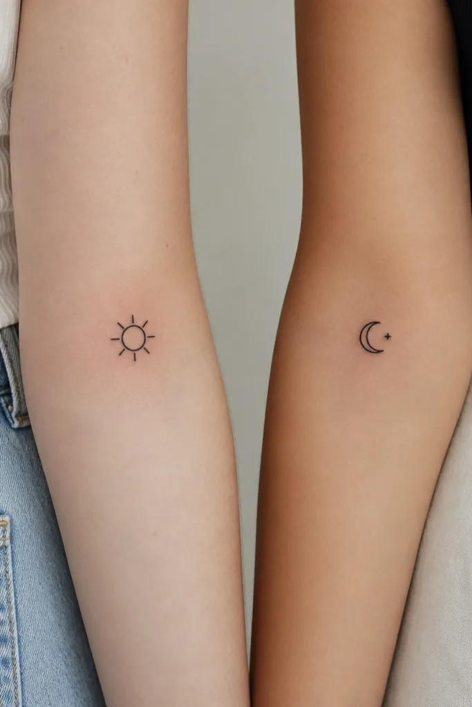
Sun and moon works because the shapes are both simple and iconic. The key is symmetry and consistent line weight - rays should be the same thickness as the moon outline. The tiny dot star keeps it matching but not identical. Black ink with no shading stays clean as it ages.
Size around 14-16 mm. Place sun slightly above where the moon sits so both designs look balanced when you stand side-by-side. Keep rays to short strokes - 8 rays max - so it doesn't turn into a spiky blob.
Pro tipUse a stencil mock with your sleeves rolled up. Check visibility in real light, not bathroom mirror light.
AvoidSkip glow effects or heavy dot shading; it creates a gray haze that hides the icon.
7. Matching Keyholes + Tiny Lock
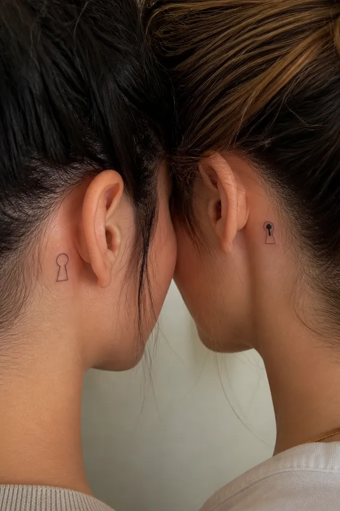
Keyholes look delicate but still read well because they have strong geometry: circle top, teardrop stem. Adding a tiny lock bar on the second bestie keeps it matching while showing a shared theme. Behind the ear is a great spot for small minimalist because it hides well and shows up when hair moves.
Size about 10-13 mm tall behind the ear. Keep the outline line weight consistent and avoid shading inside the teardrop. Position so it sits just below the ear fold - that area heals well and stays flat.
Pro tipAsk for a slightly thicker outline than you think you need. Small behind-the-ear tattoos fade faster at the edge.
AvoidDon't add tiny teeth or a full key shape; it turns into a smear on that spot.
8. Two Matching Crescents with Different Fill
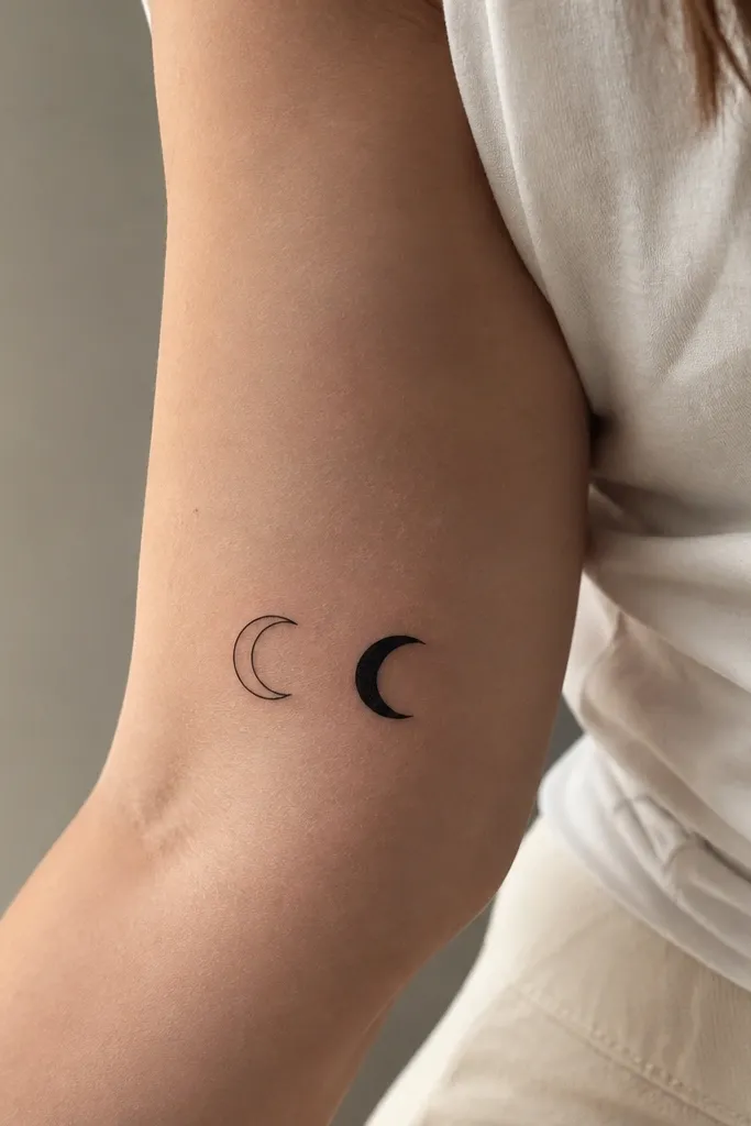
This is a clever minimalist matching trick: same outline, different fill. The filled crescent gives depth and makes it easy to tell who has which version, but the overall silhouette stays the same. It also ages well because both are black shapes with the same edges. No micro-detail means it stays sharp.
Keep crescents around 16-18 mm across. Place on inner upper arm where you don't bump it on bags. Use a stencil that matches the arc curvature exactly, then only change fill on one person.
Pro tipIf you want it to feel more "friendship" than "celestial," ask your artist to keep the crescents slightly different in tilt by 10-15 degrees so it looks like a matched set, not a mirror copy.
AvoidAvoid gray wash shading; it fades unevenly on small crescents.
9. Minimal Feather Dots
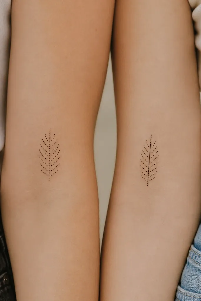
A feather made from dots stays minimalist but still has movement. The dot barbs create a soft texture without the risk of fine line feather strokes bleeding together. The single center line variation keeps the set connected. This design is gorgeous on forearm inner or upper arm outer because the dots catch light differently as you move.
Size around 20-24 mm long. Place on forearm inner about 3-5 cm above the wrist for steady skin. Keep dot spacing even so it doesn't look like accidental freckles.
Pro tipAsk for dot diameter consistency. If the dots vary too much, the feather looks uneven after healing.
AvoidDon't do thin line feather with tiny dot barbs - mixing styles inside one tattoo often ages badly.
10. Matching Coordinates Without Numbers
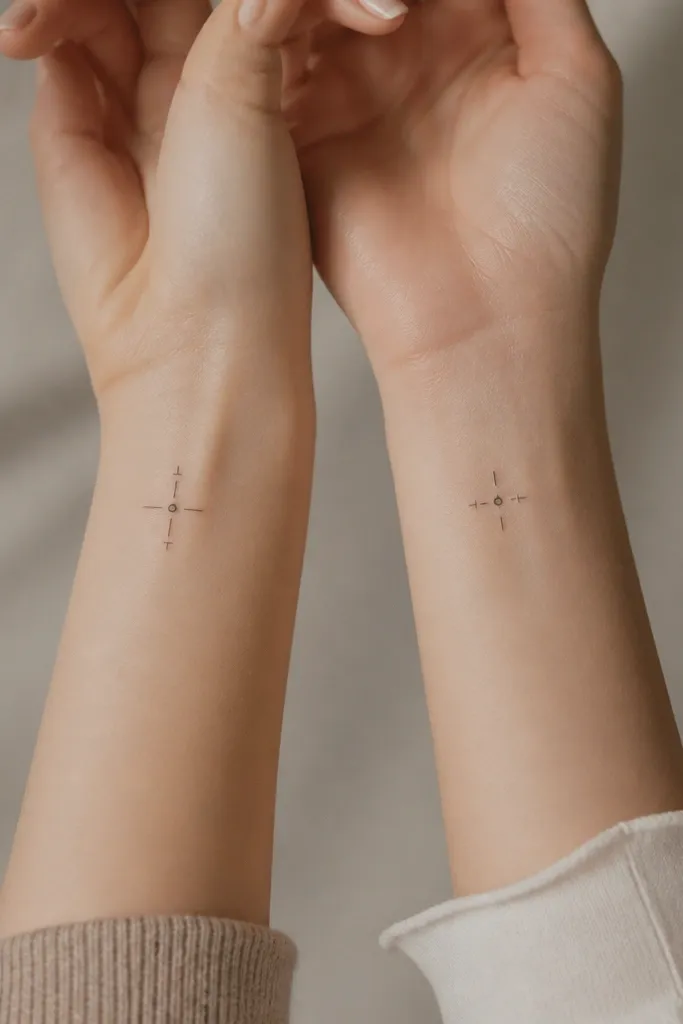
Coordinates can get messy fast when people squeeze tiny numbers in. This version keeps the vibe using only crosshair geometry, so it stays readable and minimalist. The tick orientation variation makes it match without being identical. Black ink keeps everything crisp and lets the design feel clean even when it fades slightly.
Size about 10-12 mm. Place on wrist where you can see the ticks when your hand is relaxed, not when it's flexed. Keep tick lengths consistent and make the center dot the same diameter for both.
Pro tipWrite the real coordinates on paper and give them to your artist so they can map the crosshair style you want, even though the tattoo shows no numbers.
AvoidSkip micro-number coordinates. They almost always turn into a gray blur.
11. Two Tiny Mountain Peaks
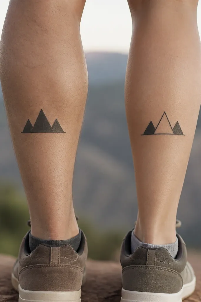
Mountains work because they're simple shapes with strong silhouettes. The hollow middle peak version keeps it matching but personal. Calf placement hides well and shows beautifully in motion, and the flat base line gives structure. Black ink with no shading keeps the triangles crisp.
Size about 25-30 mm wide for outer calf. Place where the calf muscle is flatter when you're standing, not on the highest bump. Keep triangle angles sharp - don't soften them or they'll look like generic hills later.
Pro tipAsk your artist to stencil while you're standing. Calves shift shape when you sit, and that changes the perceived angles.
AvoidDon't add trees, a sun disk, or extra layers. Small mountains need breathing room.
12. Matching Tiny Umbrellas
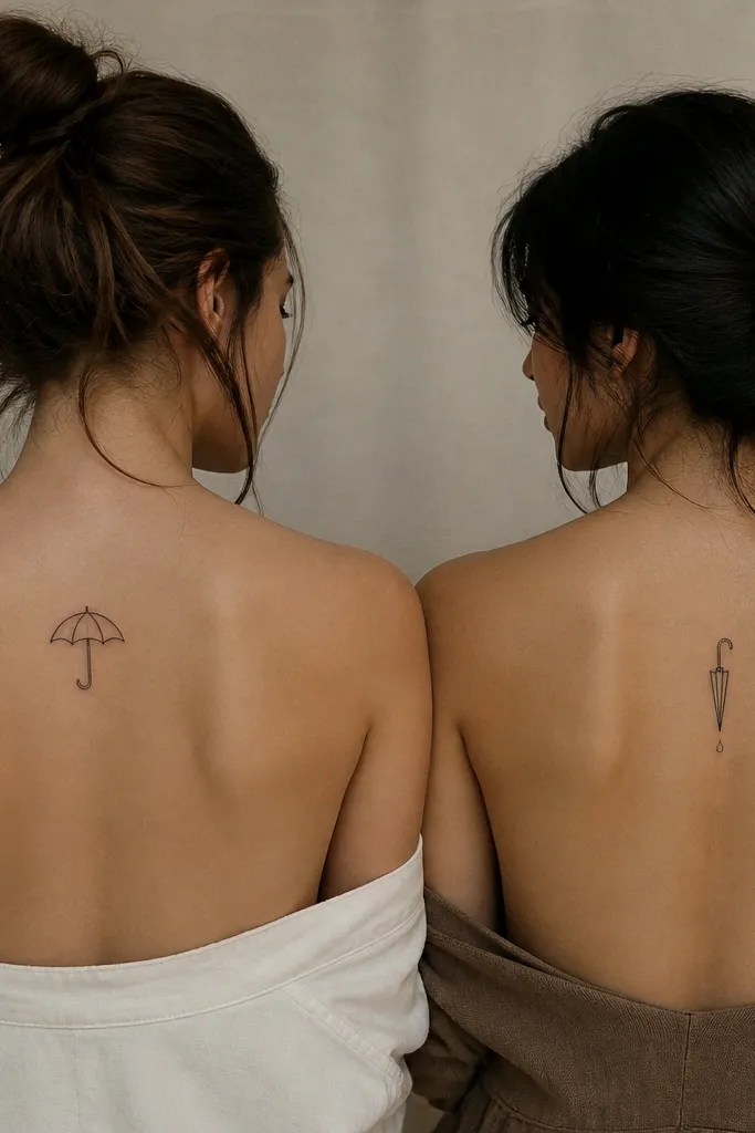
Umbrellas are a cute friendship symbol because they're about protection and "we've got you." Minimal ribs give it structure, and the closed version adds personality. Shoulder blade placement makes the tattoo feel like a secret detail that pops when you wear a tank top. Black ink keeps it clean even with the rib lines.
Size about 22-26 mm across. Place on upper back slightly off-center so it doesn't warp with spine curvature. Keep umbrella ribs evenly spaced and line weight consistent.
Pro tipIf you want it extra cute, ask for the handle curve to match the curve of your bestie's handwriting style.
AvoidDon't add rain lines. Small raindrop lines make the design look like a watermark.


