1. Single-Leaf Outline on the Outer Knee
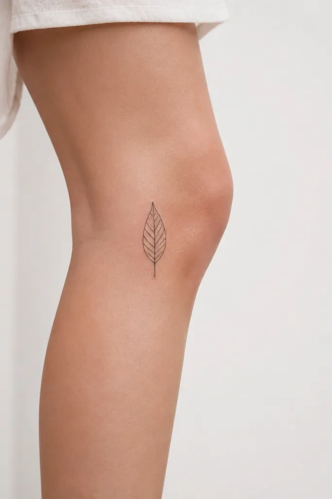
This works because the outer knee has a cleaner stretch pattern when you walk, so the outline stays sharp. The leaf shape gives you a natural direction - it points up, which visually lengthens the leg and makes the tattoo look intentional even when it's partially covered. Black ink with no fill keeps it minimalist, but the outline thickness is enough to read from a distance.
Place the leaf so its top tip sits about 1-2 finger widths above the kneecap edge. Keep the leaf about 2.5-3.5 cm tall for a knee tattoo that stays bold without looking cramped. The artist should use a consistent line weight - if the outline thins too much, it fades into the skin texture.
Pro tipAsk for a slightly thicker outer line on the leaf edge, then thinner inner contour lines - it keeps the minimalist look but boosts legibility.
AvoidAvoid a tiny leaf under 2 cm - it will blur faster on moving knee skin.
2. Micro-Filigree Dot Star on Upper Inner Knee
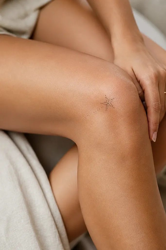
Dots give you a soft, airy texture without heavy shading, which is perfect for minimalist knee work. The inner knee spot makes the tattoo feel private and delicate, but the star still reads bold because it's the only dense element. The dot trails guide the eye, so the tattoo looks composed rather than random.
Anchor the star so it sits 1 finger width above the kneecap, with the points facing upward. Keep the star diameter around 1.8-2.5 cm. Make sure the dot density is highest at the star body, and the trails are sparse - too many dots all over will turn into a gray smear later.
Pro tipChoose a dot-only design if you're worried about blur - dots hold up better than ultra-fine lines on knees.
AvoidSkip long dot trails that cross the kneecap - they stretch and smear.
3. Tiny Geometric Triangle Stack on Outer Knee
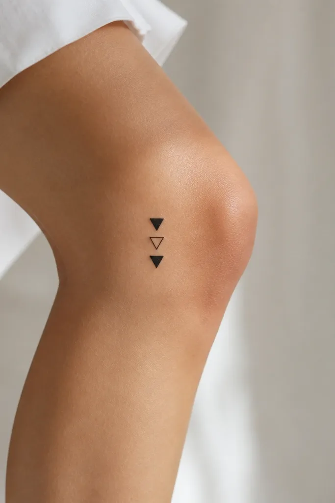
Geometric shapes look bold because they have clear edges and easy symmetry. Stacking triangles creates a clear focal hierarchy while staying minimalist. Alternating filled and outline triangles keeps contrast high, so the tattoo doesn't disappear when you wear patterned leggings.
Put the stack slightly above the kneecap and angle it so one triangle point aligns with the knee's outer curve. Aim for 1.2-1.8 cm tall per triangle, with 1-2 mm gaps between them. For best retention, keep the filled triangle area compact - large black blocks can look heavy on the knee.
Pro tipAsk your artist to test the stencil with your knee bent 90 degrees before committing to the final position.
AvoidAvoid triangles with soft rounded corners - they look fuzzy after healing.
4. Minimal Crescent Moon with One Line Accent
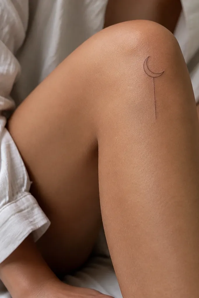
A crescent moon outline is simple, but it reads bold on the knee because it's instantly recognizable and has a clean silhouette. The single line accent adds a graphic punch without adding clutter. Keeping it mostly outline prevents the knee from turning it into a gray blob.
Place the crescent so the open side faces inward toward the leg, and sit it 1 finger width above the kneecap. Size it around 2-3 cm wide. The straight line should be short - about 1-1.5 cm - and aligned with the leg's vertical axis for a clean look.
Pro tipIf you want extra crispness, use linework with a slight taper - thicker at the ends, thinner in the middle.
AvoidDon't add stars or extra micro-lines - the knee will make them look like noise.
5. Single Dot Mandala on Lower Inner Knee
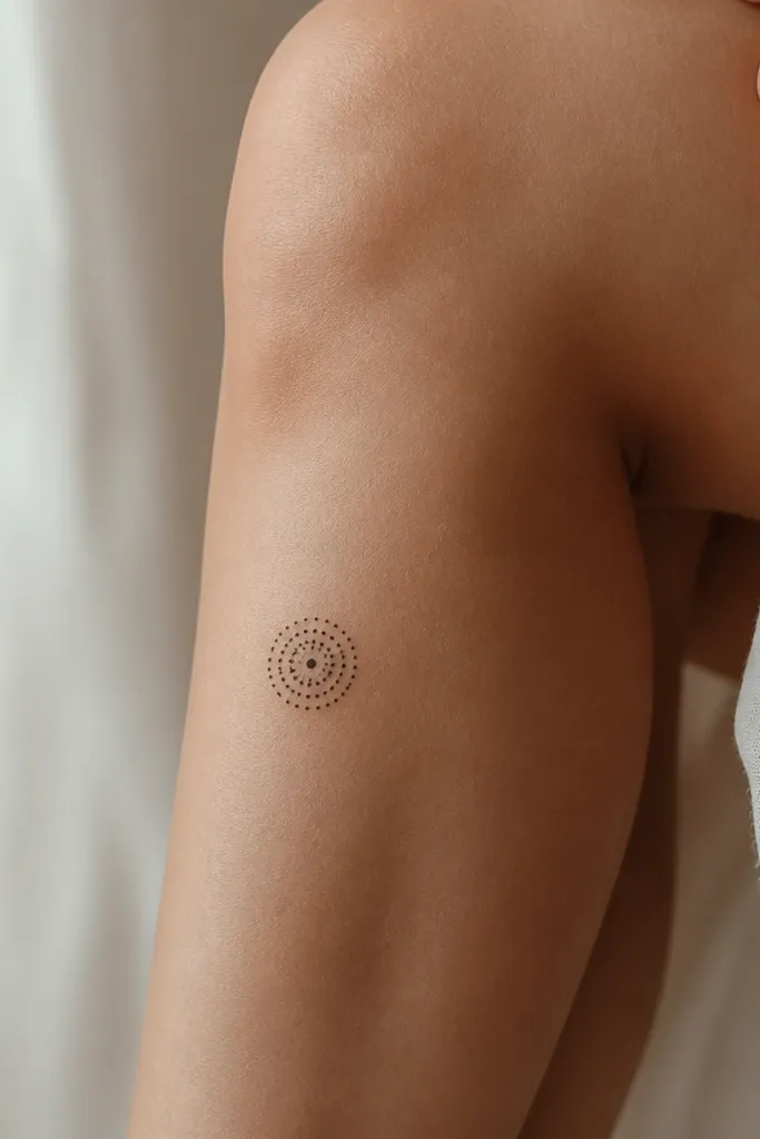
Mandala shapes can be busy, but a single small dot mandala stays minimalist and still looks intentional. The dot ring structure gives you rhythm and balance, so it looks "designed" even with minimal size. On the lower inner knee, it's visible with skirts and stays readable because the skin stretch is less intense than exact kneecap center.
Position it closer to the upper shin, about 2-3 cm below the kneecap edge. Keep it around 2 cm in diameter. Use only dotwork - no fine lines between dots, so healing stays clean.
Pro tipBring a photo of the placement on a bent knee and ask the artist to match it before tattooing.
AvoidSkip lace-like mandala lines around the dots - they fade first.
6. Fine Line Heart with Negative-Space Split
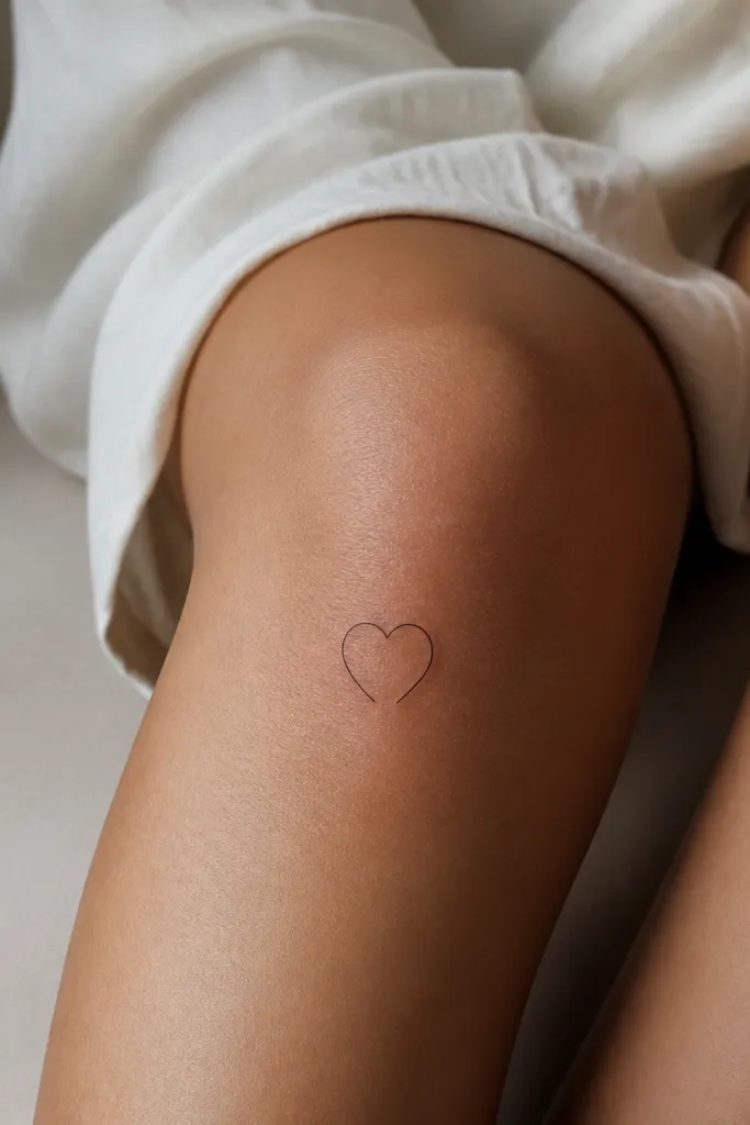
This design looks bold because the negative-space gap creates contrast even with thin lines. A heart is recognizable from a quick glance, which matters on a moving joint. The split makes it feel more modern than a standard outline heart and keeps it from looking childish.
Place it on the front of the knee but slightly above the kneecap, not centered on the joint crease. Keep the heart about 2-2.6 cm tall. The gap at the bottom should be clean and intentional - no messy blowouts around the break.
Pro tipAsk for slightly thicker line weight on the outer heart edges so the split stays crisp after healing.
AvoidAvoid very thin hairline hearts - knees chew fine ink.
7. Micro Crosshair Target on Outer Knee
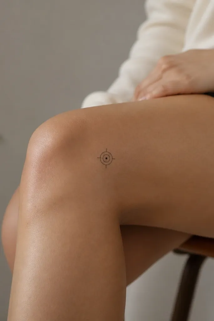
Crosshair and target symbols look graphic and bold because they're high-contrast by design. The minimal rings keep it clean, and the center dot gives a focal point that stays readable even if the knee skin shifts slightly. Outer placement also helps it look balanced when you wear shorts.
Put it on the outer plane about 1-2 finger widths above the kneecap. Target size should be around 2.2-3 cm across. Keep ring lines consistent thickness and avoid ultra-thin rings that disappear during the first weeks of healing.
Pro tipIf you want a sharper look, ask for a stencil that includes the crosshair alignment with your leg's vertical axis.
AvoidDon't add text or extra symbols near the target - it crowds the knee.
8. Tiny Lightning Bolt on Upper Outer Knee
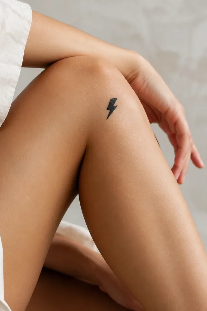
Lightning bolts work because they're naturally bold shapes with clear edges. When you keep it small but thick-lined, it reads instantly and doesn't need shading. The upper outer knee position helps it stay crisp when you bend your leg.
Place the bolt so the bottom point sits just above the kneecap edge. Size it around 2-3 cm tall. Use solid black linework - no gray wash - so the bolt stays dark after healing.
Pro tipChoose a thicker line weight than you would for a forearm - knee tattoos need more visual mass.
AvoidAvoid ultra-fine lightning bolts - they look like smudges after a few months.
9. Single Line Wave with One Dot Crest
A wave line is calm, but the single dot crest makes it feel graphic and deliberate. It reads as a complete motif, not just a random squiggle. The inner knee placement feels subtle up close, while still looking bold because the crest dot anchors attention.
Place it 1 finger width above the kneecap, angled slightly so the wave travels upward toward the inner thigh. Keep the wave length about 3-4 cm. The dot should be about the size of a small pinhead relative to the line thickness, not smaller.
Pro tipAsk for the line to start thicker and taper - it gives the wave energy without adding complexity.
AvoidSkip multiple wave lines - they tangle visually on the joint.
10. Small Black Rosebud on Outer Knee with Micro-Thorns
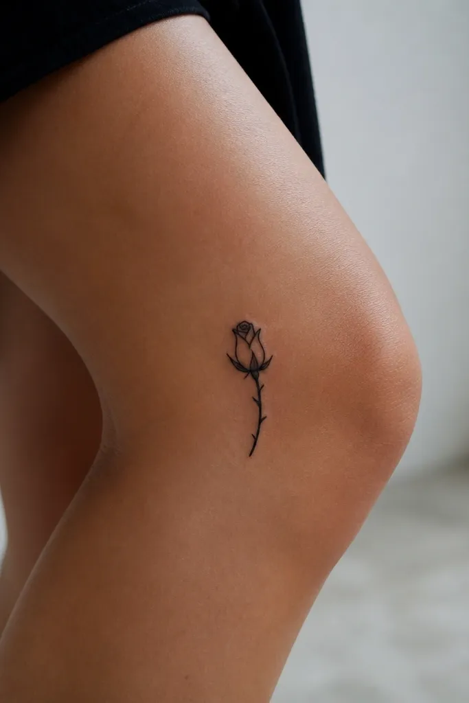
A rosebud reads bold even when small because the petal shape is recognizable. Keeping the shading minimal prevents the knee from turning it into a dark blur. Micro-thorns add attitude without turning the piece into a full bouquet.
Place the bud above the kneecap and let the stem angle down toward the outer shin but stop before crossing the joint center. Bud size around 2.5-3.5 cm tall. Use stipple only on the bud base, not across the whole bloom.
Pro tipIf your artist offers a stencil test on your skin, do it while you bend your knee - the stem should not kink.
AvoidAvoid dense heavy black fill - knees fade unevenly and can look patchy.
11. Minimal Roman Numeral V on Upper Knee
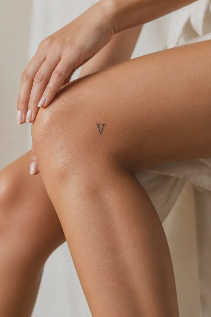
A single numeral is one of the best minimalist knee tattoos for bold placement because it's instantly readable. It also avoids the healing issues of tiny decorative elements. The V shape works with knee angles - it looks stronger on the outer side where the leg contour is smoother.
Place it 2-3 cm above the kneecap edge so it doesn't stretch across the joint. Size the numeral about 2.5-3 cm tall. Use line weight that's slightly heavier than a fine-line script - you want it to stay dark.
Pro tipPick a numeral font with straight, bold strokes. Curly serifs disappear on knees.
AvoidAvoid very small numerals under 2 cm - they fade into the skin texture.
12. Two-Strip Barbell on Lower Outer Knee
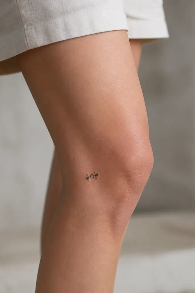
This is minimalist, but it looks bold because the icon has strong symmetry. The small center circle gives it a focal point, and the two bars keep it graphic. Lower outer knee placement works because it's visible with cropped leggings and doesn't get crushed by kneeling.
Put it on the outer knee about 3-4 cm below the kneecap edge. Keep it around 2.5 cm wide. Use solid black for the center circle and consistent line thickness for the bars.
Pro tipTell your artist you want a "sticker-sharp" outline - ask for a thicker pass on the outer edges.
AvoidSkip extra shading on the icon - it will look muddy where your skin moves.


