
1. Tiny crescent moon on the outer knee
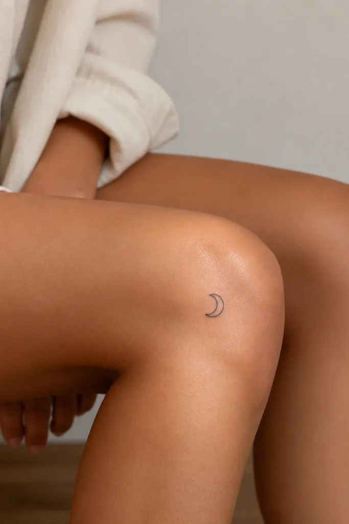
A crescent reads classy because it's one clean shape. On the outer knee, it sits where the skin stretching is more forgiving, so the curve stays smooth instead of warping into a blob. I like an outline-only moon - no heavy black fill - because it keeps the edges sharp as the years go by. If you want a softer vibe, add one tiny dot crater on the inner side of the crescent, but keep it far from the outline.
Size it to roughly 1.2 to 1.6 inches wide. Place the tips of the crescent pointing slightly upward, so it "lifts" when you stand. Use standard black ink with fine-line needles, and keep the line weight light but consistent.
Pro tipAsk your artist to stencil it while you stand and then again while you sit - adjust the height so it doesn't look stretched when seated.
AvoidAvoid a fully filled crescent moon - solid black inside small shapes tends to blur on knees.
2. Micro dot compass rose
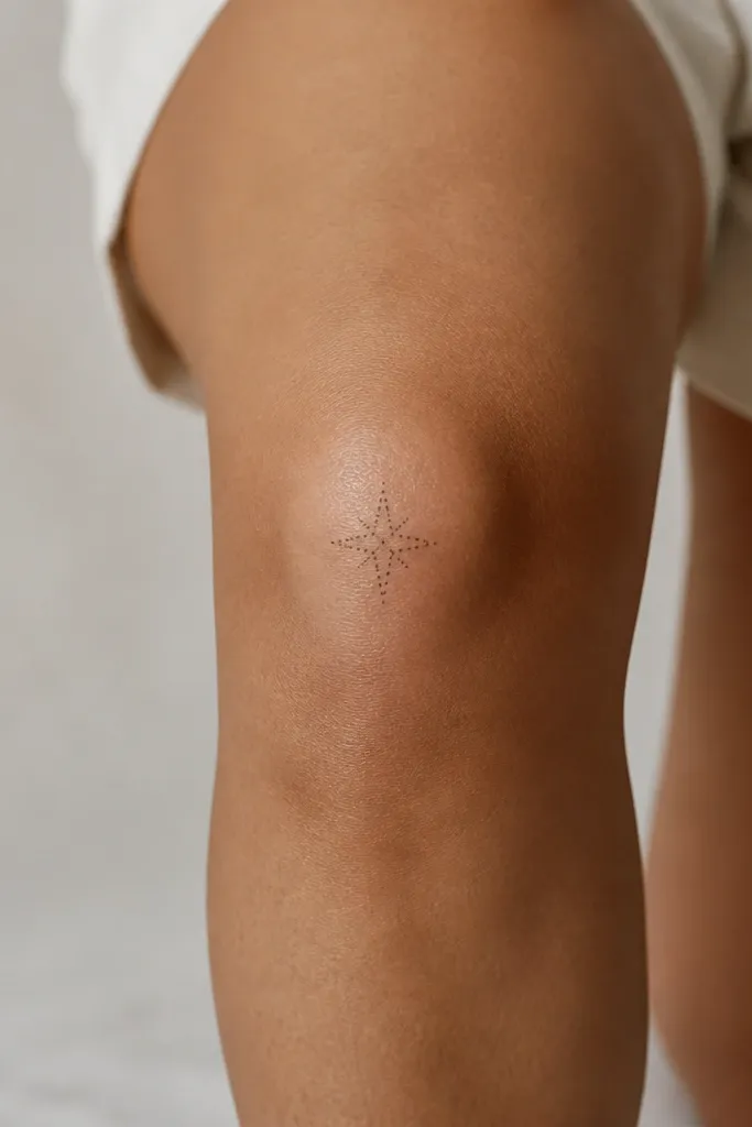
Dotwork looks delicate without turning heavy. A micro compass rose is simple but still interesting, and the dot spacing gives you a texture that survives movement. Because the design relies on dots rather than thick lines, it stays airy even after some natural fading. Keep the center and points minimal so it reads as "compass" from a distance.
Keep it under 1.5 inches total width. Place it slightly above the center crease of the knee so it doesn't get distorted when you bend. Use a dotwork-friendly stencil and request tiny, consistent dot spacing rather than random speckling.
Pro tipIf you want it extra classy, do the outer points as dots only - skip any lines between points.
AvoidDon't add extra letters or tiny directions - they disappear first on small knee tattoos.
3. Single-line butterfly wing sketch
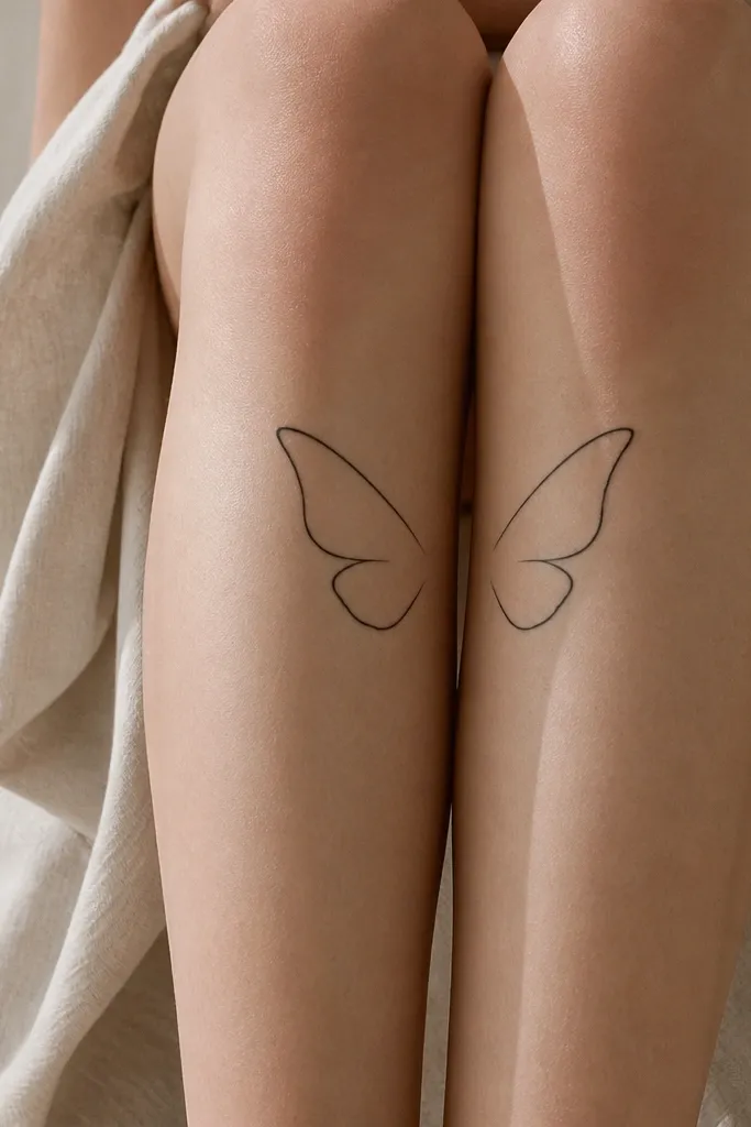
A single-line butterfly looks minimal and elegant because it doesn't try to show every detail. The key is symmetry and clean spacing, so it stays readable when your knee bends. I like it with no antenna and no body shading - the wings alone carry the look. The negative space makes it feel light instead of "sticker-like."
Size it about 1.3 inches across. Put it on the inner knee, angled slightly so the "top" of the wings points toward your thigh. Use fine-line needles and keep the line thickness consistent from start to end.
Pro tipAsk for a stencil that matches your knee crease - you want the center gap to sit over the flatter skin area.
AvoidAvoid thick outlines - heavy black on small wings turns into a dark patch.
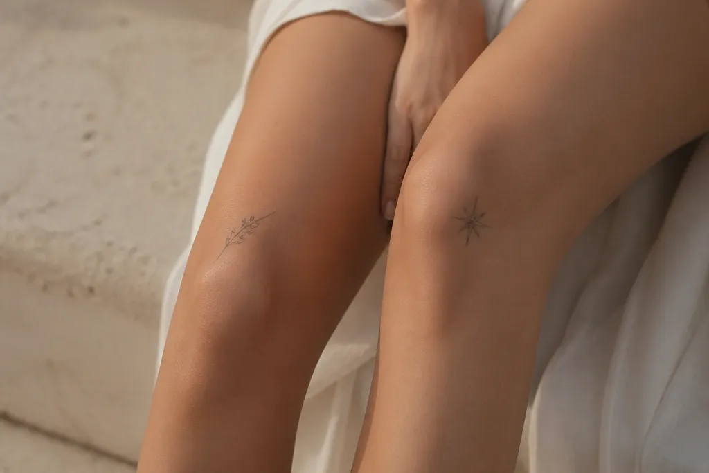
4. Vertical sprig of olive leaves
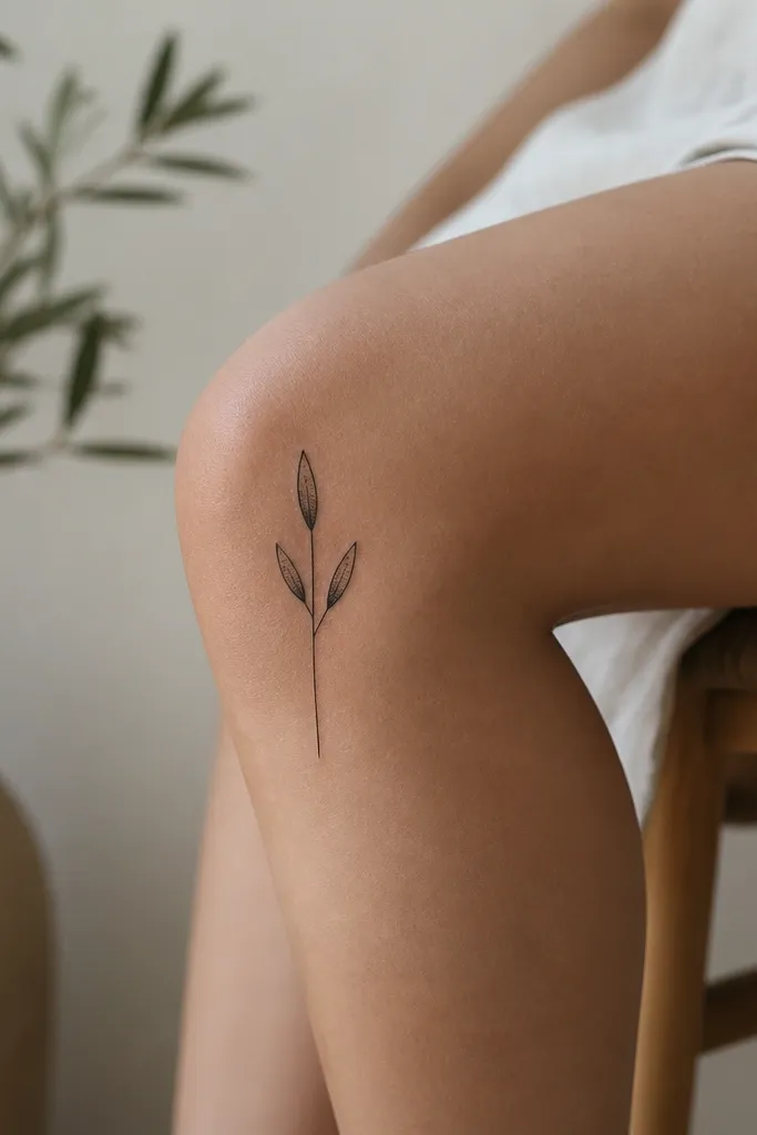
Olive leaves feel classy because they look like jewelry. The vertical layout is perfect for knees since it follows the body's natural lines and doesn't fight the curve. Dot shading adds softness without lots of fill, so the tattoo stays crisp longer. Keep the leaves small and spaced so the stem stays the main focus.
Place it on the outer knee with the stem running from about 1 inch above the knee crease down to the crease. Keep leaves around 0.25 to 0.35 inches each. If you want color, use a muted olive-green wash in just the leaf bases, not full fill.
Pro tipChoose a stencil where the stem is slightly off-center - it looks more natural on a leg than perfectly centered symmetry.
AvoidAvoid tightly packed leaves - too many edges in a small area blur together.
5. Micro heart with a tiny slash highlight
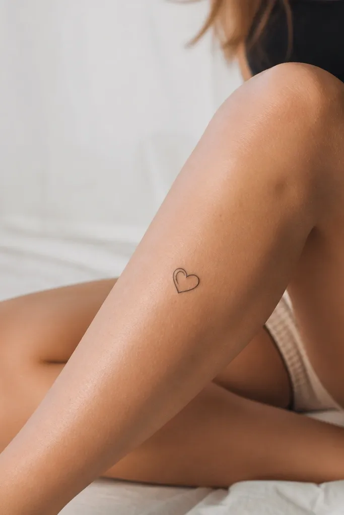
This is for people who want romantic without the cliché. The highlight slash inside the heart breaks up the shape so it doesn't look like a generic icon. Outline-only hearts age better than filled hearts because the interior stays mostly skin. It also looks good under leggings because the heart stays small and clean.
Size it at about 0.9 to 1.2 inches tall. Place it slightly below the knee center but not too low - you want it to avoid the highest stretch point. Use fine-line outline and keep the highlight slash short and straight.
Pro tipIf you want it extra classy, keep the heart pointed - don't round the bottom too much.
AvoidAvoid a thick heart outline - it turns into a blob as it fades.
6. Minimal infinity symbol above the knee crease
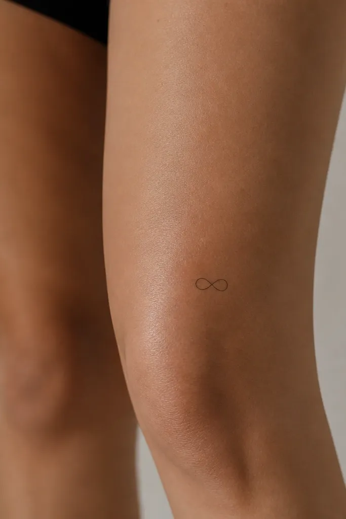
Infinity looks simple but it's visually balanced, which matters on knees. The horizontal placement reads clean in motion, and the loops give you a built-in negative space pattern. Keep it thin and airy so it doesn't turn into a dark knot over time. This one works great if you want a design that still looks "intentional" from far away.
Size it about 1.2 to 1.6 inches wide. Place it above the knee crease so it doesn't stretch and widen when you bend. Use consistent line weight and avoid extra swirls or dots.
Pro tipAsk your artist to stencil it with your leg bent 90 degrees - adjust so it doesn't look like a sideways squish.
AvoidAvoid adding shading inside the loops - it makes the symbol heavy for the knee.
7. Tiny birthstone-style dot cluster
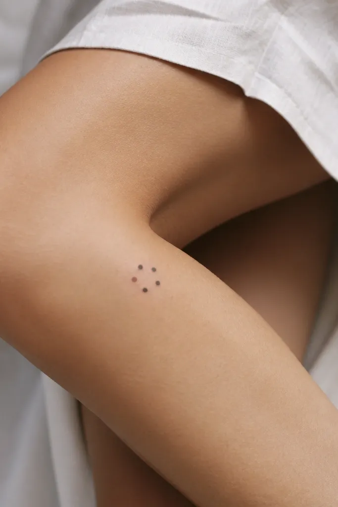
Dot clusters look like quiet jewelry. You get a "special meaning" vibe without a big gemstone illustration. The black dots hold up well, and one muted accent dot gives you color without risking a full-color blur. It's also a good choice if you want something that doesn't scream for attention.
Keep it around 0.8 to 1.1 inches across. Place it on the inner knee where it peeks out when you wear skirts. For the accent dot, use a very small amount of muted color like dusty rose or soft teal - just one dot, not a whole circle.
Pro tipBring a screenshot of how you want the color to look on skin - muted tones photograph differently than bright ones.
AvoidAvoid bright neon color - it fades fast and can look muddy next to black ink.
8. Micro linework daisy with one dot center
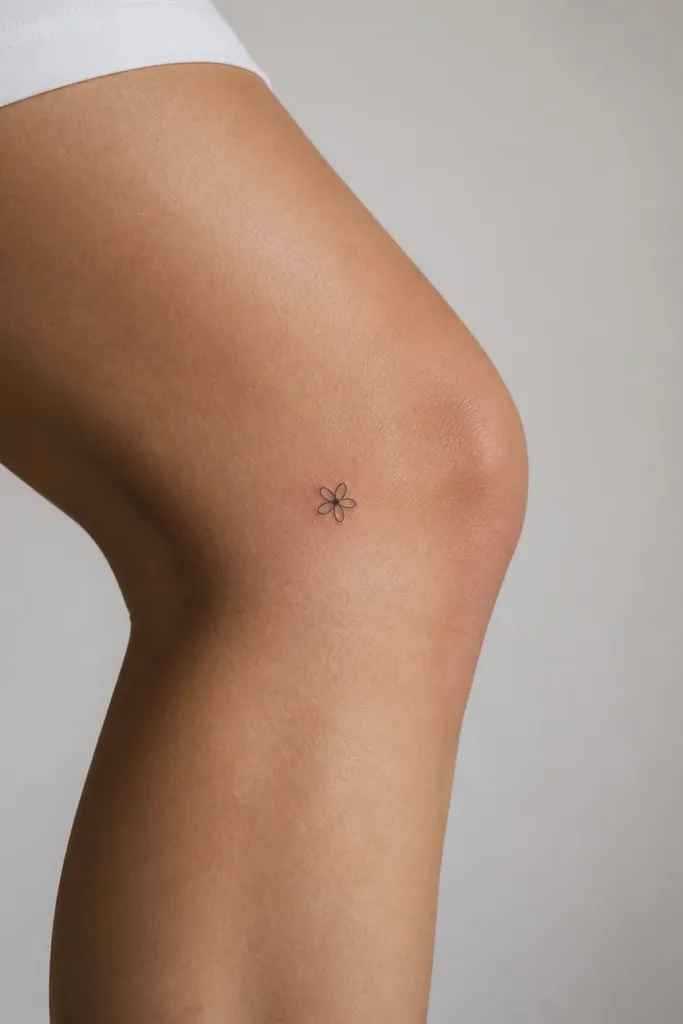
A small daisy is classic but it can go wrong when petals get too many. This version uses linework petals and one dot center, so it stays readable. The negative space between petals makes it look crisp instead of crowded. It also sits well on the outer knee where the shape doesn't distort as much.
Size it at 1 to 1.4 inches wide. Place it so the petals sit mostly above the knee crease, not across it. Use fine-line petals with uniform thickness and a single centered dot.
Pro tipAsk for the petals to be slightly longer than they are wide - it keeps the flower from looking like a starburst.
AvoidAvoid fully shaded petals - they blur into a dark flower blob on knees.
9. Small geometric triangle with one corner open
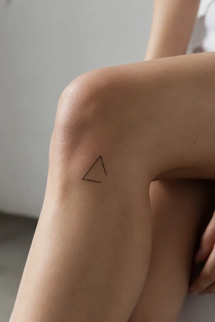
Geometric tattoos look clean on knees because they're based on angles, not tiny textures. The open corner keeps it from feeling too harsh and adds a modern, classy twist. Outline-only triangles hold up better than filled shapes, especially at small sizes. It also looks good with pants because the lines don't sprawl.
Keep it under 1.2 inches tall and centered slightly to the side of the knee front. Place it where the skin is flatter when standing. Use fine-line outline and keep the line weight consistent - no thick-to-thin tapering.
Pro tipIf you want it softer, ask for slightly rounded outer edges on the triangle points.
AvoidAvoid filling the triangle with black - small filled geometry blurs quickly.
10. Tiny ribbon bow on the outer knee
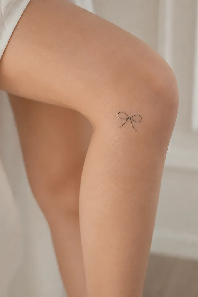
A ribbon bow looks feminine without needing color. Outline-only keeps it light and keeps the bow shape readable as the knee moves. The trick is proportions: the loops should be slightly taller than wide, so it doesn't turn into a squished blob. Keep the knot tiny and centered to make it look intentional.
Size it at about 1.1 to 1.5 inches wide. Place on the outer knee with the bow sitting just above the crease. Use fine-line and keep lines smooth - sharp zigzags age poorly.
Pro tipStencil it so the knot sits on the flatter part of skin while you stand.
AvoidAvoid extra curls on the ribbon ends - extra linework is the first thing that disappears.
11. Micro star cluster of three dots
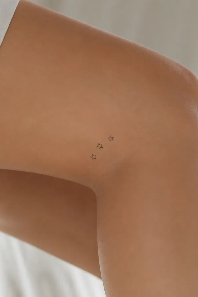
Three stars reads simple and looks "thoughtful" without being busy. Use tiny stars with thin lines, and keep them spaced so each star stays separate. An arc placement looks natural on the knee curve. This one is also easy to hide under socks or leggings if you want flexibility.
Size the whole cluster at 1.0 to 1.3 inches wide. Place it on the inner knee, slightly above the crease. Keep stars the same size and angle so the cluster looks like it belongs together.
Pro tipAsk for a slightly curved baseline under the stars using just one thin line - it ties the cluster together.
AvoidAvoid adding more than three stars - knee skin exaggerates clutter.
12. Small Roman numeral strip
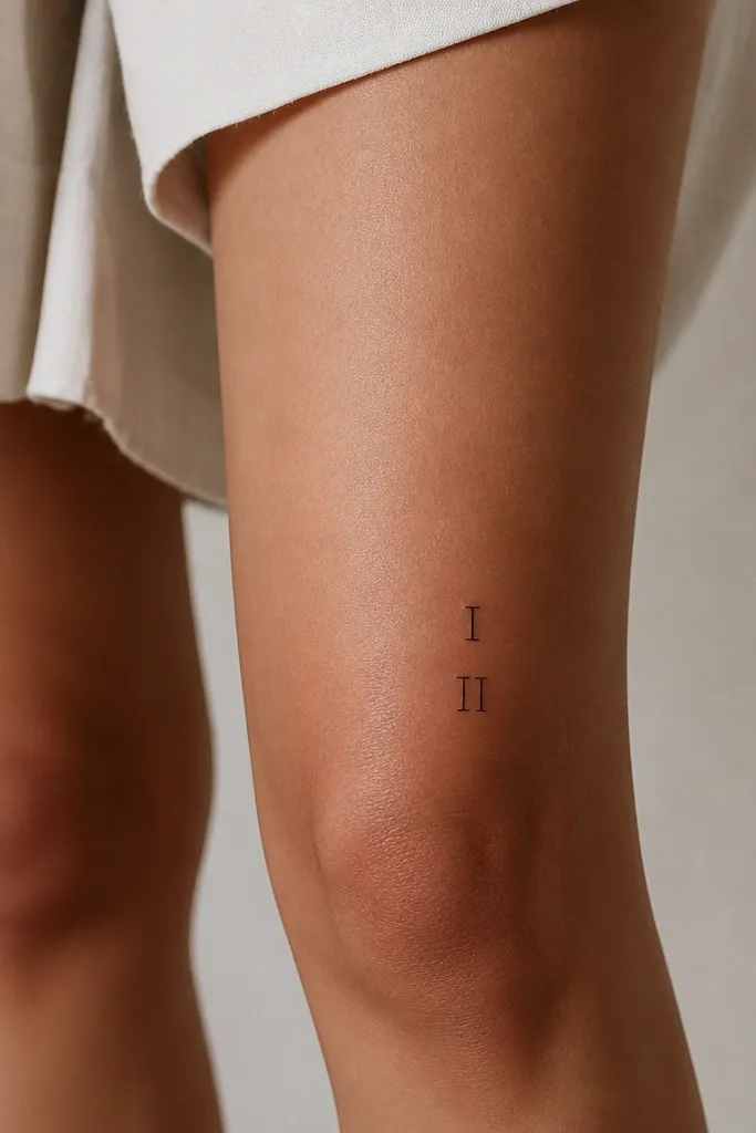
Roman numerals can look classy if they are simple and not fancy. I like a slim strip because it reads crisp even when small, and it's easy to place along the leg's vertical line. Keep the font plain - no ornate swashes - so it doesn't blur into an unreadable scribble. This also gives you a meaningful tattoo without illustration overload.
Pick two or three numerals max so the letters stay legible. Size it about 0.9 to 1.2 inches tall. Place it on the outer knee, aligned with the leg's vertical axis and slightly above the crease.
Pro tipChoose a stencil font with thick enough strokes that won't thin out - ask your artist to do a test mark on paper first.
AvoidAvoid tiny script numerals - cursive lettering fades into gray smudges.


