1. Two Tiny "Password" Lock Icons
These work because locks read instantly and the shape stays crisp even at small size. I've seen them heal better than tiny words because there's no letterform to blur. The look is playful when paired with the right placement - like forearms where you can flash them when you laugh.
Put the lock on a forearm or upper wrist. Keep each lock around 10-12 mm tall and ask for slightly thicker lines than a micro icon. Use black ink only, no gray wash, so both tattoos age the same.
Pro tipAsk your artist to add one tiny detail - a single tooth on the keyhole cover or a small notch - so it feels like a shared joke, not a generic lock.
AvoidAvoid adding tiny text under the lock - the letters blur fast on minimalist work.
2. Side-By-Side "Spicy vs Mild" Chili Sprites
This is funny because it's a clear, visual personality split. The design works in tiny sizes since chili outlines and flame marks stay legible. The shared chili shape makes it feel matching, while the different flame count keeps it personal.
Size each chili to 12-14 mm. Place one on the outer wrist and the other on the inner wrist so you can compare when you hold hands. Keep line weight consistent: same thickness for the chili outline and the flame ticks.
Pro tipBring a reference where the flames are simple ticks, not full flame curls. Ticks age cleaner.
AvoidDon't add heavy shading - it can turn into a muddy blob on small peppers.
3. "Approved" Stamp with Different Dates
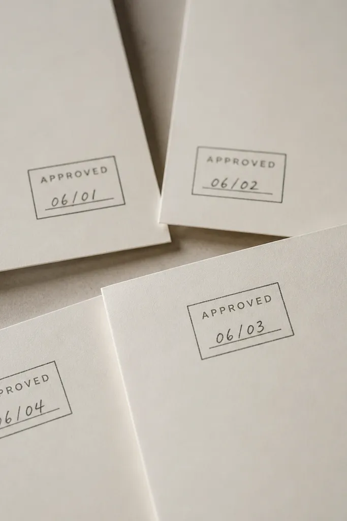
Stamps are inherently funny because they look official, like you're approving the friendship. The rectangle frame also helps the tattoo read as a single unit even when it's small. I like this idea because it gives you a shared layout but lets each friend have a personal date.
Keep the stamp about 14-16 mm wide. Ask your artist to use bold, slightly thicker letter strokes; thin font styles fade quickly. Place it on the outer forearm or upper arm where you get flat skin and less rubbing.
Pro tipUse a date format like 06.14 or 06/14 with numbers only. It ages better than long month names.
AvoidAvoid super-condensed fonts - they turn into a gray smear.
4. Tiny Cartoon Thumbs-Up and Thumbs-Down

This one is instantly funny because the body language is universal. It also scales well down to minimalist sizes since the silhouette is recognizable. The matching style matters: same line thickness, same simplified finger shapes.
Do 10-13 mm for each thumb. Place one on the inside of the wrist and the other slightly higher on the forearm so you can mirror them when you gesture. No shading - just clean outlines.
Pro tipAsk for the thumbs to be drawn with rounded knuckle corners, not sharp angles. Rounded corners hold up better as skin texture changes.
AvoidSkip extra detail like fingernails or wrist bands - they disappear first.
5. Two Mini "Snack" Icons: Cookie and Cracker
Food jokes are the easiest way to make friendship tattoos feel specific. Cookie vs cracker reads as "you two" without needing any text. Since the icons are simple and iconic, they heal with strong contrast.
Keep each icon 12-15 mm. Place the cookie closer to the thumb side of the wrist and the cracker closer to the pinky side. Ask for a flat black fill only if your artist uses it cleanly; otherwise stick to outlines.
Pro tipPick snack shapes that are already recognizable in silhouette. If you need shading to tell what it is, it will blur later.
AvoidAvoid tiny sprinkles or dot patterns - they often break up during healing.
6. "Coffee First" Cup with One Different Add-On
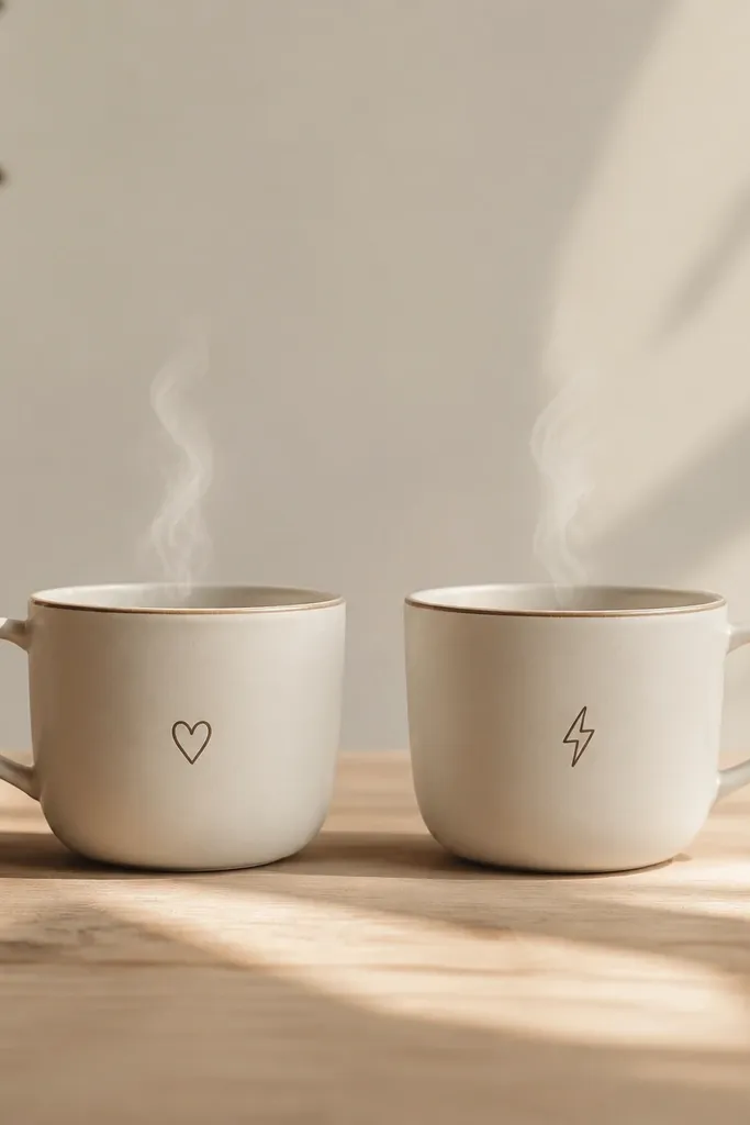
Steam lines and cup outlines are perfect for minimalist matching because they're bold shapes. The different add-on keeps it funny and personal while still reading as the same design family. The heart vs bolt gives you instant "we're different but together" energy.
Size the cup to 14-18 mm tall. Place one on the inner forearm and one on the outer forearm. Keep steam lines thin but not hairline - ask for a line weight that looks solid in daylight.
Pro tipIf one friend has a darker skin tone, ask for slightly heavier line weight so both tattoos have equal contrast after healing.
AvoidDon't add tiny barista-style swirls inside the cup - they vanish.
7. Two Matching "Giggle" Faces, One Smiley, One Grinning
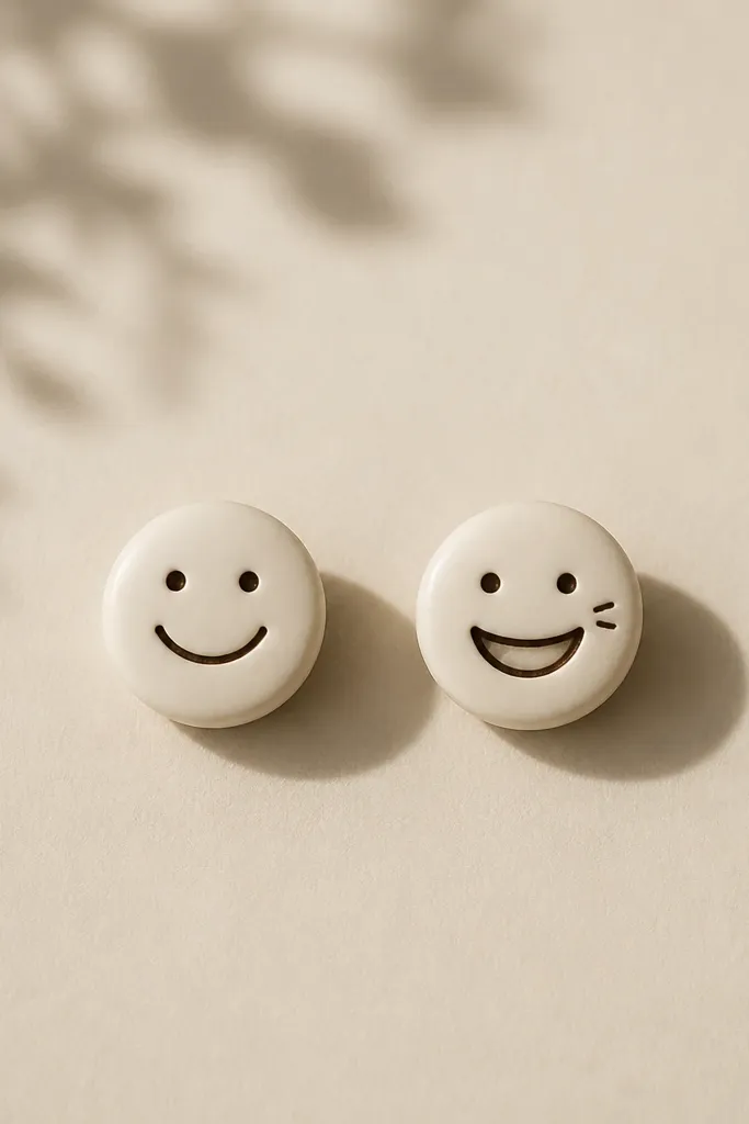
Laugh lines are funny because they act like a sound effect. Keeping both faces the same circle size and eye placement makes them feel like a set. The variation in smile width lets each friend "own" their version without breaking the match.
Keep faces 10-14 mm. Place them on the outer upper arm or upper wrist where the skin isn't constantly stretched. Use black ink with no gray wash so the laugh lines stay crisp.
Pro tipAsk your artist to keep the laugh lines thicker than the eye dots. Eye dots blur faster than short lines.
AvoidAvoid overly detailed expressions - tiny lines crowd each other and heal unevenly.
8. Infinity Loop with One Broken Link Each
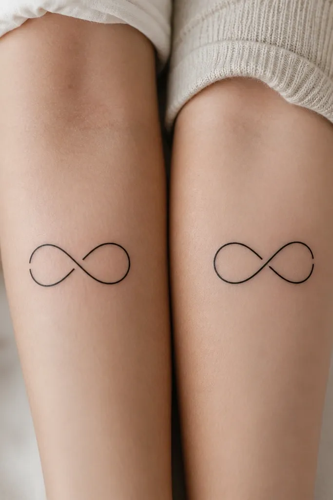
This is funny in a "we're inseparable but we still mess up" way. The infinity shape stays readable even when small. The single break makes the set feel like a shared joke rather than identical copies.
Size it around 16-20 mm wide. Place it on the collarbone area or upper arm for less friction. Keep the line single-weight, and ask for clean, continuous curves so the break looks intentional.
Pro tipMake the break gap the same width on both tattoos. If one break is smaller, the set looks off.
AvoidDon't add extra micro-shading to the infinity. It turns into gray mush quickly.
9. Two Mini "Boss Level" Arrows
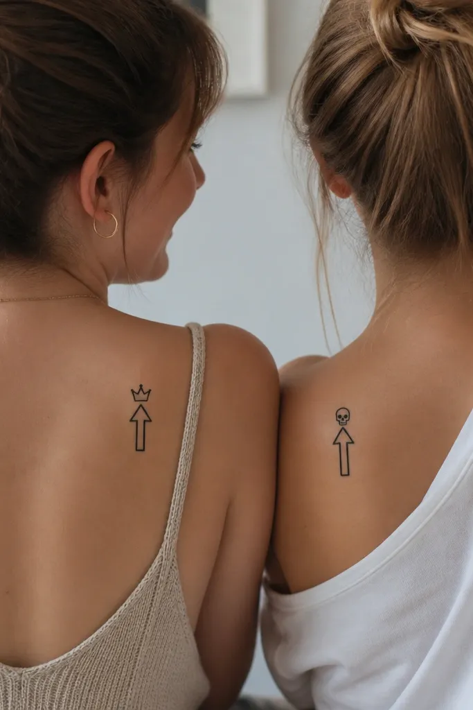
Game icons are funny because they're already inside-joke language. The crown and skull swap makes it matching-by-shape, different-by-attitude. Minimalist arrows also age well because the thick outline stays bold.
Keep the arrow about 14-17 mm tall. Place one on the inner forearm and the other on the outer forearm so they show when you raise your hands. Ask your artist for a slightly thicker arrow shaft than the crown/skull lines.
Pro tipUse a crown with only three points and rounded tips. Detailed crowns blur.
AvoidAvoid thin, outline-only crowns - they fade and look like a smudge.
10. "Besties" Bunny Ears, One with a Knot
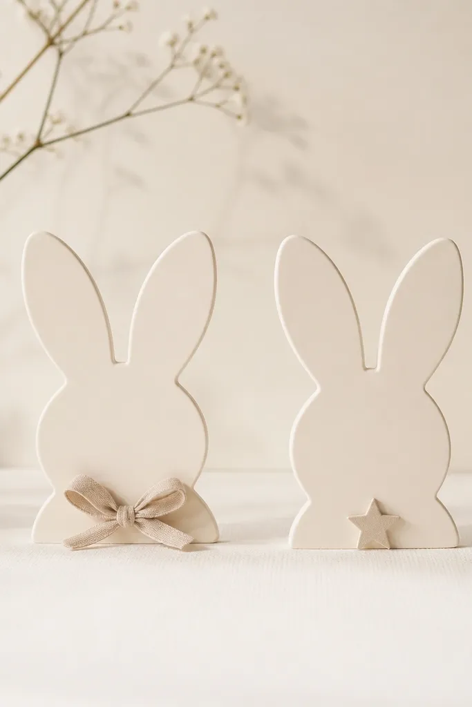
Bunny ears are cute and funny without needing words. The shared ear shape ties the set together, and the tiny knot/star gives each friend a role in the joke. It also heals well because the main forms are thick enough to hold their shape.
Size each tattoo 12-16 mm. Place on the side of the wrist or the upper arm where it won't rub against a bag strap daily. Keep the knot/star small, like 3-4 mm, not bigger.
Pro tipIf you want it to stay sharp, ask for crisp negative space around the ear inner lines.
AvoidDon't make the star too thin - it can disappear into the skin texture.
11. Two Matching "No Peeking" Eyes
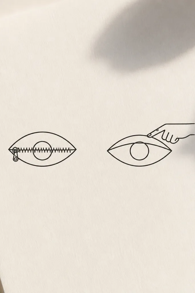
This is funny because it looks like you're policing secrets. The eye shape reads instantly, and the zipper/finger adds the punchline. Minimal line work makes it look sharp instead of childish.
Keep the eye around 10-13 mm wide. Place one on the inner wrist and one on the outer wrist so you can compare when you gesture. Ask your artist to keep the zipper line thickness consistent with the eye outline.
Pro tipBring a reference where the zipper is just 3-4 teeth marks. Too many marks blur.
AvoidAvoid adding eyelashes - they turn into a dark halo.
12. Tiny "Planet" Stickers: Same Orbit, Different Emoji-Style Stars
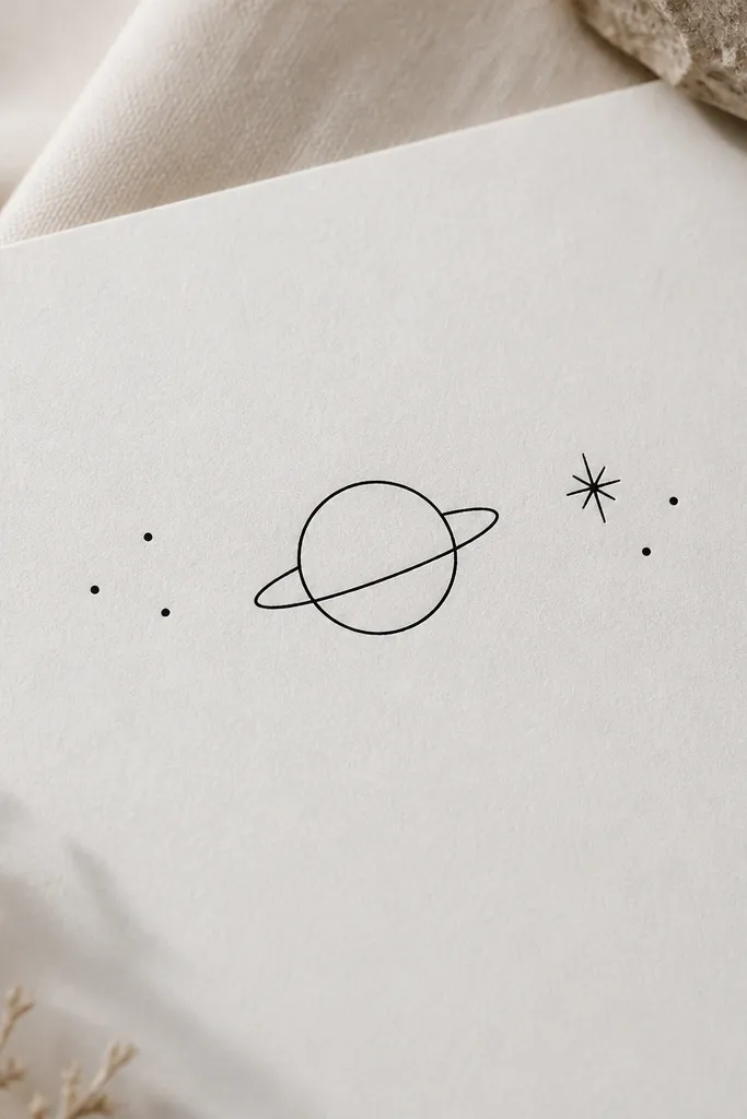
Planet icons feel "together" because the orbit is the shared structure. The star variation keeps it playful and funny without text. Minimal rings and dots are perfect for minimalist work because they don't rely on micro details.
Size the planet to 12-16 mm. Place on the upper arm or calf, whichever you can keep from constant friction. Ask for one consistent ring thickness so the orbit reads as one unit.
Pro tipIf you want it to look more like a sticker, ask for a tiny shadow-free outline only - no gray wash.
AvoidDon't stack too many dots. Crowded dots turn into a single dark spot.


