1. Two Matching Constellation Dots
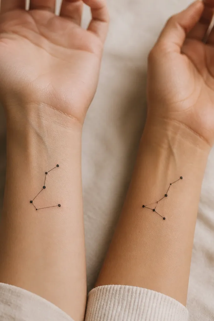
This works because stars stay readable even when the skin softens after healing. Use only black ink and keep the lines thin - think "night sky sketch," not a filled diagram. The dots should be the same size across both tattoos so the constellation feels like a shared map. If you rotate one constellation slightly, it looks like a duo instead of a copy-paste.
Ask for a line weight around 1.5-2.0 mm and dot sizes that vary only a little (about 1.0-1.6 mm). Place them on the inner forearm near the wrist crease so you can see them when your arm is relaxed. Keep the total span under 3 cm so the tiny lines don't smear.
Pro tipBring a printed constellation reference and ask your artist to simplify it to 6-8 points max.
AvoidAvoid constellations with lots of tiny stars - they blur into a dark speck cluster.
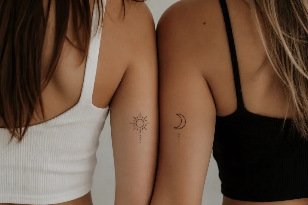
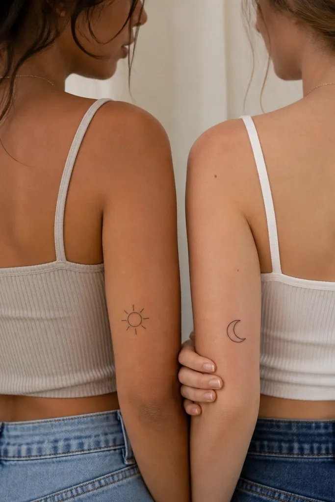
2. Half-Sun and Half-Sun Friendship Pair
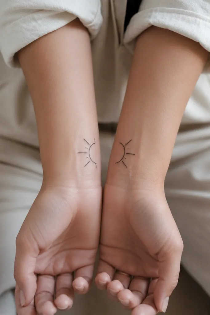
Half-suns look clean because the shape has big, simple edges. With only 3 short rays, you avoid the "fuzzy sun" problem that happens when tiny ray lines heal together. Put them facing each other and the pair reads as one symbol when your arms are side-by-side. Black-only ink keeps it crisp on all skin tones.
Size it so the half circle is about 1.8-2.5 cm wide. Place one on the inner wrist and the other on the matching spot on the other arm, then rotate one half so the flat edge faces inward. Keep the outline line weight consistent between both tattoos.
Pro tipTest the final orientation by holding your arms together in a mirror before you commit to the exact rotation.
AvoidSkip long, thin ray lines - they break up as the skin moves.
3. Two Tiny Hearts With One Shared Crack
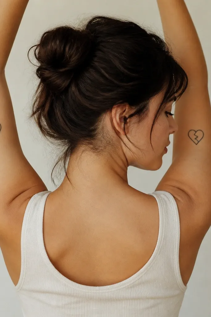
This is one of my favorite minimalist friendship formats because it adds a story without adding detail. The crack line gives motion and meaning, but it's still a simple shape. Keep the hearts small and outlined so you don't need shading. The "split" effect happens through placement and alignment, not complicated art.
Place both hearts on the outer upper arm, about 6-8 cm above the elbow crease. Size each heart around 1.6-2.2 cm tall. Ask your artist to draw the crack line with a slight angle so it lines up when your arms lift.
Pro tipDo a quick alignment test at home: mark the placement with washable eyeliner and see if the cracks visually connect.
AvoidDon't make the hearts filled - tiny fills fade unevenly and look patchy.
4. Infinity Knot in One Line
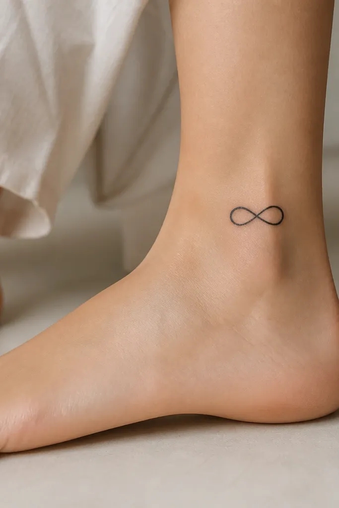
One-line infinity looks sharp because it has thick-enough geometry and no tiny interior details. The crossing point gives it character without adding shading. Black ink and a clean stroke make it hold up well as a small tattoo. It also reads as friendship even if you don't explain it.
Aim for a length of about 2.2-3.0 cm. Place it where your ankle skin doesn't get stretched too hard day-to-day, usually just behind the ankle bone. Ask for a smooth, continuous line - no segmented "sketch gaps."
Pro tipIf you're choosing between two infinity styles, pick the one with equal loop sizes; lopsided loops heal weirdly.
AvoidAvoid super-thin linework that looks delicate on day one but turns gray later.
5. Two Minimalist Matching Leaves
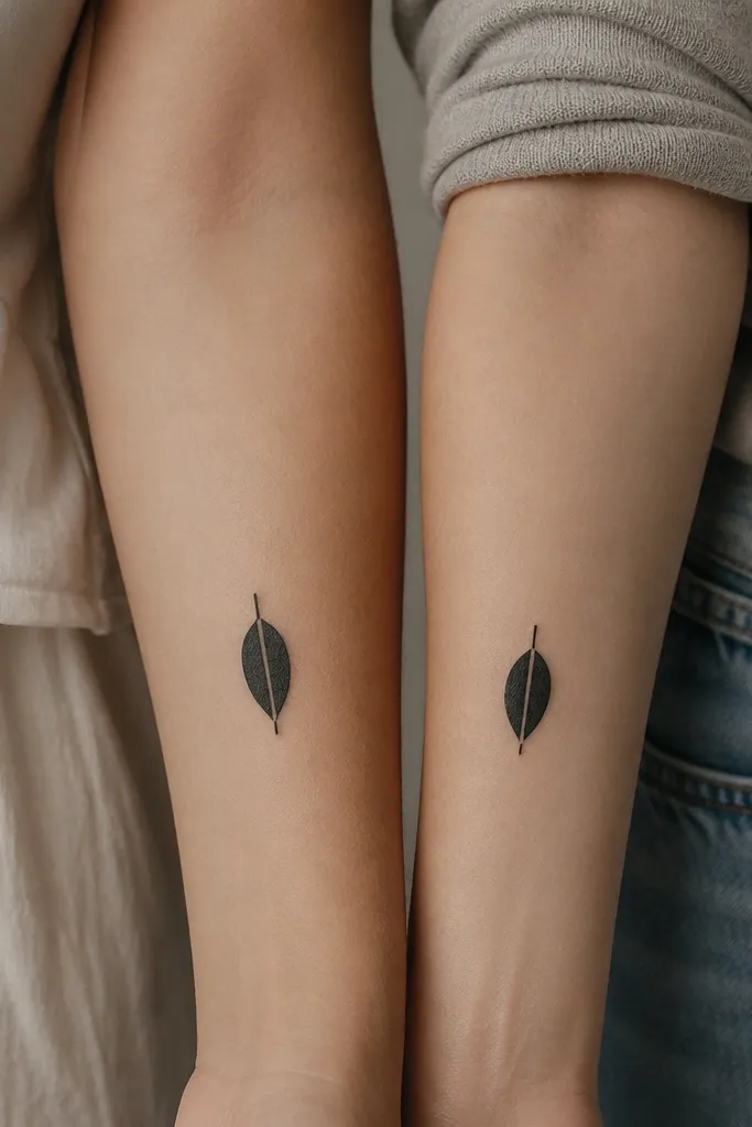
Leaves work because the shape has a clear outline and one simple internal line. That central vein adds meaning without creating a "busy" tattoo. Keep the leaves solid outline with no extra hairs or micro-texture. The result stays readable even if the skin softens over time.
Pick a leaf shape that fits your arm - I like narrow leaves around 2 cm tall. Place one on the inner forearm and the other on the other arm in the same spot. Ask for the vein line to be slightly thinner than the outer outline.
Pro tipBring a reference with one vein only. If the design has 4-6 vein lines, it will blur.
AvoidSkip tiny serrations along the edges - they turn into a fuzzy border.
6. Matching Arrowheads Pointing Opposite Ways
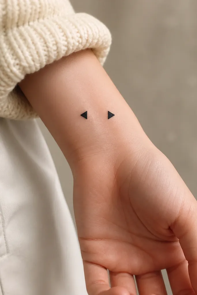
Filled arrowheads are minimalist but still bold enough to last. The shape doesn't rely on thin lines, so it holds contrast after healing. Pointing opposite directions makes the pair feel like you're moving together while still separate. It's clean, graphic, and looks good in both casual and dressed-up settings.
Size each arrowhead around 1.7-2.4 cm long. Place them on the side of the wrist where it stays relatively flat. Keep the fill solid and the edges sharp - ask your artist to avoid "hollow" fills that leave gaps.
Pro tipIf you want it more personal, add a tiny dot at the base of each arrow, same side for both of you.
AvoidAvoid arrow designs with skinny outlines only; they fade faster than filled shapes.
7. Two Micro Butterflies at Different Angles
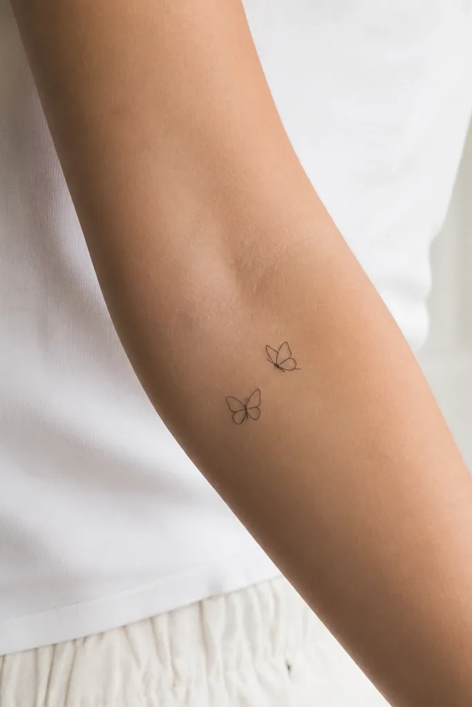
Micro butterflies look cute without getting messy when you keep the wings simple. One body line and two wing curves are enough. Changing the angle slightly makes the set feel custom rather than identical. Black-only linework keeps the tattoo consistent with any skin tone.
Keep the butterfly size under 2 cm wide. Place one on the outer forearm near the midline and the other on the matching spot on your bestie's arm. Ask for line weight around 1.6-2.2 mm so it doesn't disappear as it heals.
Pro tipChoose a placement that stays flat when you flex your wrist; the butterfly will distort less.
AvoidDon't add dots in the wings - they turn into random specks.
8. Friendship Name Initials With a Shared Star
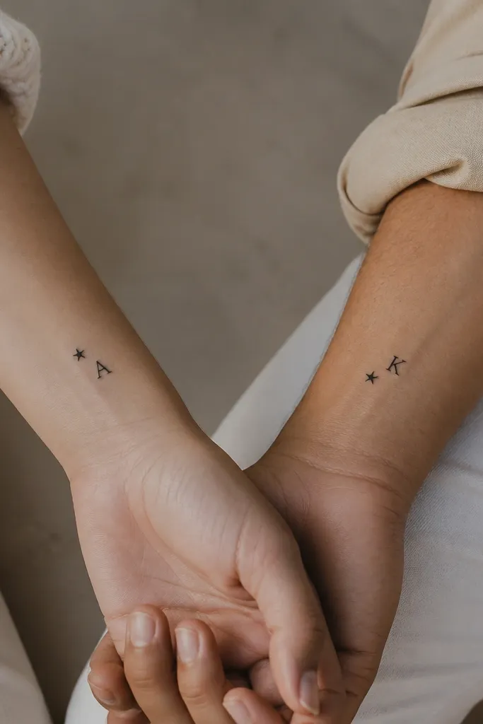
This is a minimalist way to personalize without writing full names. The star ties the two tattoos together even if your initials are different. Use a simple serif or a clean handwritten-style initial - but keep it readable. The star gives you a consistent "friendship anchor."
Pick one initial each and match the font style between you. Place the initial on the inner wrist and the star 1-2 cm away on the same side. Keep the star size about 6-8 mm so it stays crisp.
Pro tipAsk your artist to draw the initial freehand once, then trace the final shape to keep it consistent between both people's tattoos.
AvoidSkip ultra-script initials with lots of loops; they blur fast at small sizes.
9. Two Matching Lock and Key Silhouettes
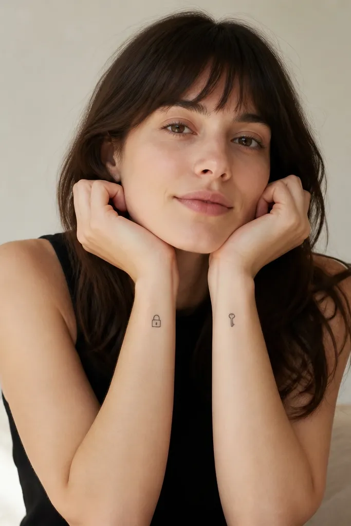
Lock and key reads instantly and stays simple when you keep it outline-only. The lock gives "you're my safe place" energy, and the key gives "you open me up" energy, without needing extra text. The silhouette style keeps it clean after healing. Pairing them in matching sizes is what makes it feel like a set.
Keep the lock and key around 2 cm tall. Place them on inner forearms at the same height. Ask your artist for slightly thicker line weight on the lock body so it doesn't fade into the skin.
Pro tipIf you're worried about legibility, choose a lock with a single clear shackle opening - it's easier to read than complex padlock styles.
AvoidAvoid tiny teeth on the key that are too small to resolve; it becomes a blob.
10. Two Minimal Peaks, Same Mountain Shape
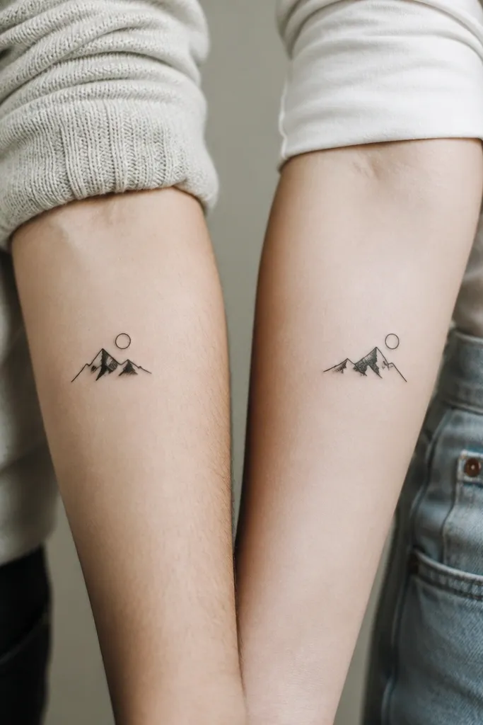
Mountain icons work because the peaks are bold shapes, not fine details. A tiny sun circle adds a clean second element without clutter. Put one sun near the top peak on each person so the story matches. The "same shape, mirrored placement" look feels intentional.
Size the mountain around 2.5 cm wide. Keep the lines solid and the sun circle about 6-8 mm. Place one on the left outer forearm and the other on the right outer forearm at the same height.
Pro tipUse a reference where the peaks are equal height; uneven peaks look accidental when they heal.
AvoidSkip snowflake-style textures or tiny dots inside the mountain.
11. Two Little Wave Lines With One Dot
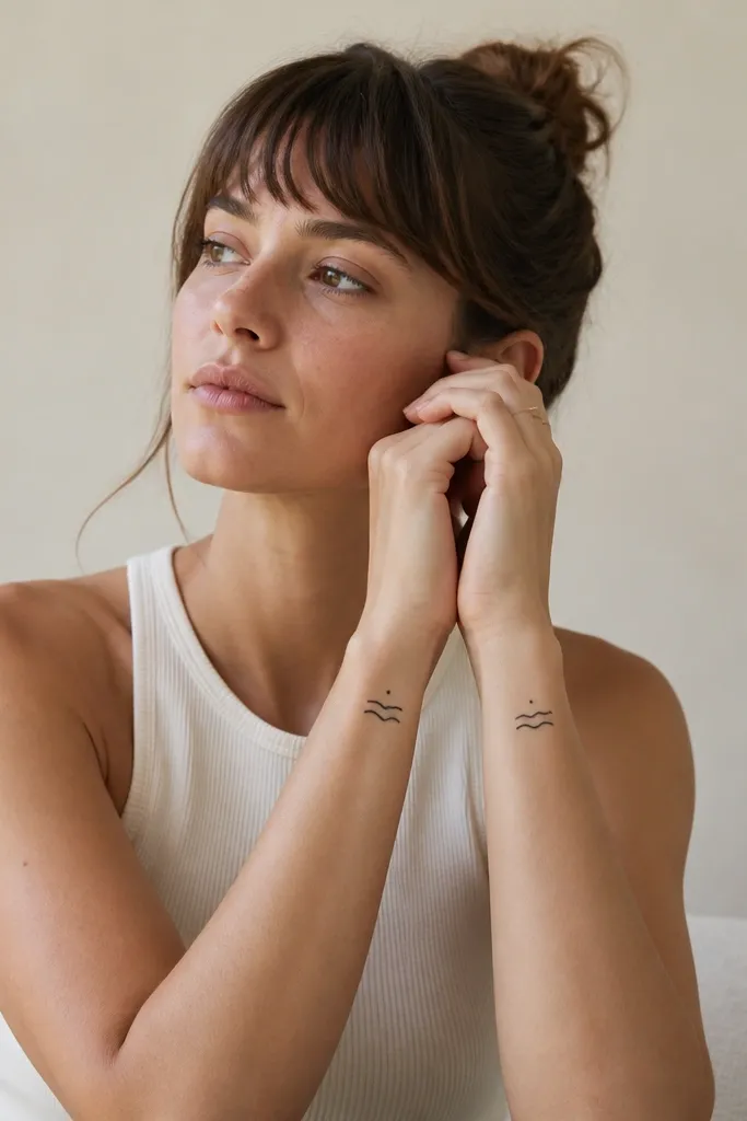
Waves are perfect minimalist friendship tattoos because they're naturally simple and rhythmic. The single dot gives a "signal" element that makes it feel like a pair. Keep it black-only with no shading so the lines heal evenly. This set also looks great if you wear bracelets - it peeks out nicely.
Make the waves about 1.8-2.3 cm wide. Place the dot about 6-10 mm above the highest wave line. Put both on inner wrists so the waves are visible when you hold your hands relaxed.
Pro tipAsk your artist to draw the waves with a consistent curve thickness so neither wave becomes thinner as it heals.
AvoidAvoid adding multiple dot clusters; they turn into random ink specks.
12. Tiny Friendship Rings on Two Fingers
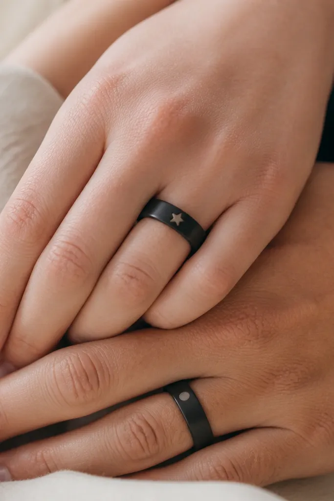
Finger tattoos can look super clean when the design is simple and the line weight is right. A thin ring band plus one tiny symbol keeps it modern and not too loud. The star/dot swap makes it feel like you each have your own role in the friendship. Black ink holds up well on fingers if your aftercare is solid.
Use line weight around 1.8-2.4 mm and keep the band height tiny (about 4-6 mm). Place it on the side of the finger, not dead center of the knuckle. Plan the healing - fingers get rubbed, so you need strict aftercare.
Pro tipSchedule your finger tattoo before a low-activity week. Water exposure and friction slow healing.
AvoidSkip super thin ring bands; they disappear fast with hand washing.


