1. Two-Point Star Constellations
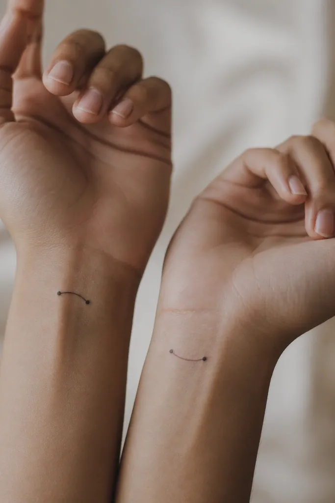
This design reads like "we're connected" without looking like a cartoon. Two-point stars survive healing better than multi-star clusters because there's less stuff for the skin to blur. The curved connector gives it motion, and the whole thing stays minimalist even at 12-16 mm.
Place both on inside wrists or lower forearm, aiming for a width of 10-12 mm and a height of 14-18 mm. Tell your artist to keep the dot size consistent (same ink saturation) and to use the same connector line thickness on both people.
Pro tipAsk for a stencil test on your skin under direct light. If you can't see the connector after you flex your wrist, it's too small.
AvoidAvoid adding more stars later. Extra dots turn a clean constellation into a muddy speck cluster.
2. Interlocking Tiny Hearts (Negative Space)
Negative space keeps the tattoo "airy." Outline hearts with a gap in the overlap look cute and modern, and they don't turn into a blob the way fully filled hearts can. The interlock is the matching element, so you can size each heart slightly to fit your wrist shape.
Keep each heart outline around 1 mm thick. Total size should land around 15-20 mm across, and the overlap gap should be wide enough to stay visible after healing - about 2-3 mm visually on the stencil.
Pro tipChoose placement where the skin stretches less, like the outer forearm instead of the most bendy inner wrist crease.
AvoidDon't use thick fills on tiny hearts. Heavy ink in a small shape swells and blurs.
3. Half-Sun Split Between Two Best Friends
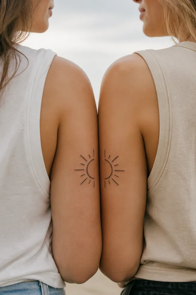
Split designs feel special because the "complete" image shows up only together. A half-sun also lets you match the silhouette while adjusting for arm length and tattoo placement. Minimal rays - like 5-7 short lines - keep the rays crisp and readable.
Pick the same placement on both bodies: upper outer arm near the same distance from the shoulder seam, or upper thigh near the hip line. Keep the half-sun diameter around 18-24 mm and the rays under 4 mm each.
Pro tipBring a photo of both placements marked on your bodies to your artist. Use a mirror stance so they can judge alignment.
AvoidAvoid detailed sun faces. The moment you add eyes and a mouth, it stops being minimal and starts being high-risk.
4. Matching Moon Phases, Same Stage
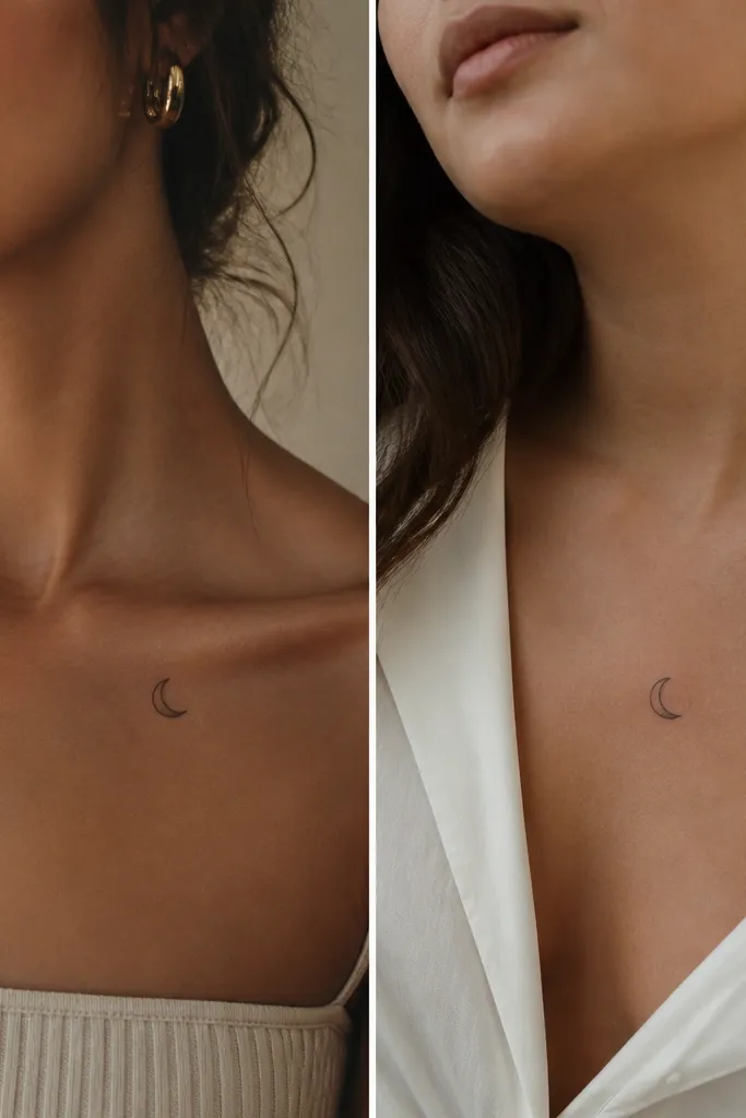
Moon phases are friendly because they're symbolic but still simple shapes. Matching the same stage keeps the pair readable, and the thin outline gives definition after healing. A crescent cutout creates contrast without needing heavy shading.
Keep size around 16-22 mm. If one of you has more sun exposure on the collarbone, put the other on a slightly covered spot like the upper chest under a strap line so both fade similarly.
Pro tipAsk for a "thin outline + negative crescent" version instead of full black shading. It heals cleaner.
AvoidAvoid thick solid black moons at micro size. They can look like a smudge after a few summers.
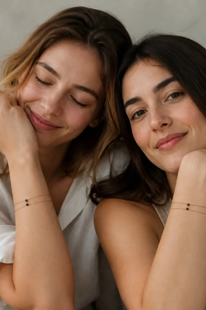
5. Micro Infinity Loop With One Dot Break
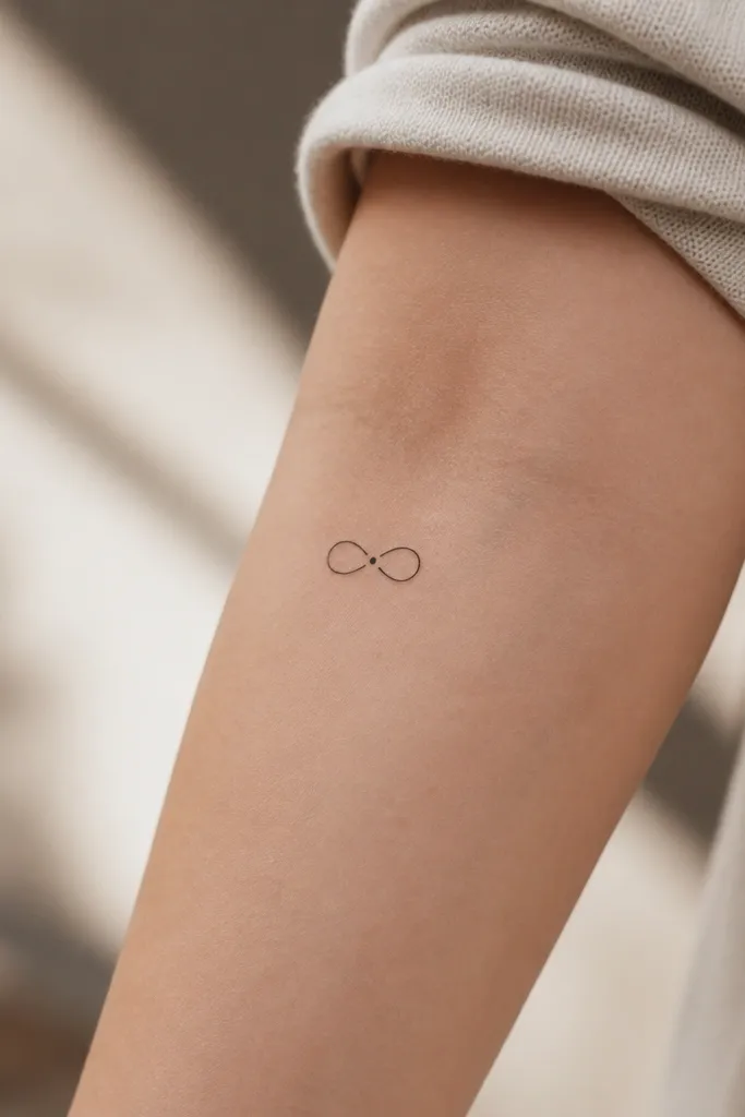
This is minimal matching with a twist. The dot break makes the infinity feel intentional instead of "almost connected," and that one dot gives the tattoo a focal point that still reads at small sizes. Fine line infinity symbols look great when both people get the same line thickness and the same dot size.
Target total size 18-26 mm wide. Make the line thickness around 0.9-1.1 mm and keep the gap between the loop and dot consistent on both tattoos. Placement works well on inner forearm or behind the ear where the skin stays smooth.
Pro tipChoose a dot size that matches the line thickness. If the dot is too big, it looks like a mistake; if too small, it disappears.
AvoidAvoid adding extra flourishes around the infinity. Swirls take up space and blur first.
6. BFF Ribbon Knot in One-Line Outline
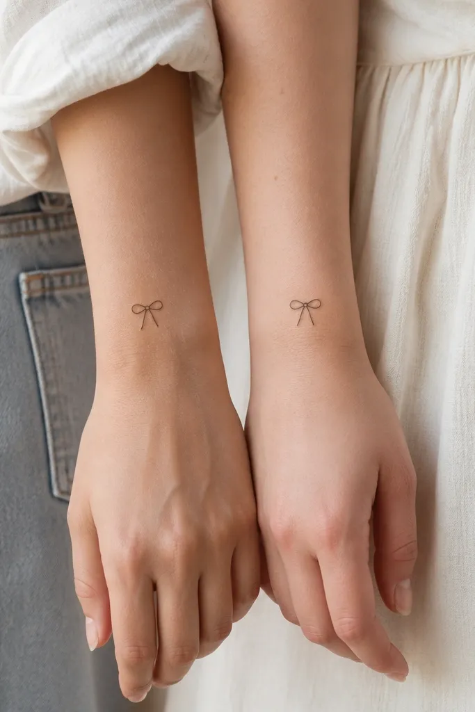
A ribbon knot reads instantly as "bond" without needing words. The outline stays minimalist and avoids the heavy fill that can spread on small skin. Mirroring one person makes it feel custom while still matching the core symbol.
Keep it around 20-28 mm tall. Outline line thickness should be consistent at about 1 mm, and the tails should be slightly different lengths so the design fits each wrist without compressing.
Pro tipAsk your artist to show you the line path on paper first. One-line knots look best when the stroke doesn't over-cross.
AvoidAvoid adding text to the ribbon. Micro lettering around a knot is where tattoos get unreadable fast.
7. Olive Leaf Sprigs, One Leaf Variation Per Person
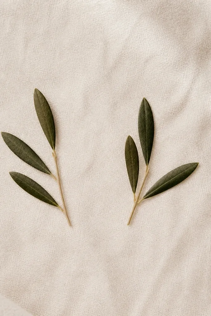
Olive leaves give a soft, grown-up look. You still match because the sprig silhouette is the same, but you personalize with a small leaf placement difference. Dot highlights on leaf tips can add dimension without turning into "dark shading work."
Size it 25-35 mm long on the outer forearm or along the side of the calf. Use small leaf shapes about 4-6 mm each, and keep the stem thin so it doesn't widen while healing.
Pro tipPick one shared leaf style detail - like a tiny notch at the tip - so people instantly recognize it as the same set.
AvoidAvoid over-detailed vein lines. Tiny leaf veins disappear and leave a grainy texture.
8. Micro Compass + North Star Pair
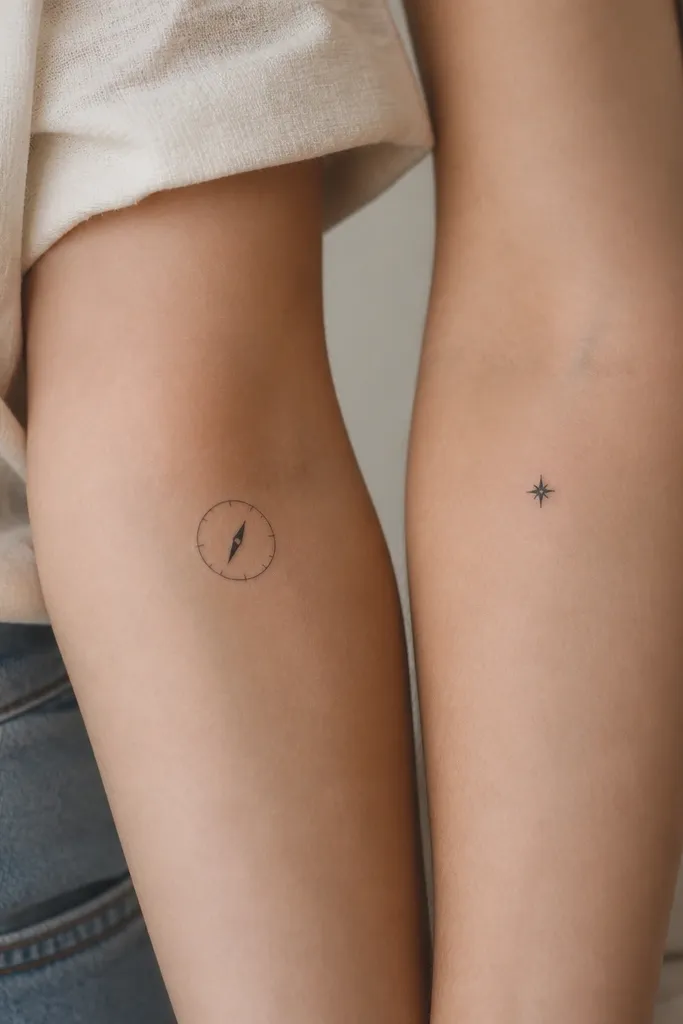
This pair works when your friendship theme is direction, travel, or "we keep each other steady." The compass stays readable with only a few ticks, and the north star gives you a clean symbol that doesn't compete with the compass. It's cute because the star feels like a personal marker, not a copy paste.
Place the compass on the outer upper arm or upper thigh and the star on the same relative spot. Compass size 20-28 mm, star size 10-14 mm so it still looks intentional, not like a random dot.
Pro tipUse a single needle direction on both designs. Even if you mirror placements, the needle should point the same way in the design.
AvoidAvoid full compass lettering. Tiny words turn into gray mush.
9. Tiny Key + Tiny Lock (Matching Sizes)
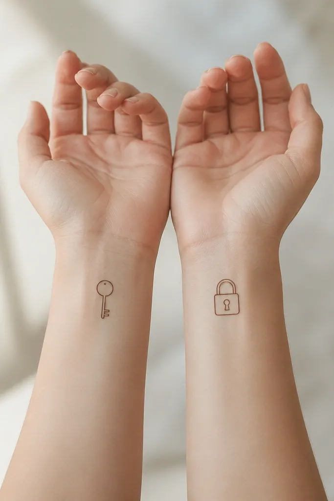
Keys and locks read as "only us" without needing hearts. Minimal outlines look sharp because the shapes are geometric and don't require shading. Matching the overall width matters more than matching the exact tooth count - both tattoos should feel balanced when you compare.
Keep total size around 18-24 mm. Use the same line thickness and similar corner angles so the outlines heal with the same crispness. Place on wrists where you can keep it flat and avoid the thick crease line.
Pro tipIf one of you has a hairline of wrinkles at the placement, shift 5-8 mm up the forearm. It keeps the key edges cleaner.
AvoidAvoid thick black fills inside the key or lock. The interior is small and fills in fast.
10. Sunflower Buds in Dotwork
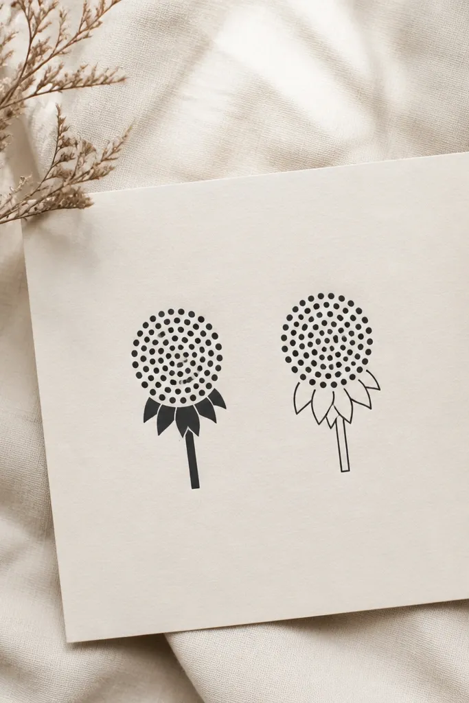
Dotwork gives that hand-drawn softness even when the tattoo is tiny. The sunflower bud silhouette stays recognizable without needing fine petals. If both seed heads use the same dot density, the pair looks matched rather than "one is more detailed."
Plan for a size of 20-30 mm tall. Use a dot cluster for the seed head only, and keep the bud outline clean with no extra shading. Place on outer forearm or upper arm where you can see it when you roll up sleeves.
Pro tipTell your artist you want dot spacing tight but not touching. Touching dots heal into a gray blob.
AvoidAvoid adding tiny leaf veins. Dotwork already takes the visual load.
11. Two Tiny Rings With One Shared Stone Dot
This is a minimalist "we're connected" tattoo that doesn't look like a couple tattoo. The shared stone dot gives matching identity, and the thin rings look clean long-term because they're just outlines. You can make one ring slightly thicker than the other if you want it to feel personal while still matching the design language.
Use ring diameter around 10-14 mm, and keep the ring line thickness under 1 mm. Place rings near the inner forearm or side of the upper arm where skin is smooth. Keep dot position consistent - like at 1 o'clock on both.
Pro tipIf your skin is prone to ink fading, go a touch darker on the dot and keep the ring line consistent, not lighter.
AvoidAvoid rings that overlap other lines. Crowding makes them look like smudges.


