1. Micro-crest on the outer knee
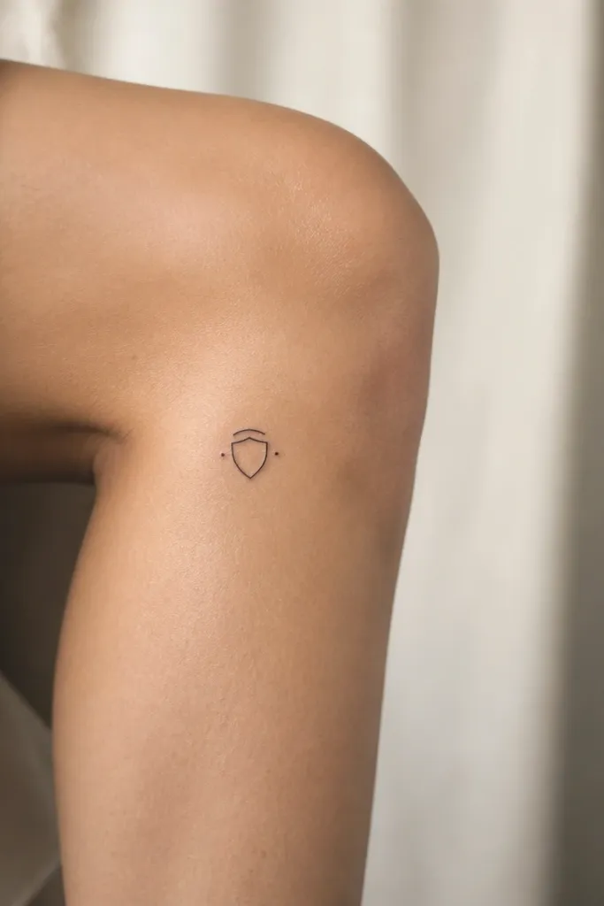
This works because the outer knee has a gentle curve, and a crest shape naturally follows it. The shield outline stays readable even if your knee shifts, because most lines are short. The two side dots add balance without needing thick shading. I like it as a first knee tattoo because it looks tidy from standing distance and still detailed close up.
Stencil it so the top of the crest sits about 1.5-2 inches below the knee crease. Keep the shield width under 1 inch so it stays "micro." Trace the stencil onto tracing paper first, then transfer with a stencil gel so the outer edges stay crisp.
Pro tipUse a stencil gel with a fine brush or cotton swab to avoid smearing the tiny side dots.
AvoidSkip crests with long banners or wide gaps - they blur fast on knee skin.
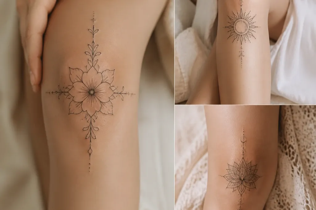
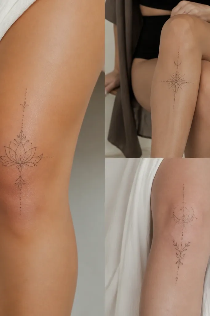
2. Half-moon with a dot trail
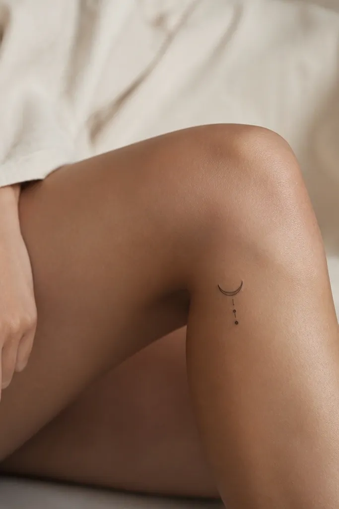
A half-moon hugs the kneecap curve and keeps the design aligned with how your skin moves. The dot trail breaks up the shape so it doesn't look like a flat sticker. Minimal dot work also ages well on knees because you're not relying on dense fill. It looks clean with fine-line tattooing and small dot spacing.
Place the crescent so its flat edge points upward toward the kneecap and the open side faces outward. Keep the dot trail length to about 1.25 inches total, with dots spaced evenly. Transfer while your knee is bent; you're matching the curve you'll see in motion.
Pro tipIf you want extra crispness, ask for dot spacing that's slightly wider than you think - knee texture makes tight dots merge.
AvoidAvoid thick rings or heavy shading in a moon shape - they look muddy on knees.
3. Tiny botanical sprig, no leaves
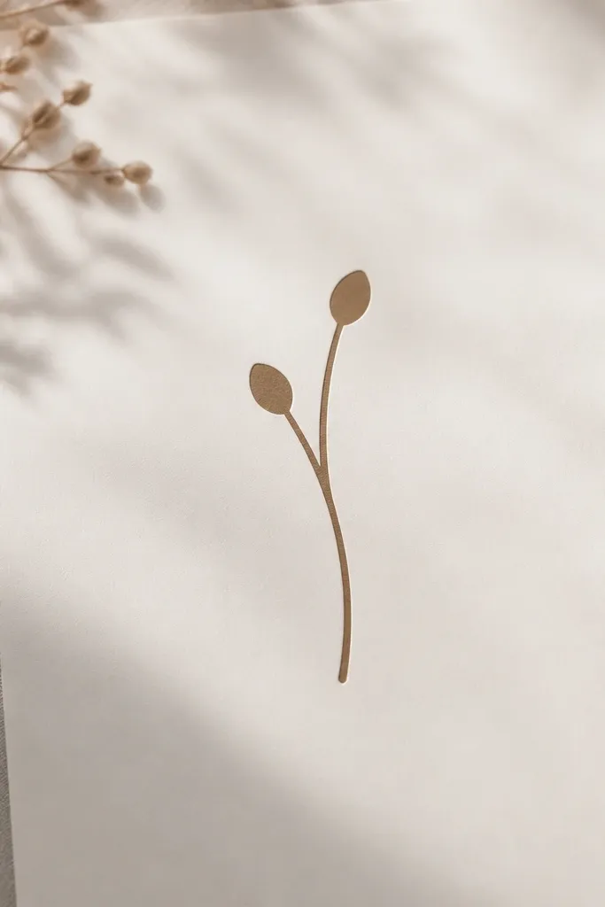
Knee skin shows texture, so leaf detail can turn into gray fuzz. A sprig without leaf veins stays sharp because it relies on line and simple bud shapes. Bud ovals also give a soft, feminine look while keeping the tattoo small. This design reads as "botanical" without the mess of micro leaf patterns.
Stencil it vertically on the inner knee or slightly off-center. Size it so the longest stem is about 2 inches. Keep the bud ovals under 1/4 inch each. After transfer, let the stencil gel dry fully before you wipe it off.
Pro tipChoose a stem line that's consistent - if the stencil line varies, the tattoo line will too.
AvoidSkip tiny leaf clusters - they turn into an unreadable blob by the time the skin settles.
4. Three stacked commas
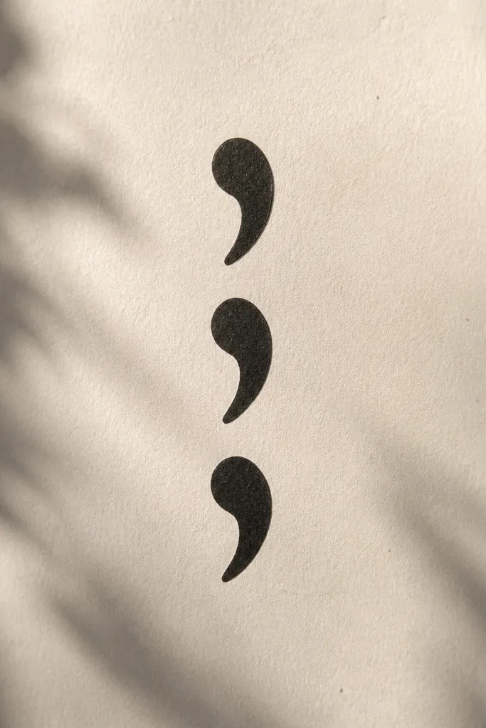
Comma shapes follow the natural curve of the knee when placed vertically. Stacking three gives you a rhythm that looks intentional, not random. You're using negative space as part of the design, which is exactly what knee tattoos need to stay clean. Minimalist comma work also heals nicely because there's little fill.
Place the stack just below the kneecap, centered on the inner knee. Each comma should be about 3/8 inch tall, with 1/8 inch gaps between them. Transfer with the knee bent so the center line stays aligned.
Pro tipAsk your artist to use a fine needle pass for the outline and avoid overworking the same comma spot.
AvoidAvoid symmetrical stacks that are too close together - healed commas can merge.
5. Micro sunburst ring, 6 points
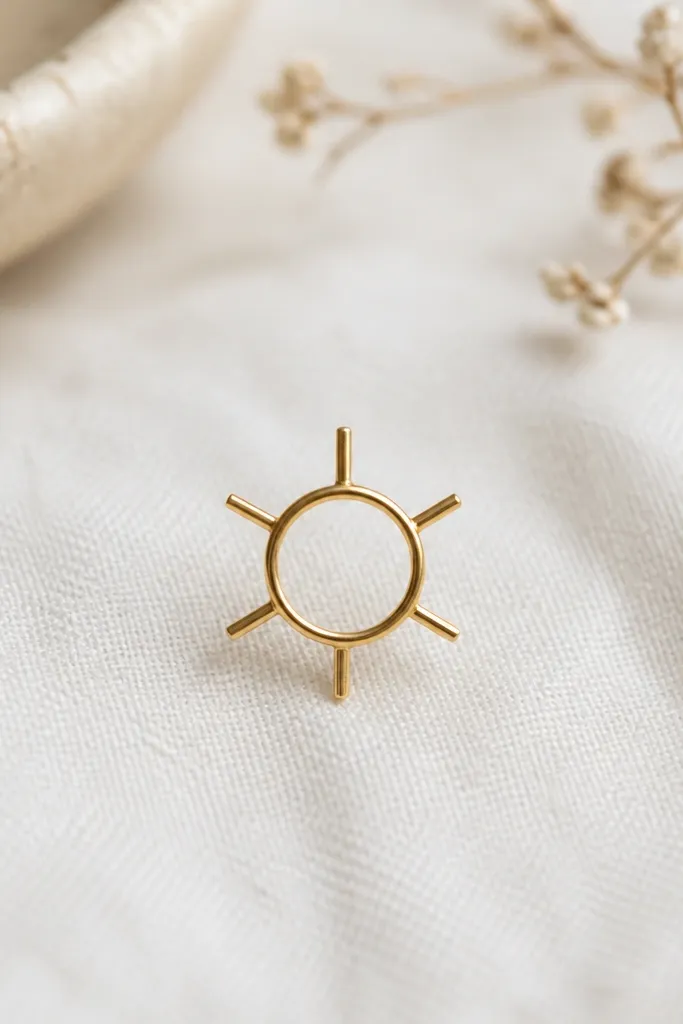
A six-point sunburst stays readable on knees because it doesn't rely on lots of tiny rays. The narrow ring gives you a focal point, and the short rays create motion without needing shading. This looks especially good on pale-to-medium skin under fine line ink. It's playful but still minimalist.
Use the outer knee for this so the rays can sit on the curve. Keep the whole design diameter around 3/4 inch. Transfer with a stencil gel using a cotton swab to press the ray tips so they don't lift.
Pro tipIf you want it softer, keep the ring slightly lighter by asking for a thin outline only.
AvoidSkip 12+ ray designs - knee texture makes extra rays disappear.
6. Wavy vertical line with two pearls
This design works because it uses one continuous line that can flex with knee movement. The two pearls anchor the eye and make the tattoo feel finished even without extra elements. It's minimalist enough for your first knee tattoo, and it looks good in black ink only. Fine line wavy work also heals cleaner than lots of tiny dots.
Stencil it vertically with the wavy line centered. Total height should be about 2 inches, pearls included. Keep pearls around 1/5 inch tall. Transfer while standing and then check again bent; the wavy line should still look centered.
Pro tipMark your transfer point with a small dot first so the design doesn't drift during gel application.
AvoidAvoid long zigzags that cross the kneecap crease - they warp when you bend.
7. Single-line heart with split bottom
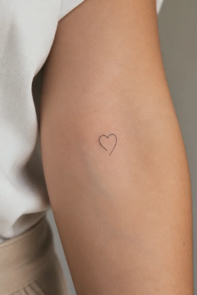
A single-line heart stays crisp on knee skin because there's no heavy fill to blur. The split bottom adds a modern twist without turning it into a complicated floral. It looks cute but still grown-up on the lower knee. This is also a good choice if you're worried about symmetry - the split tip hides slight wobble.
Place it on the outer-lower knee so it sits away from the highest movement point. Size it at about 3/4 inch tall. Transfer carefully - use a thin stencil gel layer so the line stays sharp.
Pro tipHave your artist use line-work only, no gray wash. Knee tattoos look cleaner without added shading.
AvoidSkip bubble hearts or thick outlines - they look heavy on the knee.
8. Minimal key + small circle ring
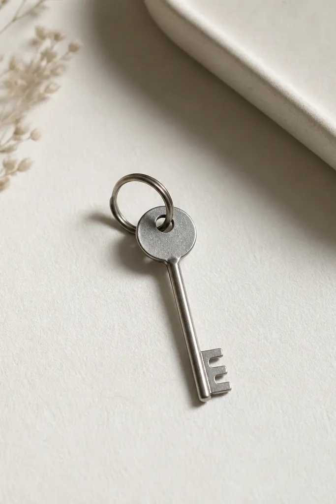
A minimal key works on knees because the shape is already vertical and narrow. It stays readable from a distance and doesn't need shading to look complete. The tiny circle ring acts like a second focal point and balances the head of the key. I like it because it feels personal without being overly cutesy.
Stencil it on the inner knee, aligned straight up and down. Keep the key about 1.5-2 inches tall and under 1/2 inch wide at the head. Transfer with your knee bent so the vertical alignment holds.
Pro tipIf your knee creases make the bow area smear, press the stencil for 10 seconds more before wiping.
AvoidAvoid detailed key teeth - too many notches turn into a dark stripe.
9. Micro laurel branch, 2 curls
Laurel curls look good on knees because they follow the natural bend and don't depend on tiny leaf texture. The two-curl version stays minimalist and ages better than dense laurel wreaths. It gives a "statement" feel without taking up much space. This is a great option if you want something feminine but not floral.
Place it across the outer knee curve, slightly diagonal but still mostly horizontal. Keep it under 2 inches across. Transfer with gel and make sure the curl tips are fully coated so they don't fade.
Pro tipAsk for a single needle pass for the outer curl line, then stop. Overworking makes laurel curl lines thicken.
AvoidSkip full wreath stencils - knees need breathing room.
10. Three-dot triangle, tiny and sharp
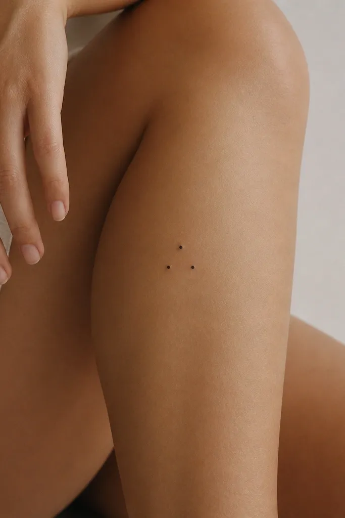
Dot triangles are small, clean, and forgiving on knee skin. They keep their shape because you're not relying on linework that stretches. The down-point triangle looks stylish without turning into a warning symbol because it's tiny and centered. This is the stencil I reach for when someone wants minimalist but doesn't want it to look plain.
Stencil it about 1 inch below the kneecap crease. Keep each dot around 1/16 to 1/8 inch in diameter depending on stencil scale. Space the dots evenly so the triangle reads instantly.
Pro tipIf your stencil dots are faint, re-ink the stencil sheet with a thick gel pen before transfer.
AvoidAvoid triangles with connected lines - they heal less cleanly than separate dots.
11. Feather tip, fine line only
Feather tip designs work because the main outline is already tapered, so it matches the knee's shape. Keeping it to a few inner lines prevents the feather from turning into a gray blur. Fine line feathers look delicate but still readable if the stencil is crisp. This one is a personal favorite for women who want something light without being too tiny to see.
Place it on the outer knee, pointing slightly upward toward the kneecap. Total length should be about 1.75-2 inches. Transfer while bent so the taper stays aligned; check again in a mirror.
Pro tipUse a stencil that has the internal feather lines separated - if lines touch in the stencil, the tattoo can merge.
AvoidSkip full feathers with lots of barbs - knee texture eats the fine detail.
12. Mini infinity loop on the outer knee
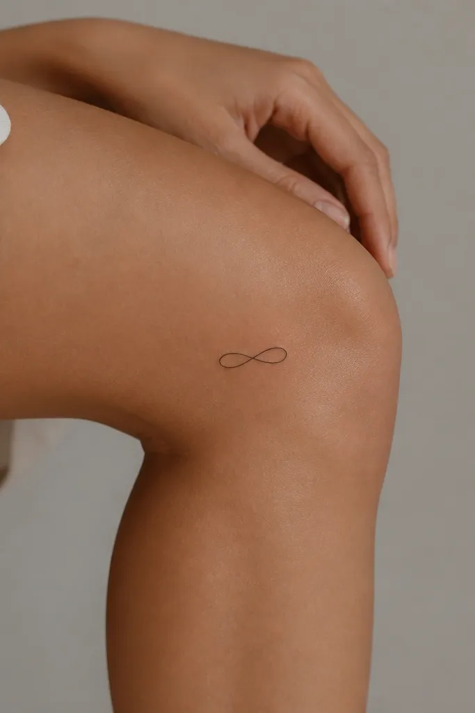
Infinity symbols look good on knees when they're narrow and stretched, not wide. The elongated loops follow the leg's natural vertical line and stay readable during bending. You don't need shading; the symbol reads from line work alone. It's also a clean choice if you want a tattoo that looks good even when it's partially covered by leggings.
Stencil it vertically on the outer knee, with the center of the infinity about 1.5 inches below the kneecap. Make the entire symbol about 1.25-1.5 inches wide. Transfer with thin gel so the line stays consistent thickness.
Pro tipAsk for the line to be even thickness from start to finish - knees punish uneven line weight.
AvoidAvoid thick infinity outlines - they look like a scribble after healing.


