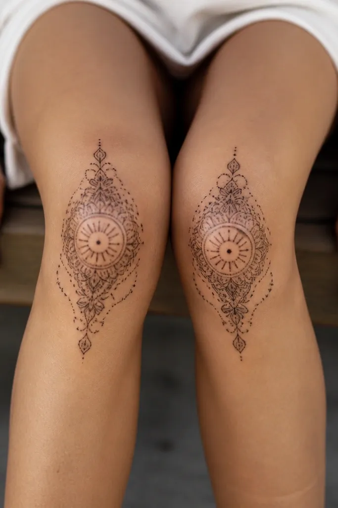
1. Micro dot mandala on the kneecap curve
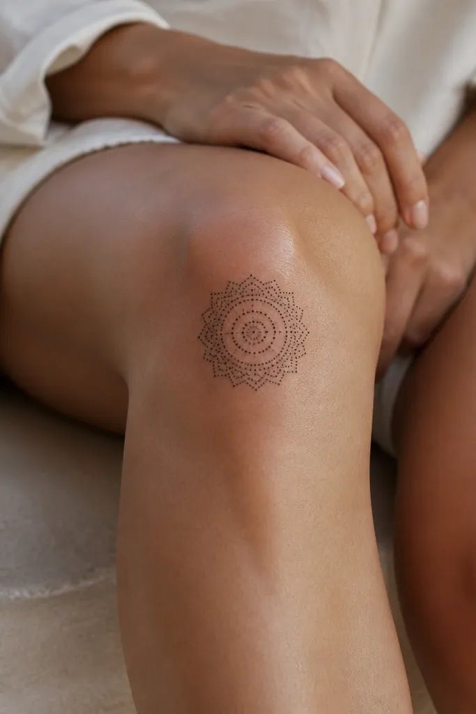
This works because dotwork sits well on skin that shifts. The dots act like pixels - even if a few blur, the overall pattern still reads as a mandala. I like a single black-ink mandala with a tight inner circle because it matches how the kneecap curves inward. The negative space between dots keeps it looking minimal instead of heavy.
Ask for a design about 1.25 to 2 inches wide, centered slightly above the kneecap ridge. Use a dot-map approach where the outer ring is denser and the center opens up. If your artist can do it, keep the outer petals made of dots rather than solid fills so it stays airy.
Pro tipHave your artist test the dot spacing on a practice skin swatch - you want dots that look crisp at arm's length, not just up close.
AvoidAvoid solid black fills that cover the whole knee cap - they heal blotchy and can look muddy.
2. Single-line crescent moon with tiny stars
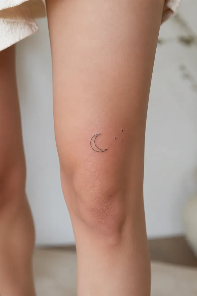
A crescent reads well on the knee because it mirrors the shape of the kneecap. The single-line style keeps it minimalist and clean, and the stars give it a little movement without clutter. I've seen this age better than many micro florals because there's no shading that depends on perfect healing. Keep it black and let the negative space do the work.
Placement is key: center the crescent so the tips hover just above the kneecap bump. Keep total width under 1.75 inches so the line doesn't stretch too much. Stars should be dot-sized - think tiny circles, not detailed starbursts.
Pro tipChoose a line weight that matches a fine felt-tip pen, not hair-thin - you want it to survive healing.
AvoidSkip star details with tiny spikes - those thin points blur fast on the knee.
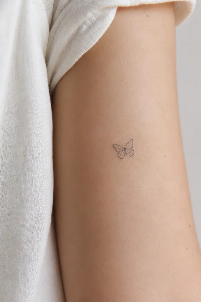
3. Minimal line-art butterfly with closed wings
Closed-wing butterflies look better on the kneecap than open-wing ones because the design stays compact and doesn't spread outward. Minimal line art works here if the artist keeps the line consistent and uses only a few internal wing lines. It looks delicate without relying on tiny shading that can turn gray.
Make it about 1.6 to 2 inches tall. Position it so the body runs vertically over the center of the kneecap. If you want extra crispness, ask for slightly thicker outer wing outlines and thinner inner lines.
Pro tipAsk for a stencil that stays readable when you bend your knee - if it distorts too much, resize it smaller.
AvoidAvoid butterflies with lots of micro veins - they don't hold up on moving skin.
4. Geometric hexagon with one dot in the center
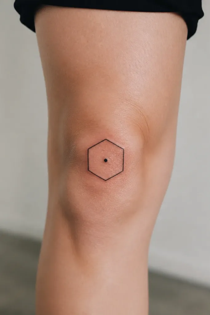
Geometry is the most forgiving minimalist style on the knee because it has hard edges and clear boundaries. The single center dot adds interest without crowding. This design also photographs well in bright light because the straight lines catch contrast. It ages as a shape, not as a soft blur.
Keep the hexagon around 1.5 to 2.2 inches wide. Center it on the kneecap ridge, not the lower shin. If you want it to feel more feminine, you can slightly round the corners while keeping the outline crisp.
Pro tipUse a bold black outline with no gradients - the knee already has natural shadows from movement.
AvoidDon't add extra lines inside the hexagon - multiple thin segments will fade into each other.
5. Tiny botanical sprig with dot shading
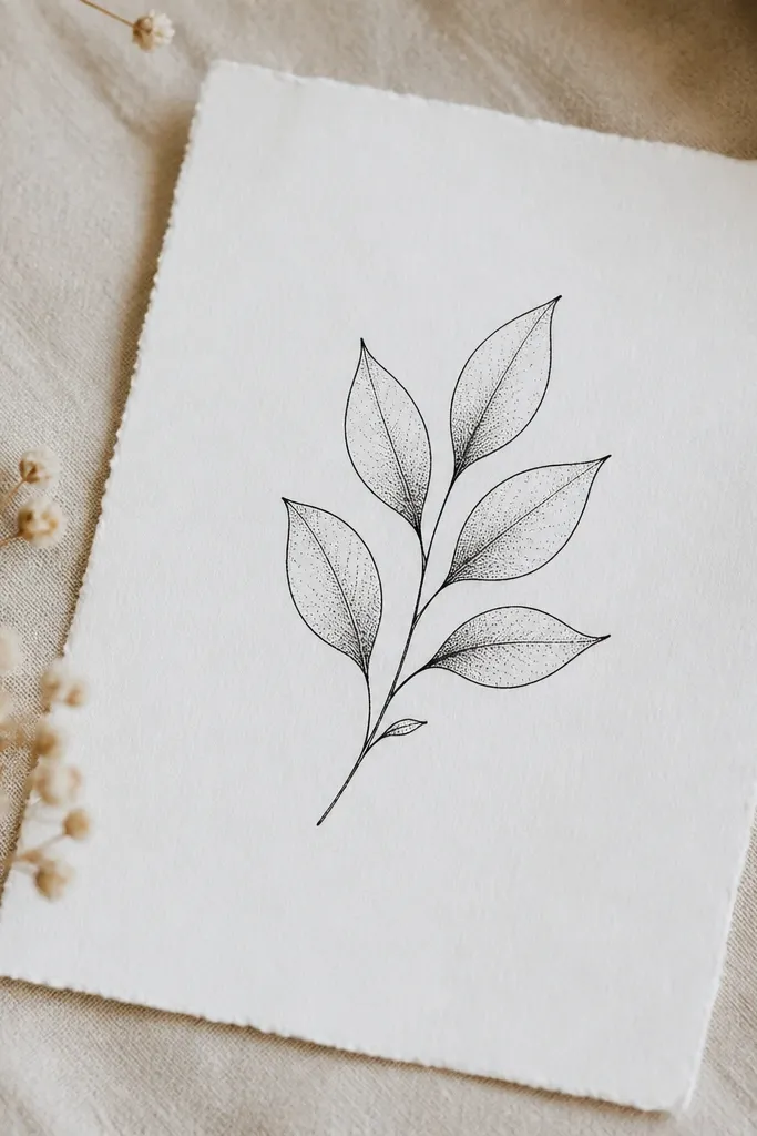
A sprig works because it naturally follows the leg's vertical line. Dot shading on leaves gives depth without the risk of heavy solid fill. I like designs where each leaf has a clear outline, then only the center gets dots. It stays minimal but still looks "finished" after healing.
Aim for one sprig about 2 inches tall, with 3 to 5 leaves total. Place the sprig vertically, with the base near the top edge of the kneecap and the tip pointing slightly upward. Ask for dot shading only on two leaves - too many dots can make it look gray.
Pro tipRequest a slightly thicker outline on leaf edges so they stay sharp when skin stretches.
AvoidAvoid super tiny leaf veins - the knee will blur them into a smudge.
6. Minimal Roman numeral with fine underline bar
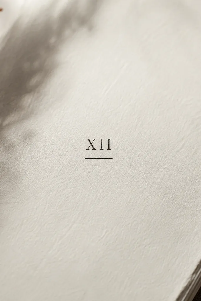
Text looks good on the knee when it's short and bold enough to survive healing. The underline bar adds structure so the tattoo reads as intentional, not like random ink. I prefer Roman numerals because they have consistent shapes that hold up better than cursive on moving skin.
Choose a numeral or two, like "IV" or "VIII", and keep the height around 1.2 to 1.6 inches. Place it across the upper kneecap so it doesn't get stretched at the bottom. Use a straight underline bar that's slightly longer than the numeral width by about 20%.
Pro tipHave your artist align the text so it stays readable when you sit, not just when you're standing.
AvoidSkip script lettering - thin loops smear on the knee cap.
7. Small heart outline with micro cracks
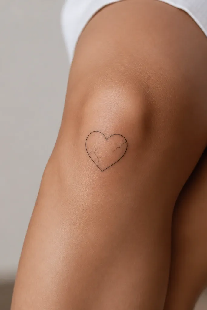
This is minimalist with attitude. The heart outline anchors the shape, and the micro cracks add texture without requiring full shading. On knee skin, texture lines are safer than gradients because they keep their direction. It looks clean up close and still reads as a heart from a distance.
Keep the heart around 1.5 inches wide. Place it centered on the kneecap, with crack lines that don't touch the outline. Ask for cracks as fine lines, but with enough thickness that they don't disappear.
Pro tipIf you want it to look extra crisp, request slightly thicker heart outline and thinner cracks.
AvoidDon't add a solid fill - cracked hearts look best as linework.
8. Half-sun with thin rays
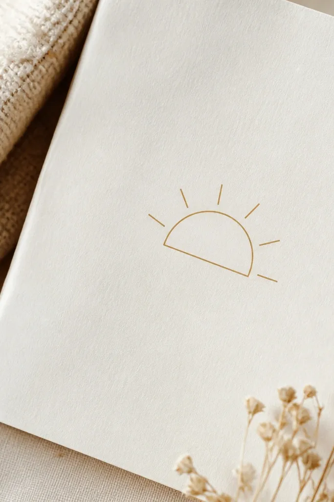
A half-sun works with the knee's curvature because it sits like a "shadow" over the kneecap. Thin rays add detail without needing shading. I've found that fewer rays look better than lots of micro rays - the knee can't hold that many fine points.
Make it about 1.8 to 2.3 inches wide. Place the flat side slightly above the kneecap ridge and let the curved edge follow the kneecap. Use black ink only, with rays kept to 6 to 8 total lines.
Pro tipAsk for rays that are the same line weight as the half-sun outline so they heal evenly.
AvoidAvoid tiny ray spikes - they blur into a gray halo.
9. Tiny eye symbol with dot-pupil
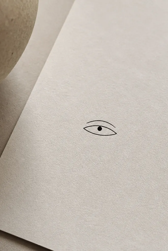
The eye symbol reads well on the knee because the almond shape follows the leg's roundness. A dot pupil keeps it graphic and minimal. I like this design because it's mostly outline, with one solid element for contrast. It also looks good with light because the outline stays crisp.
Keep it under 1.7 inches long. Place it horizontally across the upper kneecap so the eyelid line sits where the skin is flattest when you stand. If you want extra femininity, add a tiny teardrop-shaped highlight dot near the pupil.
Pro tipAsk your artist to test the eye shape at the exact size during stencil - almond shapes can distort if too small.
AvoidSkip heavy lash line - it turns into a thick band after healing.
10. Minimal keyhole with small ring
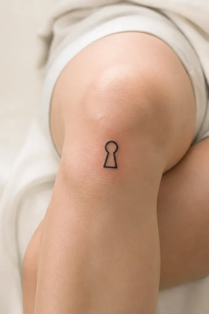
Keyholes look surprisingly good on the knee because the shape is already compact and vertical. With minimal linework, it stays readable as you move. The rounded top mirrors the kneecap curve, and the negative space inside the keyhole gives it an airy, minimalist look.
Size it around 1.4 to 2 inches tall. Center it on the kneecap, with the keyhole opening facing inward toward the center of your leg. Use a thicker outline and keep the inner opening a clean white space - no shading.
Pro tipChoose a keyhole outline that has a slightly thicker bottom stem so it doesn't fade first.
AvoidAvoid adding tiny teeth details on the key - they need space to stay sharp.
11. Small star cluster with one larger star
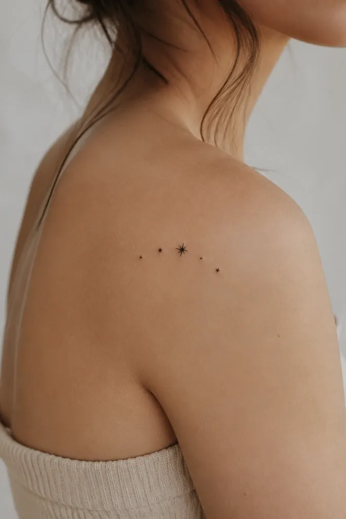
A star cluster is perfect when you want minimal but not boring. One larger star gives your eye a focal point, and the smaller stars fill the area without requiring shading. It also hides minor healing unevenness because the pattern is distributed.
Keep the cluster within about 2 inches wide. Place it on the outer half of the kneecap if you want it to look flattering with walking - it catches light as your leg swings. Use consistent star size for the small ones and one clear bigger point.
Pro tipAsk for stars as solid small shapes, not thin outlines. Solid stars age better on the knee.
AvoidDon't use different star styles - mixed line thickness makes it look messy.
12. Micro butterfly wings with negative space center
Leaving the center negative space makes the tattoo look lighter and more detailed than it really is. On the knee, negative space holds up because the background skin stays clean and bright. The wing lines guide the eye without needing shading gradients. It's a great choice if you want something delicate that still reads as a butterfly.
Keep it small - about 1.6 inches wide. Place it so the butterfly body sits along the kneecap centerline and the wings extend slightly upward. Ask for only 2 to 3 internal wing lines per side.
Pro tipRequest slightly thicker outer wing outlines than the internal lines so the butterfly doesn't "open up" into a blur.
AvoidAvoid full black wing fills - they flatten the design and look heavy on the knee cap.


