1. Two Constellations That Share One Night Sky
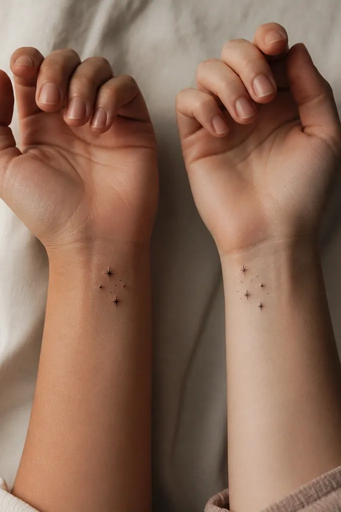
This one reads like "same sky, different coordinates." Each person gets a constellation made of 5 to 8 dots, so the meaning stays clear even when the skin texture softens over time. I like solid black dots with crisp edges because they hold shape better than thin outlined stars. The shared meaning comes from the pattern - the dots match across the two tattoos, just arranged as separate clusters.
Keep the total footprint under 1.5 cm wide. Place the cluster slightly off-center so it doesn't look like a logo. Match dot sizes: use 3 small dots at 1.0 mm and 2 slightly bigger dots at 1.5 mm for the "main stars."
Pro tipAsk your artist to draft the constellation on your skin with the same dot spacing so it looks like it belongs there, not like it was scaled down from a bigger design.
AvoidAvoid connecting lines between stars - they blur and turn into a gray scribble in small scale.
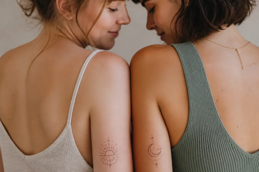
2. Split Sun and Moon Friendship Pair
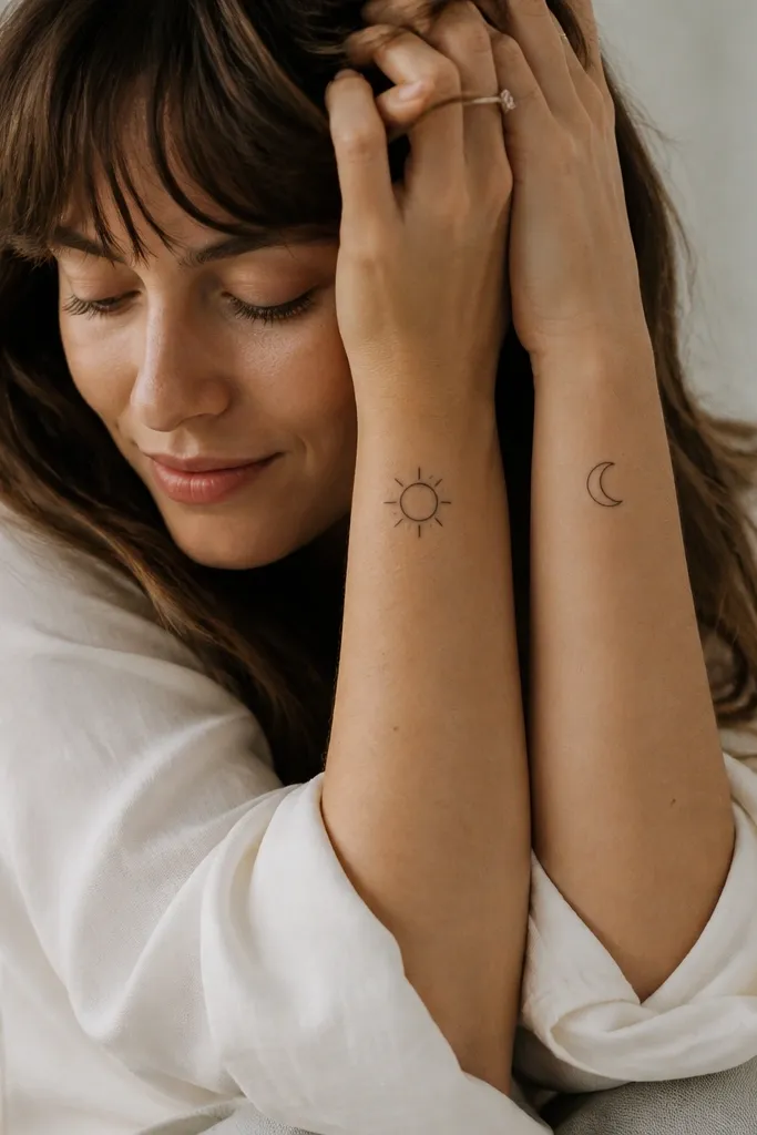
Sun and moon is the "we balance each other" symbol without needing elaborate art. Minimal rays and a clean crescent keep the design readable at wrist distance. I like thin line work at 1.2 mm so the shapes stay sharp but still bold enough to survive touch-ups. The meaning feels stronger when they're complementary - not two random icons.
Size it around 2 cm across. Put the sun on the inner forearm near the wrist crease, and the moon on the outer forearm so the pair looks coordinated when you stand side by side. Use the same line thickness on both pieces so the healed contrast matches.
Pro tipChoose sun rays with 6 to 8 short lines, not 12. Fewer rays heal cleaner and look intentional.
AvoidSkip heavy dotwork inside the sun or deep shading in the moon - it turns into a dark patch.
3. Interlocking Minimal Hearts
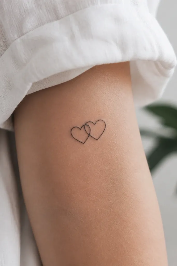
Interlocking hearts communicate closeness without turning into a standard couple tattoo. Minimal line hearts look classy and stay readable because there's no fill to fade unevenly. I've seen these work best when the hearts overlap at one sharp point - it makes the pair feel designed rather than accidental. The "friendship" part comes from the overlap being subtle, not the full lock-up you'd see in romantic sets.
Keep the hearts about 1.4 cm tall each. Place one heart on one person's upper arm (outer side) and the matching heart on the other person's inner upper arm so the overlap happens only when arms are raised. Use consistent line thickness so the shared point stays crisp.
Pro tipAsk for the hearts to be drawn a touch asymmetrical - like 1 to 2 degrees off - so it feels hand-drawn, not stamped.
AvoidDon't add tiny hearts inside or tiny text around - that's how minimalist turns into clutter.
4. BFF Knot: The Simple Tied Loop
A tied knot is basically a "we hold on to each other" symbol. Minimal knots are better than ornate ones because the meaning comes through the shape - a loop and a tie point. I like a knot with two equal loops and one clear pinch in the middle. It reads cleanly and looks good even after light fading, because the silhouette stays recognizable.
Target 1.8 cm width. Place it on the back of the wrist where you'll see it in motion. Use line weight around 1.3 mm and avoid any interior stippling.
Pro tipHave your artist draw the knot with a single continuous flow line for the outline, then add one short internal shadow line if you want depth.
AvoidAvoid thick knots with wide fills - they look chunky on small placements and age unevenly.
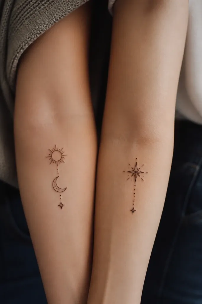
5. Compass Needle Pointing Toward Friendship
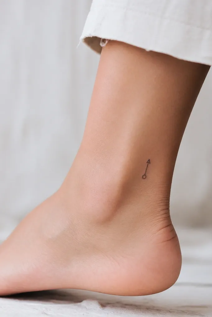
This one has a "direction" vibe without being cheesy. The needle tip pointing outward can mean "we guide each other," and keeping the compass minimal avoids the busy ring details that blur. I prefer a single needle line plus a small dot at the center. It looks clean and works great for friends who moved cities or found each other at a turning point.
Keep the needle about 2.0 cm long from tip to tail. Place it on the outer ankle just above the bone for a long, thin look. Use black ink only and no extra tick marks.
Pro tipDecide which friend gets the needle tip and which gets the center dot - so the pair feels connected but not identical.
AvoidDon't add full compass tick marks - they turn into a gray halo.
6. Two Matching Paper Planes With Different Folds
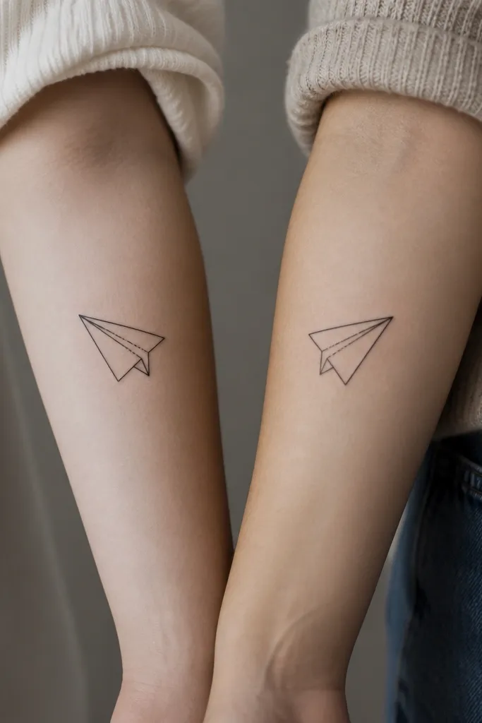
Paper planes are underrated for friendship tattoos because they're about sending, showing up, and reaching out. Minimal outlines look airy and don't trap ink. The "beautiful meaning" comes from the fold difference - each plane matches the other's silhouette but has a small variation that feels personal.
Size it 2.2 cm long. Put one plane on the inside forearm and the other on the outside forearm, angled in the same direction. Keep the line weight at 1.2 mm and use only one interior fold line.
Pro tipHave your artist test the plane angle on your skin with the stencil. Planes look best around a 30 to 45 degree tilt.
AvoidSkip tiny creases inside the plane - they fade first and make it look like a stain.
7. Minimal Handclasp on Two Sides of the Same Story
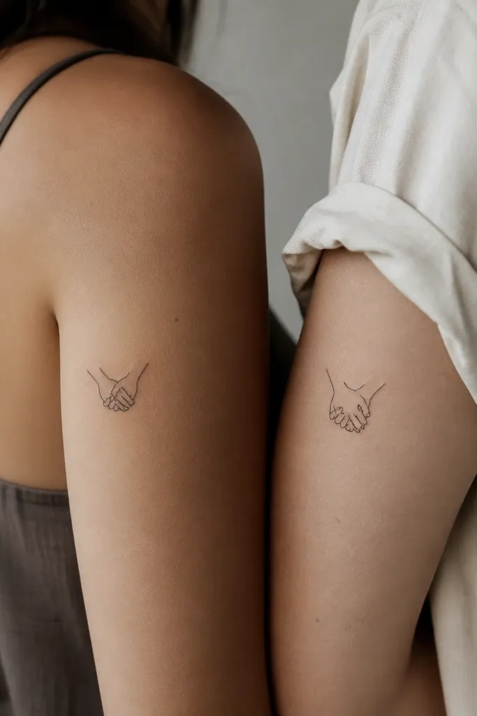
Handclasp is connection you can feel. Minimalist hands work when the artist simplifies fingers into clean shapes and keeps the grip clear. I like the "full clasp on one, cropped clasp on the other" approach because it turns into a matching set that isn't identical. It also makes it easier to place on different body spots without stretching the design.
Keep the full clasp under 2.5 cm across. Place the full one on the outer upper arm, and the cropped one on the inner upper arm. Use no shading - just consistent outline with a line weight around 1.4 mm.
Pro tipIf you're worried about aging, pick a slightly bolder outline line weight and reduce the number of finger segments.
AvoidAvoid detailed knuckle shading - it looks gray after a year.
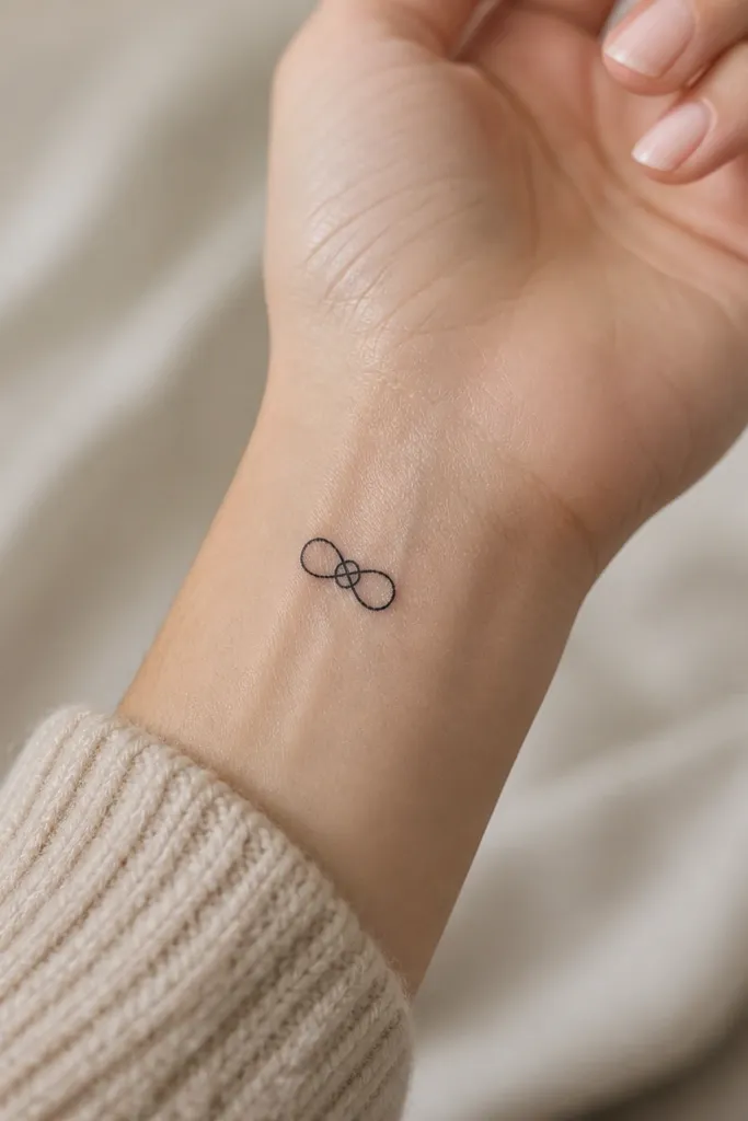
8. Infinity Loop With One Hidden Spark
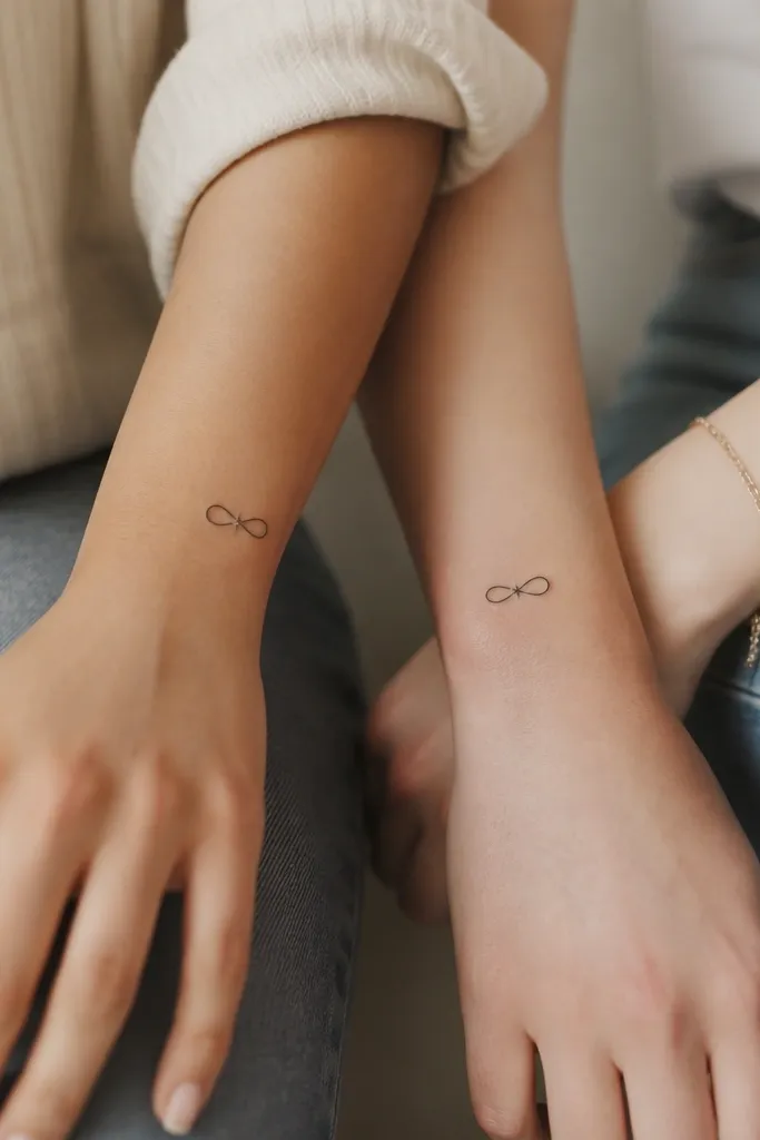
Infinity is the "always" symbol, but the hidden spark makes it feel like friendship, not a generic loop. The spark is small enough to be a secret meaning but big enough to stay visible with minimalist linework. I like an infinity outline that's even in thickness and a spark drawn with 4 points, no filled star. The contrast creates a focal point without clutter.
Size the infinity to 2.0 cm wide. Put the hidden spark on the inner side of the wrist so it shows when you flex. Use 1.3 mm line weight and keep the spark around 3 to 4 mm across.
Pro tipAsk your artist to place the spark at the same spot relative to the infinity curve on both friends if you want a matching set.
AvoidSkip tiny 6-point stars - they blur faster on small placements.
9. Two Matching Leaves With Vein Lines
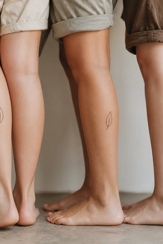
Leaves mean growth and staying grounded. Minimal leaf outlines with one central vein line look crisp and feel personal. I've used this with friends who have long-distance relationships because the leaf shape feels calm, not dramatic. The meaning becomes "we grow together" when both leaves are the same species shape - like a simple olive leaf silhouette - but placed on different legs.
Pick a leaf about 2.5 cm long. Place one on the inner calf and the other on the outer calf, matching height relative to the knee. Use 1.2 mm line weight and one vein line; no shading.
Pro tipTell your artist you want the vein line slightly offset so it doesn't look like a boring clipart copy.
AvoidAvoid multiple vein branches - they turn into a dark tangle as it ages.
10. Rings Around a Shared Point
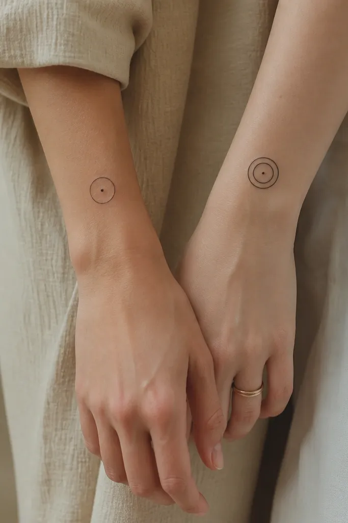
This design is for friends who feel like "one core, different layers." The shared center dot makes it clearly connected. Minimal rings age well because the shape is simple and the dot keeps the design from looking too generic. I like using one ring on one friend and two rings on the other so the pair looks intentional even when they're not placed side by side.
Use a ring diameter around 1.2 to 1.4 cm. Place it on the forearm or collarbone area where rings read cleanly. Keep line weight around 1.2 mm and make sure the center dot is at least 1 mm across.
Pro tipIf you pick a collarbone spot, ask for the stencil to be drawn along your skin fold lines so it doesn't warp.
AvoidDon't use super thin rings under 1 mm - they vanish.
11. Split Key and Keyhole Friendship Pair
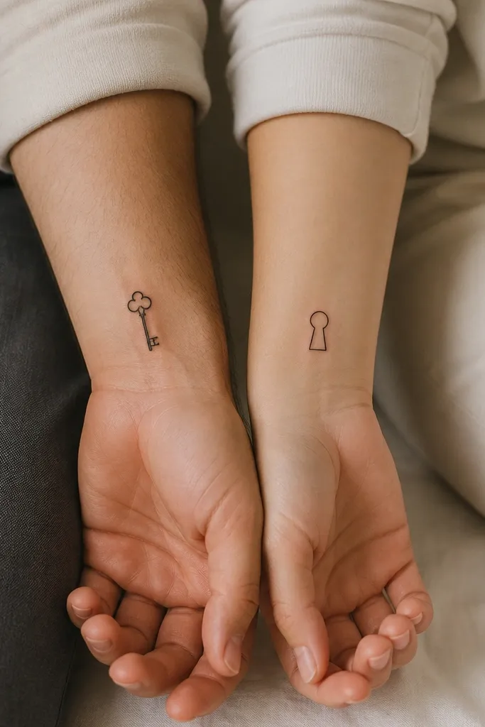
Keys are about access and trust. The split version feels like partnership between friends without copying a lock-and-key romance cliché. Minimal keys with one tooth and a simple bow stay readable. The keyhole is just a circle and a small notch, so it looks clean even when it fades slightly.
Size the key around 2.2 cm long and the keyhole around 1.2 cm tall. Place keys on the inner wrist and keyhole on the outer wrist so they look coordinated when you hold hands. Keep line weight around 1.4 mm for the key and 1.2 mm for the hole.
Pro tipAsk your artist to match the thickness of the key's bow to the thickness of the keyhole outline.
AvoidSkip tiny key teeth counts above 3 - they blur into a single dark block.
12. Two Tiny Mountains, One Shared Skyline
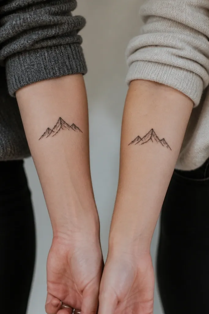
Mountain symbols mean "we made it through" and "strong together." Minimal silhouettes are perfect for friendship because they don't need background shading. I like giving one friend the taller peak and the other friend the lower peak so the pair feels like a single skyline if you stand them side by side. Keep the peaks simple - two triangles and a flat base line or none at all.
Target 2.0 to 2.8 cm wide depending on placement. Place one on the inner forearm near the thumb side and the other on the inner forearm near the pinky side. Use 1.3 mm line weight and no extra snow dots unless you keep them large.
Pro tipChoose a base line (or skip it) for both designs. Inconsistent bases make it look like two unrelated tattoos.
AvoidAvoid sketchy linework - wobbly mountains age unevenly.


