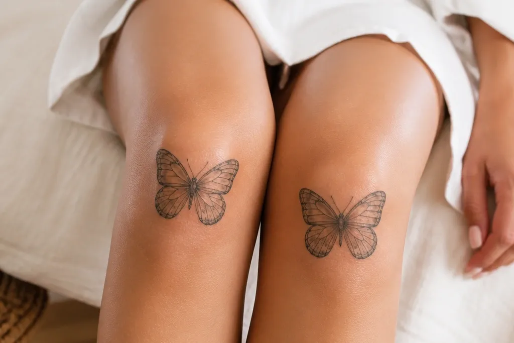
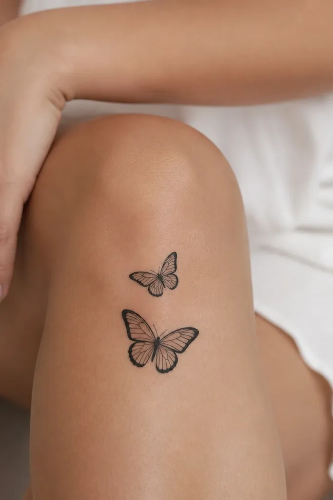
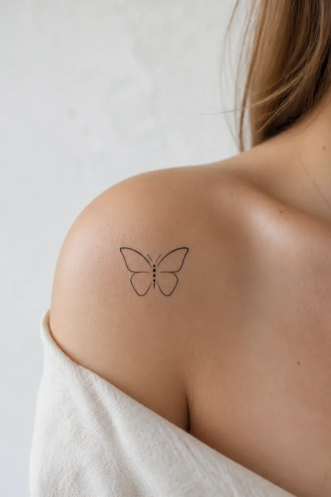
1. Micro butterfly perched above the kneecap
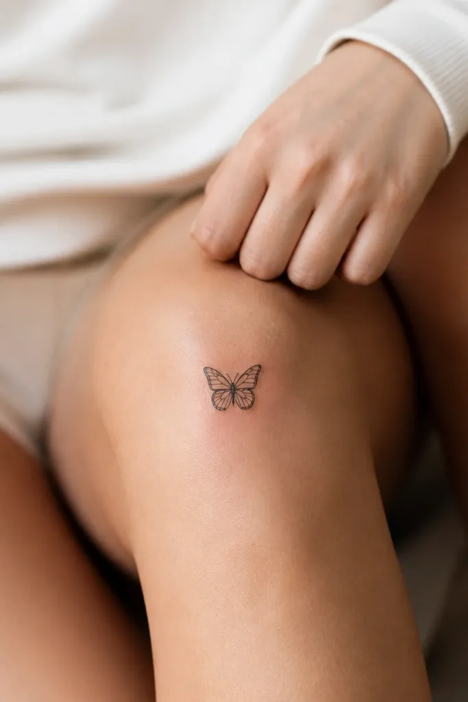
This works because the tattoo sits where the skin stretches less than the exact kneecap center. The thin inner lines read as "wings" even if the ink lightens a bit over time. I like this layout for minimalist knee tattoos because it stays cute with zero shading. The outline is sharp but not heavy, so it doesn't look like a sticker stuck on a wrinkly spot.
Position the center point about 1-2 finger widths above the kneecap. Keep the wings narrow, roughly 2.5-3.5 cm across, so it doesn't fight the knee's curve. Wear it with shorts or skirts so you can see the negative space between wing edges.
Pro tipAsk your artist to draw a light guide on your skin while you stand and bend your knee, then adjust the height before the first line.
AvoidAvoid thick filled wings - they age faster on knees and turn into a dark patch.
2. One-wing butterfly with a fine-line outline
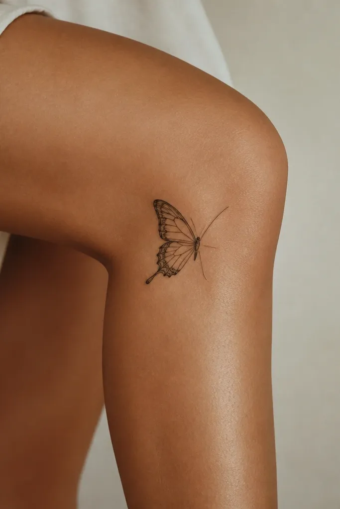
A partial butterfly looks extra cute because your eye reads movement, not symmetry. The outer knee placement also helps - it follows the leg contour when you walk. Keep it mostly outline, with only two or three inner vein lines per wing. This style hides minor ink spread better than a fully symmetrical butterfly.
Place it on the outer knee line, starting slightly above the kneecap and tapering downward. Size the full wing around 3 cm, with the "hidden" wing reduced to a few strokes. It looks best in solid black or black with one tiny dot cluster near the body.
Pro tipTell your artist you want the body line thin, not bold - the body is what keeps it from looking like a random doodle.
AvoidSkip heavy dot shading across the whole wing - it will blur where the skin folds.
3. Butterfly frame with tiny dot gradient
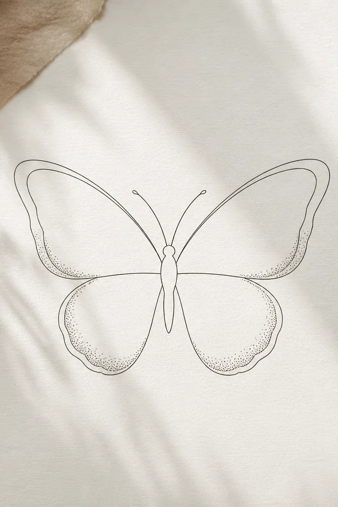
This gives you depth without turning the wings into a smudgy gray. The dot gradient is placed where the wing edge catches light, so it reads as "soft shadow." I like the double-line frame because it makes the butterfly look intentional and neat on the knee. It stays cute even after fading because the outline does most of the work.
Use dot shading only on the bottom outer edge of each wing, about 10-20% of the wing area. Keep the body tiny and centered, no thick thorax. For ink, stick to black and gray; avoid color in this design.
Pro tipAsk for dot spacing that stays visible - if the dots merge during application, it'll heal darker than you want.
AvoidAvoid shading inside the wing center - that's where knee movement blurs the lines.
4. Butterfly and micro flowers in a knee arc
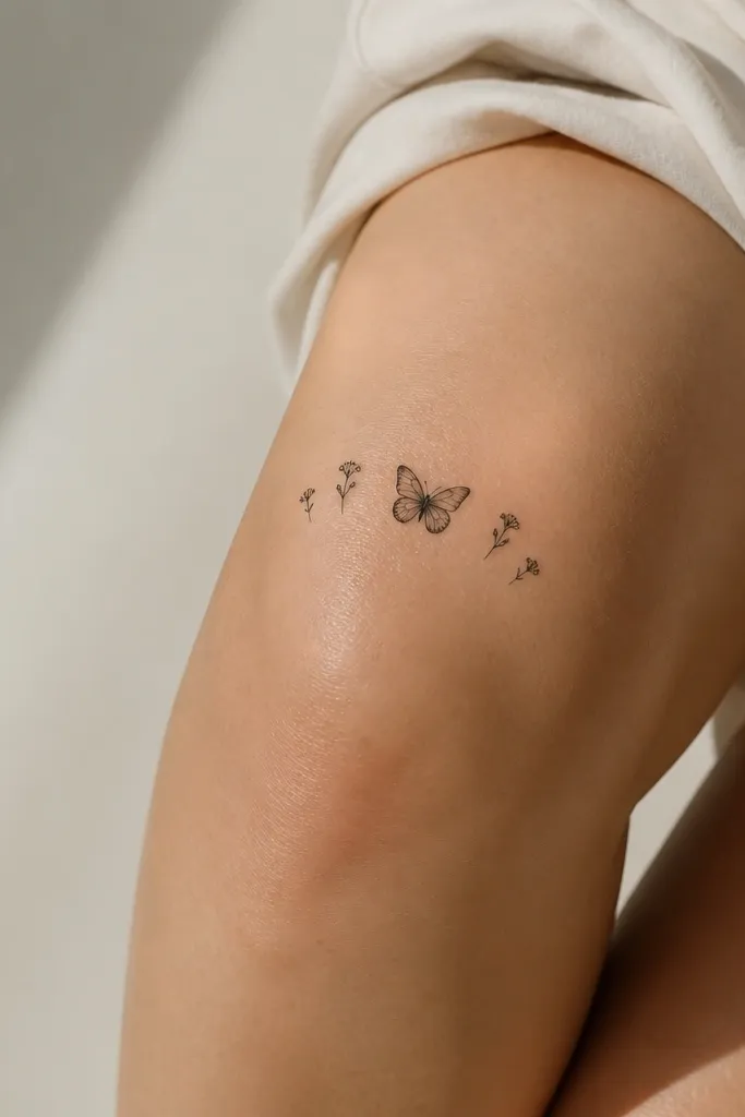
Flowers make the butterfly feel more "cute" and less like a standalone symbol. The arc placement fits the knee curve, so nothing looks randomly scattered. Keep the flowers tiny - like seed-pod size - so the butterfly remains the main focus. This design also gives you more drawing lines for the artist to use, which helps the placement stay flattering.
Place the butterfly slightly above the kneecap center, then position the buds along the outer edges of the knee arc. Target total width around 6-7 cm. Use only black ink with thin stems or just dot centers for the flowers.
Pro tipBring reference photos of your knee while seated; the arc should still look balanced when your leg bends.
AvoidAvoid adding too many flowers - three per side max keeps it minimalist.
5. Pale peach wing accents with black outline
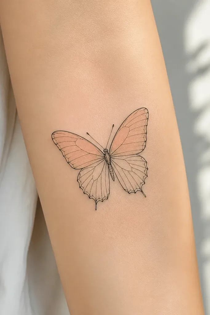
Color can stay cute on knees if you treat it like a highlight, not a full fill. Pale peach looks warm against skin and fades more gracefully than bright reds or deep purples. Keeping the outline black is what prevents the butterfly from turning into a colored blur. This style looks best on light to medium skin tones where the peach reads clearly.
Ask for color limited to the upper wing sections, leaving 60-70% of the wing as skin/negative space. Keep the peach very light, almost like tinted blush. The butterfly size should be small, around 3.5 cm across, so the color doesn't spread.
Pro tipIf your artist offers a stencil test, ask them to do a quick placement mark and confirm the color area before they start.
AvoidSkip dark color fills - knees fade and the edges turn muddy.
6. Butterfly with a thin trailing line like a ribbon
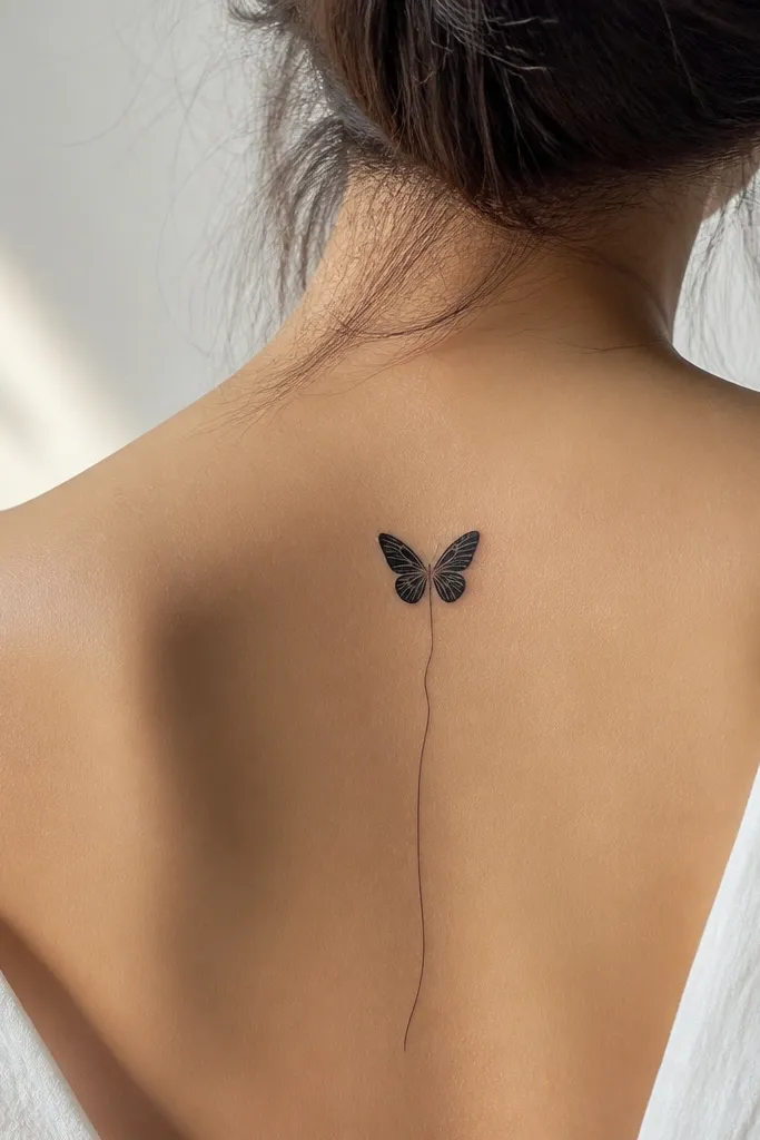
That trailing line makes the whole tattoo feel like it's floating, not pinned to skin. It also gives the knee more "direction," which helps the butterfly look good when you bend your leg. Keep the ribbon line super thin so it reads as motion. I've seen this heal cleaner than designs that try to pack in extra details.
Place the butterfly above the kneecap, slightly off-center toward the outer knee. The trailing line should end around mid-knee, about 2-3 cm long. Keep the butterfly wings narrow, and skip heavy shading.
Pro tipAsk your artist to align the ribbon line with your leg's natural angle so it follows your movement.
AvoidAvoid thick ribbon lines - they look heavy and age into dark stripes.
7. Butterfly with tiny star dust dots around it
Dot clusters around the butterfly make the design feel playful without adding extra symbols. The trick is keeping the dots sparse and placed where the knee won't smear them into a gray fog. This gives you that "cute" vibe instantly because it feels like a little scene. It also works well if you want a butterfly but you're not into flowers.
Use 5-10 dot clusters total, each cluster small enough to fit under a pencil eraser head. Keep the butterfly itself outlined only. Place it on the outer knee for better visibility with leggings.
Pro tipTell your artist you want the dot clusters to stay separated - no big filled dot patches.
AvoidAvoid dense dot backgrounds - they heal gray and look flat.
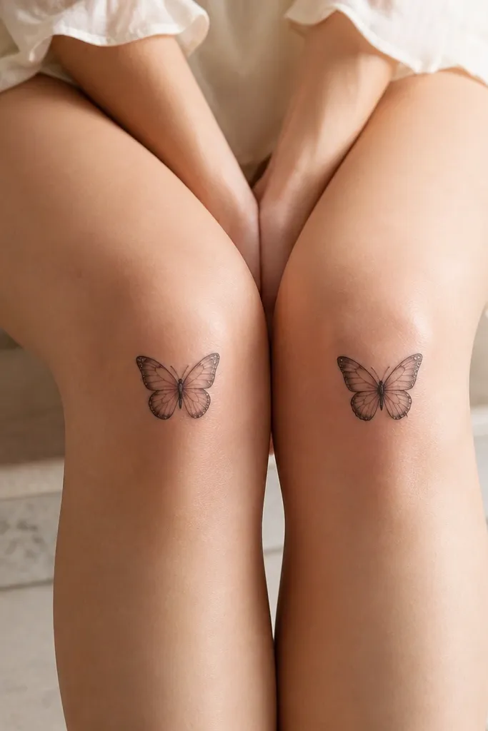
8. Two tiny butterflies stacked diagonally
Diagonal stacking looks cute because it mimics wing motion and creates a longer visual line across the knee. The smaller top butterfly keeps it from looking like a mistake or an accidental overlap. Minimal inner veins keep the design light and airy. I've had this style hold up well because the tattoos aren't trying to be too detailed in one cramped spot.
Place the top butterfly above the kneecap and angle the second butterfly toward the inner knee line. Keep total width around 7 cm. Both butterflies should be outline-only with thin veins; no shading.
Pro tipAsk for the butterflies to be angled to match your shin slope when you stand.
AvoidSkip large size increases - two big butterflies will crowd and blur.
9. Butterfly silhouette with negative-space body
Negative space tricks the eye into reading crisp shape even after healing. The body window makes the butterfly look airy and modern, not heavy. This style stays cute because it's minimal and doesn't rely on shading. It also looks good on knees because the design has built-in "breathing room."
Outline the wings with thin lines and keep the body simple, leaving a small gap in the center. Size it around 4-5 cm across. Place it slightly above the kneecap center so the negative space stays visible.
Pro tipIf your artist can, ask them to show you a stencil mock-up on your skin from two angles before inking.
AvoidAvoid fully filled silhouettes - they lose their shape on knee movement.
10. Butterfly with thin lace-like wing pattern
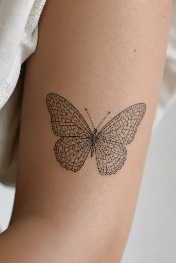
Lace patterns look cute because they give the butterfly texture without using thick shading. The key is line control - the lace lines should be thin and spaced so they don't merge during healing. This design reads like delicate fabric, which is why it works so well on knees. When done right, it still looks like a butterfly even if some of the micro lines fade.
Keep the butterfly smaller than you'd expect, about 3-4 cm across. Place it on the outer knee for the cleanest line visibility. Use black ink only and keep the lace pattern confined to the wings, not the body.
Pro tipAsk for lace line spacing that stays crisp at arm's length, not microscopic in close-up.
AvoidAvoid ultra-tiny dense lace - knees chew up micro detail.
11. Butterfly with micro dot body and outline wings
A dot body adds cuteness because it looks like a little beadwork detail. Keeping the wings outline-only prevents aging into a blob. This design is also easy to customize - you can make the dot body longer or shorter based on your knee width. It's minimalist but still has a signature feature.
Place the butterfly above the kneecap, centered. Size around 3 cm across. Keep the dot body about 6-8 dots tall, evenly spaced, and match the wing outlines to that scale.
Pro tipTell your artist to keep the dots separated, not merged into a solid line.
AvoidSkip thick body lines - they look blunt next to fine wings.
12. Butterfly with watercolor-style lavender edge
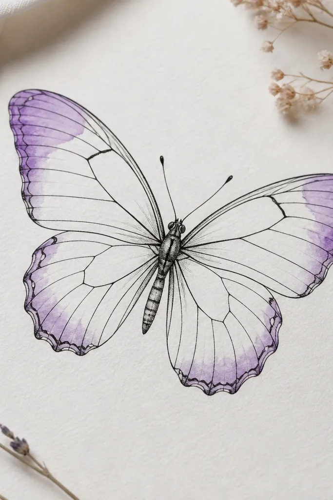
Lavender edge color looks sweet and feminine, and it fades in a softer way than darker pigments. The key is using it only at the wing tips, so you don't flood the knee with color. The black outline keeps the butterfly readable even as the lavender lightens. This is a great option if you want color but still want it to look minimalist.
Ask for a light lavender wash over about 15-25% of each wing tip. Keep the wash feathered, not solid. Place it above the kneecap so the wing tips stay visible when you walk.
Pro tipRequest a lighter hand on the first pass, then do any extra color only if the placement looks right.
AvoidAvoid full wing color - it turns patchy on knee skin.


