1. Single-Line Moon Above the Knee Cap
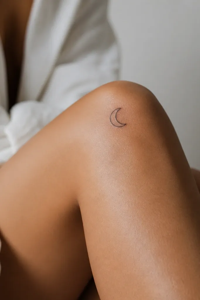
This works because the moon shape stays readable even when the skin stretches. A single-line design avoids the "blob" problem you get when artists overfill tiny gaps. Use a clean, slightly curved crescent so it catches light as a crisp silhouette rather than a gray smear. Black ink with no gray wash keeps it looking sharp for longer.
Place it about 2 cm above the knee cap and slightly toward the outer leg. Size it so the moon is roughly 2.2 to 2.8 cm wide. Tell your artist you want one unbroken line and a smooth start-stop point, not a sketchy outline.
Pro tipAsk for a tiny dot at the end of the line as a "signature" point. It adds character without adding complexity.
AvoidAvoid adding stars smaller than a pencil eraser - they fade fast on knee skin.
2. Tiny Heart Outline on the Outer Knee
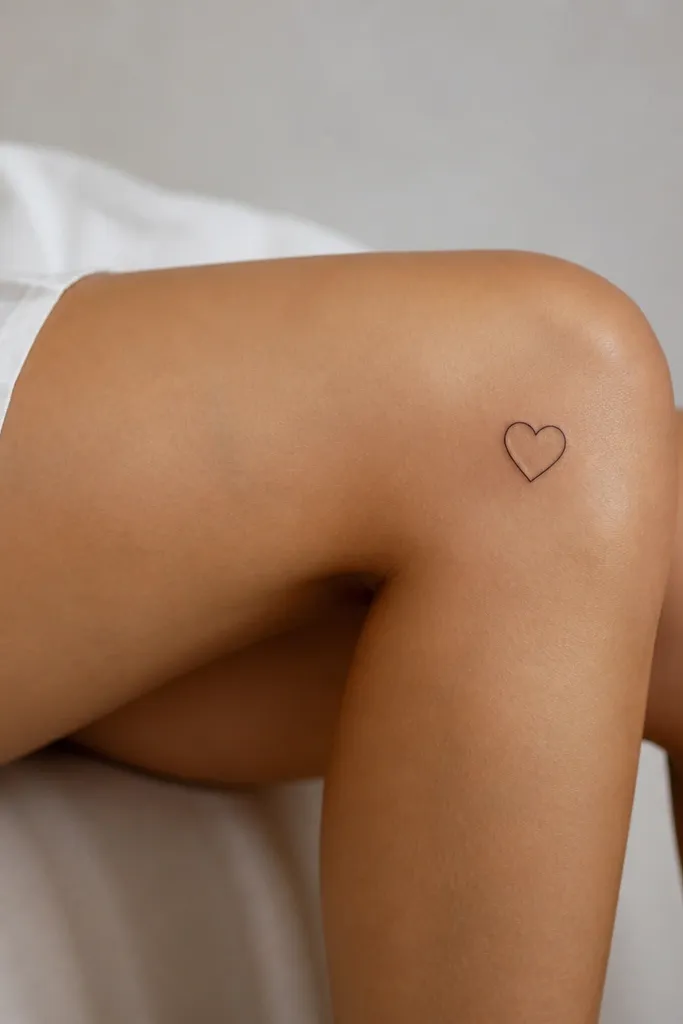
A heart outline is simple and reads fast, which is what you want on a moving joint. Thin-line hearts look delicate, but the knee needs at least a moderate line weight so the outline doesn't turn into a gray halo. Keep it as an outline only - no shading - so the healed look stays clean. The outer knee placement makes it visible with shorts without looking too exposed.
Position it on the outer front knee so it sits flatter when you stand. Target 2 to 3 cm tall. If you're worried about fading, request a slightly thicker outline on the bottom lobes where the ink tends to blur first.
Pro tipChoose a heart with a slightly squared top point. It heals sharper than a super round heart.
AvoidDon't add a name inside the heart - micro text is the fastest way to lose readability.
3. Micro Geometric Triangle Stack
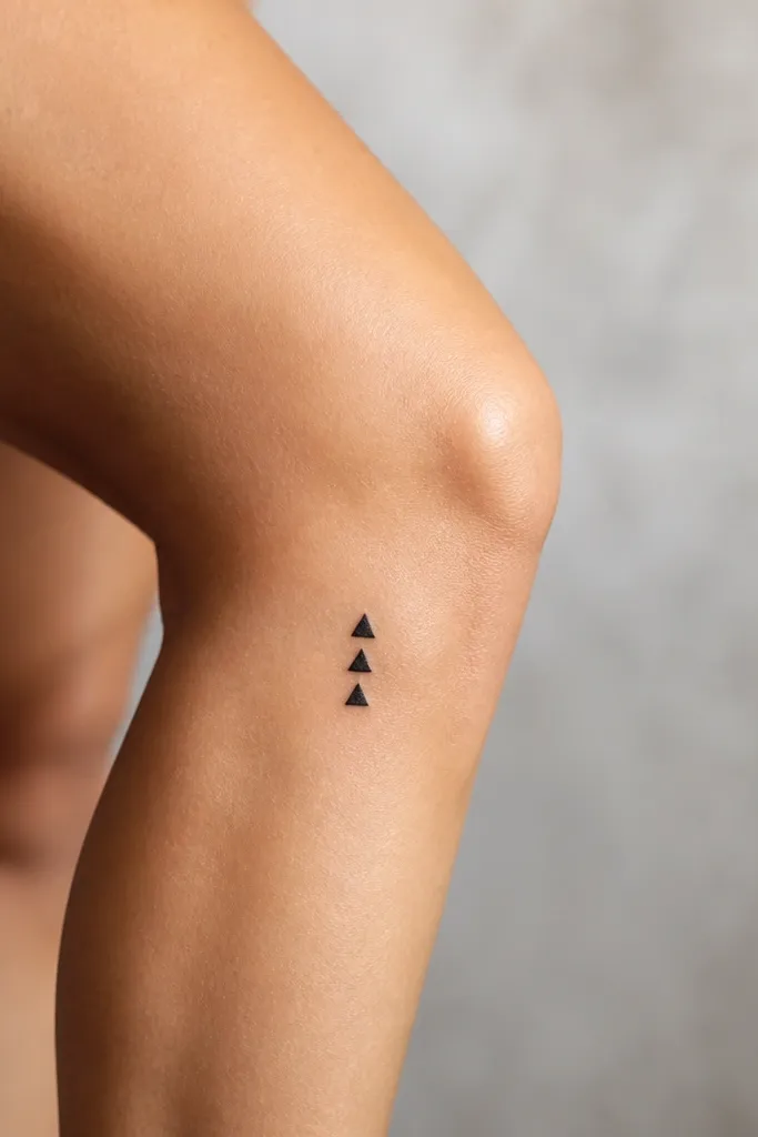
Geometric shapes hold up well because there's less skin distortion inside the design. A stack of triangles creates structure, and the straight edges keep the tattoo looking intentional. Solid black triangles also avoid the "ink spread" that can happen with heavy gray shading. You get a minimalist look with a clear focal point.
Place it near the lower edge of the knee, not the center of the cap. Size each triangle so the total height is about 3 cm. Ask for consistent spacing - gaps should look like thin white lines, not random blotches.
Pro tipAdd one triangle rotated 180 degrees. It breaks symmetry without making the design busier.
AvoidSkip gradients or stipple shading - they fade unevenly on knees.
4. Dot Cluster Like a Constellation
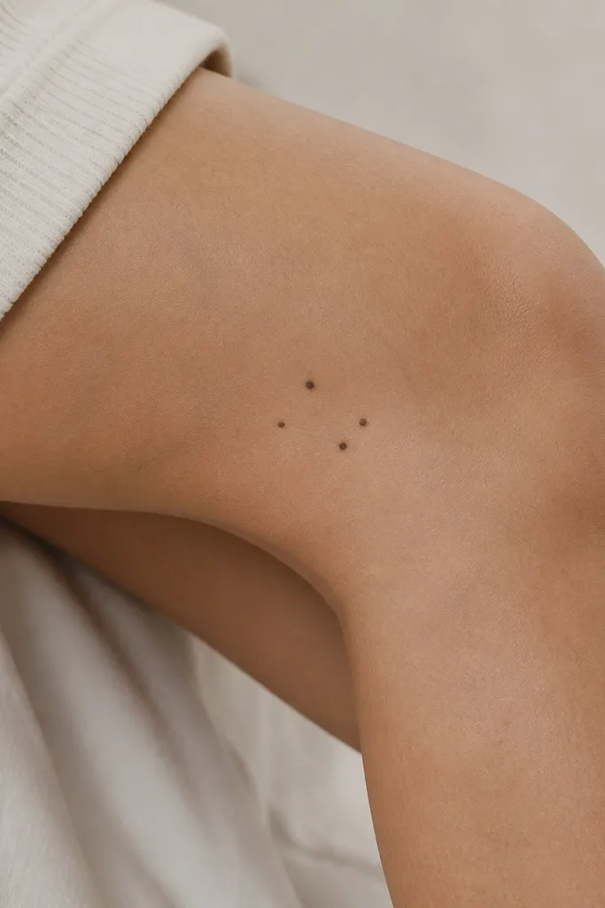
Dot clusters are minimalist and budget-friendly because they cover less area and use fewer needle passes. The knee movement doesn't ruin dots the way it ruins thin script. Keep it to 5-6 dots, spaced so the pattern still reads from a distance. Solid black dots also heal predictably.
Place it on the inner knee where leggings sit, about 1-2 cm below the knee cap. Size the whole cluster at 2.5 to 3 cm wide. Tell your artist you want dots only - no connecting lines.
Pro tipAsk for one dot slightly larger than the rest to act like the "anchor."
AvoidAvoid tiny dots smaller than 1 mm - they can disappear as the skin sheds.
5. Minimal Line Bracelet Across the Lower Knee
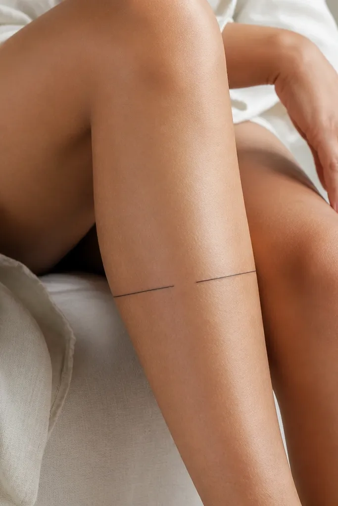
A bracelet-style line looks clean because it follows the natural curve of the leg. The horizontal placement reads like jewelry, not a random mark. Keep it as one continuous line with two small breaks so it feels intentional. Solid black without shading keeps it crisp after healing.
Place it about 3-4 cm above the ankle line, centered on the front/outer edge of the knee. Total width should be around 6 to 8 cm. Make the line weight consistent and request no extra flourishes at the ends.
Pro tipHave your artist add a tiny micro-dot at one break point. It makes the design feel finished.
AvoidDon't make the line too thick - heavy lines on knees can look raised and cloudy.
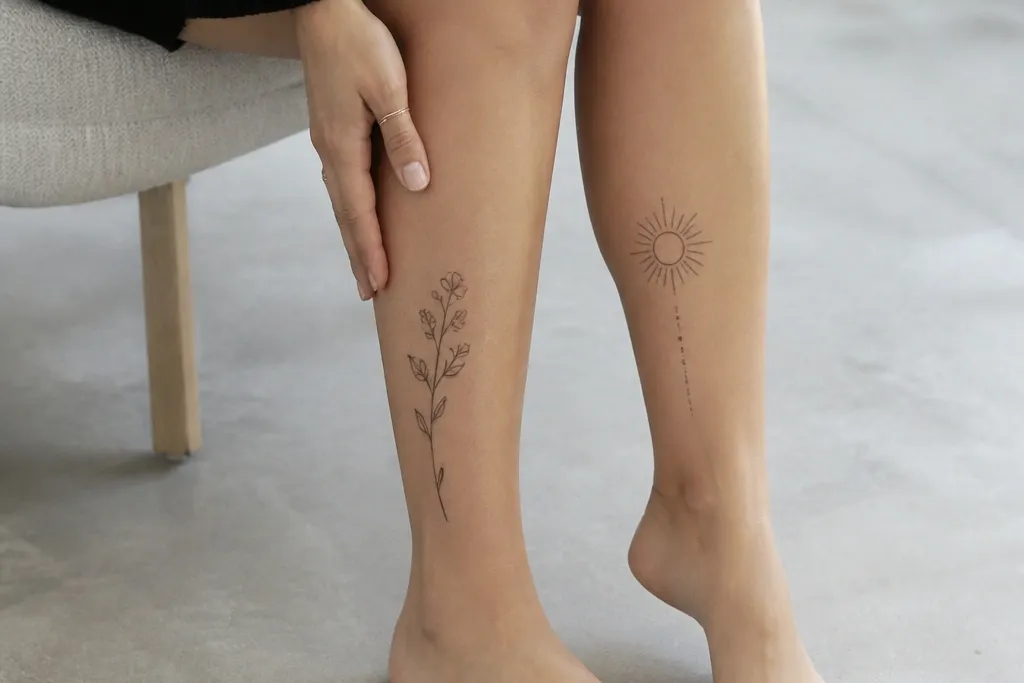
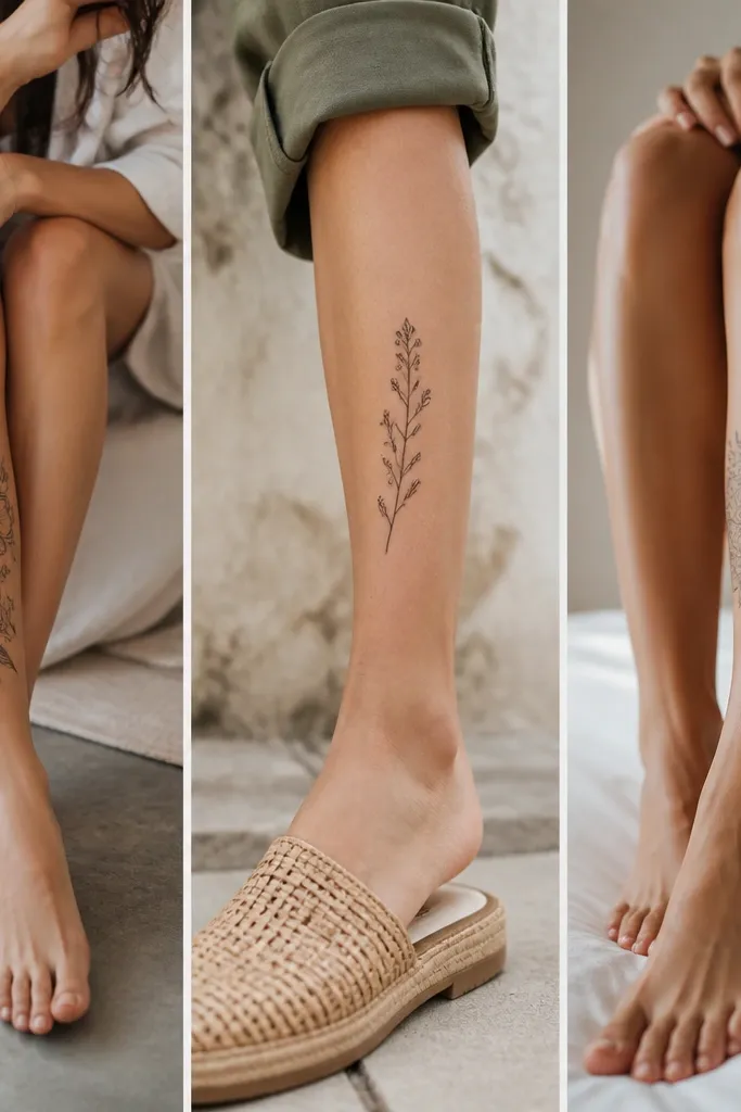
6. Tiny Botanical Sprig with No Shading
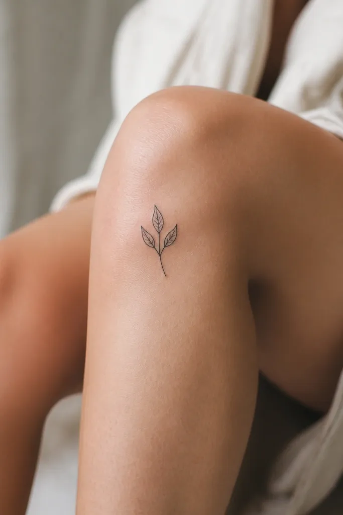
A tiny sprig stays minimalist because the leaves give shape without needing gray wash. I like a simple outline with a thin stem and leaf edges - it reads like a botanical sketch. No shading keeps the healed result from turning patchy. Black ink gives you contrast against skin so it stays visible even in soft light.
Place the stem angled upward toward the outer knee, not straight across. Total size around 2.5 to 3.5 cm. Ask for leaf edges that are clean and not too detailed - fewer lines heal better on knees.
Pro tipRequest slightly thicker lines on the stem so it doesn't blur when the knee bends.
AvoidSkip micro veins inside the leaves - those fade first.
7. Single Feather Tip with Thick Base
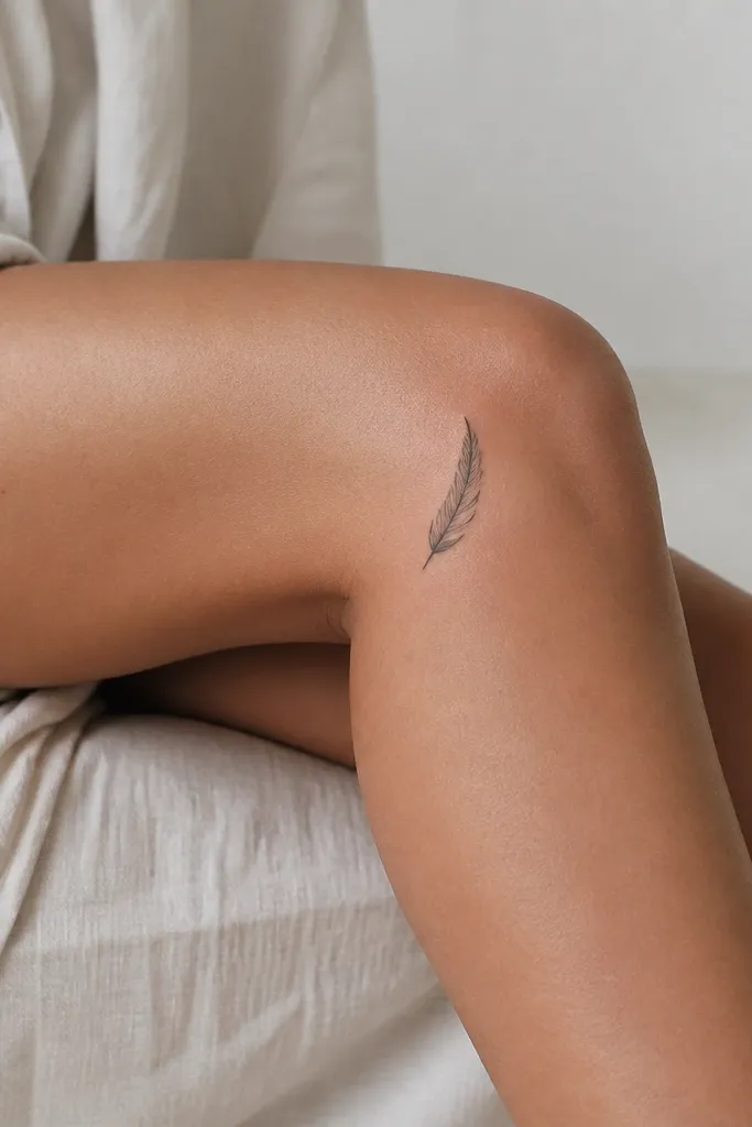
Feathers look delicate, but you can design one to survive knee movement. Use a thick base and taper so the "spine" stays dark while the outer lines remain simple. Keep the feather to one shape, with only 2-3 inner bar lines. This gives the feather its identity without turning into a gray blur.
Place it vertically just outside the knee cap. Size about 3 cm tall. Tell your artist you want the bar lines short, not long - long lines tend to stretch and smear.
Pro tipAsk for the feather outline to be slightly darker than the inner bars. It keeps the silhouette crisp.
AvoidDon't add lots of tiny texture marks along the bar lines.
8. Mini Infinity Loop on the Inner Knee
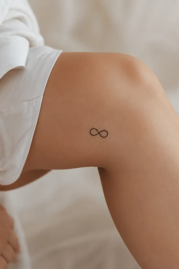
Infinity symbols work because they're symmetrical and easy to read even after mild fading. The key is curve smoothness and line consistency. A compact size helps the symbol stay legible when the skin stretches. Solid black with no gray wash looks clean against skin tones.
Place it on the inner knee, about 1-2 cm below the knee cap. Total width around 2.5 to 3 cm. Ask for equal loop sizes and a small gap in the center so it doesn't merge into a single blob.
Pro tipIf your artist offers a stencil with too-thin lines, ask them to thicken the stencil line weight before tattooing.
AvoidAvoid adding tiny stars or dots inside the loops.
9. Small Sunburst Line Cluster
Sunbursts are one of the most readable minimalist designs from a distance. The trick is to use a filled center and short rays so the rays don't blur into each other. Keep the rays straight and consistent in length. Solid black stays strong, and negative space between rays prevents the "spiky blob" look.
Place it on the lower outer knee so it's visible with skirts and shorts. Size about 3 cm wide total. Use 8 rays max - fewer rays look sharper and cost less.
Pro tipAsk your artist to draw rays with equal spacing. The symmetry makes it feel intentional, not accidental.
AvoidSkip 20+ rays. Too many lines on a knee fade into fuzz.
10. Tiny Roman Numerals with a Single Line Accent
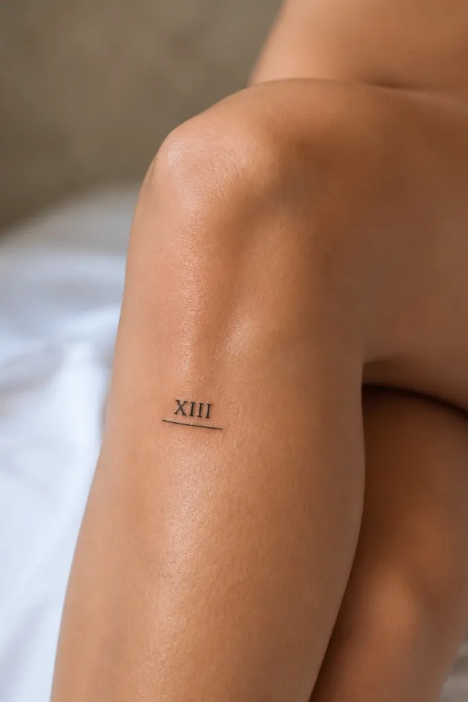
Roman numerals can look classy and small, but only when the numerals are large enough to heal. This design avoids micro text by using a thick, simple font and one underline accent. The underline is a strong visual anchor so the tattoo still looks like a design even if one numeral softens. Keep it black only.
Place on the outer knee panel so it's easy to see when you sit. Total width 2.5 to 3 cm. Ask for a font with thick strokes - no thin hairline serifs. Underline should be one straight line, not a flourish.
Pro tipPick dates that matter to you, but make the numerals big enough that you'd recognize them across the room.
AvoidAvoid cursive dates or tiny script - they heal gray and hard to read.
11. Minimal Mountain Outline with One Snow Cap
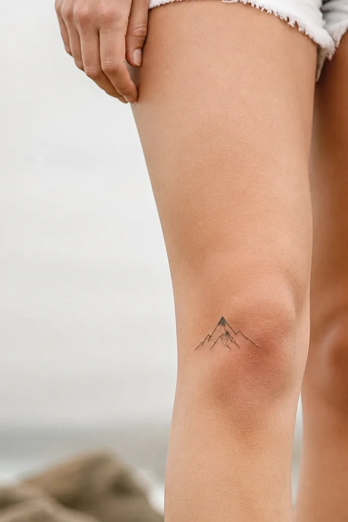
Mountains are great because the silhouette holds up even when the skin moves. Add only one detail - the snow cap - so you don't create too many thin lines. Use solid black for the outline and the snow cap, with no gray. This keeps the design graphic and readable in motion.
Place it horizontally across the outer lower knee, slightly angled upward at the right side. Size about 3.5 cm wide. Tell your artist to keep the line weight consistent and the snow cap thick enough to stay dark.
Pro tipAsk for a tiny flat base line. It grounds the mountain and looks more intentional.
AvoidAvoid shading the sides - knee skin makes gradients look patchy.
12. Tiny Key Icon with Rounded Teeth
Keys read well in minimalist style because the head and teeth shapes are distinct. Rounded teeth are easier to heal than sharp, pointy teeth that can spread. Solid black keeps it bold, and the simple silhouette stays clear. It also pairs nicely with jewelry looks because it feels like a charm.
Place it on the inner knee, upright or slightly tilted, with the head near the top. Total size about 3 cm tall. Ask for the teeth spacing to be slightly wider than you think - knee skin stretches and tight gaps can merge.
Pro tipIf you want extra meaning without clutter, add one tiny dot near the key head instead of a word.
AvoidAvoid tiny bow-and-hook keys with lots of micro curves.


