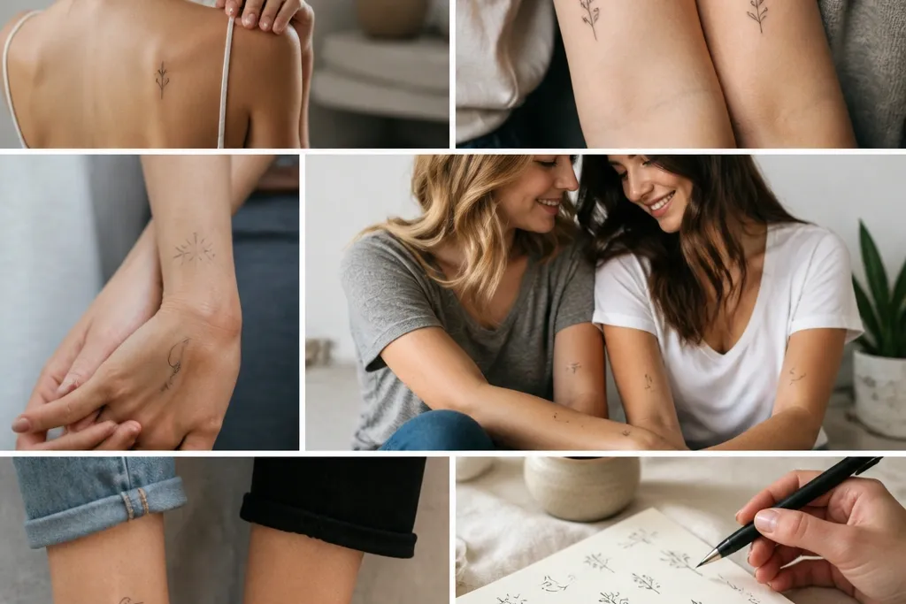
1. Two tiny matching crescent moons with one shared dot phase
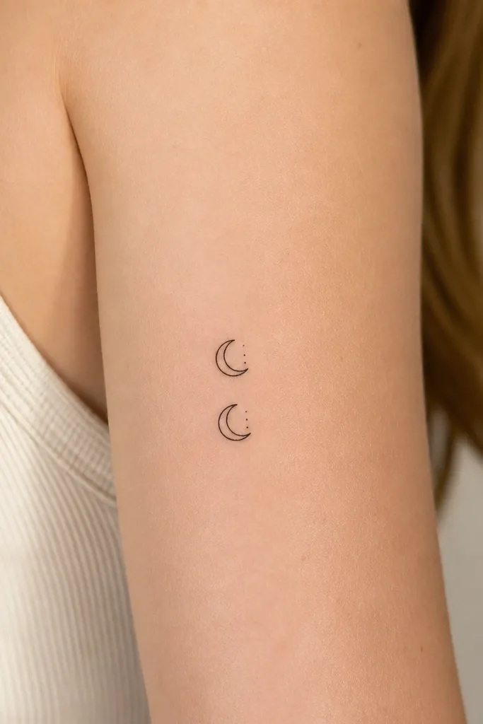
Crescents read dainty because the shape is simple and has natural negative space. The extra dot phase is what makes it friendship-specific without adding clutter. I like this design because it heals well - the moon outline stays legible and the dots keep their contrast when the artist uses solid black dot placement rather than hairline gradients.
Put them on the inner wrist or upper forearm where the skin stretches less than fingers. Keep both crescents the same size and angle, then vary the dot position by 1-2 mm if your wrists don't match perfectly. If you want it to feel "yours," swap the dot count to match a shared month or anniversary number.
Pro tipAsk your artist to draw the crescent first, then place the dots after you approve the spacing. That stops the dots from crowding the moon during stencil.
AvoidAvoid tiny crescent moons with shaded gray - stippling that's too light usually turns into a smudge.
2. Micro constellation pairs with one star highlighted in dotwork
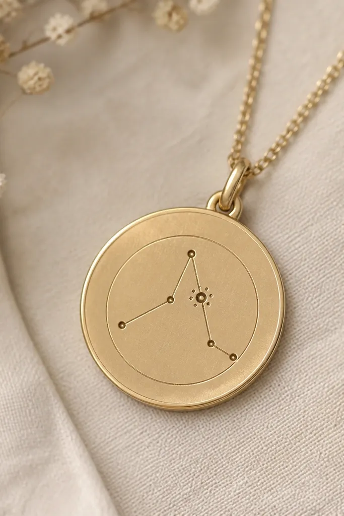
Constellations look minimalist when the cluster is small and the "connections" are short. The highlighted star gives the piece a focal point, so both tattoos feel like they belong together even if they're on different spots. Dotwork is forgiving in tiny scale when the dots are consistent - no stretched lines, no thin script.
I recommend placing this on the outer wrist or collarbone, about 1.8 to 2.2 cm wide. Use black ink only. Have the artist keep line connections under 3 mm each so the cluster doesn't sprawl when your skin moves.
Pro tipBring a constellation map screenshot and circle the exact stars you want. Artists can translate the geometry faster when they're not guessing which stars you meant.
AvoidSkip constellations with lots of tiny stars - more than six points in this size usually blurs.
3. Fine-line matching heartstrings with the knot at the center
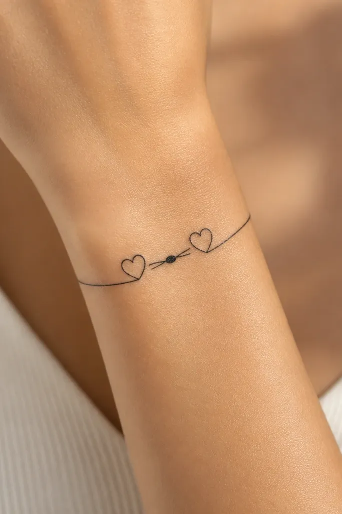
This works because it reads as one graphic symbol, not two separate hearts. The knot makes it look "designed," and that detail helps the tattoo stay interesting even when it's tiny. I like it for friendship tattoos because the knot can represent your bond without needing text.
Size it around 2 cm total width and place it on the inner forearm or above the ankle bone. Keep the heartstrings symmetrical and avoid thick fills - the knot should be solid black, while the string lines stay fine. If you want a color accent, use a single micro dot in the knot only, like a light gray or muted blue.
Pro tipAsk for a stencil that includes a reference scale on your arm. If the knot feels too small during placement, it usually heals too faint.
AvoidAvoid hearts with rounded thick outlines - the dainty look dies when the heart shape becomes a blob.
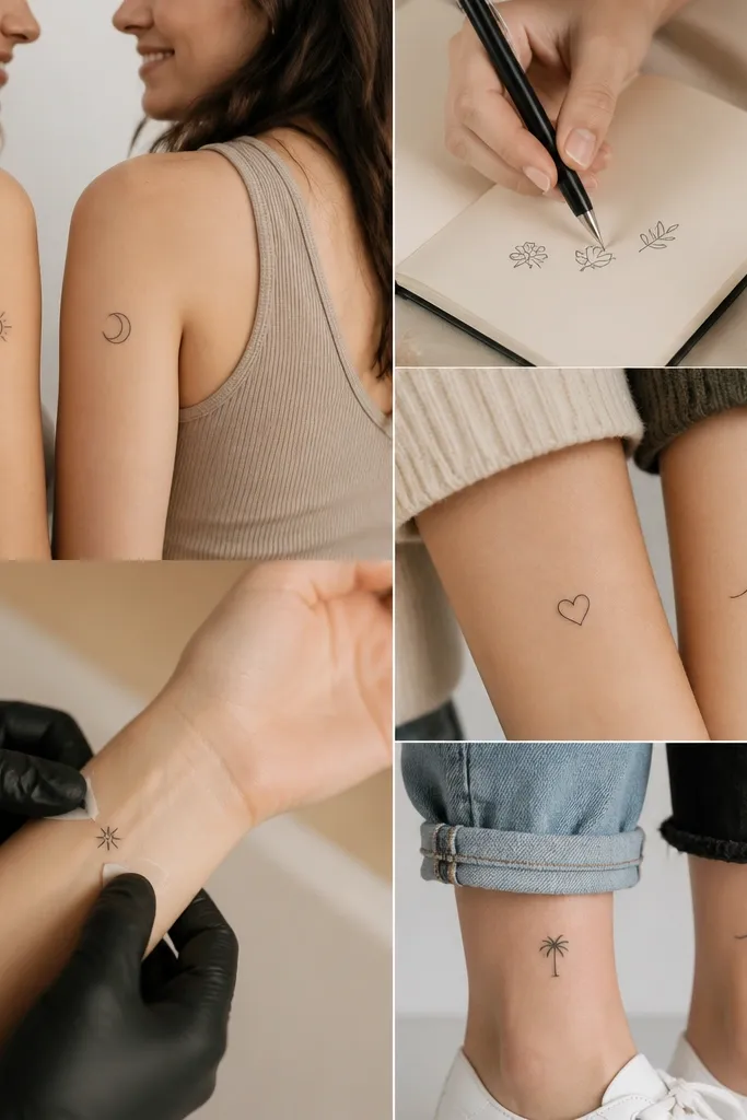
4. Tiny infinity symbol with a single hairline break at midline
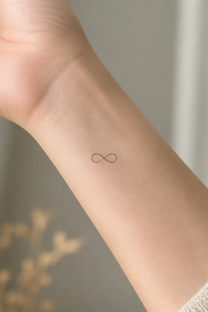
Infinity symbols can look sloppy when they're too small or too thick. A single break at the center makes it look intentional and adds meaning without adding extra elements. The break also helps the tattoo read as crisp because there's no continuous line that can over-heal into a dark bar.
Place it on the wrist outer side or the side of the ankle. Keep the line weight in that 0.8 to 1.0 mm range and keep the whole symbol under 2 cm. The break should be a clean gap, not a smear - ask the artist to test the stencil size on your skin first.
Pro tipChoose a placement with less friction. If it rubs against shoes or watchbands, the center gap can close as the skin heals.
AvoidDon't pick an infinity that's already thick on paper - the thick line becomes a dark oval after healing.
5. Matching mini lock and key with the teeth simplified
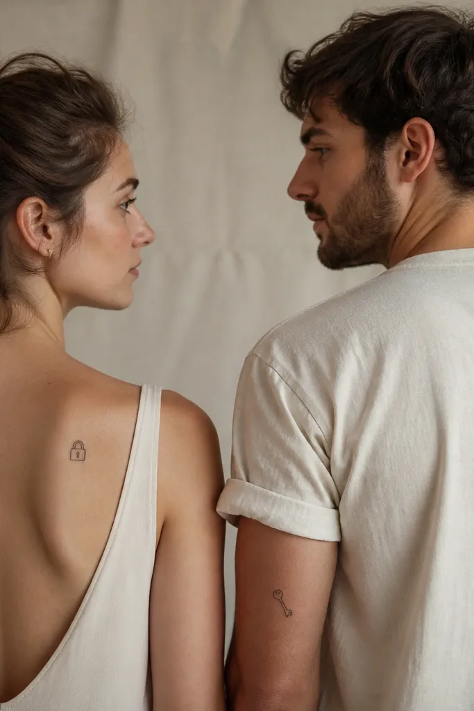
Lock and key can look childish when it's too detailed. Simplifying the key teeth keeps it dainty and adult, and the outline-only approach heals cleanly. I've done versions like this with friends where the lock sits on one wrist and the key on the other; the meaning is clear but the design stays light.
Keep the lock and key about 1.6 to 2.0 cm tall. Use line-only outlines with no heavy shading. Place the lock on the inner wrist and the key on the outer wrist so each tattoo has a different silhouette but matches in line style.
Pro tipAsk the artist to draw the lock shackle thickness slightly thicker than the body lines. That part is where thin lines disappear first.
AvoidAvoid micro-realistic key teeth. If you can count more than three teeth, it's too busy for tiny placement.
6. Two tiny sprigs in the same silhouette, one leaf angled differently
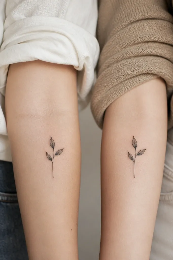
Sprigs look delicate because the shape uses thin negative space and simple curves. The angled leaf gives a "twin but not identical" feel, which is what makes friendship tattoos feel personal. This also heals well because leaf edges are clean and the stem is one continuous line.
Size the sprig to about 2.2 cm tall on the collarbone or upper arm. Keep leaf veins out at this scale; one clean outline leaf looks better than tiny vein lines. Use black ink only and let the artist keep the stem line weight consistent from top to bottom.
Pro tipPick the stem direction you like first, then choose leaf rotation second. Direction matters more than leaf detail for the final look.
AvoidSkip sprigs with lots of cross-hatching. It turns gray fast on small tattoos.
7. Micro ribbon bow with tiny tail curls
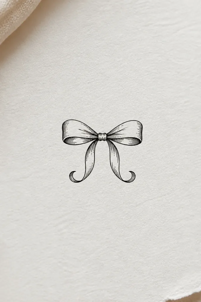
A ribbon bow reads cute without being juvenile when the lines stay crisp and the tails are simple. Tail curls add movement, and that makes the tattoo feel "alive" even at a small size. I like this for friendship tattoos because it feels like a shared symbol you can dress up with placement - wrist, ankle, or behind the ear all work.
Keep the bow about 1.8 cm wide and 2.0 cm tall. Place it behind the ear for a hidden-until-you-want-it look, or on the wrist where you can see it when you gesture. Ask for no shading - just outlines and a small solid knot.
Pro tipHave your artist place the stencil on your skin for 60 seconds before inking. Bow symmetry is easy to judge in that moment.
AvoidAvoid ribbon designs with tiny text inside the bow. The text will blur and ruin the clean look.
8. Matching tiny footprints with one toe dot as a signature
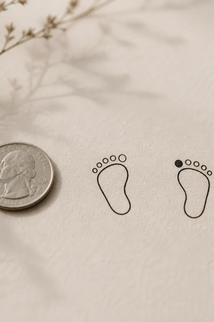
Footprints feel personal and sentimental without needing names. The single toe dot is a clever way to differentiate while keeping the overall symbol matching. It also heals well because the outline has clear edges and the toe dot is a solid point of ink, not a thin line.
Size it around 2.0 to 2.4 cm long. Place one on the outer ankle and the other on the inner ankle or the base of the calf. Keep the outline smooth; no tiny toe line segments. The toe dot should sit slightly off-center so it reads clearly as an intentional signature.
Pro tipIf you sweat a lot in that area, choose a placement higher than the shoe line. Friction makes small outlines fade faster.
AvoidSkip detailed paw-print or realistic shading - it stops looking minimal once it heals.
9. Two tiny teacup silhouettes with one steam line in dotwork
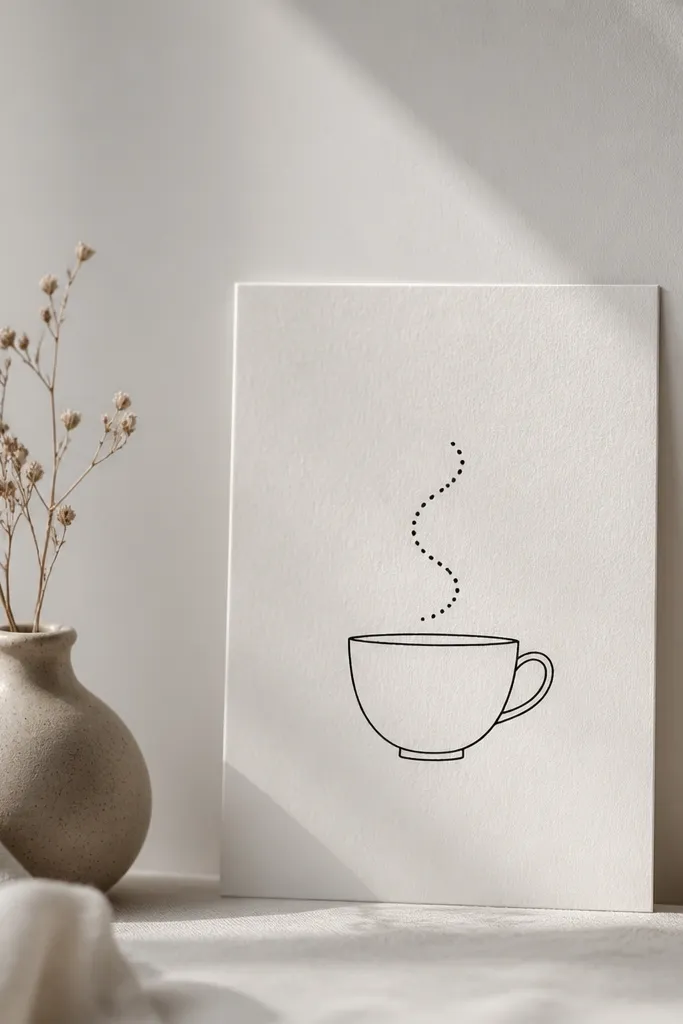
Teacups are one of those symbols that feel cozy and adult when you keep them graphic. The dotwork steam makes it look dainty and soft without adding color. This style also ages better than thin script because the main shapes are simple outlines with one dot element.
Keep the cup about 2 cm wide and place it on the inner wrist or forearm. Use solid black outlines for the cup, and dotwork only for the steam curve. If your friend has a different placement, match the cup size and steam height so the silhouettes still pair up.
Pro tipAsk for thicker outline on the cup base. That edge gets the most wear from daily hand movement.
AvoidAvoid steam drawn as ultra-thin continuous lines. It disappears faster than the cup outline.
10. Matching micro waves with one friend's wave crest turned into a dot
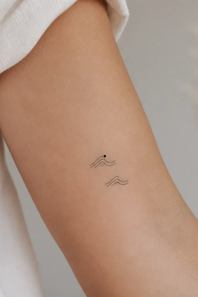
Waves look clean at small sizes because they rely on repeating curves. Turning one crest into a dot gives a signature that still feels minimal. I like this for friendship tattoos when you want something that looks calm and aesthetic rather than overly literal.
Make the wave about 1.7 to 2.1 cm wide. Place it on the side of the ribcage or the outer upper arm where the skin movement is moderate. Keep wave lines consistent thickness and avoid extra swirls. The dot crest should be centered at the peak so it looks intentional.
Pro tipChoose wave spacing like you're drawing music notes - even gaps look more "designed." Ask the artist to match gap sizes between crests.
AvoidDon't add extra tiny bubbles or highlights. Those details fade first.


