1. Infinity Knot With a Tiny Star Break
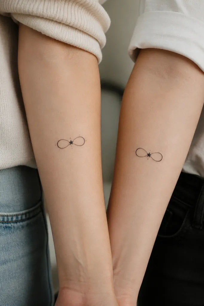
This design reads as friendship instantly because infinity is already a clear symbol, then the star break adds a "classy detail" without clutter. The star sits at the crossing gap so your eye keeps moving back to the meaning. The dot accents give a soft texture that still stays crisp in a small size.
Aim for 1.5 to 1.9 inches total width. Keep line weight consistent across the loops and let the star be about the size of a single freckle. If you want it to feel more personal, use the same infinity shape but make the star solid on one person and dot-shaded on the other.
Pro tipAsk your artist to draw it on your arm with a marker first and check it in mirror light from the side, since infinity can look warped when the arm twists.
AvoidAvoid combining this with long script - the tiny space between loops gets crowded and turns gray.
2. Two Coordinates With a Shared Compass Rose
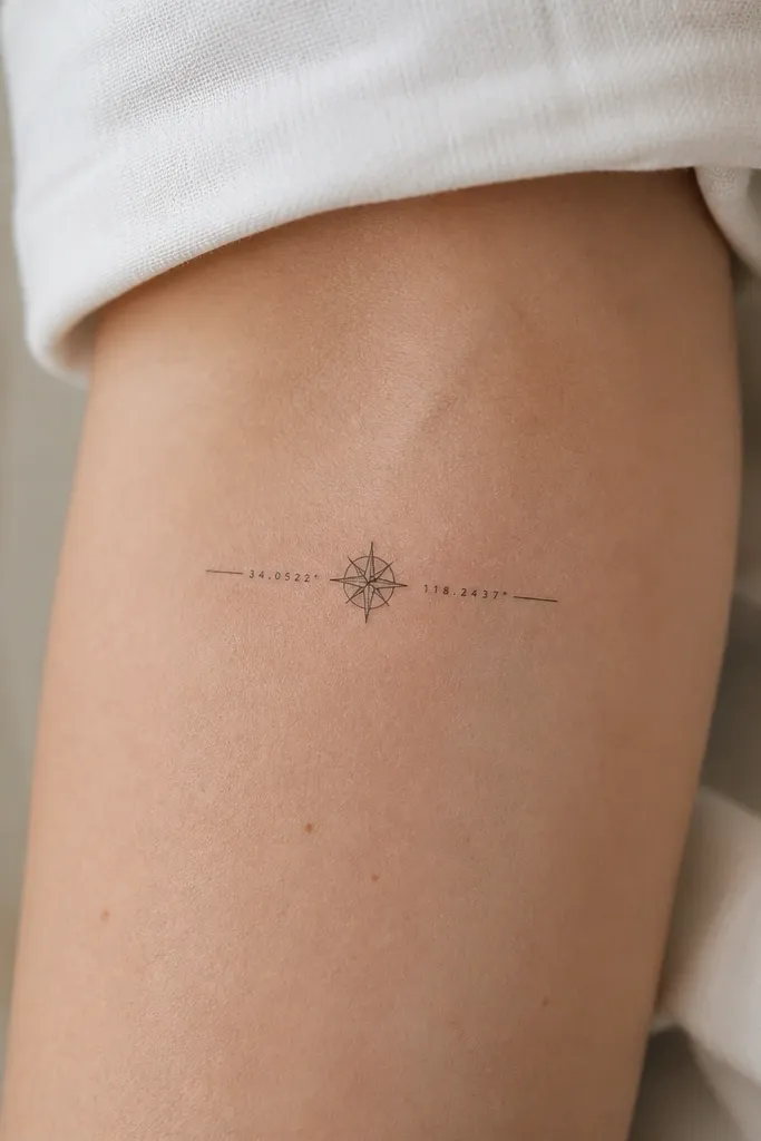
Coordinates look minimal but feel specific, especially when they're tied to a real meet-up place or a trip you remember. The compass rose gives classy structure so the numbers don't feel random. Fine black with crisp negative space keeps it readable after healing.
Use 1.2 to 1.6 inches for the compass rose and keep coordinates under 10 characters per line. Place it on the outer upper arm or inner forearm where you can keep the text aligned with the skin's natural lines. Coordinate text should be in a simple block style, not overly swirly script.
Pro tipBring the exact coordinate format you want (like 40.7128, -74.0060). If your artist has to guess, you'll end up with spacing that looks off.
AvoidSkip extremely small numerals - if the digits are smaller than a sesame seed on your skin, they will blur.
3. Friendship Bracelets as a Minimal Chain Link Set
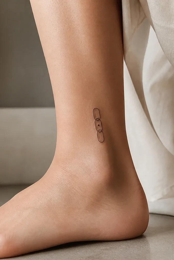
This one feels like an actual shared accessory, which is why it looks classy instead of childish. The chain link shape gives visual rhythm and the single dot detail gives a focal point. Negative space between links keeps it airy even when it's small.
Make the cluster 1.3 to 1.7 inches tall. Use three links, not five - five gets too tight at minimalist sizes. Put the dot on the middle link so both tattoos have the same "highlight."
Pro tipChoose a placement where your wrist skin doesn't crease hard, like a slightly higher inner wrist spot above the crease line.
AvoidDon't shade the links - solid fill turns the chain into a black bar.
4. Split Heart With One Side Dot-Shaded
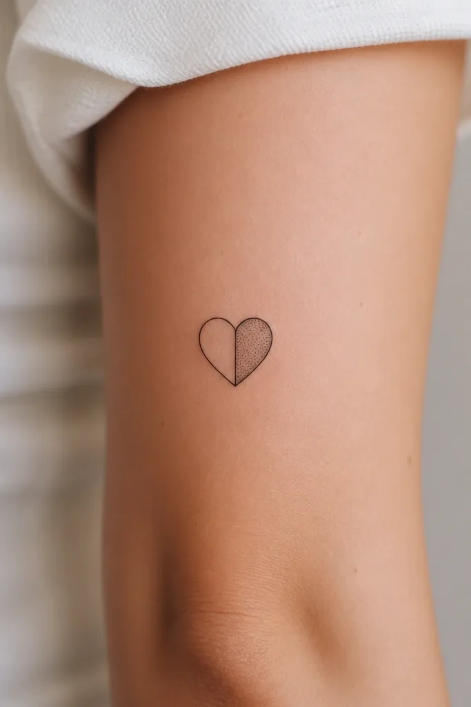
A split heart is a friendship classic, but the classy part is controlling the texture. One side plain and the other side dot-shaded keeps the design modern and stops it from looking like a Valentine doodle. The dot shading adds depth without turning the heart muddy.
Keep it under 2 inches wide so the split stays sharp. Place it on the side of the upper arm or collarbone area where the heart can sit flat. Use dot spacing that leaves small pockets of skin showing through for a clean look.
Pro tipAsk for dot shading that follows the heart's contour - if the dots are random, it looks like accidental speckling.
AvoidAvoid heavy solid shading - it makes the heart look bruised during healing.
5. Two Tiny Birds Facing Away With a Shared Line Tail
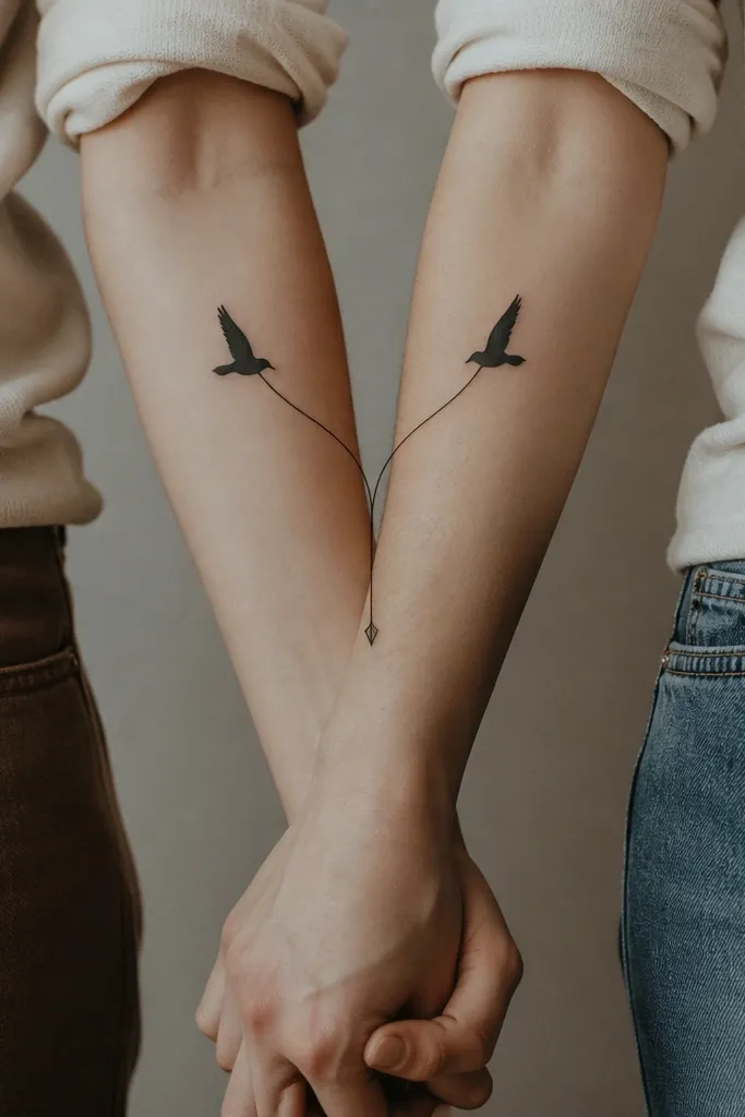
This is a friendship tattoo that feels grown-up because it reads like movement, not cuteness. The shared tail line tells the story of "we're connected" while each bird still has its own direction. Fine black lines keep the birds crisp and the arrowhead adds classy intent.
Size it around 1.8 inches wide for the pair. Put it on the inner forearm if you want it to follow the natural line of your skin. Make the tail line thin and straight, then let the birds' bodies be slightly thicker for readability.
Pro tipHave your artist sketch it on your arm first and test the spacing with your hand flexed - bird shapes can stretch on moving skin.
AvoidDon't add wings with lots of feather lines - that detail turns into fuzz at small scale.
6. Minimal Laurel Sprig With a Micro Ribbon Banner
Laurel is classy because it looks like a medal, not a doodle. The micro ribbon banner adds a personal touch without stealing the show. Keep the leaves simple and let the banner be the only text element for a clean, high-end feel.
Use 1.5 to 2 inches total height. Place it on the outer upper arm or bicep where the curve can sit naturally. For text, keep it to two short words or a single date. Use a thin serif or simple uppercase block, not cursive.
Pro tipIf you pick text, print it in the exact font style you want and show it to your artist. Text is where tiny tattoos go wrong.
AvoidAvoid long phrases - banner space shrinks fast and the letters blur together.
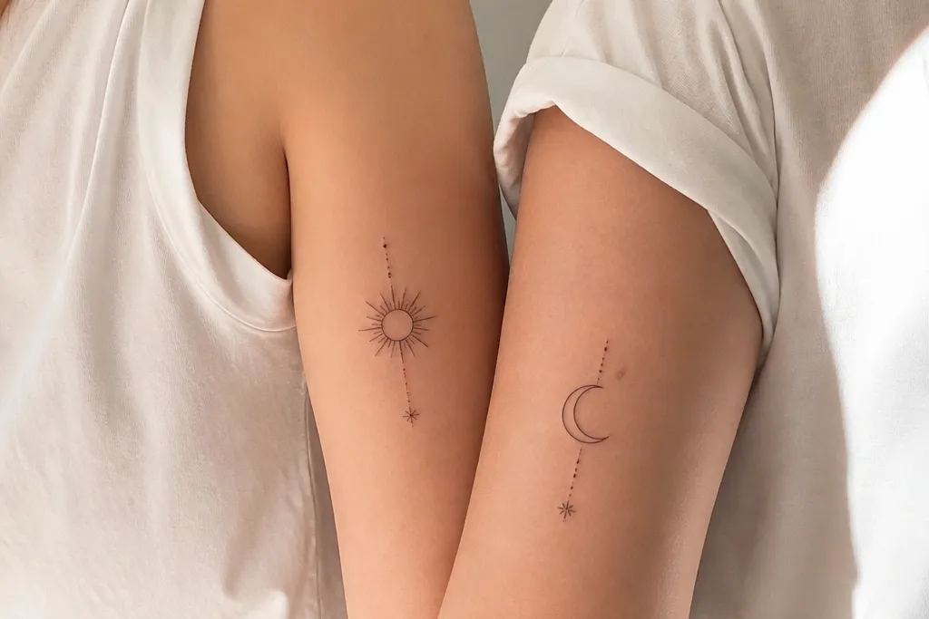
7. Sun and Moon Pair With a Half-Outline Texture
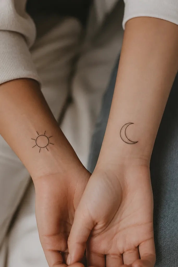
Sun and moon is familiar, but the classy detail is the half-texture: dots only on the inner curve so it looks intentional. It reads as complementary even when the tattoos are not identical. The clean outlines keep everything crisp from a distance.
Pick 1.4 to 1.8 inches for each symbol. Place on wrists or behind the ear for a subtle look. Keep rays short and evenly spaced; long rays look messy at this size.
Pro tipAsk for consistent dot density - if one artist's dots are sparse and the other's are heavy, the pair won't match visually.
AvoidSkip gradients - they turn gray and look wet instead of detailed.
8. Two Interlocking Circles With One Micro Engraved Line
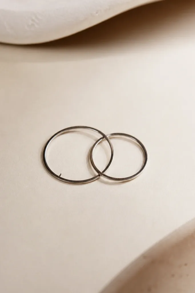
Interlocking circles are minimalist but still look intentional because the geometry is clean. The micro engraved line makes each person's tattoo feel personal without changing the overall silhouette. This style also heals well because it relies on crisp edges, not tiny pictorial details.
Make the circles about 0.9 to 1.1 inches each, total width around 1.7 inches. Place it on the outer forearm or upper arm so the circles don't distort when you bend your wrist. Keep the engraved line centered and straight.
Pro tipMeasure where the center of the circles lands relative to a bone or crease so it stays aligned after swelling goes down.
AvoidAvoid adding tiny icons inside the circles - you'll lose the clean geometry.
9. Minimal Key and Tiny Lock With One Shared Dot
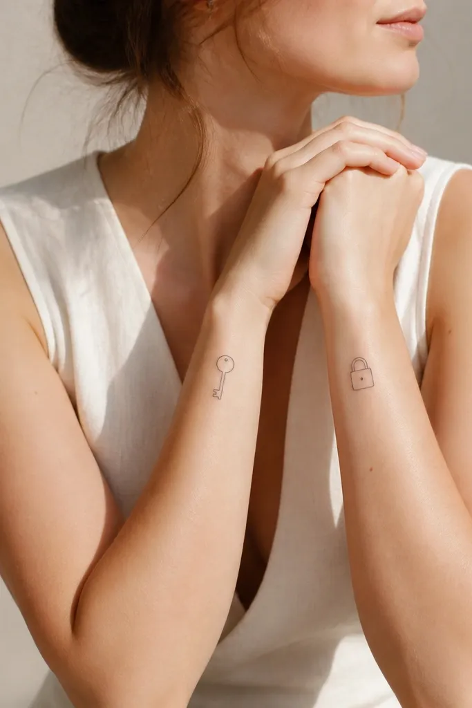
This is one of my favorite friendship setups because it tells a story without needing matching identical shapes. The single shared dot is the classy "link" between them. Keep everything line-only so it stays sharp and doesn't turn into a gray blob.
Size the key around 1.6 inches long and the lock around 1.3 inches tall. Place on inner forearm or upper arm where the key's teeth won't get stretched. Use a simple key tooth count of 3 or 4 - too many teeth crush readability.
Pro tipHave your artist stencil it with the dot exactly the same distance from the top on both designs so the pair feels coordinated.
AvoidDon't go for super tiny tooth detail - the teeth will merge into a dark streak.
10. Micro Flower Bud Pair With One Colored Dot Core
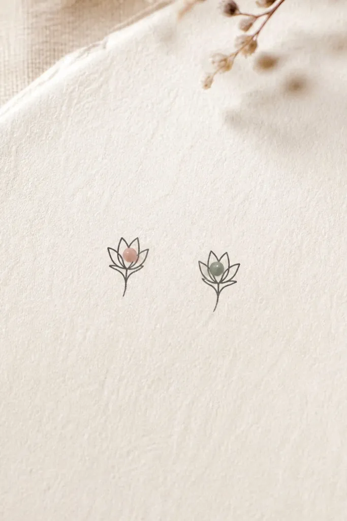
Micro flowers can look cheap fast, but a single colored dot core keeps it classy and intentional. The black linework gives structure; the one color point gives personality. This is a great option if you want matching but not identical - swap core colors between you and your friend.
Keep the bud size around 1.2 to 1.6 inches. Place on the ankle outer side or upper arm where the color dot has room to breathe. Use muted tones - blush pink and sage green hold up better than bright neon.
Pro tipAsk for color placement sparingly. One dot core heals cleaner than a filled petal.
AvoidAvoid full color fills in tiny flowers - they fade into a smudge.
11. Two Minimal Hands Holding a Single Thin Line
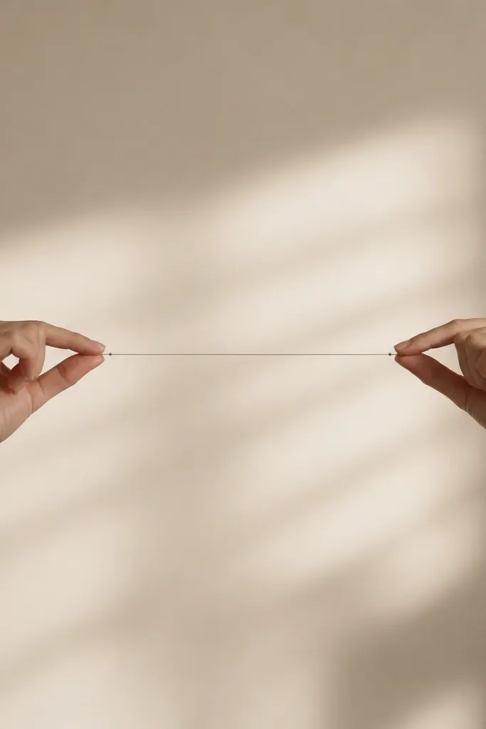
Hands holding is emotional, but it can still look minimal when you strip it down to outlines and a single line "thread." The thin line acts like a visual bridge, and the end dots give a finished, classy frame. This tattoo has a calm look because it avoids extra finger detail.
Size it about 1.7 inches wide. Place on the forearm or upper arm where your hand movement doesn't twist the design too much. Use outline-only hands with no heavy shading; the bridge line should be straight and centered.
Pro tipRequest a stencil that shows your arm flexed. If the hands look stretched in flex, reposition higher on the forearm.
AvoidSkip detailed finger knuckle lines - they blur and make the hands look smudged.
12. Minimal Moon Phase Arc With Two Stacked Dots
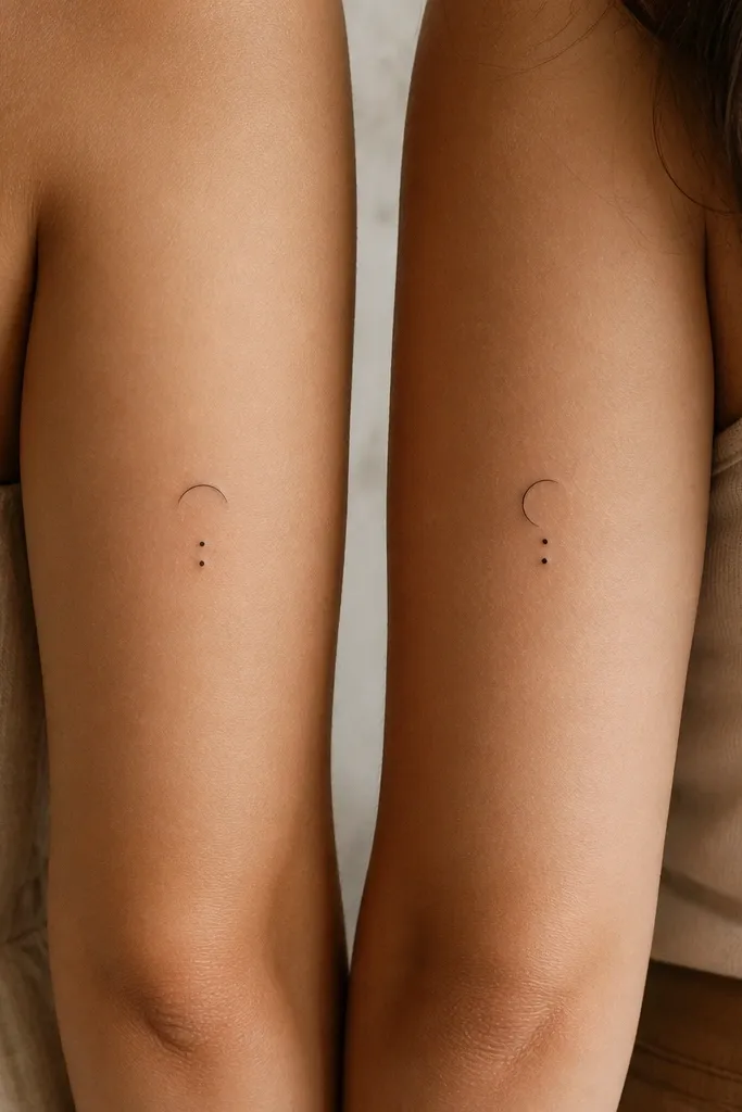
Moon phases look classy because they're graphic - arcs and dots are clean shapes. The two stacked dots act like a shared signature so even if the moon phase differs, the set still matches. This also heals well because the design has no tiny curves that need perfect precision.
Use a crescent arc about 0.8 to 1 inch wide, plus two dots sized like a small ink speck. Place on the side of the wrist or along the inner forearm. Keep dot spacing consistent between you and your friend so the pair feels intentional.
Pro tipIf you want it to feel like a timeline, pick phases for two dates and keep the exact day spacing in mind when you choose the illustration.
AvoidAvoid adding a full moon face or stars - the space gets crowded quickly.


