1. Grace in tiny serif on the outer knee
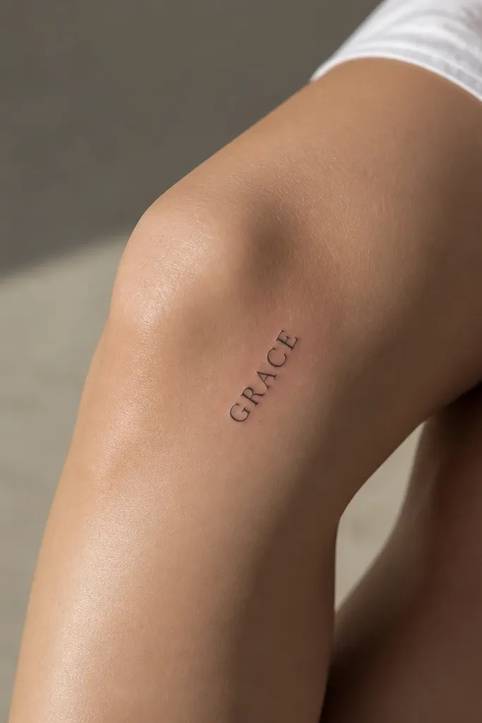
"Grace" has a calm meaning, and serif letters make it look intentional without needing extra decoration. On the outer knee, the skin has a smoother curve for text, so the thin serifs stay sharp. The uppercase treatment also keeps the word readable if you wear shorts or leggings and the knee flexes in photos.
Have the artist place the word so the baseline angles about 20-30 degrees upward toward the outer calf. Target letter height around 10-12 mm for a small minimalist look. Use needle depth and clean line weight - no heavy bolding - so the serifs don't thicken over time.
Pro tipAsk for a stencil test with your knee bent at a 90-degree angle before the final outline goes on.
AvoidAvoid thin script flourishes here - they fade faster on the outer knee from friction.
2. Amor in tight cursive with a micro underline
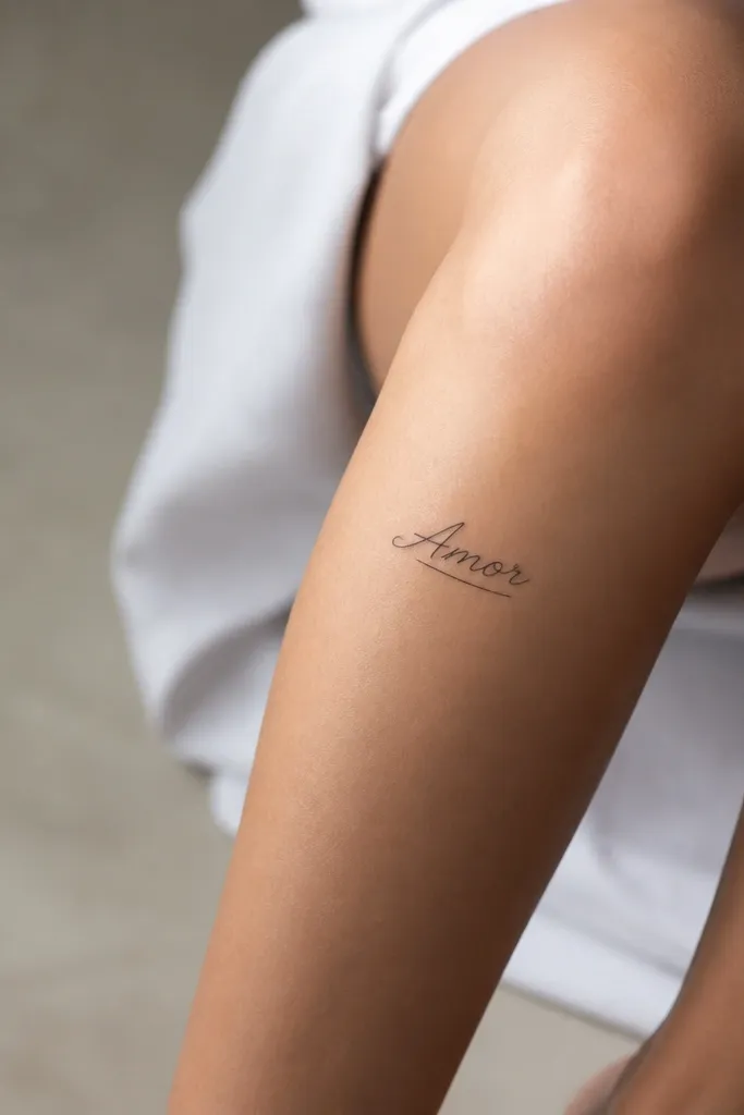
"Amor" means love, but this layout keeps it from looking romantic in a fluffy way. Tight cursive gives you movement, while the micro underline anchors it so the letters don't float. Inner knee placement also lets the word feel private - you see it when you sit or cross your legs.
Place the word vertically-ish along the inner knee curve, with the underline angled slightly to follow the anatomy. Keep flourishes minimal - the "A" and "o" should be the only expressive parts. Letter height around 11-14 mm works well so the cursive doesn't blur into a single dark line.
Pro tipWear tight shorts during your appointment so your placement matches real knee flex, not a flat leg.
AvoidSkip long looping letters - they smear when the knee bends.
3. Fé in small accent script at the front knee
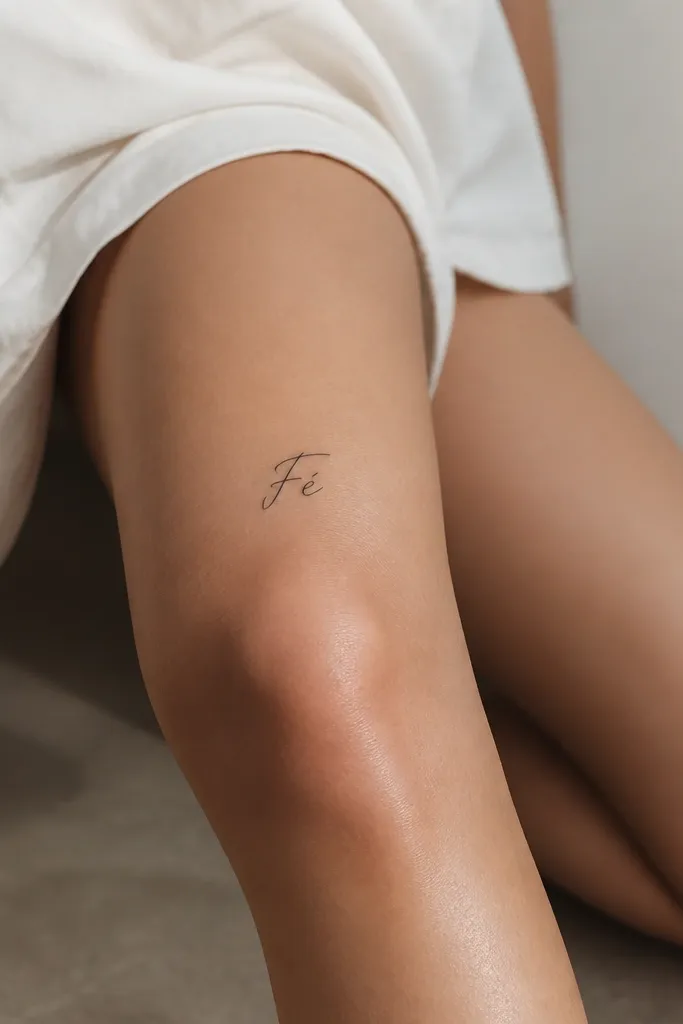
"Fé" means faith, and the single accent mark is the whole point - it makes the tattoo look finished even though it's tiny. Front knee placement shows the accent clearly, and the short word keeps the letters from stretching. Script here feels personal, not generic, because the diacritic gives it character.
Put it just above the kneecap crease, not directly over the most flexed point. Keep the word width under about 25-30 mm. The accent mark should be separated by a small gap so it doesn't melt into the E over healing.
Pro tipAsk the artist to draw the accent mark first on the stencil - if it's too close, it'll blur.
AvoidDon't place it too low on the knee - the bend compresses the diacritic.
4. Brave in uppercase block with a thin shadow line
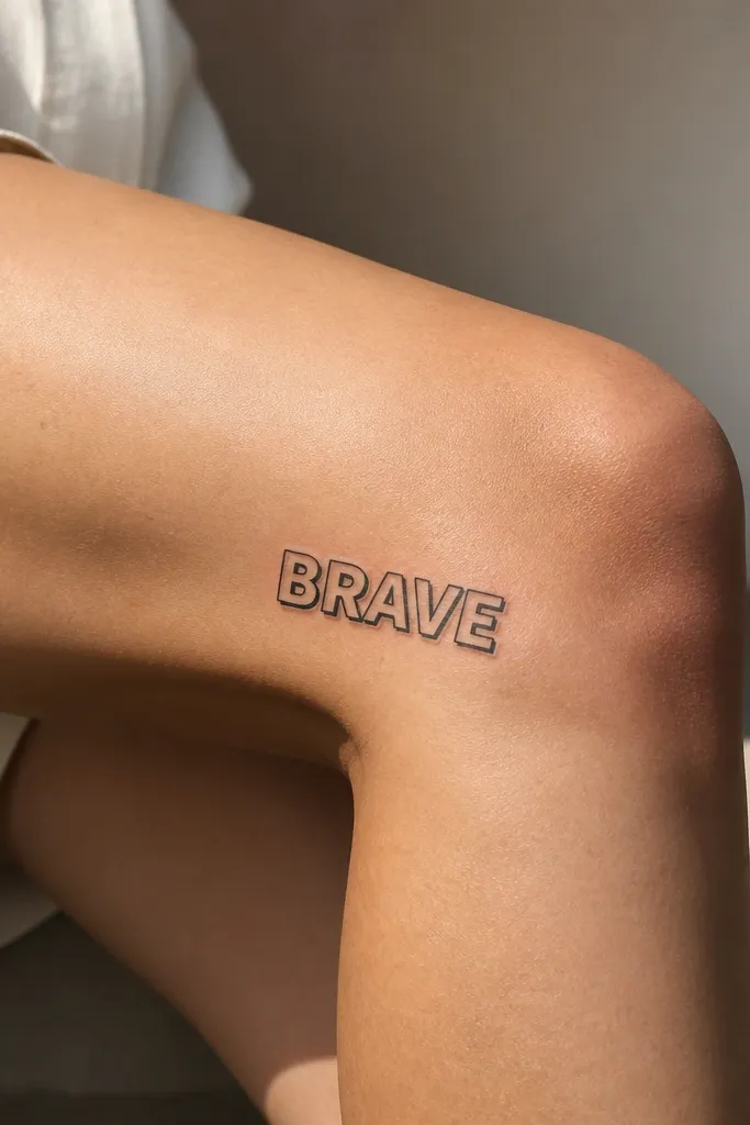
"Brave" is a straightforward meaning, and block letters keep it from turning into decorative typography. The tiny shadow line adds depth without going full 3D. Because the knee skin texture can blur subtle gradients, the shadow line stays crisp when it's just a simple offset stroke.
Use letter height about 12-13 mm and keep the stroke weight consistent. The shadow line should be offset about 1 mm and only applied to the right side edges so it doesn't double the whole word. This style looks best with no extra symbols.
Pro tipRequest a stencil that shows the offset line in bent-knee position so the shadow doesn't drift.
AvoidAvoid thick shadows - they turn into a dark blob on knees.
5. Sola in minimalist line-lettering
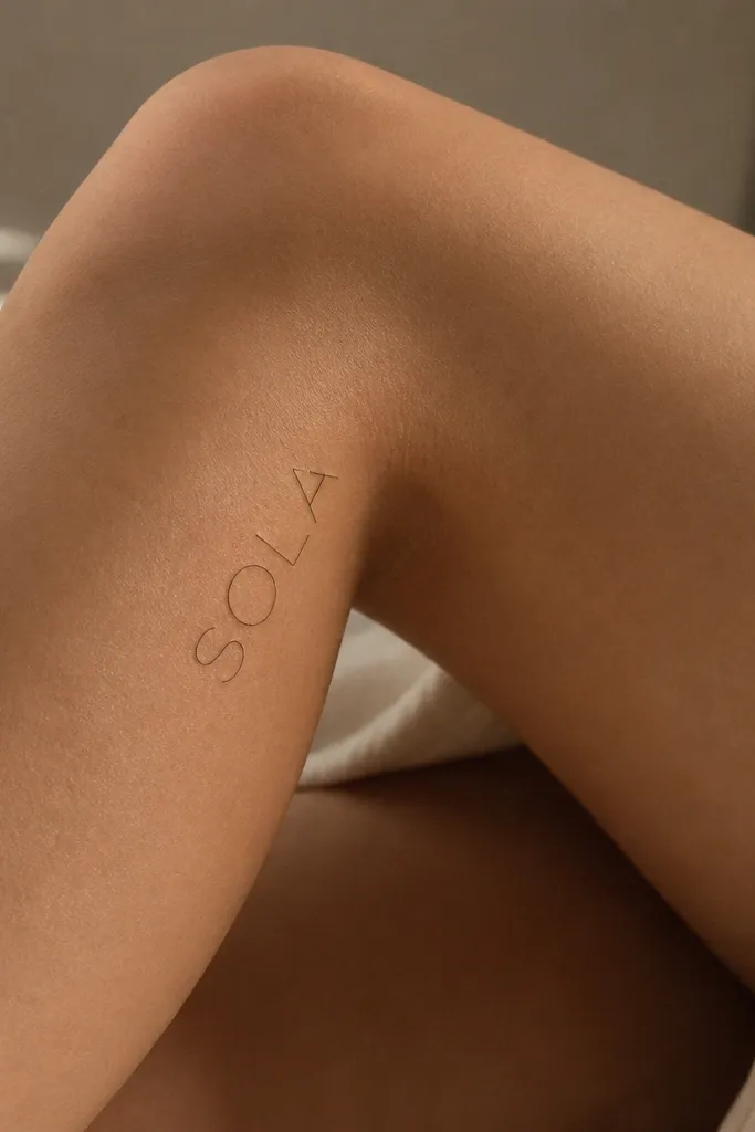
"Sola" means alone/sola, depending on the context you choose, and line-lettering makes it feel modern and self-possessed. Open centers reduce how much ink sits on the knee, which helps it heal cleaner and stay readable. This is a great choice when you want meaning without adding decoration.
Keep each letter outlined with a consistent line width (think 0.8-1.0 mm stroke feel, not hair-thin). Place it so the word follows the inner knee curve, angled 10-20 degrees. Keep the word size compact - around 22-28 mm wide total.
Pro tipIf your artist uses too much solid ink, ask them to thin the fill and keep the strokes open.
AvoidDon't choose super delicate single-line script - it fades unevenly.
6. Amor Fati in two-line minimalist split
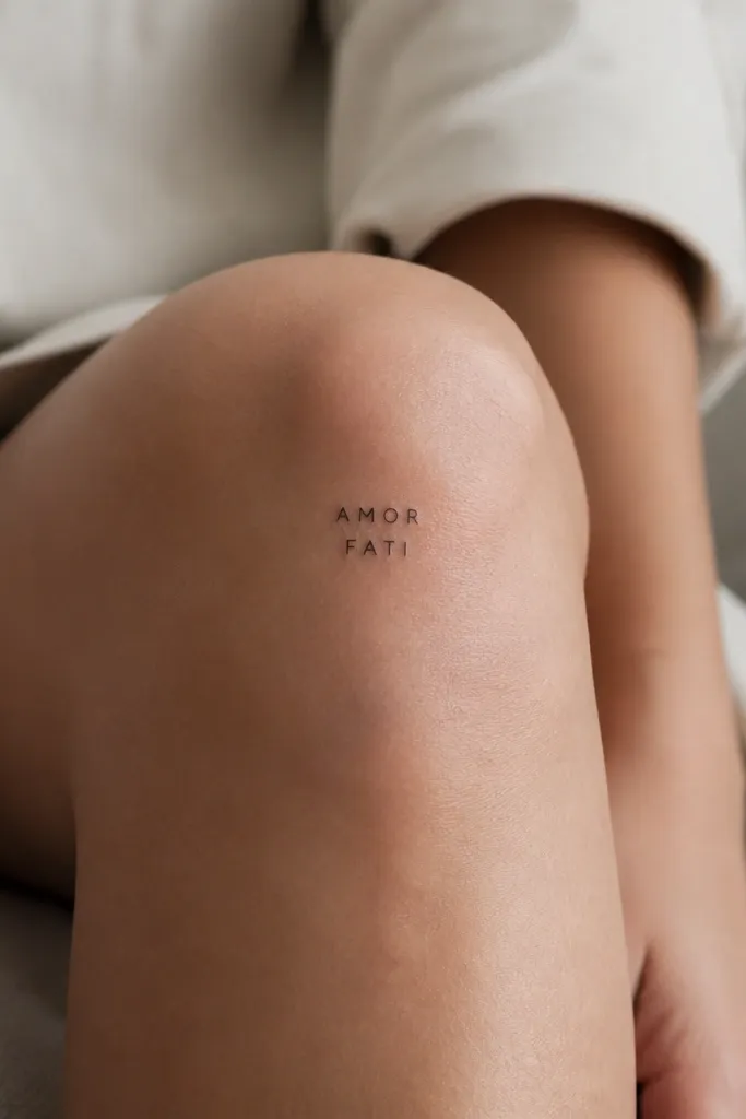
"Amor fati" is a meaning about loving your fate, and splitting into two lines solves the knee flex problem. A single long line warps; two short lines stay readable. Uppercase letters also keep it clean from every angle.
Place it so the top line sits a bit above the kneecap center and the bottom line sits just below. Keep total width under 30 mm so it stays minimalist. Letter height around 9-11 mm with tight spacing looks the most balanced on knees.
Pro tipTest leg bend during stenciling - two-line words should not cross the strongest crease.
AvoidAvoid extra spacing between AMOR and FATI - the gap makes knees look "off-center."
7. Luz in rounded micro lettering
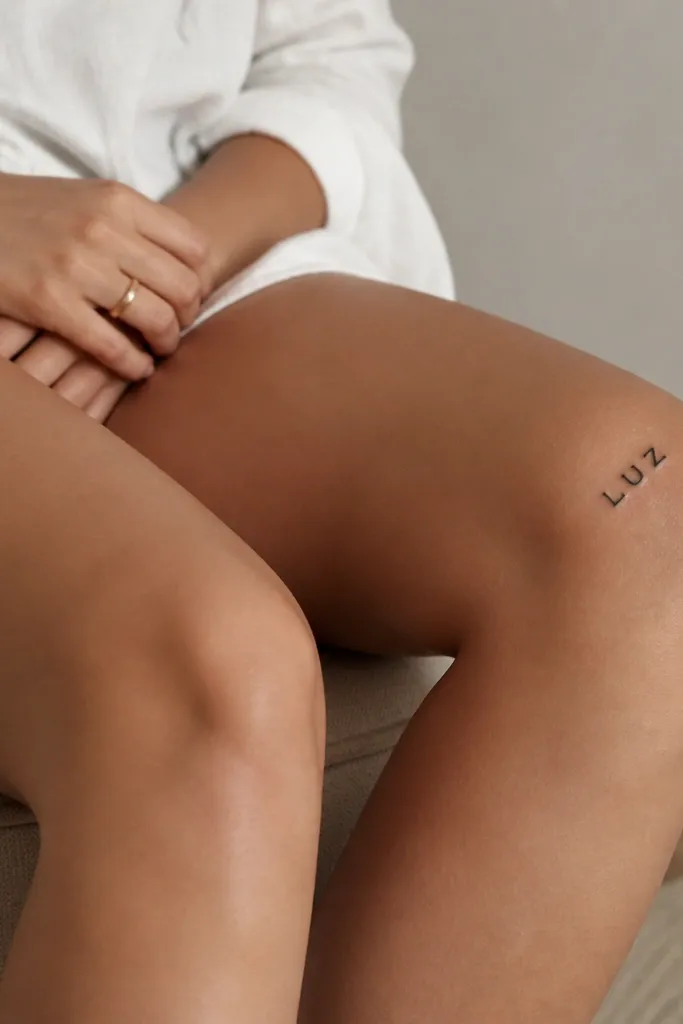
"Luz" means light, and rounded micro lettering reads sweet but still minimalist. The thicker vertical strokes help the letters hold shape even with knee movement. This looks great with fine dot shading around it - or with nothing at all if you want pure type.
Keep it small: letter height 10-12 mm, total word width around 18-22 mm. Place it on the outer knee so the letters follow the curve as your leg bends. If adding dots, limit to 3-5 tiny dots and keep them far enough away to stay distinct.
Pro tipAsk for slightly rounded corners on the stencil - sharp corners can blur first on knees.
AvoidSkip overly thin outlines - they disappear faster than you think.
8. Vera in fine script with a tiny heart stop
"Vera" means true/authentic, and the micro heart stop keeps it feminine without making the whole piece look childish. Fine script gives the word a signature feel, while the heart stop gives a focal point so you notice it even in partial views. On the inner knee, it feels personal when you cross your legs.
Keep the heart stop under 4 mm wide so it doesn't become a dark blob. Place the word diagonally across the inner knee curve about 15-25 degrees. Letter height around 11-13 mm keeps the script readable without heavy linework.
Pro tipHave the artist show you two stencil sizes and pick the one that still reads when you bend your knee.
AvoidAvoid large hearts or lots of swirls - knee friction ruins them.
9. Stella in minimalist star-letter combo
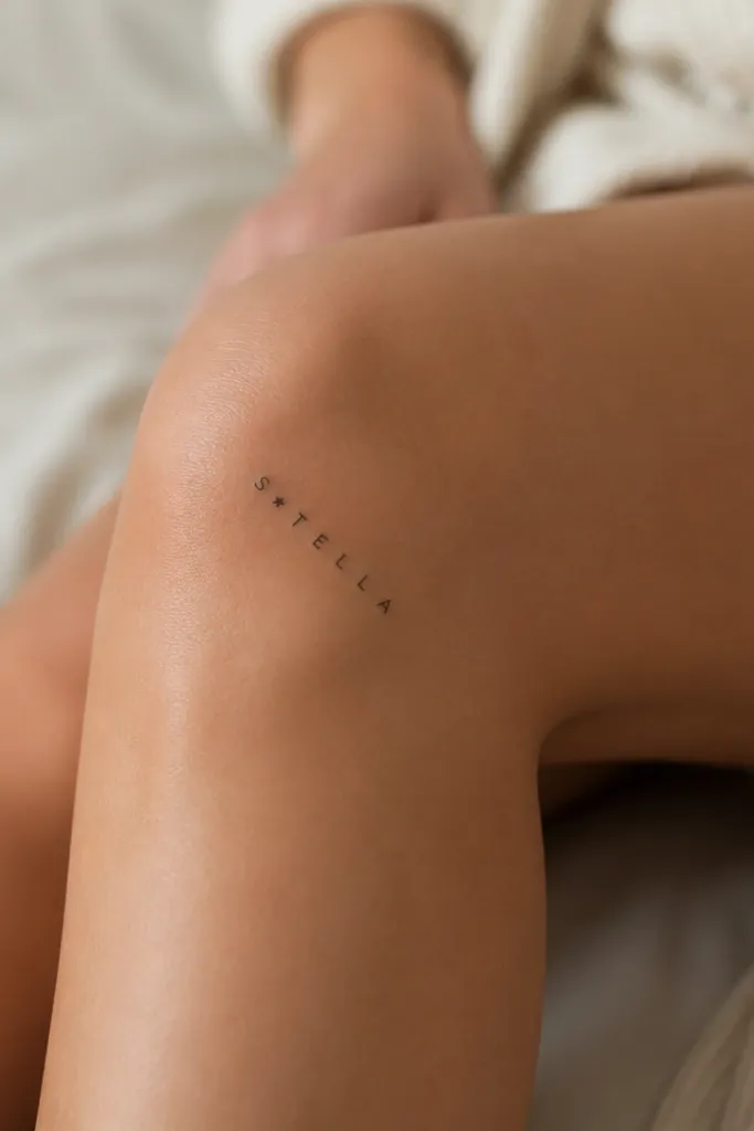
"Stella" means star, and adding a single star keeps the meaning visible even if the letters are small. The key is restraint: one star, not a cluster. Uppercase letters plus a tiny star make the tattoo look like a clean icon, not a decorative doodle.
Place the star exactly centered between the two letters so it doesn't throw off reading order. Keep letter height 9-11 mm and keep the star around 4-5 mm wide. The whole word should fit within about 32 mm width for a minimalist knee look.
Pro tipIf your knee has dimples or small texture lines, place the stencil slightly higher so the star doesn't sit over the deepest crease.
AvoidSkip multiple stars - they thicken and merge during healing.
10. Fleur in tiny script with a single petal flourish
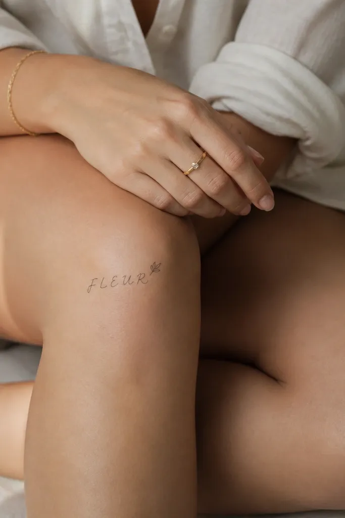
"Fleur" means flower, and the petal flourish gives you that feminine vibe without turning into a full botanical tattoo. A single flourish is easier for the artist to keep crisp on knee skin than multiple leaf shapes. It also frames the word like a signature.
Position the word so it sits on the smoother side of the kneecap curve, usually just to one side rather than dead center. Use letter height around 10-12 mm. The petal flourish should be tiny and close to the letter, not floating out into empty space.
Pro tipAsk for a stencil in two positions: one straight and one diagonal. Choose the diagonal if you want readability when you sit.
AvoidDon't add vine lines - they catch friction and blur.
11. Sol in micro uppercase with a dot halo
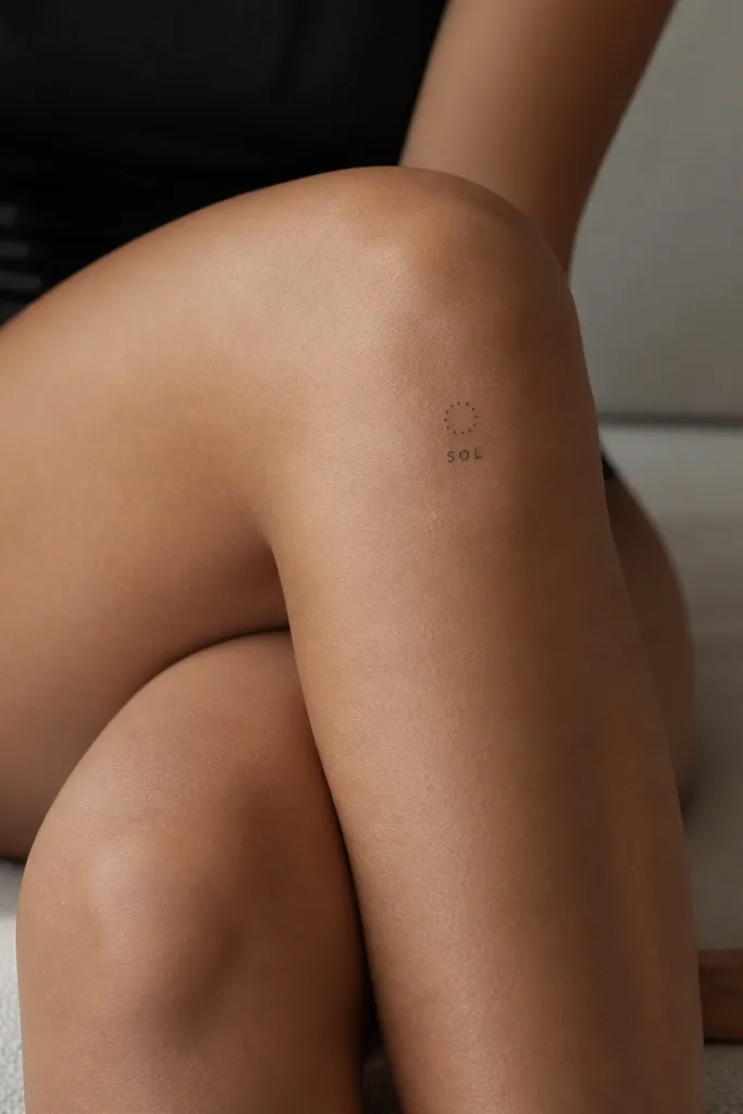
"Sol" means sun, and the dot halo makes the meaning obvious even from a distance. Dots age better than tiny filled shapes because knee skin texture spreads them more evenly. The word stays the focus, and the halo adds only a hint of symbolism.
Place the dot halo about 3-4 mm above the tops of the letters. Use dot size around 0.8-1.0 mm and space them evenly. Keep the word width under 20-24 mm so it stays minimalist and doesn't stretch across the flex line.
Pro tipTell your artist you want dots, not a thick ring - rings look great for a month and then flatten.
12. Hope in typewriter-style letters
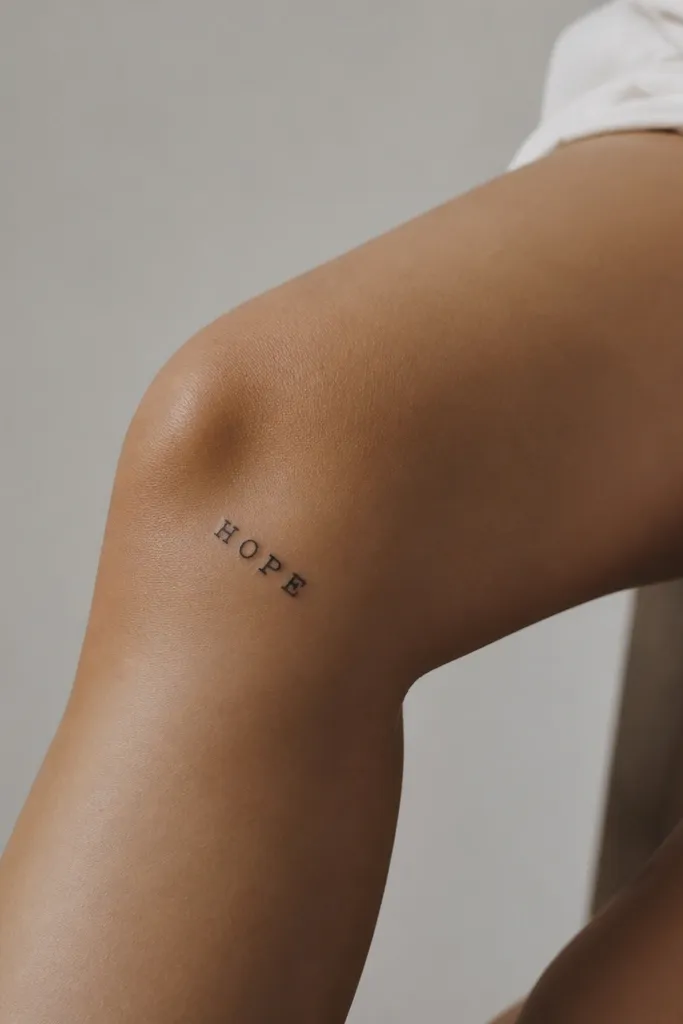
"Hope" is a meaning you can wear every day, and typewriter-style letters give it texture without adding images. The slightly varied spacing makes the tattoo feel human, not sterile. On knees, this style reads well because the letterforms are thick enough to survive movement.
Use letter height around 11-13 mm and keep the strokes medium weight. Place it on the inner knee where the curve helps the letters stay aligned. No underline needed - the typewriter look already has character.
Pro tipBring a reference font sample and ask the artist to match the stroke thickness, not just the shapes.
AvoidAvoid ultra-thin type styles - the knee will eat the detail.


