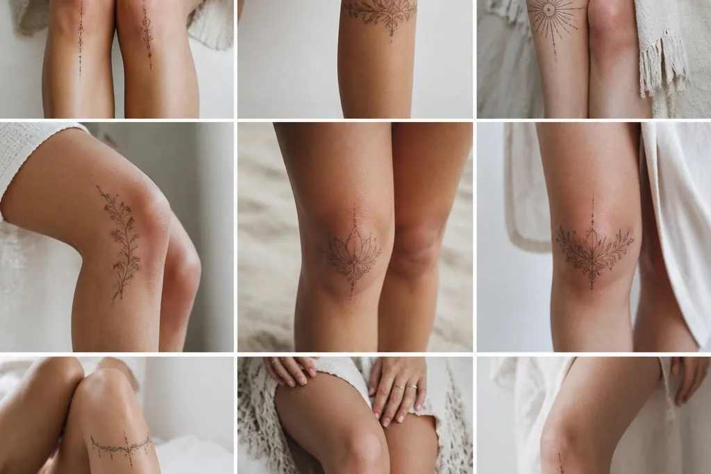

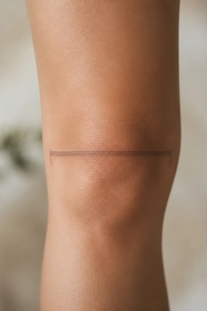
1. Kneecap U-arc with a 3mm gap
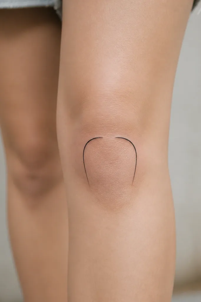
This is the cleanest "frame" because the U shape mirrors how your knee opens and closes. The 3mm gap matters - it prevents the tattoo from looking like a thick band and it keeps the center airy in photos. I've seen this read almost like a negative-space bracelet for legs. Fine-line black keeps it minimalist and helps it heal without turning gray too fast.
Place the U arc so the lowest point sits 8-12mm above the kneecap crease, not directly on the most bony spot. Keep the width around 35-55mm across, depending on your leg size. Ask for taper ends that stop before the shin gets too flat, usually around 20-25mm below the crease.
Pro tipDo a quick test with a semi-transparent eyeliner stencil in the mirror while you sit and stand. If the U still looks centered when your knee bends, you're in the right spot.
AvoidAvoid putting the U arc directly on the kneecap's highest bump - it stretches and turns into a smudgy horseshoe.
2. Inner crescent frame + vertical shin taper
This design creates flow by pulling the eye inward at the knee and then down the shin. The crescent gives you that soft feminine outline without adding bulk on the front of the knee. I like it because it stays readable even when your leggings crease over it. It also hides well under socks, and you can extend it later.
Stencil it on the inner knee where your leg naturally narrows when you walk. Keep the crescent height around 18-25mm and place the taper line to end around 60-70mm below the crease. Use one line weight throughout for a minimalist look - no thick outline border.
Pro tipIf you wear dresses a lot, place the crescent slightly higher so it shows above the hemline when you sit.
AvoidDon't angle the vertical taper too far forward; it will twist with your stride and blur faster.
3. Double-side micro arcs (left/right symmetry)
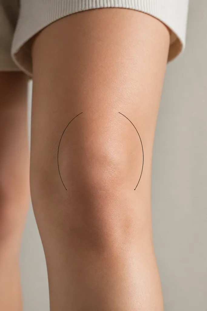
Two arcs make the knee look "outlined" instead of "decorated," which is why the flow feels natural. Symmetry matters here: when the arcs match, your knee reads as a single shape rather than two separate tattoos. Tiny dot ends add movement without turning into a busy pattern. This one looks amazing in cropped pants and when the knee is slightly bent in photos.
You want each arc width around 25-35mm, with a gap of 10-15mm between the two sides at the center. Start the top of each arc about 10mm above the crease, and taper down so the arc fades before it reaches the shin's widest point. Keep dots to 1-2mm so they don't blow out.
Pro tipAsk your artist to place a temporary "center line" on your leg with a marker before the stencil - it prevents off-by-a-few-millimeters symmetry issues.
AvoidAvoid packing both sides too thick. Heavy linework on the knee heals unevenly and makes the arcs look like they're melting together.
4. Ribbed ribbon line across the crease
This tattoo reads like a ribbon because it follows the crease line where your skin naturally folds. The ribs create texture without shading, so it stays minimalist. When you bend your knee, the line still looks intentional because it's already aligned with the fold. I've had this style hold up well because there's less area for friction compared to a full wrap.
Place it directly on the crease fold, not above it. Keep the total length around 45-60mm, and limit the rib grooves to 3-5 so they don't blur together. Ends should taper into 10-15mm strokes that sit on the sides of the knee, not the front center.
Pro tipIf you're doing this for your first knee tattoo, pick a rib count that your artist can keep crisp at 0.25-0.30mm line width.
AvoidSkip wide ribbon shapes. A thick band over a moving joint always looks worse after a year.
5. Tiny rosebud at the seam (micro petals)
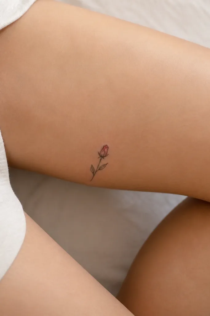
A micro rosebud gives you softness while the leaves create the framing flow. The bud acts like an anchor near the knee, and the leaves pull the eye toward the shin without covering too much surface. I like it because it's still readable in motion - the petals are small and crisp, and the leaves taper naturally. It also pairs well with a future extension if you want to add more later.
Keep the bud diameter around 10-18mm. Place it 5-10mm above the crease on the inner side, then angle the leaves downward so one leaf points slightly toward the center front and the other points slightly toward the inner shin. Use fine-line black with tiny negative-space petal gaps.
Pro tipAsk for petal gaps, not solid fills. Negative space keeps the rosebud from turning into a blob during healing.
AvoidAvoid realistic shading. Knee skin texture and friction make soft gradients turn muddy fast.
6. Single-side frame with a thin "breathing gap"
Single-side frames look intentional and subtle, especially if you're getting your first knee tattoo. The "breathing gap" makes it look designed rather than accidental - it breaks up the outline so it doesn't become a solid stripe. This design also hides better under pants and still shows clearly when you wear cropped jeans. The flow comes from the split that mimics skin movement as you bend.
Place the main curve on the outer knee edge so it catches when you walk. Total height should be about 7-9cm, with the split occurring around 2-3cm below the crease. Keep the gap around 2-3mm and use consistent line weight so the split reads clean.
Pro tipWear the jeans or pants you plan to live in during stencil placement. If the fabric crease covers the split, it will heal less evenly.
AvoidDon't put the frame on the very front of the knee. Friction makes the front lines blur first.
7. Micro star cluster frame (3 stars + taper)
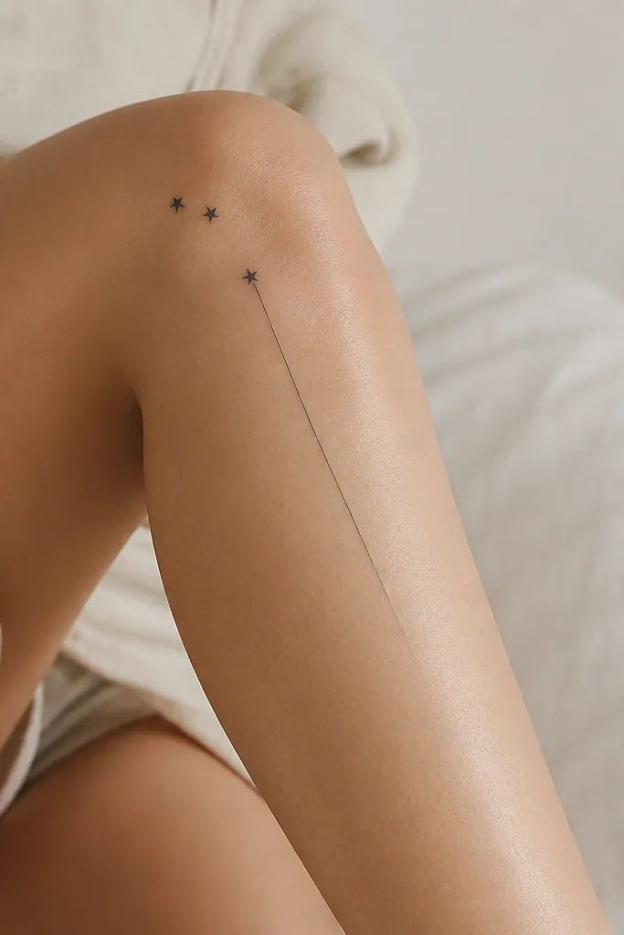
Stars look playful, but the trick is placement. A curved cluster frames the knee like punctuation, then the taper line pulls it into the shin so the design flows instead of floating. I like this when you want something minimal but not boring. It also hides well when you wear long socks and still reads clearly when you show your knees.
Keep each star around 3-4mm across. Place the cluster width around 30-45mm and space stars so they don't touch at any angle. The taper line should be 5-7cm long with a sharp point - no rounded end.
Pro tipTell your artist you want "no thick star centers." Solid-filled stars heal thicker and lose the crisp shape over time.
AvoidAvoid more than three stars. Four or five on the knee gets crowded and looks like an accidental sticker.
8. Feather edge border on the outer knee
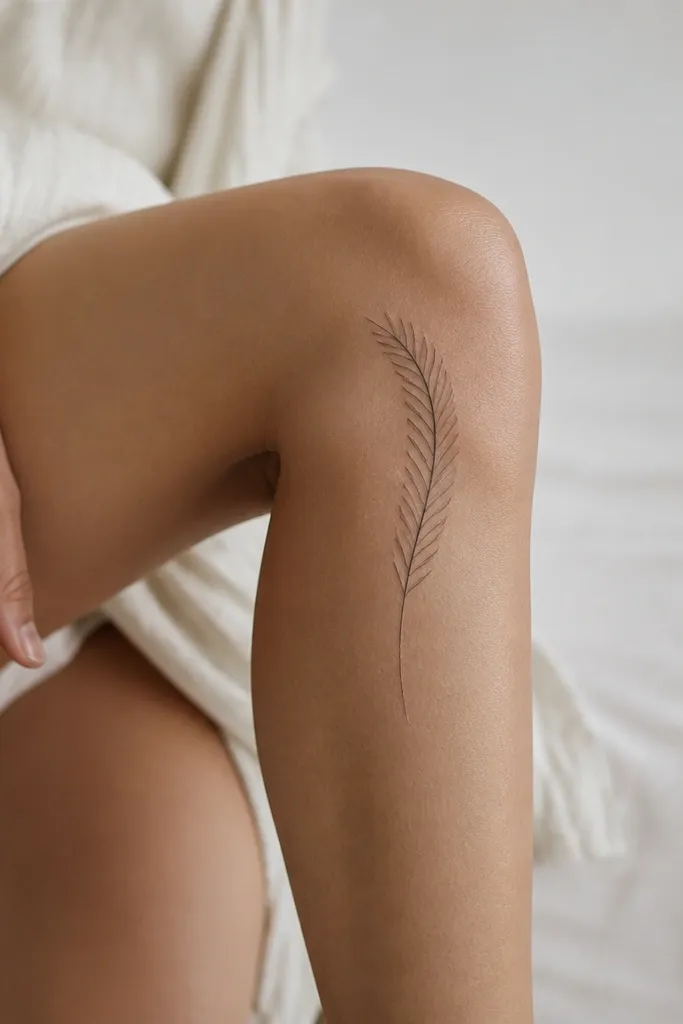
The feather works because it naturally suggests movement, and the outer knee is where it looks like it's "floating" instead of wrapping. Barbs create texture without needing gray wash. When you bend your knee, the feather edge still looks aligned because the barbs follow a gentle curve. It's minimalist but not empty.
Place the feather so the shaft runs along the outer knee curve, not straight. Keep the feather height around 6-8cm and keep barbs short, about 2-4mm each. Use black linework only; if you add shading, keep it to a single tiny stipple patch near the shaft.
Pro tipAsk for barbs that get shorter as they reach the taper end. That gradient in shape reads as flow faster than any shading.
AvoidDon't add a full feather wing shape. Broad feather silhouettes on the knee heal uneven and lose definition.
9. Dotwork lace corner (one small corner only)
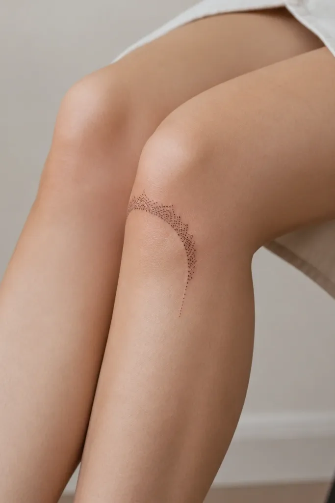
Dotwork lace gives texture without heavy coverage, which is exactly what the knee needs. By keeping it to one corner, you avoid the "doily" look that can feel too busy on a moving joint. The dot fade creates a soft transition, so it still looks like a frame after healing. This is the one I recommend when you want more detail but still want small and minimalist.
Size it small: about 35-50mm wide at the top, with dot density highest near the corner. Ask for dots that get sparser as they reach the taper lines, so you don't end up with a dark patch. Keep the lace corner aligned with the outer knee edge to reduce friction.
Pro tipIf you're worried about pain, keep the dotwork shallow and concentrated - large filled areas on the knee hurt more and blur faster.
AvoidAvoid dense black fill. Knee dotwork should be airy; packed dots turn into a gray blob.
10. Minimal leaf sprig that frames the crease
A leaf sprig creates "flow" because the stems guide the eye around the fold of the knee. The center vein lines add structure, so the tattoo looks sharp even when your skin texture changes. This design also works with small sizing because leaf shapes read clearly at 2-3cm. It's feminine without being overly floral.
Keep the sprig height around 5-7cm. Place the lowest leaf tip about 10-15mm below the crease, and angle the outer leaves so they follow the knee's contour. Use line weight around 0.25-0.35mm and keep leaf outlines thin with negative-space centers.
Pro tipPick leaf shapes that taper at the ends. Pointy tips create a cleaner silhouette in healed skin.
AvoidSkip thick leaf outlines. Thick lines on the knee heal wider and make the sprig look blunt.
11. Micro chain links on the inner knee edge
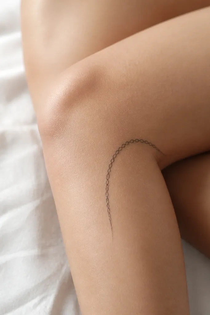
Chain links look great because each tiny loop gives you movement, and the curve is what frames your knee. The inner edge placement makes it feel delicate instead of bulky. I've found that chain link tattoos hold up well when the links are small and spaced so they don't merge during healing. It's minimalist jewelry energy without needing any color.
Make each link about 4-6mm wide. Keep spacing between links so there's a visible gap - no touching loops. The chain curve should be about 50-70mm long, wrapping just enough to follow the knee edge while still leaving negative space on the front.
Pro tipTell your artist you want "open links" - the gap inside each link helps the tattoo stay crisp after swelling.
AvoidAvoid big chain links. Larger loops on the knee blur and look like a band.


