1. Two Minimal Constellations
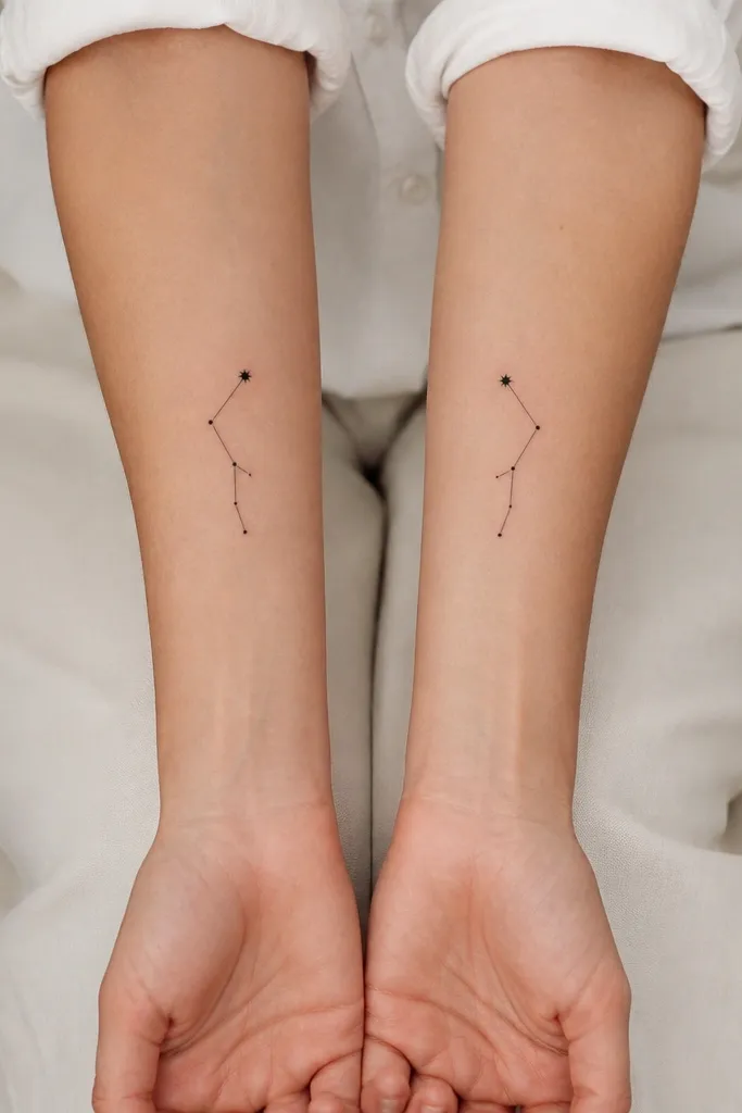
This works because constellations read as dots and short lines, so they stay minimalist even when small. The black dot sizes create a clear hierarchy: tiny points for most stars and one slightly heavier dot for the "main" star. The connecting lines are short and thin, so they don't blur into a gray mass.
Ask the artist to trace the star layout at 2.5-3.2 cm long on the forearm. Keep the dot diameter around 1.0-1.2 mm for most stars, and one dot around 1.5 mm. Place it on the inner forearm where the skin is flatter, not on the wrist crease.
Pro tipPrint the constellation map you like and bring it, then mark the exact 5-7 stars you want tattooed so the artist doesn't "improve" it.
AvoidAvoid constellations with lots of stars; more than 10 points starts looking like noise when it fades.
2. Friendship Coordinates in a Clean Script
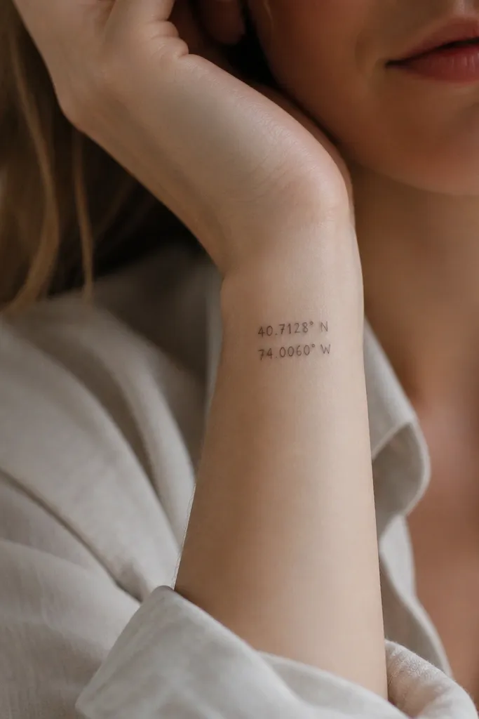
Coordinates look sharp when the design is controlled and the font is simple. The layout matters more than fancy lettering: two lines, consistent spacing, and no flourishes. Thin script can be pretty, but it must be sized so it stays legible from arm's length.
Target 2.0-2.8 cm width on the wrist, and keep the height under 1.2 cm per line. Use a single black ink pass with no gray shading. If you want it to be extra minimal, remove commas and use only dots between sections.
Pro tipWrite the coordinates on paper in the exact spacing you want. Bring that layout to the artist so they match the rhythm.
AvoidSkip super-thin micro lettering; it turns into a dark blur on skin that moves a lot.
3. Interlocking First Initials (One Line Each)
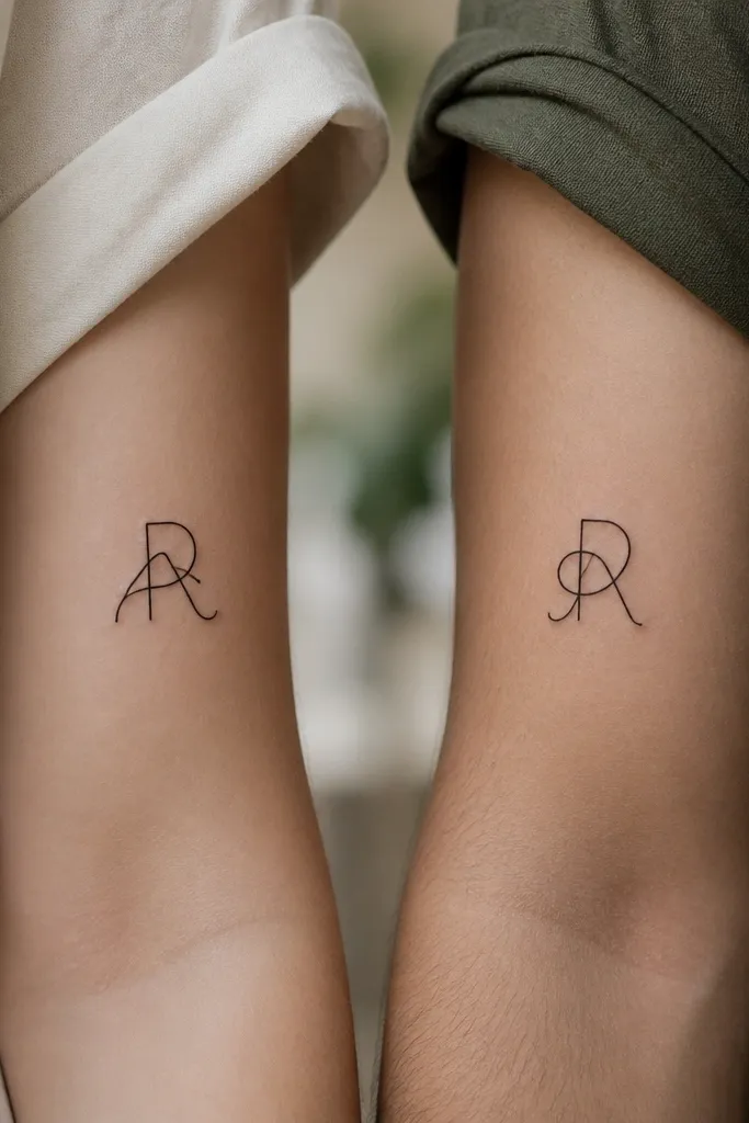
Interlocking initials work because they read as one graphic shape, not two separate names. Using a single-stroke style keeps the tattoo minimalist and gives you a clear outline even as it fades. Even line thickness makes the overlap stay crisp instead of turning muddy.
Pick initials that have simple curves or straight strokes so the interlock can be drawn cleanly. Place it on the outer upper forearm, 6-8 cm above the wrist, and keep it around 3 cm wide. Use black ink only, and ask for no fill shading in the overlap.
Pro tipChoose a font where the letters touch naturally. If the letters don't naturally share a point of contact, the tattoo will look forced.
AvoidAvoid thickening one letter and leaving the other thin; mismatched weights look off over time.
4. Mini Compass Rose with Matching Dates
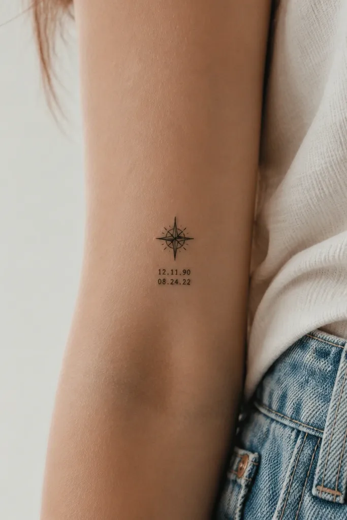
A compass rose is one of those symbols that looks clean at small sizes because it has strong geometry. Pairing it with tiny dates keeps the tattoo personal without adding clutter. The compass structure holds up as the skin ages because the lines form a clear pattern.
Go for a compass around 2.2-2.8 cm across. Put dates directly underneath in a simple sans-serif or block style, about 6-8 mm tall each number set. Place it on the outer bicep or upper forearm where the lines don't stretch much.
Pro tipKeep the compass to 4 points, not 8. More points look cool on paper but blur faster on skin.
AvoidDon't add decorative swirls around the compass; those fill in and ruin the minimal look.
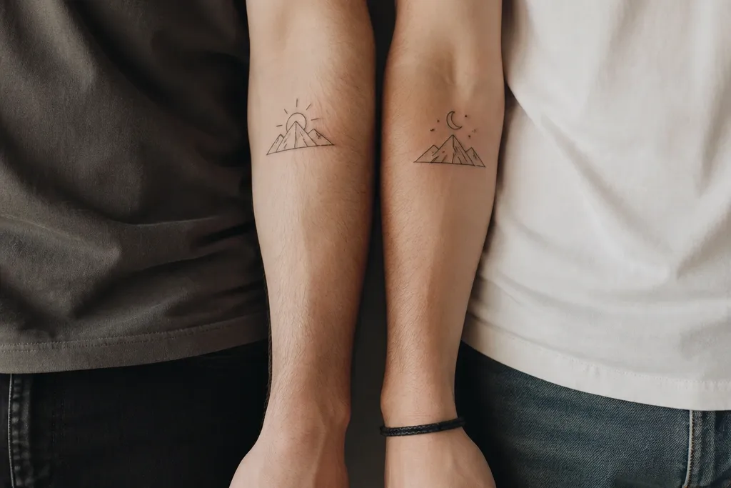
5. Two Tiny Mountains, Same Silhouette
Mountain silhouettes are minimal but still meaningful, especially if your friendship includes hikes, roads, or late-night drives. The key is using a simple outline with one internal line for the "snow" cap. That keeps the tattoo graphic and reduces fading issues.
Size it to about 2.5-3.0 cm wide on the forearm. Keep the outline line thickness consistent and avoid shading. Place it near the outer forearm so the peaks aren't distorted by wrist bending.
Pro tipBring a photo of the mountain silhouette you want and trace it smaller before you book the appointment.
AvoidAvoid realistic mountain shading; it turns patchy and gray in small formats.
6. Matching Arrow and Dot Set
This is minimalist without being boring. The arrow gives direction and the dot gives a simple "anchor," so the tattoo still reads clearly even if it fades a bit. Mirroring the arrow between friends gives you a match that feels intentional.
Pick an arrow length of 2.0-2.6 cm and keep the dot diameter around 1.2-1.5 mm. Do it in solid black, no gradients. Place on the inner wrist or the side of the forearm for a clean look under rolled sleeves.
Pro tipDecide who gets the dot where before the artist sketches. That one detail changes the whole vibe.
AvoidSkip curved arrows with lots of swoops; they look messy when small.
7. Minimal Infinity Loop with One Accent Line
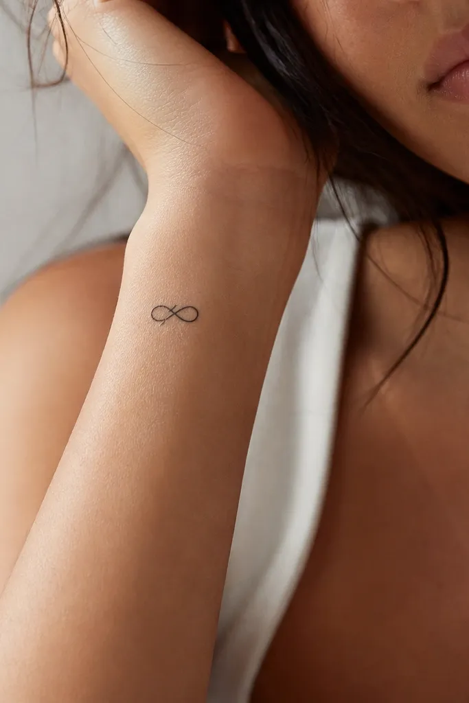
Infinity symbols work for friendship because they visually communicate "together" without names. Adding one small accent line keeps it from looking like a generic infinity clipart. The accent line creates a focal point that stays readable as the loops fade.
Keep the infinity size around 2.3-3.0 cm wide. Use consistent line thickness and no shading. Place it on the outer wrist where the symbol sits flat and doesn't get stretched by gripping.
Pro tipAsk for a stencil that shows the infinity symbol at your final size on your skin. If it feels too small, go bigger by 5-8 mm.
AvoidAvoid very thin infinity loops; they disappear first and leave uneven blobs.
8. Two Matching Keyholes (One Has a Tiny Heart)
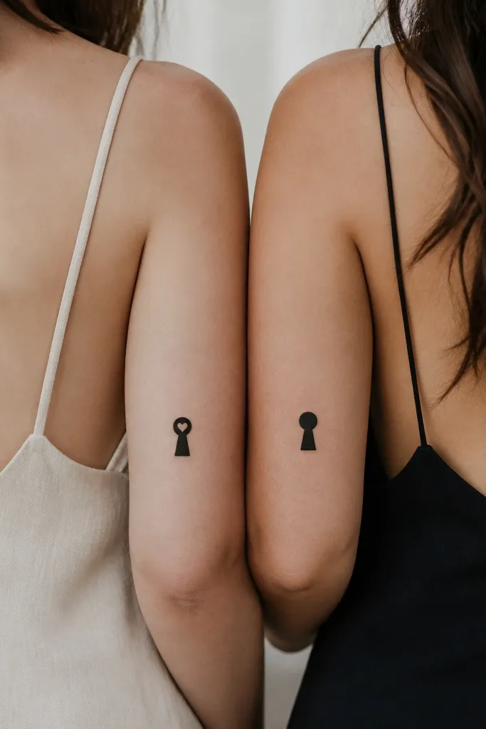
Keyholes feel personal and grown-up, not juvenile. The minimalist shape reads instantly, and the tiny heart adds warmth without turning it into a big romantic tattoo. Because the heart is small and solid, it stays crisp instead of turning into a gray smear.
Keep the keyhole line work bold enough to hold detail - solid black with no gray wash. Size it around 2.0-2.7 cm tall. Place it on the upper arm outer side or the side of the forearm for less stretching.
Pro tipUse a heart that is filled in solid black, not an outline heart. Filled hearts age better at small scale.
AvoidDon't add extra filigree around the keyhole; those tiny curls fade into nothing.
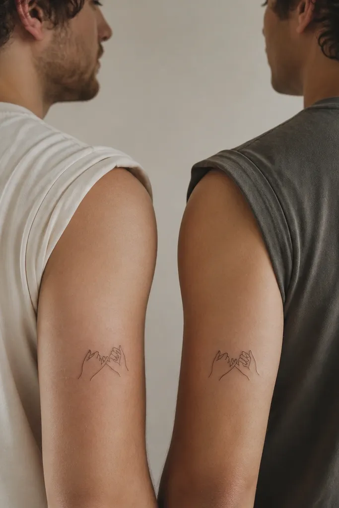
9. Small Matching Handshake Silhouettes

A handshake can be super clean when it's simplified to silhouettes. The trick is to avoid detailed finger lines; you want two grips and a palm shape so it stays readable. This design feels friendly because it's instantly recognizable even when small.
Aim for 2.8-3.6 cm wide so the grips don't become blobs. Use solid black outlines with no dot shading. Place it on the outer forearm where the handshake can sit horizontally and look natural when you gesture.
Pro tipPick a handshake orientation: horizontal for forearms, vertical for upper arms. Consistency keeps it looking intentional.
AvoidAvoid thin finger linework. Fine fingers are the first thing to blur.
10. Two Minimal "Cheers" Toast Glasses with Dates
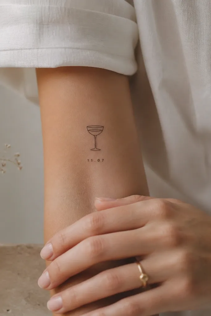
If your friendship is built on shared nights out, a toast glass fits without being loud. The glass outline stays minimalist when you keep only the rim line and one interior line. The date adds meaning without needing a long message.
Keep the glass height around 1.8-2.4 cm and keep the date text under 1 cm tall. Use black ink and no shading. Place it on the inside forearm or upper arm so the glass doesn't warp on the wrist.
Pro tipChoose a date format that looks clean in tiny text, like 04.18 or 2019-07.
AvoidSkip tiny cursive for dates; it breaks into unreadable squiggles.
11. Matching "Besties" Style Heart Split Down the Middle
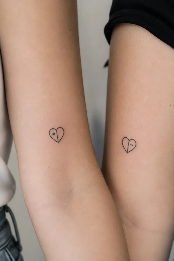
A split heart gives you a matching set that isn't identical copywork. The vertical line makes it graphic and minimal, and the tiny side symbols give personality without adding extra clutter. Because the heart outline is bold, the tattoo still reads even after years.
Size it around 2.2-2.9 cm tall for the forearm or upper arm. Use solid black outlines, with the split line also in black. Put the dot or dash on the left or right half so both halves look balanced.
Pro tipMake the dot and dash the same weight as the split line. If one accent is thicker, the tattoo looks uneven.
AvoidAvoid adding two different full hearts; that turns into a pair instead of a single shared idea.
12. Minimal Roman Numerals with a Tiny Leaf Accent
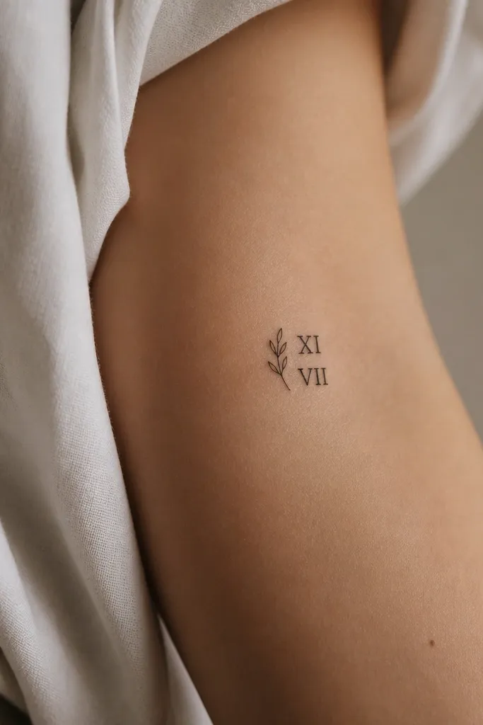
Roman numerals look clean when they're spaced correctly and kept at a readable size. The leaf accent adds a natural vibe that doesn't look like generic date tattoos. Minimal leaf icons hold up because they rely on simple curves and one central vein line.
Pick a placement like the side of the forearm or upper bicep. Keep numerals around 1 cm tall each line and total width under 2.5 cm. Use black ink only, and keep the leaf tiny so it doesn't compete with the numerals.
Pro tipWrite the numerals on paper with the exact spacing you want. Bring it to your appointment and ask for that exact spacing.
AvoidAvoid over-stylized Roman fonts with lots of serifs; they blur into a gray texture.


