1. The Same Constellation, Each Friend Gets One Star
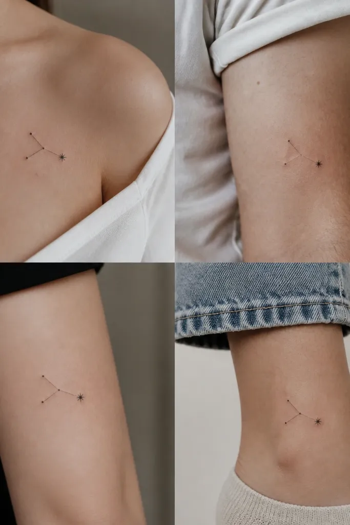
This works because constellations have built-in structure. The shared dot-and-line pattern gives the group cohesion, and the one slightly larger star reads as the personal signature. I've seen this look gorgeous in black ink with tiny dotwork shading behind the cluster - it catches light without turning heavy. Keep the stars small and crisp so the design doesn't thicken as it heals.
Have your artist draw the cluster using consistent line weight (fine-line) and place it in the same relative position on each body, like outer upper arm or outer ankle. Size it so the cluster spans about 3 cm. Add a tiny dotwork halo behind the main cluster on each tattoo if you want that "sky" feel.
Pro tipAsk for the larger signature star to be the only element that changes - either slightly bigger dot or a tiny ring around it.
AvoidAvoid swapping between totally different styles (script on one, realism on another) because it ruins the match.
2. Tiny Infinity Loop With One Shared Charm Per Person
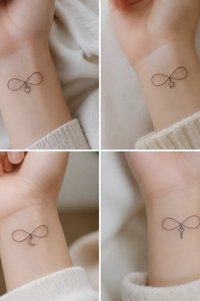
Infinity symbols look clean when they're thin and centered. The charm-at-the-crossing trick keeps the design cohesive while giving each friend a distinct meaning. I like this in solid black with the charms kept to dot sizes and tiny line details so they stay sharp. The infinity line also hides well on wrists because it doesn't sprawl.
Use a line thickness around 0.9 to 1.1 mm and keep the infinity about 2.8 to 3.2 cm wide. Place the tattoo on the inner wrist or outer wrist so the loop sits straight when your arm relaxes. Choose one charm shape set so they look like they belong together in size - about 4 to 6 mm tall each.
Pro tipBring a charm set in the same style to your artist (all micro line icons, not mixed with filled shapes).
AvoidDon't make one charm bold and filled while the others are line-only - healed contrast looks uneven.
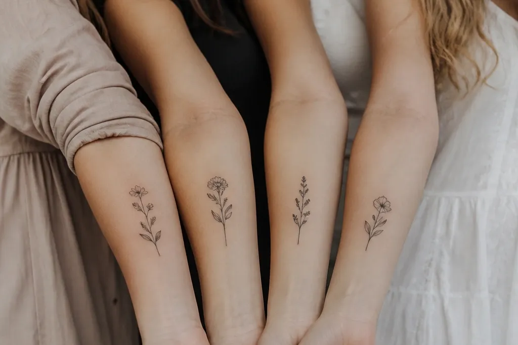
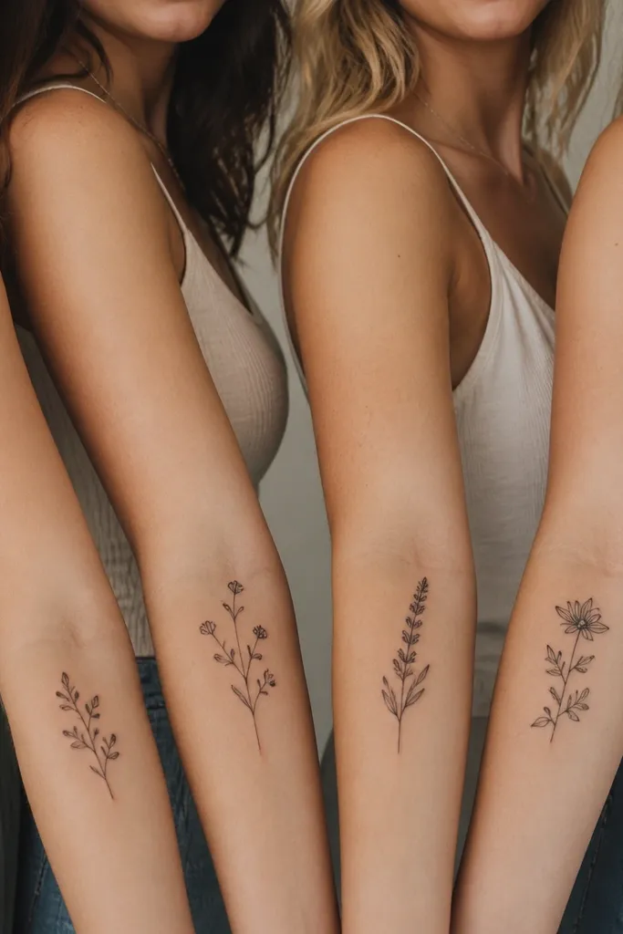
3. Four Matching Sprigs, One Personal Leaf Shape
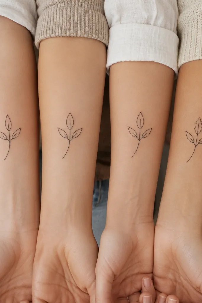
This is the friendship tattoo I recommend when you want something soft but still graphic. A sprig has natural flow, and matching stems make it look like a coordinated set. Each friend's unique leaf shape keeps it personal without making the tattoo feel like a different series. I like this in black with a tiny stipple shadow under the sprig so it stays dimensional after healing.
Keep the sprig height around 3.5 to 4 cm. Place it on the outer forearm or above the elbow where the skin is smoother. Have your artist draw the stem curve first, then swap only the leaf outline for each person: one rounded leaf, one pointed leaf, one heart-shaped leaf, one thin oval.
Pro tipAsk for stippling only on the underside of the sprig so it doesn't look smudgy as it ages.
AvoidSkip heavy shading - it turns "pretty" into "blurry" on small sprigs.
4. Shared Coordinates With a Different Tiny Marker
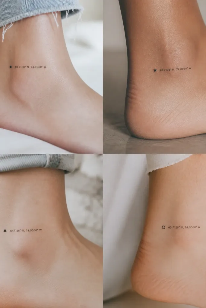
Coordinates look clean when the numbers are small enough to stay crisp and the layout is identical. The tiny marker icon is the personal element that keeps it from feeling generic. I've done this with friends where the numbers stay the same across all four, and only the marker changes - the result reads coordinated but still personal. Use fine-line text with consistent spacing so it doesn't warp as it heals.
Choose a font style that stays legible at small size - thin, not overly fancy. Keep the tattoo height around 2.8 to 3.5 cm on ankles. Put the marker icon at the same side for each friend and match icon size to about 3 to 4 mm.
Pro tipPrint the exact numbers and spacing on a layout sheet and have your artist trace it before they ink.
AvoidAvoid dense script fonts - they smear faster than you think on thin skin.
5. Four Tiny Lockets, Same Chain, Different Insert
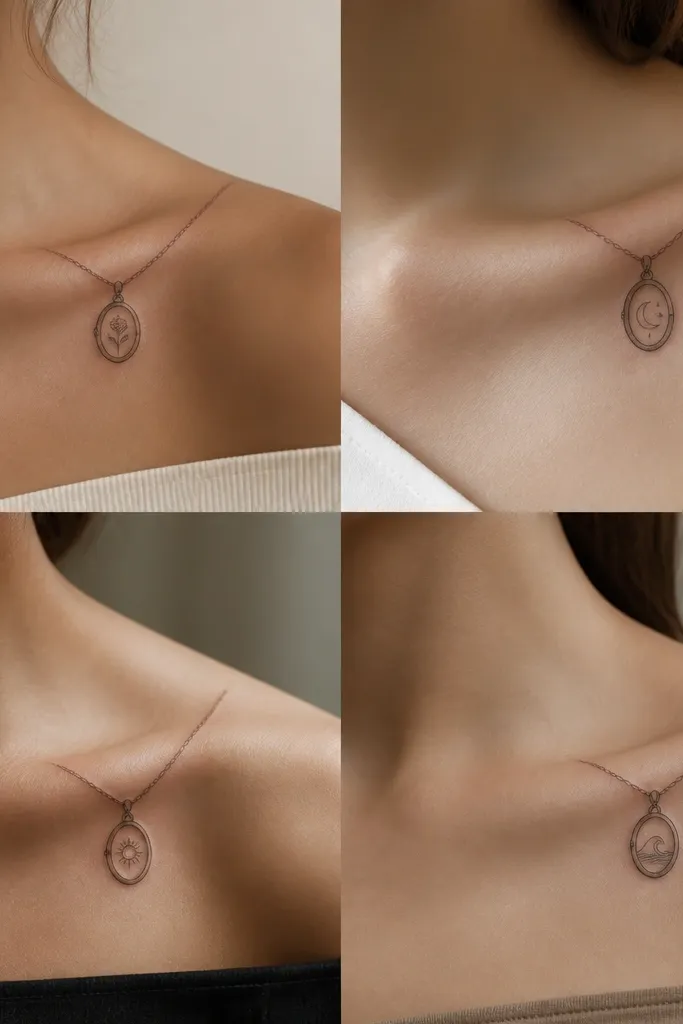
Lockets work because they're instantly readable even when small. When the chain and locket outline match across all four, it looks like one ongoing idea. The different inside insert - like a tiny initial, a micro heart, a star, or a folded paper plane - gives each friend a personal meaning. I like this design in black outline with minimal fill so it ages gracefully.
Keep the locket about 1.7 to 2.2 cm tall and the chain short so it doesn't stretch across too much skin. Place near the collarbone but not on the bony edge - aim for the slightly padded area above the shoulder. Keep the insert icon within the locket frame using the same line thickness as the chain.
Pro tipAsk your artist to add a tiny highlight dot in the locket area only if they're confident - it helps the shape read as "metal" without heavy shading.
AvoidDon't let the chain lines get too thick; thick chains turn into dark bands over time.
6. The Same Wave Crest, Different Symbols in the Foam
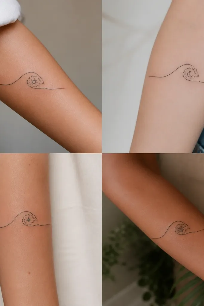
Waves are a great friendship theme because they're naturally repetitive and easy to match. Use the same crest line and foam shape across all four, then swap the tiny symbol in the foam for each friend. I've found the foam area gives you a perfect "window" for small icons without making the tattoo busy. Keep it black line with micro dot accents, not large shaded areas.
Size it around 3 to 4 cm wide and place it on the inner forearm or outer wrist where it stays visible. The foam burst should be the same shape every time - like a three-arc foam icon. Insert one symbol per person, about 2 to 3 mm: a star, a lightning bolt, a leaf, or a small heart.
Pro tipUse dot accents around the foam instead of shading - dots heal cleaner and look sharper longer.
AvoidAvoid adding extra wave lines for "style" because it breaks the match between friends.
7. Four Matching Handwritten Words, One Letter Shared
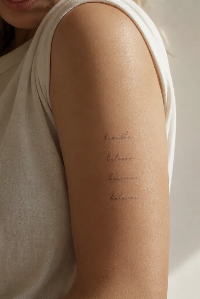
This looks gorgeous when you keep the script size tiny and consistent. The shared first letter ties the group together, and the rest of each word keeps the meaning personal. I like using one shared letter style - same loop shape - so it looks intentional, not accidental. Black ink only for this one, because mixing styles (black ink with colored highlights) makes the set look mismatched.
Pick one short word length for all four, like 4 to 6 letters total. Place on the side of the upper arm or outer upper arm where the skin stays smooth. Keep the baseline height around 2.5 to 3 cm so the letters don't blur into each other.
Pro tipBring a handwriting sample from each person if you want it to feel real, then have your artist convert it into consistent fine-line script.
AvoidDon't use super curly letters - they thicken as they heal and lose the handwritten vibe.
8. Same Minimal Heart, Different Dotwork Texture
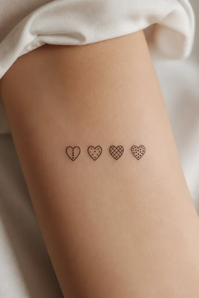
The outline is the anchor, and the fill texture is the personal variation. This is one of the cleanest ways to make four tattoos look coordinated while letting each friend have a different "energy." I like dotwork textures because they add interest without turning into heavy black blotches. Keep the heart small so the texture doesn't merge into a blob.
Use a heart outline about 2.2 to 2.8 cm tall. Place on the outer wrist, inner wrist, or upper arm where it's not stretched tight. Decide the dotwork pattern differences ahead of time so each friend's tattoo looks like part of the same series.
Pro tipAsk for dotwork spacing to stay at least a few millimeters between clusters - it keeps the pattern readable.
AvoidAvoid full solid fills inside tiny hearts; they heal dark and can lose the heart shape.
9. Four Matching Little Comets, Different Trails Length
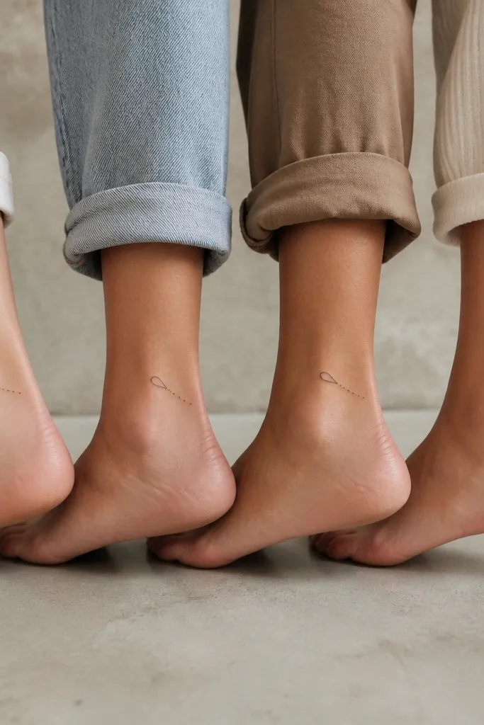
Comets look cute and still meaningful because they're simple. The shared comet head keeps the set cohesive, and the different trail length reads as a personal twist. I like the dotted trail approach because it adds motion without heavy shading. Keep everything black so the trails don't look mismatched after healing.
Size the comet head around 4 to 6 mm and the whole tattoo around 3 to 4 cm. Place on the outer ankle or top of foot where the trail direction looks natural. Have your artist use a consistent dot spacing for the trail, changing only the number of dots.
Pro tipChoose the same direction for the comet trail on all four bodies - left-to-right or right-to-left - so the set reads as a coordinated group.
AvoidDon't add planets or extra stars; it makes each tattoo feel like its own theme.
10. Shared Bird Silhouette, Different Wing Dot Patterns
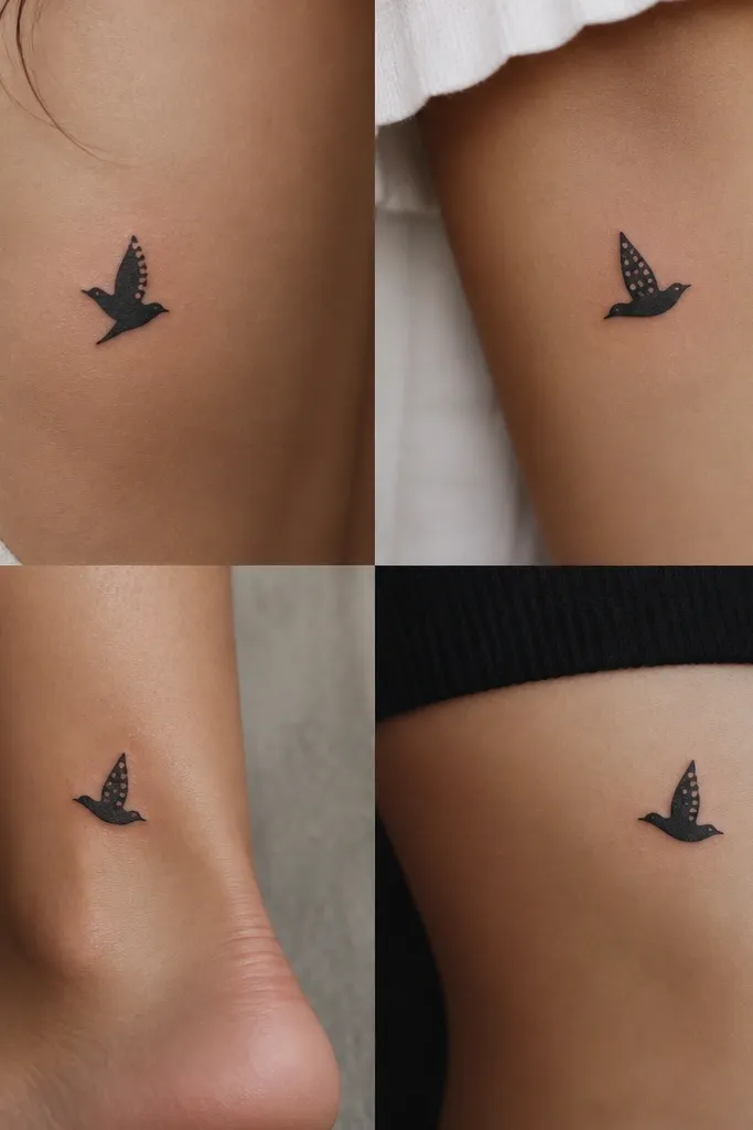
Bird silhouettes work because they're instantly recognizable even when small. Matching the body and wing outline keeps the set unified, and the wing dot pattern becomes the signature. I like this style in clean black with tiny dot clusters because it looks intentional and graphic. It also heals well since there's no heavy fill.
Pick one bird shape and stick with it for all four. Keep the tattoo about 3.5 cm wide and place it on the upper back or outer arm where it looks like it's flying outward. Use dot clusters of equal size but different arrangements: one dots-in-a-row, one scattered, one crescent, one tiny star cluster.
Pro tipAsk your artist to sketch the dot patterns on paper first so the differences are consistent and not "freehand random."
AvoidAvoid shading the bird body - it makes the silhouette look flat and messy on small scale.
11. Four Matching Stars With Birthstone Color References in Black Ink
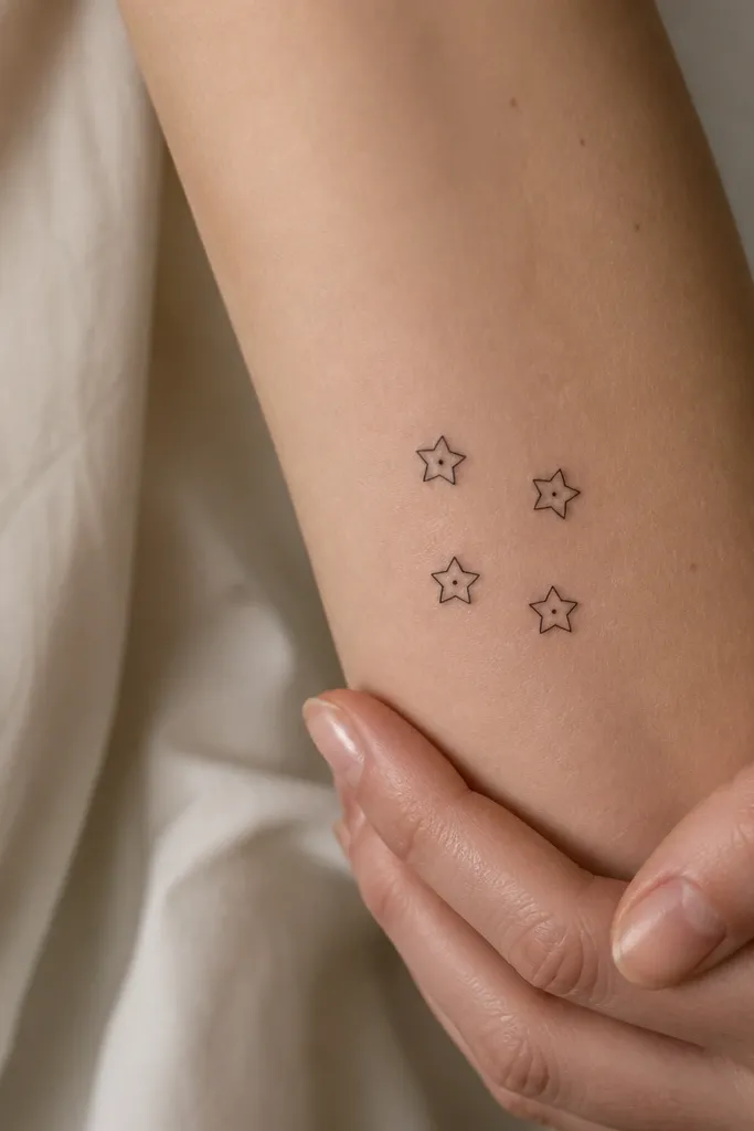
Even if you're doing black ink only, you can still reference birthstones through dot placement patterns. The stars give you a clear friendship motif, and the consistent star outline keeps the set matching. I've used this idea where each star has a different "inner dot map" that corresponds to each friend's birthstone - it stays tasteful and doesn't require color that fades. It looks cohesive from across the room because the overall shapes match.
Use tiny stars about 1.2 to 1.8 cm each. Place them on the same body zone (like outer forearm near the wrist or upper thigh) so the quartet vibe reads. Decide a dot pattern key before you tattoo: for example, one star has one center dot, one has two dots in a diagonal, one has three dots in a triangle, one has a small dot ring.
Pro tipTell your artist the "dot map" meanings so they can draw the same pattern across all four without guessing.
AvoidDon't add color in tiny spots unless your artist has a track record with micro color; it can blur fast.


