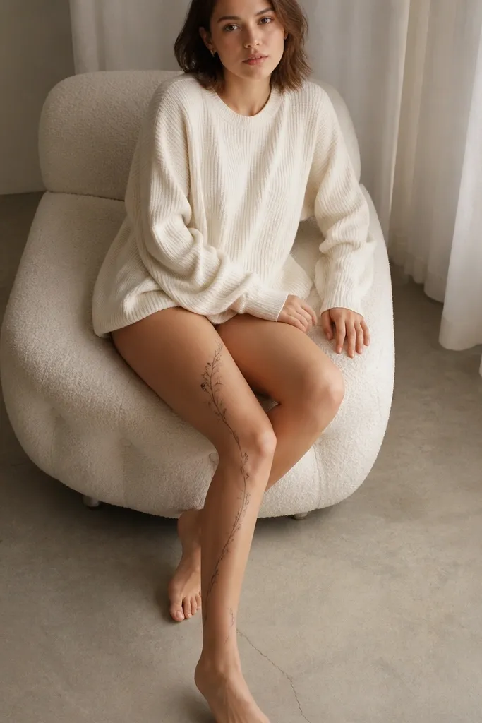
1. Single-word block text over the knee crease
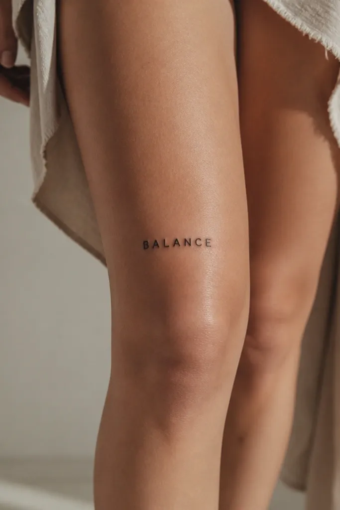
Block letters hold their shape when skin stretches. Above the knee, that matters more than fancy fonts because the kneecap changes the angle of your skin. I like uppercase for minimalist tattoos because it reads fast - you don't need flourishes to make it feel intentional. Keep it black only so it stays sharp against your natural skin tone.
Size the word to about 5 to 7 cm wide depending on your thigh. Place the center of the word at the midline of your leg, and keep the baseline parallel to the floor. Use fine-line black ink with a consistent line weight; avoid hairline strokes.
Pro tipDo a knee-bend photo test. If the letters look like they "bow," raise the placement a finger width.
AvoidAvoid condensed fonts that have tight internal gaps; they look muddy after a few months.
2. Curved arc word with a soft "smile"
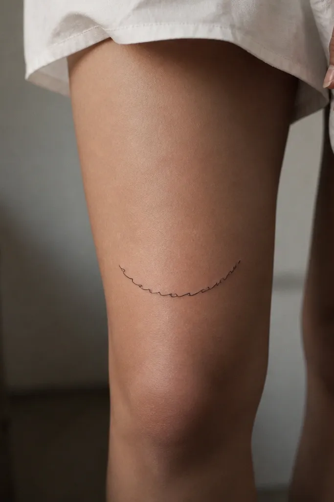
A gentle arc follows the natural curve of the thigh, so the letters don't fight the leg shape. The trick is a shallow curve - too much curvature makes the middle stretch more than the ends when you walk. Script works here because the stroke stays readable if the line weight is medium, not wispy.
Keep the arc radius subtle: the word should only curve slightly from left to right. Place it so the ends sit about 1-2 cm apart from the thigh's outer and inner edges. Stick to one color - black - and skip shading so it heals evenly.
Pro tipAsk for a stencil that includes both standing and bent-knee views; it should look centered in both.
AvoidDon't pick a super looped script; tiny loops collapse into dots above the knee.
3. Two-line minimalist phrase with staggered baseline
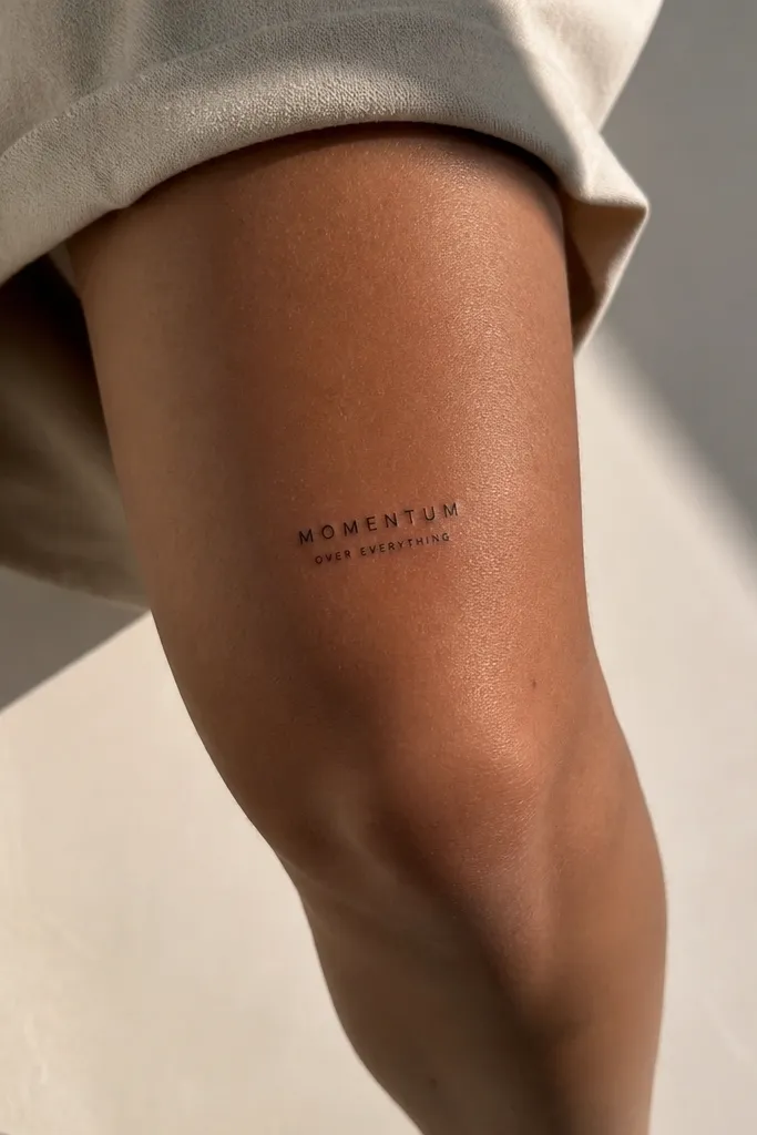
Two-line phrases can look elegant on the knee area if you stop them from becoming a block. A slight stagger gives the tattoo motion without adding decorative elements. Minimal sans-serif letters stay crisp and don't rely on shading, which helps them age well on high-movement skin.
Make the top line about 3/4 the width of the thigh section you're using, and keep the second line narrower. Leave at least 4 mm between lines so the ink doesn't blend during healing. Use consistent black line weight across both lines.
Pro tipIf you want the phrase to stay readable from a distance, keep the smaller line at least 3 mm tall.
AvoidAvoid stacking lines too close; knee tattoos blur together fast when the gap is under 2 mm.
4. Vertical word strip down the outer thigh
Vertical text is great when you want the tattoo to look intentional even when you wear shorts or leggings. On the outer thigh, the skin movement is less chaotic than directly over the kneecap, so the letters stay cleaner. A narrow layout also helps small minimalist words feel "designed," not squeezed.
Pick a word length that fits within about 6-8 cm tall. Center it slightly forward on the outer thigh so it catches light when you turn. Use a clean serif or sans-serif so the letter edges stay defined as the leg bends.
Pro tipPlace the lowest letter tip 1-2 finger widths above the knee crease to avoid distortion.
AvoidAvoid placing vertical text too close to the front; it warps in photos when you cross your legs.
5. Roman numeral word style for a date-meaning vibe
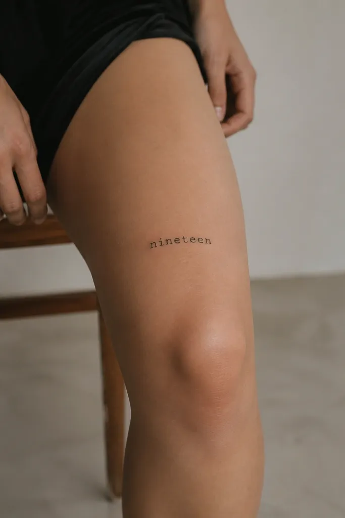
Roman numerals have built-in structure, so even small sizes stay readable. The minimalist approach works because the numerals don't need extra icons to feel complete. Above the knee, the strong geometry holds up better than ultra-thin scripts.
Keep the numeral height around 4-5 mm for a small minimalist look. Place it centered and straight, not angled, so it doesn't look like it's sliding down your leg. Use black ink with consistent stroke width.
Pro tipIf your numerals include "I" and "V," ask your artist to slightly widen the "I" strokes so they don't look like a smudge.
AvoidAvoid tiny numerals under 3 mm tall; they disappear as the tattoo fades.
6. Handwritten single word with thickened terminals
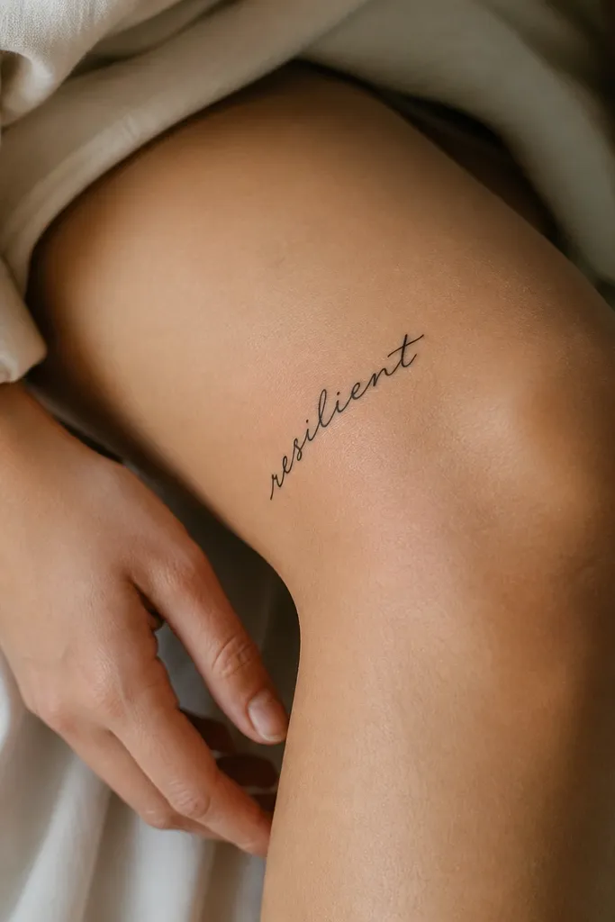
Handwritten styles can look amazing on the knee because the movement of the letters matches the movement of the body. The key is thickened terminals - little bumps at the ends that keep the word from looking fragile. This gives you the "real pen" vibe without turning into a blurry scribble later.
Go diagonal only if the word reads cleanly standing straight. Place the start of the word higher on the outer thigh, then let it slope gently toward the center. Keep the letter height about 4-6 mm and stick to black ink.
Pro tipBring a reference font or a photo of real handwriting. Your tattoo should match the spacing from the reference, not just the shape.
AvoidAvoid ultra-thin handwritten fonts; they fade unevenly over the knee.
7. Micro word in a thin boxed outline
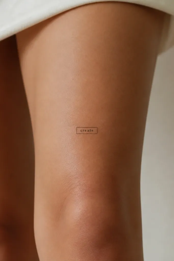
A thin box frames the text and keeps it looking "finished," which matters for small minimalist tattoos. The outline also makes the tattoo feel crisp even if the word fades slightly over time. Keep the box lines thin so it doesn't overpower the word.
Use a single word around 3-5 letters for this look. The box should be about 3-4 cm wide; the word should sit centered with even margins. Place it slightly above the kneecap so the box edges don't stretch into a trapezoid when you bend.
Pro tipAsk for the box corners to be rounded. Sharp corners heal sharper, but they also catch irritation more easily.
AvoidAvoid thick box lines; they turn into a heavy rectangle that hides the meaning.
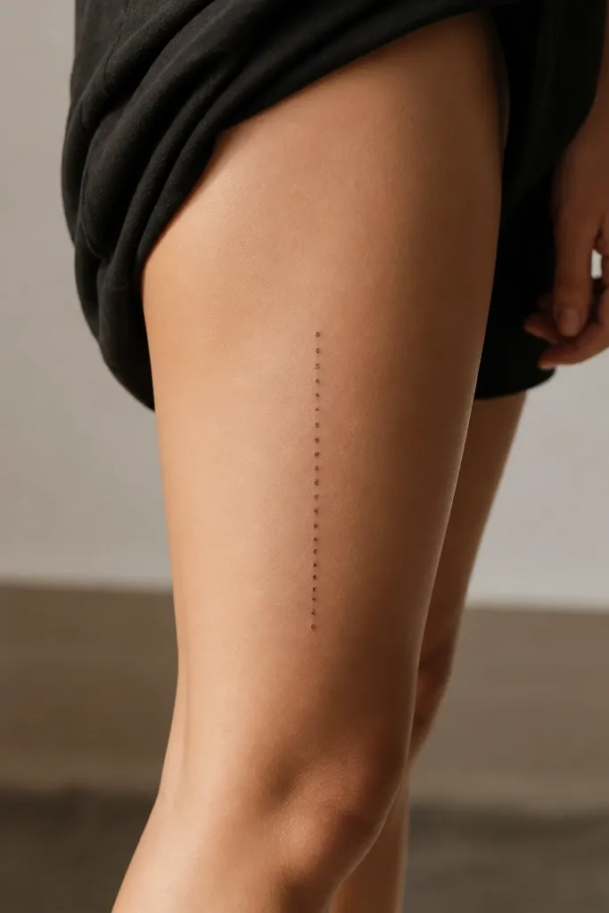
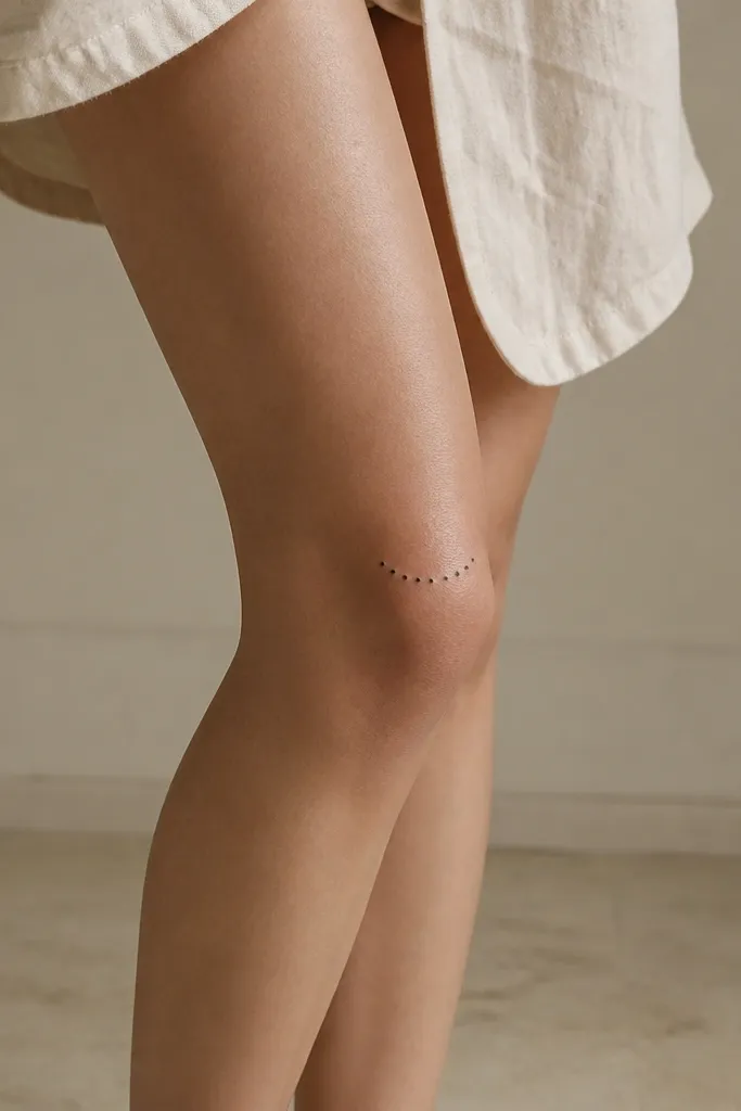
8. Word with small dot separators
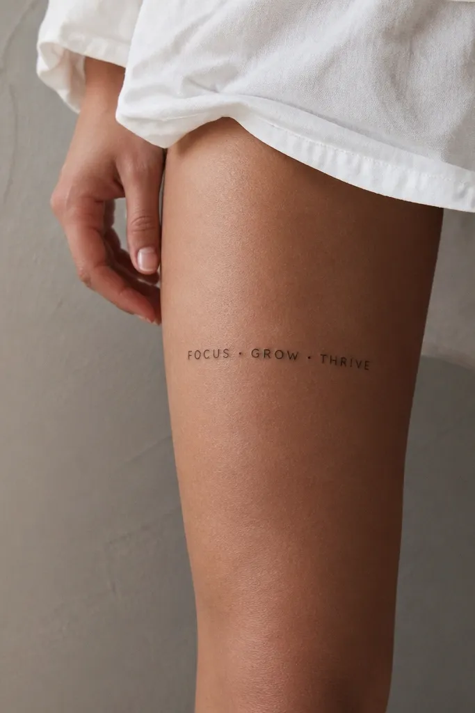
Dot separators give you clean structure without adding clutter. On skin that moves, punctuation helps your brain read the spacing - it's like visual pauses. This is a great option if you want a phrase that feels tidy, almost like a label.
Keep the dots about the same thickness as the letter strokes. Place the phrase centered above the knee crease with consistent baseline alignment. Use one font family for the whole phrase so it doesn't look mixed.
Pro tipIf your phrase has two words, use dots as the divider and keep the second word the same size as the first for a balanced look.
AvoidAvoid large decorative dots; they look like random specks after healing.
9. Script word with a single underline stroke
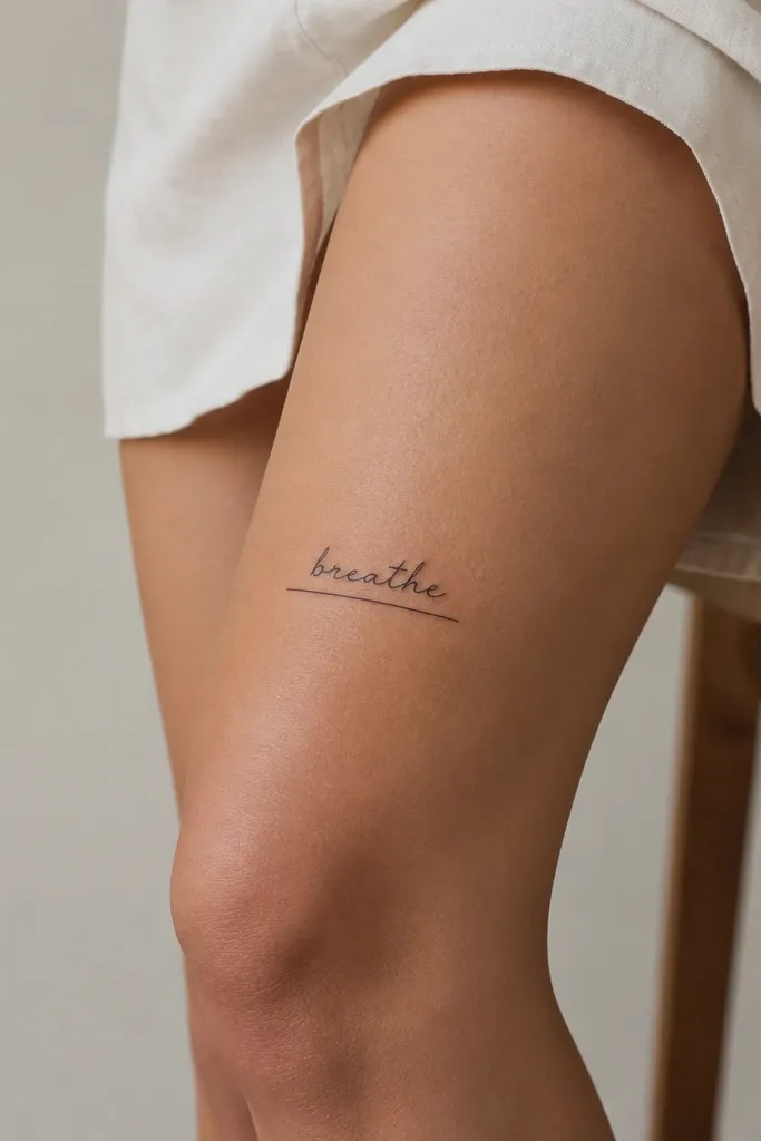
A single underline makes the word feel styled without adding extra symbols. It also gives you a stable visual anchor - the underline can stay readable even if the word letters soften a bit with time. Choose a script that has straight-ish strokes so it doesn't collapse into loops.
Underline length should be about 10-15% longer than the word width. Place the underline parallel to the floor and keep the script slightly above it so you don't crowd the letters. Use consistent black ink, no gray wash.
Pro tipUnderlines look best when they're slightly thicker than the script stroke. Ask your artist for that contrast.
AvoidAvoid double underlines; they thicken too much during healing.
10. Minimal serif word aligned to the kneecap curve
A serif word adds a little sophistication while staying minimalist. Aligning it to the kneecap curve means the letters sit where your skin stretches less. This works best with moderate serif - not fancy, not overly thin.
Place the word so the center letter sits directly above the kneecap, but keep the overall word slightly higher than the center point. The word should span about 4-6 cm. Use black ink and keep spacing even between letters.
Pro tipTry a stencil that includes the leg crease line. If the top of the word crosses it, raise the design.
AvoidAvoid placing serif words too low; the serifs get fuzzy first.
11. Two-word phrase with a tiny heart-less symbol spacing
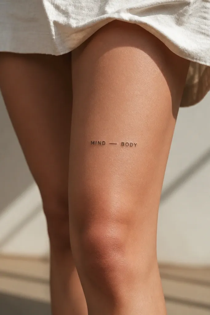
A dash symbol is subtle but it gives rhythm to the phrase. The knee area already has a natural curve and crease, so you don't want a big icon that fights for attention. This layout keeps the focus on the words while still looking styled.
Use a font where letters have similar stroke weight - think simple uppercase sans-serif. Keep the dash centered and about the same thickness as the letter strokes. Place it horizontally and make sure the dash doesn't sit too close to either word.
Pro tipIf the phrase is longer than 10 letters total, shrink the font and increase letter spacing slightly so it stays readable.
AvoidAvoid hearts, stars, and big icons near the knee; they age unevenly and can look like clutter.
12. Short word stacked in a staggered vertical pair
Stacking text can look clean if you stagger it slightly instead of making it perfectly symmetrical. The stagger mirrors the way your thigh has slight asymmetry, especially when you stand with one leg forward. Minimal uppercase keeps it crisp and readable from a distance.
Use two short words or a phrase that breaks naturally into two parts. Keep each line's width about the same. Place the top line 2 finger widths above the kneecap and the bottom line about 8-12 mm below it.
Pro tipStencil it with your most common stance - one leg forward. The tattoo should still look centered.
AvoidAvoid perfect symmetry if your stencil looks off in your mirror stance; tiny shifts matter above the knee.


