
1. Micro Crescent Moon with Tiny Stars
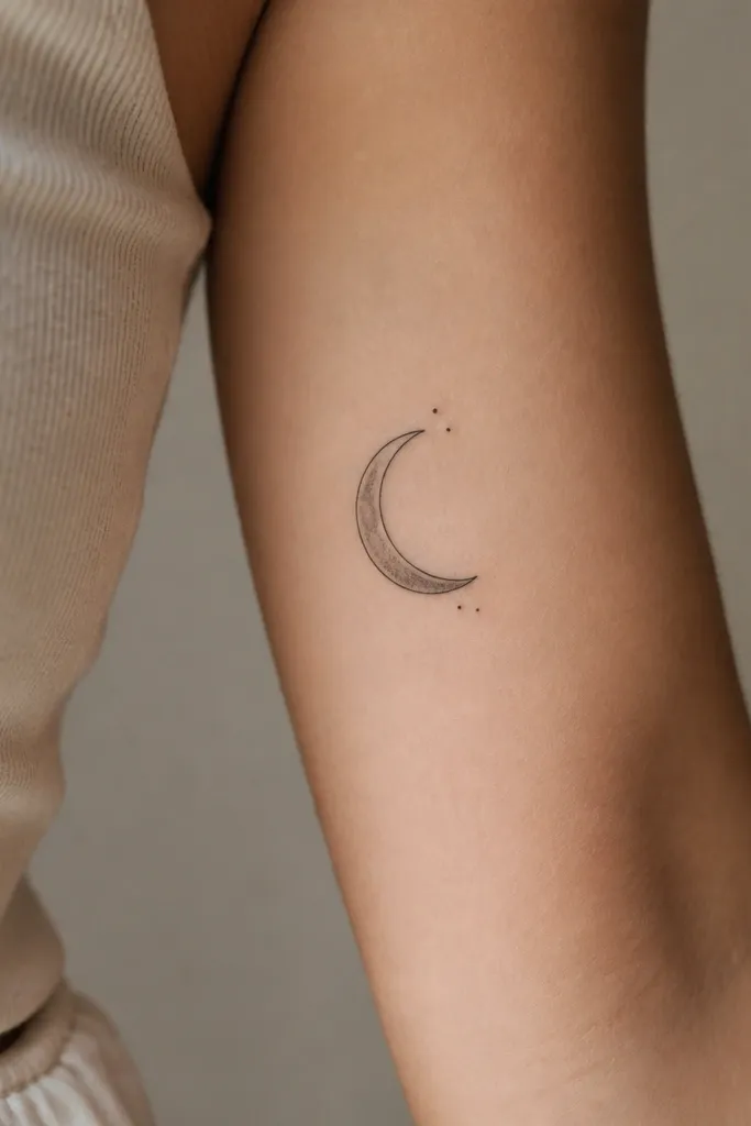
This design looks classy because the crescent gives you a clean curve that follows your arm. The tiny stars are small enough to stay sharp and airy, so they don't turn into blobs as your skin ages. I like thin black outlines plus a gentle gray wash for the moon - it catches light without looking like a heavy stamp.
Place the crescent vertically so the tips point up toward the mid-bicep. Keep the star dots no bigger than the width of a fine needle line, spaced with clear gaps. If you want it more subtle, ask for only one or two stars and leave the rest as negative space.
Pro tipBring a reference photo where the moon has visible skin between the stars and the crescent. That spacing is the whole look.
AvoidAvoid filling the entire crescent with solid black - it makes small stars look crowded.
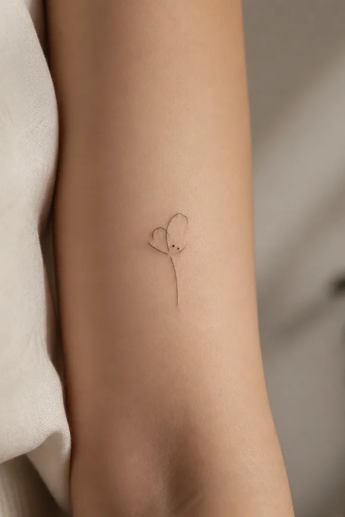
2. Single-Line Minimal Rose Bud
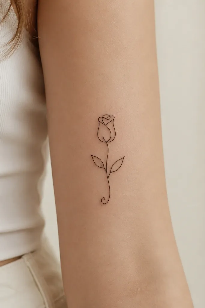
A single-line rose bud stays classy because it relies on line weight and breathing room. You get the floral vibe without the "busy" look that happens when petals get too many micro details. On the upper inner arm, the vertical bud shape hugs the natural curve of the muscle.
Keep the bud height around 5-6 cm and the leaf width under 1.2 cm. Place the bottom curl near the midline of your inner arm so it doesn't twist when you move. Ask for linework done with a consistent needle grouping so the line thickness stays even.
Pro tipIf you want it to look more feminine, ask for one leaf to be slightly smaller and angled outward - it creates a gentle S-curve.
AvoidSkip shaded petals with lots of tiny lines - they blur fast in small-space placements.
3. Tiny Butterfly with Open Wings
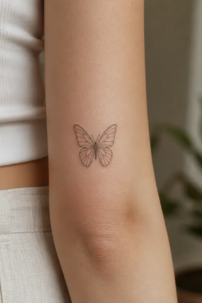
Open-wing butterflies look classy on the upper inner arm because the negative space does the heavy lifting. The fine lines stay light on the skin, and the micro dot accents add a little sparkle without turning into watercolor. When your arm flexes, the outline still reads cleanly.
Keep the wings narrower than you think - aim for 3-4 cm total width. Position the butterfly so the body sits closer to the inner seam, and the wings angle slightly toward the front of your arm. For the dots, use 2-4 tiny dot clusters rather than filling the whole wing.
Pro tipAsk your artist to do a quick stencil test while your arm is relaxed and then again while it's slightly flexed.
AvoidDon't go for a thick, filled butterfly - small fills turn into a dark patch over time.
4. Small Bow Tie with Center Knot
A bow tie reads classy because it's graphic and symmetrical, not overly detailed. The vertical layout makes it feel intentional on a small canvas. Light gray under the knot adds depth without turning the bow into a shaded blob.
Size it around 5 cm tall with the widest part staying under 1.5 cm. Place it slightly above the midpoint of your inner arm so you're not fighting the elbow crease. Keep the knot centered so the bow doesn't look lopsided when your arm moves.
Pro tipIf you're worried about symmetry, pick a bow style where one loop is fractionally angled - it looks hand-drawn instead of printed.
AvoidAvoid thick outlines - they crowd the tiny loops and make the bow look heavy.
5. Micro Key and Heart Split Accent
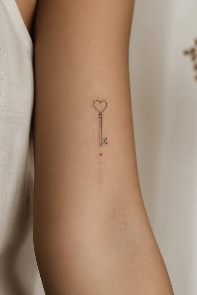
This works because it combines two recognizable symbols without the clutter. The key gives you a strong vertical silhouette, and the outline heart keeps it sweet instead of romantic mush. The dot trail adds movement while staying minimal.
Keep the key shaft about 3.5 cm and the heart no wider than a pencil eraser width. Place the heart near the upper portion of the tattoo so it stays visible when you wear sleeveless tops. Use one consistent line weight for the key and heart so it doesn't look like two different tattoos.
Pro tipAsk for the heart cutout to be slightly open - it keeps the shape airy in small space.
AvoidSkip adding extra tiny curls around the key - they get lost and blur.
6. Minimal Birth Month Flower (One Petal Detail)
One-petal-detail florals look classy because they don't fight for attention. You get the "I know what this means" vibe without a heavy bouquet effect. On the upper inner arm, the negative space keeps the design light and readable as skin texture changes.
Choose a flower with a simple silhouette, like a small daisy or a single camellia bud. Keep the overall height around 5-6 cm and leave at least 1-2 mm of skin between lines. If you want color, go for a single tiny accent in muted rose or dusty sage - only one spot, not a full color wash.
Pro tipBring the artist a real example of the flower shape you want, not a Pinterest collage. You're picking the silhouette, not the vibe.
AvoidAvoid full-color petals on a small piece - it heals uneven and loses definition.
7. Tiny Line Art Constellation (4 Stars)
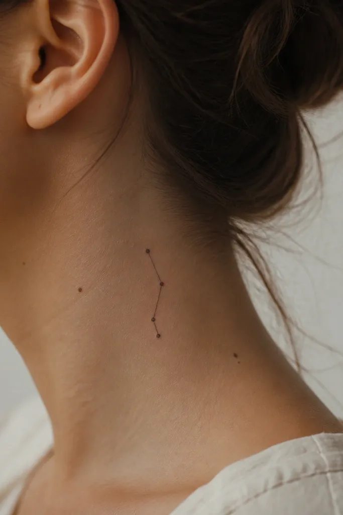
Constellations feel classy in small space because they're built from simple geometry. Four stars give you meaning without the "busy sky" look. Thin connecting lines plus dot stars heal cleaner than micro-asterisms with lots of points.
Keep the whole piece about 4.5-6 cm tall. Space the stars so each dot is separated by visible skin, and make the connecting line slightly thinner than the star dots. Place it along the inner arm seam so it looks straight when you stand.
Pro tipPick star dot sizes first. If the dots are too big, the constellation looks like a random cluster.
AvoidDon't add more than four or five points. Extra stars turn into a dot storm.
8. Micro Roman Numerals with Small Leaf
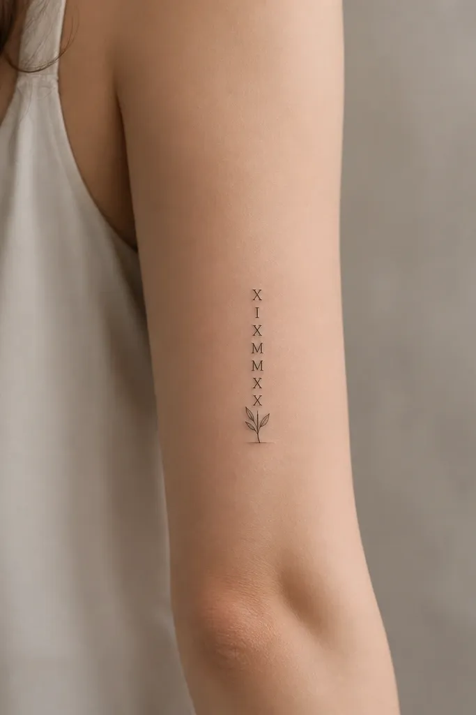
Roman numerals look classy because they're legible and clean when sized right. The small leaf keeps it from looking like a label or a receipt. A light gray under the leaf adds depth while the numerals stay crisp.
Limit the numerals to 4 characters max so they don't sprawl. Keep the text height around 3.5-4.5 cm and the leaf height about 1 cm. Place the tattoo higher than you think so it doesn't get distorted by elbow movement.
Pro tipAsk for numerals with slightly wider spacing between characters. Tight fonts blur on small skin areas.
AvoidAvoid super-thin font styles that look great on paper but disappear after healing.
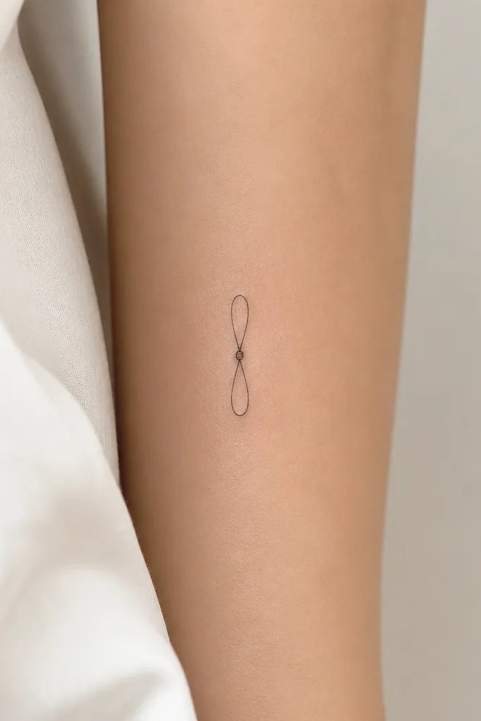
9. Small Infinity Symbol with Two Micro Dots
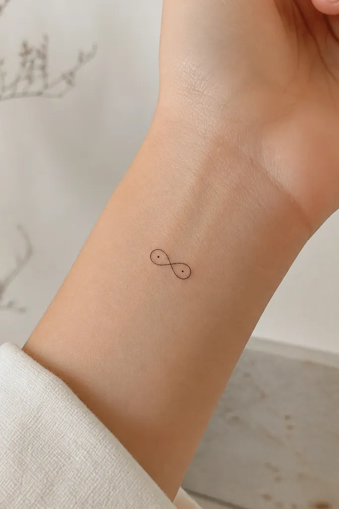
Infinity symbols read classy when they're minimal. The two micro dots give it a finish without adding extra elements that crowd the loops. On the upper inner arm, a slim infinity keeps its shape even when your arm moves.
Size the infinity around 4.5-5.5 cm tall with clean, narrow loops. Place it vertically with the twist centered on the inner seam. Keep the line thickness consistent - ask the artist to match the loop width to the dot width.
Pro tipChoose a version with rounded loop ends. Sharp ends can look scratchy as the tattoo heals.
AvoidDon't thicken the symbol or add shading - it turns into a dark scribble.
10. Two-Part Matching Hearts Split Down the Middle
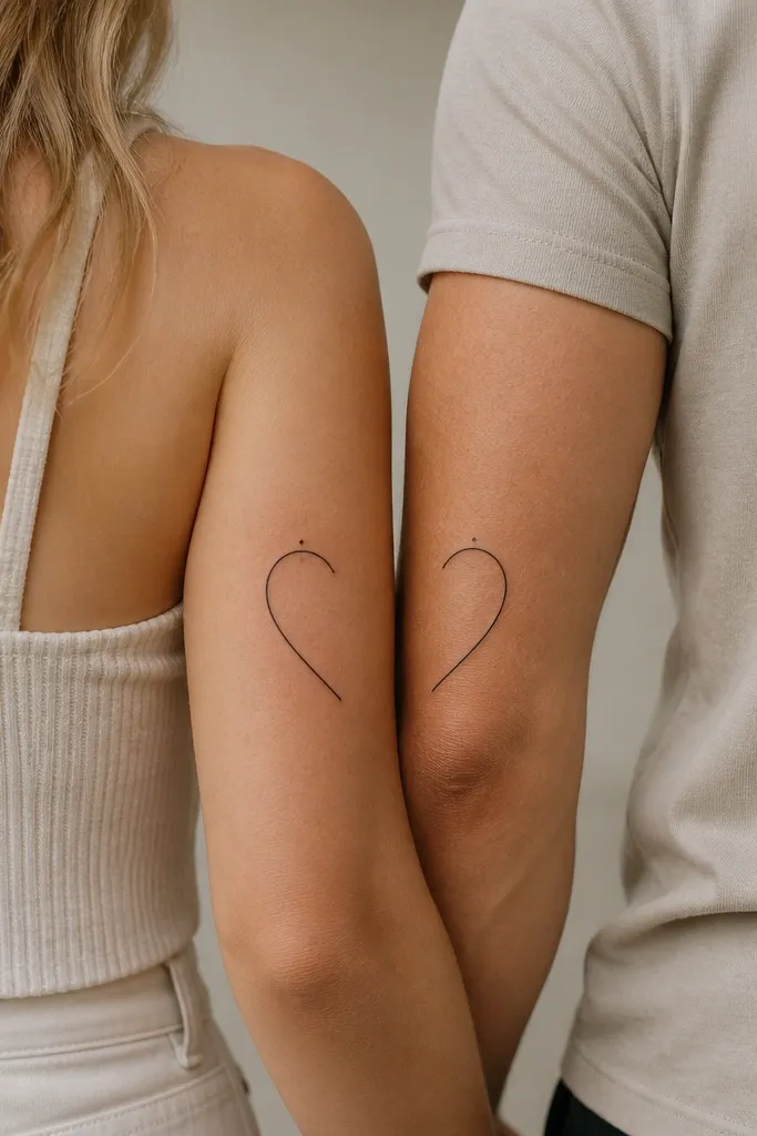
This is the kind of matching that looks classy because it's not identical-copy cringe. When you hold hands or stand side by side, the hearts complete. The outline style keeps it light and avoids heavy black fill that can blur in small space.
Make each half-heart about 5 cm tall with a clean negative space gap where the hearts meet. Place the "point" near the upper inner arm so it doesn't get swallowed by the arm crease. Use the same line weight on both partners so the edges match.
Pro tipDo a quick test photo in a mirror with both arms relaxed and slightly flexed. The gap should stay clean.
AvoidSkip shading on half-hearts. The shared line edges blur and the split stops looking intentional.
11. Micro Dainty Feathers with Stipple Gradient
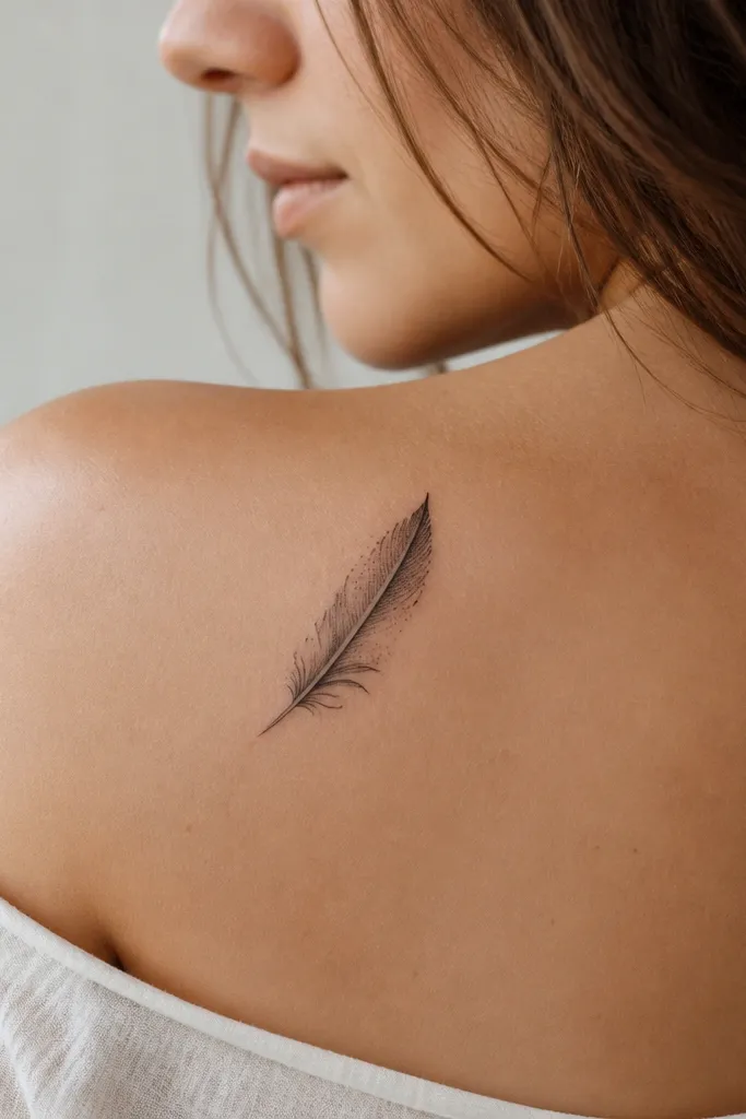
Feathers can look classy in small space when you keep the barbs minimal and let stipple do the texture. The stipple gradient gives softness without dark blocks. It also looks good on inner arm skin because the feather naturally sits along the arm's length.
Keep the feather height around 6 cm and width under 1.8 cm. Ask for barbs only on one side if you want a lighter look. The stipple should be light gray and fade toward the center line so it doesn't look dirty.
Pro tipTell your artist you want "air between barbs." That phrase helps them keep spacing clean.
AvoidAvoid lots of tiny barbs all around. Too many lines pack in and heal muddy.
12. Small Sanskrit-style Single Word in Thin Script (No Swirls)
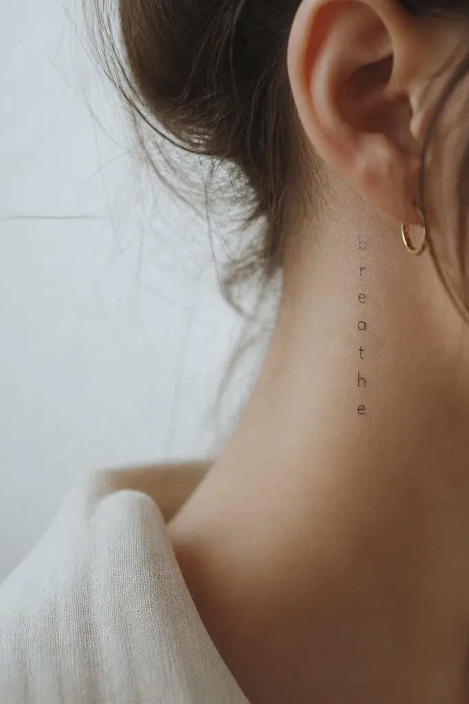
Thin script can look classy when it's restrained. No elaborate curls - just a clean word with even spacing. The dot accent gives it a focal point and helps the tattoo look finished instead of like unfinished practice lines.
Limit to one word and keep the total height around 4-5.5 cm. Place it along the inner arm seam so the letters don't tilt when you flex. Ask for the script to be drawn with consistent line weight and a slight baseline so it stays level.
Pro tipHave your artist mock up the exact script size on the skin with a stencil, then check it while your arm is slightly bent.
AvoidSkip long, looping scripts. They blur and turn into a gray ribbon.


