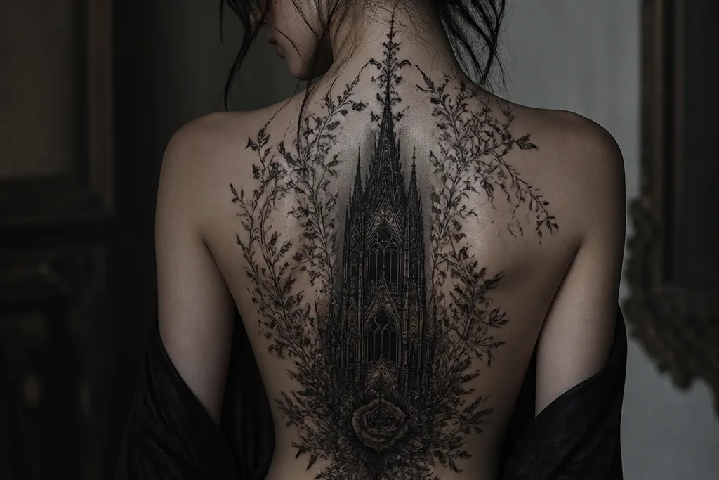

1. Cathedral Arch With Feathered Black Smoke
This works because the design is built on a simple silhouette that stays readable as your back moves. The jet-black pillars anchor the gothic look, while the feathered smoke creates the "dark detail" without relying on tiny, high-risk lines. I like it for women because the arch naturally follows the body's vertical shape and doesn't fight the shoulder angle.
Place it about 2-3 finger widths below the neck line, centered between both shoulder blades. Size it so the arch height lands around 10-14 cm - big enough for contrast, not so big you lose the fine smoky edges. Ask for a mix of solid black fills and smooth grey wash in the smoke, with a slight lighter rim just inside the arch.
Pro tipRequest a stencil with a value map: black areas blocked in first, then grey, then the soft edge highlight. It keeps the gothic contrast from turning flat.
AvoidAvoid crowding the arch with tiny skulls or micro text - it usually blurs into a dark smear on healing.
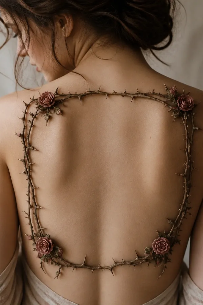
2. Gothic Rose With Thorn Shadow Halo
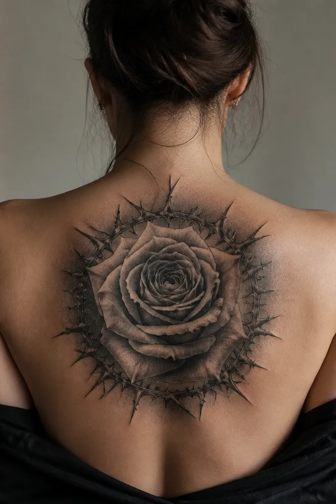
The rose gives you unmistakable gothic energy, and the thorn halo frames it so the tattoo reads like one unified image. Stippled petal shading looks great on backs because there's enough skin area for dots to fade nicely into grey. The thorn shadow halo adds depth without needing super-fine linework everywhere.
Center the rose slightly above mid-back, with the bottom of the bloom landing near the bra strap line. Keep the thorns at mid-thickness, not razor-thin, so they hold detail. Use deep black for the core petals and mid-grey for the outer petals, then soften the halo with a gradient so it looks like a shadow behind the flower.
Pro tipBring a reference that shows dark rose petals with strong contrast - avoid pale, pastel roses. Gothic roses need black-heavy shading to stay dramatic.
AvoidSkip super-thin "engraving" lines for the thorns - they heal spotty on larger fills.
3. Raven Wing Span With Black Vein Feathers
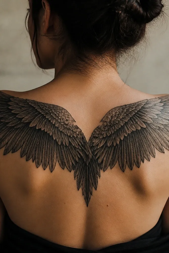
Wing tattoos look insane on a back because the body gives you a natural canvas for the curve. The "black vein feathers" detail keeps the gothic vibe sharp - it looks like the feathers have structure, not just a silhouette. I've seen this style age well because the heavy outlines and darker inner shading stay legible.
Place the center seam on the spine line, just below the shoulder blades, so the wings extend outward toward the back sides. Aim for a width that reaches near the outer shoulder line without wrapping too far onto the sides. Ask your artist to use solid black for outer feather edges and grey wash for inner veins, then add a couple of crisp highlight gaps to keep it from looking flat.
Pro tipIf you're beginner-level, choose a reference with fewer feather divisions. You'll get cleaner healing and better long-term contrast.
AvoidAvoid a full "dot-only" feather technique - it can turn into a uniform haze after a year.
4. Candle Flame Over Dagger In Negative Space
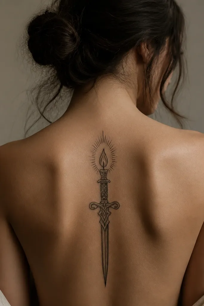
This is one of the most beginner-friendly gothic designs because it relies on strong shapes and negative space instead of tiny textures. The candle flame gives you that dark romantic mood, while the dagger keeps it sharp and gothic without needing a ton of shading. Negative space also helps the tattoo look crisp as it settles.
Place it straight down the middle of the upper back, with the flame just below the neck. Keep the dagger about 12-16 cm tall depending on your back size. Use a solid black outline and add a limited amount of grey shading inside the dagger groove so the flame doesn't get crowded.
Pro tipAsk for the flame tip to have a small highlight gap - it makes the ink look like it's burning, not just drawn.
AvoidDon't fill the whole dagger with dense black - it can heal thick and lose that gothic line clarity.
5. Clockwork Crown With Black Gears
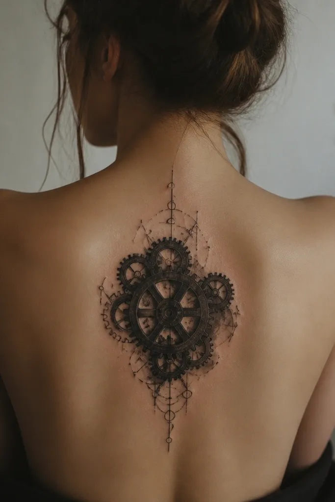
Clockwork gothic looks are popular for a reason - they're graphic, and graphic tattoos hold up well. The crown shape frames your shoulder blades, and the black gear shading gives you that "stunning dark detail" without relying on color. The mechanical vibe also reads bold even when you're not close to it.
Position the crown centered between the shoulder blades, with the widest point aligned to the upper shoulder area. Keep the gear lines thick enough to read from a distance - no hairline spokes. Use solid black for gear outer rings, then grey wash in the inner circles so it feels dimensional.
Pro tipIf you're worried about detail, pick a crown with fewer gear types and bigger circles. Bigger shapes age better.
AvoidAvoid micro numerals around the gears - they heal like a grey blur.
6. Spiral Witch Sigil With Black Ink Blooming
This style looks gothic because the spiral feels like a ritual, and the smoky blooming edges create dark movement. It's also great for beginners because you can keep the linework bold and let the shading do the drama. The key is controlled "spread" - you want it to look intentional, not blown out.
Place it mid-back, centered, with the spiral spanning roughly from bra strap level down a bit toward the upper waistband. Use a bold stencil with thick curves so your artist can add smoky bloom around the line edges. Request a limited grey halo around the spiral, not full background fill.
Pro tipAsk for a test swatch on paper or on your stencil - show your artist the exact amount of bloom you like so it doesn't turn into a blot.
AvoidDon't choose this if you hate the look of smoky edges - it's meant to be atmospheric.
7. Barbed Wire Heart With Double Black Outline
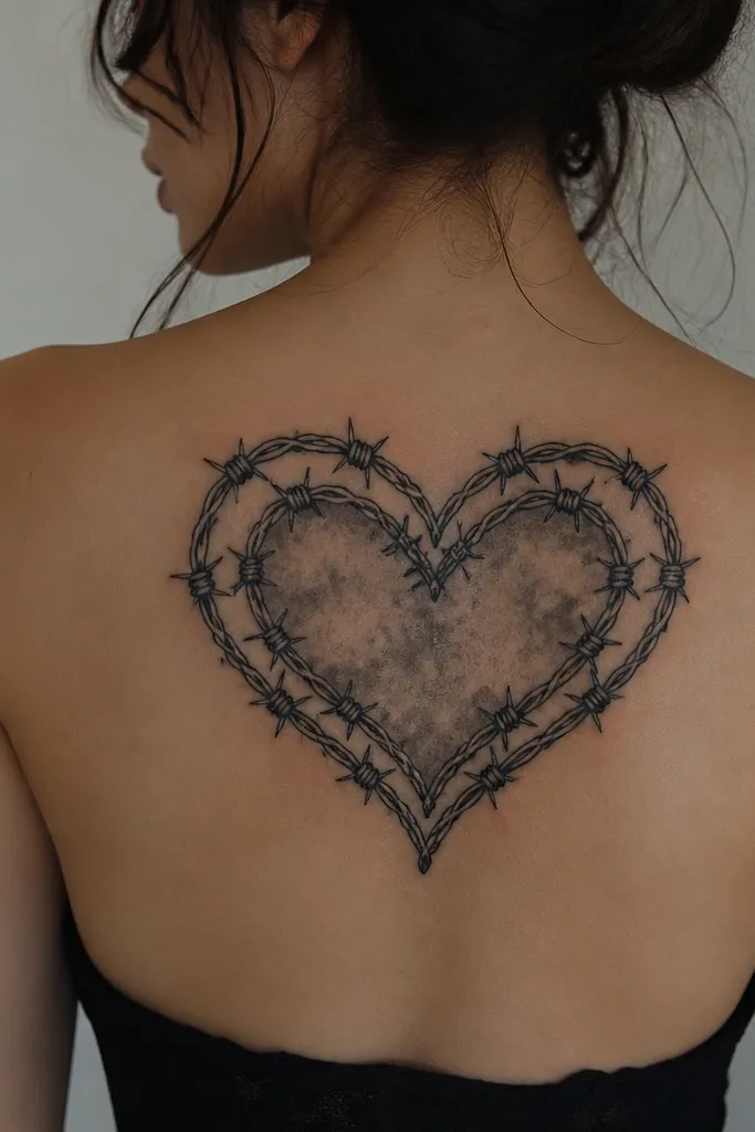
Barbed wire hearts hit that gothic romance sweet spot. The double outline keeps the piece crisp, even when the inner shading settles. The smoky fill adds depth while the wire itself stays graphic and readable.
Center the heart across the upper back between shoulder blades, with the top curves near the shoulder line. Size it so the bottom point stops above the lower spine area - you want it to sit on flatter skin. Use solid black for the wire and barbs, then grey wash inside the heart with a darker center and lighter edges.
Pro tipAsk for the barbs to be slightly thicker at the base. Thin barbs often heal with missing tips.
AvoidAvoid color fills like dark red inside the heart - it can fade unevenly and distract from the gothic black.
8. Vine-Thorn Frame With Hidden Roselets
Frames look polished on backs because they create structure. The negative center makes your skin act like part of the design, which helps the fine vine details read clearly. Small roselets add gothic sweetness without forcing you into a huge rose piece.
Place the frame starting just below the shoulder blades and ending around the mid-back. Keep vines thick enough to survive healing - think medium line weight. Use solid black thorns and vines, then add tiny roselets with stipple shading so they pop against the negative center.
Pro tipChoose a frame reference that leaves plenty of open skin area. The open space is what keeps it classy, not messy.
AvoidDon't fill the center with extra symbols. Frames look best when they have one job: framing.
9. Noose-Like Chain Across Shoulder Blades
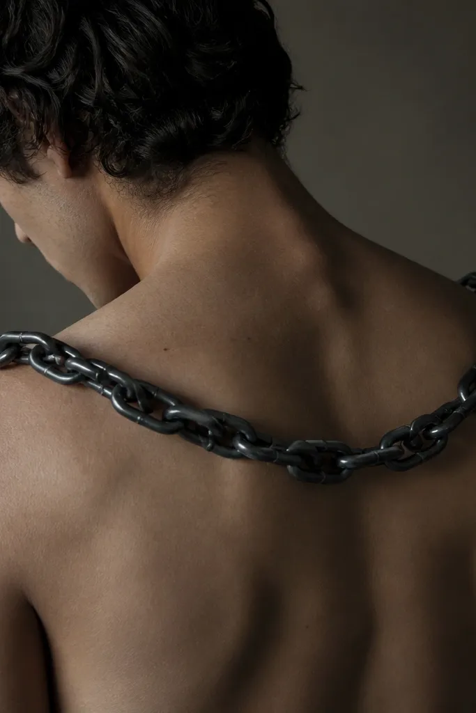
A chain across the shoulder blades looks dramatic because it follows your natural movement lines. The dark link shading gives it weight, and the slight highlight edges keep it from looking like a flat black band. This design looks especially good on women because the chain sits cleanly between shoulder width and doesn't fight the spine curve.
Start the chain near one shoulder blade edge and let it drape toward the opposite side, with the midpoint hovering over the spine line. Keep the chain thickness consistent and use grey wash inside the links for depth. If you want more gothic detail, add a small knot or clasp at the center with solid black fill.
Pro tipAsk for a couple of thin highlight breaks on the chain edges. Those tiny gaps keep it from healing muddy.
AvoidSkip ultra-detailed micro links. They usually blur into one dark strip.
10. Grim Reaper Mantle Silhouette With Charcoal Shading
A silhouette mantle tattoo reads strong even from far away, and the charcoal gradients give gothic depth without needing tiny details. I like this for beginners who want a bigger piece but don't want to risk delicate linework. The solid black edge framing makes the shape stay crisp as it heals.
Place the reaper so the hood sits between shoulder blades and the mantle spreads toward the mid-back. Keep the silhouette proportions tall and clean - don't squeeze the figure into a wide, flat oval. Use charcoal grey gradients on the mantle folds with solid black outlines, then add a single darker fold line for contrast.
Pro tipBring reference showing strong contrast between outline and interior shading. If the reference is too flat, your tattoo will heal flat too.
AvoidAvoid adding lots of tiny skulls or bones inside the mantle. Keep the interior simple.
11. Moon Phase Medallion With Black Dust Background
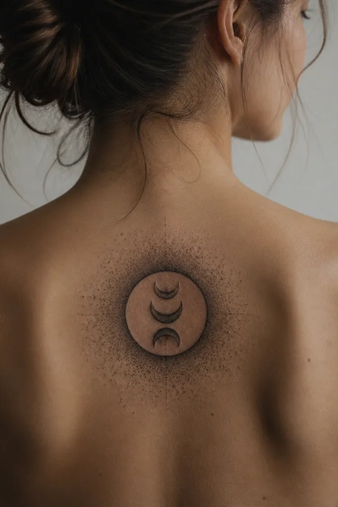
Moon phase tattoos look gothic when the medallion is clean and the background is smoky. The stacked crescents give you a strong graphic center, and the black dust halo adds texture without clutter. This also ages well because the center shapes stay bold while the outer dust softens over time.
Center it between shoulder blades, with the circle about the size of a grapefruit on your skin surface. Use solid black for the crescent edges, then grey wash for the inner shading. For the dust background, ask for controlled speckling that fades before it hits the next detail element.
Pro tipChoose a medallion reference with thick crescent edges. Thin crescents disappear as the tattoo settles.
AvoidDon't fill the entire back with dust. Keep it as a halo so the medallion stays the focus.
12. Owl Of Midnight With Dark Stipple Feathers
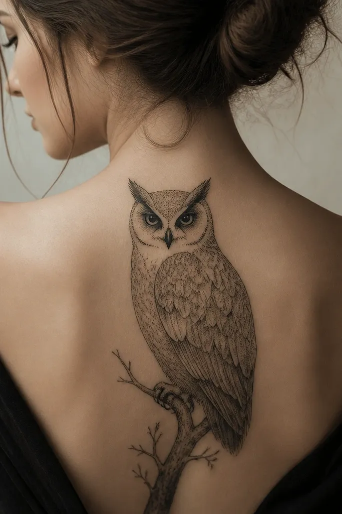
Owls look striking on the back because you can build a face focus with surrounding feather shapes. Dark stipple gives you that gothic texture without needing lots of linework. The key is keeping the eyes and beak in solid black so the design has a clear focal point.
Place the owl so its head sits around the upper shoulder blades and the body spreads down toward mid-back. Use solid black for eye patches and beak, then stipple and grey wash for feather areas. Keep the background minimal - a faint smoky vignette works better than full black fill.
Pro tipAsk your artist to test your stencil with the eyes first. If the eyes are off-center, the whole tattoo reads wrong.
AvoidAvoid tiny feather lines around the wings. Stipple is safer than hairline detailing.