
1. Outer Bicep Moon With Tiny Star Burst
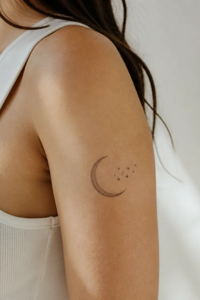
This works because the moon shape gives you a clear silhouette that stays readable as it heals. The tiny stars add motion without forcing heavy fill time. Blackwork on Black skin holds contrast well when the lines are thick enough and the dots are spaced so they don't merge.
Place the crescent so its tips point toward the elbow, not the shoulder. Keep the moon about 4 to 5 inches wide on the outer bicep bulge and let the star burst take the remaining space up toward the shoulder seam. If you're doing couples matching, have both of you use the same moon style but different star counts.
Pro tipAsk for a slightly thicker outline on the moon and thinner dot stars so the eye reads it instantly in photos.
AvoidAvoid super tiny star dots packed too tightly - they blur into one gray patch.
2. Matching Two-Line Script Coordinates (No Cursive Mess)
This is budget-friendly because it's mostly straight, consistent strokes - less time for the artist than heavy shading. Coordinates or a short phrase looks sharp when it's legible from a few feet away. On darker skin, black ink script stays bold if the strokes are not overly thin.
Keep the text block narrow, about 1.5 inches wide, and centered along the outer bicep. Write it with a simple font style the artist can stencil cleanly, not looping cursive. For couples, match the placement and font but swap the numbers.
Pro tipChoose coordinates that fit within 2 lines max - anything longer starts to crowd and heal uneven.
AvoidSkip super thin cursive with lots of hair-like loops - it turns soft after healing.
3. Single Rosebud With Black Vein Leaves
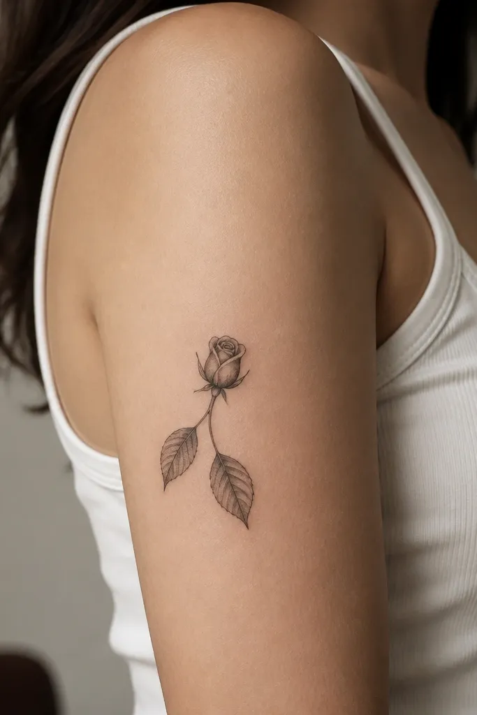
A rosebud is classic, but the budget version is all about restraint. Crisp leaf veins give texture without filling time, and the rose can be done with light black shading that still reads. The contrast of dark leaves against the lighter rose shading looks strong on Black skin.
Size it around 3.5 to 4 inches tall so it sits neatly on the outer upper arm. Place the rose at the top third near the shoulder seam, with leaves pointing toward the midpoint of your arm. For couples, each person can get the same rosebud but different leaf count, like 2 leaves for one and 3 for the other.
Pro tipAsk for a "black gradient" on the rose that starts heavier at the base and fades toward the petals.
AvoidDon't add too many tiny thorns - they turn into a fuzzy outline.
4. Bicep Band of Micro Stars and a Center Dot
This design flatters the upper arm curve because it wraps visually without needing to wrap physically far. Micro stars look clean when they're consistent in size and the spacing is even. The center dot anchors the whole tattoo so it doesn't look like scattered filler.
Measure your outer bicep width while your arm is relaxed, then set the band to match it - usually 3.5 to 4.5 inches long. Keep it in the outer half of your arm so it doesn't creep onto the inner bicep. Couples can match the band but swap center dot details, like a dot for one and a tiny star for the other.
Pro tipHave the artist use a stencil guide so the band stays level when you flex.
AvoidAvoid uneven star sizes - random spacing reads sloppy after healing.
5. Teardrop Heart Outline With Bold Fill Accent
Heart tattoos look expensive when the artist uses negative space correctly. This one uses a clean outline and a single bold fill area so you get contrast without a full fill job. On Black skin, the negative space stays crisp and the dark fill holds strong.
Place the widest part of the teardrop near the bicep bulge. Keep the heart about 3 inches tall and 2.25 inches wide for a budget-friendly session. For couples, mirror it - one gets the fill on the left, the other gets it on the right.
Pro tipAsk for the highlight gap - it makes the heart look glossy and intentional.
AvoidSkip full solid hearts if you're budget-limited; they can look flat and heavy.
6. Infinity Loop With Two Tiny Names in Block Letters
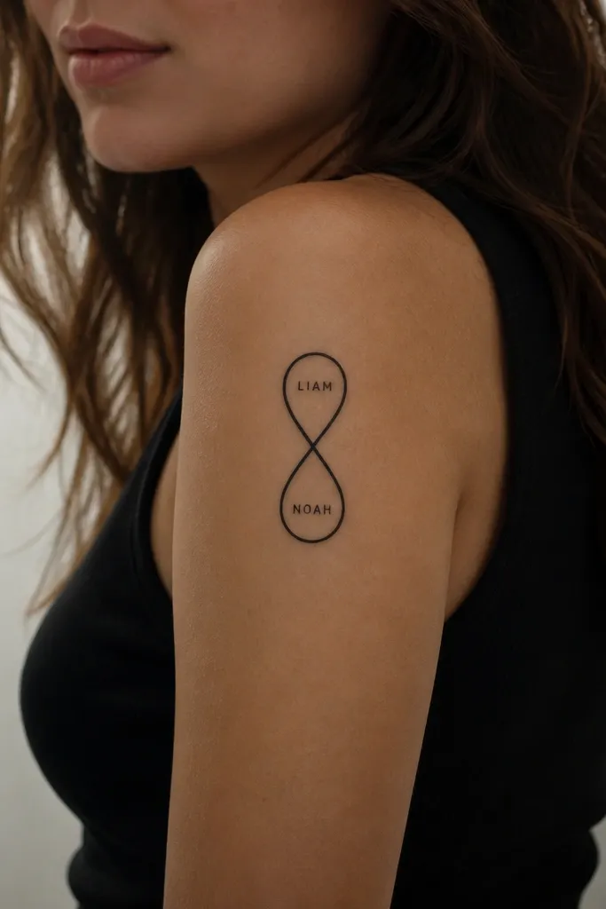
Infinity symbols are easy to size and easy to match. Block letters heal better than delicate cursive because the stroke widths stay consistent. This gives you a couples tattoo that feels personal without paying for color packing or complex shading.
Use a vertical infinity about 4 inches tall, with the names in tiny caps that fit inside each loop. Keep the letters big enough to read at arm's length, not microscopic. Couples should match the layout but use different names, or swap the order of the names if you want a subtle twist.
Pro tipBring the exact spellings printed in the font you want so the artist doesn't freestyle the letter shapes.
AvoidAvoid letter sizes smaller than a grain of rice - they fade into the background.
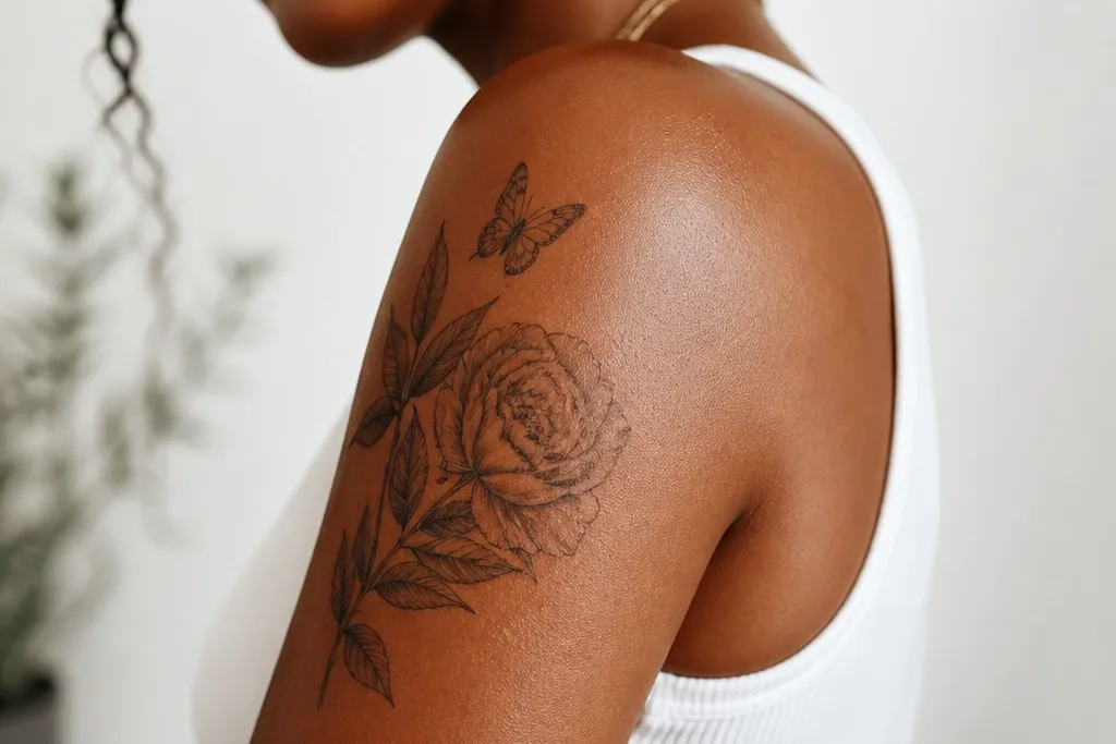
7. Linework Butterfly With One Teal Wing Spot
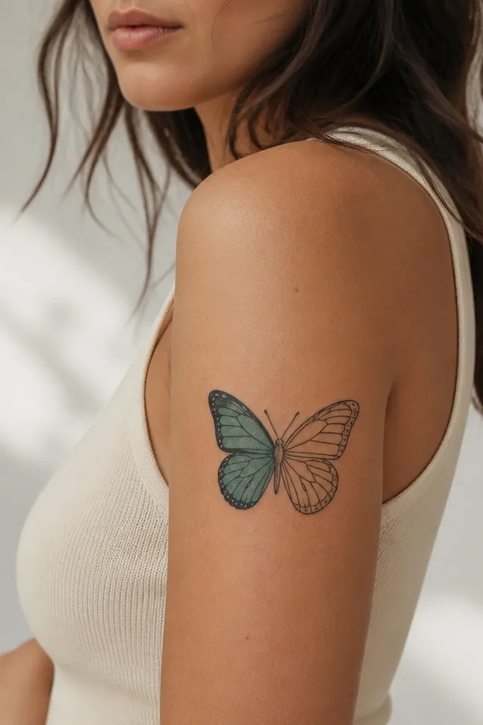
A butterfly reads clearly even when it's small because the silhouette is recognizable. Adding one teal wing spot gives you color payoff without turning the whole tattoo into a long, expensive color session. Teal tends to heal with good contrast against Black skin when it's applied as a controlled shape, not a full spray.
Size it 3.5 to 4 inches across so it fits the outer upper arm without wrapping. Place the body near the midpoint between shoulder and elbow, with wings angled slightly upward. Couples can share the same butterfly outline but each person chooses a different color spot like teal and burgundy.
Pro tipAsk the artist to blend the teal edge into the black outline with a soft boundary, not a hard sticker edge.
AvoidSkip lots of micro color dots - they blur and turn muddy.
8. Arching Laurel Branch With Tiny Berry Dots
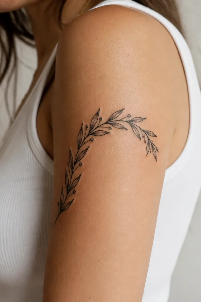
Laurel branches look "high effort" because of the repeating leaf pattern, but they're time-efficient when the leaves are consistent. The berry dots add a finishing detail that reads from a distance. Blackwork dot shading also ages well when the dots are spaced and not packed too tightly.
Place the curve so one end sits near the shoulder seam and the other end points toward the outer arm midpoint. Keep the whole piece about 5 inches long so it doesn't take over the arm. Couples can match the laurel layout but change the number of berry dots - it keeps it personal.
Pro tipHave the artist use a stencil with leaf direction markers so the leaves don't flip as they go.
AvoidAvoid random leaf sizes - it makes the branch look like clip-art.
9. Simple Crossed Keys Icon (One Person Gets the Bow)
Keys are a couples-friendly symbol because they're naturally paired. This design stays budget-friendly because it has bold outlines and minimal shading. The ribbon bow gives one person a unique detail while still matching the overall idea.
Keep the keys about 4 inches long each, crossed at the center of the outer bicep. Position them so the teeth point slightly toward the elbow. For matching, both people get the same crossed keys but only one gets the ribbon bow.
Pro tipAsk for rounded edges on the key heads; sharp corners can heal rougher on the upper arm.
AvoidSkip heavy metallic-style shading; it takes longer and can look gray instead of crisp.
10. Handwritten "Us" Banner in Thick Outline
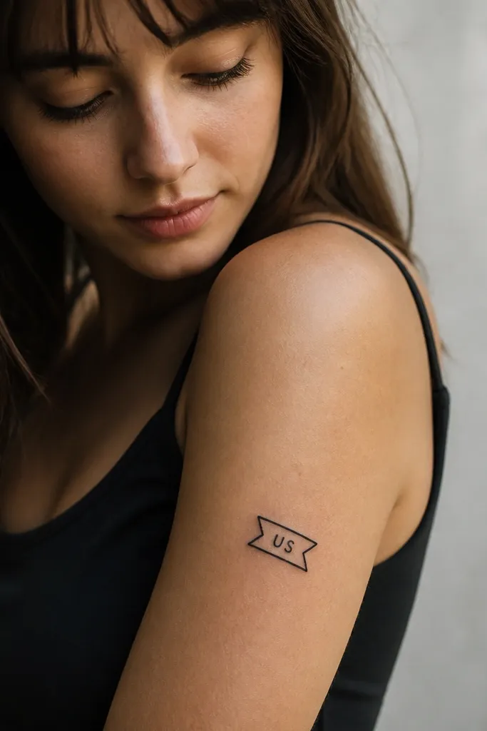
Thick outlines make text tattoos look clean after healing. The banner shape frames the word so even if the letters soften slightly, the overall design still reads. This works well for couples because it's simple to match and easy to personalize with a second line.
Put the banner diagonally from the outer shoulder area down toward the bicep bulge, about 3 inches wide. Add a second line for one partner, like a date in smaller block letters. Use a stencil with thick strokes only - no thin hairline edges.
Pro tipChoose "US" or "ME+YOU" over long phrases so the letters don't crowd.
AvoidDon't use thin, fancy script - the banner outline will look sharp while the letters fade.
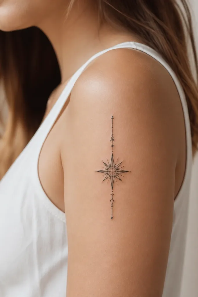
11. Sunburst Halo With Minimal Rays
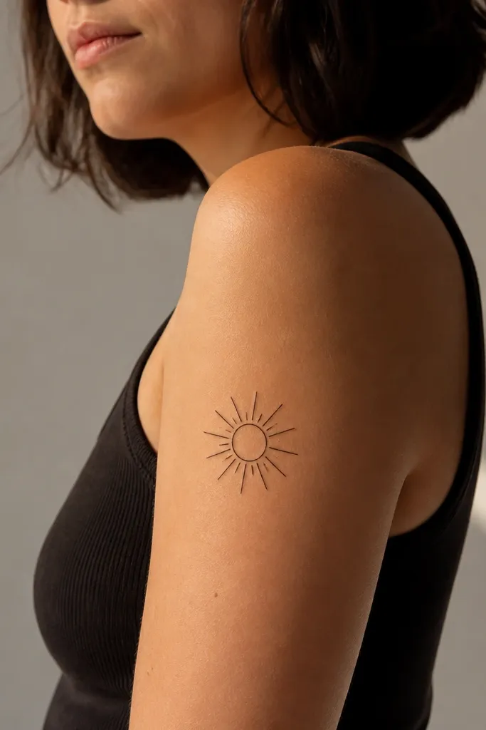
Minimal rays keep it budget-friendly and make it easier for the artist to keep symmetry. The center circle anchors the design so it doesn't look like a random splash of lines. On Black skin, black rays hold contrast well without needing shading.
Place the center circle at about the midpoint of the outer bicep bulge. Keep the overall size around 3.5 to 4 inches across. For couples, one person gets the halo rays longer and the other gets shorter rays, same placement.
Pro tipAsk for clean ray spacing - uneven rays are what make sunburst tattoos look cheap.
AvoidSkip lots of tiny rays - they merge into a gray halo.
12. Two Matching Line Portrait Silhouettes (Side Profile)
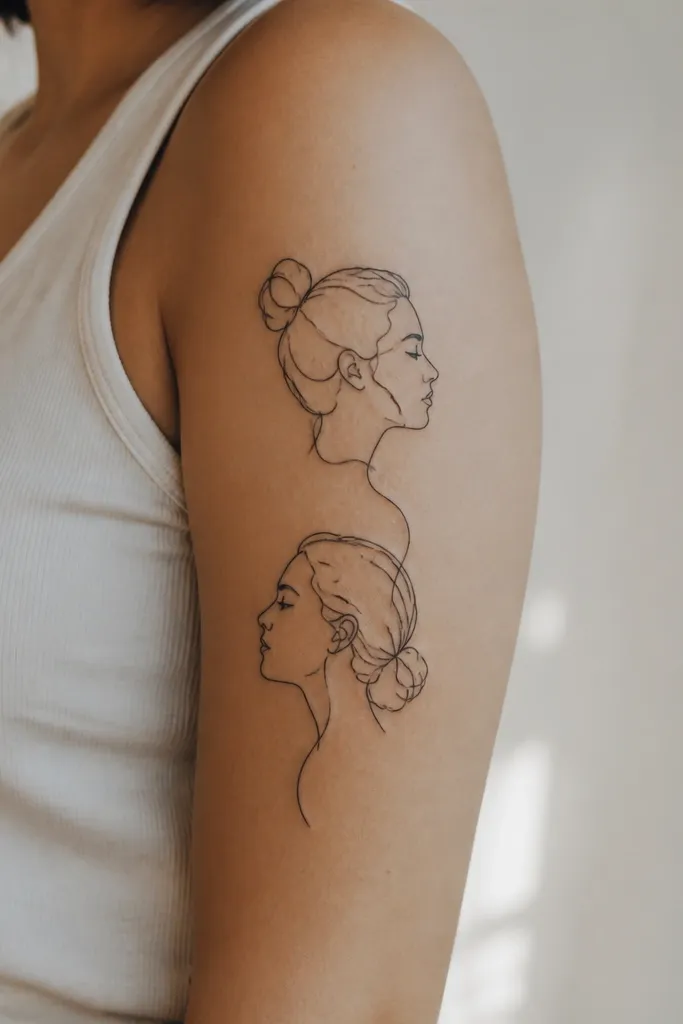
A single-line portrait style can look stunning without heavy shading. The key is choosing a side profile that uses strong outlines and avoids tiny facial features. Couples matching works because the shared line style makes it feel like one set even if the faces differ.
Keep the portrait height 4 to 4.5 inches so it fits the upper arm without stretching across the entire bicep. Place it vertically so the jawline sits near the bicep bulge. For couples, use the same line weight and same background accent line, like a small arc behind the head.
Pro tipBring reference photos taken in the same lighting and angle so the artist can match the line style accurately.
AvoidAvoid adding tiny eyelashes and pores; they blur and disappear.