
1. Outer Bicep Rose + Dotwork Halo Half Sleeve
This layout works because the rose gives you a clear focal point and the dotwork halo creates a visual frame that follows your arm's curve. The dotwork also hides the awkward "in-between" stage when one section is healed and the rest is still fresh. I've seen this combo look sharp even when the linework is thin, because the dots give texture without forcing heavy shading everywhere.
Have your artist place the rose slightly higher than mid-bicep so it doesn't end up too low when your arm relaxes. Ask for a halo that reaches toward the deltoid but stops before the inner arm, keeping it readable as a half sleeve. Keep the filler minimal - a few micro stars or leaf tips, not a full scatter.
Pro tipBring one photo of your arm with your hand up so the rose angle matches your natural curve.
AvoidAvoid a halo that's too dense; it turns into a gray smudge after healing.
2. Watercolor Wash Peony with Black Outline Band
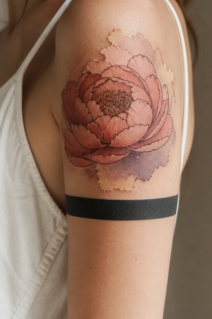
Peonies look gorgeous on the upper arm because the petal shapes can bend with your anatomy. The black outline keeps the watercolor from looking fuzzy as it heals, and the cuff band gives you a "finished" boundary even if you only get half the sleeve at first. I like this for women who want color but still want structure.
Choose a limited palette: coral pink, dusty rose, and a pale cream highlight. Ask for the watercolor to stay mostly inside the black outlines, with only small bleed-outs into the negative space. The cuff band should be about 1.5 to 2.5 cm wide on the outer arm, centered around mid-bicep.
Pro tipAsk for a test stencil placement on your skin for 10 minutes. Watercolor looks different depending on how your skin texture sits under the stencil.
AvoidAvoid pure neon colors; they fade unevenly and the peony can end up looking patchy.
3. Geometric Hexagon Panel with Thin-Line Florals
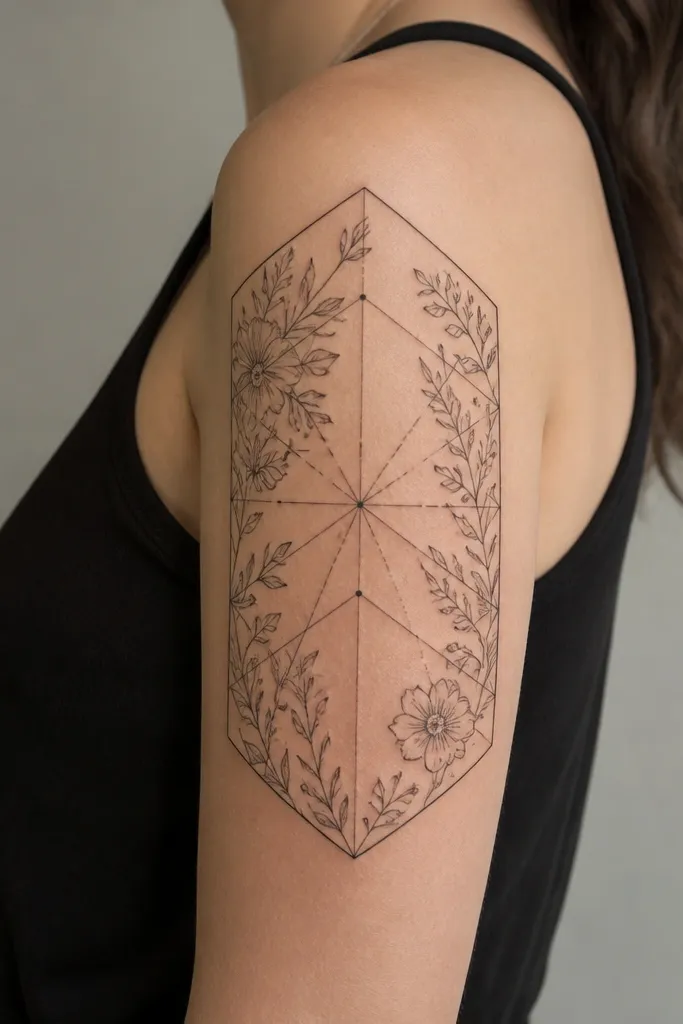
This is one of the cleanest options for Upper Arm Tattoos For Women beginner because geometry forces spacing. The thin-line florals soften the hard edges without adding heavy shading that's hard to place. The big hexagon also reads well from across a room because it creates a strong silhouette.
Have the main hexagon start near the top of the deltoid and end around mid-bicep. Keep the florals at the border only - like small sprigs at the corners - so the panel stays the star. For best healing, request consistent line weight on both the geometry and the florals.
Pro tipIf you're worried about line blur, pick thinner linework but fewer elements. One strong panel beats five small attempts.
AvoidAvoid crowded micro-details inside the hexagon; it turns into a dark mesh.
4. Feather + Moon Phases Upper Arm Half Sleeve
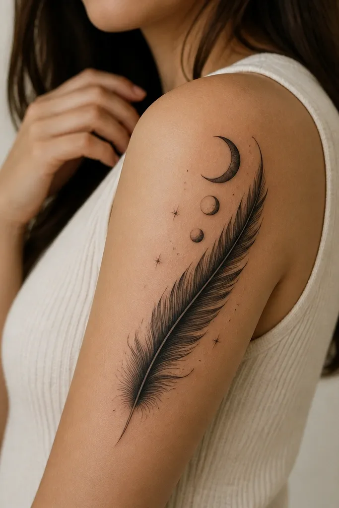
The feather gives you motion, and the moon phases add rhythm. This works especially well for beginner placement because the design naturally follows a diagonal path that flatters most upper arms. I've found that moon phases also age nicely because they're mostly outlines with clear shapes, not heavy gradients.
Place the feather's shaft along the outer arm curve, starting near the shoulder and ending around mid-bicep. Put the moon phases in a vertical mini-stack near the top third, not across the entire arm, so it doesn't feel scattered. Ask for light stipple shading at the feather base only, so the texture doesn't turn muddy.
Pro tipIf you want it to look more "half sleeve," ask for a small black band shadow under the feather tip to anchor the bottom edge.
AvoidAvoid a feather that's all solid black; it hides the barbs and looks flat after healing.
5. Mandala Half Sleeve with Negative-Space Sunburst
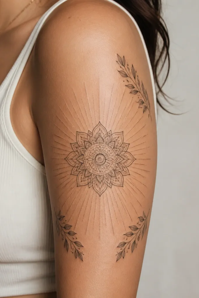
Mandala tattoos look stunning on the upper arm because the symmetry frames your arm shape. The negative-space sunburst keeps the design airy and makes the mandala pop without heavy graywork. I like this for people who want a "statement" without deep shading that takes longer to heal.
Center the mandala so its top petal sits just below the deltoid bump, then extend the sunburst lines to the shoulder area. Keep leaf clusters small and at four points only. Request a clean dot-to-line transition so the outer edges don't get too thick.
Pro tipChoose one mandala size that fits your arm width at rest. If it's too wide, it will wrap awkwardly onto the inner arm later.
AvoidAvoid filling every gap with dots; the whole piece becomes visually heavy.
6. Blackwork Botanical Half Sleeve with Stipple Shading
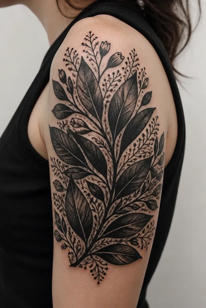
Blackwork botanicals look bold and clean on women's upper arms because leaves naturally layer without needing realistic color. Stipple shading gives depth without the "waxy" look of heavy gray gradients. This is a great Upper Arm Tattoos For Women beginner option if you want something that heals strong and stays readable over time.
Ask for three leaf sizes: one large outer leaf, one mid leaf that overlaps, and one small bud cluster near the bottom. Keep the shading mostly inside leaf shapes, not across the whole arm, so the edges stay crisp. The outer border should be a simple leaf outline - that gives you a clean half-sleeve boundary.
Pro tipIf you bruise easily, ask for the artist to do the densest stippling in one session and save lighter line segments for later.
AvoidAvoid super-thin outlines around thick black leaves; the outline can disappear first and the leaves look unfinished.
7. Japanese-Style Wave Band with Small Cherry Blossoms
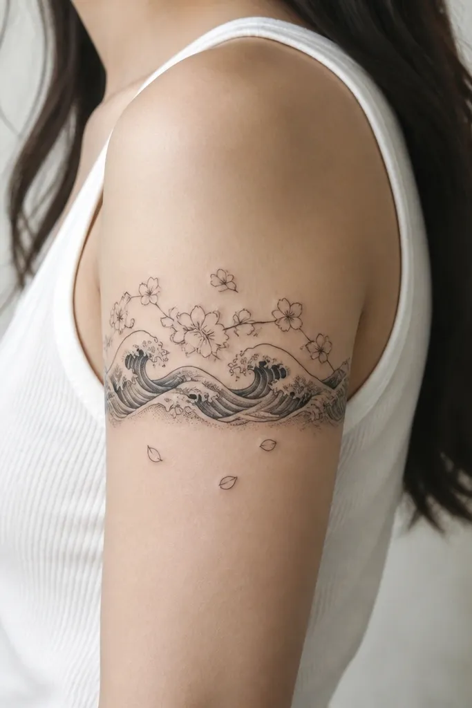
This design looks intentional because it uses a band format that matches how shirts and sleeves sit. The wave band reads instantly, and the cherry blossoms keep it feminine without turning into a full busy sleeve. I've done this placement with clients who wanted something that's easy to cover with work clothes and still looks great in summer.
Have the wave band sit around mid-to-upper bicep, roughly where a short sleeve seam hits. Keep the blossoms concentrated above the band on the outer arm, not wrapped fully around. Ask for wave shading to stay mostly at crest highlights, so the gray doesn't blur into a gray blob.
Pro tipBring a photo of the tattoo area with your arm at 90 degrees. The band should stay level, not tilt.
AvoidAvoid placing the wave band too low; it will compete with the elbow area and shorten the half sleeve visually.
8. Script Nameplate with Ornate Corner Flourishes
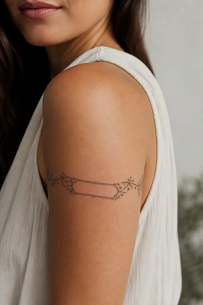
Text tattoos can look classy on the upper arm when you treat them like design, not just letters. The corner flourishes give the piece structure and make the placement look planned. I like pairing script with dotwork accents because it breaks up the empty space without adding a lot of time.
Choose a script size that fits the outer arm width at rest. Keep the nameplate idea tight - about the width of two to three fingers on average - so the letters don't stretch. Flourishes should sit at the top and bottom corners only, leaving the center readable.
Pro tipAsk your artist to do letter spacing on your skin with the stencil, then check it in a mirror from two angles before tattooing.
AvoidAvoid super thin script; it fades into a gray line and reads wrong.
9. Small Sleeve-Ready Animal Portrait with Surrounding Stars
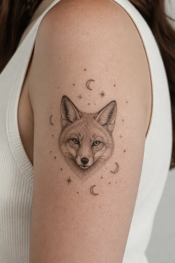
A portrait on the upper arm works because you can keep it compact and still make it feel like a half sleeve when you add a star field. The stars act like filler that's easy to extend in later sessions. I've seen this style look best when the portrait is shaded lightly but the eyes stay crisp.
Place the portrait on the outer bicep, with the head angled slightly toward the shoulder. Keep star sizes small and varied - not all the same. If you plan multiple sessions, ask for the portrait first, then build the stars and moons around it as the "later layer."
Pro tipGet the artist to show you a healed photo of a similar black-and-gray portrait on skin tone close to yours.
AvoidAvoid adding heavy gray fur texture across the whole arm; it turns into a flat gray patch.
10. Fine-Line Birds in Flight with Continuous Line Frame
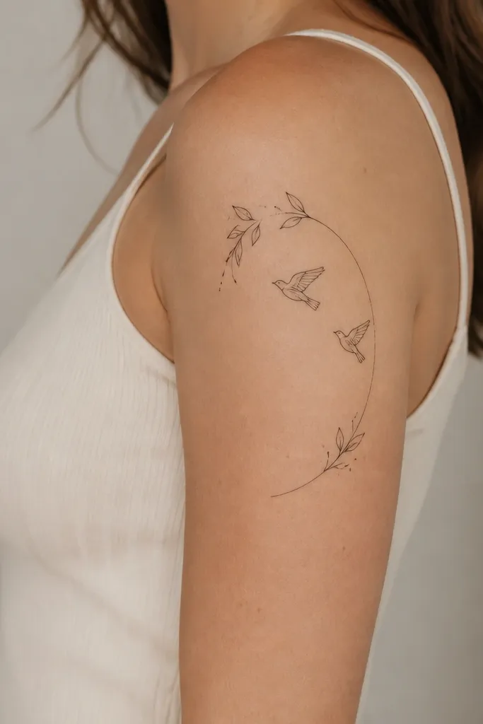
Fine-line birds look great on the upper arm because the motion goes with the arm's curve. The continuous line frame makes it feel like a set, not random elements. I like this for beginners who want a lighter tattoo that still feels intentional and easy to place.
Keep the birds small enough to avoid crowding near the elbow. The continuous line frame should start near the shoulder and arc to mid-bicep, leaving breathing room between the frame and the birds. Add micro dots only at the frame ends so the tattoo stays crisp.
Pro tipChoose a placement slightly higher than you think. Fine-line tattoos settle and can look lower after swelling and healing.
AvoidAvoid thickening the lines during the session; it makes the fine-line style look inconsistent.
11. Tribal-Inspired Outer Arm Panel with Shield Motif
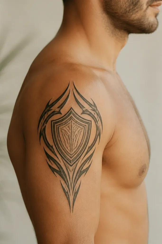
A shield motif is a beginner-friendly "half sleeve" because it gives you a clear shape to build around. The bold outer panel reads from far away, and the clean center keeps it from looking like a full patch. I've found this style ages well when you keep edges crisp and avoid heavy clutter inside the shield.
Place the shield emblem so its top sits near the deltoid and the bottom lands around mid-bicep. The tribal panel should taper - thick at the outer edge, thinner as it approaches the inner border. Ask for sharp corners where the lines meet, not rounded smears.
Pro tipIf you want it more feminine, ask for a slight curve to the shield outline and include one small floral dot cluster near the top edge.
AvoidAvoid turning it into a full blackout tribal; it can make your arm look smaller and heavier.
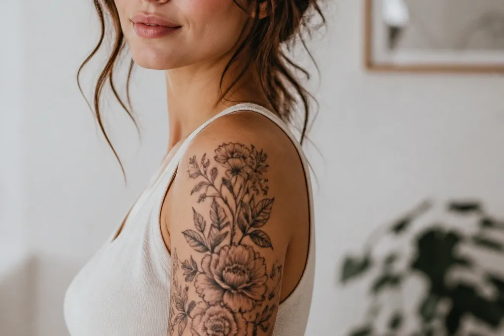
12. Half Sleeve Floral Ladder with Vertical Stem
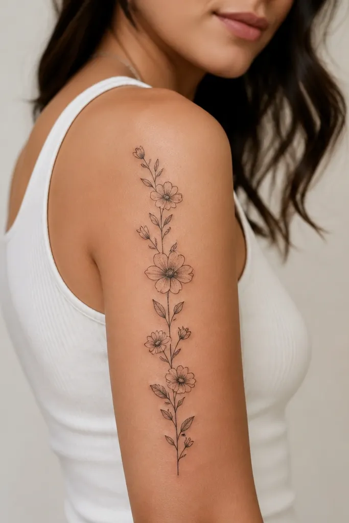
This design is a lifesaver for beginners because the vertical stem anchors everything. Your brain reads it as one path, so even if each flower is slightly different, the overall sleeve still feels planned. I like it for women who want a feminine look without going full realism or watercolor.
Ask for a stem width around the thickness of a standard marker line on your skin, not super thick. Place the largest flower around the upper third, then step down to medium and small blooms toward mid-bicep. Keep the leaves angled outward so they follow the arm's outer curve.
Pro tipBring a list of your top two flower choices. Pick one main flower and let the other be accents, or the ladder looks busy.
AvoidAvoid mixing too many flower styles with different line weights; it looks like separate tattoos stitched together.