1. Moon Phase + Tiny Star Arc
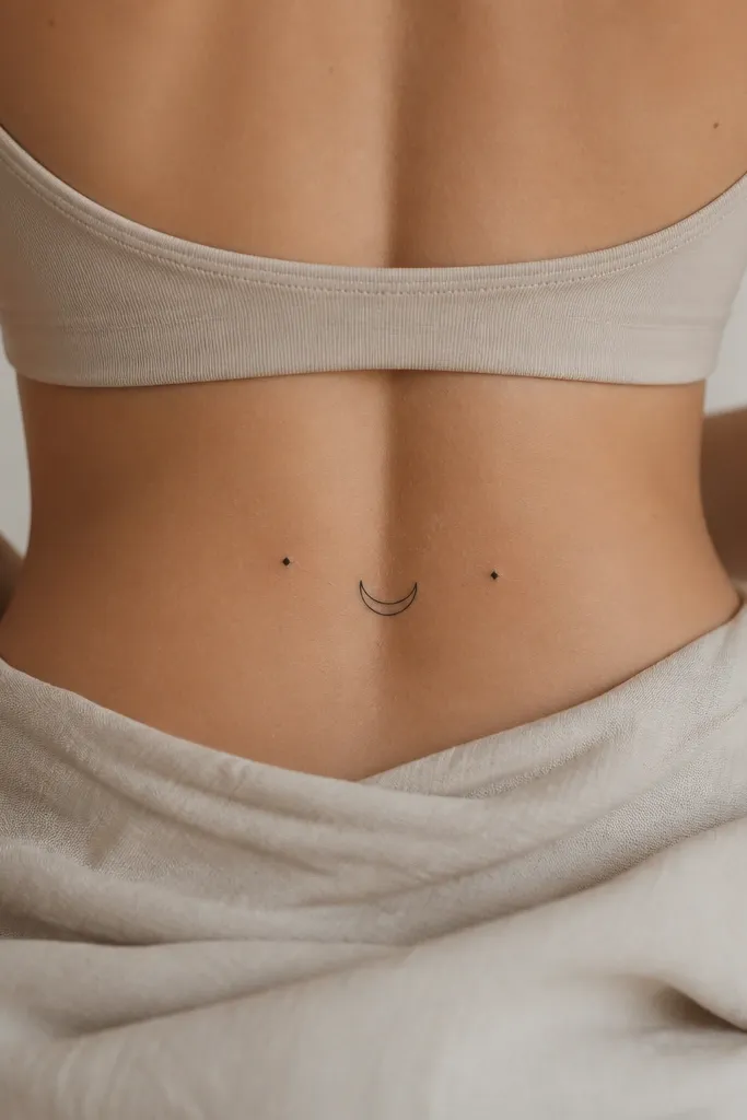
This works because the moon shape naturally follows the curve of the lower back. The tiny stars keep the tattoo airy, so it doesn't feel heavy under leggings or a tight dress. Fine-line black ink looks clean even when the area moves a lot during the day.
Ask for the crescent to be about 2 inches wide, then place the arc so the moon points slightly toward the spine. Keep the stars small - around 1.5 mm dot size - and space them evenly. It suits a matching couple where one partner has the full moon and the other has the crescent.
Pro tipBring a bra you actually wear to the consult and have the artist place the stencil with you standing, not lying down.
AvoidDon't add thick shading behind the moon if you want it to stay crisp - packed black on the lower back bruises more during healing.
2. Script Coordinates Along the Spine
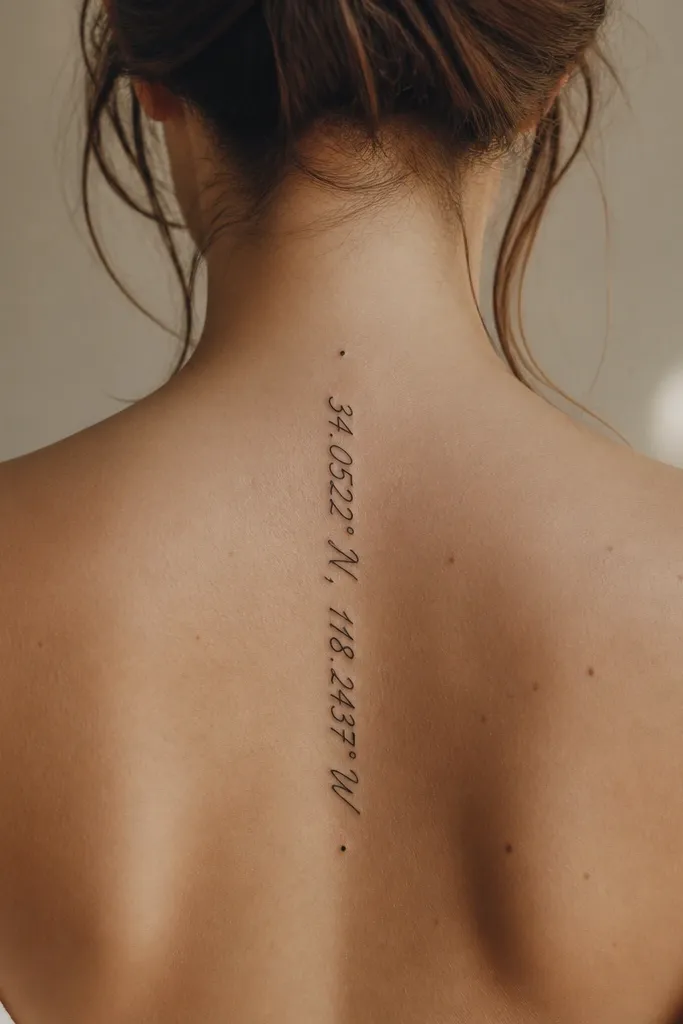
Text looks best here when it's small and centered, because the spine gives you a built-in alignment guide. Coordinates feel personal without needing a big graphic. Thin script also hides well on days you wear high-waisted bottoms.
Use 6-10 characters total so the letters don't spread out. Keep the text length under 3.5 inches. Have the artist make the stencil, then rotate it 2-3 degrees to match your natural posture curve.
Pro tipPick a font with consistent stroke thickness - thin hairlines fade faster than you expect.
AvoidAvoid all-caps calligraphy with ultra-thin strokes; it turns into a gray blur on healed skin.
3. Interlocking Hearts in Negative Space
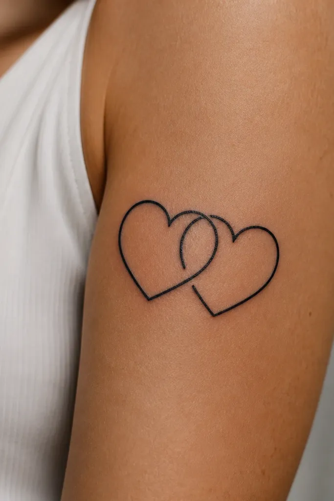
Negative space makes this look sharper and more expensive than a fully filled heart. It also gives the tattoo room to "breathe" as your skin stretches. The outline stays bold while the center gap keeps it light.
Ask for hearts about 2.25 inches tall each, with the interlock touching at the top lobes. Keep the outlines around 2-3 mm thick. For couples, give each partner the same interlock but mirror left/right so the pair sits symmetrically on two different bodies.
Pro tipHave your artist test the design under warm bathroom lighting - it reveals if the lines are too thin for your skin tone.
AvoidDon't fill both hearts solid black if you're budget-limited; it increases healing irritation and can blur edges.
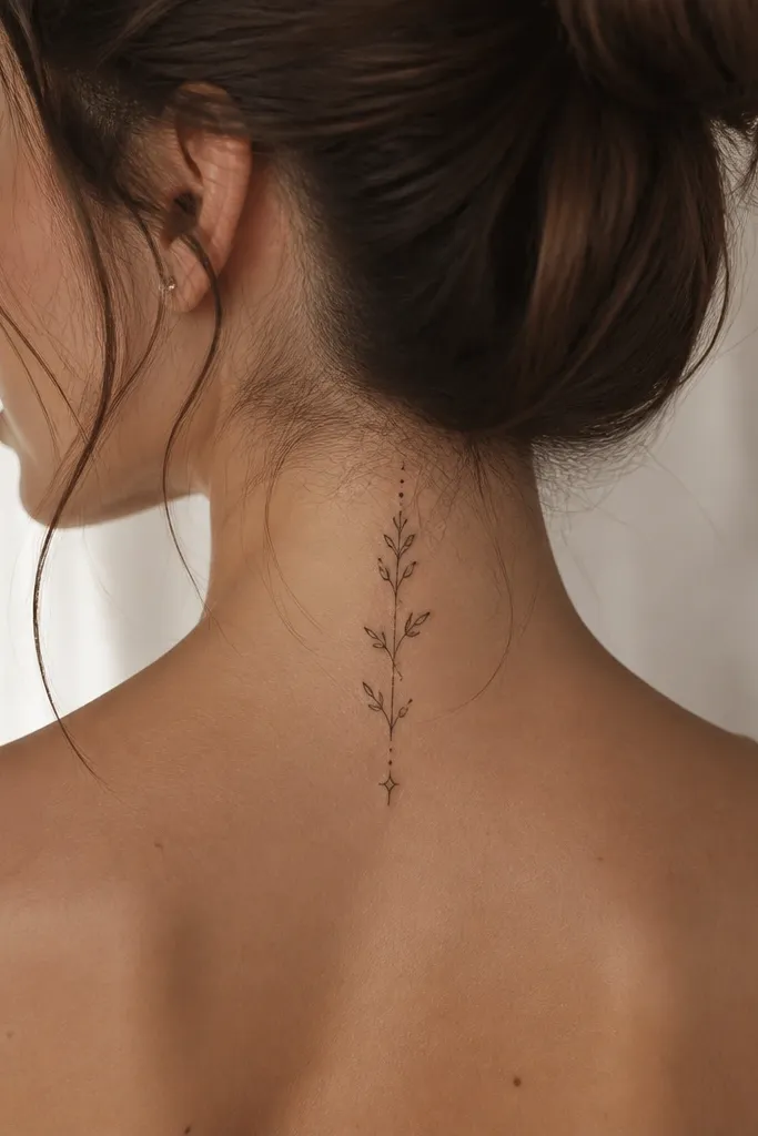
4. Botanical Branch with Two Mini Leaves
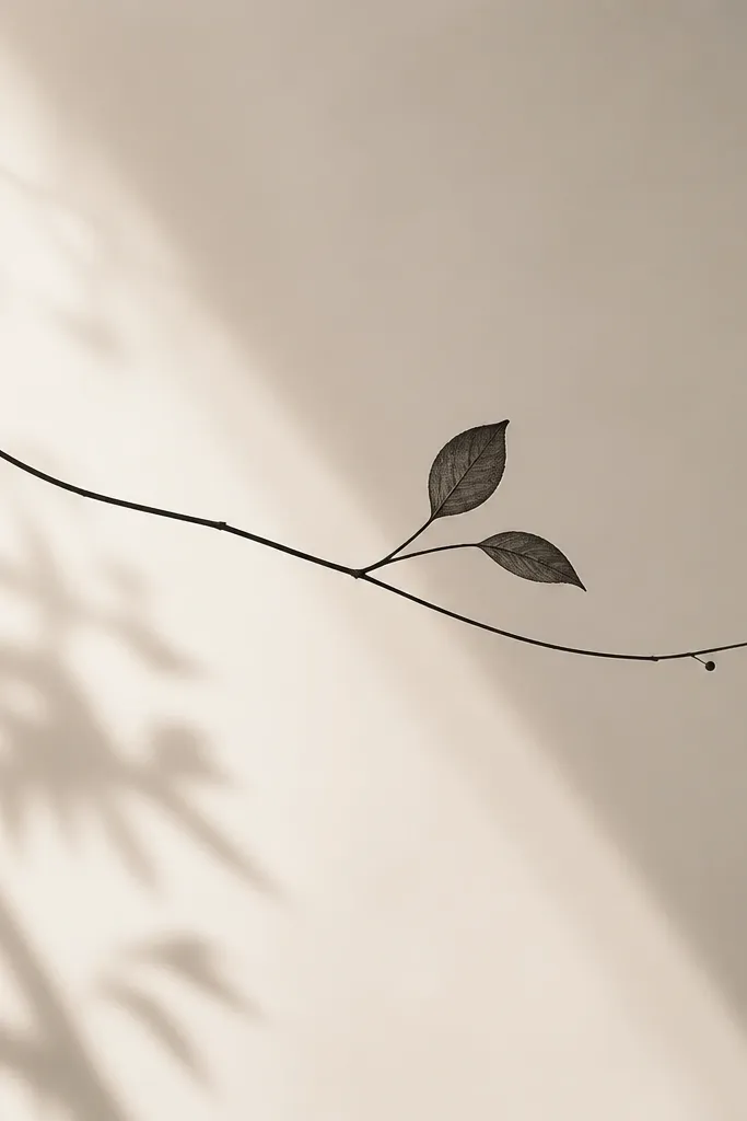
Botanical linework flatters the lower back because it follows the natural sideways curve. Two leaves keep it minimal but still "styled," especially with small dot accents. This design looks good in both fine line and slightly bold blackwork depending on your pain tolerance.
Keep the branch length around 4 inches. Place the leaves so one sits closer to the spine and the other closer to the hip bone. If you want a couple set, use the same branch but change leaf type - one partner gets eucalyptus-like leaves, the other gets a tiny rosebud outline.
Pro tipChoose healed-look stability: ask for leaf lines to be at least 1.5 mm thick.
AvoidAvoid super tiny leaf veins; they disappear first during healing.
5. Feather Quill with a Micro Dot Ombre
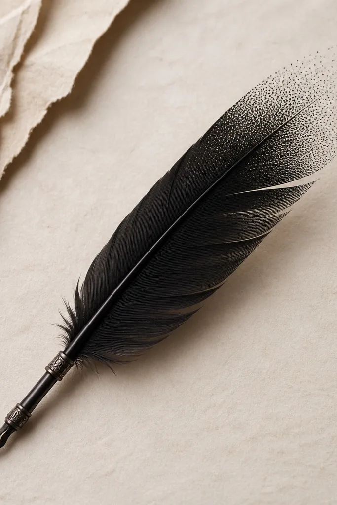
Feathers look classy on the lower back because they elongate the area and create movement. The micro dot ombre gives depth without the mess of heavy shading. It also ages better than solid black blocks because the dotwork breaks up potential fading.
Ask for the feather to be 4-5 inches long, with the tip ending around the midline of your waistband. Keep barbs thin and spaced. For couples, do the same feather but rotate each one so it points toward each person's spine.
Pro tipIf you hate pain, request a lighter hand on the barbs and a slightly darker touch only at the dotwork tip.
AvoidDon't place the feather too close to the waistband; it gets stretched and the tip blurs.
6. Small Roman Numerals with a Laurel Clip
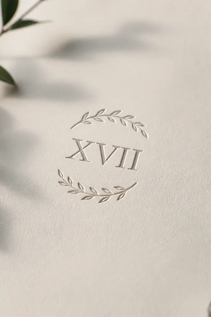
Roman numerals read cleanly on the lower back when they're short and framed. The laurel clip adds a polished vibe without turning into a full crest. It looks great for couples because the dates can match while the laurel stays subtle.
Use 4 numerals max to keep spacing tight - like II.VI or 08.14. Keep the laurel outline around 2 mm thick. Place the numerals centered and the laurel arc hugging the upper curve of the lower back rather than wrapping all the way around.
Pro tipBring your date format exactly as you want it tattooed; artists often "correct" spacing if you don't.
AvoidAvoid heavy black fill in the laurel; it makes the numerals look crowded after healing.
7. Two-Word Vow Split by a Small Diamond
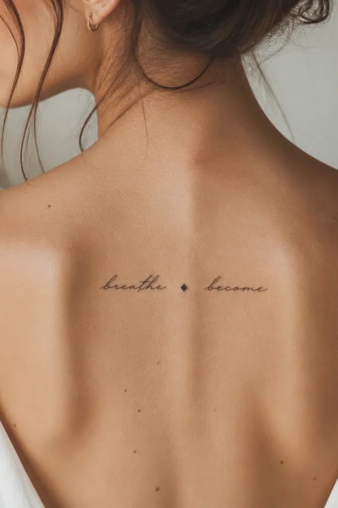
This style works because the diamond gives the eye a rest point, so the words don't run together on a moving body area. Thin script looks romantic, and the small symbol makes it feel intentional. It reads well even when the tattoo is partly covered by underwear lines.
Keep each word under 6 letters. The diamond should be about 4-5 mm wide. Place it so the diamond sits just above the thickest part of your lower back curve.
Pro tipAsk for a stencil in your favorite undergarments; if the line crosses the seam, it will look crooked when you wear it.
AvoidAvoid long phrases; lower back text breaks up as it fades and it stops reading after a year.
8. Tiny Sunburst with 8 Rays
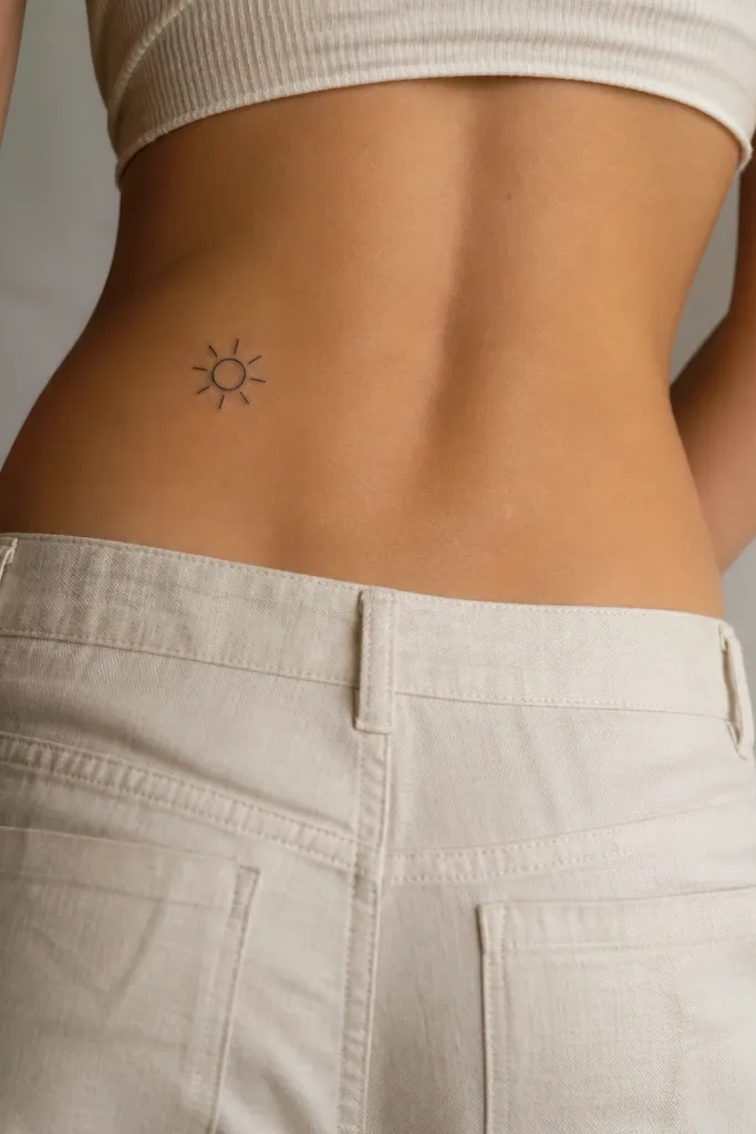
A compact sunburst is a strong choice for budget because it uses clean geometry and limited ink. The eight rays create a graphic look that still feels feminine. It also ages nicely if the lines are thick enough to survive the first year's fade.
Aim for a total size of 1.75 to 2.25 inches wide. Keep rays around 3-4 mm long and consistent thickness. For matching, give one partner the sun and the other the moon - same size, different symbol.
Pro tipChoose a stencil position that doesn't sit directly over a hip crease; that crease smears ink over time.
AvoidAvoid 16 ultra-thin rays; they look great fresh and then turn into a fuzzy ring.
9. Heartbeat Line Ending in a Micro Rose
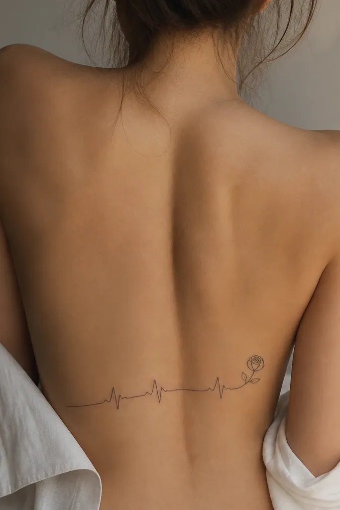
Heartbeat lines feel personal and couples-friendly because the same path can be drawn to represent both people's story. The micro rose adds softness without needing color. It looks styled because the line is continuous and the ending detail gives it a focal point.
Keep the heartbeat line length around 4.5 inches. Place the rose so it sits near the right hip bone, not the center spine. Ask for the rose petals to be outline-only with tiny gaps to prevent smudging.
Pro tipTell the artist the heartbeat rhythm you like (straight spike pattern vs. Rounded bumps) so it matches your meaning.
AvoidAvoid thickening the heartbeat line too much; it can blur and the rose turns into a black blob.
10. Abstract Wave + Star Dots
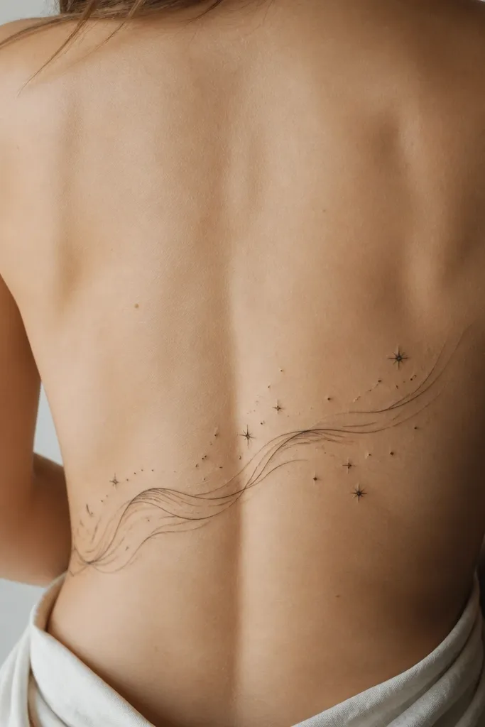
Waves follow motion, and the lower back is all about motion. The star dots give contrast and a playful feel while keeping the design minimal. This looks great with either fine line or slightly bolder linework because the wave line does most of the work.
Pick a wave height of about 1.5 inches and a total span of 4 inches. Keep the stars tiny - 1-2 mm dots. For partners, match the wave direction and mirror the star placement so each tattoo points toward the center of the couple's shared composition.
Pro tipAsk for a stencil on a day you wear the same underwear style you'll use for photos - fit changes how the tattoo sits.
AvoidAvoid too many stars; crowded dot fields look muddy faster than you think.
11. Half-Sleeve Style Floral Belt (Lower Back Portion)
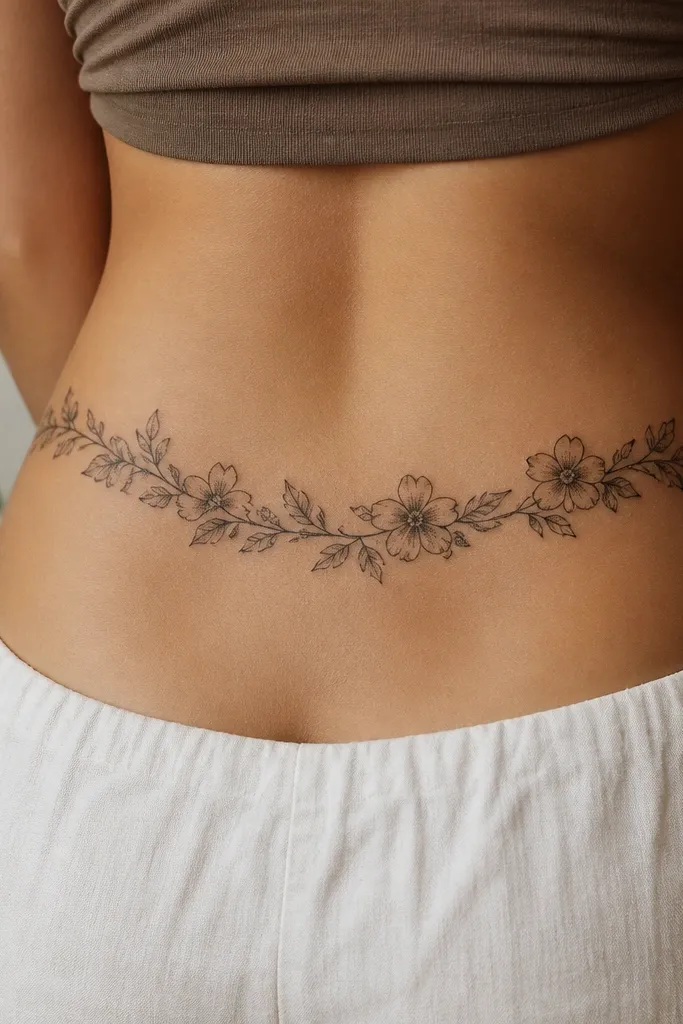
This design reads like a "belt" and flatters the waistline because it frames the body. Outline-first flowers with light dot shading look expensive without needing full color realism. It also gives you room to add matching elements for couples, like the same flower species in different positions.
Keep it as a band, not a full panel: 3.5 to 4.5 inches tall at the center. Place the band so it sits just above your hip crease, leaving a small gap at each side. Ask for dot shading only inside petals - no large filled backgrounds.
Pro tipIf you want it to stay crisp, ask for flower outlines slightly thicker than the leaves.
AvoidAvoid dense black backgrounds behind the flowers; they trap irritation and blur over time.
12. Two Matching Keys with Bow Tie Shapes
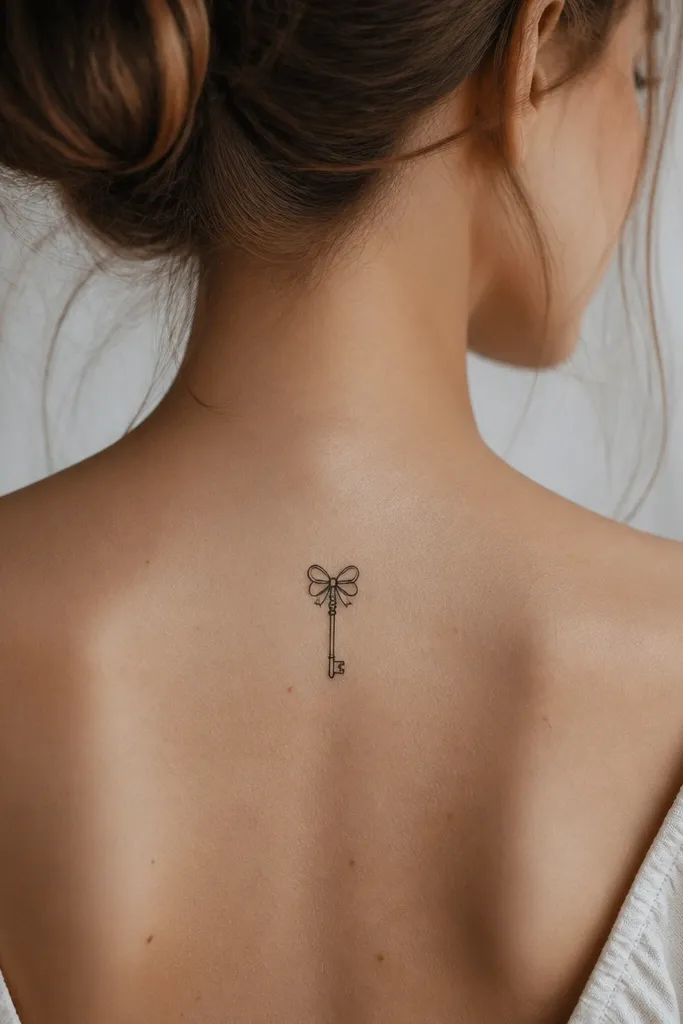
Keys are a couples classic, but the lower back makes them look tailored instead of "generic symbol." The bow tie top detail keeps it feminine and adds a recognizable silhouette. Linework stays sharp when the key's teeth are spaced and not tiny.
Make the key about 3.75 inches long, with teeth around 2-3 mm tall. Place it slightly off-center so the bow top sits closer to one side of the spine. For couples, have two keys that share the same tooth pattern but different bow sizes.
Pro tipBring a photo of your favorite jeans rise; it helps your artist place the key where it won't get stretched by waistbands.
AvoidAvoid razor-thin key teeth; they disappear first and leave the key looking unfinished.