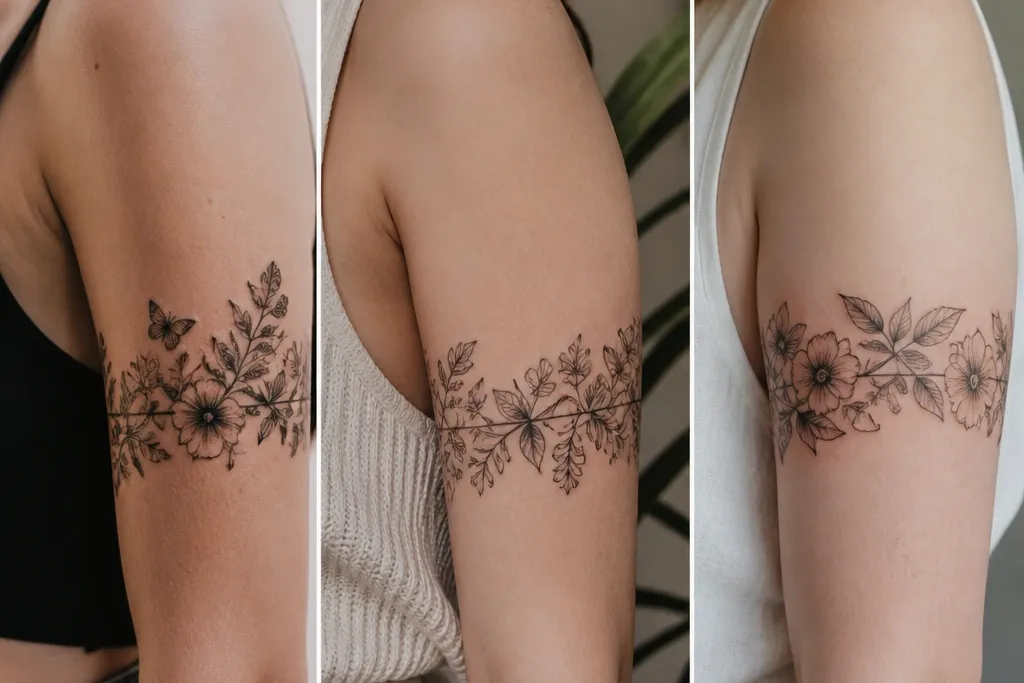
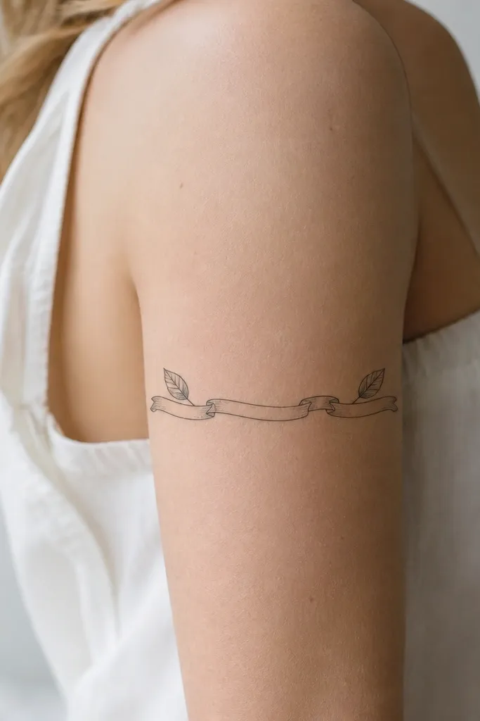
1. Mini Vine Band With Two Leaf Clusters
This one looks simple because the vine line stays thin and steady, and the leaves are the only "busy" parts. I like a clean black-and-grey style with no big shading - just a little stipple on the leaf bases so they catch light. The negative space in the middle makes the wrap feel airy, not crowded.
Place the band so it sits just above the midpoint of the bicep, with the ends angled slightly toward the inner arm. Keep each leaf cluster about the size of a dime to quarter, and leave a gap in the center that's at least one leaf width. If you want it sharper, ask for solid linework first, then light stippling only where the leaf meets the vine.
Pro tipIf you're worried about placement, do a temporary stencil with your arm relaxed and then with your arm flexed to see if the ends still line up.
AvoidAvoid adding extra random twigs in the empty center - that's what turns "simple" into clutter.
2. One Flower Wrap With Tiny Buds
A single flower reads clean because it gives your eye one focal point. The tiny buds on both sides act like bookends, so the tattoo still feels like a wrap even though most of it is minimal. I've found that small floral wraps look best in black ink with light grey petal shading, not full color.
Center the flower on the outer arm, then let the buds curve downward slightly toward the inner arm. Keep petals simple - five to six rounded petals with thin line outlines. Add a small dot shadow under the flower where it would "sit" on the skin, then stop.
Pro tipAsk for a stencil that wraps onto the inner arm by about 1/2 inch so the band looks continuous in photos.
AvoidSkip thick, heavy petal fill - it makes a small flower look like a sticker.
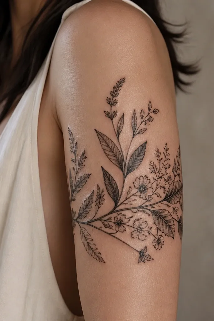
3. Palm Frond Band in Fine Line
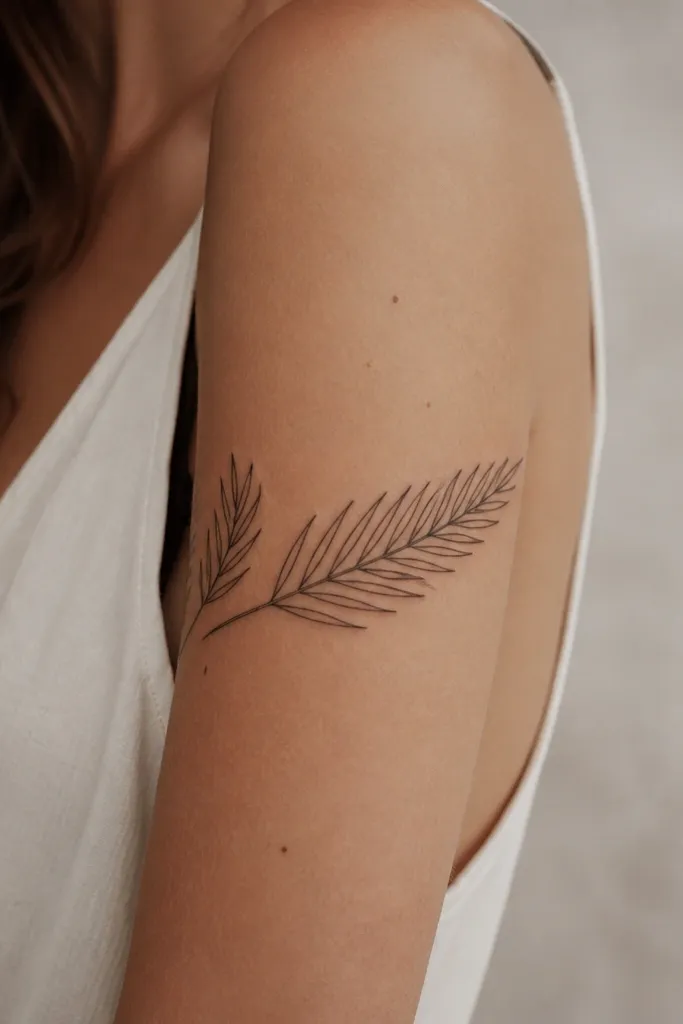
Fine line palm fronds look minimal because they rely on shape, not shading. The wrap shape makes the fronds feel like they're growing around your arm instead of draped across it. I like using pure black lines with no grey fill so the design stays crisp as it heals.
Choose a frond height of about 3 inches total and keep the band width under 1 inch. Place the spine of the frond along the curve of your bicep. If you want extra detail without clutter, add tiny cut-out notches along the leaf edges - just a few per leaflet.
Pro tipIf you sweat a lot, request slightly thicker linework than "ultra fine" so it doesn't blur as fast.
AvoidDon't add lots of micro-teeth across every leaf - it hurts readability.
4. Fern Leaf Half-Band With Dot Shading
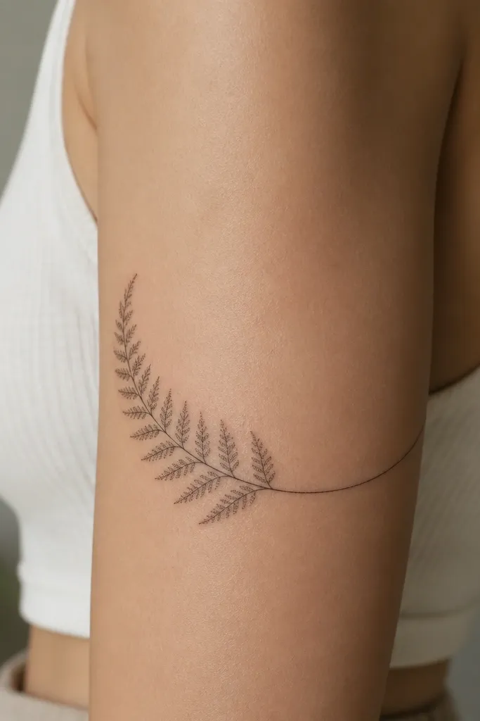
Ferns are naturally segmented, so they look detailed without needing a heavy design. The dot shading gives depth but stays "simple" because it's concentrated in the leaf segments. This style also heals well because the dots and lines are consistent in size.
Use one main fern frond arc that covers roughly 70 percent of the wrap, leaving the other 30 percent mostly negative space. The stem should start near the outer arm and curve toward the inner arm. Keep dot density light - you should still see skin between dots.
Pro tipBring a reference photo with a similar fern type so the segment spacing matches how your tattoo artist draws plants.
AvoidAvoid solid black in the leaf segments - it turns fern detail into a dark blob.
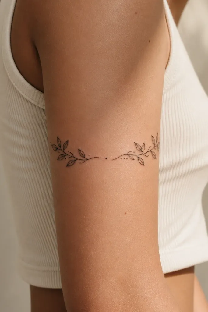
5. Tiny Wreath Wrap With Two Leaves and a Center Dot
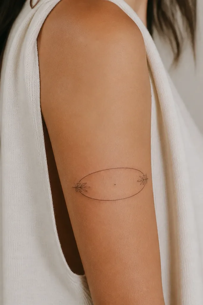
This is one of the cleanest small wrap tattoos because the shape is closed. The center dot gives you a focal point, and the thin oval outline makes it look intentional even from far away. I've seen this style age well because the design doesn't rely on tiny micro-elements.
Keep the wreath height around 2.5 to 3 inches and make the oval outline about the thickness of a fine pen line. Place it slightly higher than the widest part of your bicep so it doesn't stretch into a squashed oval. Add the two leaves on opposite sides so the wrap feels balanced.
Pro tipIf you want it to feel more feminine, ask for leaf tips that taper to a point rather than rounded ends.
AvoidDon't thicken the oval outline too much - it makes the dot center look off-balance.
6. Single Twig With Three Berries
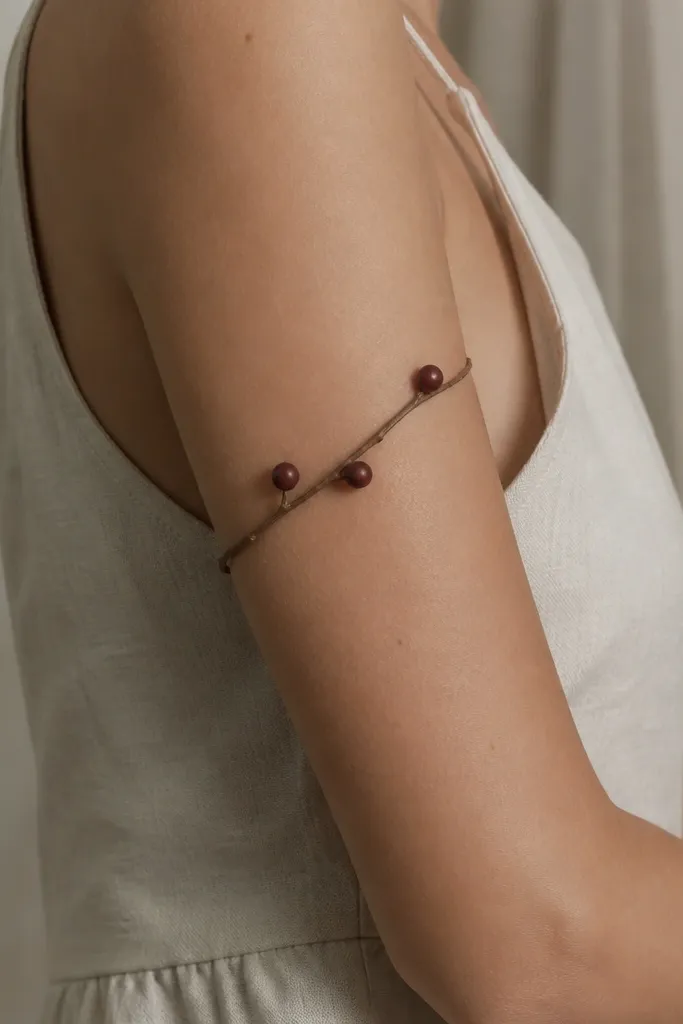
This looks simple because it's basically one line plus three dots that read as fruit. The wrap effect comes from the diagonal curve that follows your arm. I like black ink with optional grey under-burn on the berries so they don't look flat.
Place the twig so it starts on the outer upper arm and gently curves around toward the inner arm. Keep berry sizes consistent - about the size of a pencil eraser mark. Space them so the middle berry sits near the outer center of the upper arm.
Pro tipAsk for a stencil with three berry sizes marked - you want one clear focal berry, not all equal.
AvoidAvoid uneven berry spacing; it makes the wrap look like random placement.
7. Botanical Ribbon Wrap With Micro Dashes
Ribbon folds give you movement without needing big shading. The micro dashes mimic fabric creases and make the tattoo feel "finished" even though it's small. I've done this for women who want plants but don't want full florals - this one stays minimal and graphic.
Draw the ribbon as two parallel lines that taper slightly at both ends. Add leaf tips only at the ribbon ends, not throughout the band. Keep dash marks short and consistent, like tiny ticks, and place them on the outer side of the ribbon where light hits.
Pro tipIf you wear short sleeves a lot, put the ribbon seam on the outer arm so it reads clean when your arm is relaxed.
AvoidSkip long dash lines - they look like scratch marks on a small tattoo.
8. Rose Bud Wrap With One Side-Leaf
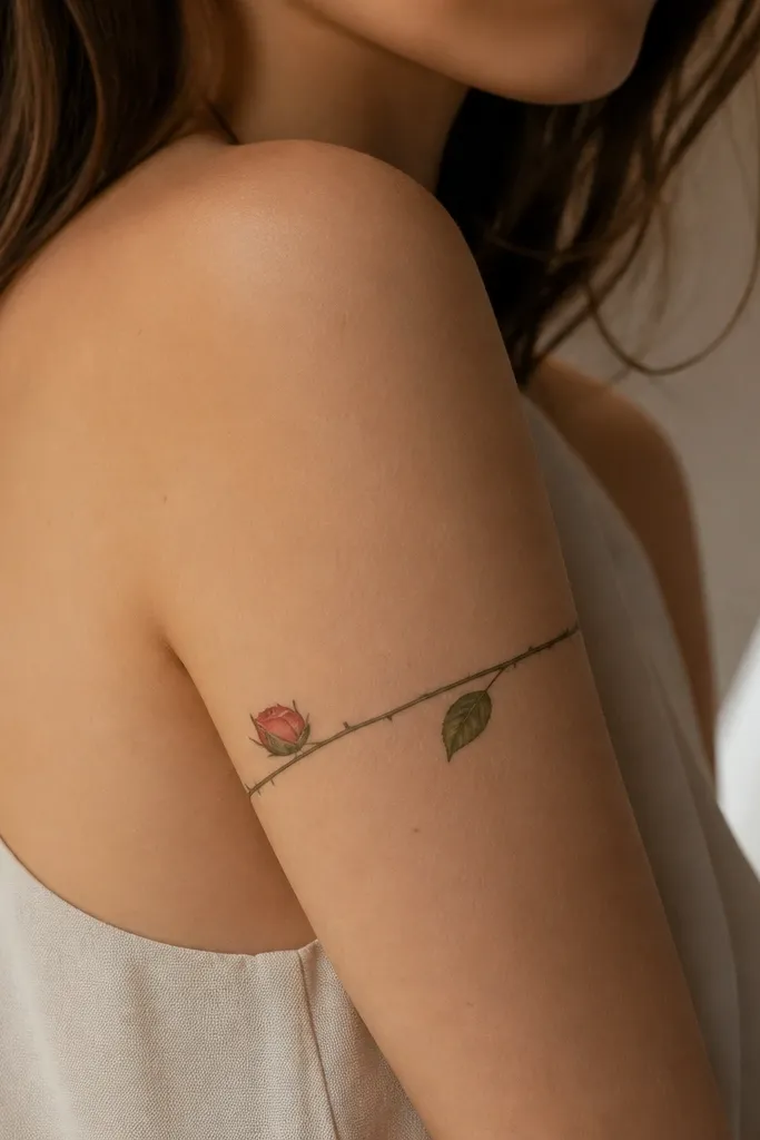
A rose bud is feminine without the mess of full roses. Keeping it to one side leaf keeps the composition simple and still gives the wrap a direction. I prefer black ink with a light grey bud shadow so the petals don't turn into a flat circle.
Place the bud slightly forward on the outer bicep, with the leaf curving behind it toward the inner arm. Let the wrap end with a tiny thorn line - short, straight, and not too spiky. Keep the bud about 1.5 to 2 inches wide so it doesn't dominate your arm.
Pro tipAsk your artist to do a quick line-only pass first so you can approve the bud shape before shading.
9. Lotus Seed Pod Band With Dot Highlights
Seed pod shapes are graphic and simple, and the wrap band gives it motion. Dot highlights add a soft glow without turning it into a heavy ornamental piece. This style works great if you want something "plant-like" but not leaf-heavy.
Keep the pod centered and make the band width narrow, about half an inch. Add two small dot groups - one above and one below the pod - with consistent dot size. For shading, use grey only inside the pod outline, leaving the outer edge crisp.
Pro tipIf you want it to look extra clean, request no crosshatch - just linework plus light stipple.
AvoidAvoid thick black in the pod interior; it kills the seed pod detail.
10. Clover Wrap With Curved Stem
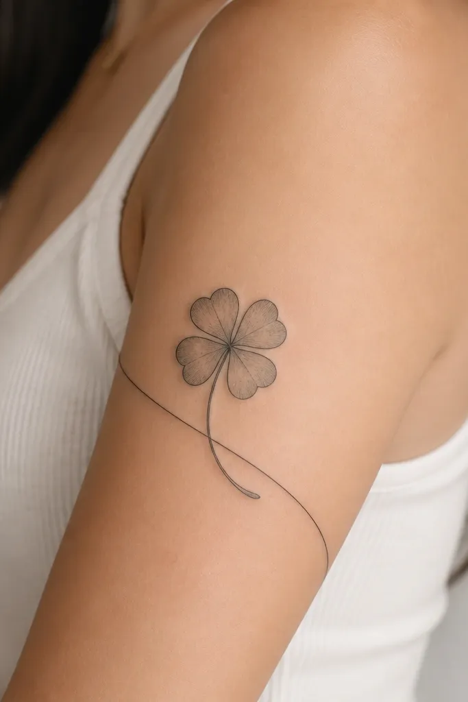
Clover wraps look simple because the shape is bold and easy to read. The curved stem is what makes it a wrap rather than a standalone clover on the arm. I like a thin outline and light grey shading under each leaf so you get dimension without clutter.
Place the clover on the outer upper arm and curve the stem so it follows the bicep. Keep each leaf about the same size, with the top leaf slightly larger for balance. Add a tiny dot shadow at the base of each leaf.
Pro tipIf you're adding meaning, keep the number of leaves consistent with your story - don't "accidentally" make one leaf look smaller.
AvoidSkip tiny extra leaves or random dots; they ruin the clean clover silhouette.
11. Butterfly + Leaf Corner Wrap
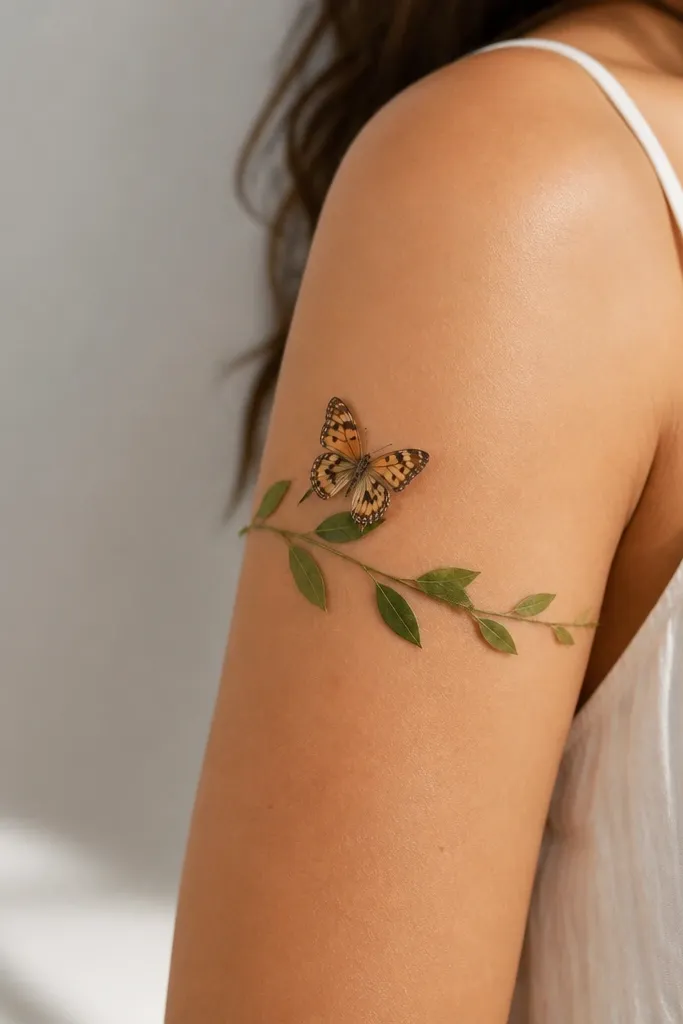
This design stays simple because the butterfly is small and the leaf band frames it like a border. The wrap arc makes it feel connected to your arm shape, not pasted on top. Use black ink with a couple of grey wing shadows only - too much shading makes a tiny butterfly look muddy.
Place the butterfly slightly above the midpoint of the upper arm so it doesn't drift when you move. Have the leaf band start lower on the outer arm and curve toward the inner arm behind the butterfly. Keep wing lines crisp and avoid tiny filled specks.
Pro tipAsk for a reference stencil that shows wing symmetry - even slight imbalance stands out on small pieces.
AvoidAvoid full butterfly fill; it turns into a dark oval on the skin.
12. Hops Vine Wrap With Cones
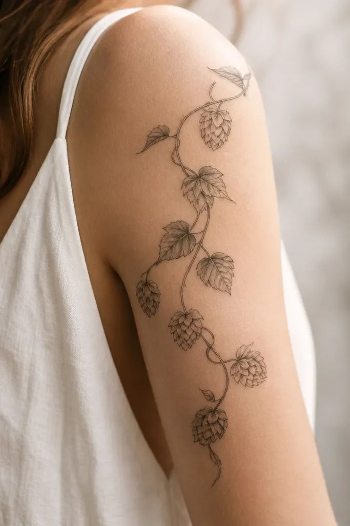
Hops cones look interesting but still simple because they're repetitive shapes. The wrap vine keeps the tattoo flowing along the arm curve. I've found that cones with light grey shading heal cleaner than heavy black cones.
Keep the vine thin and place 3 to 4 cones spaced evenly along the curve. Each cone should be about the size of a small pea - not bigger, or it overwhelms the wrap. Add a tiny dot cluster near the base of the last cone for a "finished" feel.
Pro tipIf you want a cooler look, ask for grey shading on cone ridges only - not the whole cone interior.
AvoidDon't cram cones too close; the spacing is what makes it read as hops.


