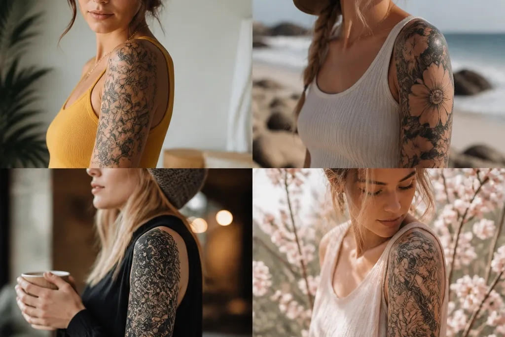
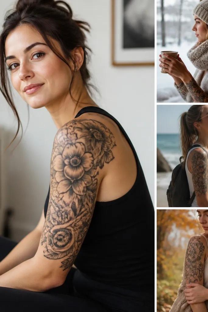
1. Bicep-to-Shoulder Rose Halo With Soft Black Fade
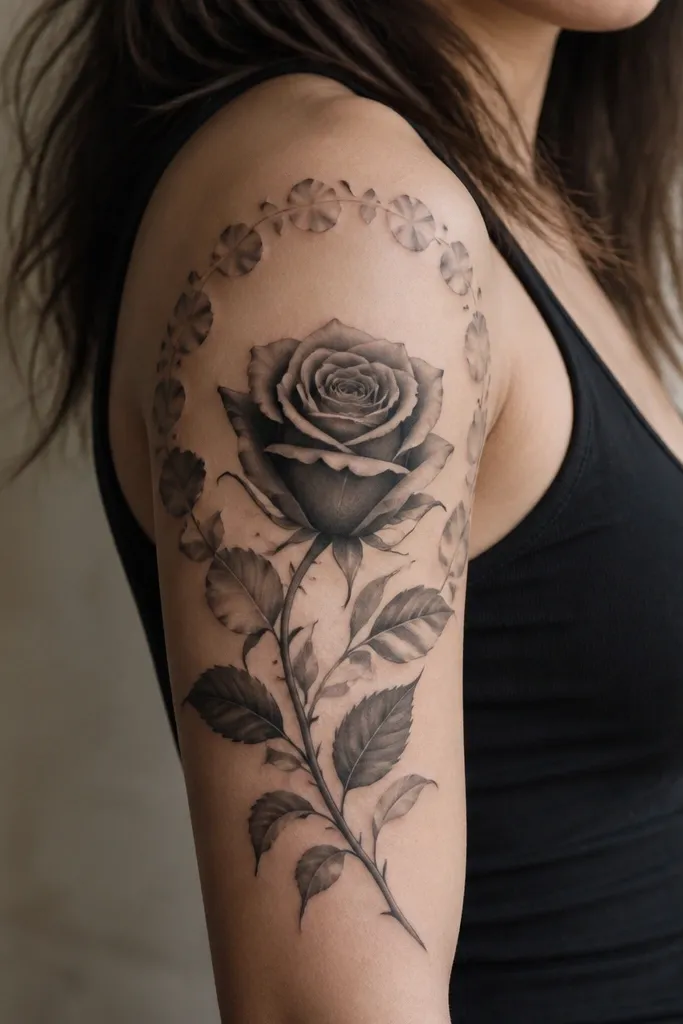
This design works because it reads as one continuous shape when your arm relaxes. The rose head sits slightly forward on the outer bicep, so it doesn't flatten when you bend your elbow. The halo of small petal marks gives you visual texture without packing too much ink near the armpit, which helps it stay crisp as your skin moves. The soft black fade also makes the tattoo look less "stamped" when you switch between short sleeves and long sleeves.
Ask for a clean petal outline first, then a gray wash that thins out before it reaches the inner arm. Keep the halo band about 1.5 to 2 finger widths wide at its thickest, and let it fade before it touches the shoulder cap. Placement should start around the outer bicep curve and stop about 1-2 inches below the shoulder seam so it doesn't get chewed by strap seams.
Pro tipDo a placement trial with a stencil for 10 minutes while you wear the tank or dress you actually use in summer. If the halo band disappears behind a strap line, move the top edge down 1/2 inch.
AvoidAvoid putting heavy shading right where your bra strap or swimsuit strap rubs - that area heals unevenly and can look patchy.
2. Fine-Line Botanicals That "Follow" Your Arm Muscle
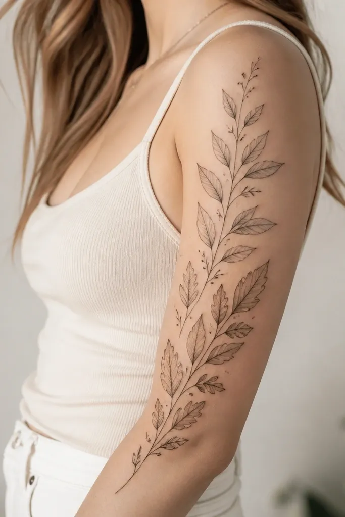
Fine-line botanicals look seasonal_evergreen because they don't rely on big blocks of ink. When your arm stretches, thin lines flex without turning into a heavy gray smear. You get a natural flow by aligning the stems with the bicep muscle direction - the tattoo looks intentional, not random. The dot accents and minimal gray shading help the sleeve stay readable even in low indoor light.
Use line weights that stay under 0.35 mm for outlines and 0.2-0.25 mm for vein lines. Build the sleeve in two zones: a denser cluster on the outer bicep and a lighter trailing vine toward the shoulder. Keep negative space between leaf groups so your skin texture shows through and the tattoo doesn't feel crowded under clothing.
Pro tipPick two leaf shapes and repeat them in a pattern that mirrors your arm's taper - one leaf at the widest part, one leaf at the narrowing part.
AvoidAvoid mixing thick bold outlines with ultra-thin internal lines - the contrast can blur as the tattoo ages.
3. Watercolor Orchid With Controlled Edges
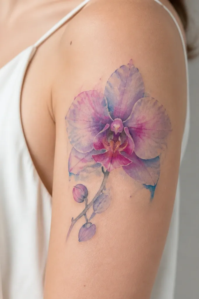
Controlled-edge watercolor looks good on the upper arm because your movement creates natural "motion" over the pigment. The orchid's darker core gives it a focal point, while the faded wash spreads into the surrounding skin tone for that airy look. Lilac and magenta sit well against both warm and cool lighting, which matters for year-round wear. Keeping edges controlled prevents the design from turning into a blob as it heals and settles.
Ask for a crisp stencil outline and then watercolor fill that stays within a defined boundary. Use lilac (#C79BD8 vibe), magenta accents, and a light blue wash in the negative-space pockets. Place the orchid so the bloom sits near the outer curve and the stem drops toward the mid-bicep, stopping before the armpit rub zone.
Pro tipPlan a second session for pigment depth after the first heals. Watercolor often needs layering so the saturation stays strong without overworking the skin.
AvoidAvoid going too bright right at the armpit - heavy color there can fade faster from friction.
4. Blackwork Geometric Sleeve With Vertical Rhythm
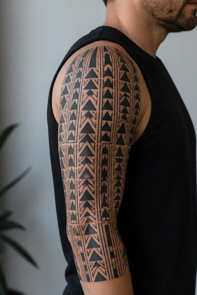
Geometric blackwork works with upper arm anatomy because vertical rhythm matches the way your arm narrows toward the elbow. The design holds up when you flex because the shapes are already aligned to that movement. It also stays readable under different clothing - short sleeves make it look bold, while long sleeves make it look crisp and architectural. If you want matching couples sleeves, geometry is easy to mirror without making it identical.
Build the sleeve on a grid: main columns should be about 1/2 inch wide at the widest point and taper slightly as they rise. Put the densest cluster on the outer arm where your eye naturally lands. Keep the inner arm side lighter so the sleeve doesn't look heavy when you're wearing a strap or off-shoulder top.
Pro tipBring a photo of your arm in a mirror with a bent elbow. If the vertical columns stay straight, the placement math is right.
AvoidAvoid large solid black blocks right near where your elbow crease will rub during healing.
5. Half-Sleeve Script and Symbol Lockup
This style looks flattering because the script follows your arm's curve instead of wrapping randomly. When the text baseline matches the bicep contour, it stays legible even when your arm bends. The symbol gives you a visual anchor so the sleeve still looks complete if you cut it off at a reasonable length. For couples, you can match the placement and font style while swapping the symbol and the wording.
Use script that stays medium height - around the size of a pencil eraser for lowercase letter loops at the outer bicep. Place the symbol at the thickest part of the bicep, then run the script slightly below it toward mid-arm. Leave 1 inch of breathing space between the script and the inner arm edge so it doesn't crowd when your arm relaxes.
Pro tipGet the tattoo stencil placed while you're wearing the same neckline you plan to wear most. If the text baseline crosses your strap line weirdly, adjust now.
AvoidAvoid ultra-thin script that relies on hairline strokes - it fades faster on the upper arm than you expect.
6. Japanese Wave Sleeve With Brass-Tone Gold Ink Accent
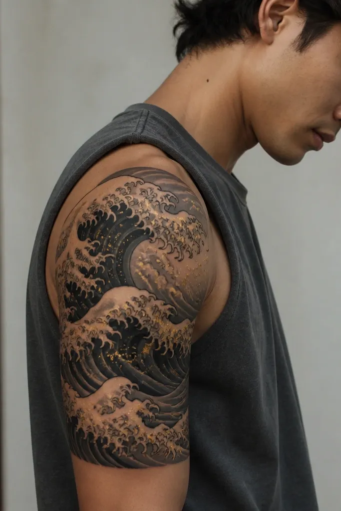
Waves look clean on the upper arm because the curves match how your arm rolls. The layered black and gray creates depth, and the gold accent gives you that "light catches it" effect without turning the whole sleeve into color chaos. This stays seasonal_evergreen because it looks dramatic in summer light and still reads in winter when you're wearing long sleeves. Gold accents also help couples match by keeping the same crest placement while swapping the wave crest symbol.
Ask for 3-4 wave layers, with the darkest layer on the outer curve. Keep the gold accents small - think thin highlights, not big filled shapes. Place the wave crest highest on the outer bicep and let it taper down toward mid-arm, stopping before the armpit.
Pro tipWear a short-sleeve shirt during your tattoo preview appointment. You'll see if the crest catches light where you want it.
AvoidAvoid placing gold accents too close to high-friction areas - gold ink can dull faster if it gets rubbed constantly.
7. Patchwork Quilt Sleeve In One Color Family
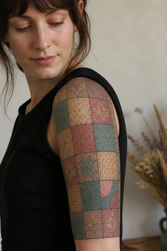
Patchwork works because it creates structure, and structure survives skin movement. Using one color family keeps it cohesive, even when the sleeve grows over multiple sessions. The quilt dividers also hide small healing variations - if one patch heals slightly lighter, the block boundaries make it less noticeable. For couples, you can keep the exact same block layout and swap only the colors.
Have the artist map the sleeve into 6-10 blocks. Keep dividers thin and consistent - around 0.25-0.35 mm line weight. Choose a color palette that reads warm in daylight and not muddy indoors; dusty rose with tan and a muted teal highlight works well.
Pro tipPick one "hero" patch color and one "support" color. Start with those in the first session so you can judge the overall vibe while it heals.
AvoidAvoid too many unrelated colors - the sleeve starts looking like random sticker art after the first year.
8. Single-Cell Dotwork Mandala On Outer Bicep
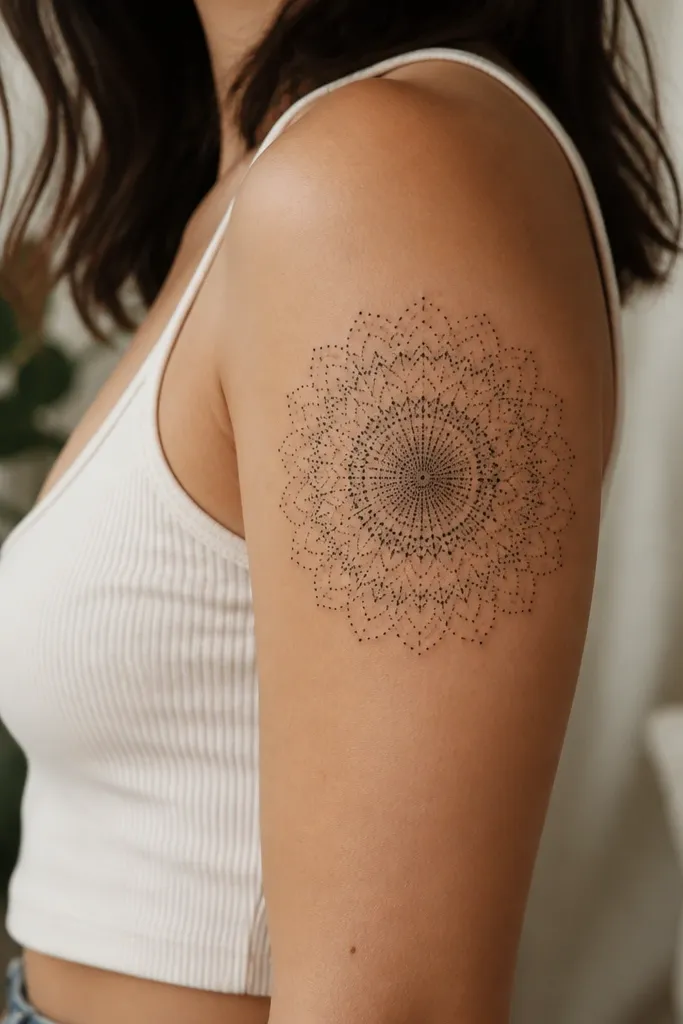
Dotwork mandalas look clean on the upper arm because the gradient can be built slowly without heavy trauma to the skin. The outer bicep is a great place because your arm's curve gives the mandala a natural roundness. The density gradient keeps it from turning into a flat sticker. It also stays season-friendly because the dot pattern reads in both bright sun and dim indoor lighting.
Keep the mandala about 3.5 to 4.5 inches wide at the widest ring. Start with the center and build outward in rings, leaving a fade zone where dots thin to negative space. If you're doing a sleeve expansion, anchor the mandala now and let the surrounding elements grow from the outer ring edges.
Pro tipAsk the artist to show you a dot density reference on skin - you want the center dark enough that it doesn't look "smudged" after healing.
AvoidAvoid placing the outer ring too close to the armpit line - dots there get rubbed and blur.
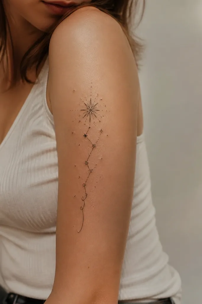
9. Black Orchid + Tiny Constellations Micro-Sleeve
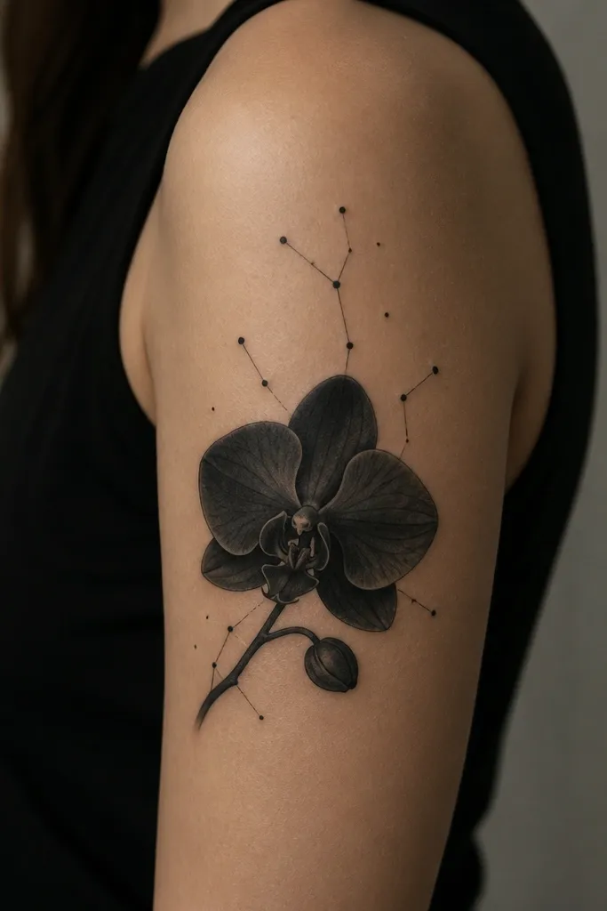
This micro-sleeve works because the orchid gives you the main shape and the constellations add sparkle without requiring color. Black orchid petals with gray transitions make the tattoo look dimensional. The tiny dot stars stay readable as the sleeve extends because they're small and spaced. For couples, you can keep the orchid style the same and swap the constellation map - still matching placement and size.
Place the orchid so the bloom sits on the outer bicep curve and the stem points toward mid-arm. Keep the constellation scatter in the top third of the sleeve, roughly a hand-span from the shoulder seam. Use dot sizes that are clearly distinct - a mix of tiny points and slightly larger stars avoids a flat "speckle" look.
Pro tipChoose the constellation spacing based on how far your eyes sit from the tattoo in real life. If you can't see the pattern when you hold your phone a few feet away, it's too tight.
AvoidAvoid packing too many constellation dots - it looks like noise after healing.
10. Realistic Portrait Silhouette Framed by Thin Black Vines
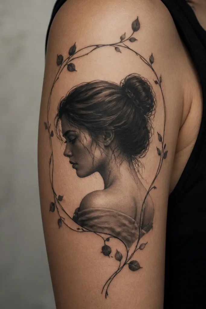
A portrait silhouette with a vine frame looks good because the frame creates a boundary, and the portrait sits inside that boundary without fighting your arm's curve. The realistic shading gives depth, while the thin vines keep it from feeling too heavy. This looks especially nice year-round because it doesn't depend on color saturation. Couples can match the frame style and placement while swapping the portrait subject or silhouette style.
Keep the portrait centered on the outer bicep with the top edge around the shoulder seam zone but not touching it. Use thin vines that wrap 1/3 to 1/2 around the portrait, leaving negative space on the inner arm side. Request a grayscale range that includes soft midtones so the portrait doesn't turn into a flat stamp.
Pro tipBring a photo of your arm in a fitted short-sleeve top. If the portrait gets distorted by fabric folds, your placement needs a small shift now.
AvoidAvoid placing a portrait too low - it can look like it's slipping when you move.


