1. Outer Arm Rose + Dotwork Collar
This works because the rose gives you a clear hero shape, and the dotwork creates texture without filling the whole arm. The dot collar frames the flower so it looks finished even if you only tattoo the top half of the upper arm. I like this style because it stays readable as it fades - dots soften but the rose outline still holds the design.
Place the rose so the top petal points toward the shoulder seam. Keep the vine thin - about the width of a pencil lead - and let it disappear under the collar dots. For a couples version, one person gets heavier dot density on the collar while the other keeps the dots lighter and adds a small leaf cluster instead.
Pro tipAsk your artist to use a "shadow edge" under the bottom petals, not full petal fill. That keeps healing smoother.
AvoidAvoid full black fill across every petal - it heals thick and can look muddy years later.
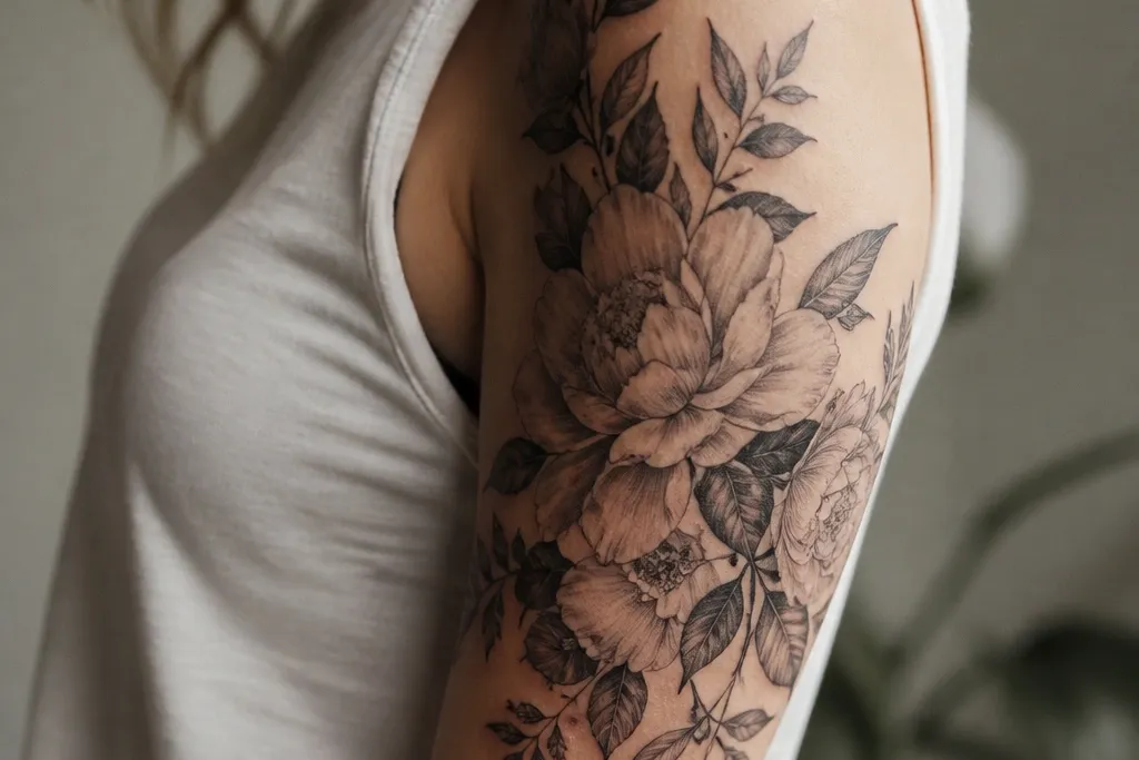
2. Bicep Peony With Soft Half Sleeve Wrap
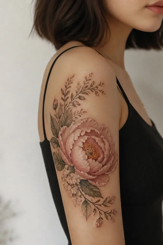
Peonies look gorgeous on the bicep because their petal layers fan out with the muscle contour. The wrap of small leaves gives motion so the tattoo doesn't feel flat. I've seen this age well because the petal layering creates depth even after contrast drops.
Start the peony at the mid-upper arm and let the outer petal tips reach toward the front of the arm. Keep the leaf wrap on the outer edge only - don't tuck it too far toward the inner arm. For matching couples, keep the peony size identical and swap leaf placement: one tattoo has leaves more on the top, the other has them more on the bottom.
Pro tipUse fine linework for the leaf veins so the tattoo stays crisp when it loses some contrast.
AvoidDon't make the peony too small - a tiny peony on the bicep looks like a sticker instead of a bloom.
3. Tricep Lily With Sideways Arc Vine
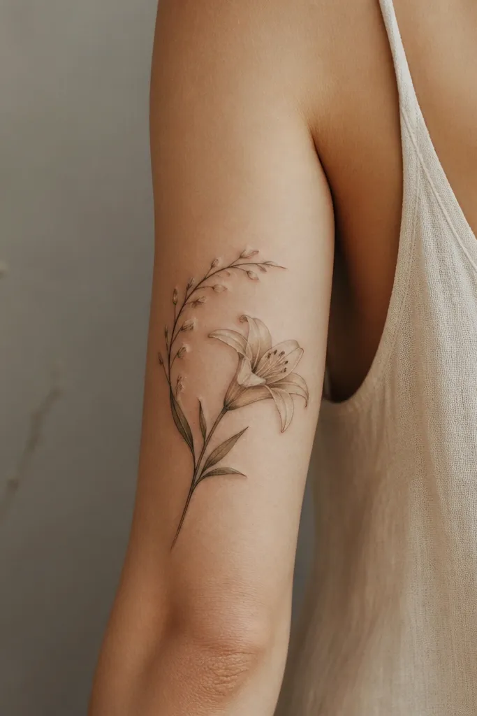
A lily reads elegant because it has clean, readable petal shapes. The sideways arc vine makes it feel like it wraps around you, not pasted on. This is a strong pick if you want something that looks good in tank tops and still looks intentional when your arm is relaxed.
Place the lily so the stem follows the tricep line - slightly diagonal, not perfectly vertical. Keep buds smaller than the lily, about half the width. For a quick_easy matching set, mirror the lily orientation between partners and change only the bud count by one or two.
Pro tipTell your artist you want "petal edges first" - crisp outlines with light shading only along the inner folds.
AvoidSkip heavy crosshatching on lilies - it clogs the petal edges and blurs the shape.
4. Sunflower Trio On Outer Upper Arm
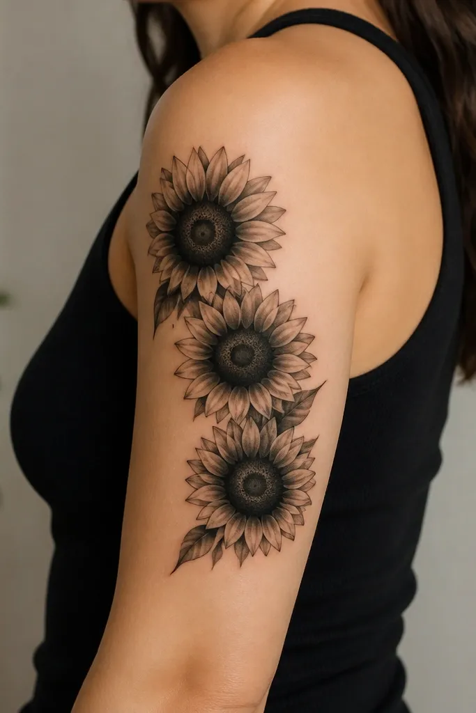
Sunflowers give you instant impact without needing a full sleeve. The trio layout makes it look like a composition, not a single icon. I like the textured centers because they create depth even with limited shading time, which helps when you're doing a quick placement session.
Use one larger sunflower at the top third, then two smaller ones beneath it, keeping spacing consistent. Keep the stems minimal so the flowers stay the focus. For couples, keep the trio spacing identical and swap which sunflower gets color (if you add color) - top in one set, bottom in the other.
Pro tipAsk for a stippled center texture instead of solid black, so it heals with a softer grain.
AvoidDon't overcrowd the petals. If petals touch too tightly, the whole flower turns into a dark blob.
5. Cherry Blossom Branch With Micro Petals
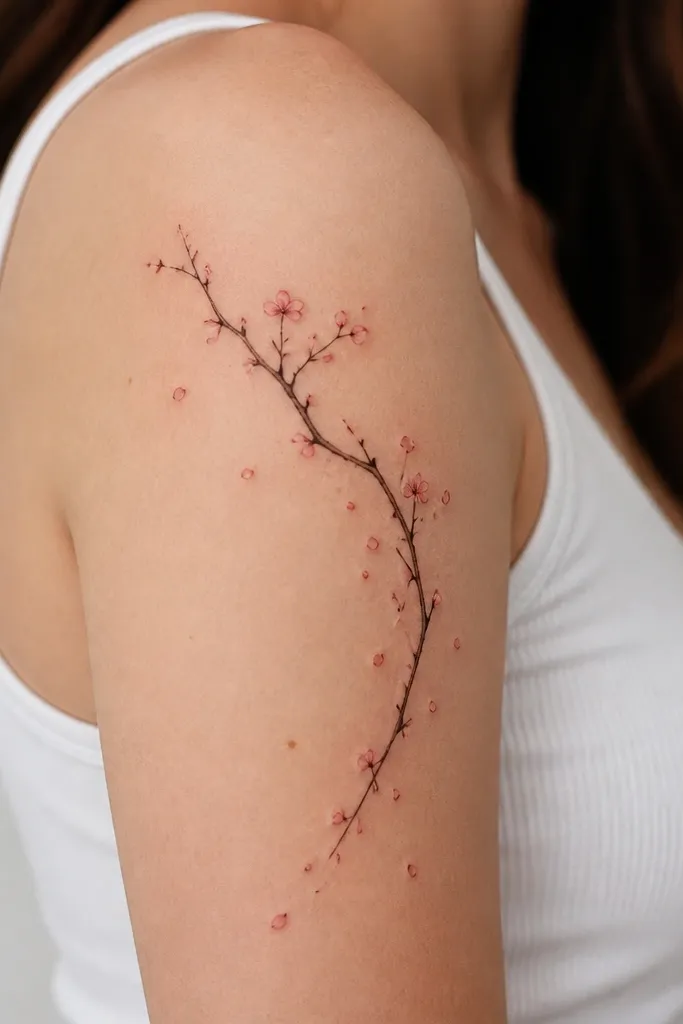
This looks airy but still detailed, and it's one of the easiest "half sleeve" reads because the branch gives structure. Micro petals fill negative space so the design doesn't look empty on close inspection. It's also an easy matching concept because you can keep the branch path identical and vary the blossom density.
Anchor the branch near the shoulder and curve it toward the outer mid-arm. Keep the largest blossoms only at the top third; let the lower area fade into small petal dots. For matching, one partner gets three full blossoms and the other gets two full blossoms plus extra micro petals.
Pro tipHave your artist do the branch line first, then place blossoms after. It prevents awkward spacing.
AvoidAvoid thick outlines on the branch - it makes the whole piece feel heavy and less like real twigs.
6. Wildflower Cluster With Black Ink + One Accent Color
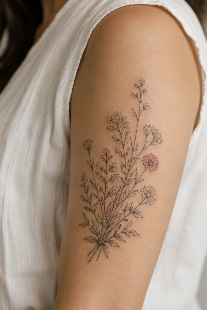
Wildflowers are forgiving because you can build a "dense" look without needing perfect realism. Keeping almost everything black and gray makes it last, while one accent color gives that wow moment when you're wearing short sleeves. The cluster approach also hides minor healing differences because there's lots of texture.
Pick 4 to 6 flower types max so it stays readable. Place the cluster so the densest part sits on the outer upper arm and the edges taper off toward the bicep. For couples, swap which flower gets the rose pink accent and keep the rest identical.
Pro tipUse a single color only on petals, not on stems. Stems in color fade fast and look patchy.
AvoidDon't add too many colors. Three-plus colors on small flowers turns into muddy speckles after a year.
7. Orchid With Vein-Detail Shading
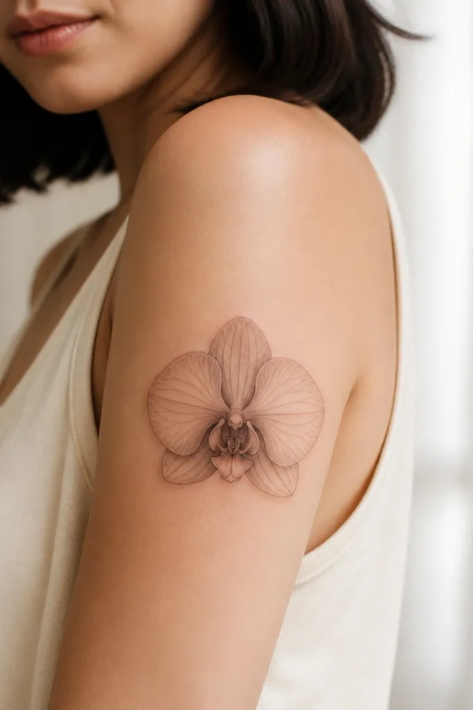
Orchids look high-end because the shape is naturally symmetrical and the veins give you detail without needing a huge size. Concentrated shading at the folds keeps it dimensional. This is an excellent upper arm design when you want something delicate but still "real" up close.
Place the orchid with the center petal aligned to the bicep curve. Keep the side petals slightly angled outward so it catches light. For matching couples, keep the orchid exact size and change the vein style: one set uses straight vein lines, the other uses gentle curve veins.
Pro tipAsk for thin black vein lines first, then add gray shading after. It keeps the veins from getting buried.
AvoidSkip heavy full-petal fill - orchids need air around the veins.
8. Dahlia With Geometric Petal Outline
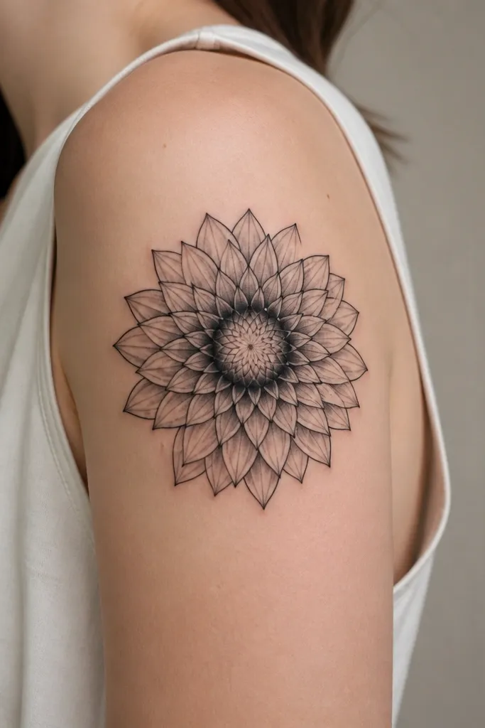
This style gives you gorgeous detail without relying on ultra-realistic realism. The geometric petal outline stays clear even when the tattoo softens with time. It's also quick_easy because the composition is built from repeatable petal segments.
Keep the dahlia large enough that each petal segment is visible - don't compress it. Place it slightly higher on the outer arm so the lower petals don't get lost. For couples, keep the petal segment count the same and vary the center ring thickness.
Pro tipUse a dark ring under the center petals so the whole dahlia has a strong focal depth.
AvoidAvoid uneven segment spacing - that's what makes geometric tattoos look rushed.
9. Peony + Mini Butterflies Above
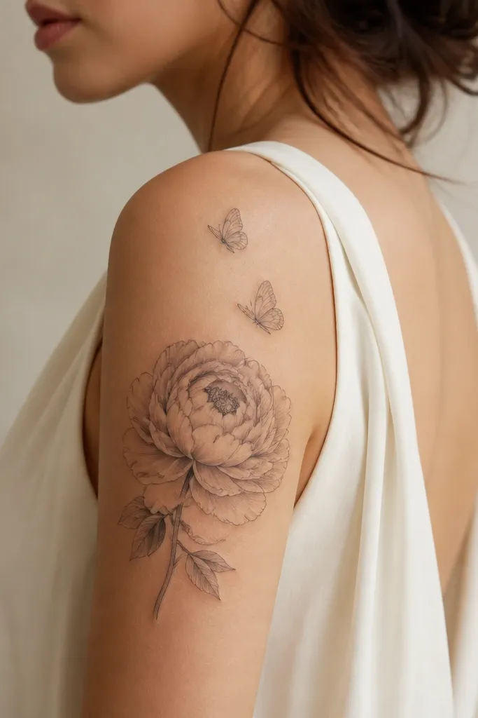
Butterflies above a peony create a top-to-bottom reading path, so the design looks like a full composition. The butterflies add movement while the peony keeps the grounded "flower" identity. I like it because it reads feminine and still looks strong with black ink only.
Place the peony in the middle third of the upper arm. Position butterflies at the shoulder side so they don't drift into the inner arm. For matching couples, keep butterfly positions identical and alter the peony shading depth (one more contrast, one more airy).
Pro tipKeep butterfly wings linework thin - the flower can carry the heaviness.
AvoidDon't make butterflies too dark. If they match the peony density, they compete instead of complement.
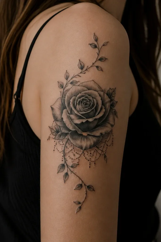
10. Vine + Roses In Negative Space Frames
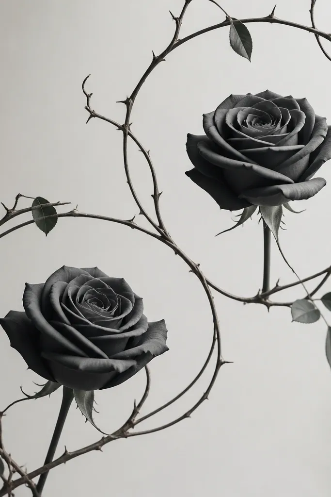
Negative space frames make upper arm tattoos look cleaner and more expensive. The roses stay detailed, and the open frame lines prevent the tattoo from getting visually crowded. This is a great quick_easy option because you can keep the roses moderate in size and rely on the frame for structure.
Use two frame arcs: one wrapping along the outer arm curve and one lower arc closer to the bicep. Keep vines thin and let the roses be the only shaded elements. For couples, mirror the frame and swap which rose has a darker center.
Pro tipTell your artist you want "open frame lines" with no extra dot fills - that's where the crisp look comes from.
AvoidAvoid filling the background behind the frame. It kills the negative-space effect.
11. Single Rosebud With Lace-Like Border
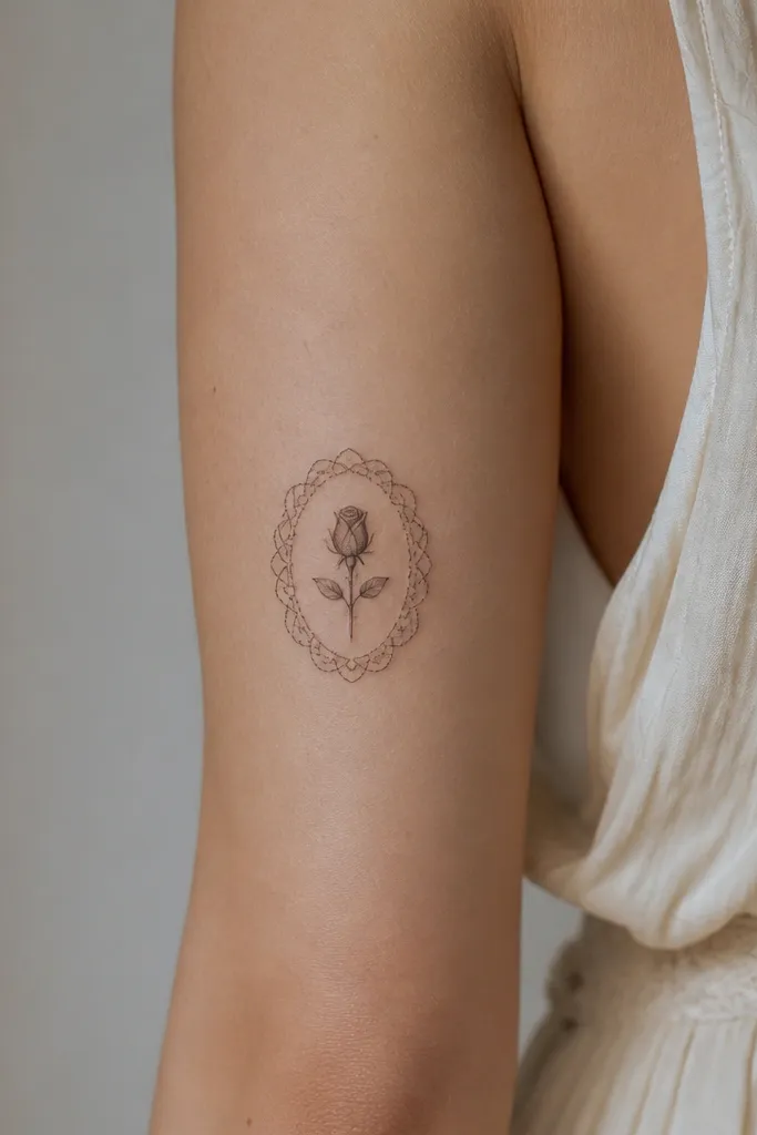
A single rosebud gives you a clean, quick tattoo plan. The lace border does the heavy lifting for visual detail, so you don't need to tattoo a large bloom. This design looks great when you want something that feels intimate but still shows up in photos.
Keep the rosebud around palm-size on the outer upper arm area, not tiny. Let the lace border wrap around it like a cuff, with the densest loops on the top and sides. For matching couples, one partner gets a rosebud with darker shading, the other gets a lighter rosebud and more lace loops.
Pro tipAsk for lace borders to be slightly irregular, like real fabric - too perfect looks fake.
AvoidSkip thick outlines on lace. It spreads and turns into a dark ring.
12. Lotus Flower With Stem That Follows Muscle
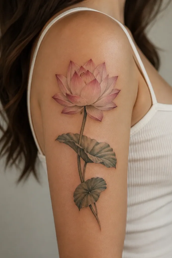
Lotus designs are easy to read because the petal layers create a natural symmetry. Following the stem with the muscle line keeps the tattoo from looking warped when you move. I've found lotus leaves add just enough detail to feel like a half sleeve without covering the entire arm.
Place the lotus so it sits slightly above center on the upper arm. Keep the stem thin and angled to match the bicep curve. For matching couples, keep the lotus outline the same and swap leaf count - one partner gets three leaves, the other gets five.
Pro tipUse a lighter gray at the top petals and darker gray inside the folds. That adds depth with minimal time.
AvoidDon't over-shade the outer petals. If the outside is too dark, the lotus loses its airy shape.


