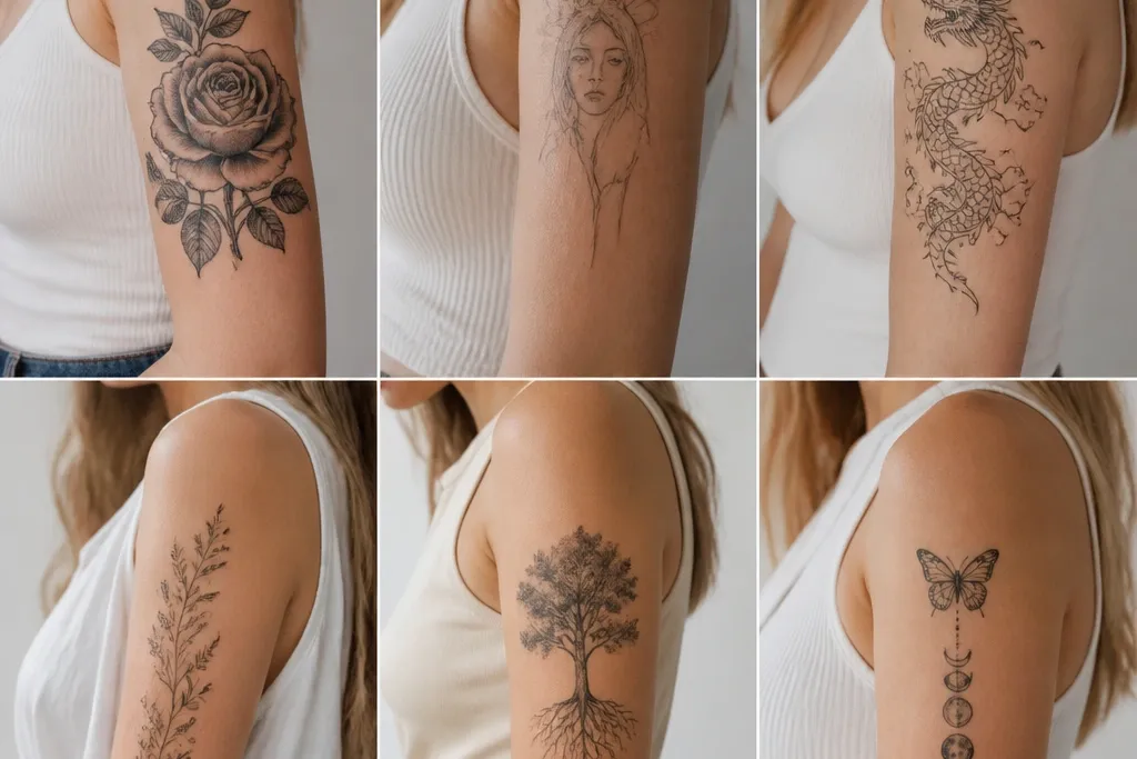
1. Outer-Arm Constellation Pair Sleeve
This look works because constellations read well even when your arm shifts. The dots are small and evenly spaced, so they stay legible as your skin texture changes. The thin connecting lines keep the sleeve feeling airy, and the negative space stops it from looking like a busy sticker sheet. For couples, the shared spacing rule makes it match without needing identical star shapes.
Place the densest star cluster near the shoulder cap and taper the line connections toward the outer elbow side. Keep the dot sizes within a narrow range - think micro dots with only one or two slightly larger "anchor" stars. Choose one ink temperature for each person: cool grey for one and pure black for the other, so they look coordinated but not identical.
Pro tipAsk for a placement stencil while you flex your arm - if the lines start to bend weirdly, the spacing will show in photos later.
AvoidAvoid thick black bands in the middle; they swallow the star dots and make the sleeve look heavy.
2. Inner-Arm Heart Lockets With Matching Dates
Inner-arm lockets look intimate because they sit closer to the viewer when you're wearing short sleeves or rolling up cuffs. The heart outline stays readable because the design uses linework and light shading instead of full color fill. Matching dates make it feel personal without adding clutter. The spark dots add a gentle highlight effect when light hits your arm.
Keep the lockets small - about 1.1 to 1.5 inches tall each - and stack two to three lockets vertically. Put the smallest locket near the top and the largest near mid-arm for a natural sightline. Let the chains follow the arm's curve; don't make them perfectly straight.
Pro tipUse a stencil that matches your inner arm crease angle. If the chain crosses a fold, it will blur sooner and look off in motion.
AvoidAvoid tiny script font inside hearts; it will fade into a grey smudge faster than you want.
3. Outer Arm Botanical Stem With Two Flower Swaps
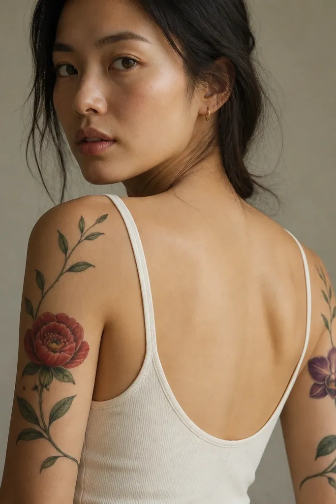
This design works because it's one shared structure with a clear identity swap. The continuous stem gives the sleeve unity, while the flower colors add the couples connection without copying the whole tattoo. Soft grey shadows behind petals keep color from looking flat. Leaves with a consistent line weight make the whole sleeve feel like one piece instead of scattered art.
Plan the stem width to stay thin - about the thickness of a pencil lead in the final tattoo. Place both flowers so they land in the same vertical spots on each arm, even if the flowers differ. Use muted greens for leaves and reserve saturated color for only the petals so it ages clean.
Pro tipIf you want it to look sharp longer, ask for grey "haze" shading only under petals, not across the entire leaf background.
AvoidAvoid filling every leaf with heavy black; it turns the sleeve into a dark blob over a couple years.
4. Matching Roman Numeral Sleeve With Micro Ornaments
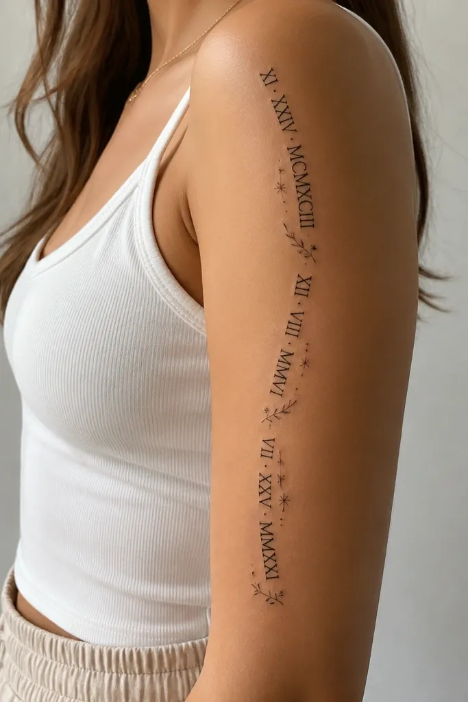
Roman numerals look classy on upper arms because the text is long and reads well along the curve. Micro ornaments keep it from feeling like a label. A slight grey shadow under the numerals helps it look dimensional without turning it into a full black block. Couples matching is easy here: keep the same numeral style and spacing rule, swap the date pair or add different single ornaments.
Size the numeral line so it spans from about 2 inches below the shoulder to mid-upper arm. Use numerals that are consistent in stroke thickness; don't mix thin and thick letter styles. Keep ornaments tiny - no bigger than the width of the numeral stroke - so the sleeve stays elegant.
Pro tipChoose numerals with enough internal space. If a letter has thin gaps, it will fill in as it ages.
AvoidAvoid straight text across the arm - it warps when you rotate your shoulder.
5. Feather Fan Sleeve With Sister-Color Pairing
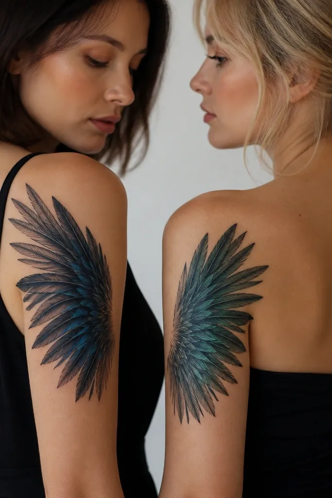
Feather fans work because the shape naturally follows the arm's flare. The shared structure is the fan curve and the barb spacing. Color accents are limited to only the feather vanes, so you get a couples match without making the whole sleeve high-maintenance. The grey shading at the base makes the feathers look layered.
Start the fan at the shoulder with the widest feather about 2.2 inches long. Each feather should taper - don't keep widths identical or it looks like a stencil sheet. Use two "sister" accent colors: one cool blue family and one teal family, so they harmonize in photos.
Pro tipAsk for the barbs to be drawn slightly uneven. Perfectly uniform barbs can look robotic and cheap after healing.
AvoidAvoid full-color feather fills; they blur where skin stretches and makes the fan lose crispness.
6. Two-Part Infinity Knot Sleeve With Shared Line Weight
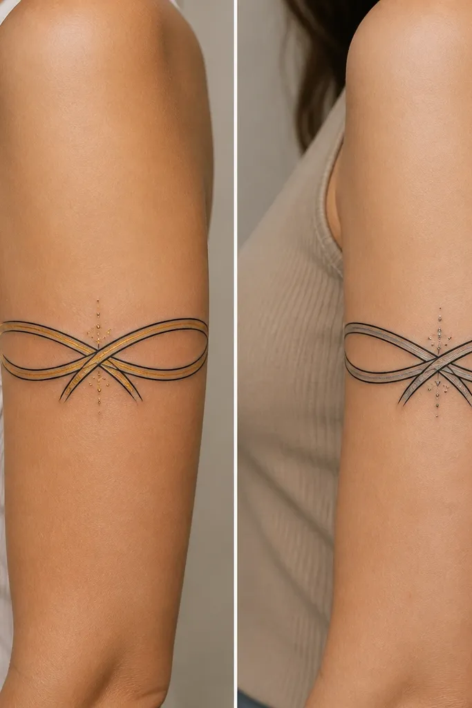
Infinity knots look good on upper arms because you can place them so the curve stays readable when your arm bends. The shared line weight is the secret - couples usually mess this up by having one tattoo heavier and the other too light. A single highlight stroke (gold-tone or grey) adds shine without turning it into a colored cartoon. Dot sparks at the crossing point give it a focal moment.
Make the ribbon width consistent at about 0.35 to 0.5 inches. Put the knot crossing at mid-upper arm where you'll see it most often when you raise your arm. Use one small set of spark dots - five to eight dots - so it doesn't turn into a random sprinkle.
Pro tipHave your artist place a temporary marker line on your arm and rotate your shoulder. If the knot crossing shifts, adjust before ink.
AvoidAvoid thick outlines around the entire knot; it makes the ribbon look like a sticker.
7. Outer Arm Arrow Pair Sleeve With Shared Spiral Base
Arrows work because they naturally align with the direction your arm "reads" in photos. The spiral base gives the sleeve a shared anchor, and the arrowheads let you personalize. Grey under-shading keeps the arrows from looking flat, especially over bony areas. This style also hides minor fading better than dense black blocks.
Keep arrows slightly curved to match your outer arm line. Put the spiral base at the top third of the sleeve, then run arrow shafts down toward the elbow side. Use consistent spacing between the arrow curves so both sleeves look like the same design family.
Pro tipChoose arrowheads that have clear edges - avoid tiny points that can blur into a rounded blob.
AvoidAvoid placing the spiral too low. If it starts near mid-arm, the whole sleeve feels cramped.
8. Matching Sun and Moon Upper Arm Sleeve
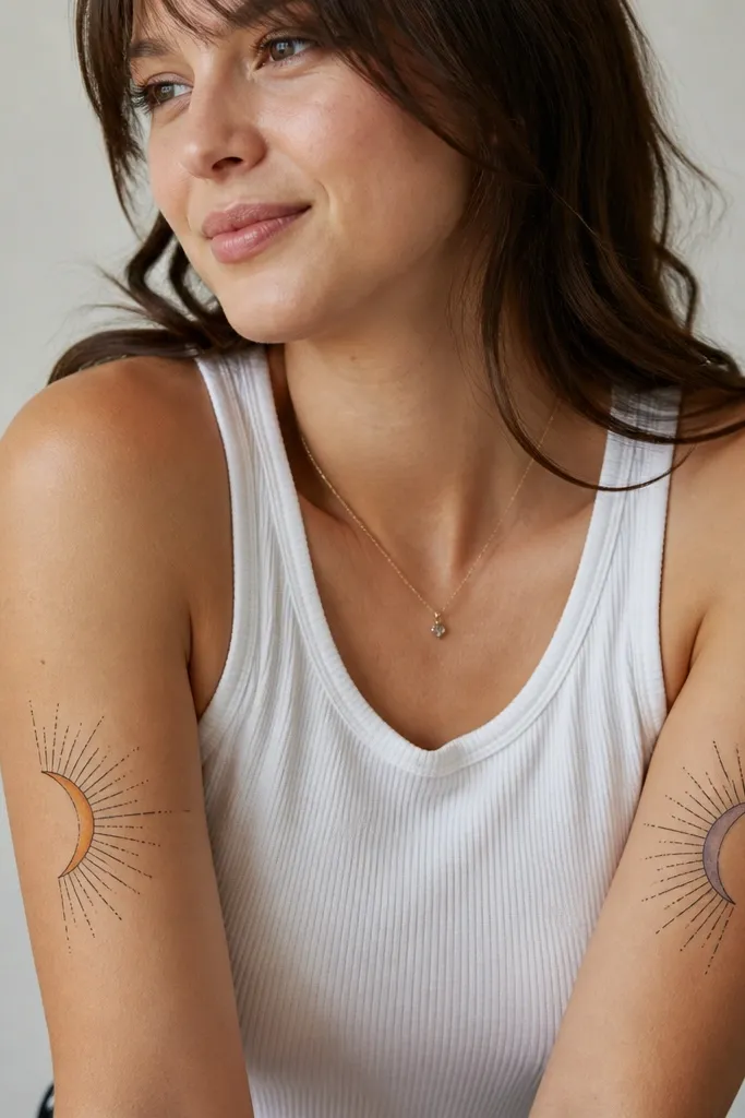
Sun and moon sleeves look balanced when the rays and dot texture are the same scale. The shared rule here is ray length and spacing, not the exact shapes. Limited color accents keep the sleeve from turning into muddy orange or grey over time. The dot texture adds depth without needing heavy shading.
Place the main sun/moon shape around the upper third of the arm. Keep rays thin and staggered, so you don't get a solid black "hedgehog." Use one accent color per tattoo: warm orange-yellow for the sun, lavender-grey for the moon, with grey only where rays overlap.
Pro tipAsk for the dot texture to be concentrated behind the main shape, not spread down the entire forearm area.
AvoidAvoid copying a full manga-style sun with thick fills; it loses detail fast.
9. Geometric Frame Sleeve With Matching Corner Symbols
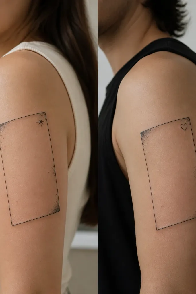
Geometric frames look clean on upper arms because the lines create structure even when your skin shifts. The frame is the match; the corner symbols are the couples part. Keeping the frame thin prevents the tattoo from looking like a thick border sticker. Sparse dot work inside the frame adds texture while keeping the sleeve breathable.
Tilt the frame so one corner points toward the shoulder. Line weight should stay consistent across all edges, and the corners should have small grey "shadow corners" rather than full black fills. Place the symbol in the corner at about the same size for both people.
Pro tipUse a stencil that matches your arm's curve, then check in a mirror with your arm slightly raised.
AvoidAvoid thick geometric lines with lots of dot fill; it heals into a heavy outline.
10. Matching Lace-Pattern Sleeve With Two Accent Colors
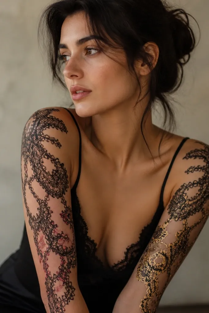
Lace patterns look high-end because they rely on negative space and consistent loop rhythm. The match comes from the same lace repeat size and spacing. Adding tiny accent colors in only a few loop areas keeps the sleeve from getting overly colorful. When done with thin linework, it looks like fabric rather than a flat drawing.
Choose a lace repeat that fits your arm width. On an upper arm, a repeat that's too large makes it look stretched; too small turns into a scribble. Add color only at loop nodes and tiny floral corners, and keep the rest black line with light grey depth under the largest floral loops.
Pro tipAsk your artist to leave a "breathing strip" of clean skin at mid-arm. That gap makes the lace read as lace instead of a full patch.
AvoidAvoid a fully filled lace background. It heals darker than you expect and loses the loop detail.
11. Couples Initials Sleeve With Shared Border Vines
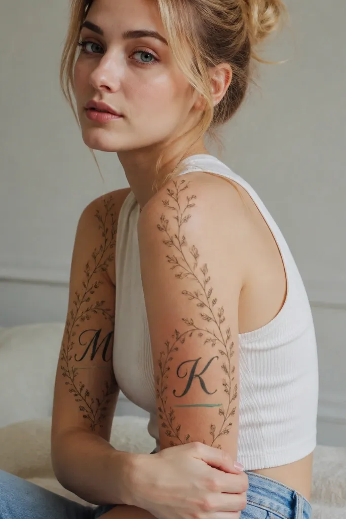
Initials look best when they're framed by motion lines that follow your arm curve. The vines do that work - they guide the eye and make the initials feel placed, not floating. Couples match comes from identical border vine spacing and leaf size, while the initials swap for you. A single accent underline color adds couples energy without turning the whole piece into color overload.
Keep initials tall, about 3 inches high, and place them slightly off-center toward the outer arm so they sit in the "flat view" area. Vines should border the initials with a consistent gap, like 0.25 to 0.4 inches. Use tiny teardrop leaves - no larger than the width of the initial stroke.
Pro tipUse a font with sturdy strokes. Thin script looks sweet at first but turns soft as it heals.
AvoidAvoid putting initials too close to the shoulder crease; that spot stretches and blurs quickly.
12. Matching Animal Linework Sleeve With One Shared Pose
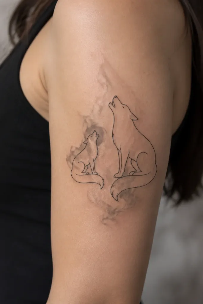
Animal linework sleeves work when you match the line thickness and the "turn" of the silhouette. The shared pose angle makes it feel like a couples set even when the species changes. Grey smoke shading behind the main shape adds depth and makes the animals pop without heavy black fill. This style also hides aging better because the design relies on silhouette clarity.
Place the animal head near the upper third, with the body following the arm curve. Keep line thickness consistent between both tattoos, and keep shading to a controlled patch behind the torso. Add one tiny shared detail, like a small star or paw print, at the same height on both arms.
Pro tipAsk for a stencil that shows your arm in two positions: relaxed and flexed. The silhouette should stay readable in both.
AvoidAvoid adding lots of tiny fur dots. They heal uneven and turn into a grey cloud.


