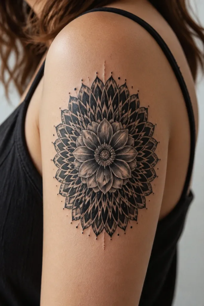
1. Veil Roses That Swallow Hard Edges
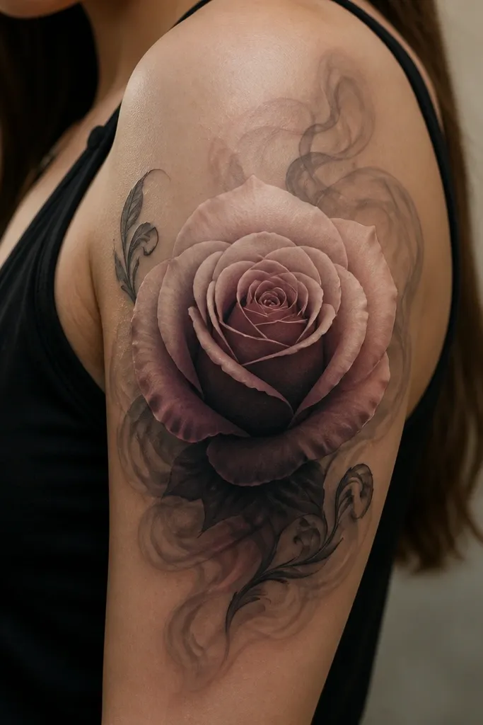
This look works because the veil creates a gradient surface where old tattoo edges can disappear. The rose gives you the "main character" shape, while the smoke does the blending work the skin needs. I like using cool gray smoke behind warm rose tones because it keeps the whole piece from turning muddy. The result reads luxe because the darkest pigment stays in the rose center and the rest transitions smoothly.
Ask for a composition that starts the rose just above the bicep's outer curve and lets the veil sweep toward the back-of-arm seam. Use gray wash for the veil, then add thin highlight lines on the top petals so the rose looks dimensional. Placement matters: keep the veil's thinnest part near the armpit crease so it naturally thins where the skin folds.
Pro tipBring a photo of your current tattoo in the exact lighting you'll get tattooed in. If your old ink is warmer (more brown-black), you'll want cooler gray smoke to counter it.
AvoidAvoid solid black fill behind the rose - it kills the veil effect and makes the cover-up look like a patch.
2. Gray-First Orchid With Clean Negative Space
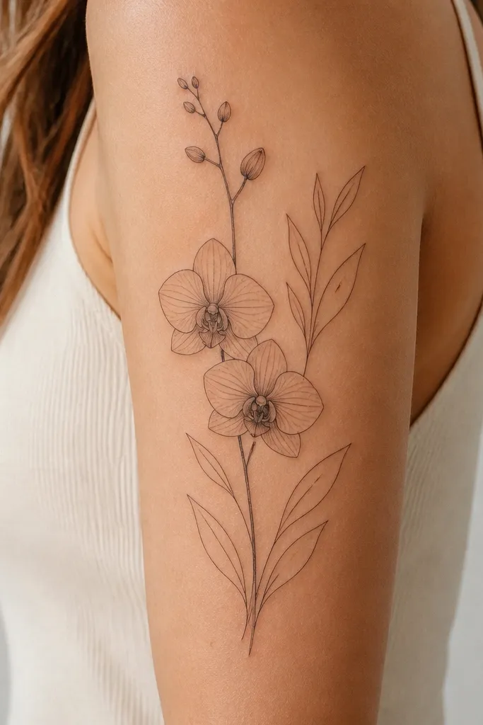
Orchids look expensive when the linework is disciplined and the shading is mostly gray with tiny color pops. Negative space is the trick: it gives your cover-up room to breathe so the old ink doesn't have to be fully hidden with heavy black. This design also suits matching couples because both people can share the orchid type and the same "stem direction," while spacing adjusts for arm size. The luxe effect is the crispness of the outlines and the soft, controlled gradients inside each petal.
Keep the main stem angled slightly toward the outer bicep, not straight up. For color, choose one accent family like magenta or deep plum and use it only in the center lip of the orchids. The leaves should be thin, with light gray shadows under them so the negative space stays clean.
Pro tipIf your old tattoo is patchy, ask for the orchid's center shading to overlap the darkest spots by about 1-1.5 cm so the eye lands on the new work, not the old edges.
AvoidDon't thicken every outline - heavy lines over old ink make everything look like one dark sticker.
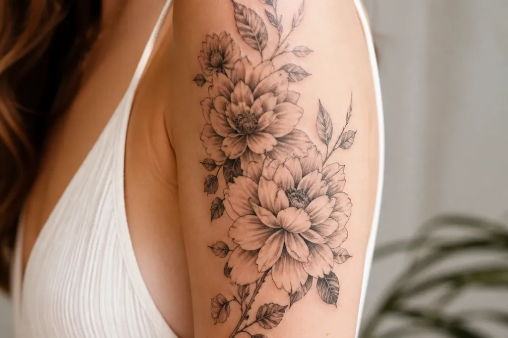
3. Peony Bunch With Dotwork Petal Spark
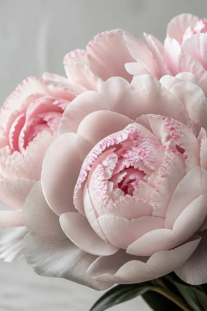
Dotwork turns a cover-up into something that looks finished, not just covered. The peony cluster gives you a strong silhouette that can hide uneven coverage, and the dot highlights make the piece feel light even if you had heavy ink underneath. I like this when you want feminine and luxe without going full realism. The dots also help break up the visual weight so the tattoo doesn't feel like a single dark mass.
Place the peony's densest shading at the center bloom, then taper outward with lighter gray. Add dotwork only on the top half of the petals and keep the dots smaller near the edges so it looks like light catching texture. Leave a small area of skin-negative space between the blooms and the outer leaves to keep the composition airy.
Pro tipAsk your artist to map the dot density: heavier dots near the center, lighter toward the outer petals. That keeps the tattoo from looking like a printed pattern.
AvoidAvoid dotwork across the entire piece - it turns into speckled fog and hides the shape.
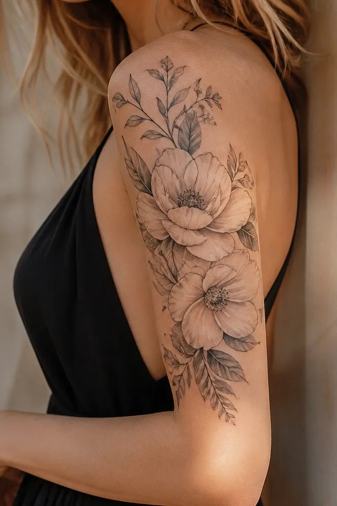
4. Rose + Fine Vines With Color-Only Centers
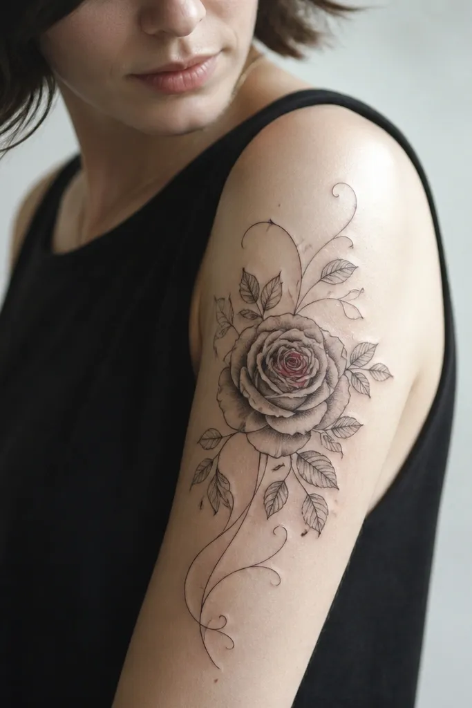
This is a luxe option because it looks intentional and tailored - the fine lines frame the bicep and the color stays concentrated where the eye lands. It's also practical for cover-ups because gray shading is forgiving when you need to blend. I've used this style to soften older linework: the vines act like a distraction path so the viewer doesn't stare at the old outline. The result feels high-end because the tattoo looks crisp and light, not heavy.
Use thin liners for vines and keep them at about the thickness of a couple of hairs, not a bold black line. For color, pick one - like coral-pink or wine red - and apply it only to the rose center and a tiny highlight on one petal. The outer leaves should be minimal and angled outward to follow the arm's curve.
Pro tipIf you have old ink near the inner bicep, tuck the rose slightly toward the outer arm so the vines can wrap and cover without compressing the design.
AvoidDon't add full-color petals if you're covering a dark tattoo - color saturation over old black often looks bruised.
5. Japanese-Style Flower Frame Without the Full Sleeve
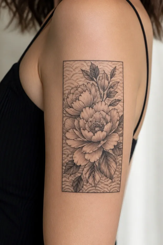
A frame gives you control - it tells the eye where to land, so the cover-up reads as design instead of patchwork. Japanese-inspired composition also handles color and blackwork well because the structure keeps everything balanced. This is luxe_high_end because the lines feel deliberate and the negative space is planned, not accidental. If your old tattoo has multiple directions of ink, the frame organizes it visually.
Ask for a border that sits parallel to your upper arm contour - not straight across. Use gray wash inside the frame and add small wave textures behind the flowers to pull attention away from any uneven coverage. Keep the main bloom centered and let secondary petals drift toward the outer edge.
Pro tipBring your measurements: have the artist place the top of the frame at the same height as your armpit crease, then adjust the bottom to end about 6-8 cm above where your sleeve seam hits.
AvoidAvoid a frame that's too wide - it makes the tattoo look like it's spilling past the arm's natural boundaries.
6. Botanical Collage With Overlapping Petals
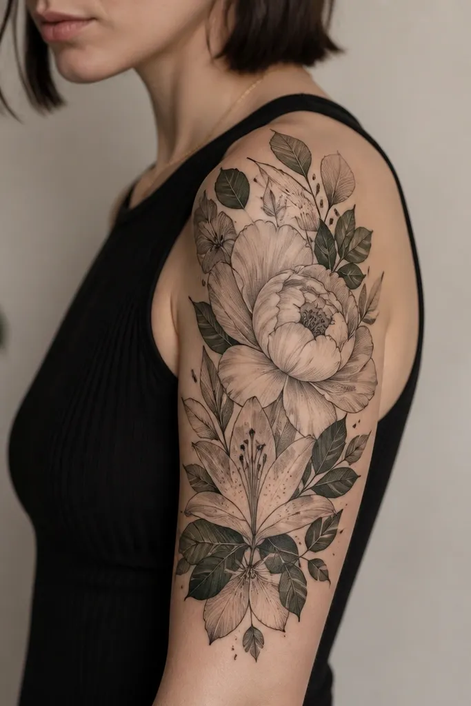
Overlapping petals are great for cover-ups because each layer can be tuned to hide a specific old ink area. This style looks luxe when the overlaps are intentional - you can see which element is in front and which is behind. The collage approach also hides mistakes well: if one spot doesn't take as evenly, the next petal layer covers the transition. It feels high-end because it has depth, not because it's overly detailed.
Plan on 3-5 different petal sizes, with the largest bloom anchored near the outer bicep. Add muted green accents only to leaf shadows or tiny veins; keep most of the color muted so gray shading stays the focus. Use soft transitions on the petals closest to old black areas, then keep the topmost petals slightly crisper.
Pro tipTell your artist where the darkest part of your old tattoo is. Overlap that area with the second layer, not the topmost layer, so the blend looks natural.
AvoidAvoid random elements with no overlap hierarchy - it looks like a sticker sheet stuck on skin.
7. Blackwork Medallion With Shaded Center Bloom
A medallion is the most controlled way to cover older tattoos when you want something that still reads like a flower. The blackwork outside edge hides uneven ink, while the shaded center keeps it from looking flat. I like this when you want luxe without needing color - it still looks expensive because it's clean and structured. The center shading creates depth, and the radiating petals guide the eye along the arm shape.
Place the medallion so the widest part sits on the outer bicep - that's where it will look balanced. Use gray shading in the center bloom and keep the radiating blackwork slightly lighter at the edges to avoid a heavy halo. Add 2-3 thin highlight strokes on the center petals so the piece doesn't look like pure black geometry.
Pro tipIf you're worried about fading, ask for slightly softer gray gradients in the center. They age better than razor-sharp contrast in high-sun spots.
AvoidAvoid a fully solid black outer ring - it makes the tattoo look like a stamp and emphasizes old discoloration.
8. Color-Accented Peony With Cool Gray Underpainting
This is the luxe version of color without the risk of looking bruised. The cool gray underpainting smooths transitions and gives you a base that looks even, even if your old tattoo underneath is uneven. Then the color goes on top in controlled areas - top petals and the inner bloom - so the tattoo has dimension. The effect is high-end because the color looks like it belongs to the shading, not like it was stamped on.
Ask for a two-step approach: gray first to map the petal volume, then color accents only where light would hit. Keep the rose-pink muted and let wine tones sit in the inner bloom. The leaves should be mostly gray with only tiny hints of green at the veins.
Pro tipIf your skin runs warm (yellow/olive undertone), lean toward cooler rose-pink and avoid orange-red. It keeps the final color from turning muddy with healing.
AvoidAvoid heavy full-petal color coverage over old black - it often heals darker than expected.
9. Luxe Laurel Frame With Small Flower Clusters
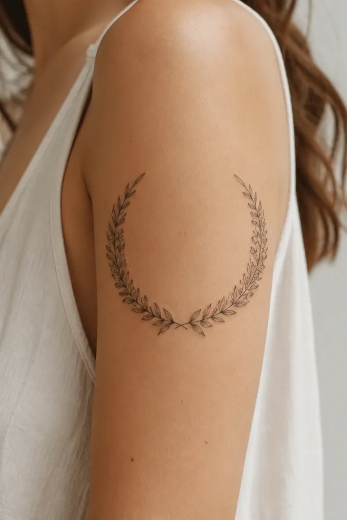
Laurel frames look expensive because they're clean and they create structure without needing big color. Small clusters let you cover uneven areas in patches while keeping the overall look light. This works for couples because the wreath shape can match perfectly while the flower clusters can vary slightly in density. The luxe effect comes from consistent line weight and tiny shading - it looks like jewelry.
Keep linework thin and consistent, then add gray shading only under the top edges of each tiny flower. Place the densest cluster at the outer bicep and taper down toward the back-of-arm seam. If your old tattoo has a dark hotspot, hide it under one cluster, not across the whole wreath.
Pro tipAsk for a test stencil on your arm with marker first. Laurel shapes can warp if the arm rotates - the marker check saves you from a crooked wreath.
AvoidAvoid thick black laurel lines - they make the tattoo look like a logo, not luxe jewelry.
10. Petal Fan With Micro-Highlights (Realism Lite)
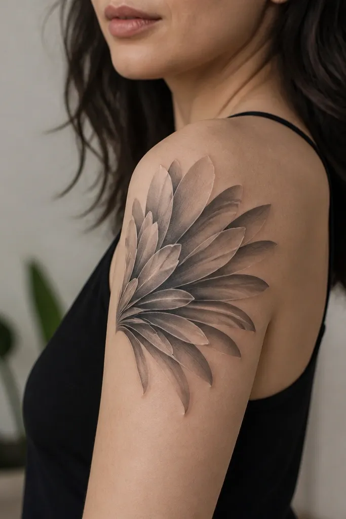
This design looks high-end because the highlights are controlled and the shading is smooth, not speckled. The petal fan shape also helps cover-up work because it lets you distribute pigment across a larger area, reducing the chance that one old ink patch stands out. I've seen this style age well because the micro-highlights give the tattoo a sense of light even after some fading. It reads luxe when the gradients are soft and the silhouette stays clear.
Place the fan so it follows the arm's curve: narrower near the armpit crease, wider toward the outer bicep. Use gray gradients in each petal and add micro-highlight strokes only on the outer top edges. Keep the leaves minimal so the fan stays the focus.
Pro tipDuring the appointment, ask the artist to check the tattoo under a mirror at arm-twist angles. If the fan loses its shape when your arm rotates, it will also look off after healing.
AvoidAvoid adding too many tiny flowers - the fan stops reading as one piece.


