1. Thin Blackwork Orbit Bands
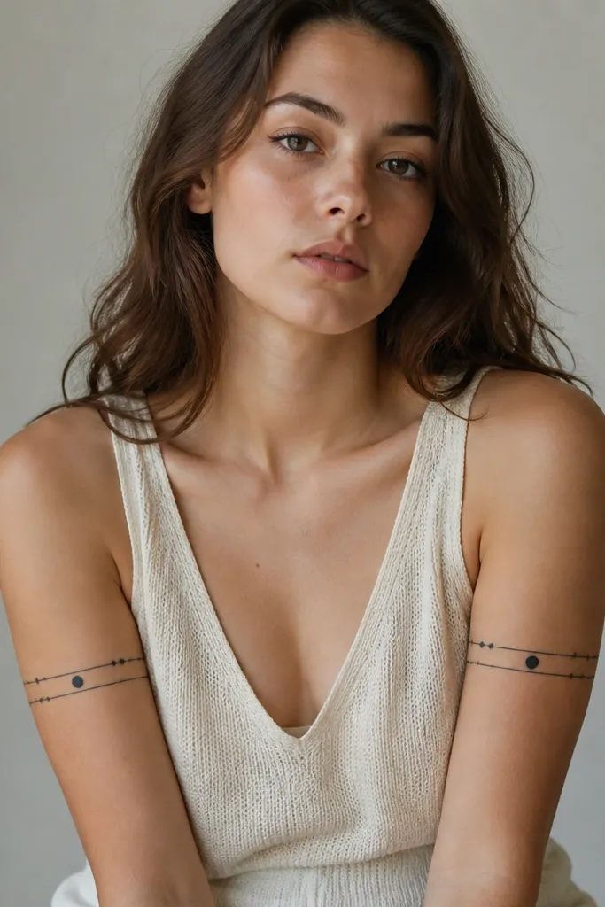
This is a low_maintenance matching option because it's mostly solid black lines and dots with negative space. The orbit pattern reads as a "set" from across a room, even if the healing is slightly different between partners. I've seen these age well because there's no delicate shading to blur into mush. Keep the bands narrow so the wrap doesn't fight sweat and clothing friction.
Place one band centered on the bicep, with the second band slightly higher so it feels like a stacked wrap. Aim for 3-4 cm width total, and keep the dot planets consistent in size (roughly the diameter of a pencil eraser tip). For couples matching, mirror the orbit direction: one arm has dots clockwise, the other counterclockwise.
Pro tipAsk your artist to mark the band on your arm while you flex and relax - it prevents that "tilted orbit" look after swelling.
AvoidAvoid adding tiny comets with hairline shading - they fade fast and make the wrap look patchy.
2. Arched Linework Heart Wrap
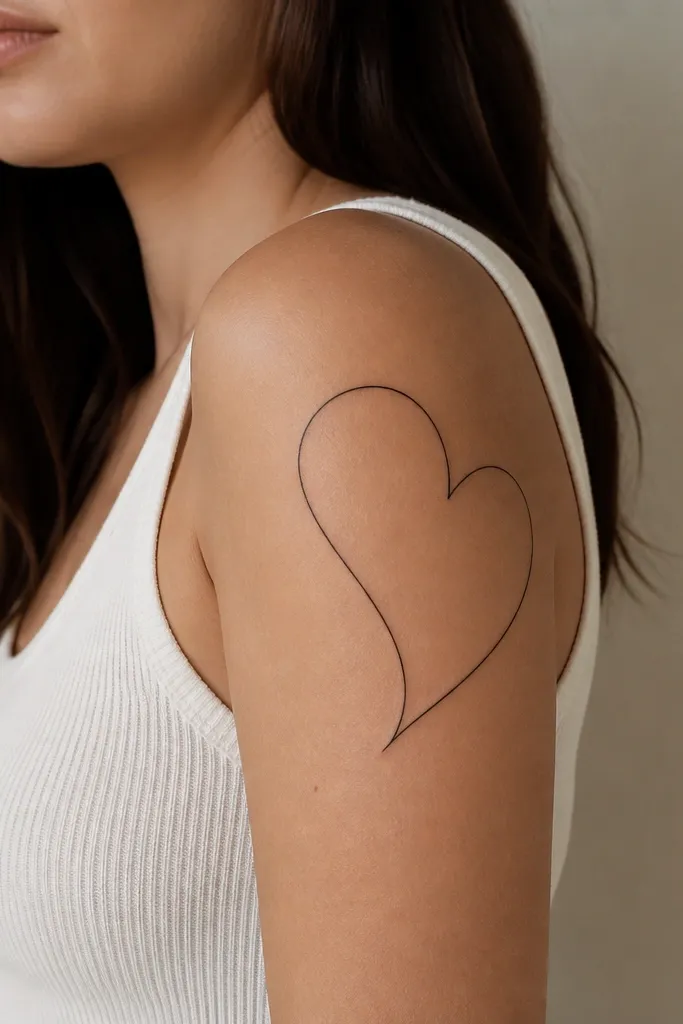
A heart outline works for couples because it's instantly recognizable, and line-only tattoos heal cleaner than heavy black hearts. The wrap arc makes it look like the heart is hugging your arm instead of sitting flat. I like this design because it stays elegant with minimal ink - no gradients to get muddy. The negative space inside the heart keeps it breathable visually.
Size it so the heart's widest part sits on the outer bicep. Keep the outline thickness around 2-3 mm and leave a 1 cm gap from the armpit crease. For matching, one partner can have the heart slightly higher and the other slightly lower, but keep the same arc radius.
Pro tipWear a fitted short sleeve for the first week after healing starts - less rubbing helps the outline stay sharp.
AvoidDon't fill the heart solid black - it traps more scabbing and can heal unevenly on textured skin.
3. Infinity Ribbon With Micro Dots
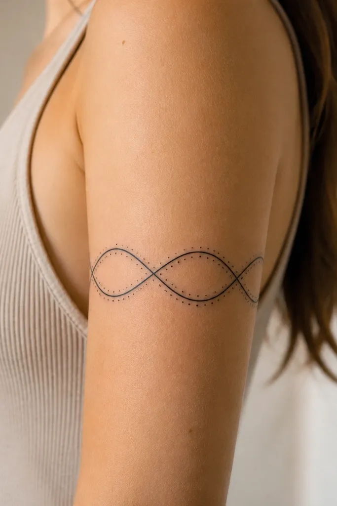
Infinity looks romantic without needing big color blocks. The ribbon line is straightforward to heal, and the micro dots add personality without requiring shading. This design stays low_maintenance because it doesn't use fine crosshatch that blurs over time. The dot spacing gives you a "stylish line" look even after mild fading.
Draw the infinity so the center crossing sits on the outer bicep, not the inner arm. Keep ribbon width consistent (about the thickness of a thin marker) and use dots at every second bend. For couples, swap dot placement: partner A has dots on the top edge, partner B has them on the bottom edge.
Pro tipAsk for a stencil placed while your arm is bent at a 90-degree angle - infinity symbols distort if the tattoo is planned on a straight arm.
AvoidSkip long thin tails that extend toward the elbow - those get stretched and fade sooner.
4. Minimal Feather Arc With One Accent Color
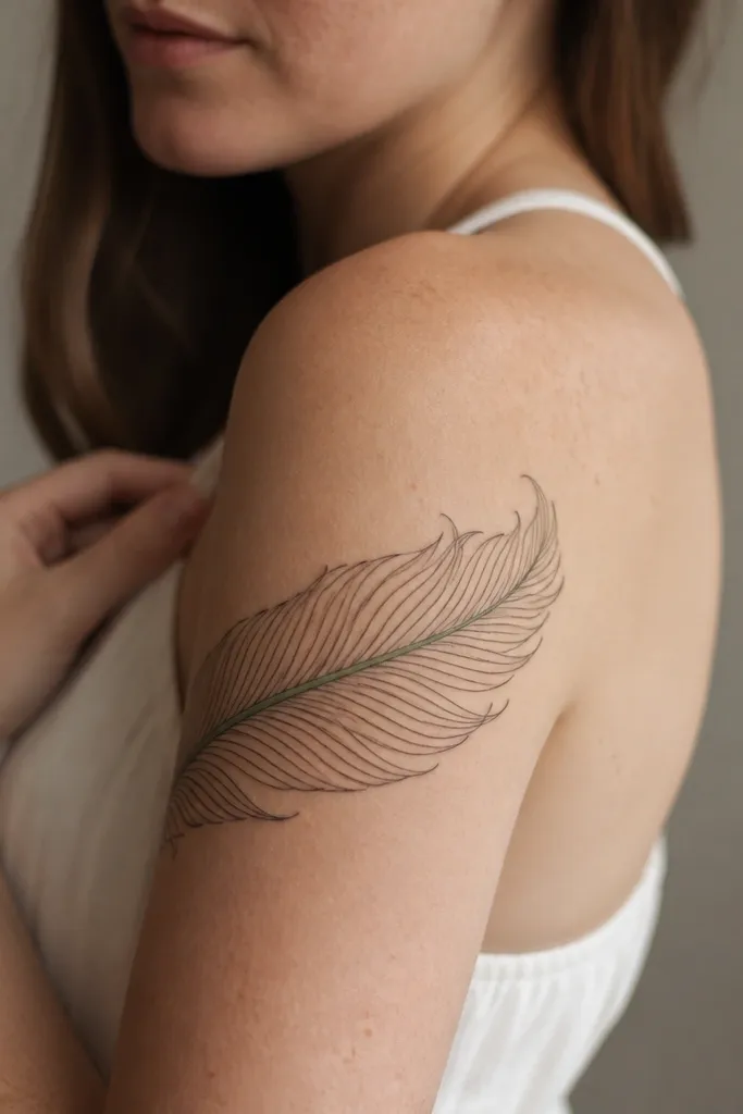
A feather wrap reads soft, but linework keeps it low_maintenance. The one accent color keeps the design interesting without making it dependent on color staying perfect. I've had this hold up better than full-color feathers because there's no large wash to fade unevenly. The feather arc also hides minor healing texture because the lines are directional.
Place the feather so the quill starts near the shoulder and the barbs trail toward the outer tricep. Keep feather width around 4-5 cm so it wraps naturally without invading the armpit. Use sage-green only for the shaft line or a narrow stripe; everything else stays black.
Pro tipIf you're fair-skinned, keep the green slightly darker than you think - it needs contrast to survive the first year.
AvoidAvoid using light pastel for the accent - it disappears into healed skin faster than black.
5. Stitched-Edge Wrap Frame
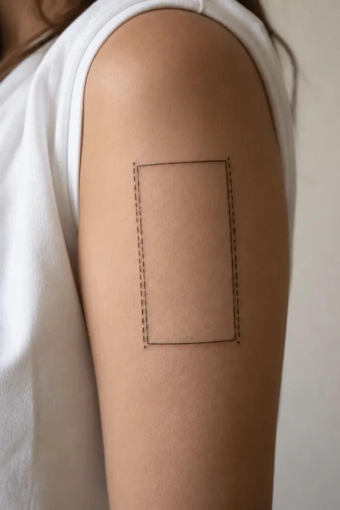
This one looks stylish because it gives you a graphic tattoo without complex art. The "stitched" dashes are easy to read and age because they're thick enough to hold. It's also low_maintenance since you're not relying on shading or tiny details. Couples can match the frame while each person adds a single small symbol inside.
Make it a frame that wraps 60-70% around the arm, with the open side facing slightly toward the inner arm. Keep dash width consistent and spaced evenly (roughly 3-4 mm dash length). For couples, keep the frame identical and swap the inside symbol: one has a small star, the other has a tiny crescent.
Pro tipChoose a placement that sits on the outer bicep even when you flex - if it slides, it will blur.
AvoidDon't make the frame too thin - hairline stitch dashes heal patchy.
6. Wordless Constellation Wrap Dots
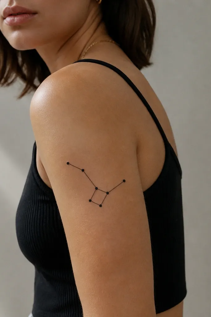
Constellation tattoos look personal but they're low_maintenance when you keep them geometric and dot-based. The dots age well because they're solid, and the short connections don't require shading. This style also works for couples because you can match the same star map shape while changing one "star" size or adding/removing a single dot. It reads as intentional even if your bodies heal differently.
Place the densest cluster on the outer bicep and let one or two dots trail toward the upper tricep like a wrap tail. Keep the entire constellation length around 10-13 cm. For couples, mirror the cluster orientation: same shape, flipped direction around the arm.
Pro tipUse a stencil that includes a flex pose - constellations can look like they're "drifting" if the lines don't align with your muscle movement.
AvoidAvoid adding cursive lines or script between dots - that turns the tattoo into fine-detail territory.
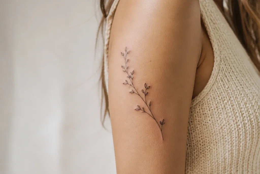
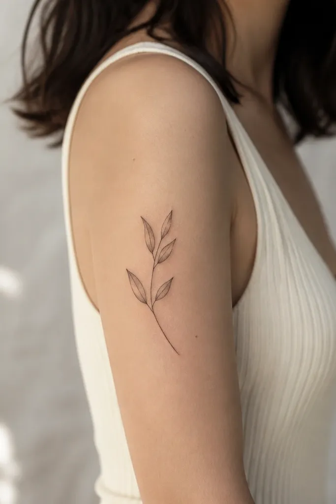
7. Two-Line Botanical Wrap (Sage Leaves)
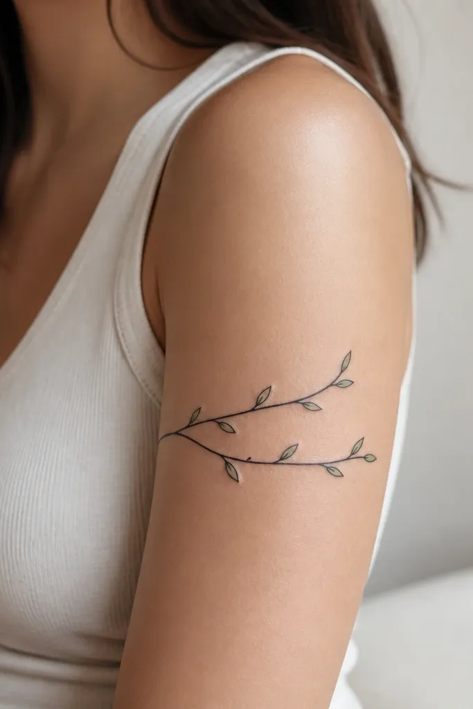
Simple botanical linework looks classy and stays readable when it's built from outlines and a couple of color touches. Two stems give you movement without turning into a sprawling full sleeve. I like it for couples because each person can have the same stems, then swap the leaf color intensity. The wrap placement makes it feel coordinated instead of separate botanical pieces.
Keep leaf outlines thick enough to hold (no hairline veins). Add sage-green only to the outer-facing leaf tips so it catches light on the top of the arm. The stems should wrap around the outer bicep with the tips pointing toward the tricep.
Pro tipIf you're getting this in summer, start sunscreen early once it's fully healed - leaf color fades faster on exposed skin.
AvoidSkip tiny vein lines - they blur and make leaves look like scribbles after a year.
8. Bold Cross-Section Wrap (Compass Style)
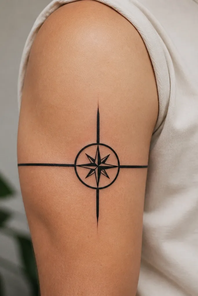
This is a graphic couples tattoo that stays clean because it's mostly bold geometry. The compass rose center gives the piece focus, and the wrap lines make it feel like it belongs on the upper arm rather than floating on skin. It's low_maintenance because there's no soft gray work to fade into uneven tones. From a distance, it reads as sharp and intentional.
Place the center compass rose on the outer bicep, then wrap the cardinal lines around so they follow the arm curve. Keep the whole piece about 11-14 cm long and 4-5 cm wide. For couples, keep the same design but swap the direction: one has the N pointing toward the shoulder, the other toward the elbow.
Pro tipAsk for pure black lines without gray wash - it heals more evenly and stays contrasty.
AvoidDon't add tiny text labels around the compass - micro lettering turns into a smudge.
9. Geometric Chevron Wrap With Negative Space
Chevron wraps look great on women's upper arms because the pattern follows muscle lines. The negative space stripes make it lighter visually, and that helps it look fresh even as it fades. I prefer this because it doesn't rely on gradients or fine details. Couples can match the band and then personalize the direction of the chevrons.
Use alternating chevrons that are thick enough to hold (about 3-4 mm per black stripe). Keep the band centered on the bicep with the ends stopping before the inner arm. For matching, flip the chevron direction between partners while keeping the same band width.
Pro tipChoose placement where your bra line or sleeve seam won't rub the ends - the band edges are where fading shows first.
AvoidAvoid very tight chevrons packed too close - they heal together and lose the crisp zigzag.
10. Micro-Flower Bud Band
Micro flowers are cute, but this version stays low_maintenance because each bud is outline + one dot, not a shaded bloom. The repetition creates a stylish line effect around your arm. Couples matching is easy: same bud count and spacing, then swap one bud as the "signature" (bigger center dot or a tiny sage-green dot). This looks polished even with minimal ink.
Aim for 9-13 buds across the wrap length. Keep bud size consistent (about 6-8 mm across). Place the band so buds sit on the outer bicep; stop short of the armpit fold so they don't get rubbed.
Pro tipAsk your artist to count your buds with you on your skin before they start tattooing - spacing mistakes show up fast on repetitive patterns.
AvoidSkip adding petals with ultra-thin lines - they blur and the bud turns into a blob.
11. Single-Needle Scriptless Date Line Wrap
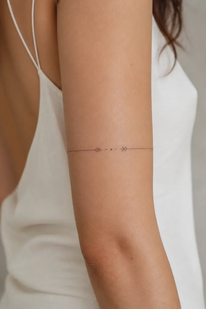
This is a couples tattoo trick I use when someone wants the meaning without the risk of fading text. Instead of actual letters, you get a clean date-line look using markers and dot counts. It stays low_maintenance because there's no micro typography to smear. You can keep it stylish with consistent line weight and a simple rhythm.
Use a single continuous thin line wrapped around the outer bicep, with two end brackets about 1-1.5 cm apart from the line's ends. Put dot markers at exact intervals to represent the date - for example, 8 dots for month, 12 dots for day, then one larger dot for a year marker. Both partners get the same dot system, but swap which side has the larger marker.
Pro tipIf you want this to last, keep the line thicker than you think - a super-thin line disappears in a year.
AvoidAvoid real cursive dates - they fade into a gray smudge quickly.
12. Roman Numeral Wrap With Thick Frame
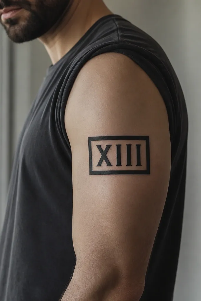
Bold Roman numerals look sharp because you're using thick strokes that heal clean. The thick frame makes it read like one cohesive graphic, not scattered text. For couples, you can do the same frame and numerals with a swapped numeral for an anniversary date that stays meaningful to both. This is low_maintenance because it avoids delicate flourishes and gray shading.
Keep the frame width around 5-6 cm and the numerals large enough to be readable at arm's length. Place it on the outer bicep, with the bottom edge stopping above the tricep crease. For matching, do partner A with the date in normal order and partner B with the same numbers reversed - it keeps the set feeling tied together.
Pro tipAsk for the numerals to be drawn in a bold stencil font, then check the stencil from a distance in the mirror before you commit.
AvoidDon't add thin decorative lines around numerals - they vanish and make the frame look uneven.


