1. Moon Phase + Stardust Flow Half Sleeve
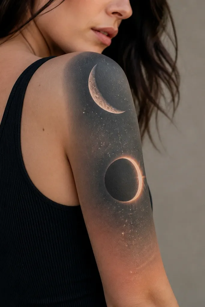
This style looks best when the moon shapes are clean and the background is light. I've seen it done with black ink moons and a thin wash of cool gray behind them, then a dusting of tiny dots that fade toward the inner arm. The negative space between the moon and the stars keeps it airy, so it doesn't feel crowded even when you cover a big area. It also photographs well because the moons act like anchors for the eye.
Have the main crescent sit on the outer bicep, about 3-4 inches below the shoulder seam. Keep the star field sparse near the inner arm so it doesn't thicken there. For a couples match, use the same moon sequence number (for example, new moon to half moon) but flip which moon sits on the outer bicep.
Pro tipAsk for a dot map plan: where the brightest dots start and where they fade, so you don't get a heavy blur in one spot.
AvoidDon't let the artist pack the stars too tightly - dense dot clusters turn into a gray patch over time.
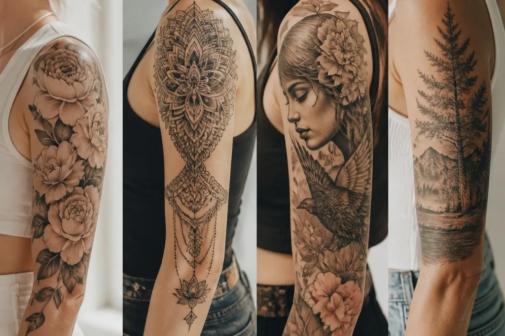
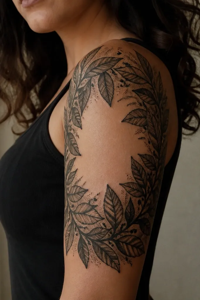
2. Fine Line Botanicals With One Bold Stem
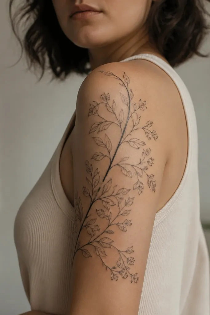
This is the style I recommend when you want softness but still want the tattoo to stay readable. The trick is controlled contrast: keep most elements fine line, then make one stem - or one flower outline - slightly bolder. That bold line gives the sleeve structure when skin stretches or when you're wearing short sleeves and only part of the design shows. It also makes matching easier because couples can share the same "hero stem" idea.
Choose three plant types max (like baby's breath style dots, a single rose bud outline, and small leaf sprigs). Place the bold stem diagonally across the outer bicep, then let thin tendrils reach toward the tricep cap. If you want color, add only tiny touches (like muted blush-pink petals) and keep the rest black.
Pro tipBefore your appointment, bring two reference photos that show the sleeve from both front and side - you need to see how the thin lines behave on arm angles.
AvoidAvoid adding too many different plant species - it reads messy instead of airy.
3. Watercolor Rose With Clean Negative Space Edges
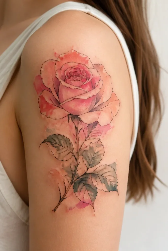
Watercolor looks good when the artist respects the boundary between pigment and skin. I've had this exact setup: rose petals in diluted pink and peach, with thin black linework to keep the rose from turning into a smudge. The clean negative space edges make it look intentional instead of like a stain. On upper arms, the contrast keeps the rose readable even as the wash fades slightly with time.
Put the rose head on the outer bicep and let the stem taper toward the inner arm. Keep the wash concentrated around the petals and pull the color outward into a light gradient - not a full background blanket. For matching, give each person the same rose placement but different accent colors (one peach, one lavender) so it still looks like a pair.
Pro tipAsk the tattooer to test the wash density on a small practice stencil at the start of the session.
AvoidDon't choose a full watercolor background with no blank skin - it heals darker and heavier than you expect.
4. Chicano Banner Half Sleeve With Ribbon Banner Text
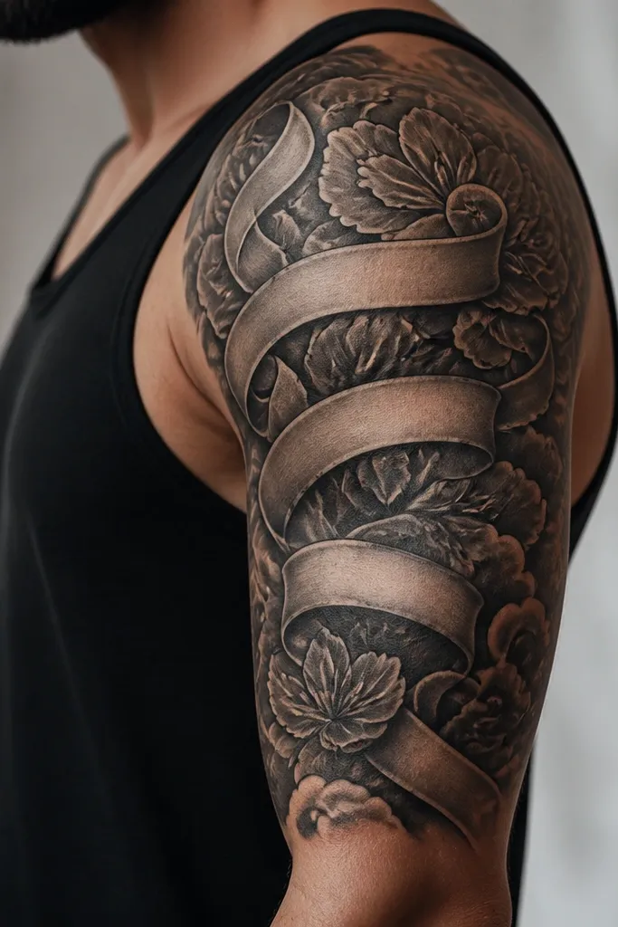
If you want a sleeve that looks finished even when it's partially covered, Chicano banner layouts do that. The ribbon gives you a natural curve that follows the arm, and bold shading keeps it strong. I like the version where the banner text is secondary to the portrait or emblem - otherwise the lettering can look cramped when the skin flexes. The contrast between solid ribbons and shaded background makes it pop in real life, not just flash photos.
Place the ribbon band across the outer bicep at a slight diagonal, then let the banner tails drop toward the tricep cap. Keep lettering to one line or two short lines so it stays legible. If you're matching with a partner, use the same banner shape and swap the names/dates - keep the font weight identical.
Pro tipBring your text in the exact font style you want and ask for a test placement on your arm with marker before ink goes in.
AvoidAvoid tiny script on a banner that wraps - it turns into unreadable mush.
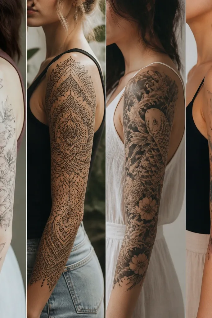
5. Geometric Half Sleeve With Triangles and Negative Space Skin
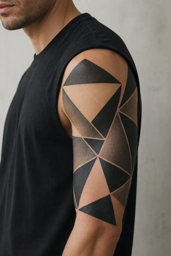
Geometric sleeves look crisp when the artist uses the skin as part of the design. The best versions leave big negative space panels so the eye gets breaks - otherwise the whole arm turns into one dark block. I've seen this heal beautifully when lines are consistent and shading is done with smooth gradients inside each triangle. It also works for matching because you can mirror the pattern and still keep it unique per person.
Start with a grid: outer bicep gets the darkest triangles, inner arm gets lighter gray, and the tricep cap gets the most negative space. Keep line thickness uniform - ask for 1.0-1.5mm line equivalent in the stencil, then stick to it. For couples, match the overall geometry but rotate the pattern 30-45 degrees between arms.
Pro tipAsk your tattooer how they plan to handle skin folds at the bicep - if they don't mention it, that's a red flag.
AvoidDon't add too much micro-detail inside triangles - it blurs and kills the clean geometry look.
6. Japanese Waves Half Sleeve With One Red Anchor Element
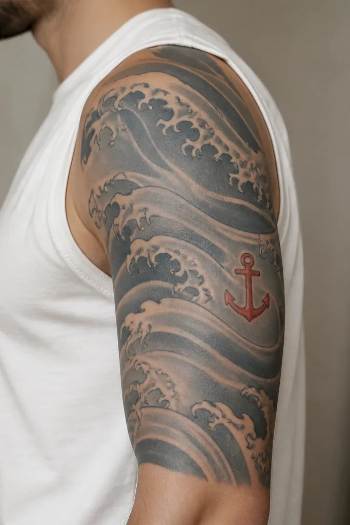
Waves are hard to mess up if the artist understands flow. The arm is curved, so the wave bands should wrap with it - not run straight across. I like keeping the palette mostly blue-gray with one red anchor element because it gives you a focal point for photos. The red also helps matching couples: same red anchor placement and shape, different wave intensity.
Place the densest wave crest detail on the outer bicep, then thin it down toward the inner arm. Use one red anchor or small torii-like accent about the size of a large coin (around 1.5-2 inches wide). Keep the background between wave bands light so the design breathes.
Pro tipRequest a "flow check" in the mirror after the stencil - you want to see the waves wrap when your arm is bent.
AvoidAvoid painting every crest with the same density - the sleeve should fade slightly to look natural.
7. Blackwork Botanical Frame With Hand-Poked Texture
This is my go-to when someone wants bold and artsy but not full color. The frame gives structure, and the hand-poked texture adds a lived-in feel without turning into a gray smear. The central negative space is what keeps it from looking like a heavy black sticker. On upper arms, blackwork frames also hide uneven healing better than full-coverage shading.
Use one or two thick botanical outlines (like oversized leaves) and build texture with dot shading in the leaf interiors. Keep the frame gap about 1-2 inches wide so skin can show and the tattoo looks intentional. For matching, keep the same frame thickness and swap the central symbol (a small heart, initials, or a tiny bird).
Pro tipAsk for dot texture density maps - too many dots in one area heal darker than the rest.
AvoidDon't fill every single gap - letting skin show is what makes blackwork look designed.
8. Portrait Mini-Scene With Soft Realism Background
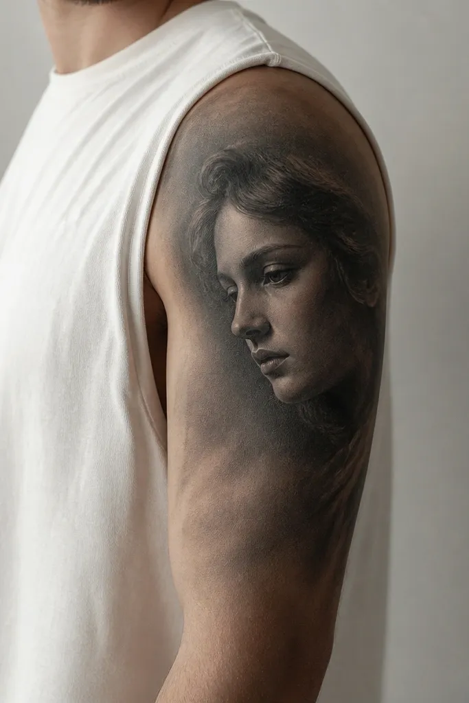
Realism on an upper arm looks best when it's framed by a calm background. The portrait becomes the anchor, and the soft gray fade keeps it from fighting with the arm's movement. I've done this with black-and-gray only, then used a tiny highlight on the cheek or forehead to bring the face forward. Couples love this because you can match the "mini-scene" layout and swap the person.
Place the portrait where you'll see it when you raise your arm - usually mid outer bicep. Keep the background gradient lighter near the inner arm so it doesn't look like a dark wall. Limit the portrait size to about 3.5-4 inches wide for a half sleeve; bigger can overwhelm.
Pro tipBring a reference photo with the same lighting direction you want tattooed - realism needs consistent light, not vibes.
AvoidAvoid tiny hyper-realistic eyes with no surrounding shading - they heal and blur into ink dots.
9. Skull and Peony Half Sleeve With Offset Placement
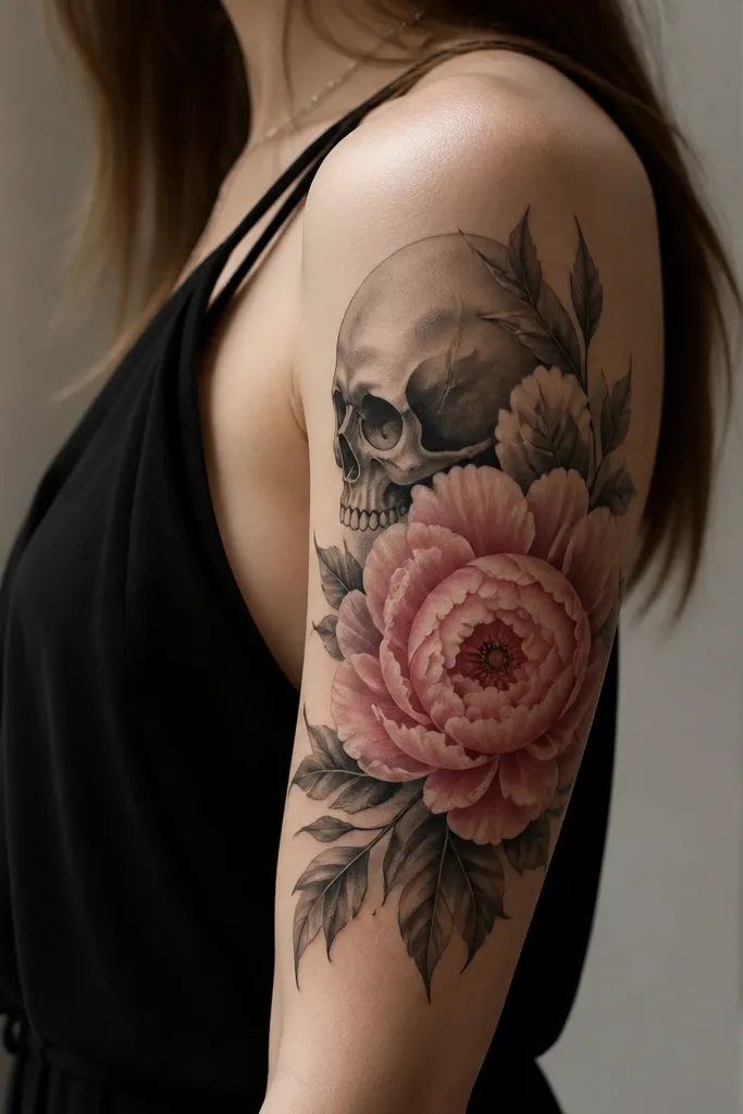
This combo works because it balances softness and edge. The peony brings color and petal shape, while the skull adds contrast and personality. I like offset placement: skull slightly higher or lower than the peony center so the sleeve has motion. When the artist connects them with thin vine lines, the whole piece looks like one story instead of two separate tattoos.
Put the peony bloom on the outer bicep, then tuck the skull near the tricep cap with a slight rotation. Use gray shading under the peony petals to make them look dimensional without overdoing color. For matching couples, keep the same peony size and swap skull details (one has roses, the other has a small crescent).
Pro tipAsk for a thin vine bridge line that wraps around the outer arm - it helps the tattoo stay readable from the side.
AvoidAvoid placing the skull dead center under the peony - it often looks stacked and flat.
10. Serpent Wrap Half Sleeve With Pearl Highlights
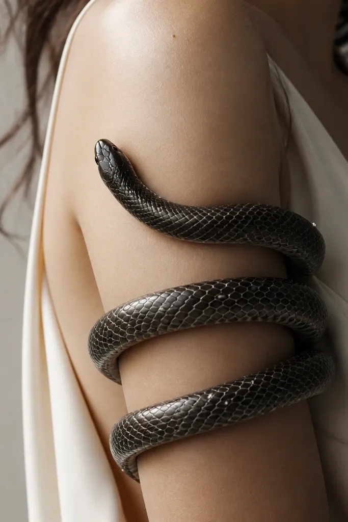
Snakes look alive when the head is placed where it can "reach" toward the shoulder. Pearl highlights - even just a few white ink touches - make the eyes and scale edges stand out. The coil path should follow the arm contour so it looks like it's hugging you, not sitting on top. For couples, you can mirror the snake direction while keeping the pearl count the same.
Start the head on the outer bicep and let the body coil toward the inner arm. Use gray scale shading with sharp linework on the outer coil edges, softer blending on the inner coil. Keep white highlights limited to eyes, a few scale edges, and the tip of the nose so it doesn't look chalky.
Pro tipAsk your artist to stencil the coil while you flex your arm - the tattoo should stay curved in both relaxed and flexed positions.
AvoidDon't overuse white ink - too much makes the piece look faded and uneven after healing.
11. Butterfly Wing Half Sleeve With Ombre Fade
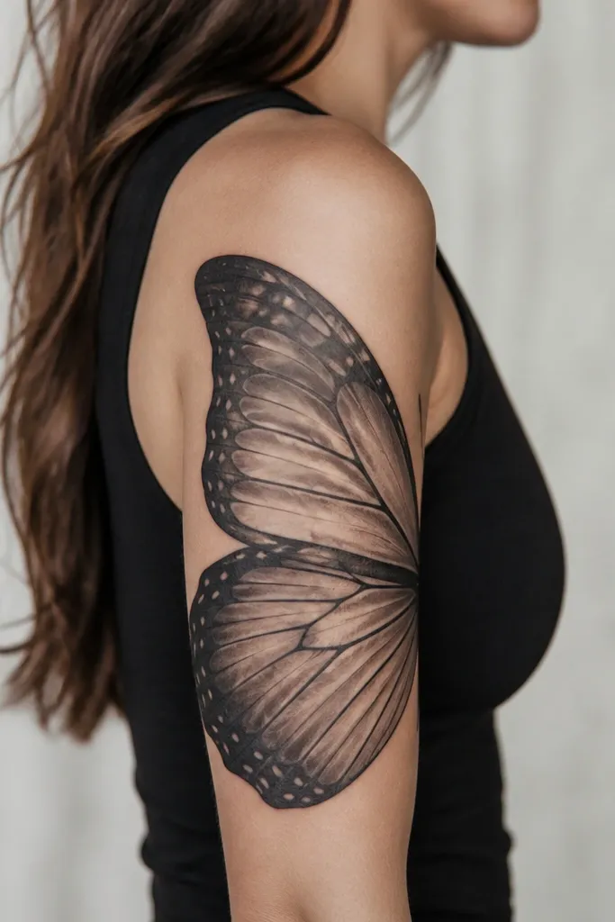
Butterfly wings look best when the wings are large and the fade is intentional. This style uses a strong edge outline, then transitions into a light ombre so the wing looks like it's dissolving into the skin. I like black-and-gray with one color accent in the wing tips, like muted teal or dusty purple. It reads delicate but still holds up because the outline is bold.
Place the wing "spine" along the outer bicep and let the wing tips reach toward the tricep cap. Keep the ombre lighter as it approaches the inner arm. For matching, swap the accent color but keep the wing shape identical.
Pro tipAsk for a color accent only at the top edge of the wings, not across the whole wing - it keeps it from looking like a sticker.
AvoidAvoid tiny butterfly wings - small wings disappear when the arm moves.
12. Matchstick Candle Sleeve With Wax Drips
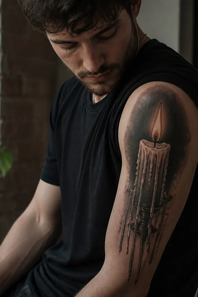
This is a fun, graphic half sleeve that still looks romantic. The wax drips give you natural vertical movement, and the flame adds warmth without needing full color. I've done it in mostly black and gray, then used warm yellow-orange in the flame only - it makes the tattoo look brighter without turning the rest muddy. Couples match well because you can do the same candle shape and swap dates or initials on the label.
Put the candle base near mid outer bicep, then let drips angle slightly toward the tricep cap. Keep the label area about the size of a credit card corner (small but readable). Flame should sit near the shoulder line and be smaller than you think so it doesn't overpower the sleeve.
Pro tipIf you want it to feel more personal, add a tiny line of text in the label but keep it short - 3-6 characters looks best.
AvoidAvoid outlining every drip equally thick - some drips should be thinner so the wax flow looks real.


