1. Outer arm crescent moon with dot shading gradient
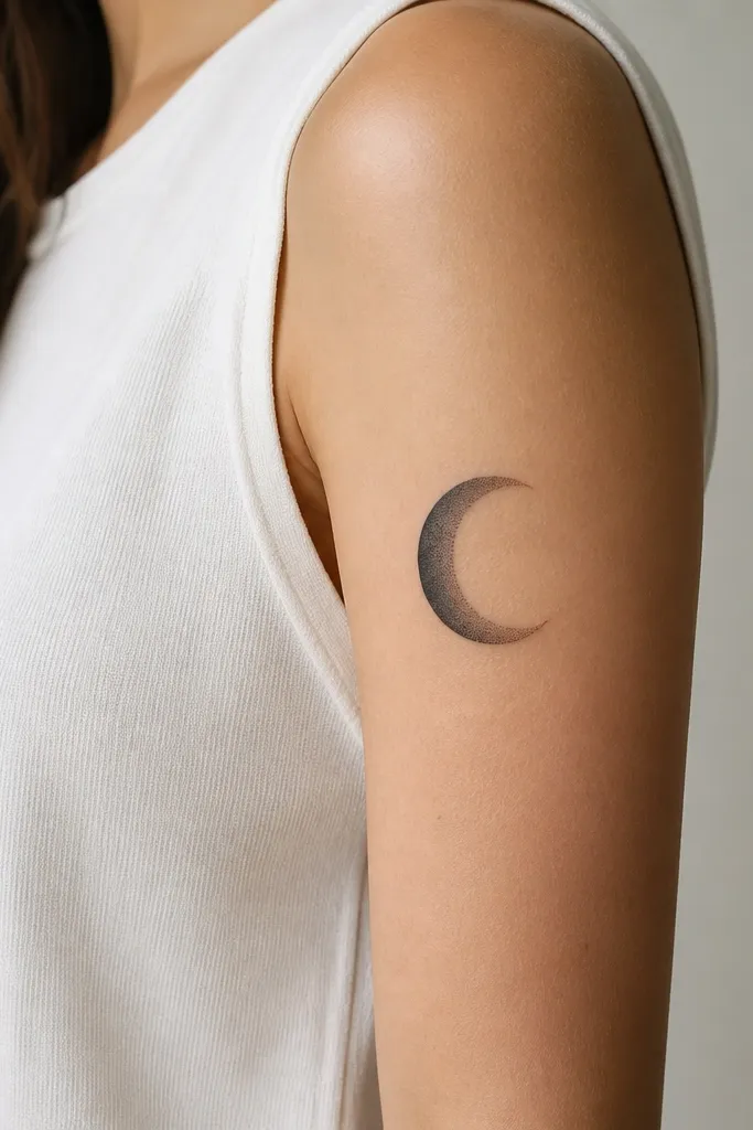
This design looks good before and after healing because the dot shading creates a slow tonal drop-off. On the upper arm, that gradient hides minor post-heal fading and keeps the moon reading as one shape instead of separate dots. I like the crescent angled slightly upward, because it lines up with the biceps curve and avoids the "flat sticker" look.
Place it on the outer upper arm, centered about 2-3 inches above the elbow crease when your arm hangs relaxed. Keep the crescent about 3.5-4.5 inches long so it stays legible after healing. Ask for dot shading with a darker inner crescent and lighter outer edge; avoid packing the dots into a solid block.
Pro tipDo a flex test in a mirror with a temporary marker outline. If the crescent stretches and looks warped, move it a half-inch toward the back of the arm.
AvoidAvoid a thick solid crescent with no tonal fade - it heals flat and can look heavy compared to the rest of your tattoo plan.
2. Small linework butterfly with negative-space wings
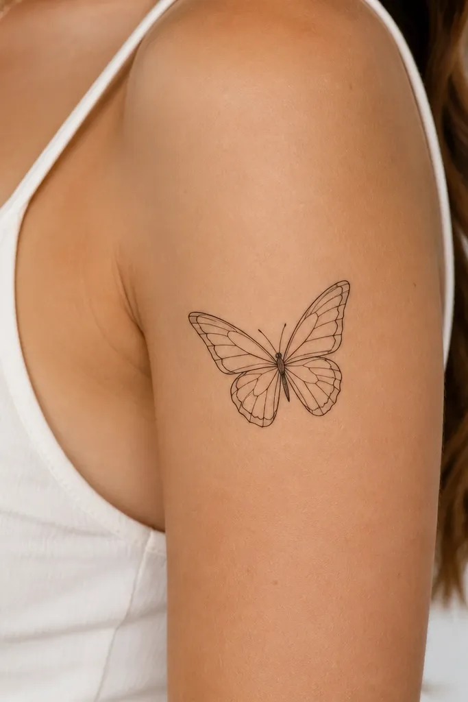
Negative space is the secret sauce for linework that still looks crisp after healing. The gaps give your skin room to breathe while the lines stay readable even if they soften by a touch. I picked this for women who want something feminine but not "overly cute," and the outer wing edges catch light differently as the arm moves.
Size it around 2.5-3 inches tall so the lines don't get swallowed. Place it on the front upper arm, slightly off-center toward the outer side, so it follows the arm's natural curve. Use thin lines with minimal micro-fill; the butterfly should feel airy, not shaded into a gray blob.
Pro tipAsk your artist to do a stencil with the wings slightly asymmetrical - it looks more natural and less "printed."
AvoidAvoid tiny filled wings with lots of micro dots - those blur fastest on moving skin.
3. Two-person matching: linked hearts, one solid one outline
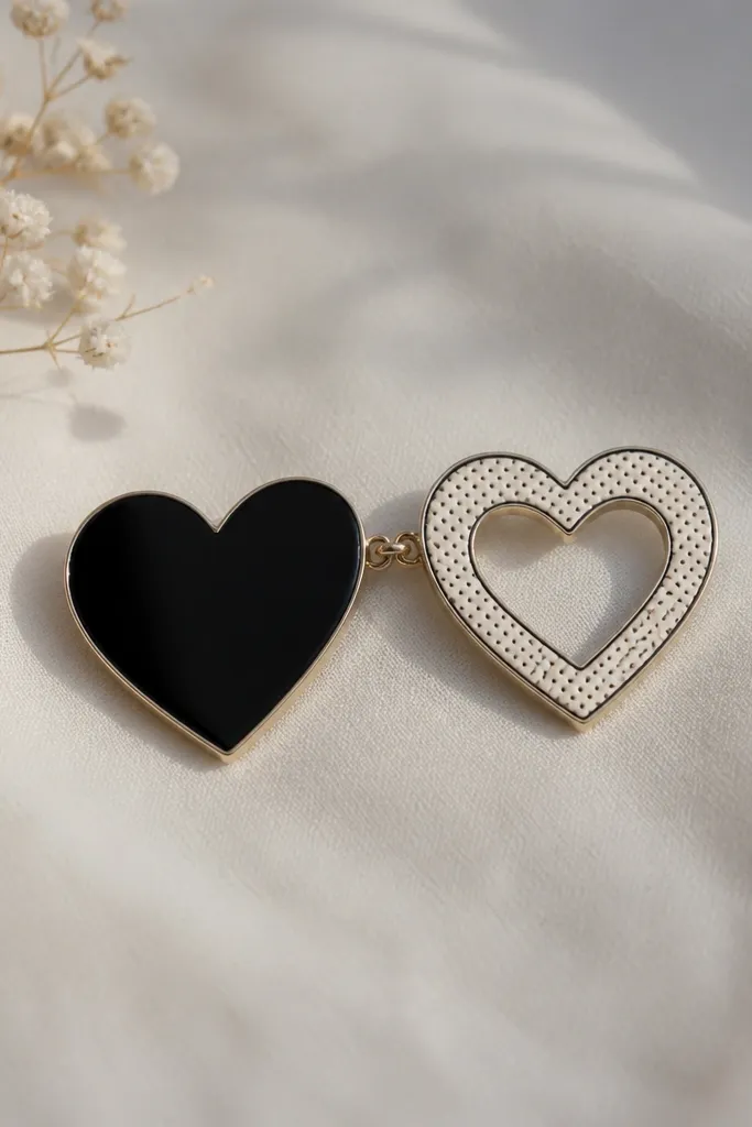
This is matching that looks intentional after healing. Solid and outline hearts age differently, so the pair still has contrast when the outline softens slightly. The link line gives you a visual connection even if your arm positions aren't identical.
One person gets a 3.5-inch heart with solid black fill; the other gets a 3-inch outline heart with light dot shading inside. Place both on the inner upper arm so they face your torso when you wear sleeveless tops. Keep the connecting link line thin and short so it doesn't turn into a thick band.
Pro tipIf you're doing this as a couple, bring a photo of both arms flexed and relaxed. Use that to choose which heart gets the solid fill so the shape holds under stretch.
AvoidAvoid identical hearts with identical fill - the one with more surface area will heal darker and can make the pair look mismatched.
4. Geometric armband panel with angled dot highlights
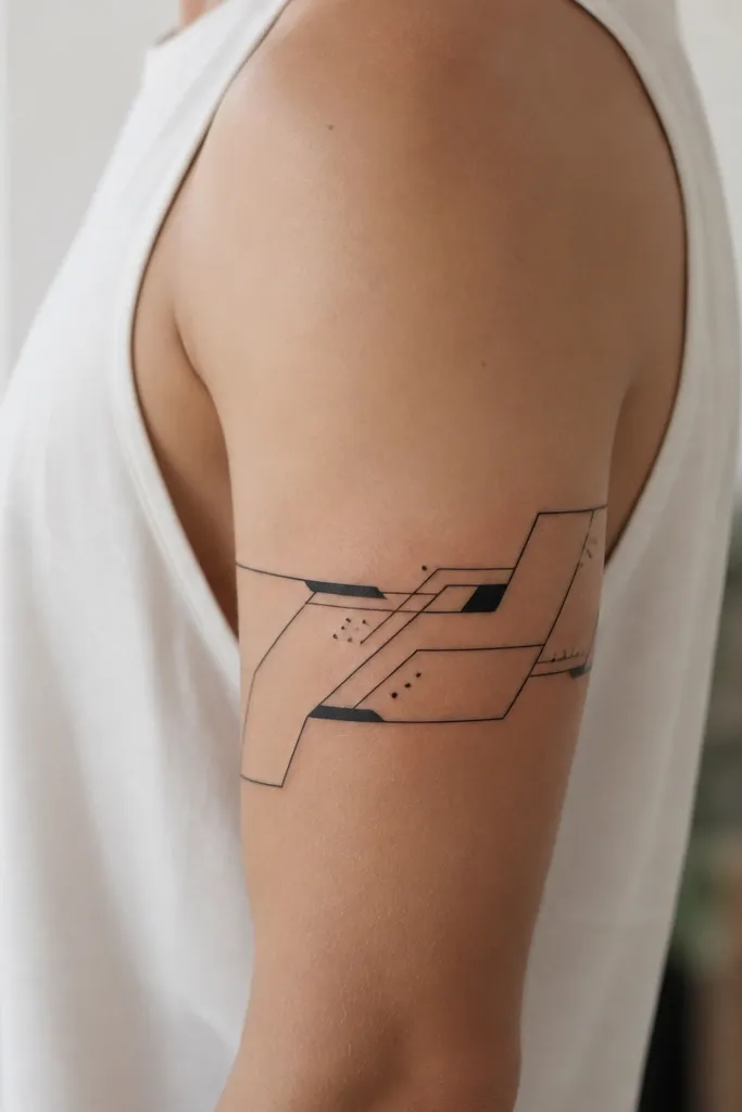
Geometric panels hold up on the upper arm because the design uses straight edges and clear negative space. The dot highlights add texture without forcing the artist to shade large areas that can heal unevenly. I like the angled dot clusters because they mimic light catching on skin.
Don't do a full circle on the upper arm - do a partial band that wraps about 60-70% around the arm. Place it on the outer side so the geometry doesn't collide with your biceps bulge. Keep it about 4-5 inches wide and include at least one breathing gap of clean negative space.
Pro tipAsk for one "anchor" triangle or diamond that stays centered. If everything is the same weight, the tattoo can look flat after healing.
AvoidAvoid dense full coverage shading across the whole panel - it can heal mottled and lose the crisp geometry.
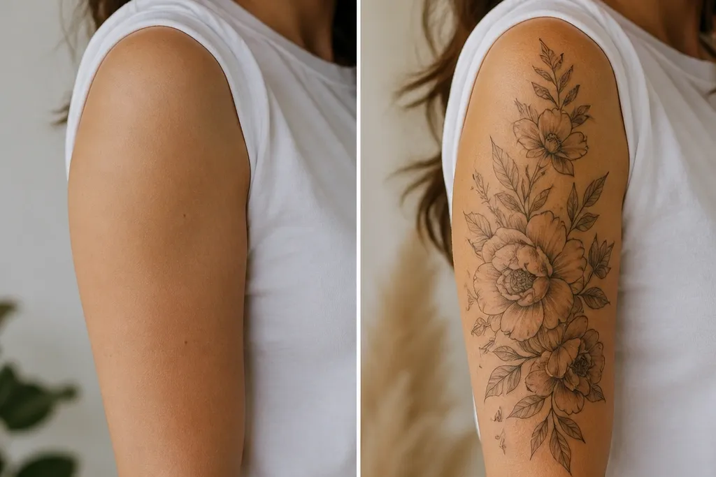
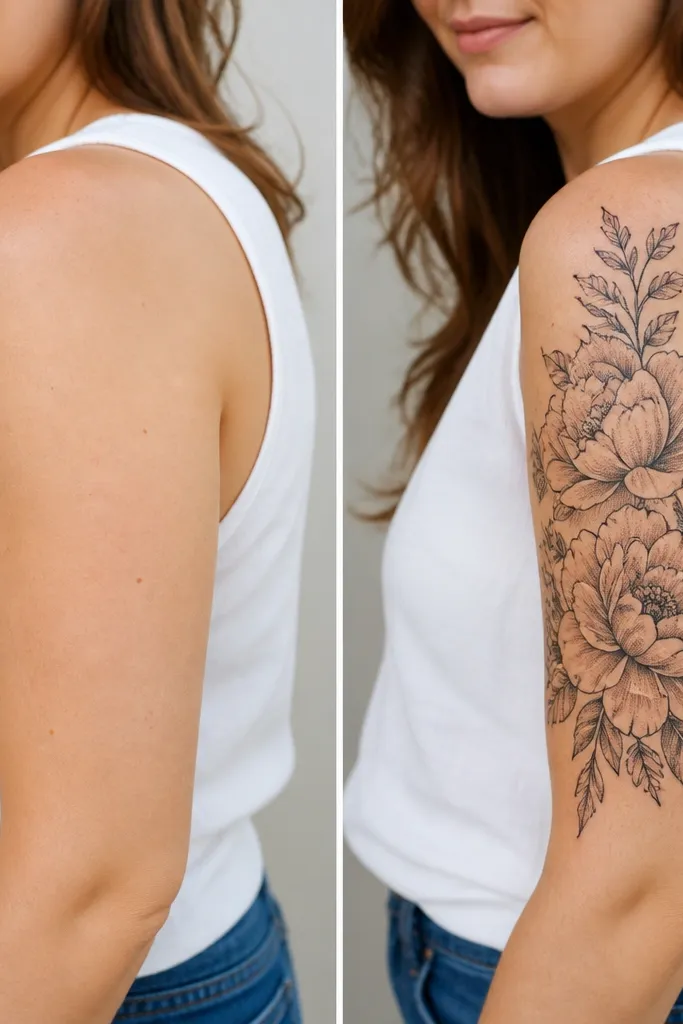
5. Line-and-wash rose on outer upper arm
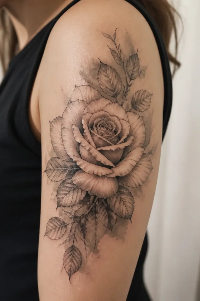
A rose with linework plus wash is forgiving because the wash smooths transitions and hides small healing variations. The outer fade keeps the tattoo from looking like a dark square on your skin. I've seen this heal really naturally when the artist keeps the wash light near the edges.
Place it on the outer upper arm where your arm naturally curves outward. Size the rose head about 3 inches wide, and let the stem or leaves trail down less than 2 inches. Ask for gray wash that fades before it reaches the outer edge of the design.
Pro tipPick a reference rose photo with a visible petal edge shadow. That helps your artist place the wash where it will read in real life.
AvoidAvoid fully shaded roses with heavy black backgrounds - they heal darker than expected and can look bruised.
6. Tiny constellation with a single thicker star
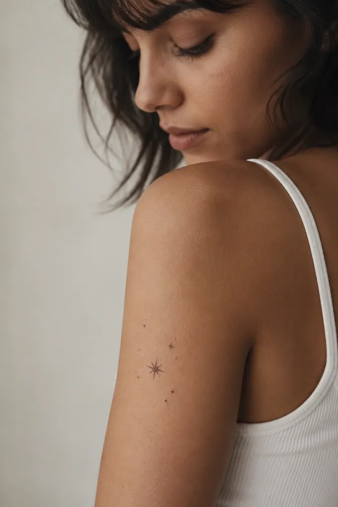
Constellations work on upper arms because the pattern is naturally scattered and doesn't require big solid areas. The single thicker star acts as a focal point so the whole piece doesn't turn into a faint speck after healing. I like this placement because it looks good under short sleeves and still meaningful up close.
Keep it 2.5-3.5 inches wide. Place on the front outer upper arm, slightly above the midpoint of your biceps. Use fine dot stars with one star in slightly bolder line weight or a small starburst.
Pro tipAsk your artist to map star positions with a light marker on your arm first. The spacing matters more than the actual star shapes.
AvoidAvoid using only tiny dots with no focal star - it can heal too light to notice.
7. Script name in a bowed baseline with thin flourishes
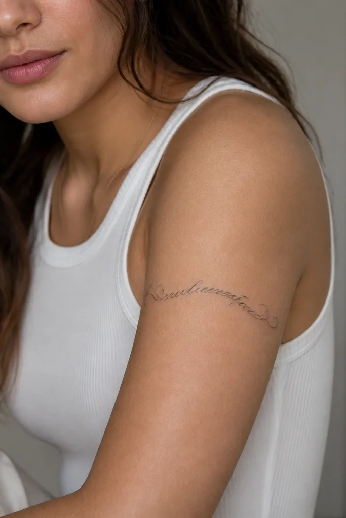
Script on the upper arm can look clean when the baseline follows the arm's curve. I like bowed baselines because they keep the letters from stretching into weird angles as your arm moves. Light under-letter shading helps the script pop without turning the whole word into a gray blur.
Size it so the word spans about 3.5-4.5 inches. Place it on the front upper arm, not the inner biceps crease. Ask for thin flourishes that don't touch each other; spacing prevents healed merging.
Pro tipBring your exact font reference and ask for one test line pulled in the correct curvature on stencil day.
AvoidAvoid thick calligraphy on moving skin - it heals heavy and can thicken beyond the font you picked.
8. Color pop: small watercolor-leaning sunflower with black stem
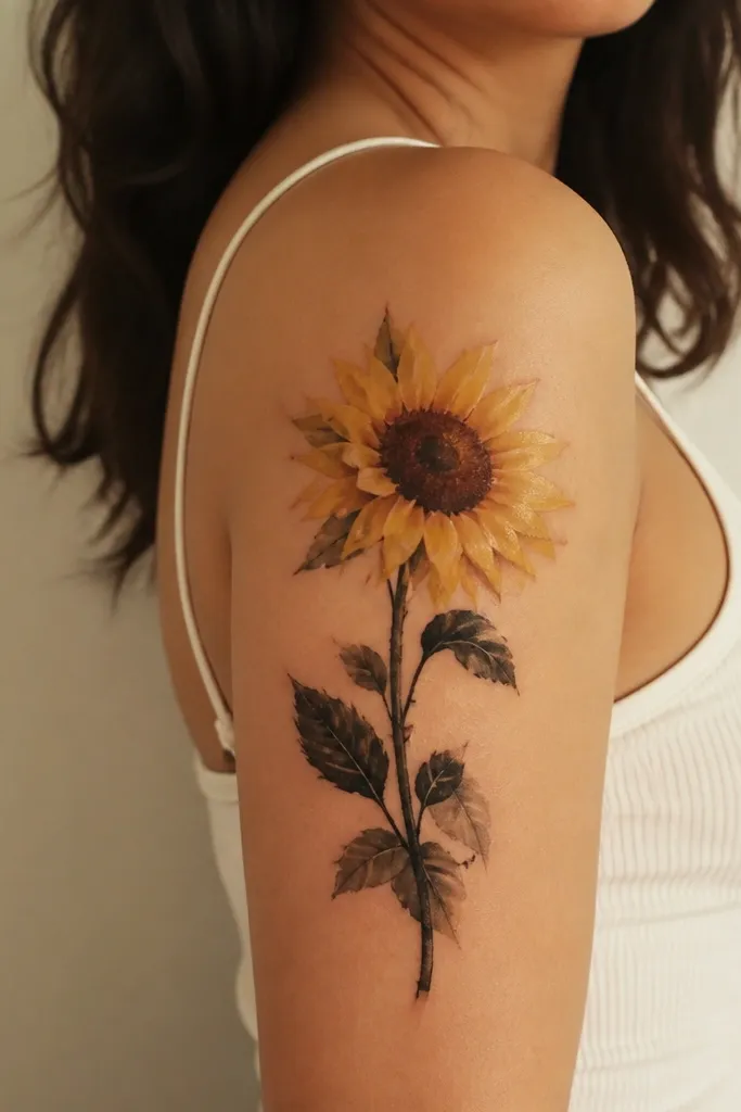
The black stem anchors the piece so the color doesn't spread into a vague patch after healing. Sunflower color stays readable because the petals have a clear shape even when the watercolor edges soften. I chose this for people who want color but hate the look of heavy full-color sleeves.
Keep the flower head about 3 inches wide. Place it outer upper arm so the stem can angle up toward the outer shoulder. Ask for yellow with controlled saturation and let the petals fade at the edges instead of full-bleed color.
Pro tipPlan for touch-ups if you're going brighter than honey yellow. Very pale yellow can fade faster on top of healed skin.
AvoidAvoid watercolor blooms with no dark outline if you want crisp petals in year two.
9. Feather with directional shading from quill base
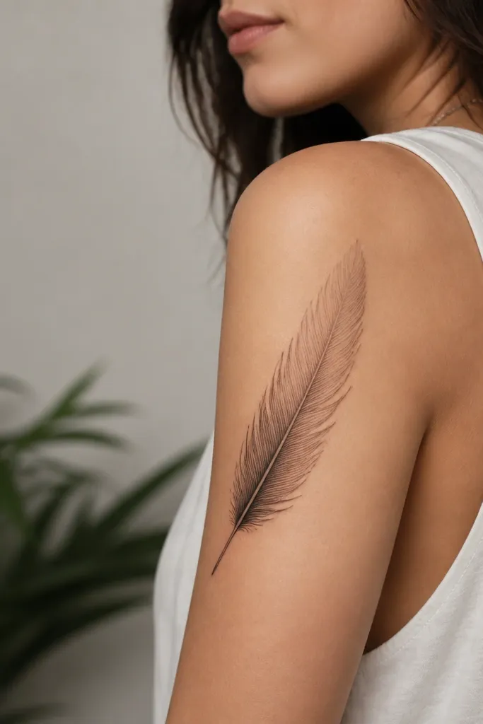
Directional shading makes the feather look like it has depth, and it also hides healing changes. When shading starts dark at the base, the tip can fade slightly and still read as a feather. The fine line veins give structure so it doesn't turn into a soft gray brushstroke.
Size it about 4-5 inches long. Place it so the feather shaft runs diagonally from upper outer arm down toward the back of the biceps. Use thin line veins spaced evenly; ask the artist to keep the tip lighter than the center.
Pro tipAsk for a stencil that follows your arm's diagonal - straight up-and-down feathers look awkward once you flex.
AvoidAvoid packed shading all the way to the tip - it heals too dark and loses the feather shape.
10. Mini portrait silhouette in solid black oval
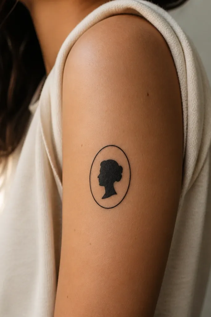
Solid silhouettes age well on upper arms because there's no fine color detail to blur. The oval frame keeps it from looking like a random blob, and the stark contrast stays readable through healing. I've seen this work for couples too when you want matching without copying every facial detail.
Keep it 2.5-3 inches tall. Place on the outer upper arm where it will catch light in photos. Ask for a clean oval and a silhouette with sharp edges; avoid gray gradients.
Pro tipBring a high-contrast photo with clear jawline. Your artist can trace the shape and simplify it for better healing.
AvoidAvoid tiny facial features like individual eyelashes - they disappear after healing.
11. Script + small icon: dagger with ribbon knot
This design works because the dagger lines are long and straight, and the ribbon knot adds a softer curve. The mix of sharp and curved shapes holds up as the skin moves. I also like that the script sits above the dagger and doesn't need to be huge.
Use a 3-4 inch dagger length and keep the ribbon knot under 1 inch. Place on outer upper arm so the dagger points slightly toward the elbow. Ask for the script in thin linework, not thick fill, and keep it short - 3-5 words max.
Pro tipIf your script is long, split it into two short lines so the letters don't stretch across the biceps bulge.
AvoidAvoid placing the dagger tip too close to the elbow crease - it distorts when you bend.
12. Matching couples: mirrored wave lines with same spacing
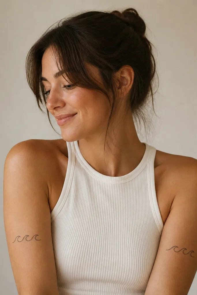
Waves look clean after healing when you keep the line spacing consistent and avoid heavy shading. Mirrored waves also make couples feel connected without copying the same exact arm position. The pattern reads as "flow" even if the skin stretches a little.
Choose a line weight that stays thin but not hairline - medium fine looks best after healing. Place one wave set on the outer upper arm and the other on the inner upper arm so they face each other when you stand side by side. Keep the whole piece around 3 inches wide.
Pro tipUse a flexible measuring tape and place tiny dots on your stencil points first. Consistent spacing beats perfect symmetry.
AvoidAvoid extra swirls between arcs - they crowd the healing space and blur.


